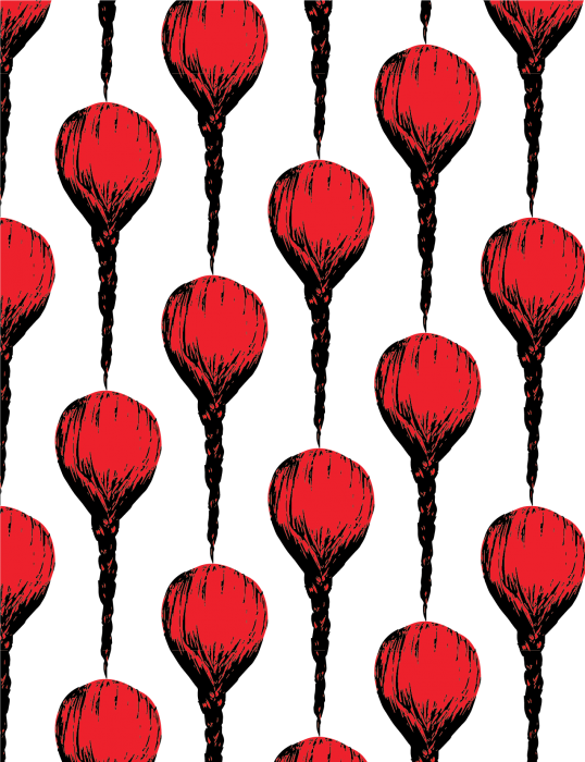
Background experimentation
There are 20 posts filed in My Work (this is page 1 of 2).
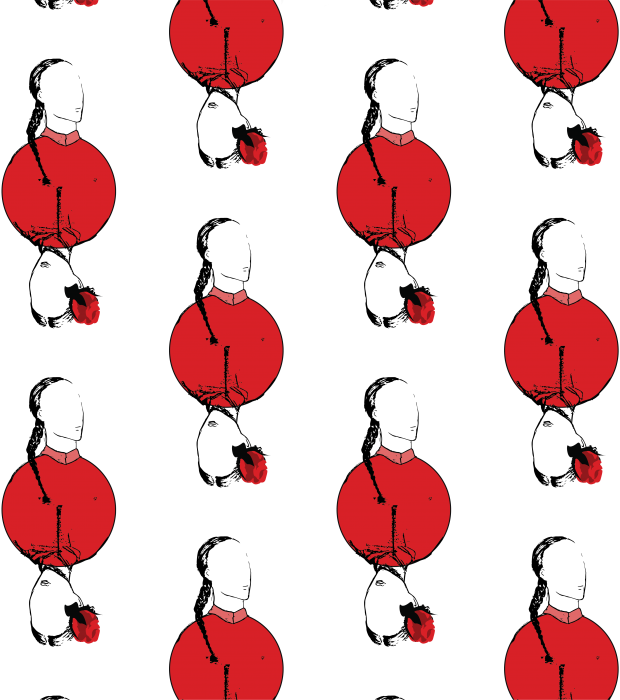
This past week I’ve been experimenting with arrangement of motifs and what I would want my motifs to be. Starting out with a few basic motifs, I’ve started to play around with the patterns and it was so much fun. It was like watching your child grow up right before your eyes.
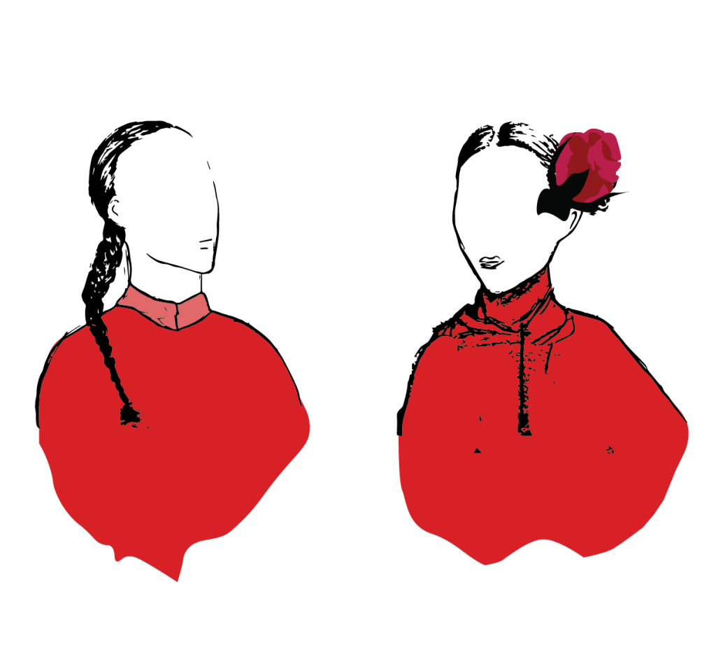
Faceless motifs. The image of people who have passed. We remember the impressions they have left on us. Right now I’m experimenting with the styles and still trying to find a style that ties in with my concept.
 Right now I am still experimenting with the style so I would like to expand on the sketches.

This semester’s painting was really one of the most enjoyable modules I have taken. It was like being able to take a break from the hectic life of everything else and just being in a calm space with just music and paint. I loved the assignments week to week and being able to try out different techniques and methods and not being afraid to go out of exact realism with the help of Miss Kelly. Surprisingly, at the end of sem show, all the paintings seemed to mesh together really well in terms of the theme and style. I felt that all the paintings had a sort of still and deathly look to it (Which I was not sure how to react) but I guess I kinda like that deathly look.
Self Portrait: Selfie
Going into this self-portrait painting, I wanted to do something which captured motion but not do something too experimental until it becomes an abstract version of myself. I decided to do a selfie portrait because I love selfies.
Spirit Self : Spiritual Self
I painted myself as a monk because I believe I was a monk in my past life since I’m so kind-hearted. Anyway I loved painting the aura behind the head and I felt it really gave it that extra pop. The drips were happy accident and I felt like it worked well.
Portrait Painting #1
For this painting, I decided to do an impasto styled painting which I used thick slabs of paint and scratched it out to give a sort of textured movement to the skin. I thought it gave him a 1960s look which I loved. Miss Kelly and I agreed that the green background wasn’t really working out and so I tried out different cool colours and felt that a black background still works the best.
Portrait Painting #2
For this painting I wanted to blend and make everything smooth and also capture the details on the face. I felt like this was the more realistic painting which I painted.
Portrait Painting #3
I LOOOOVEEE this painting of Wuyou. I departed from the previous styled and went for a more light-hearted animated style and I thought it came out really well. With the pink polka dots and the light yellow background and the contrast on the face. I loved all of it. This is my favourite portrait painting.
Portrait Painting #4: The Warhol Inspiration
This was unexpectedly fun to paint. Although I was a little worried at first trying to paint the model as she kept moving and sleeping, her decision to fall asleep was able to give this painting a sense of zen (coincidentally her name) and calmness yet still have a great sense of evil and menace. I didn’t know I would be able to capture two opposing emotions at once but I learned that it was the contrast between subject and colors. For this painting, I decided to try a more graphic technique using the colours and create a sort of 3D model of the model and use contrasting colors and I was really happy with the result because not only did it turn out looking different from my other portraits, it was striking in appearance. I decided to play with the colors to come up with a series and all of them worked really well and I felt like it resembled Warhol’s prints.
Vanitas : Life After Death
I worked on this vanitas over the recess week and loved working on it. It was a painting which I really wanted to spend time on and I had to plan before execution because I did not want to miss out details. This was also my first time painting reflective paper and it was hard to see the shapes in the reflected light but in the end I felt I managed to capture it. The concept behind this painting was the Chinese traditional offerings in which I grew accustomed to growing up. Whenever me and my family would go and visit our ancestors we would set up the offerings for the deceased and I thought I’d inject some culturally inspired set-ups into this still-life painting to exude death.
Experimental #1 : Still Energy
The painting before was very different from the final outcome. The consensus I got was that it portrayed a sense of misery and depression from the dullness and stillness of it. After adding a splash of contrasting colours I felt it really popped.
Experimental #21: Burning Serenity
I loved the colours in this. How the warm colour juxtaposed with the cool serene pinks and purples really made this calm yet energetic.
Still Life #1
The first still life was exciting for me because it was one of the first time touching oil paint and surprisingly I like it more than acrylic because of the smoothness of it and I really learnt how to deal with the paint in the first lesson. The important notes I needed to take which differentiated oil from acrylic was that it was easily smudged (good & bad) and that the textures were smoother which I loved to be able to handle shadows.
Still Life #2
The second still life once again featured my favourite red shoe. This lesson I tried to learn how to incorporate the background to make it look less dull. I felt that the first still-life had more life in the background than this but I tried many variations but it just didn’t seem to match the stillness of this set-up so I kept with the brown.
Night Landscape #1:
The ADM carpark. LOVED THIS because of that one light and in the end I loved how that one light source gave life to this painting.
Night Landscape #2:
This was the hardest painting for me because of the many details in the window sill to the different variations in lighting. I think there were about 7 layers to this painting because everytime I added a colour I had to wait for it to dry before I could do the appropriate tweaks for the next colour/layer. But I really loved the outcome.
I really enjoyed this class and sadly I can’t take it again but would love to join future lessons.
Painting was awesome!
In Staver’s paintings, he combined various techniques to draw the viewer’s attention to certain subjects and takes you on a visual excursion through the painting and in a sense he is giving you puzzle pieces in chronological order to allow the viewer to make sense of the scene depicted within the painting. He uses colours to emphasize light which immediately draws the viewers to a certain area of the painting and contrasts that with dark, bold colours which allows the subjects ot be defined.

Kyle Staver, Prometheus, Oil on Canvas
In this painting, my eyes are drawn to the cool colours of the sky and there is a stark contrast as he juxtaposed an almost black figure of the eagle and that sillouette is easily identified as an eagle in motion. With the motion depicted downwards, the eyes are then drawn to the nude figure perched on a rock. What is interesting to me in this painting was that the background and foreground are mostly sillouettes with not much detail but we are able to make out the idea of depth and space and even that the scene is taking place outdoors. The use of light and shadow juxtaposed with the harsh, dark lines not only creates a three dimensional space but also guides the eyes from point to point in the painting, creating a narrative.

Kyle Staver, Leda, 2015. Oil on canvas
Once again, Staver creates emphasis on the swan with the contrasting light colours to suggest a light source and defines the sillouette of the swan. Our eyes are then guided around the painting which creates a context of the figures being within nature. Again, I noticed that he uses a lot of cool, natural colours to depict nature and the figures being nude also give a natural, almost liberating feel to the painting. Our eyes are then guided to the sleeping lady in the background and then down again to the cool blue mat. In this painting our eyes move in a top-down motion.
Kyle Staver, Adam and Eve and the Goats, 2016, oil
Once again, Staver uses cool natural colours and light colours to highlight a light source, drawing the eyes to the central opening of a dense forest.The eyes are then drawn to the sillouette of the female nude in the foreground, then to the tree and the apples. The eyes then move down to the animals and then right to ‘Adam’. In this painting, I felt that the eyes moved in a circular motion with the male figure on the right being the last to be seen.
Overall I enjoyed the process in the beginning but I really regret changing the concept so late in the game just because I felt like doing something different. This project actually taught me more about myself that once I’ve settled on something I should just go through with it unless I really feel the burning desire to change it and not just change it like that. I would have liked to end 2D on a better note. But It’s alright. I’m glad how everything turned out aesthetically and I really enjoyed 2D for the past 2 semesters. Thank you so much Joy. You’re such an amazing tutor and I’ve really learnt a lot from you 🙂
What a great way to end this semester haha. For this final project I got to work with the fabulous Charmaine, Ying Xiang and Eng Seng! For our final project, we’ve decided to incorporate the idea of the morphing image of the Buddha corresponding to the region in which Buddhism had spread to and how different ideal standards of beauty in that region affected the iconography of the Buddha.
So the idea started out as a basic print-based format of photoshopped images of the Buddha on Fashion magazine covers of different regions around the world. Our initial research brought us to coming up with images concerned with popular culture.
However, we were thinking how to make it more interesting and interactive so the audience could immerse themselves into the work and not just see it visually.

Creating the container was also a tiring process. Choosing the paint colours to match and the size in which to create our prototype.
So we finally found an artist whose works we felt really tied in with our concept of dissecting the Buddha image and placing it in a modern context to allow the audience to have a clearer picture of the concept. Monty Hurwitz also questioned the idea of identity and we felt this really resonated with our concept.

So one of the first problems we encountered was the medium in which the buddha head was going to sculpted and dissected. Should we use paper? Clay? Foam? So we got a large foam block and tried to saw it but we couldn’t quite get the right Buddha iconography and instead it turned out looking like a cute lego versio nof the Buddha. Sawing the foam block was really tiring and we didn’t really get the form we wanted. But at least we tried.
We then decided to move on to paper…
Turns out it worked beautifully! The first draft of the 3D piece was made with satay sticks and just flat 2D paper of the Buddha image with celebrity icons photoshopped on them.
However, we felt like it was too unpolished and wanted images to be displayed on the sides as the audience move around the piece. This we decided to use styrofoam blocks to create different perspectives. So we painted the sticks black so the ‘satay sticks’ weren’t too much of a distraction.
So for me I mostly worked with the prototype ; me and my team mates constantly had to communicate to make sure that our concept is clear through the medium, the colours, the presentation and the overall concept in our proposal and artist statement.
Overall it was a tiring process but my group and I are really happy with how everything turned out! Great Semester of art history and a really nice way to end it. 🙂
Thanks Sugatha!
The mock-up of our 3D installation. Many images of the Buddha formed by pop culture images.
Artist Reference :
Jonty Hurwitz
Hurwitz focuses on artworks which requires the movement of the audience as he utilises the audience’s point of perspective to create different images.
The Buddha image has been continuously appropriated through the different ages, by different civilizations to suit their own stylized idea of beauty. The Indians valued the lean look of the Buddha statues: they were a symbol of abstinence and virtue, while statues of a fat, Laughing Buddha have been found to be originated in China, and was thought to be attributed to prosperity and good fortune. The Japanese also adapted Buddha images that were similar to the Indians, but they contained features that were more oriental in nature. Inspired by these appropriations of the Buddha image that aim to achieve each civilization’s own aesthetical standard of beauty, the Dissecting an Icon was created as a visual response to these issues. Drawing a parallel with society’s cult following
 of popular
 culture and appearances today, the work
 consists of several suspended pieces of wood, that when combined, form a large Buddha head. But when approached from another angle, each piece is then seen to contain tongue-in-cheek images of the Buddha in altered popular
 images of pop culture. Dissecting an Icon represents the impermanence of beauty in every society; akin to the Buddhist ideals of transcendentalism. It provides an alternative perspective into the fanatical worshipping of trends and an obsession with getting the perfect appearance and body type at any cost.
Medium :
I’ve chosen to use the medium of puzzles to lay over images. Searching through for inspiration I’ve found that the idea of layering segmented images would really communicate my idea well as the subject matter of breasts, being part of the female body, could be represented as physically attached but emotionally detached(I know bit confusing ah I don’t know how to explain) As in like for a transgender it could be represented as a puzzle to make one feel whole. And I find the idea of having cracks/spaces between the segmented pieces because it shows that it is not a true original piece but it could be formed and created to ‘finish’ your own puzzle.
I’ve also decided to split the 6 images into two categories of perspectives:
1st person perspective vs 2nd person perspective
Positive Breast
Trasgender | Baby
Superficial Breast
Anorexic | Plastic Surgeon
Negative Breast
Breast Cancer Survivor | Conservative
Inspirations :
I wanted to have a minimalistic illustrated look to mimic certain magazine covers that I felt had a really clean look and to convey a message quick and easy but not too literal. So that was the main challenge for me which was to find a balance between too symbolic and too literal.

I’ve decided to go with a consistent female body through all the compositions so give a sort of flow and simplicity to the works. I did not want it to be messy and all over with different representations for every work.
For this work I began with a painted mock-up of the idea with a plain puzzle set from ArtFriend and during consultation the problem that was brought up was that the message of the work would be better conveyed if the puzzle pieces weren’t placed all over. So I’ve decided to rework it and place the puzzle pieces around the body instead, representative of the human superficial flesh in contrast to the inner body of a Transgendered person.
Creating spaces between the positive and the negative which shows the dissipation of the old identity and the reformation of a new identity.
I felt that the typography would actually create more visual mess and take away the focus from the work and message itself. So I decided to do away with the text across all 6 works.
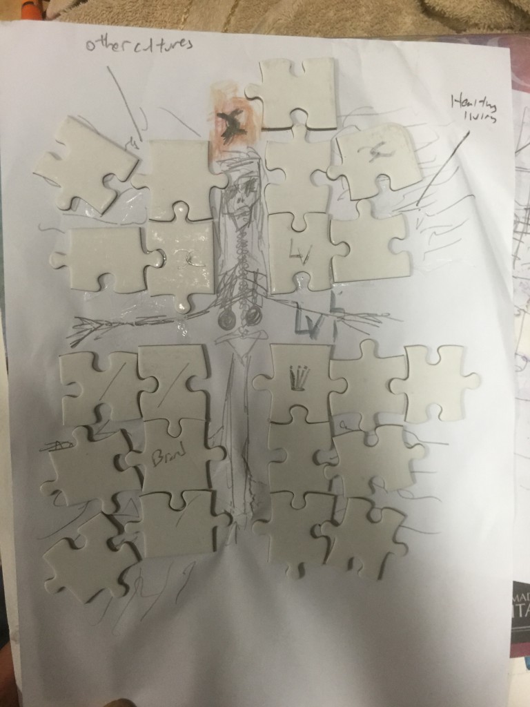
Breasts in the POV of an Anorexic is Out Of Place
The first mock-up idea
The first idea for the POV of an anorexic which showed a crucified skeleton weighed down by shackles on the ribcage and the puzzle pieces represented the media covering up the ‘healthy lifestyle’ and only showing the ‘superficial’ pop culture.
The problem with the first mock up from the consultation was that it was very crowded and messy and had too many points (Media,Social) and that the focus was taken away from the breasts themselves.
So I decided to just remove everything around the skeletal figure and just focus on the figure itself and represent then breasts as puzzle pieces that were ‘out of place’.
Experimenting with the background colours to see which would best fit in terms of contrast and the mood and decided to go with the warm colour of yellow because I felt that it gave a happy but creepy feel with the illustrated skeletal figure in the forefront.
Breasts in the POV of a Breast Cancer Survivor is a Medal of Healing
The idea of using threads as stitches to show a physical representation of healing and I felt that having it be real-life and not printed would give the effect of physical/superficial scars and to be able to see through the threads allows the message of not allowing the breasts t define them superficially anymore.
I realised I forgot to take photos of the sewing because I was trying so hard not do break the paper so yea :/
Breasts in the POV of a Plastic Surgeon is a Puzzle To Be Rearranged
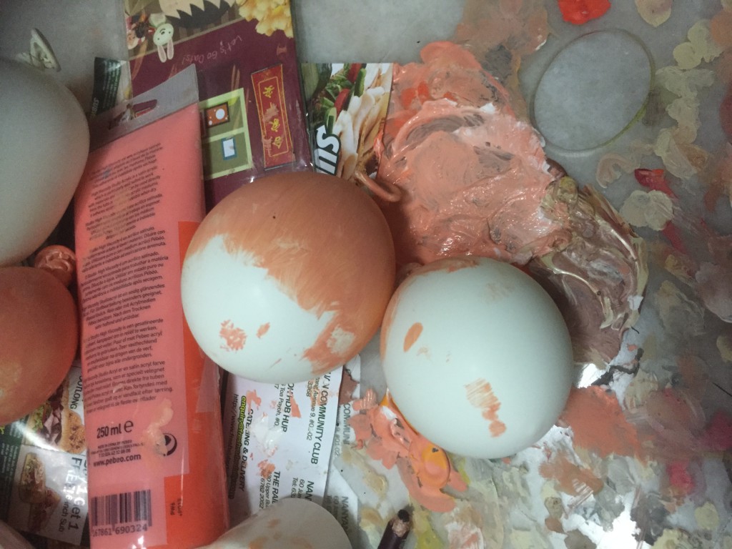
Making of the breasts using balloons and rubber as a synthetic material that adds to the quirkiness of the work
Breasts in the POV of a Conservative is Censorship
Breasts in the POV of a Baby is Food
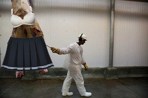
Idea of depicting women as meat. I had trouble trying to find a balance between depicting the boobs as food and not some sex trade mysoginistic way
Miscellaneous :
Just some initial ideation for my own use
Overall it was a tiring process and mostly because of conceptual problems and I’ve realised that the concept is the hardest part for me and execution usually goes smoothly! Hopefully I’ll be able to conceptualise faster for Project 3.
So I’ve finally decided on a concept which I’m excited to execute! Been quite sometime since I actually got my hands dirty for 2D and so I’ve decided to go back to traditional mediums of illustration and painting.
6 Concepts are :
Breasts in the point of view of a Transgender Woman is Identity
Breasts in the point of view of a Porn Actress is Money /Livelihood
Breasts in the point of view of a Baby is Food
Breasts in the point of view of the media is censorship
Breasts in the point of view of a Plastic Surgeon is a Blueprint
Breasts in the point of view of an Anorexic is Fat/Burden
Medium :
I’ve chosen to use the medium of puzzles to lay over images. Searching through for inspiration I’ve found that the idea of layering segmented images would really communicate my idea well as the subject matter of breasts, being part of the female body, could be represented as physically attached but emotionally detached(I know bit confusing ah I don’t know how to explain) As in like for a transgender it could be represented as a puzzle to make one feel whole. And I find the idea of having cracks/spaces between the segmented pieces because it shows that it is not a true original piece but it could be formed and created to ‘finish’ your own puzzle
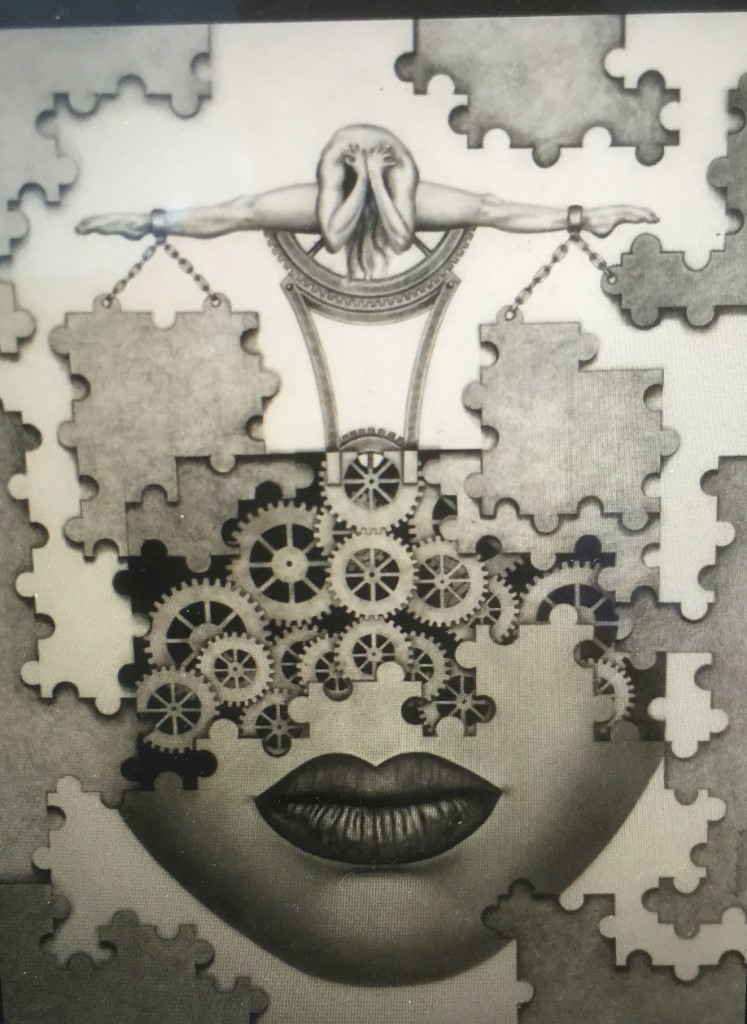
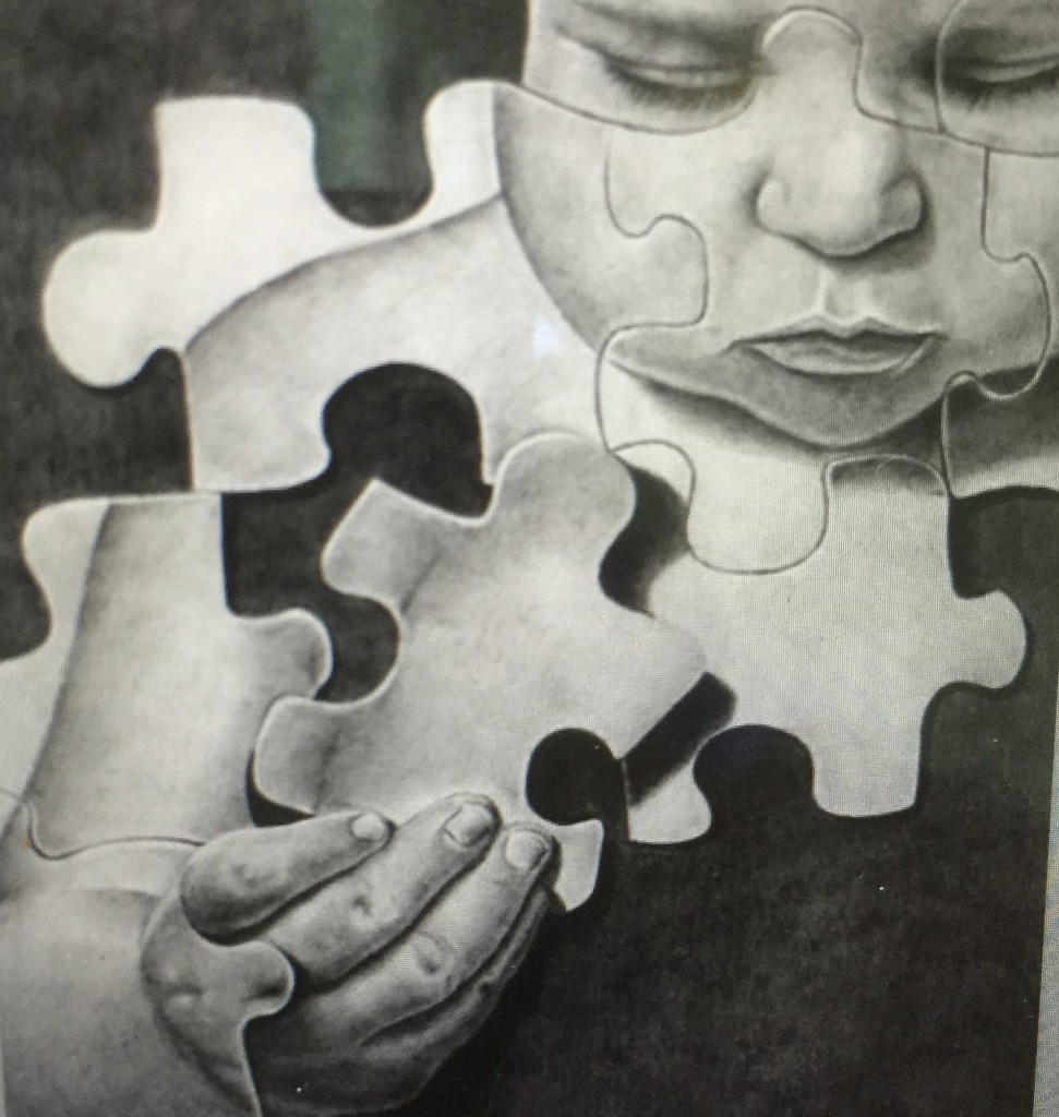
I was inspired by images like these 2 and I felt like it could create dark humour
Ideation :
Breasts in the point of view of a Transgender Woman is Identity
Initially I had the idea illustrating a male’s head on a female mannequin’s body but it was too ‘in your face’ to me. So I’ve decided to use puzzle pieces to represent the different perspectives of breasts. (Missing Pieces)
Missing Pieces representing identity
Breasts in the point of view of a Baby is Food
Puzzle pieces forming the components of nutrition in breast milk. (Normal Pieces)
Breasts in the point of view of a Plastic Surgeon is a Blueprint
(Pieces altered; Puzzle pieces are broken/replaced with new ones)
Breasts in the point of view of the media is Censorship
(Blurred puzzle pieces/Transparent Puzzle pieces but one opaque?)
Breasts in the point of view of an Anorexic is Fat/Burden
(Puzzle Pieces that don’t fit in? Too big pieces. Out of place)