Drawing archive

Screen Shot 2016-02-11 at 10.52.50 am Screen Shot 2016-02-11 at 10.53.19 am Screen Shot 2016-02-11 at 10.53.33 am Screen Shot 2016-02-11 at 10.53.45 am

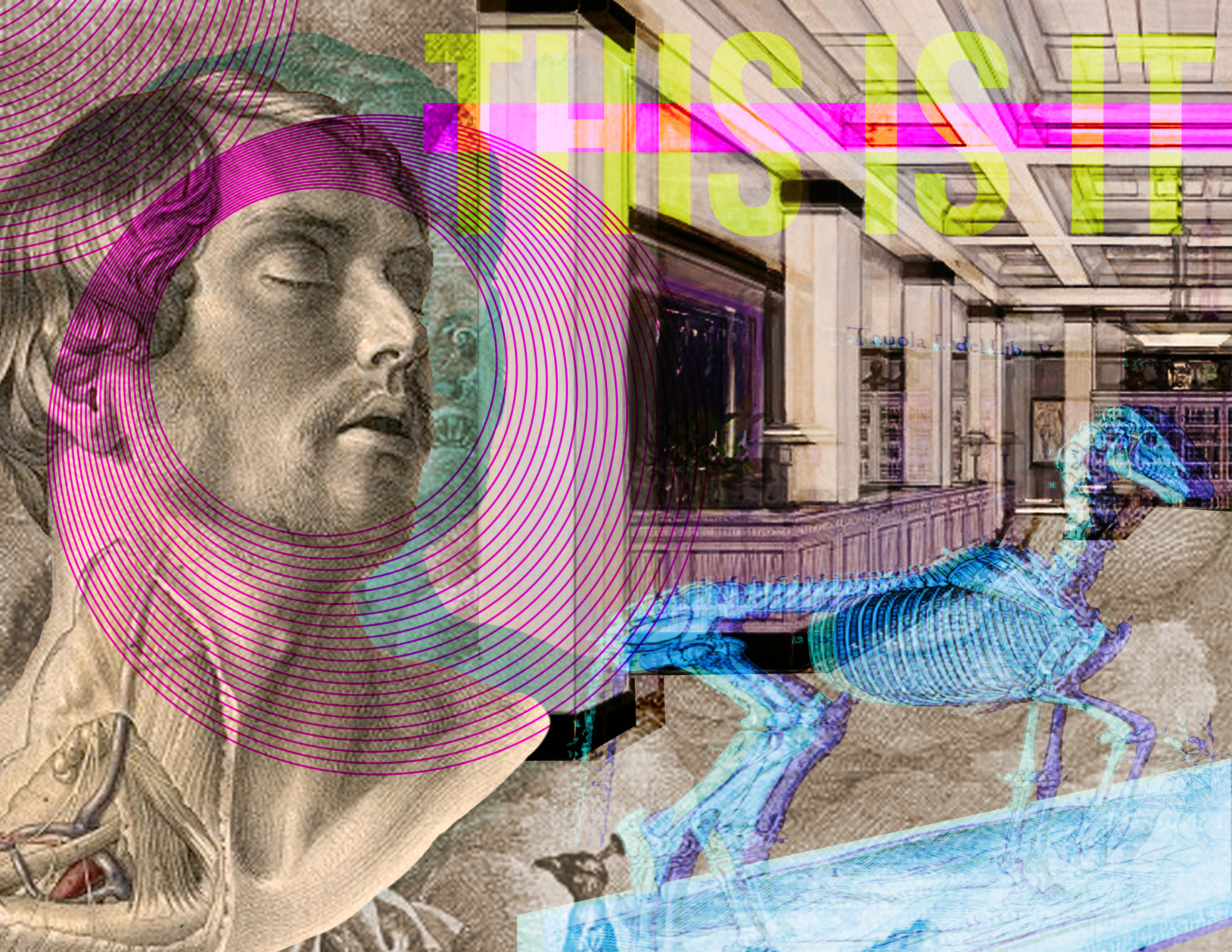
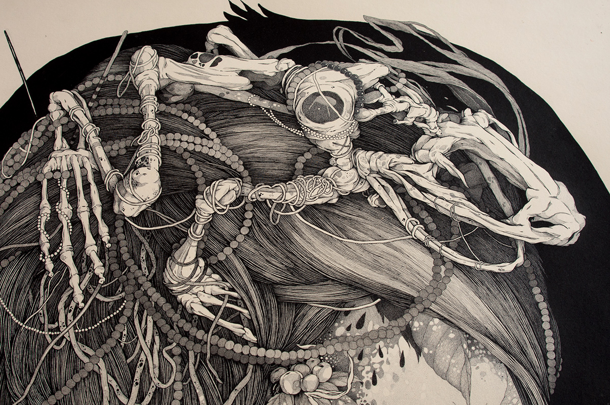
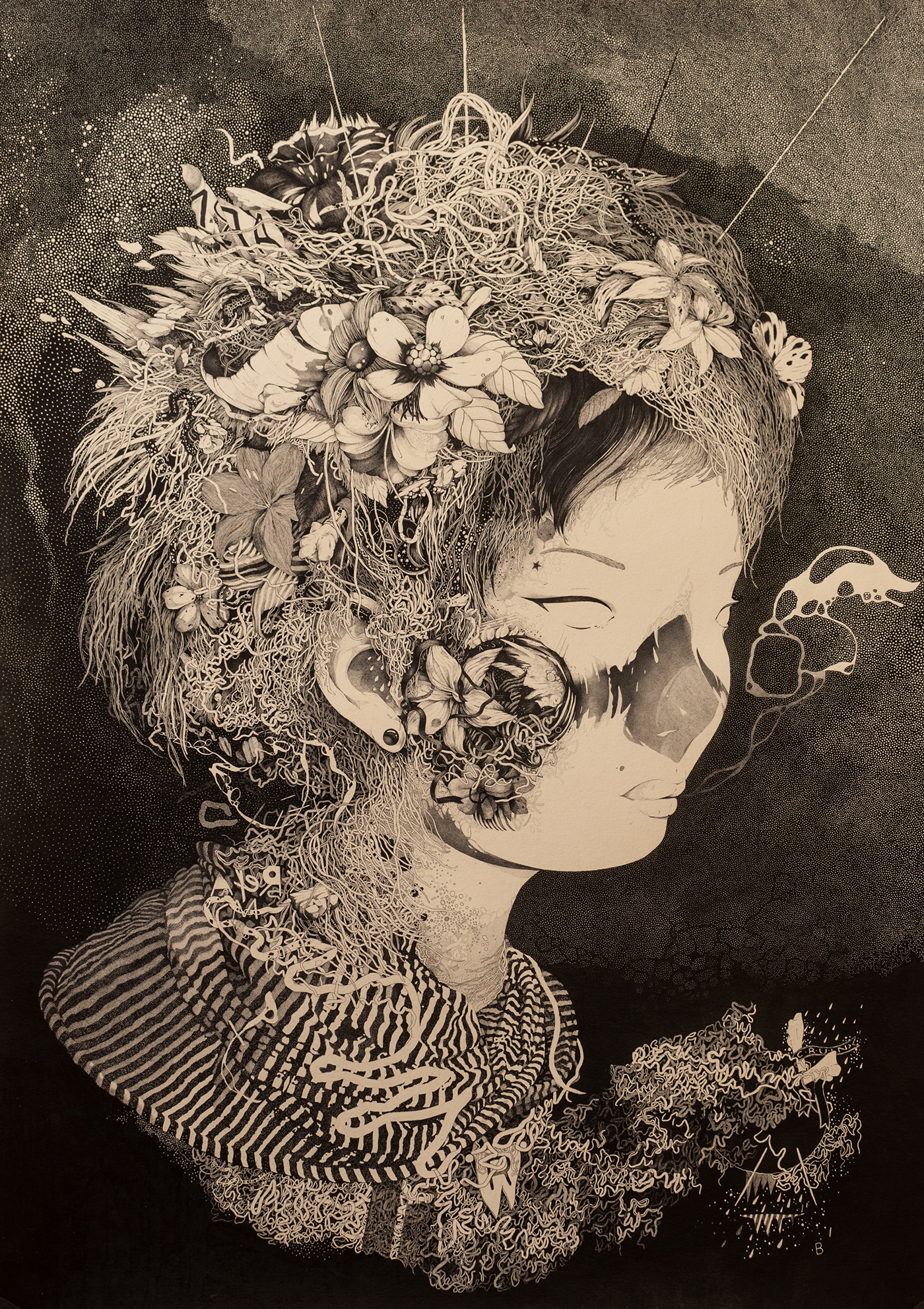
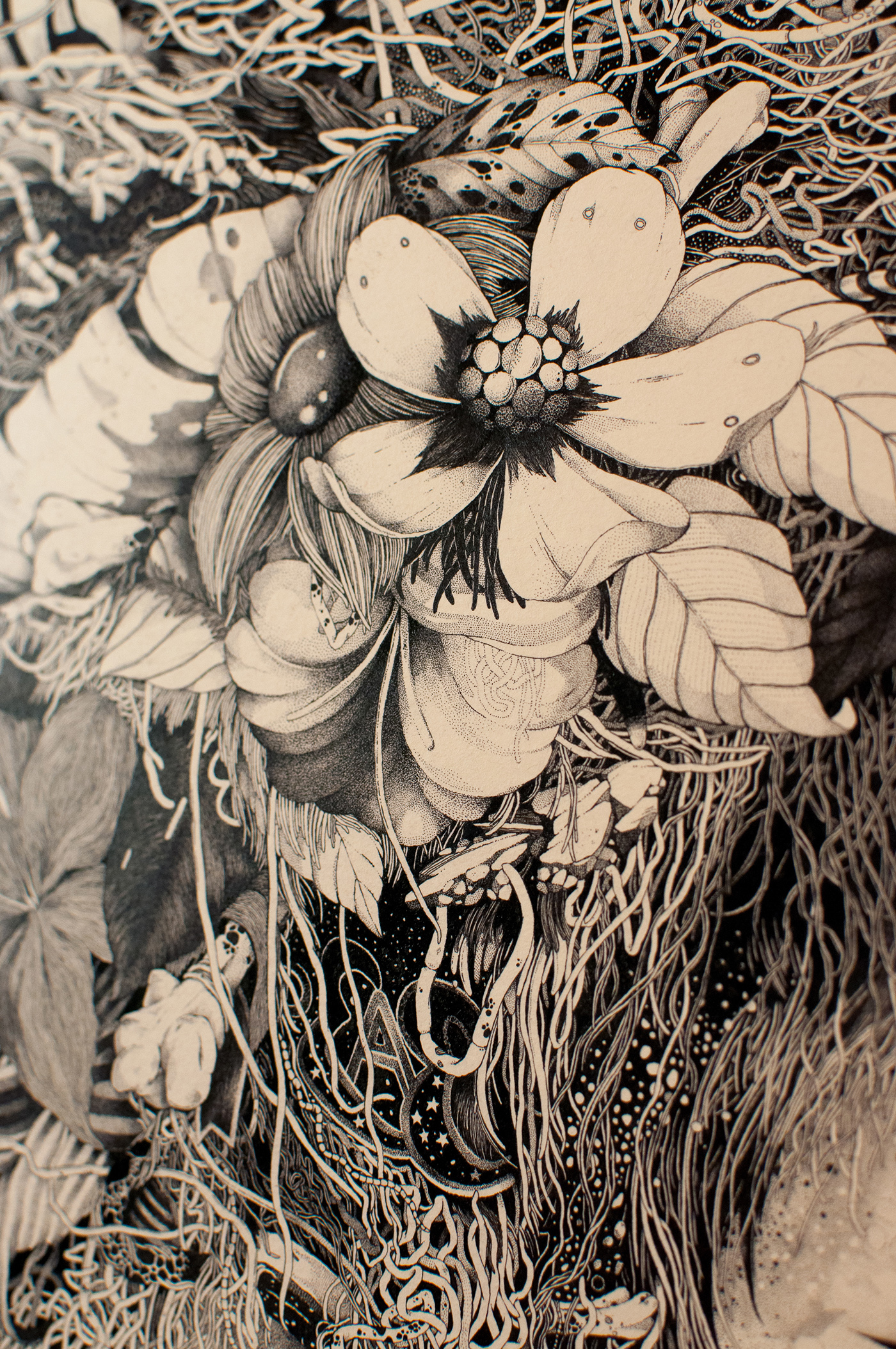
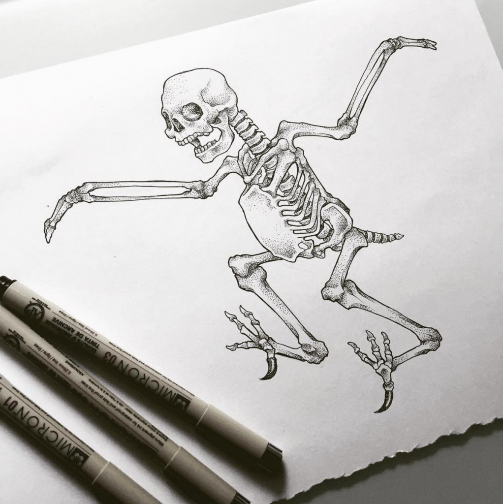
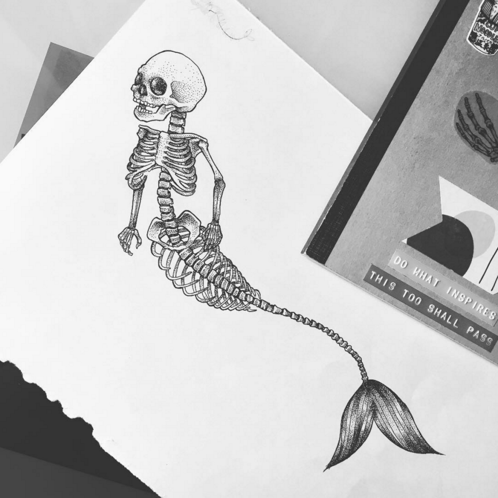
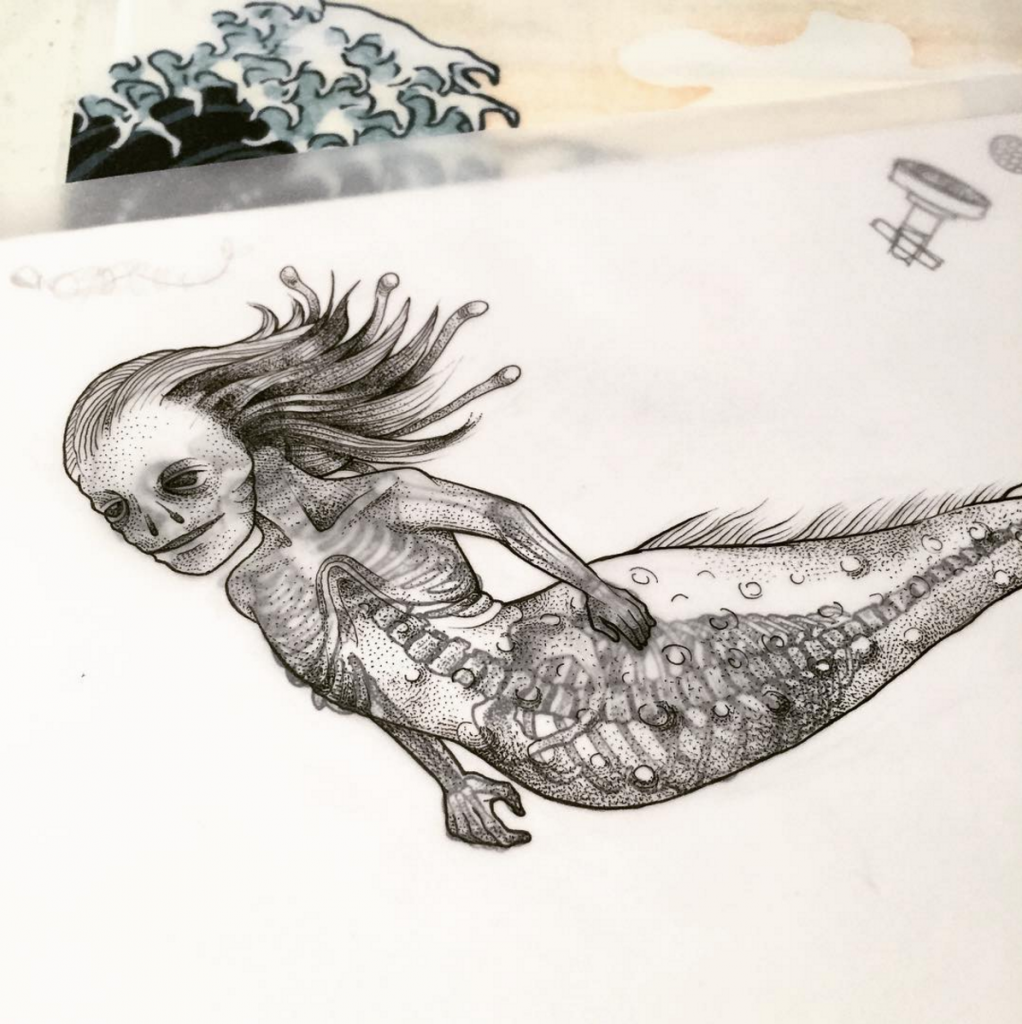
Over the past week I’ve been working on my layered illustrations for my book since I’ve already settled the type styles and the technical aspects of putting it together. By focusing on the illustrations now, I’ll have enough raw material to start putting drafts for the mural together and I’ll be able to consider my gallery setup with more concrete details. I’ll probably pick up on more typesetting this week and start laying out more of the content to determine if I need to generate more.

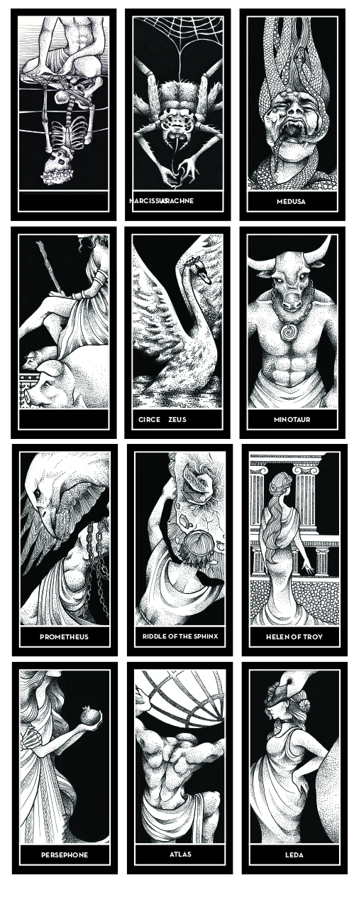
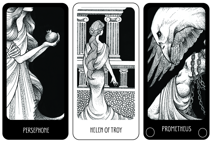
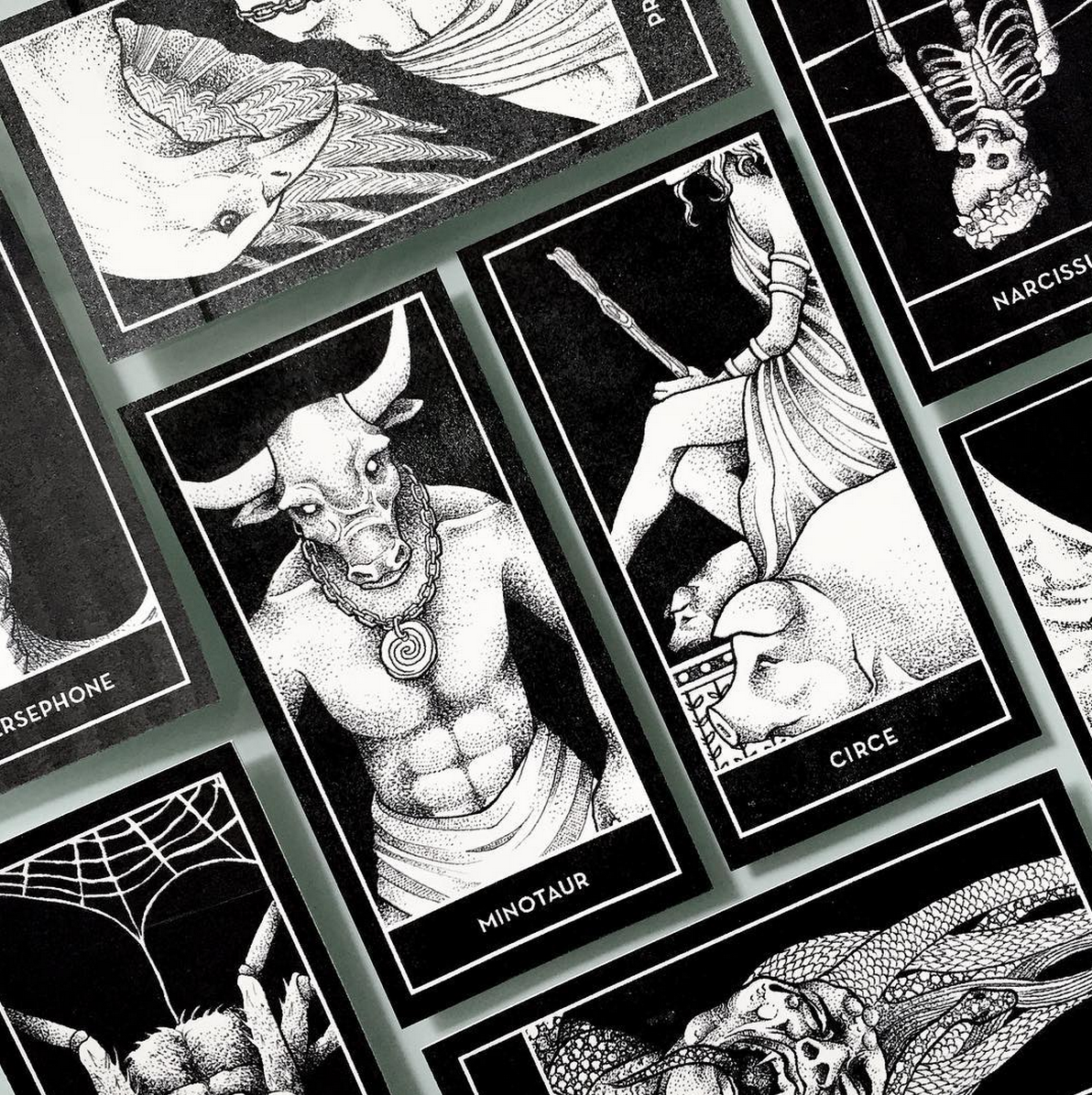
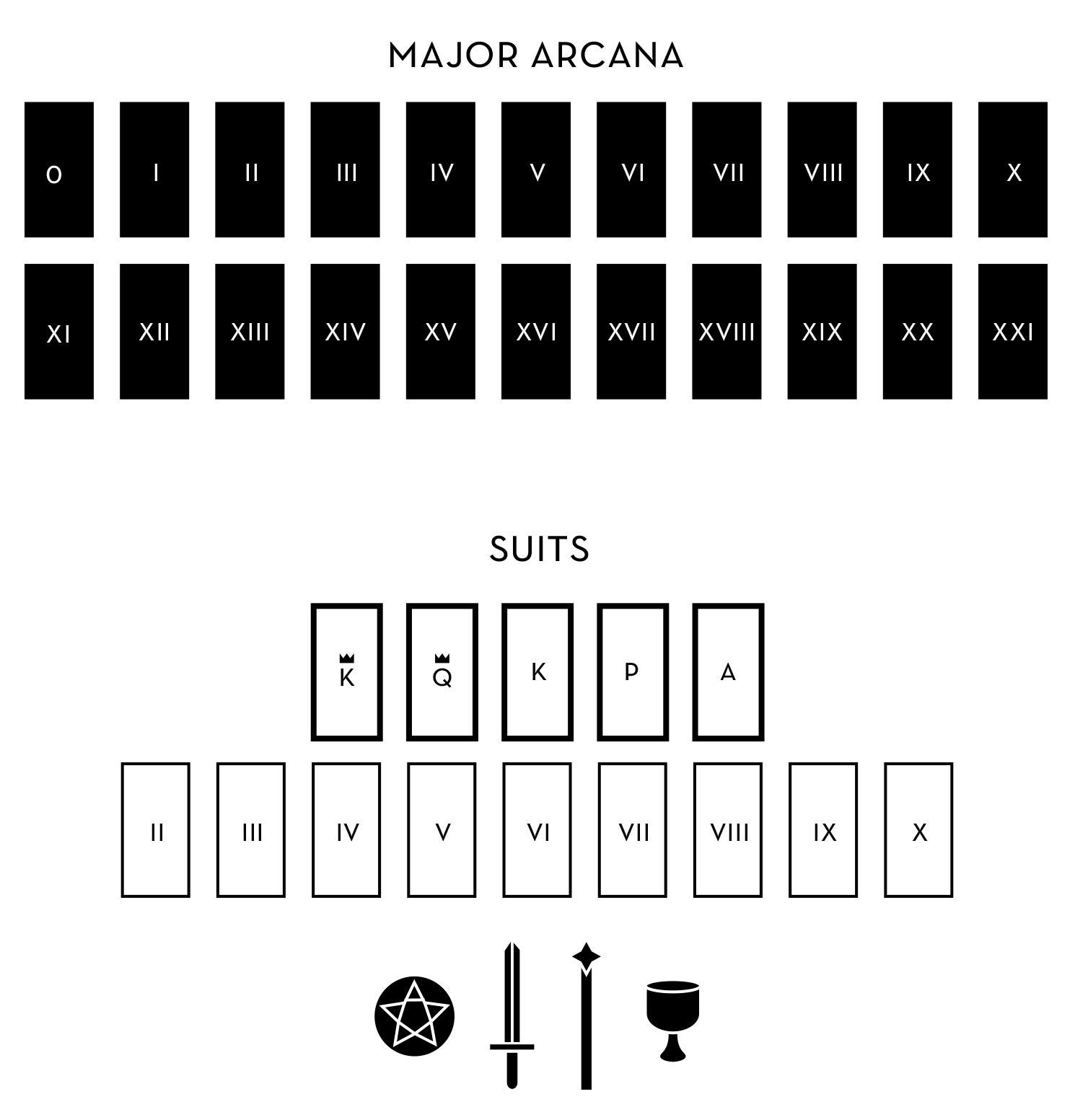
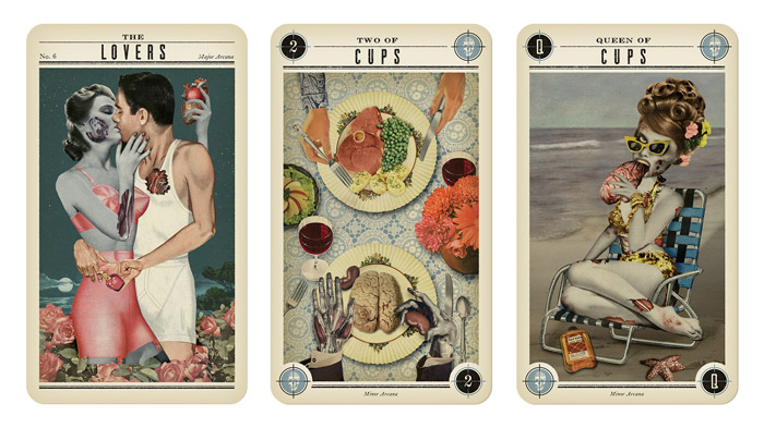
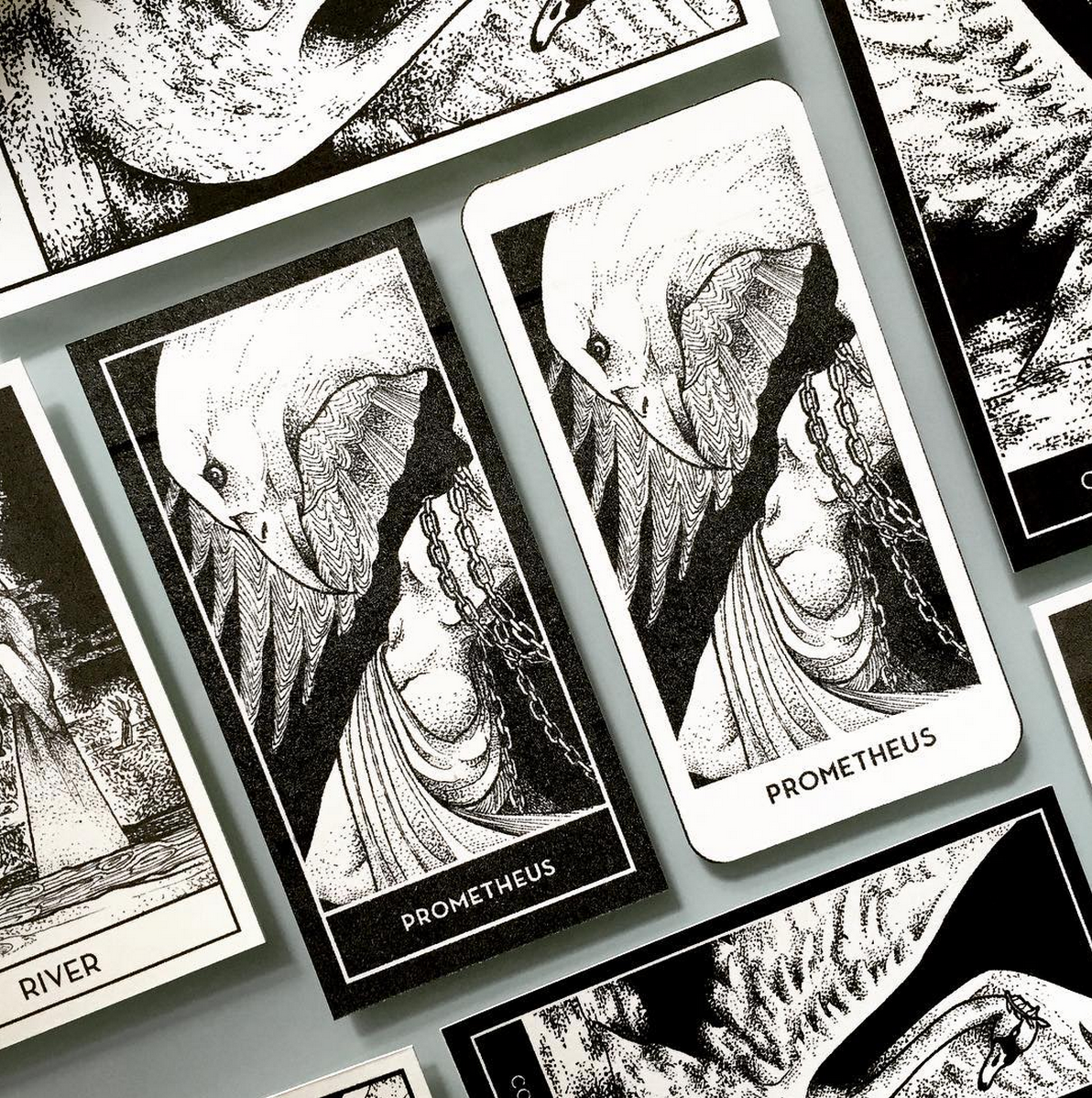
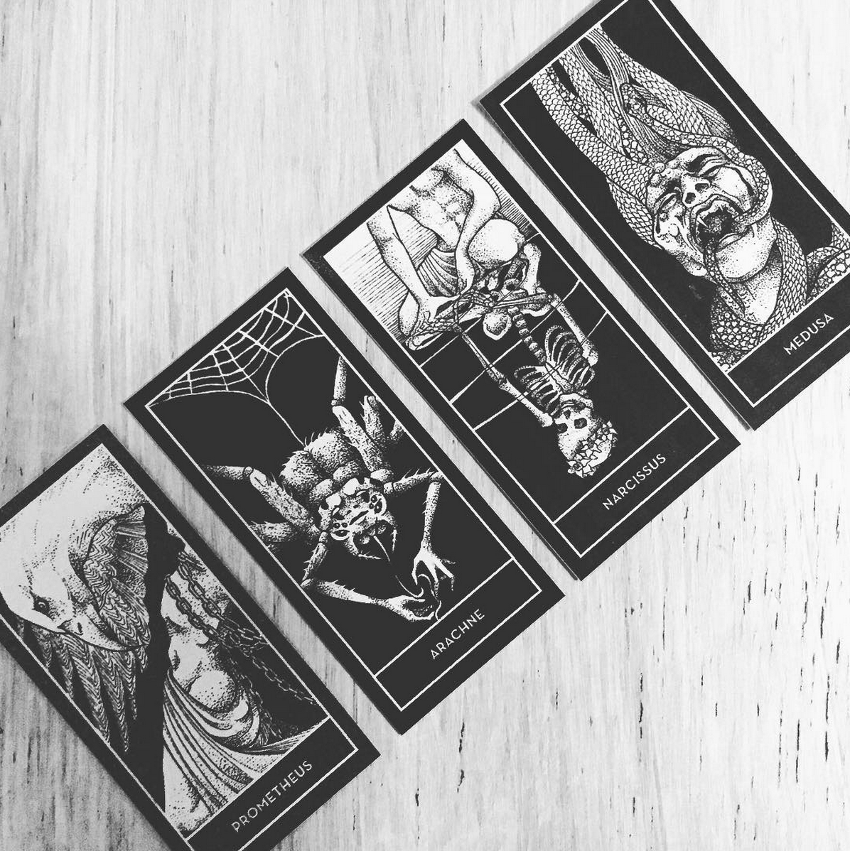
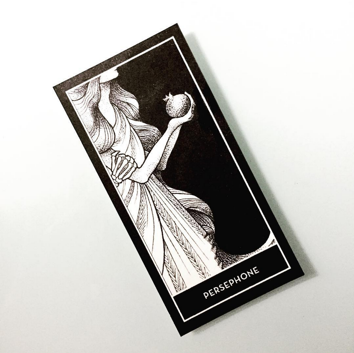
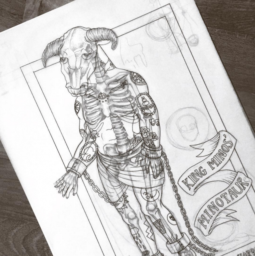
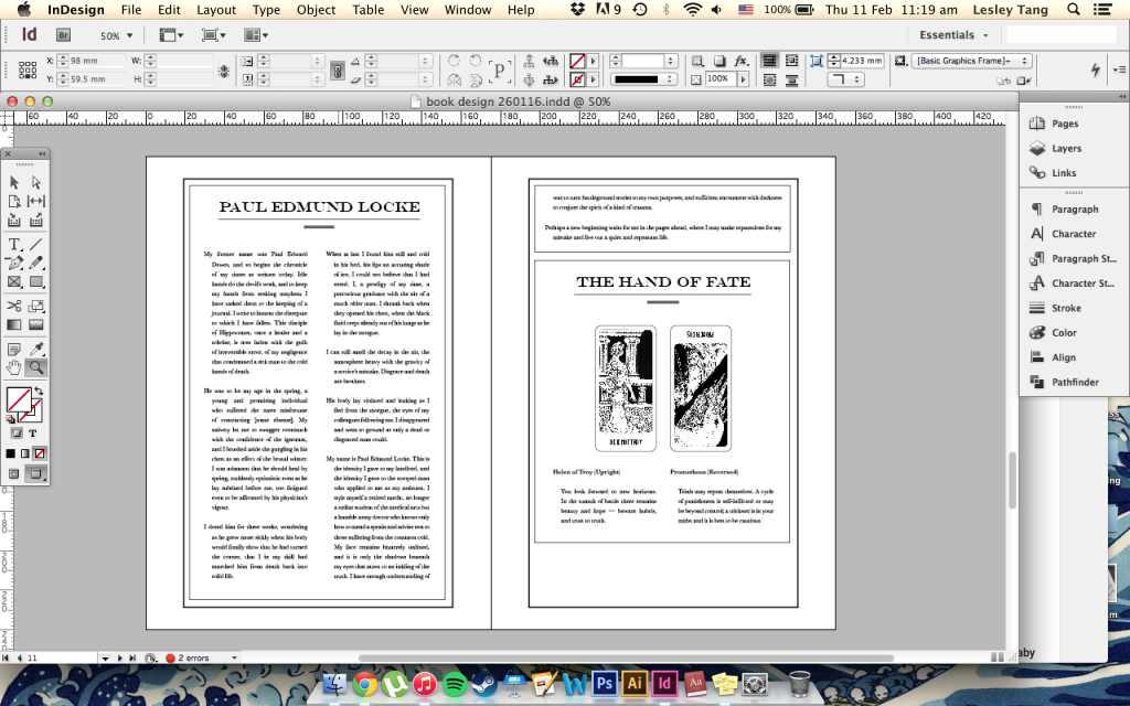
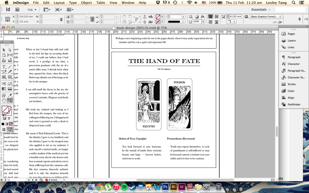
One additional concept I’ve added on is the introduction of the tarot/fortune cards to the story – I’ll be redesigning the card frames and writing in meanings for the spreads that are interspersed with the story to help create additional layers of storytelling and meaning:

Screen Shot 2016-02-11 at 11.19.53 am

Screen Shot 2016-02-11 at 11.20.02 am

A lot of this is getting very introspective (I’ve been playing Sunless Sea, a very deep storytelling game that has probably influenced the amount of content I’m building around my narratives) but I hope to be able to map it out soon in a more critical way that deconstructs the narrative process (just to please people who couldn’t understand my research… *cough* and I do like mapping now).

More collages

Untitled-3

Untitled-2

Thank you to Beverley for sharing collage resources and influences with me! Here are more visual experiments (I don’t know how I’m going to use them yet in the final outcome) with source imagery courtesy of the Wellcome Library, London. Anyone who needs remixable stock images should definitely check their library out. Right now the way I’m creating is really organic without a specific direction as yet (just going by the aesthetic I like), but along with my illustrations and writing I’m sure this will lead me somewhere good.

Collage experiment

Untitled-1

I think I might actually get into this. I was a bit lazy and clueless about my first collage and just threw a bunch of coloured shapes over the top, but I feel the potential in this for making great visuals for my book that can work alongside my illustrations. I think these are great for period posters and supplementary imagery, so I’ll experiment with more of them and figure out how to fuse this with a type approach plus my existing drawings. Primarily, I still want to draw, but I want to be able to create ephemera that evokes a 1800s mood with a modern sensibility. Thoughts?

All images used in the collage (except the geometric elements which I lazily made in Illustrator) are from Wellcome Library, London.

Illustration by Benze + Setup

I’ve been feeling a bit stale in the drawing department lately (although this has been a really good break for me), so I started browsing my favourite art websites to look for new inspiration. I am still bent on black and white illustration as much as I ever was, and today I discovered Benze‘s work, which is another aspect I’d like to incorporate into my melting pot of influences.

benze1

benze2

benze3

benze4

My plan for the setup is to have the book surrounded by my illustrations/ephemera created that relates to the book. This is just a spontaneous idea for now, but I’ve always been inspired by past work that creates an illustrated space. I’m not sure if it’ll be counterintuitive for the space to overwhelm the book, but I want to immerse the viewer in my aesthetic and I can draw pretty fast when I need to, so I really want to push myself.

Screen Shot 2015-11-03 at 10.16.46 am

I’m hoping to have this kind of space. Right now the plan is to have the left wall focus on fact and the right wall on fiction. So, the left wall would be newspaper clippings (all made by me) and anatomical drawings in a large, pleasing collage. The right wall would be more surreal drawings, possibly excerpts from Pollux’s narrative voice in the book, stuff that’s more esoteric (like my tarot cards). The back wall will be where I can illustrate most, a giant detailed piece about Gemini. And of course, the display stand will be where I place my book (hardcover with gold foil, hur).

This is just a fleeting thought at the moment, but I want a space that creates immersion in my theme and aesthetic so that people who don’t get to see the book at the show can still understand my thesis just from the way the space is arranged. I had a show in JC where I also did a book, and not everyone was able to see it because a book is by definition an intimate viewing that’s most conducive for one person at a time. So, I want to make the space at large evidence of my research, work and illustration skills as well.

Work in progress update

111015 cards

111015 cards_formats

This is how the deck’s going so far in terms of just imagery, and here are some experiments as to how I can lay out each card. I haven’t been all too adventurous yet because I still need my system of organization, but I think I’m leaning towards removing the white frames around each card and having them either fully black with no visible border or fully white.

Work in progress + new thoughts

Screen Shot 2015-10-06 at 9.44.17 am

Here’s the progress so far on my fortune-telling deck. I’ve been focusing on getting all the artwork out before attending to the structure of the deck and cards, because it’s the most intuitive way for me to work on my project. Having researched on various aspects of deck design over the past couple of days, I’ve come to certain conclusions about how to further stretch my project.

  1. First of all, I’m starting to look into card systems and deck structures in more detail. Yesterday I came up with a simple map for the Rider Waite tarot deck that I have at home. My rationale for doing this is that I don’t yet have a straight-up system I am using to build my deck. At this point I only have about ten cards so it’s not so pressing for now, but it’s a good time to be looking into what the deck structure is going to be like. Deck structures aren’t only common to tarot sets, but to regular old four-suit playing card decks and to trading card games. (I used to collect Neopets cards and they came with Heroes, Villains, Locations, Items, Equipment, and Something Has Happened cards.) As a kind of side project to my illustrations I’m trying to find different ways to map the decks that I have to get an understanding of and inspire some structure.

    mapThis isn’t really part of my final outcome, but it’s useful to do for my own reference and I can include it in my process too.

  2. Building on the idea of structure, there’s a surprising amount of details that goes into the design of a single card. I’ve been using a single border and the same font (Neutra) for all of my cards just as an interim thing, but if you look carefully at these cards from the Zombie Tarot, you’ll notice that there are signifiers on the corners that tell you the value of the card and add to the zombie-themed design. In playing cards, every card needs to tell you its value and suit while being instantly recognizable and that’s something I want to incorporate into my deck. So far, I’ve been thinking of dividing my cards into two categories, Characters and Places. The initial idea here is to first deal a Place (i.e. Labyrinth, which could symbolize confusion/journeying), and then a Character card (or cards?), whose meanings would be read in the context of the larger Labyrinth meaning. (I should probably map this.)11_06_12_zombie3
  3. In addition to card structures, there are also almost infinite spread structures (provided in books or on Pinterest) that are meant to give direction to the way you deal cards. I’ve been using a four-card spread for all of my own casual personal readings (I don’t take tarot that seriously but sometimes it’s useful for me because the phrasing of meanings inspires me sometimes) but there are more, and the Da Vinci deck that I have (which was also my first deck) offers a 12-card spread using the mandala-like card backs as part of the reading. You’re meant to tile the card backs in a way that means something to you, and turn the cards mirrorwise to read them after you’re finished. I thought that was a really creative way to add substance to a reading within in the structure of a themed deck. Speaking of card backs, I’m leaving the design for that till later.

Erté’s illustrations

7d3863364d425848532c96cda6841fcb

38dc9bea614ce8f24d6b9b9a3624a582

628c514ace366cea4a3c80712c97f447

7791d83ac10cd6aaa2e4fe1cdc6e12c1

I know Erté is known primarily for fashion illustration but I love his use of detailing and patterns in his work. I hope to bring some of this elegance into my tarot/fortune cards, my patterns are getting pretty repetitive (in my own opinion) and maybe fashion illustration will inject something more interesting into my work too. I know how to draw pustules and blood but drawing embroidery and more creative drapery (???) escapes me.

Card deck progress

Screen Shot 2015-10-02 at 11.00.55 am

Screen Shot 2015-10-02 at 11.01.17 am

Screen Shot 2015-10-02 at 11.01.33 am

I might rework some of these cards next semester but I’m quite happy with my progress so far. I’m aiming to finish 24 by the end of October, and use November and December to focus on refining the deck, the system and the book. I think I’m in a somewhat more settled place, and I’ve been using my time to work on compositions that play with 2D space and make reference to Harry Clarke and Aubrey Beardsley.

Some of my friends were really excited about the cards because they’re quite fond of Greek mythology too. One of my friends really liked the Persephone card (the composition and the sneaky skeletal Hades hand), so that reaffirmed my belief in my FYP and in the concept I’m pursuing. I still want to think about special printing after reading Neil Gaiman’s The Sleeper And The Spindle again – Chris Riddell’s illustrations are printed in black and white with gold as an accent and I’d love to know if that’s viable for me. I’m still quite taken with black and white because of Harry Clarke.

Aubrey Beardsley’s Poe Illustrations

Aubrey_Beardsley_-_Edgar_Poe_1 Aubrey_Beardsley_-_Edgar_Poe_2 Aubrey_Beardsley_-_Edgar_Poe_3-669x1024 Aubrey_Beardsley_-_Edgar_Poe_4-662x1024

I just wanted to share Beardsley’s Poe illustrations because his compositions are so wonderful and spare. I love the flattening of space going on in his and Harry Clarke’s works and I’m trying to work that into my own compositions for tarot cards as well.

http://www.openculture.com/2015/09/aubrey-beardsleys-macabre-illustrations-of-edgar-allan-poes-short-stories-1894.html