Just a little book layout/experiment I decided to do. I’m basically almost done with the skeleton of the Paul/Pollux story, so I’m trying to come up with ideas about how to present the world I’ve built without spoiling the story. The plot twist (i.e. Paul = Pollux) can be made rather obvious and chronological, which is not exactly what I want.
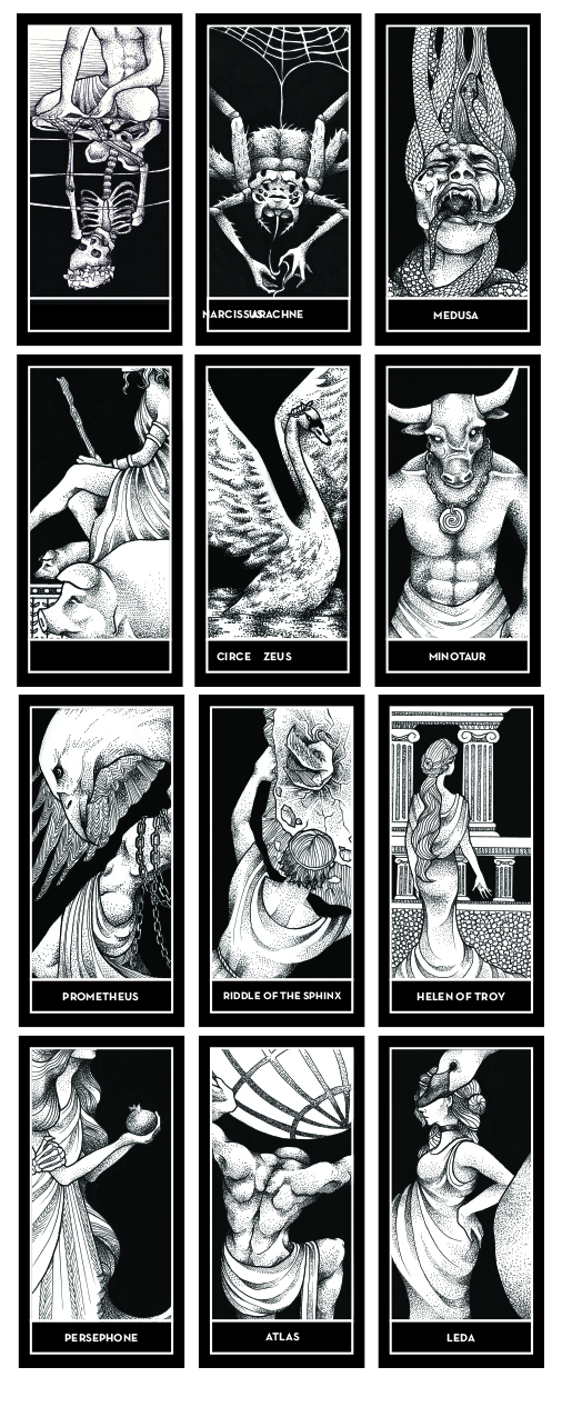
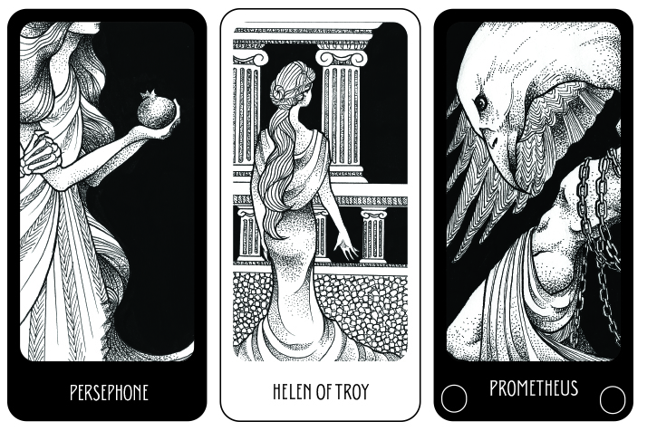
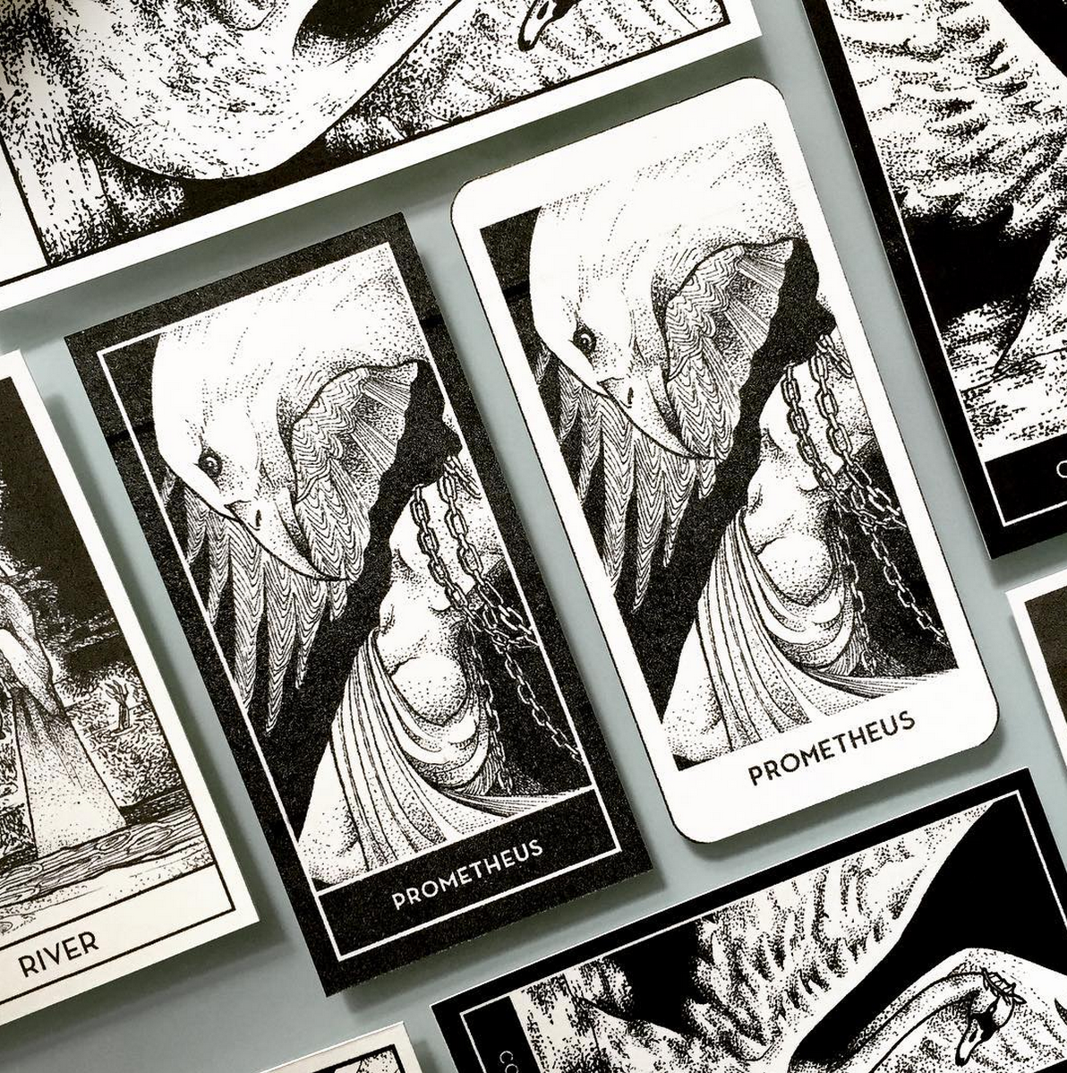
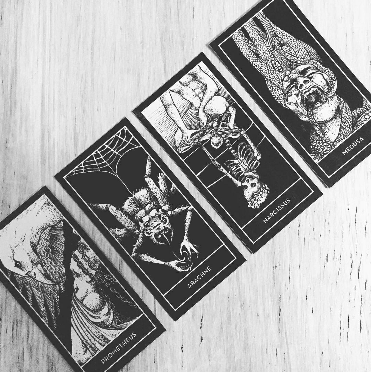
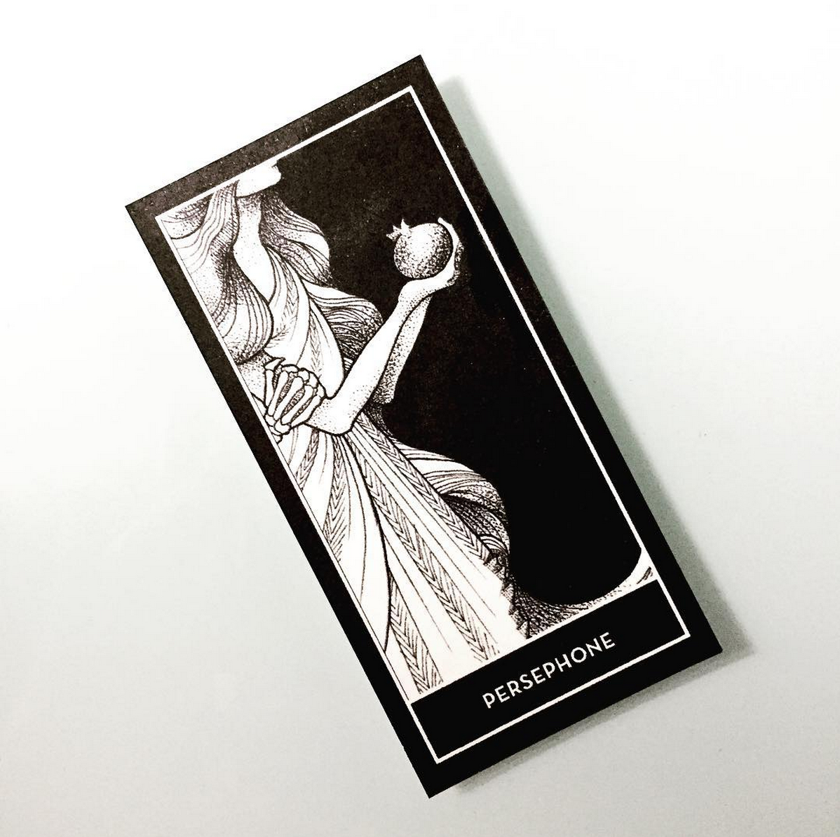
At the moment I’m packaging the entire volume as part of something released by an organization called The Mystery Guild (I used this as a frame for my calendar project. I’ve been working on designing a proper logo for TMG to use in the project). The text in this InDesign document is mostly finalized, but the images are all fillers (just ignore them. Even the logos are just fillers I took from the Internet to act as visual placeholders before I finish the final logos and images).
Right now, I am working on
- typography selection for main book (ignoring process book for now)
- page layout for main book (paper size, grid, hierarchy)
- format for main book (i.e. books within books, translucent pages)
- typographic approach for Pollux’s story
- how to tell the two stories side by side???
- mini branding for The Mystery Guild (logo mostly)
Some ideas I have for the main book
- translucent overlays of bone structures printed on tracing paper (or something similar) to be overlaid on anatomical drawings of creatures within Paul’s diary [if you read the previous post you know that Paul is a broke surgeon who makes cryptids for a living, just explaining this in case]
- hardcover to be embossed with gold foil and book to be coptic bound so it can flip open easily
- one colour accent within the book pages – not going full-colour at the moment as it doesn’t seem necessary
- process diary look and feel will probably be informed by the main book, but the aesthetic for the process diary is going to be comparatively more raw (intended because it’s sort of a sketchbook/work-in-progress companion to the final space + book)
I’m going to work on the FYP Report only after I produce more work and experiment more. I haven’t yet found a good way to synthesize all the research I have such that it’s easily understood because I went all over the place with regard to what I was looking at and I’m not entirely sure how to organize it. After I work on more of the book (and do some test prints to see how the layout is shaping up), I’ll start on my report. By then I should be much clearer on how I want to proceed.
PS: Mysterium Veritatis is Google Translated Latin meaning ‘the secret truth’.