The relationship between aphids and ants is symbiotic in that both receive some benefit from the arrangement.
Aphids are also known as plant lice, they are very small sap-sucking insects that collect the sugar-rich fluids from host plants.
Aphids consume large quantities of a plant to gain adequate nutrition. They then excrete equally large quantities of waste, AKA honeydew, which in turn becomes a sugar-rich meal for ants.
The ants care for and protect the aphids from predators and parasites for the honeydew excreted by the aphids.
Some ants are so hungry for the aphid honeydew, that they will “milk” the aphids to make them excrete the sugary substance. The ants stroke the aphids with their antennae, stimulating them to release the honeydew. Some aphid species have lost the ability to excrete waste on their own and depend entirely on caretaker ants to milk them.
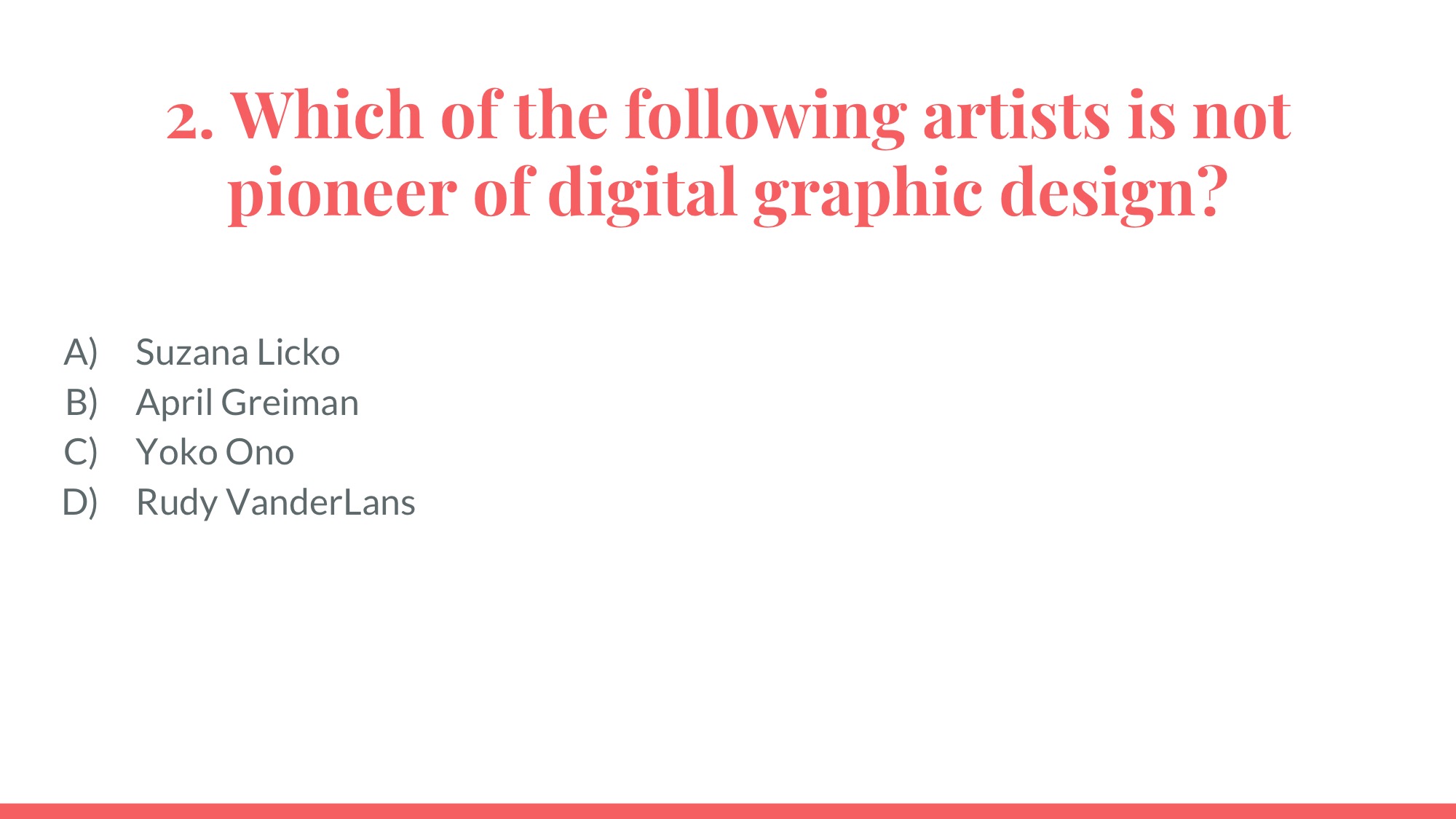
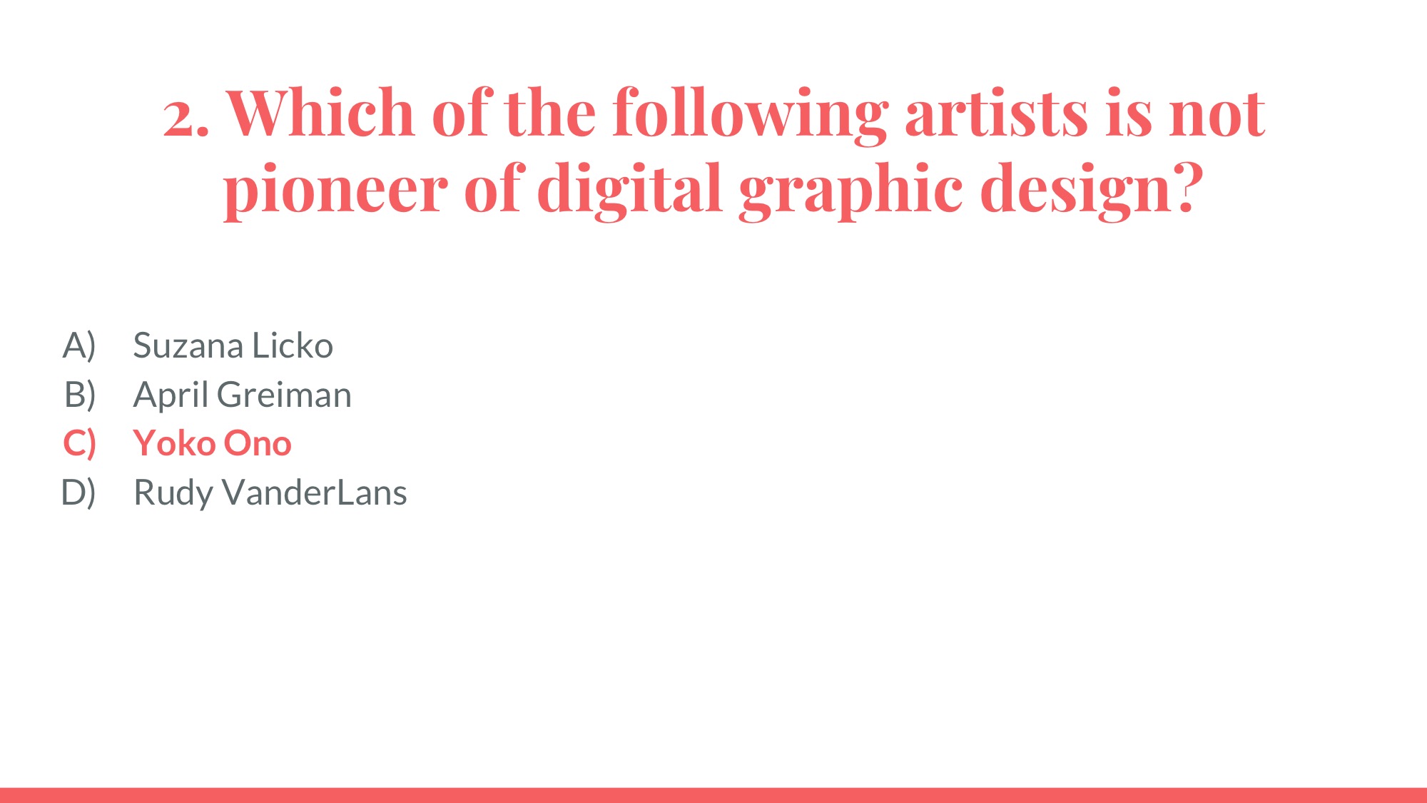
WINGLESS APHIDS
While it appears the ants are generous caretakers of aphids, ants are more concerned about maintaining their steady honeydew source than anything else.
Aphids are almost always wingless, but certain environmental conditions will trigger them to develop wings.
If the aphid population becomes too dense, or food sources decline, aphids can grow wings to fly to a new location. Ants, however, do not look favorably upon losing their food source.
Ants can prevent aphids from dispersing. Ants have been observed tearing the wings from aphids before they can become airborne. Also, a recent study has shown that ants can use semiochemicals to stop the aphids from developing wings and to impede their ability to walk away.
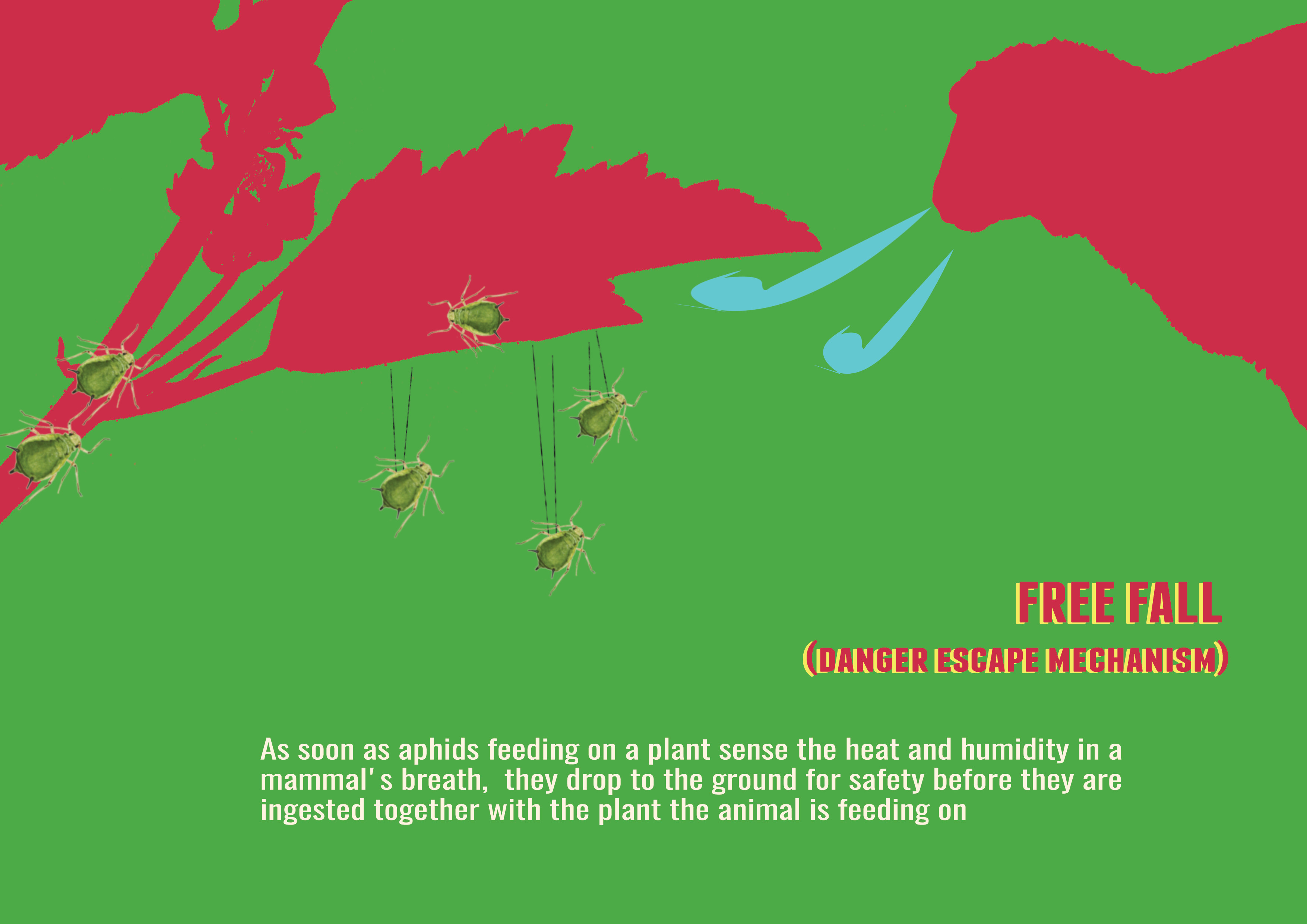
FREE FALL – DETECTING DANGER
As soon as aphids feeding on a plant sense the heat and humidity in a mammal’s breath, they drop to the ground for safety before they are ingested together with the plant the animal is feeding on.
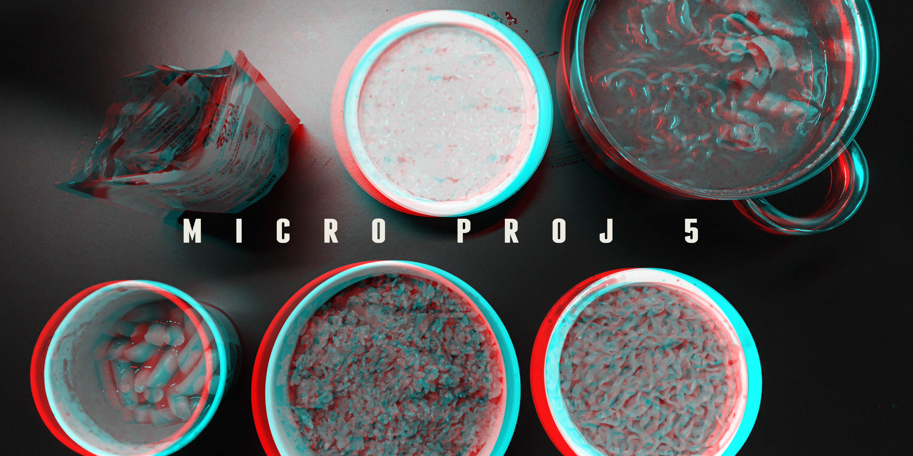
Our project was based on the idea of seeing cooking as a form of art and destruction at the same time. When we cook we take something perfectly fine from nature. We ‘destruct’ it to ‘create’ a dish only to ‘destruct’ it again by consuming it. Recipes were ‘destructed’ and accidents were embraced when we realized we had too much bacon but no fridge to keep it. As an result took conventional recipes and interpreted in our own way. Examples will be adding bacon strips to Ramen.
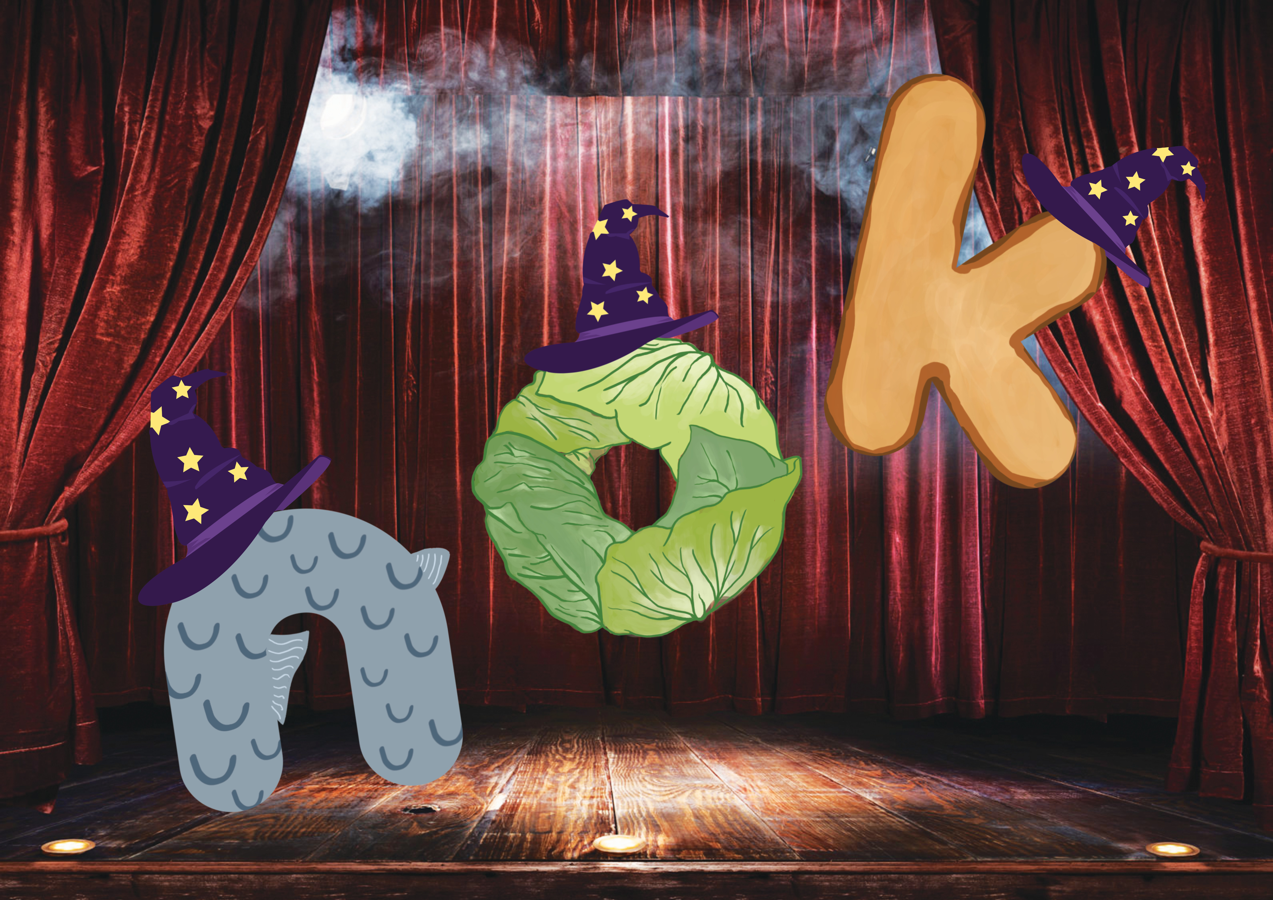
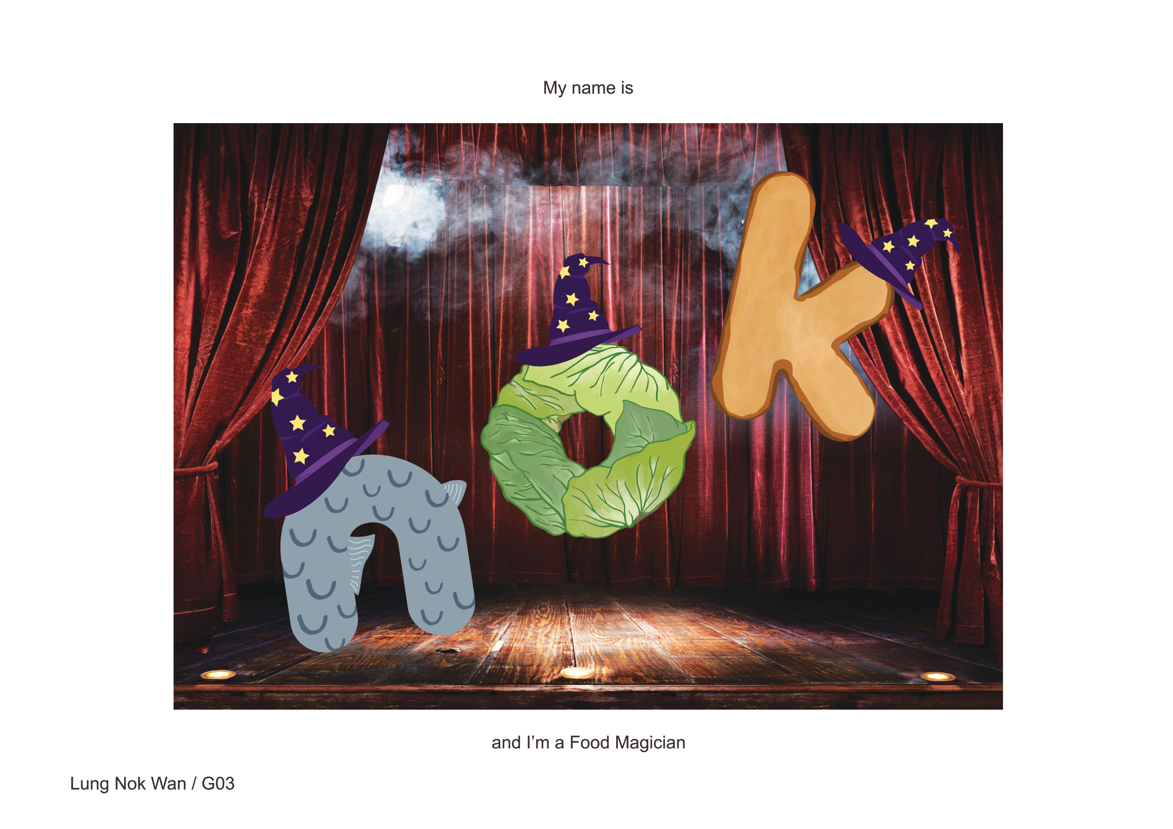
I can make food appear from thin air! These are MAGICIAN FOODS
I wanted this piece to be fun and have a cute doodling style to it. Hence the rounded font and hand-drawn elements.
The composition of the letters are also tilted and floating, giving it a jumpy and fun feel, like how a action-packed magician show would feel like.
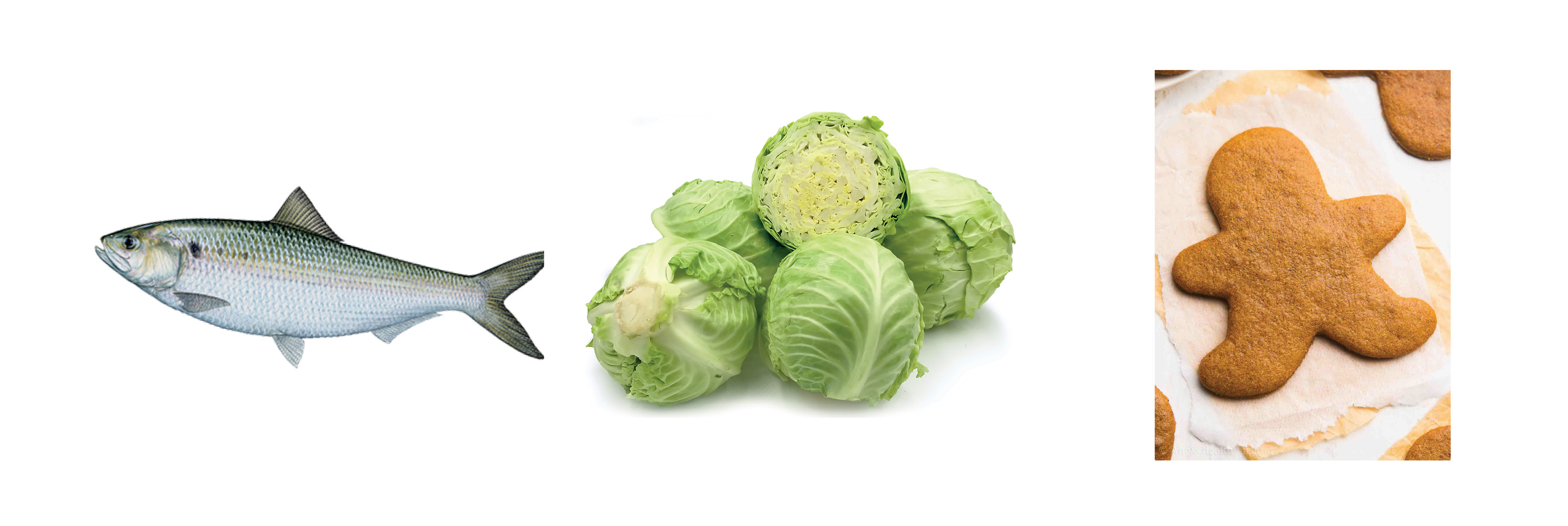
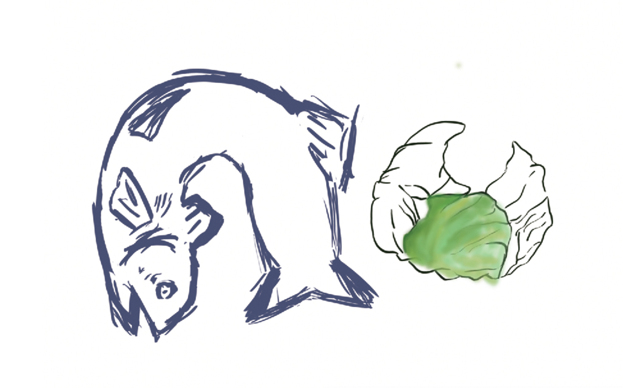
FOOD: represented by the usage of a meat (fish), vegetable (cabbage) and a pastry (gingerbread)
Dat fish tho
It was very painful doing the line art for the cabbage.. It was my first time using a tablet so it really took some getting used to even just getting the above sketched out.
Especiallythe painting. It just looked so weird.
I wanted it to look cartoonish, not realistic. (It didn’t turn out looking very realistic either…)
MAGICIAN: wizard hats worn by the foods
I actually started this with the idea of doing food esper.
Initial sketches for the magical element in magician/esper
After consultation, we agreed that (2) had too many elements and it’s quite messy.
After going through hours of trying to make the cabbage line art looks smooth and neat, I decided that I shouldn’t torture myself that way and tried using AI for the first time. (why didn’t I do that earlier…)
O mighty illustrator
BACKGROUND: A night sky background was what I had in mind, flying in the sky = magical? Shirley suggested a stage background and I thought that it’ll work better so I went on with that in the end.
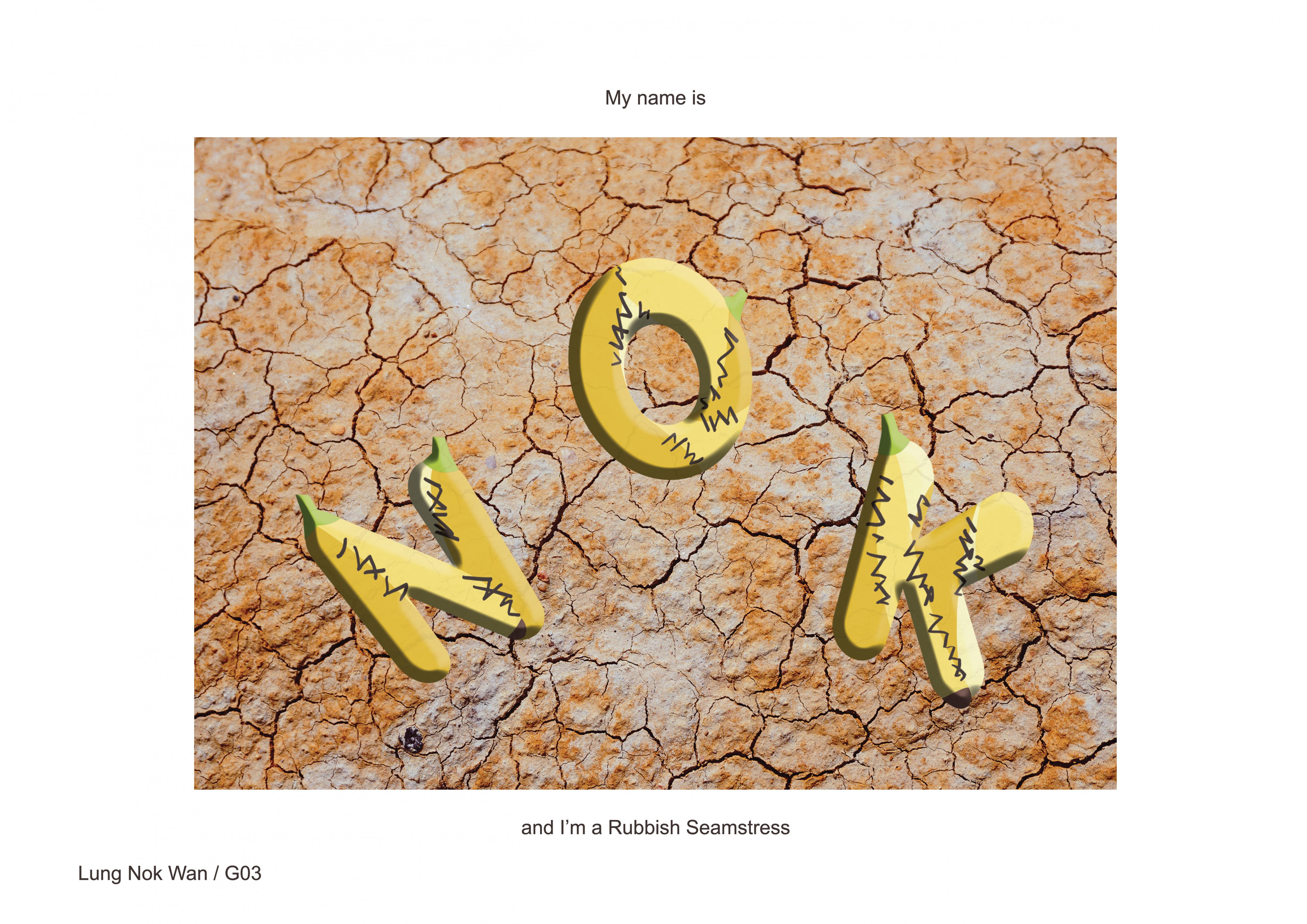
RUBBISH SEAMSTRESS
Sloppy sewing skills + sloppy materials = sloppy art
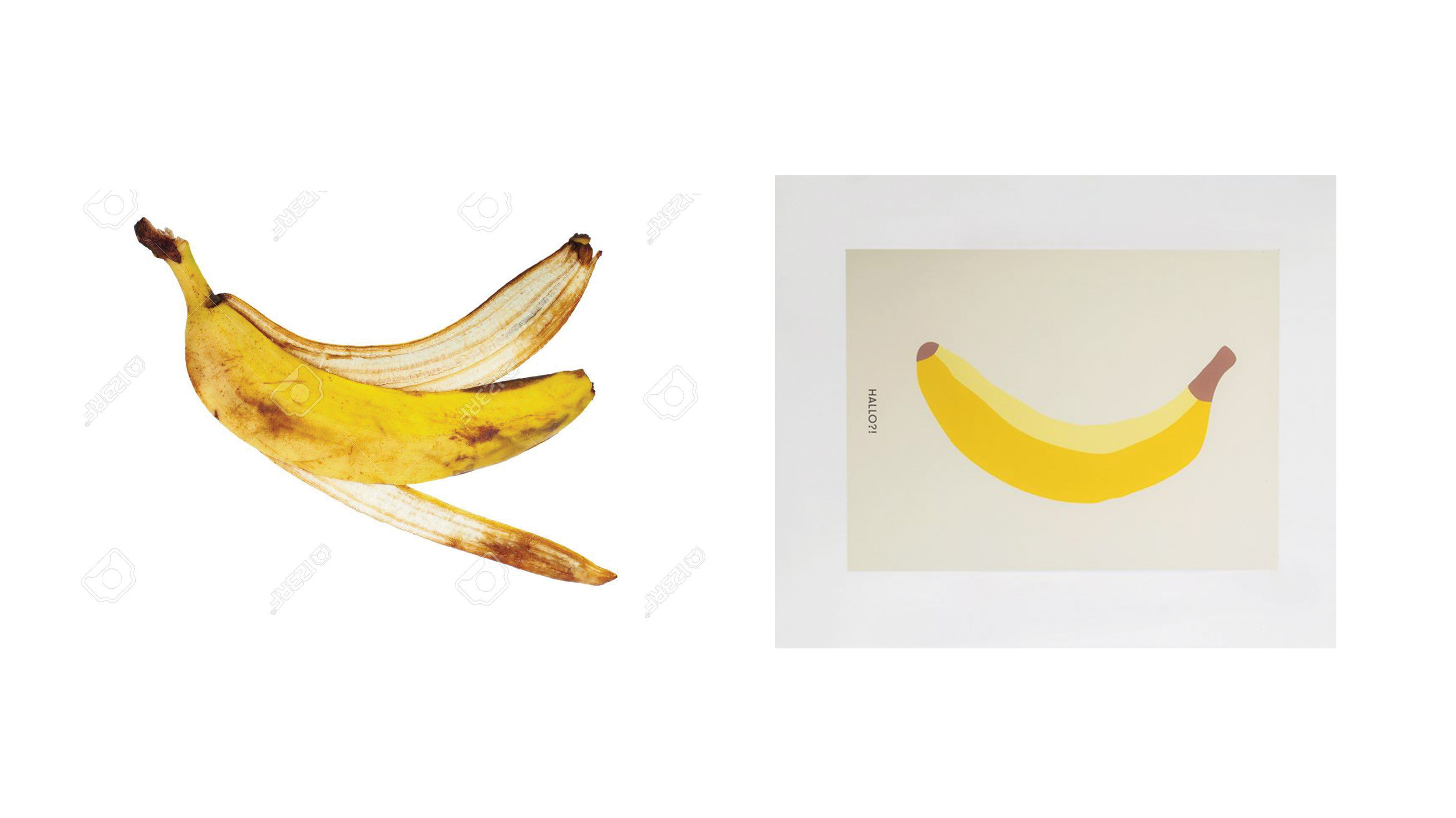
The composition is made as such as you’re looking down on the floor, at the banana peels. The stitches were meant to look untidy, giving the impression that it’s sloppy, no effort made.
RUBBISH: Initially, my idea of rubbish were plastic bottles. I wanted to use different types and sizes of plastic bottles to illustrate the idea of rubbish. After consultation, I change to use banana peels instead as using so many different plastic bottles seemed to be too messy.
Googling my time away for some peels
Funfact: My banana tips were original in brown due to the images i found above. I realise it should actually be green…..
SEAMSTRESS: Dark brown stitches sewed. Very sloppy looking, which was what I was trying to portray with this job!
BACKGROUND: I couldn’t find a hi res concrete alleyway ground to my liking. Then I found this cracked ground and thought that it was suitable. Kind of give of the poverty vibes so have to resort to selling whatever you could find A.K.A. banana peels art
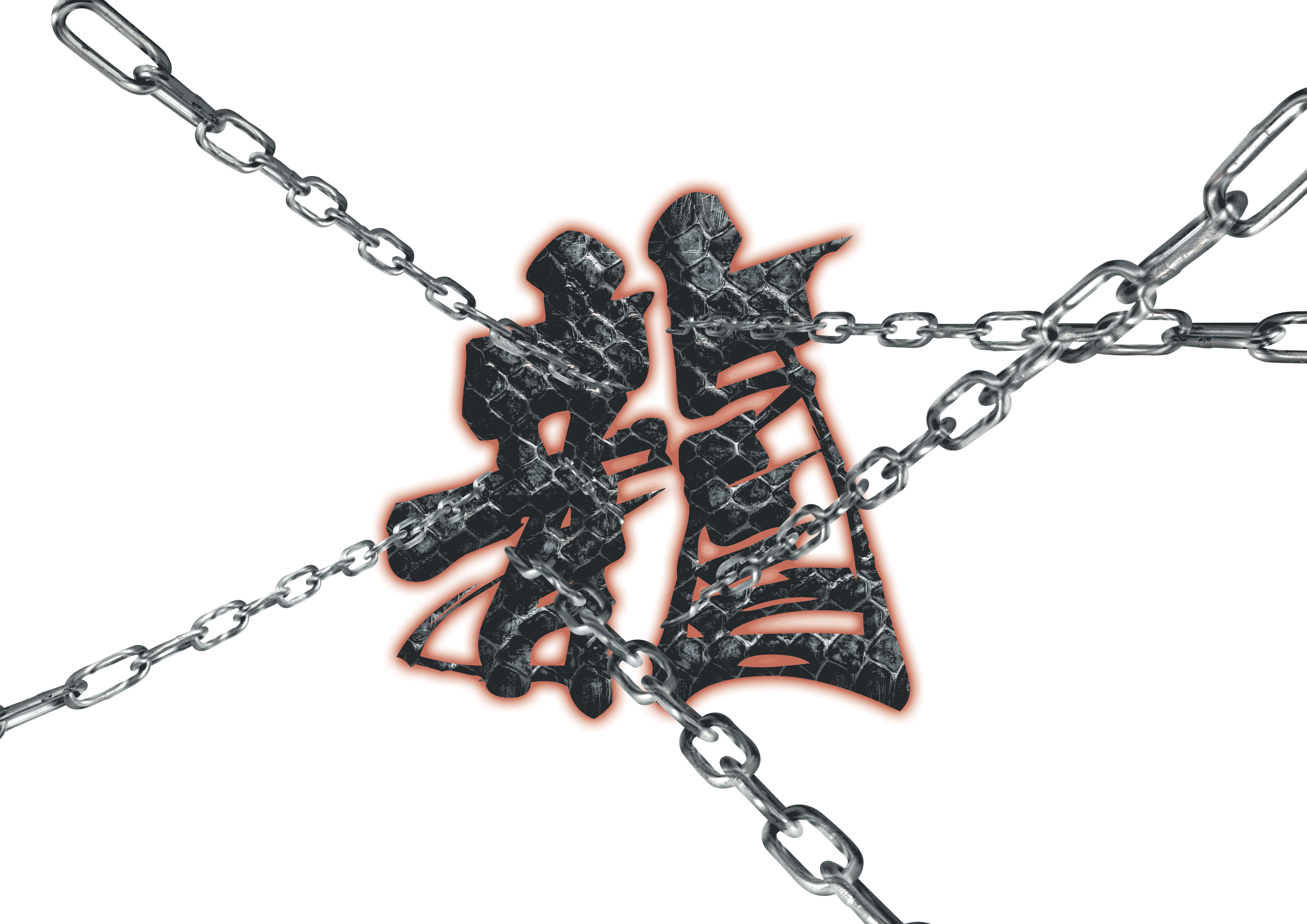
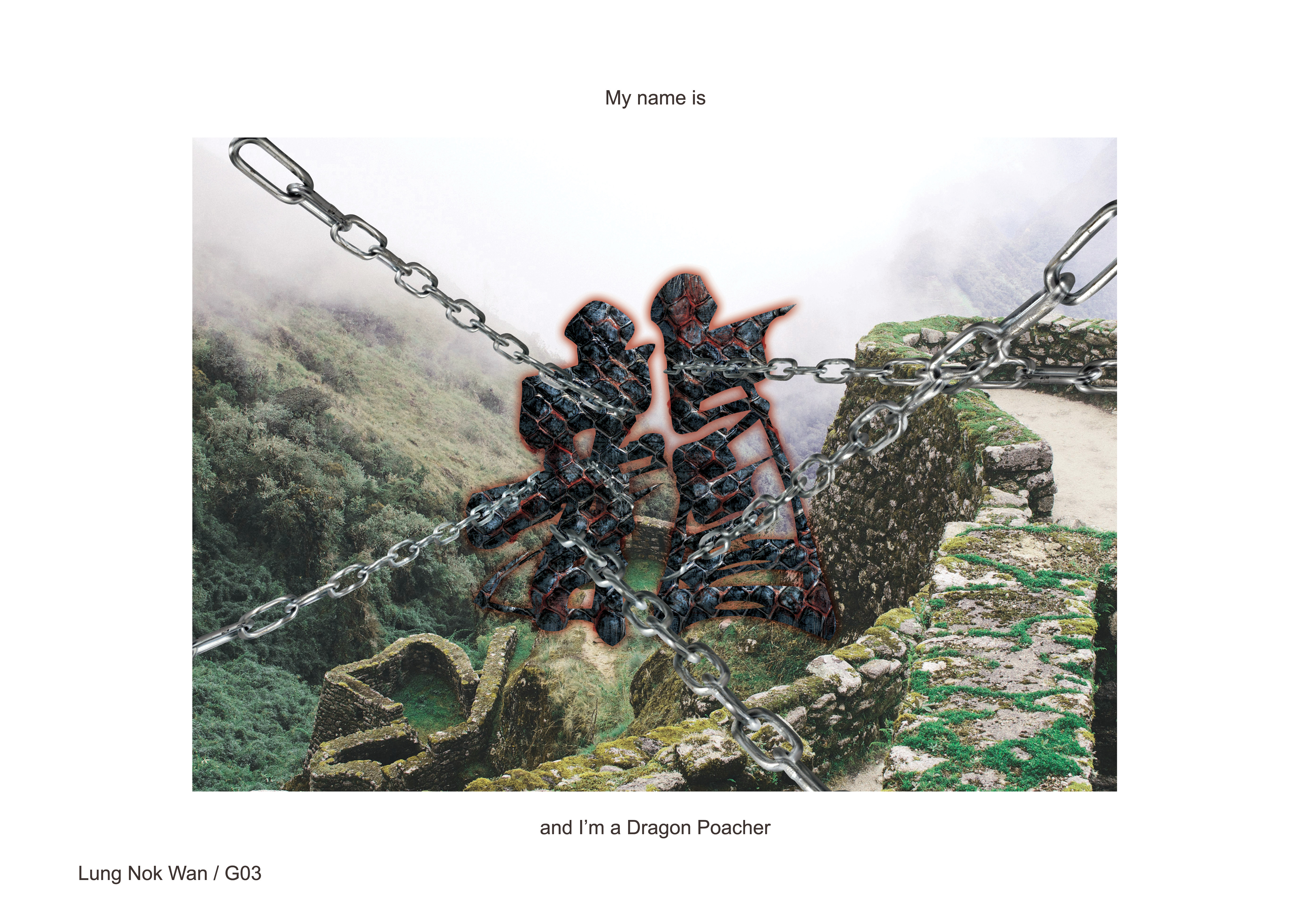
DRAGON POACHER
Masters of the wild trapped by $$ hunters like me
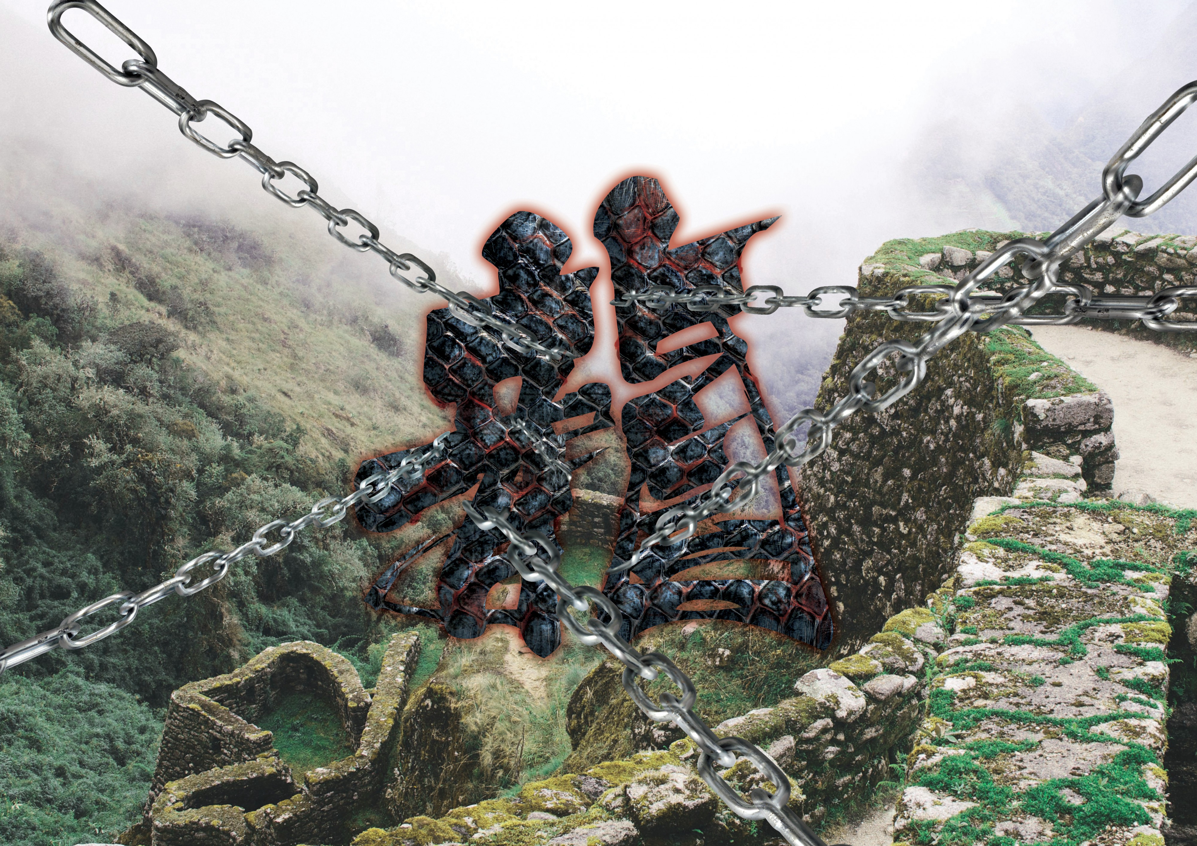
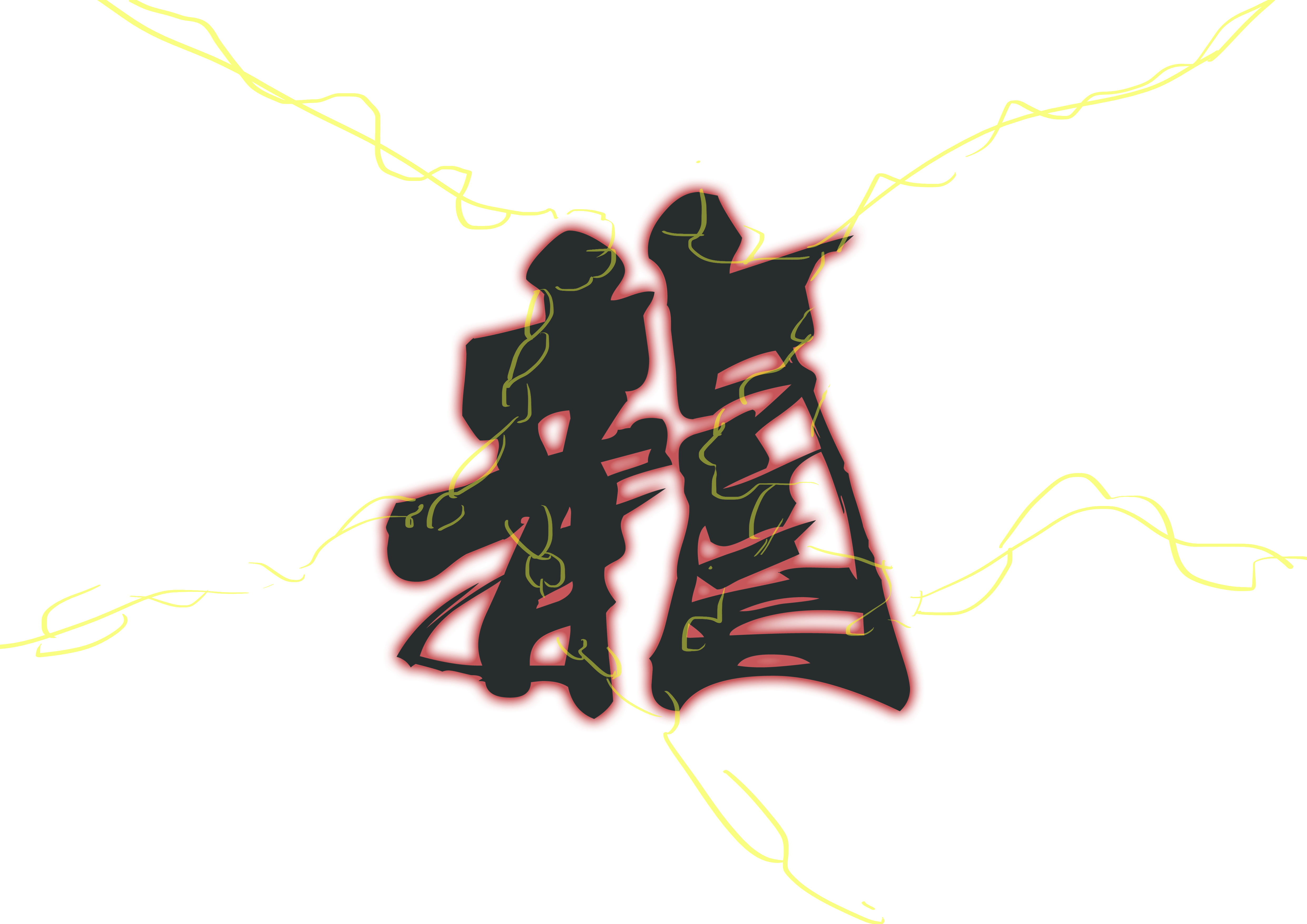
This is my surname is Chinese. Thought that it’ll be cool if I were to include my Chinese name in 1 of the compositions! I choose a calligraphy style of type because it gave off a traditional feel, and dragons are myths from the past!
Initial sketch
DRAGON:
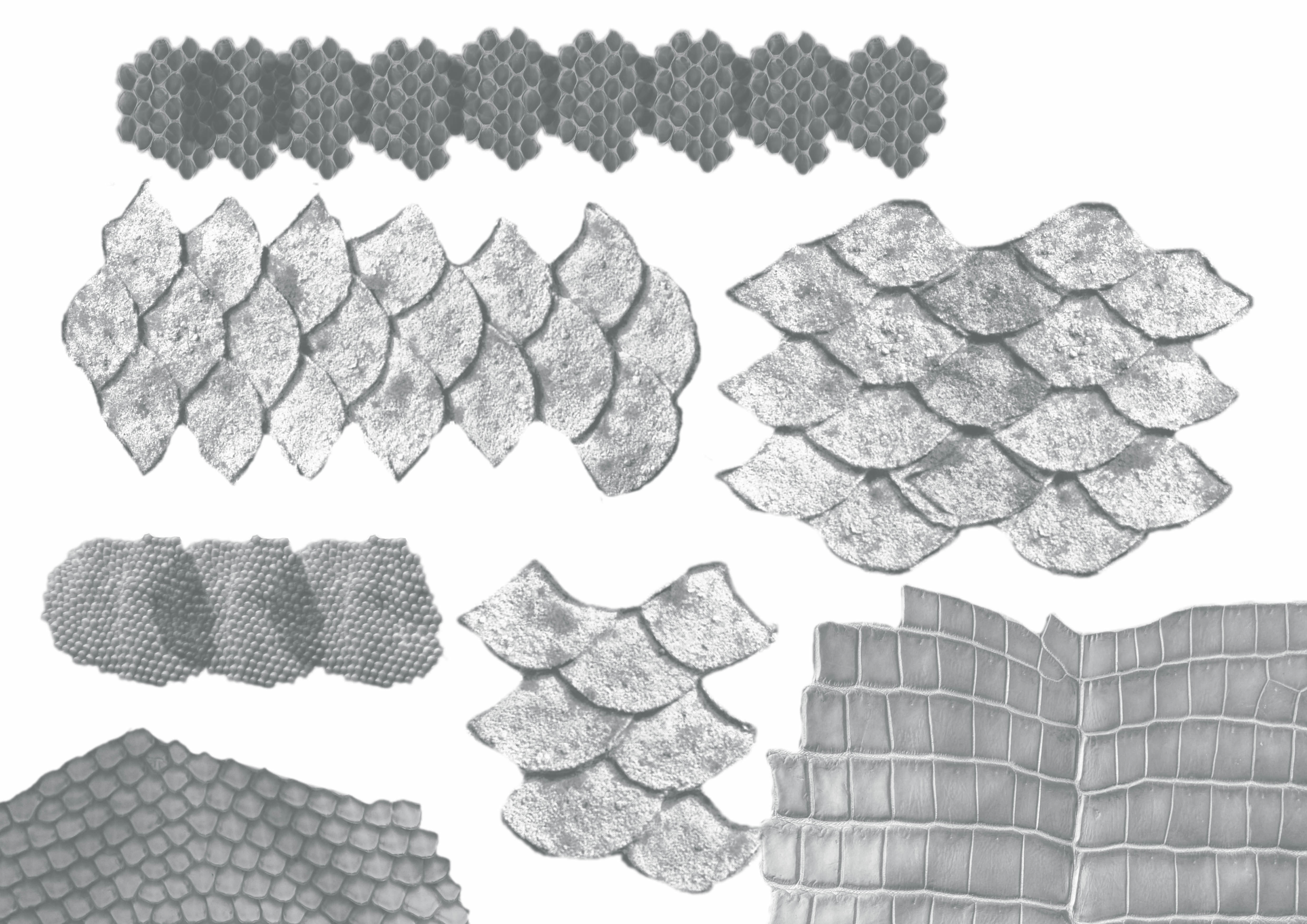
Scales brushes
I went to google some reptile brushes to use for the dragon skin. After some experimenting and adding in of blood…
After twerking with the colour…
POACHER: The chains are holding back the dragon, I also played with perspective of the chains, giving the impression that the dragon is being constrained from all directions.
BACKGROUND: I had a lot of problems trying to find a suitable background. The background needs to be bright enough for the type to pop up. I didn’t want to change the colour of the scale texture used for the type because I felt that black scales gives off a stronger impression of a majestic dragon. (which also highlights the danger of this job!) However… I was looking for a background that will make the composition seem mysterious.
It really was a dilemma as to what background to use, and whether I should compromise on the colour of the scales or the background…
Backgrounds I had in mind
I choose this background of a ruin-like place with the scenes of the nature at the back because the nature is where the dragons should belong, all free to be flying wherever they want to. Instead, these majestic creatures are trapped by poachers (ME!!!)… 🙁
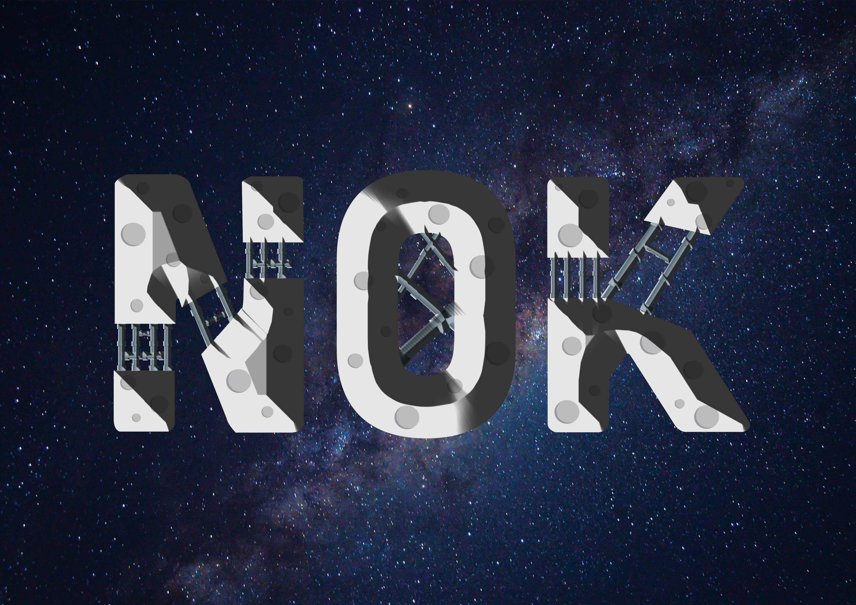
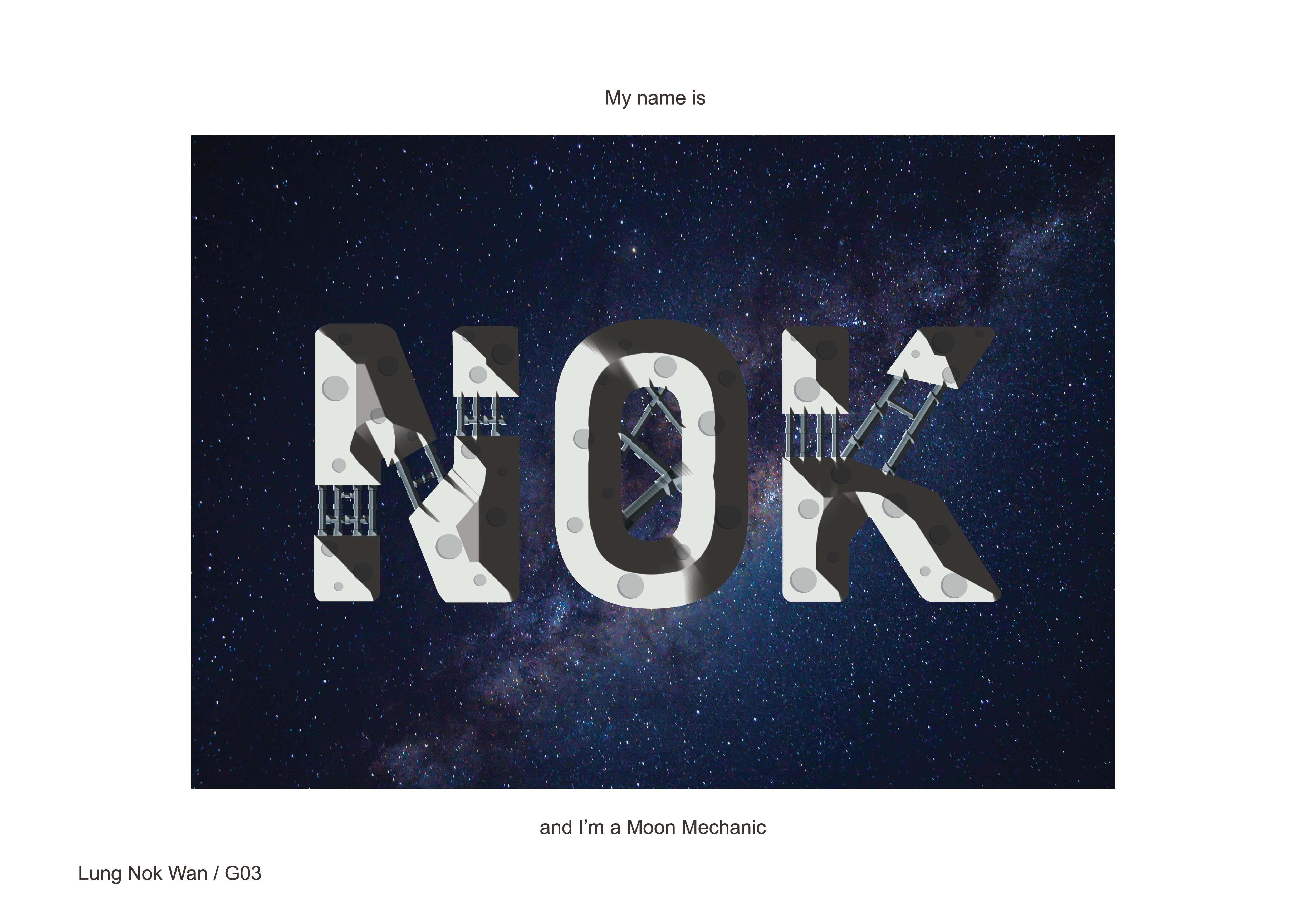
MOON MECHANIC
The moon needs maintenance too!!
The vector of the moon and pipes are first done illustrator, and transfer over to photoshop for bevel and the editing of the background image. This is using what I’ve learnt from the food magician composition.
I made the type seemed very rigid and rectangular, because thats the way people would perceive of machines!
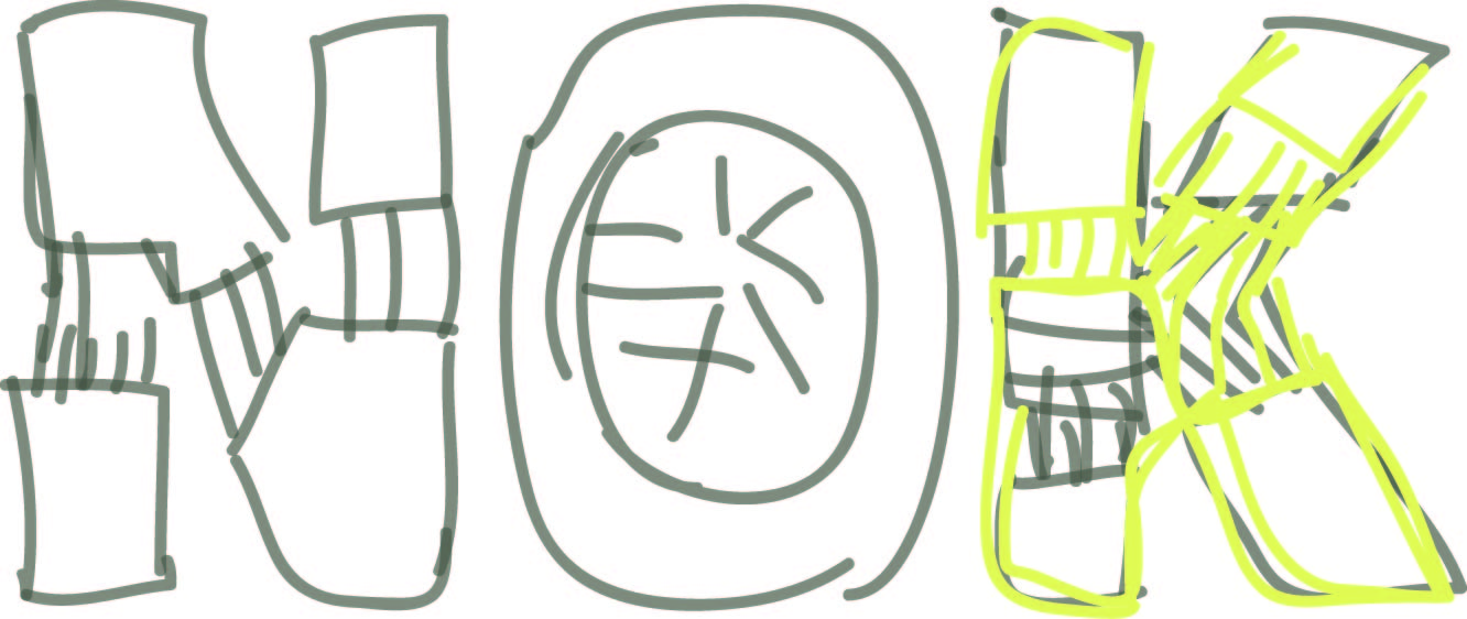
Sketch
References
MOON: I have no idea why, but the colour I was intended to use at first was yellow for the moon.
That might have to do with how animations and the media tend to associate yellow with the moon. Luckily I went to search for some moon references and change the colour to a whitish-grey.
MECHANIC: Again, AI’s here to save da day :’) All pipes vectorised in courtesy of O’ mighty AI. Due to my poor planning, the pipes are actually intended to be in the shades of the moon. However, due to the change from yellow to whitish-grey, I had to rethink the colours for the pipes! I thought that blueish-grey would be a nice combination, not very striking and feels complimentary with the colours of the moon.
BACKGROUND: I wanted to use a vector of a night sky. But changed to a real image as I wanted the 4 jobs to feel like a series (since all are already using real images)
THE TRANSFORMATION OF NOK MOON
DIFFICULTIES/TAKEAWAYS
I really went out of my comfort zone and tried many new things for this project. I’ve learnt how to use AI, using a tablet and drawing/painting digitally for the first time and even combining techniques from both Photoshop and AI into 1 composition.
This project was really one that required lots of research and perseverance. It was really hard for me to to not give up and push through into translating what I had in mind to the compositions.
I’ve also learnt to not be so fixated and be more opened to different method in creating my work. (Eg: not just wanting to using a single program, use whatever that can do the job the fastest and most efficient!)
Not giving up was also very important, I tend to be very impatient when I can’t transform what I’m thinking onto what I intend to portray. The process is as important as fine-tuning and refining from failing would definitely slowly shape into the final work.
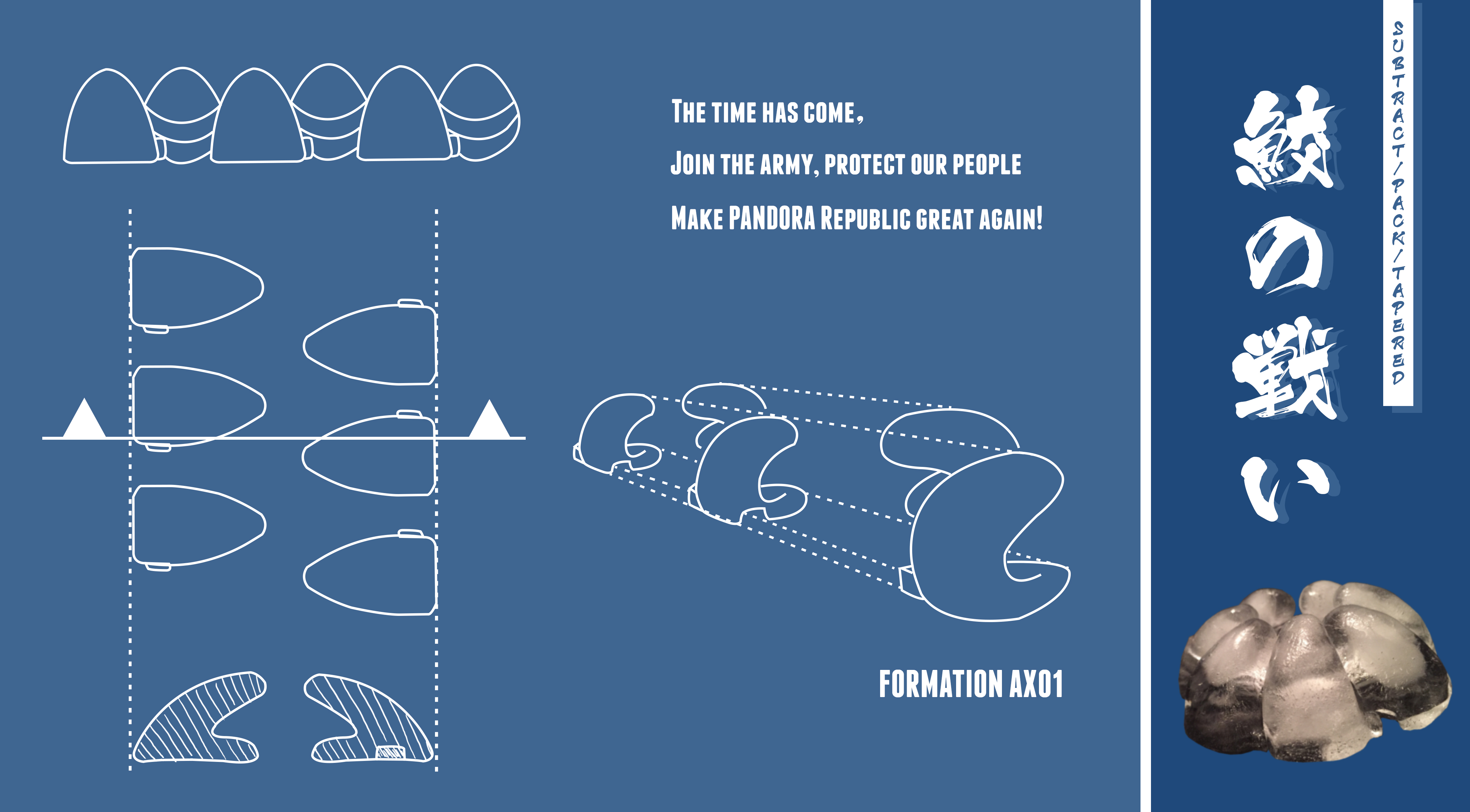
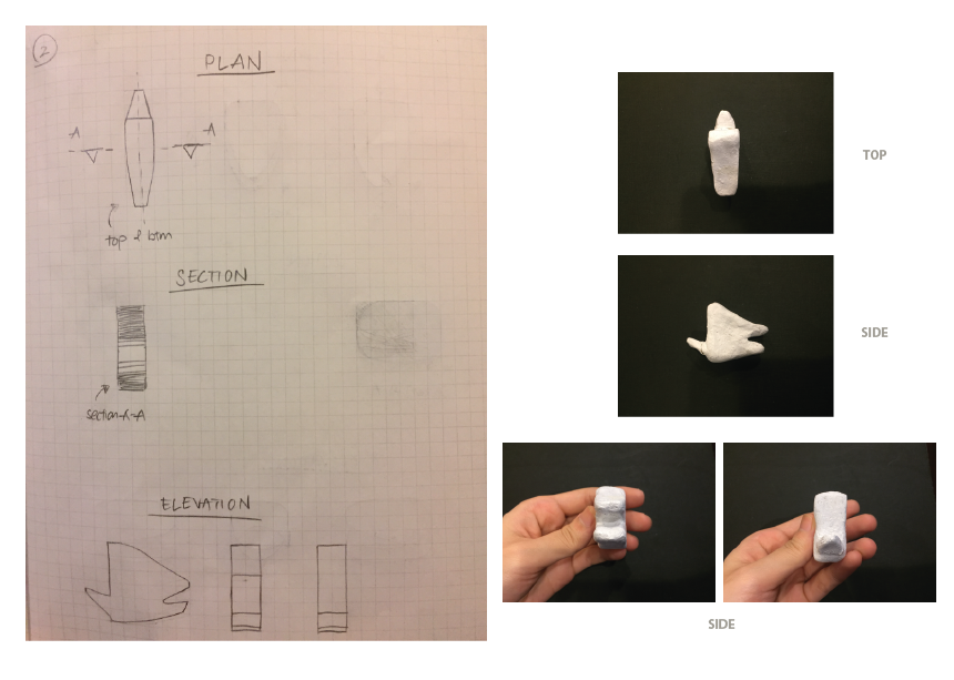
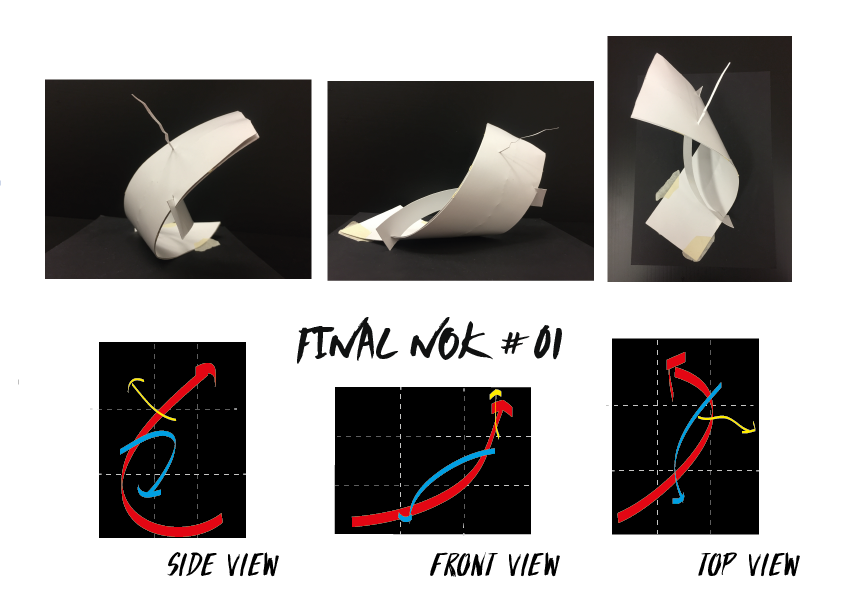
SUBTRACT + PACK: Triangular piece protruding could be slotted into the hole of the next module, forming a pack
TAPERED: Triangular made to be t
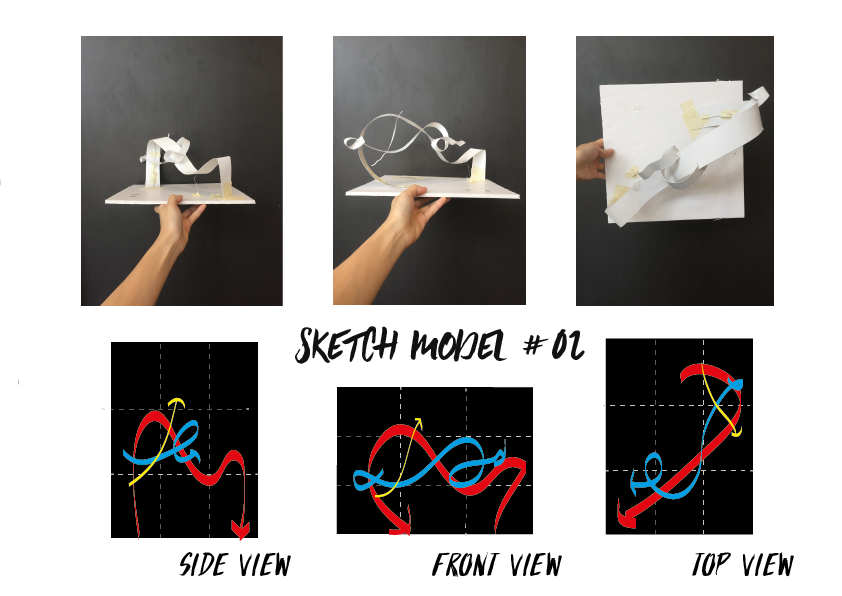
MODEL 2
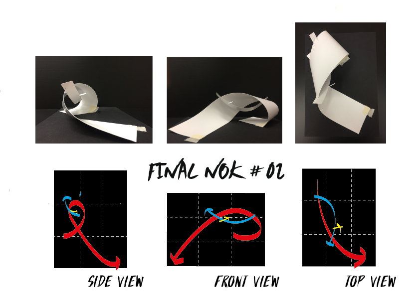
SUBTRACT + PACK: A pack could be formed when the triangle piece at one side of the module is slotted into the triangular “mouth” (AKA hole) at the other side of another module
TAPERED: Both the protruding piece and the “mouth” were tapered
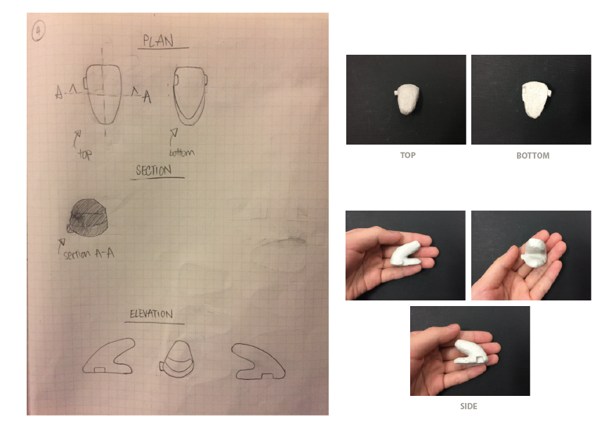
MODEL 3
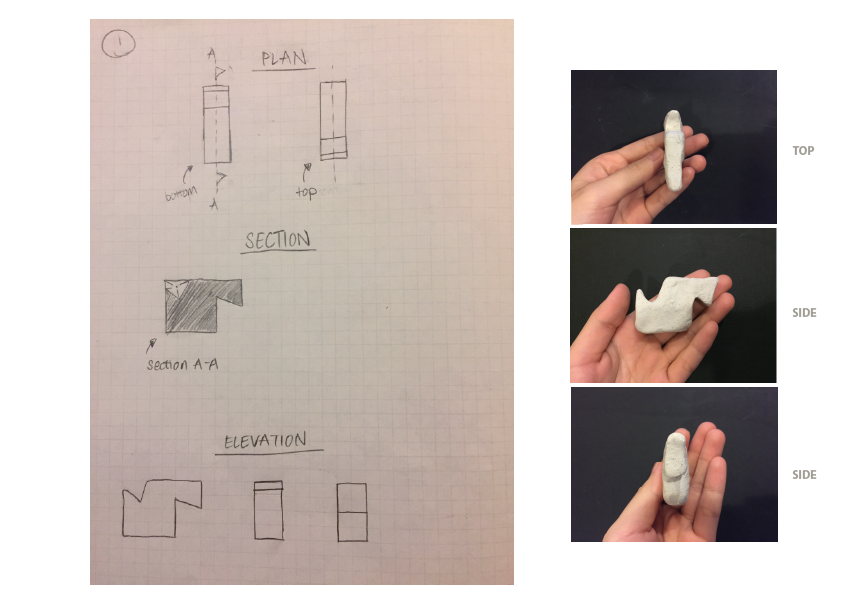
SUBTRACT: The “mouth” was formed by taking away part of the model away. A rectangular hole also dug out.
PACK: Rectangular button could be slotted into the to hole at the side of another module
TAPERED: The top and bottom of the “mouth” were designed to be tapered as it extends out
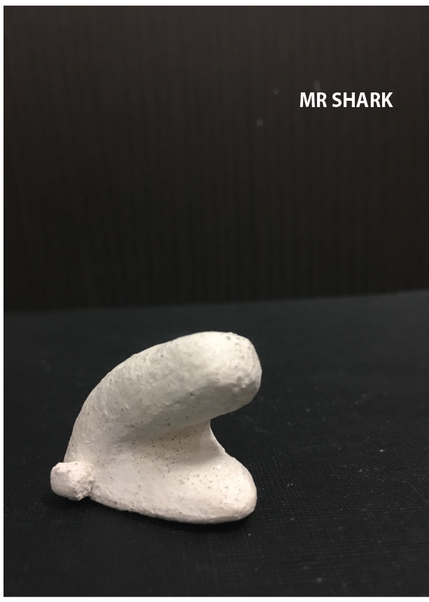
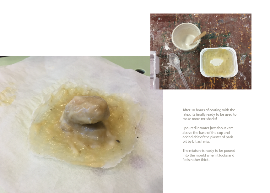
FINAL MODEL – MR SHARK
Mr shark is a improvement of model 3.
Improvements made:
Decrease overall size of model
Flat base made in consideration of mould/ice tray making
Button and hole carefully measured and made so modules could be slotted together perfectly
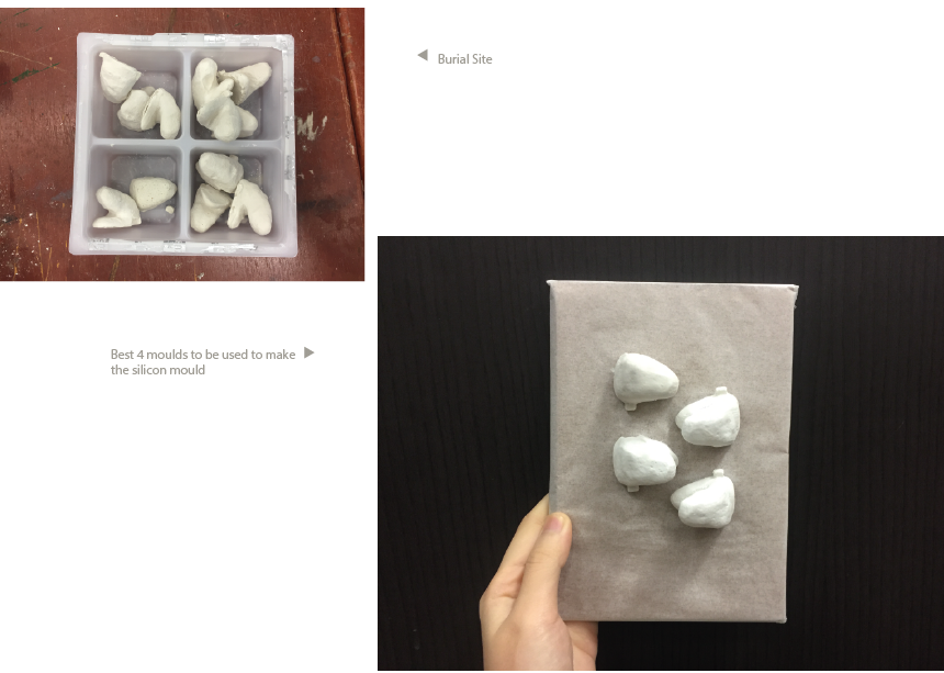
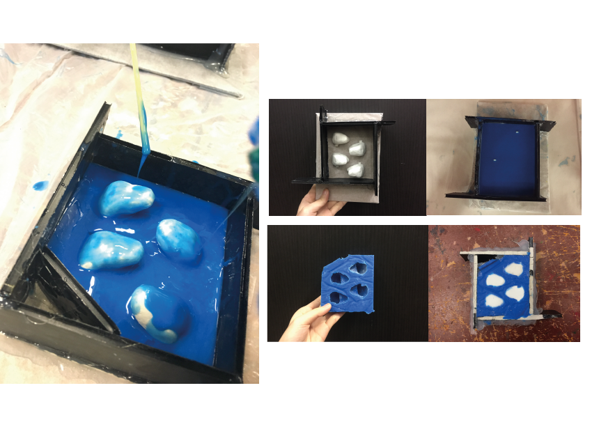
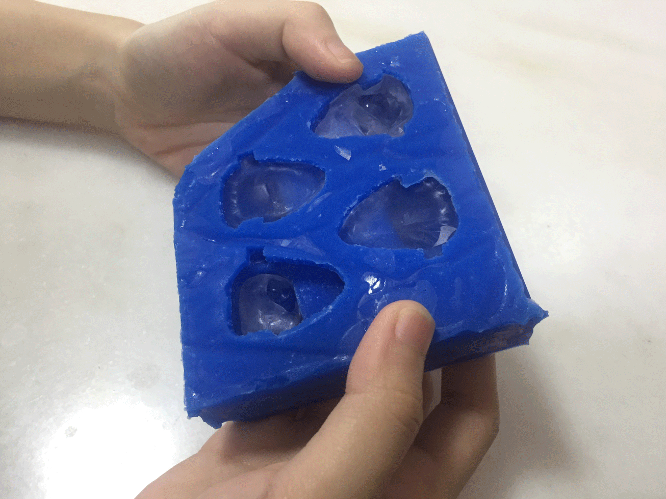
MOLD MAKING PROCESS
ICE MODULES
FINAL THOUGHTS
Sanding and polishing the initial model is very important. My initial model wasn’t very smooth and that affected all the models made with the latex mould… I had to polished and touch up on them before they could be used for the silicon mould.
Our work involves each participant to contribute their sentence to form a story. With a time limit of 30seconds, they are required to scan through what was already written and then, add in their own. There’s a set of requirements (limitations) imposed however:
A character must disappear
A plot twist must be included
We further drive the difficulty up by placing 3 ballot lotteries for 3 people.
…The process is as important as the outcome, forming relationally aware peer enactments. – (Marc Garrett, 2014)
Compared to traditional art making by single artist, our work was based on contributions made by the participants. The process in which the story was made is as important as when the story was completed. Our work doesn’t just look at the completed piece of artwork at the ending, it was also about the experience and process the participants went through.
Real time interaction and reaction is something very unique in open-source practices. Seeing how their own contribution reflected in real time on the artwork encourages active contribution. The final artwork produced would also be very unpredictable and therefore be interesting.
Similarities/Differences from examples shown
SIMILARITIES
Human Clock: Contributions (pictures/sentences) to the final piece of artwork are made at the point of time.
“Cut”: Contributions are made on the spot. A sense of uncertainty in introduced in the audiences as they might not be the first ones to want to contribute a specific area to cut or a certain sentence to the artwork.
DIFFERENCES
Human Clock/The Sheep Market/Crowd-sourced Dating: The audience are not in a controlled environment. The audience are not obliged to contribute to the project. For crowd-sourced dating, the responses given by the audience can be very opened in a sense that it could be anything.
She has a very strong and defined style of adding shadows, something I’ll love to do in my compositions.
jenny yu
Similar with genice, jenny also uses strong shadows.
My drawing skills is rather limited so her style of using solid shapes is something I’ll like to reference on.
E G O M I N D M A P
IDEATION
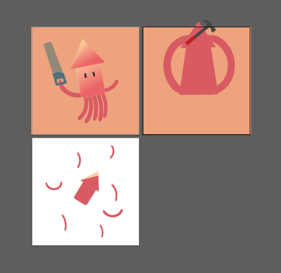
1_ Sotong me + Doing 3D = Cuts myself (Cuts off all my “tentacles”)
2_ Snake me + Finding my way = Gets lost (Unexpected place? Outer space.)
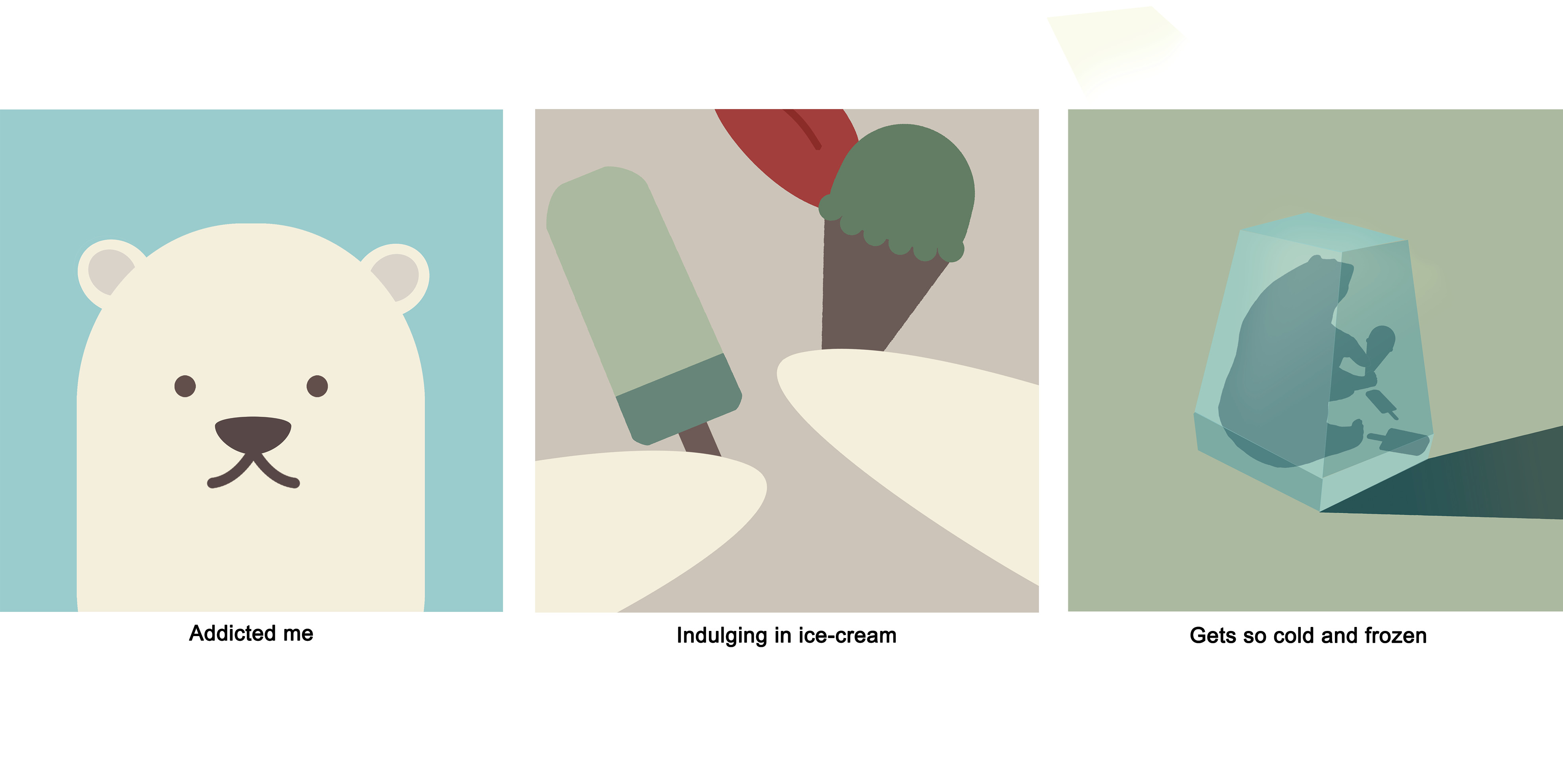
3_ Polar bear me + Eating ice-cream = Gets so cold (FROZEN INTO AN ICEBERG)
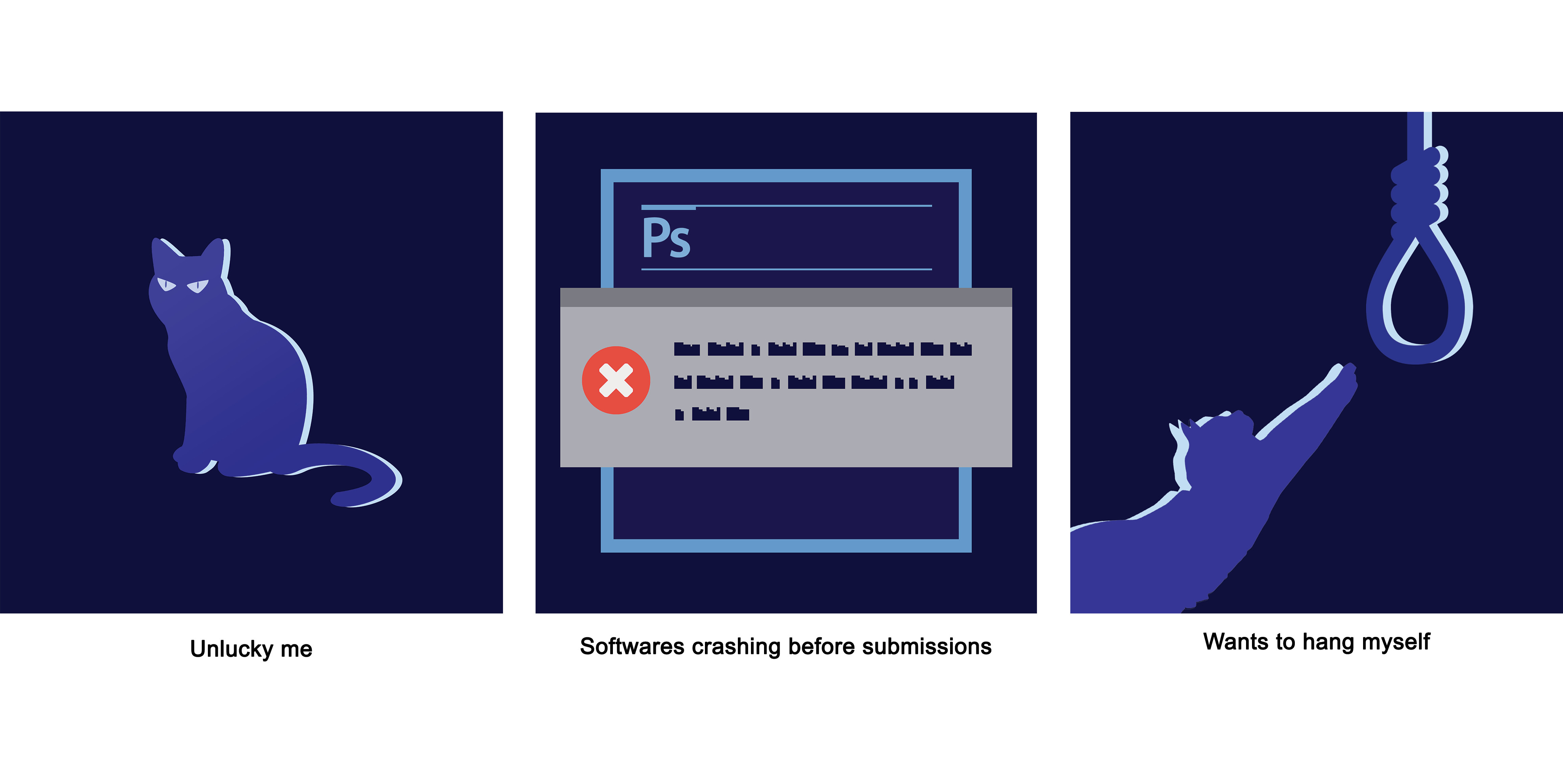
4_ Black cat me + Rushing 2D = Worse thing that could ever happen (PHOTOSHOP CRASHES)
I tried using 2 animals with attributes unique to themselves:
Sotong – Very blur
Black Cat – Bad omen, associated with bad luck
And 2 animals that are NOT supposed to act/react in a certain way:
Polar bear – arctic animal, why would a polar bear get cold easily?!
Snake – Navigator, predator. Definitely not an animal that would get lost finding its way to somewhere.
P R O C E S S / F I N A L
I started this project with illustrator. It was a painful process. I never finished my sotong series, and changed to using photoshop.
AI attempt
SOTONG
Clumsy me. I choose a bright mustard colour for the background to give it a playful feel. And the last panel a blue one to add on to the dramatic feel for this series. I feel that the inversion of the yellow background to blue really changed the atmosphere of the panel compared to the first 2 which was what my intention.
Addicted me. Colours used here are of a cooler tone to give the series a cooler feel. Continuity used here too. A colour from the previous panel will be used in the next.
1st panel: Cream (bear) in 2nd panel hands > 2nd panel: Green (ice-cream) in 3rd panel background > 3rd panel: Blue (Ice) in 1st panel background
Explorer me. The snake is red and placed on a green background to so that emphasis can be on the snake. Everything in this series is green in different hues, to bring focus on the main subject of the GPS logo and snake that is of a red colour. Colours used are complementary.
Unlucky me. Everything is almost blue in different hues, with only the warning window in grey and the sign in a striking red. Our eyes are naturally drawn to the striking red, because the colour is of a high contrast compared to the blues. I choose blue not just to compromise on the colour scheme of the photoshop panel, but to also give the the series a mysterious feel. I also really like the highlight here. Really added a nice look to the series. 🙂
My photoshop also crashed… and I had to redo EVERYTHING.
Lesson learnt: To not save everything in 1 file and saving multiple copies as i work.
Photoshop hates me
One of the biggest takeaway from this project was lighting theory. Shadows are not just black, and light is not just white. Using different colours for shadows and light will make my compositions stand out so much more.
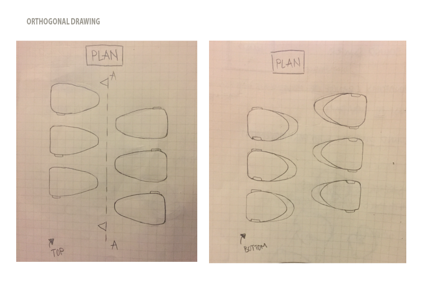
There’s too much going on in the 2 models. Very difficult to see the focus. Aim for improved models: MINIMALISTIC
FINAL PLANE MODELS
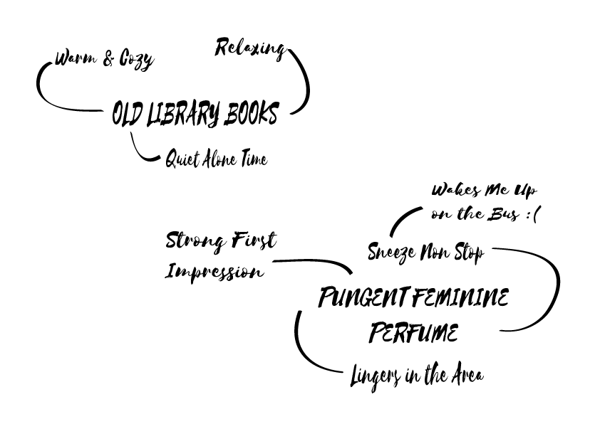
SMELL & MEMORIES RESEARCH
The sense of smell is closely linked with memory, probably more so than any of our other senses. Those with full olfactory function may be able to think of smells that evoke particular memories; the scent of an orchard in blossom conjuring up recollections of a childhood picnic, for example.
Smell can also affect people’s behaviour in other positive ways. The smell of roses for example is known to induce a feeling of relaxation, whereas lemon scents lead to feelings of invigoration and the smell of apple pie or coffee brings a feeling of comfort. In addition, our sense of smell acts as a warning mechanism for fire and hazardous substances. This mechanism is however limited. After exposure to a particular scent over a period of time, you are no longer able to sharply smell or detect it.
SMELL IN DESIGN
In Victoria Henshaw’s book ‘Urban Smellscapes’, she outlines four different methods for designing for smell:
Separatation // Spatial or temporal separation of odours through planned activity or displacement
Deodorisation // Planned removal of odours of dirt or waste
Masking // Overlaying of one odour with another: focus is on hiding or changing the original odour(s)
Scenting // The introduction of an odour for its specific odour qualities or characteristics: focus is on the introduced odour(s)
I really like the how the artists play with perspective and warping to make the space feel and look more fantasy. Will try to do that in the project!
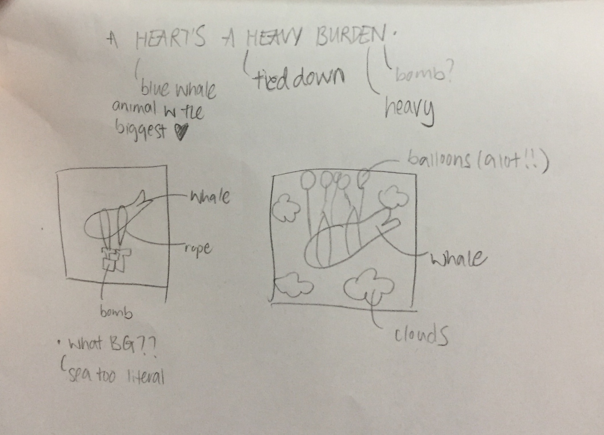
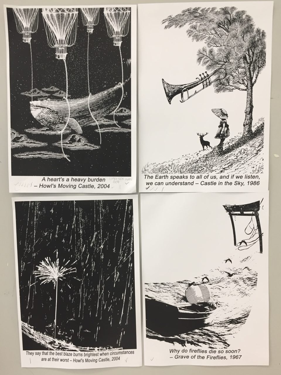
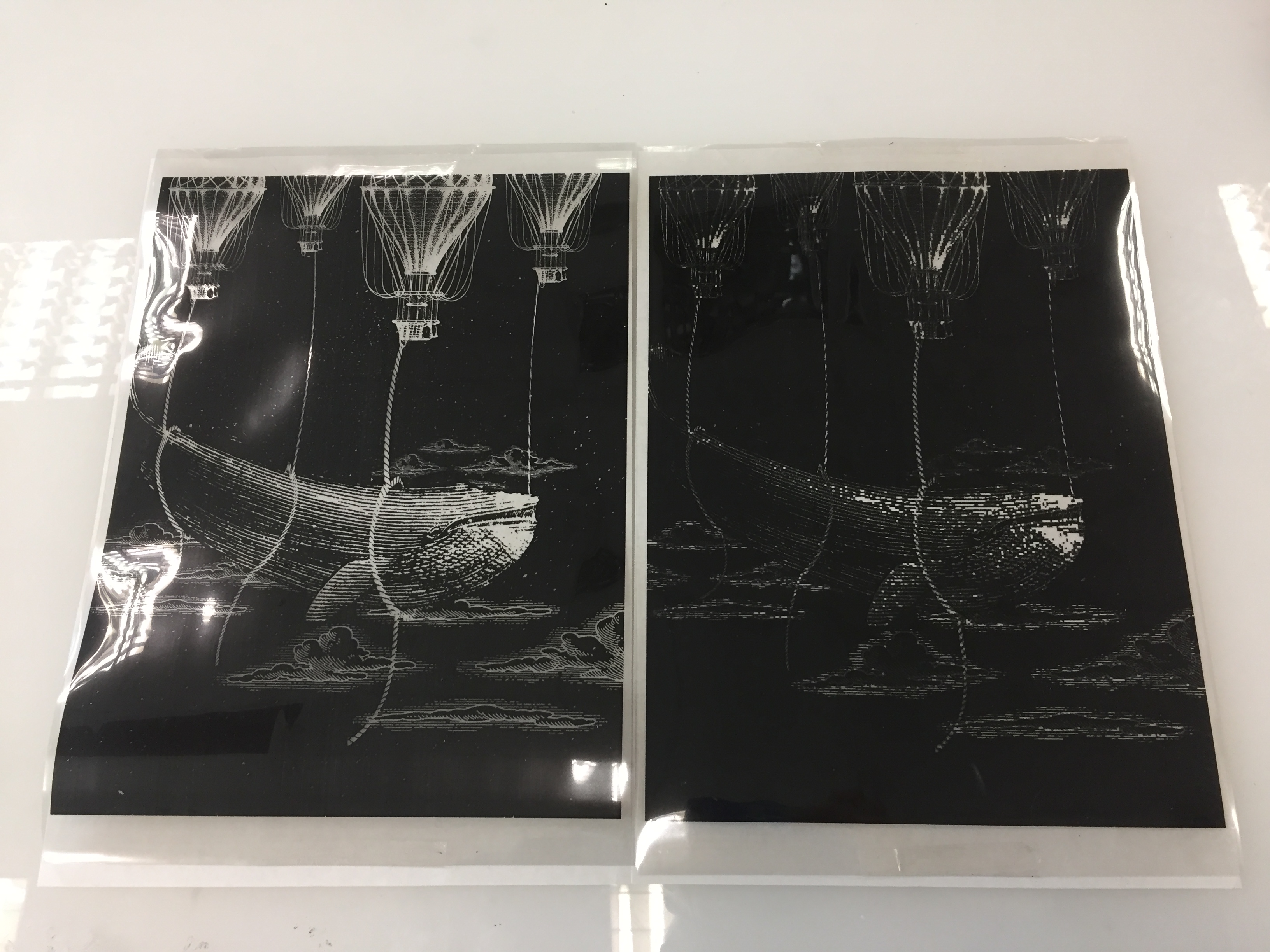
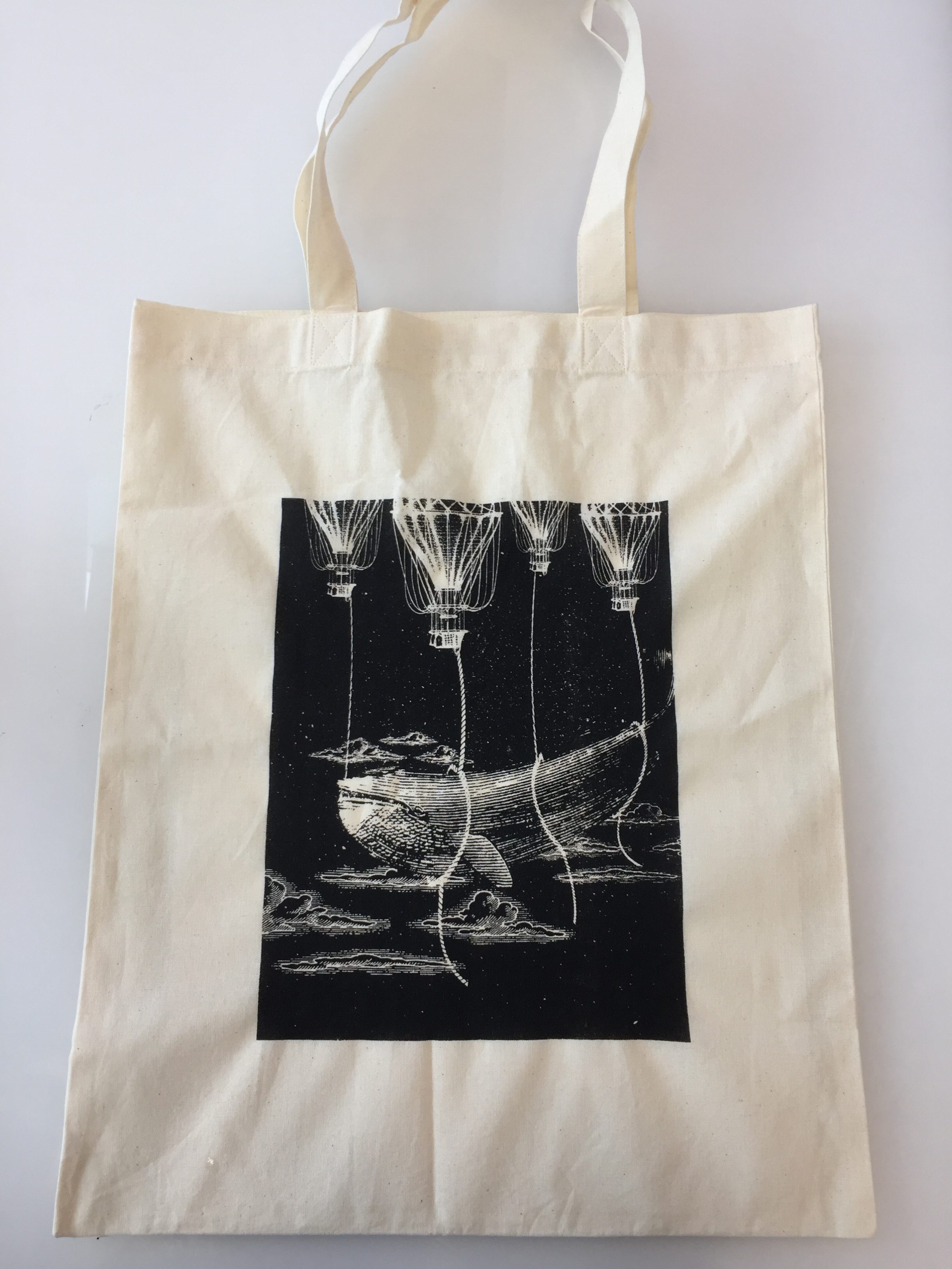
1. “A heart’s a heavy burden” – ( Howl’s Moving Castle )
Mindmap
Interpreting the quote
“Aheart‘s a heavyburden”
Heart – What could be used to symbolise having a big heart? Blue whales. They have the biggest hearts in the world.
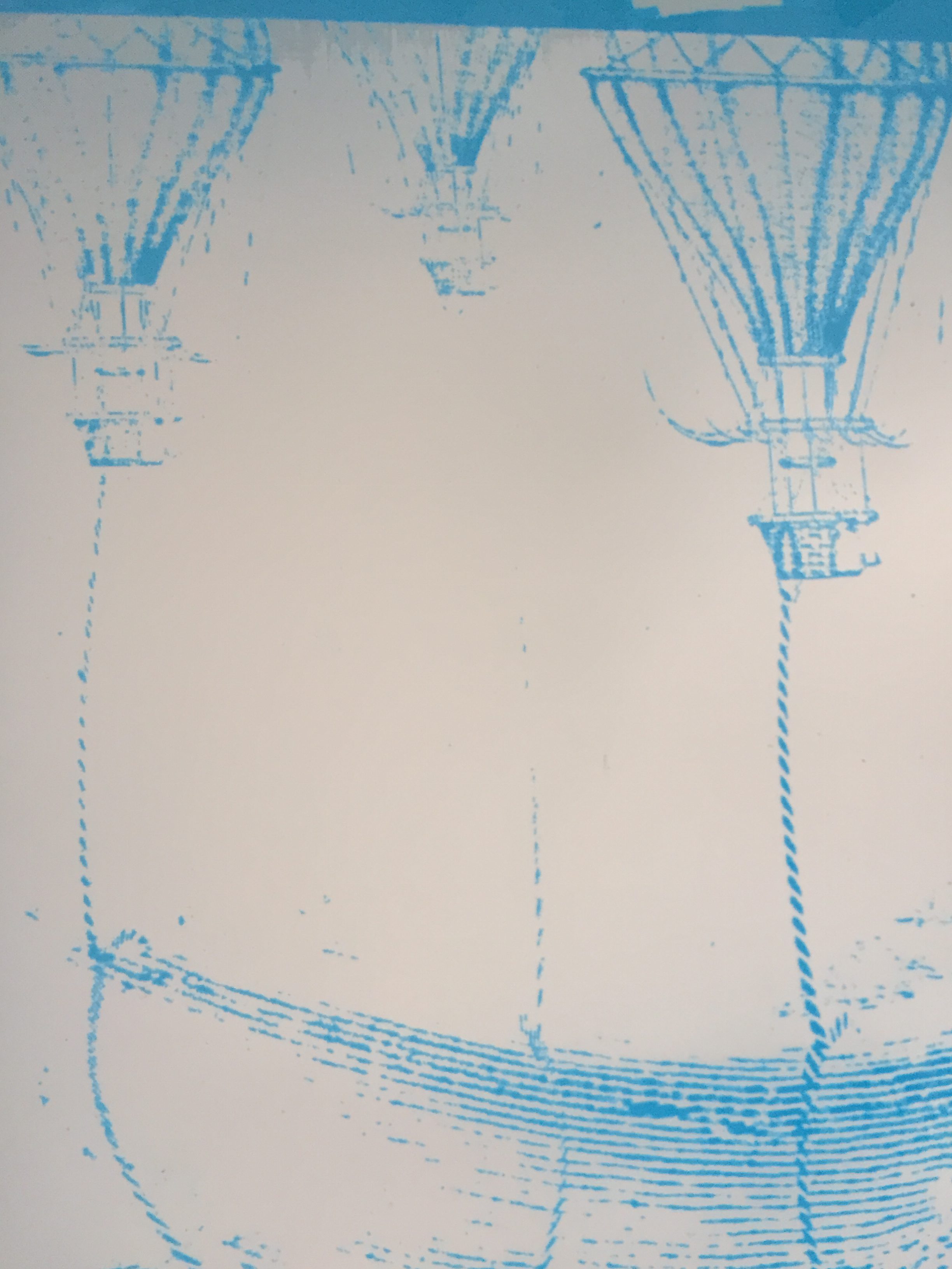
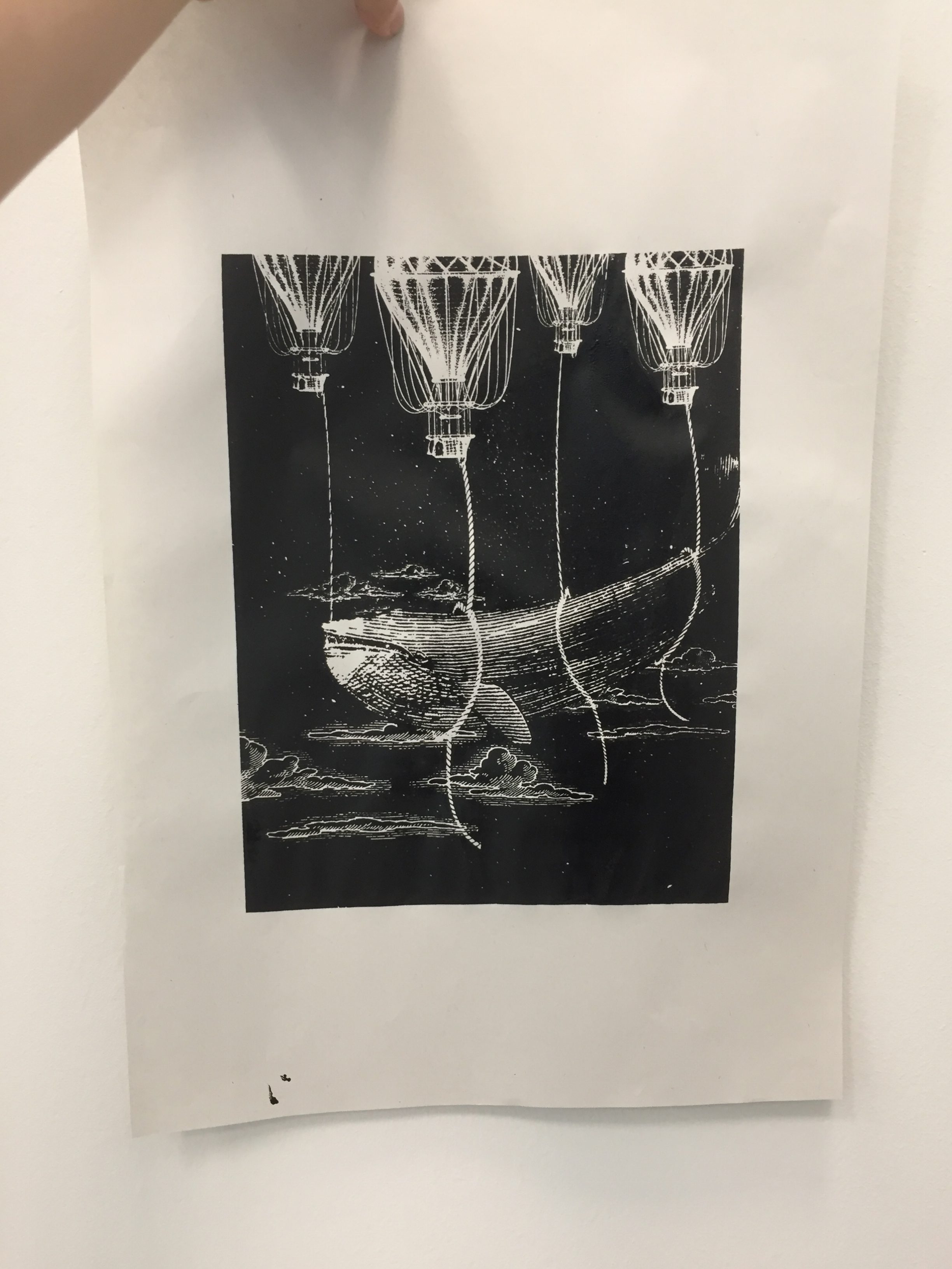
Heavy – Being tied down, confined and constricted by something (e.g.: responsibilities). I used the ropes to represent the responsibility the balloons plays in flying the enormous whale. Enlarging the blue whale in the composition also made the animal seemed heavier in the visual sense.
Burden – This whole task of flying the blue whale with balloons appeared to be a very troublesome and impossible task. The whale symbolising the heart just seemed like a pain in the butt.
Principles of design
Scale – Scale variation provides the viewer a sense of perspective. Clouds that are further can smaller in size compared with the ones that are nearer. The same concept can be seen with the balloons. The play on sizes gives depth and makes the composition feels more dynamic.
Movement – The ropes are all flying in the air in different directions! This makes the composition feels more dynamic in general.
Texture – Just having a black background is boring. I photoshoped in a galaxy-liked star background to make the composition feel more fantasy.
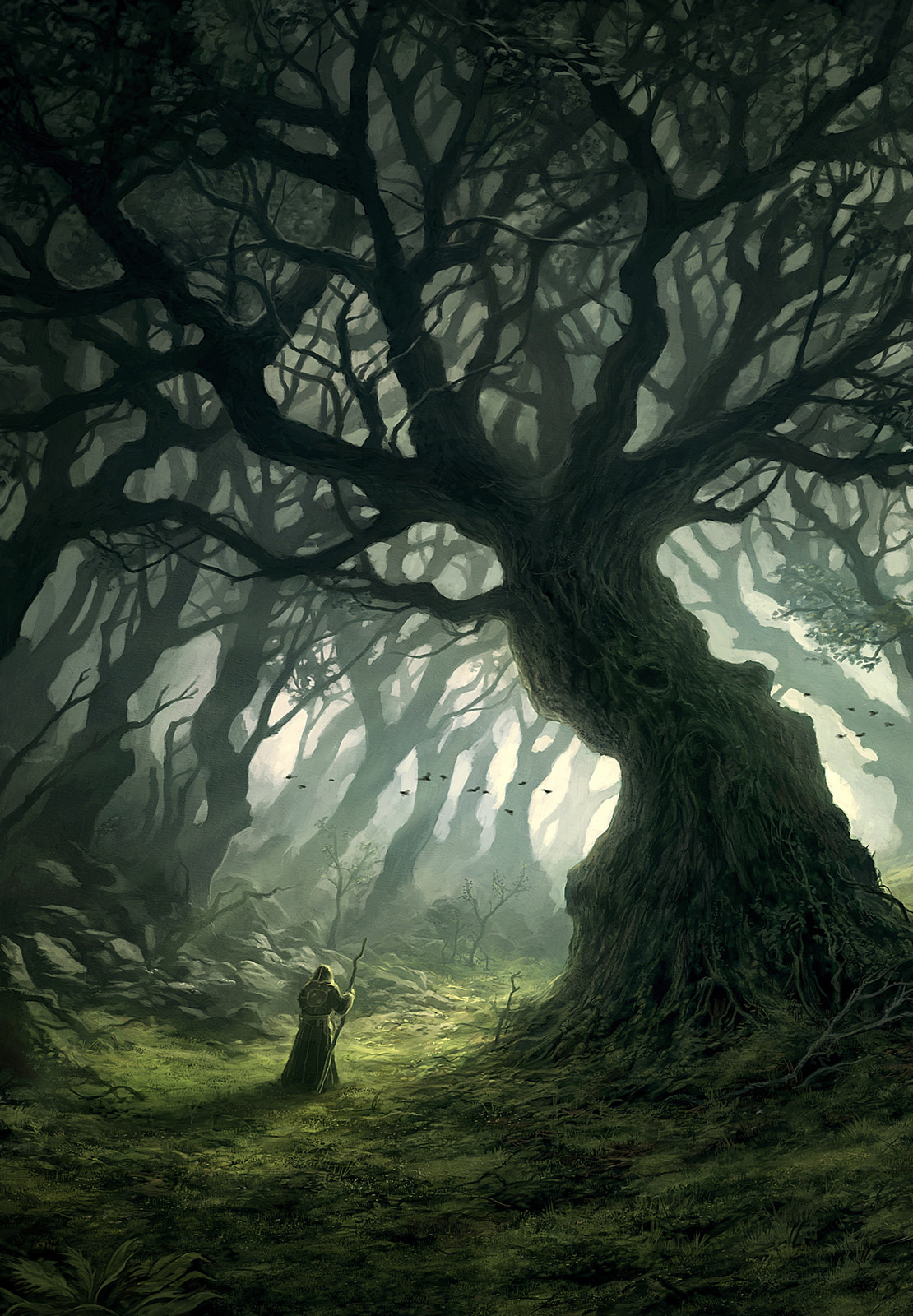
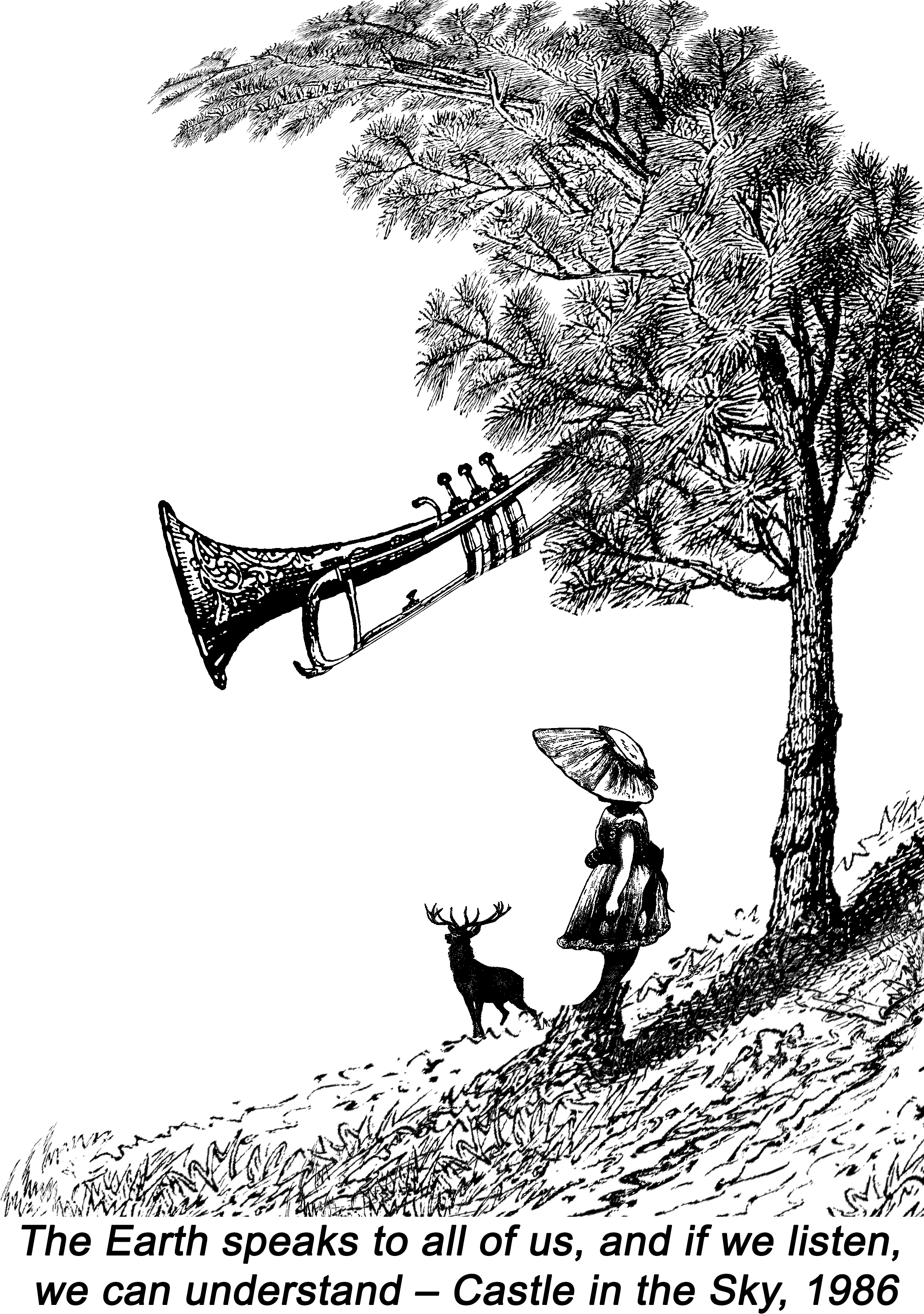
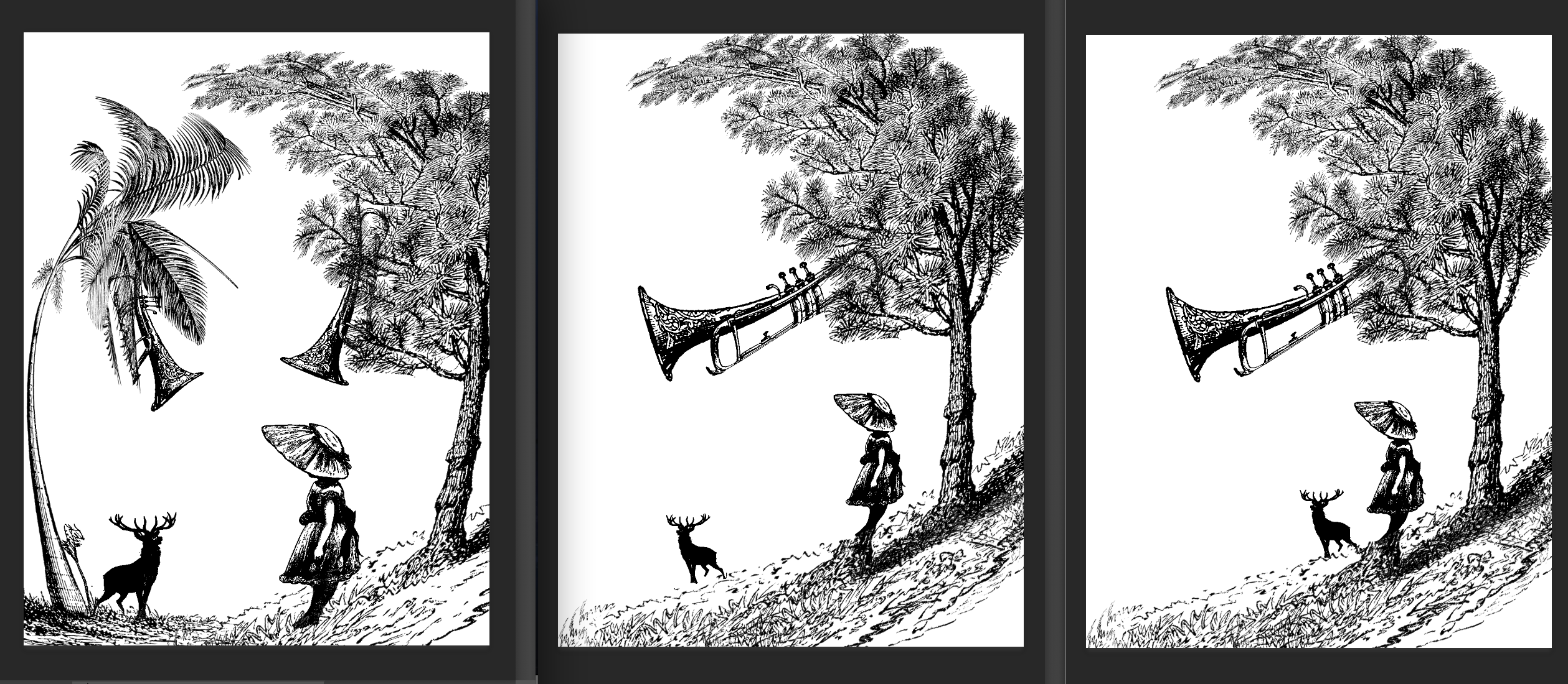
2. “The Earth speaks to all of us, and if we listen, we can understand” – ( Castle in the Sky )
Mindmap
Evolution
Interpreting the quote
“The Earthspeaks to all of us, and if welisten, we can understand.”
Earth – First thing I thought off was mother nature. Trees, animals, grass field. A place out of human reach, somewhere peaceful.
Speaks/Listen/Understand – How do nature communicate? Animated movies always tries to convey that through songs. Music is a universal language, no boundaries. Instruments felt like a good representation of what I was going for. Brass instruments like trumpets and saxophones seemed like a great choice.
We – Humans. I used a little girl and not a teenager/grown adult in this case. Children symbolises innocence, which I thought was suitable in this fairytale-liked composition.
Principles of design
Scale – The variation of scale gives the viewer a sense of perspective. The closest object which is the tree is the biggest and the furthest which is the deer is the smallest. The play on sizes gives depth and makes the composition feels more dynamic.
Golden rule/ratio – The tree and girl are placed 1/3 from the right. The tree and girl are warped to the left side, leading the viewer’s attention and leaving them to imagination about what is there.
Visual Hierarchy – Our eyes are first naturally drawn to the biggest elements in the composition: the tree and trumpet. The visual weight makes it so that we first sees the subject.
Rhythm – Everything in the composition are on the right side, facing or leading to the white spaces at the left. The white spaces leaves the viewer thinking about whats at the left, outside the composition.
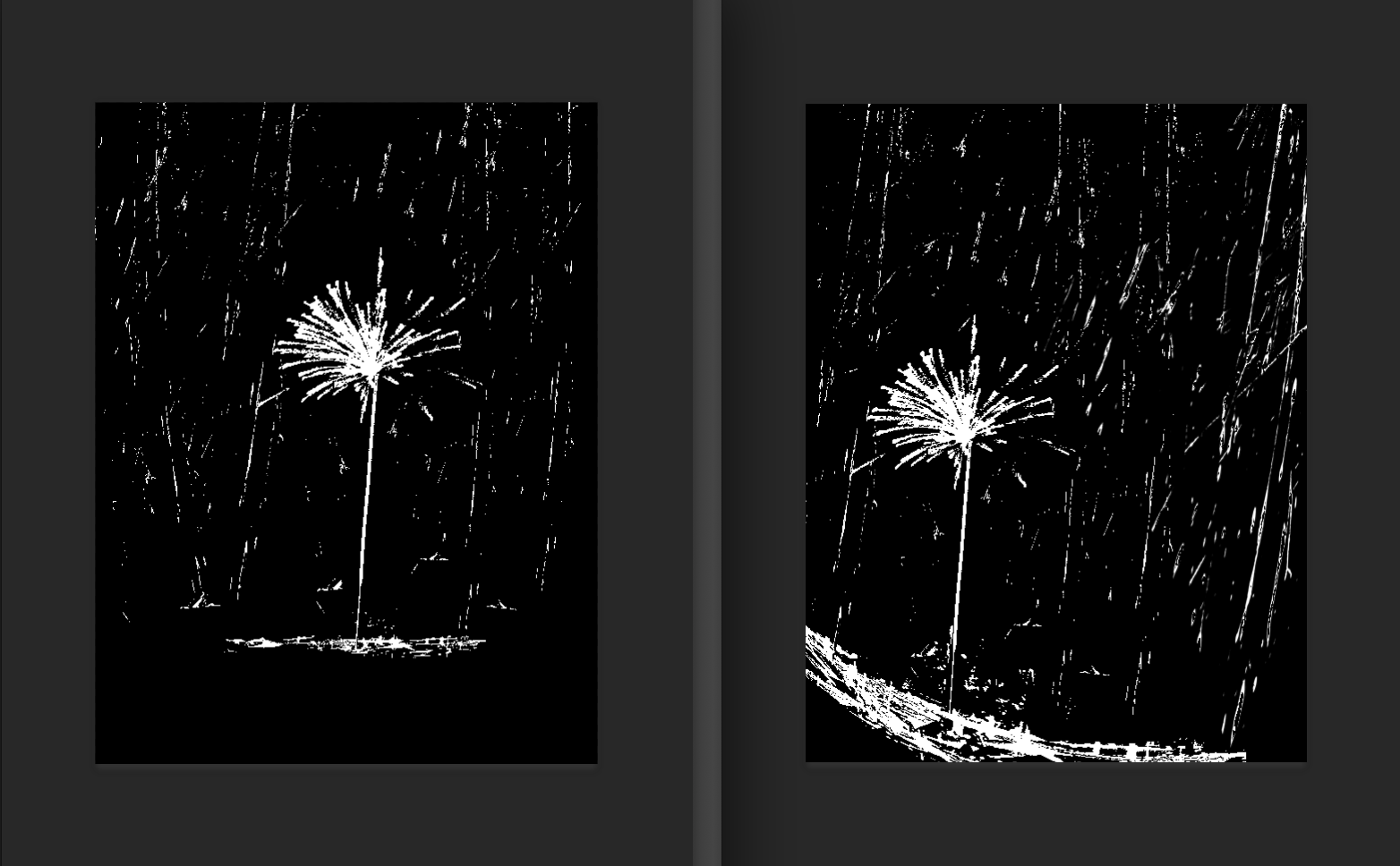
3. “They say that the best blaze burns brightest when circumstances are at their worst” – ( Howl’s Moving Castle )
Mindmap
I wanted to give myself a challenge and try make something with minimal engraving and mostly black and white.
The first composition was too static and boring. Changed for the firecracker to be at the 1/3 mark after consultation!
Interpreting the quote
“They say that the best blaze burns brightest when circumstances are at their worst.”
Burns brightest – Something very big and bright. Some objects that came to mind were fireflies, lamps, lanterns and fireworks. I choose firecracker sticks in the end because I wanted to portray a sense of playfulness and innocence just like in my other compositions. (Animation movies woohoo!!)
Circumstances/worst – A situation when only the fittest could survive. A firecracker burning brightly despite a heavy shower seemed like a pretty impossible thing to happen.
Principles of design
Golden rule/ratio – Placing the firecracker at the 1/3 mark makes the composition feels more dynamic and less static. The ground is also warped to enhance this effect.
Visual Hierarchy – The first thing the viewer will be drawn to is the sparkle as its the brightest and biggest element.
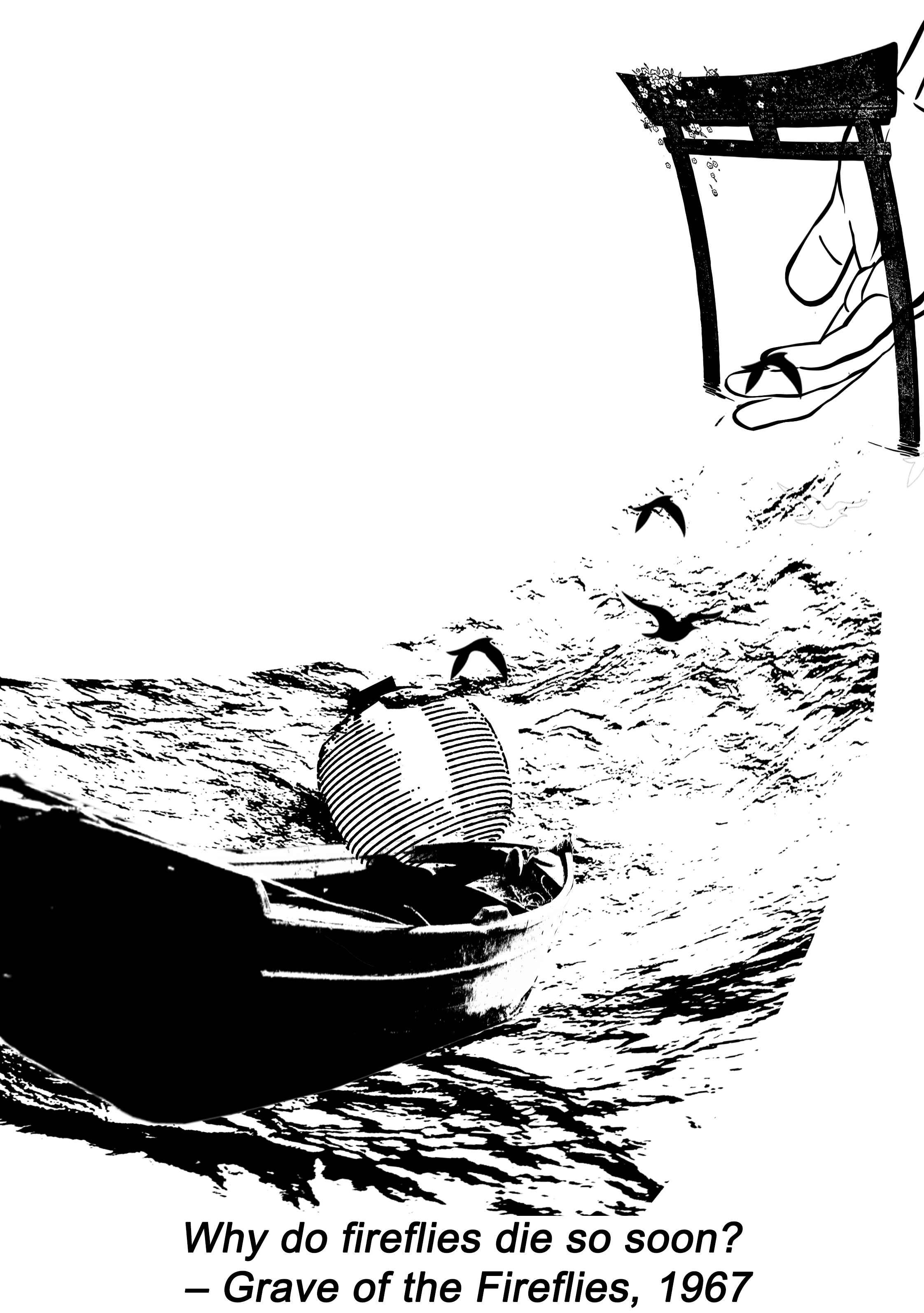
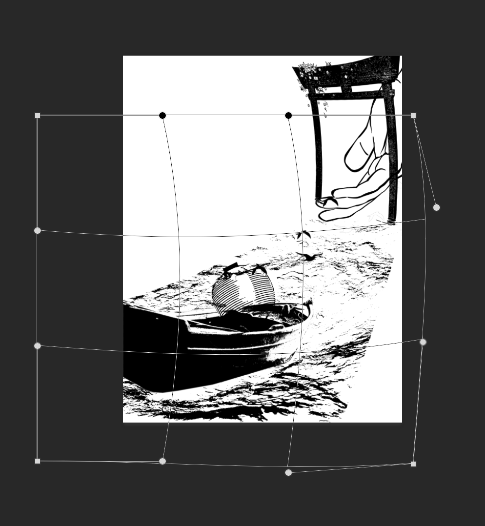
4. “Why do fireflies die so soon?” – ( Grave of the Fireflies )
Mindmap
This composition gave me A HUGE HEADACHE….
I started the project with this quote, made so many changes and finalised this the last.
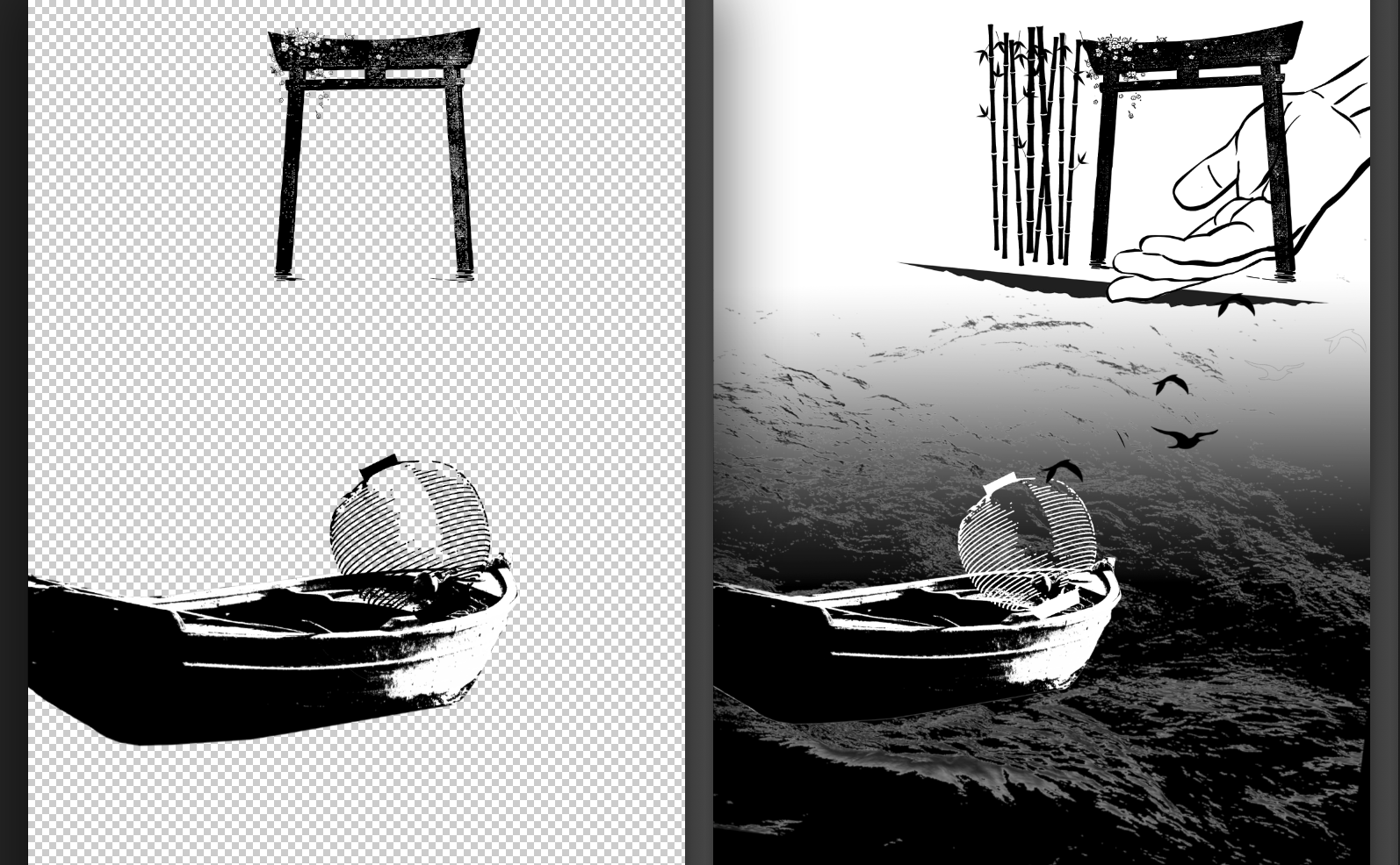
Drafts
The main reason I had so much trouble with this was because I didn’t know what to do with the white spaces. I had no idea how to link the gate with the boat.
Warping
I love warping. There’s warping in all 4 compositions! I love how it gives the composition look more dynamic.
Interpreting the quote
“Why do firefliesdie so soon?”
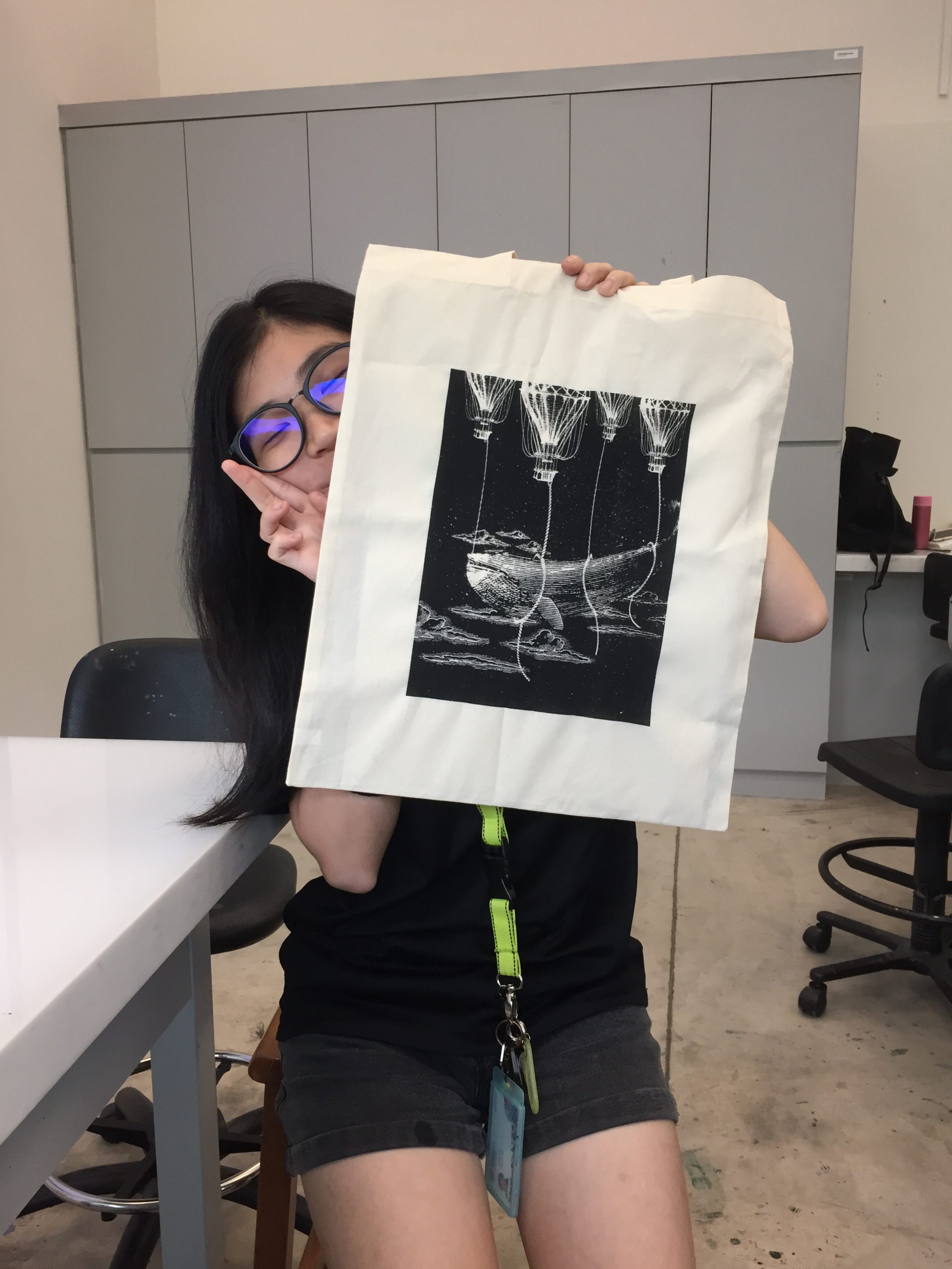
Fireflies – Fireflies lit up the darkness. We keep fireflies in a jar, so I thought : why not in a lantern? Since this was a Japanese movie about war, I used a Japanese lantern since I wanted this to have the ancient Japanese feel.
Die – Death normally means separation. But if we think about it deeper, it means reunion too. When life gets so tough especially in the context of the movie, sometimes dying might be the only way out, the only comfort. The gate signifies crossing over to the afterlife where the hand reaches out for the souls coming to be reunited with the dead.
Soon – Something fast, something that can signify the transition between life and death. The birds flying from the lantern to the gate signifies exactly that, giving that transition a beautiful and bittersweet visual effect.
Principles of design
Scale – The variation of scale gives the viewer a sense of perspective. The closest object which is the boat is the biggest and the furthest which is the gate and hand is the smallest. The play on sizes gives depth and makes the composition feels more dynamic.
Leading Lines – All the elements are composed so that attention will be lead to the gate and hands.
REFLECTION
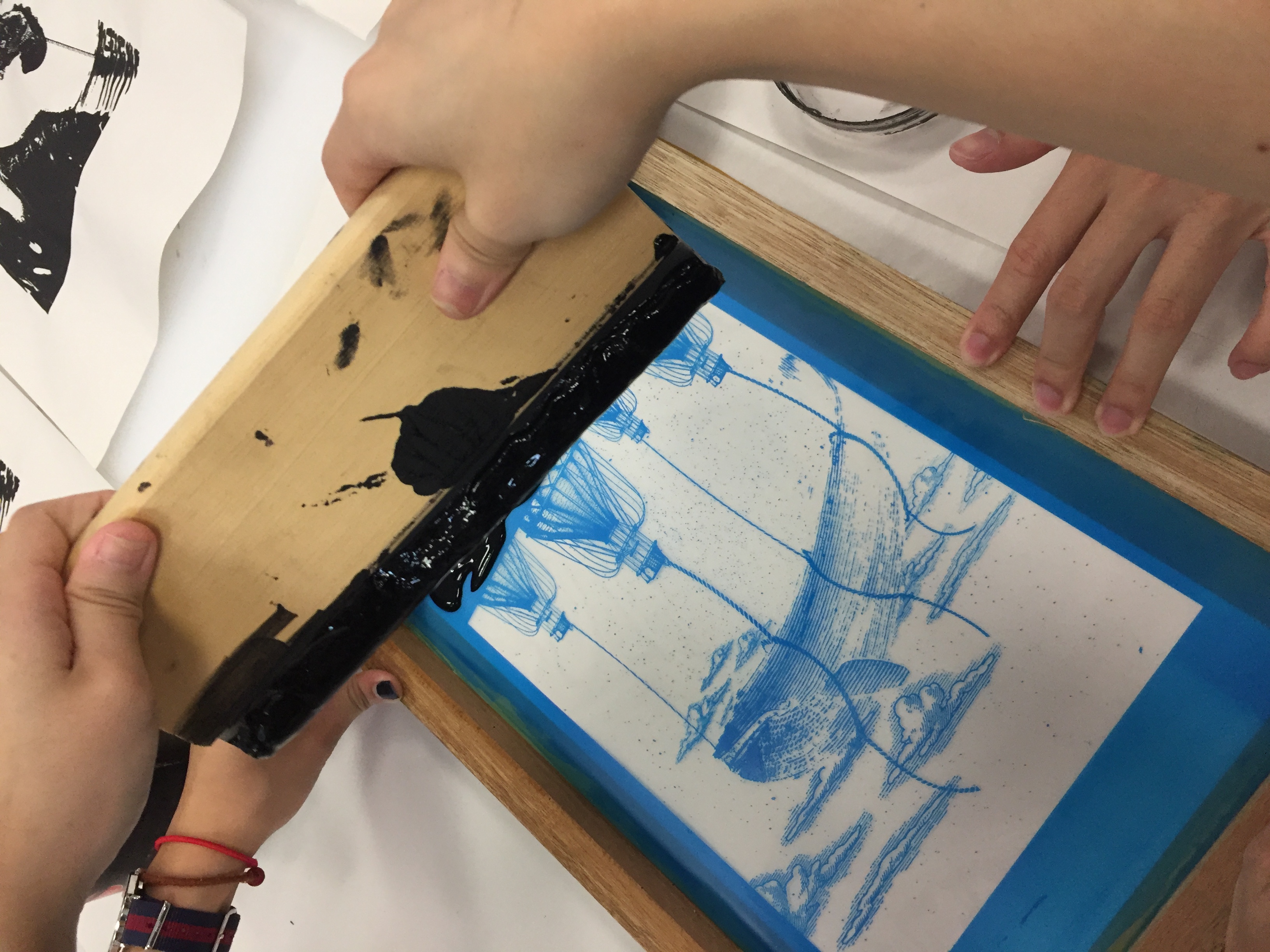
Silkscreening was really fun yet tedious on the mind. Started off badly when the printing uncle printed my transparency too dark, which affected my exposure and in turn resulted in the countless redo-ing cycle… But the tote bag turned out beautiful in the end!!
The most difficult part of this project was to not use too many elements to convey my message. For this project, I think a lot and a little too deeply and tend to not go straight to the point – which was very very difficult because I kept discarding and restarting my designs 🙁
Mind mapping really helped me a ton,I find that I’ll focus only on the keywords and stay on track! ( Will 10/10 mind map everything from now on )
Woohoo!!!!
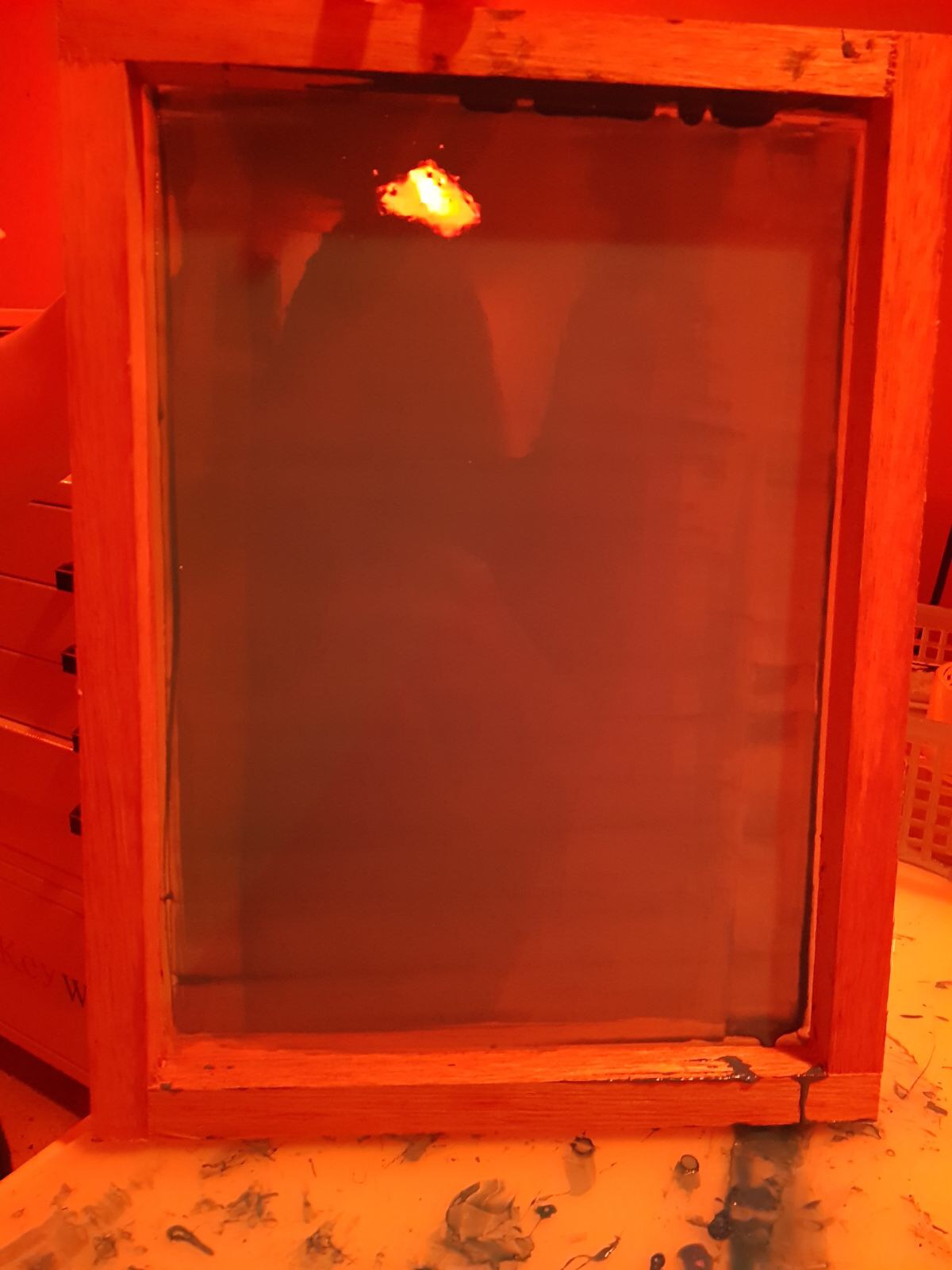
SILK SCREEN PROCESS
Printed transparency to be used for the silk screen!
My first few attempts exposing the screen ended up in failure because the transparency was printed too dark.
Coating the screen with the P5C blue emulsion after washing the screen.
Coat applied needs to be even and not too thick.
Transparency would be pasted on the screen and sent to be exposed to light.
After washing off the blue emulsion…
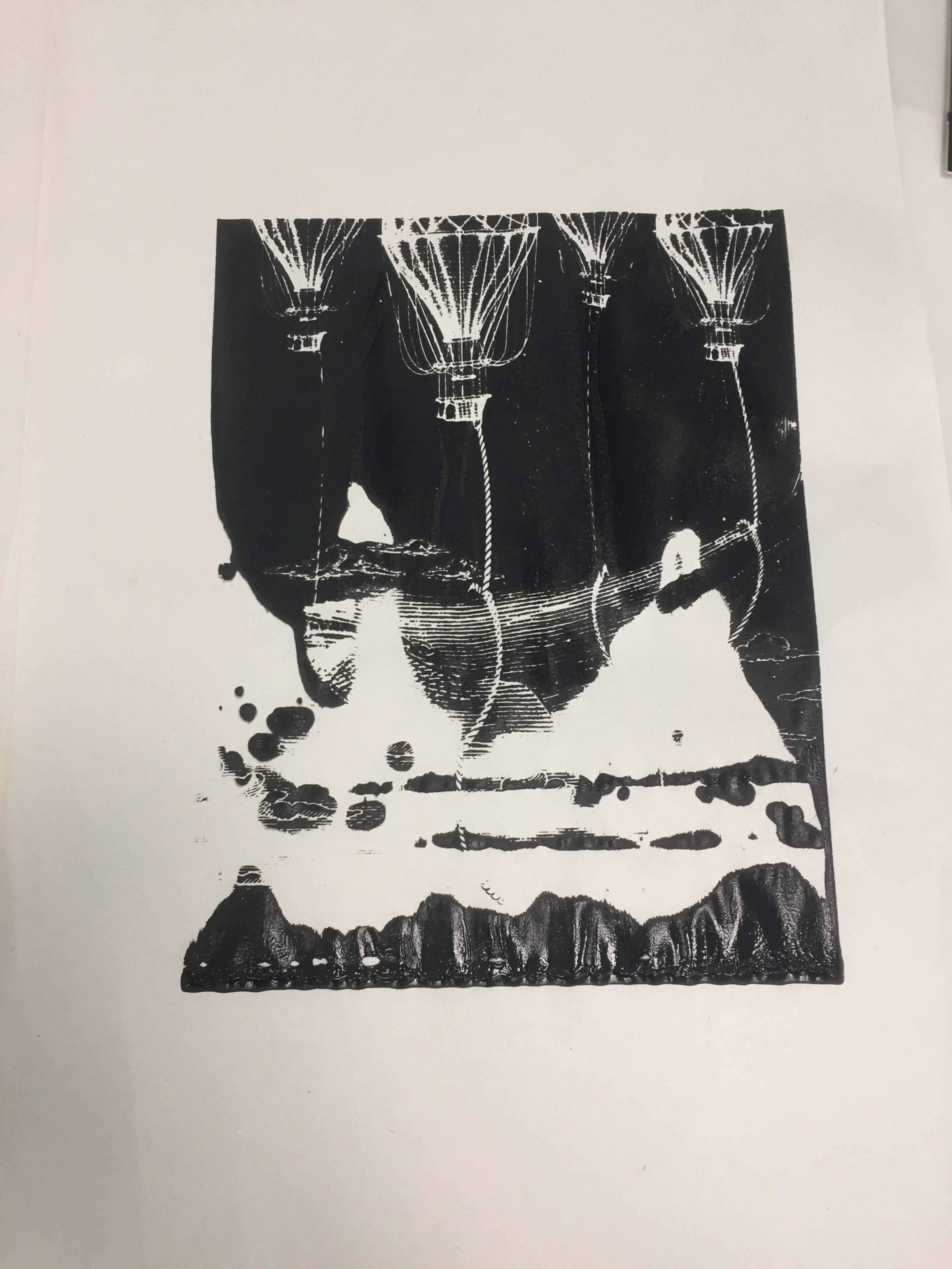
Failed silkscreen 🙁Washed off details
This was the failed attempt, look at the washed off rope 🙁
After a few tries and re-printed the transparency…
Success!!
Next would be to test print on newsprint.
vid
It was very difficult trying to figure out the suitable amount of paint to use andthe right strength to be applied.
Not enough paintToo much strength
Not losing hope and after many painstaking print-wash-dry cycles…
I DID IT!!!!!!!!!!!I DID IT!!!!!!!!!!! PT.2Victory shot :^>