Value: Perseverance
When life gives you lemons, make lemonade.
To me, this quote meant that, no matter how sour a situation is, I should always try my best to make the most out of the situation. Not just because something doesn’t seem good at first impression or first try, I give up trying.
Working with this quote, I wanted to introduce fun and liveliness to my poster. This meant I needed warm and pastel-ly colours in my work. I also chose fruit as an object in my quote as it would create a focal object, rather than having too many shapes.
This poster consist of a lemon, a straw and bubbles. When life gives you lemons, make lemonade. This is shown by the straw sticking out of the lemon. The bubbles are pink to signify joy. Rather than treating lemons as sour, we try to perceive it positively. The lemon is also not a full rounded circle, this is because a lemon is not perfecty shaped (slightly uneven), just like how the problems being thrown to us in life, they are not perfect, but we can always turn a negative situation into a positive one for us.
Design Elements
Lines – Except for the straw, all the lines are curved. Curves suggests a form of relaxation and comfort, which are pleasing to look at. The reason why the straw is straight is because it creates stability and balances out the curves in the poster.
Texture – Lots of circles of different sizes and opacity representing bubbles, creates a happy texture.
Space – Lemon shape does not clutter the entire poster, neither does it take up too little space. Allowing space for the poster to “breathe”.
Proportion – Fizzy pink bubbles are smaller in size as compared to the lemon. It also creates focus on the lemon, while not creating clutter.
Typography – Text is aligned to the right. The comma and full stop is also aligned
Colour – Colours used are very in line with nature, like how the straw is the same colour as that of a lemon’s leaf.
Design Principles
Rule of Third – Lemon takes up 2/3 of the poster and the straw occupies the top 1/3.
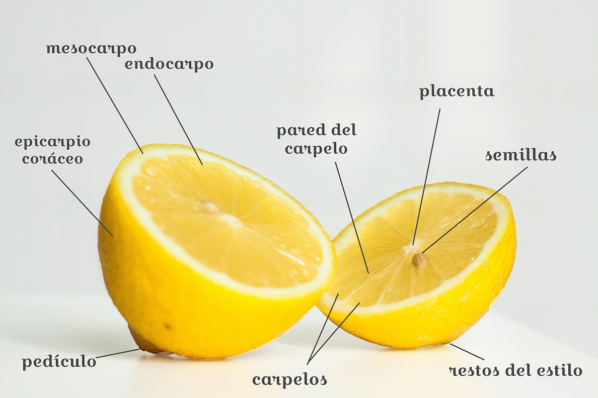
 Golden Ratio – We can also see the golden ratio as the lemon curves towards the placenta of the lemon, which is nearly about the golden ratio.
 Contrast – Contrasting colours is used where green and yellow is in analogous but pink is in contrast to both the colours.
Depth – The whole lemon is in a solid colour while the pink bubbles have a lower opacity, this allows the lemon to pop while the pink shade recedes into the background.

Gestalt Principles
Closure – Although the poster does not show the full shape of a lemon, we can tell it is a lemon due to the law of closure.

Colour Palette
 My colour choice consist of light colours which have a pastel tone to it, evoking a calming effect. The yellow colour is warm which makes the lemon pop.
Yellow: An energetic colour signifying joy and happiness.
Green: Fresh and earthy.
Pink: Playful and bubbly.
I chose to use split complementary colours where it consist of yellow, green and toned down purplish red (pink). Here’s how I pair the colours together as shown in the colour wheel below.

Yellow and green are analogous to each other. Which meant that they blend well together, however I want my poster to have a playful tinge of contrast, and pink felt like the best choice. Therefore I end up using split complementary colour combination.
Difficulties
Initially my poster design was very flat because I dare not go bold with my idea. So what I did was placing my object in the center of the poster. After consultation with our teacher, I shifted my design to occupy 2/3 of the poster, and it really created more focus to the object.
It was my first time working with the pen tool and using shapes to create a design. It was difficult to use the pen tool to create desired curves, but I really enjoyed the process of learning and mastering the bicycle handle of the pen tool.
Conclusion
To conclude, I am very thankful for the opportunity to learn illustrator. I feel that it is a very valuable skill to learn in school. I now know how to create objects using simple shapes, and I have also learnt that illustrator is much better than photoshop when it comes to creating logos and designs as it uses vector, which meant quality of image will not be compromised.
