
I have finally decided on my medium: traditional using watercolour
Hurrayy! I can use my fave medium!
Here are some of my all-time favorite artists who I intend to learn from
Watercolour illustrators
iraville
I followed Iraville for quite a while already, I guess it’s been at least a year?
I enjoy watching her process videos. I learn alot just my watching her paint. The techniques she uses, paper and paint combination etc.
Anyways, taking a closer look at her works:
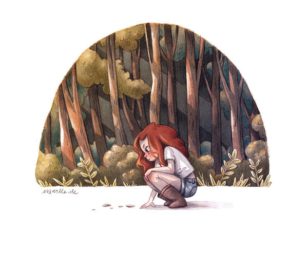
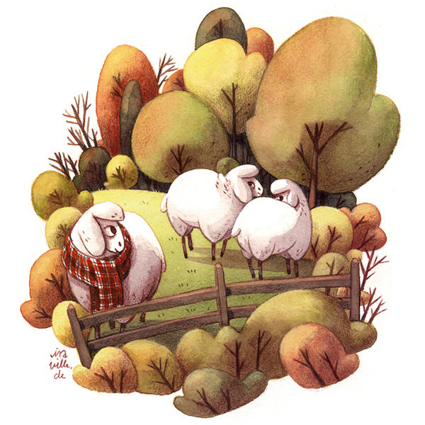
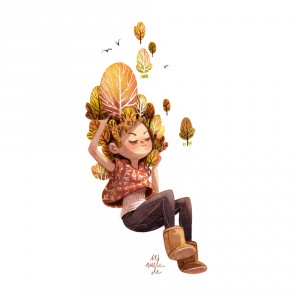
iraville uses warm, earthly colour schemes. These are often desaturated colours, adding in the earthly feeling.
There is also this roundness to her paintings as well as the components in her painting.
The harmonious colour scheme together with the round figures add a touch of warmth and scenerity. It makes me feel relaxed.
The way she composes her artworks are also very clean and minimalist. The entire painting appears as a whole, partly due to the clever use of overlapping as well as colour choice to show depth and space.
and here’s Master iraville discussing about colours:
😀 she’s so nice to share her thoughts on paints!
maruti_bitamin or koyamori
https://koyamori.deviantart.com/
I followed koyamori first on deviantart. I think I followed her for 6 years already. HAHA time flies.
She never fails to paint daily. She updates every single day, and she just gets better and better!
By the way, she does not use masking fluid. I strive to be like her!
Some examples of her work:
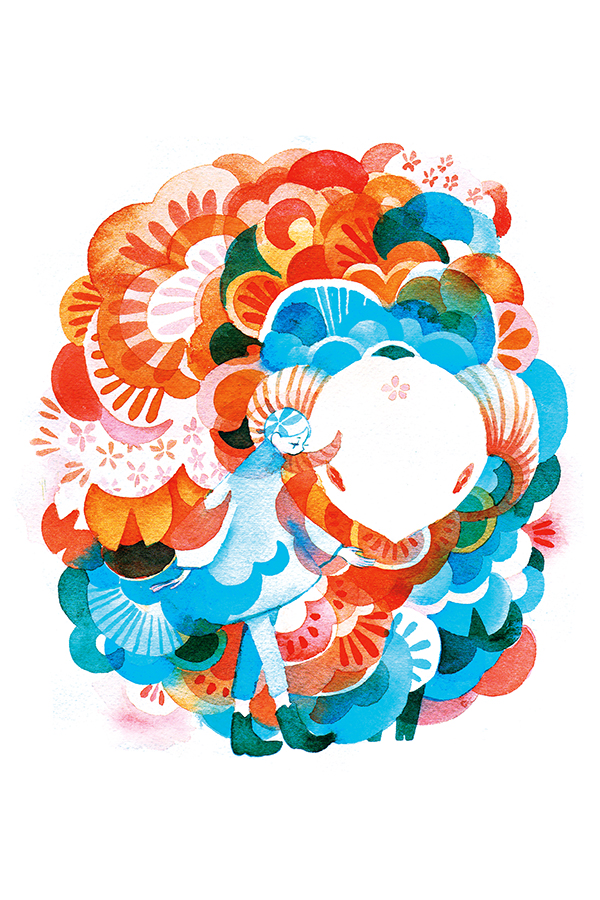
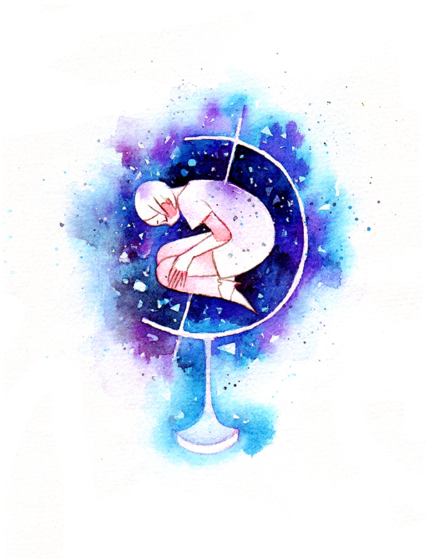
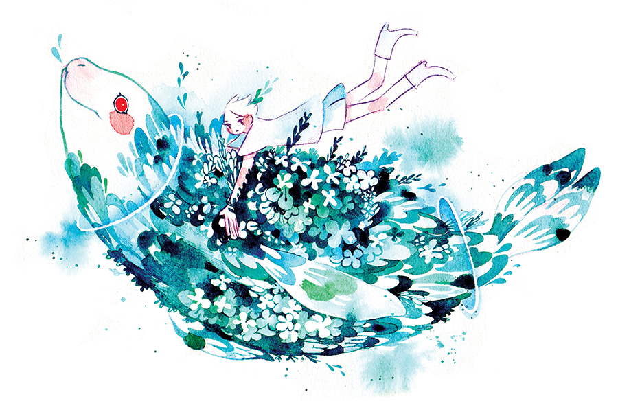
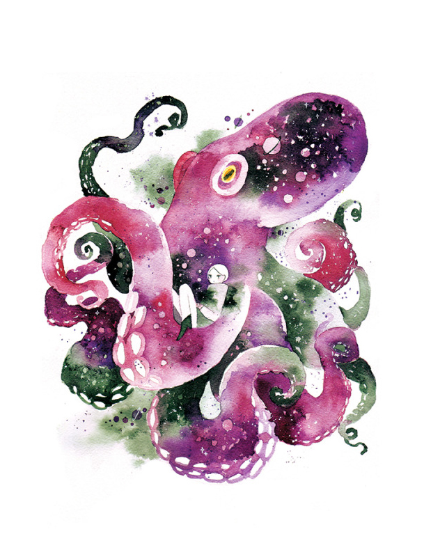
koyamori uses pattern and layers extensively in her artworks. Her colour schemes are oftne monochrome, analogous or complementary. Koyamori’s simple choice of colour (colour combination) adds a personal touch to her works.
Koyamori employs centralised, concise and succient designs to make her point.
She also uses negative space readily to show depth and space!
Pearfleur
https://www.youtube.com/user/MyPetiteCakes
Pearfleur acually collab with iraville previosuly:
In this painting, she employed a soft, mellow colour scheme.
Pearfleur makes uses of texture very often.
lazy day ? pic.twitter.com/7lUFKd0hsj
— PearFleur (@PearFleur) August 10, 2017
which one to post quick pic.twitter.com/PDYWacbYBi
— PearFleur (@PearFleur) August 1, 2017
I definitely want to start using my twitter more!
Here's a painting I did on the whim a while ago pic.twitter.com/ZM8NKC7Ycs— PearFleur (@PearFleur) July 27, 2017
Pearfleur uses blue extensively in her works. I think she uses prussian blue the most!
Nishi
A japense illustrator!
She often experiments using different colour schemes.
Her colour schemes are often soft and mellow. As compared to pearfleur, iraville and koyamori, her palette is why more pastel and lighter.
pata
AnotherJapanese illustrator! Her works are intricate and often character based.
Pata also experiments using self selected colour schemes.


