Terminology:
-Saturation:
Intensity of colour

Saturation can help add emphasis to a subject.
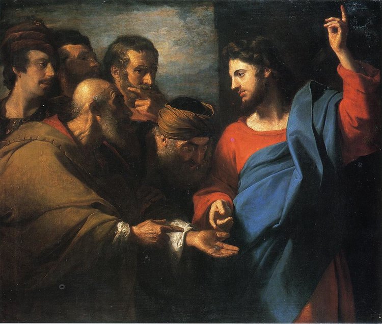
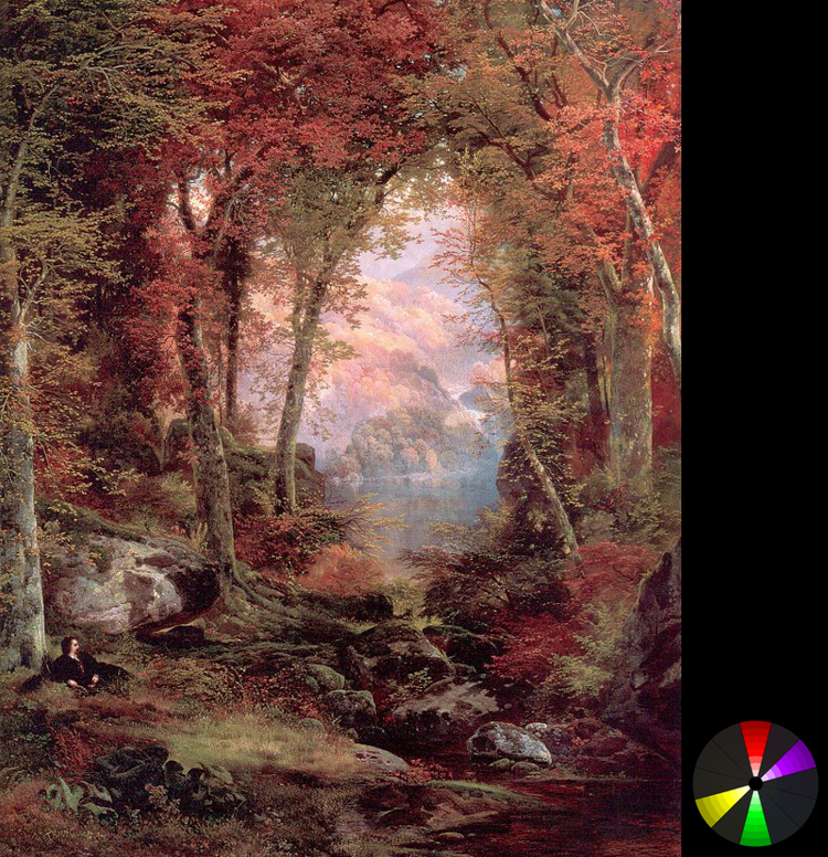
Jesus stands out from the other figures due to the colours that were added to his clothes.
However oversaturation is something to be avoided. If the colours are too intense there will be too focal point as there are too many things going on in the painting.
Saturation vs Desaturation: It brings out the mood and sets the atmosphere.
-Value:
Brightness/Darkness of colour
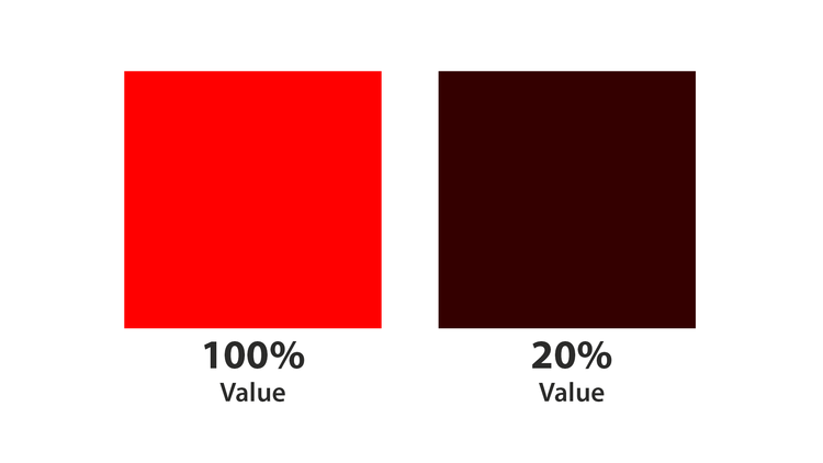

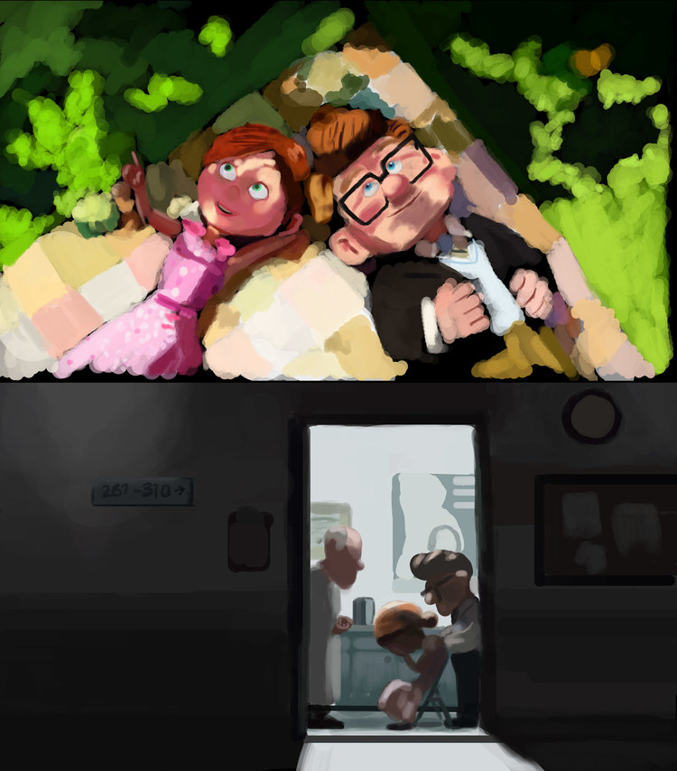
Value is important as it creates depth and dimension.
Normally we use monochrome or just black and white to study tonal value.
Shadows and Light are often expressed through the manupulation of values.
-Hue:
Pure colour or shade
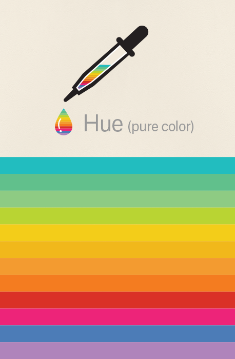
It is what we normally refer to as “colour”.
-Tone:
Pure Hue + grey (varying amount)
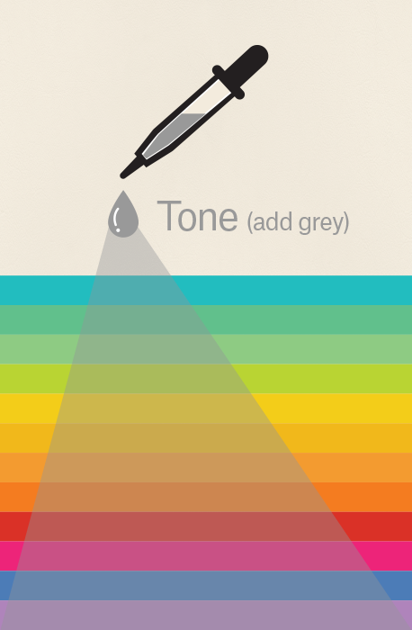
Often tied to Value. (Tonal Value)
-Tint:
Pure Hue + White (varying amount)

The addition of white may make the hue to appear more to a pastel colour.
Pastle colours often have white as a base hue.
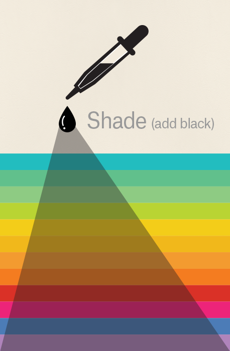
-Shade:
Pure colour + black (varying amount)
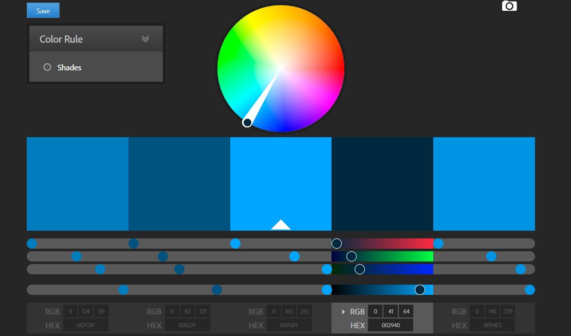
Different shades of blue on Adobe color CC.
The use of value brings out space and dimension.
The use of contrast also brings the image into life.
Meaning of Colours:
001 Red:
Red
Associated with
- fire
- violence
- warfare
- danger
- love
- passion
There are both negative and positive connotation.
Red can actually have a physical effect on people, raising blood pressure and respiration rates. It’s been shown to enhance human metabolism, too.
In design
A powerful accent color.
Can have an overwhelming effect (especially in its purest form)
Great color to use when power or passion want to be portrayed in the design.
- Brighter versions: more energetic
- Darker shades: more powerful and elegant.
Example:

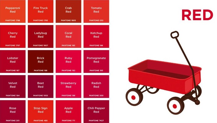
The use of red gives the page energy and vibrancy.
002 Orange:

Orange:
Associatied with
- changing seasons
- changes
- movement (in general)
- creativity
- energy
- earth (muted orange)
- autumn (muted orange)
- vitality
Example:

Vibrancy and energy are not lost despite the muted orange colour.
003 Yellow:

Yellow:
It’s associated with
- happiness
- sunshine
- deceit
- cowardice
- hope
- light
Yellow can also associated with danger, though not as strongly as red.
In designs
- Bright yellow can lend a sense of happiness and cheerfulness.
- Softer yellows are commonly used as a gender-neutral color.
- Light yellows also give a more calm feeling of happiness than bright yellows.
- Dark yellows and gold-hued yellows can look antique, create a sense of permanence.
Example:

The use of light and muted yellow adds vibrancy and liveliness without being overwhelming.
004 Green:

Green:
Associated with:
- new beginnings
- growth
- renewal
- abundance
- envy jealousy
- lack of experience
- nature
Has the Calming attributes that blue has, but it also incorporates some of the energy of yellow.
In design
A balancing and harmonizing effect, and is very stable.
It’s appropriate for designs related to wealth, stability, renewal, and nature.
- Brighter greens are more energizing and vibrant
- Olive greens are more representative of the natural world
- Dark greens are the most stable and representative of affluence.
Example:

Bright kelly green is used to create the refresh look.
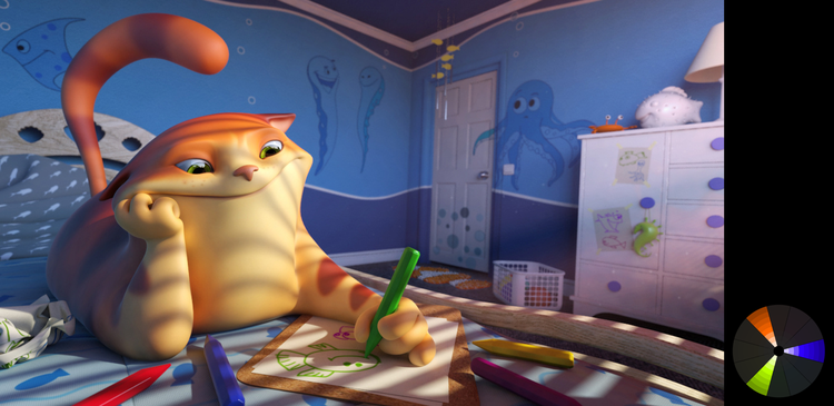
005 Blue:

Blue:
Associated with:
- sadness
- calmness
- responsibility
- peace
- spiritual and religious connotations
Light blues can be refreshing and friendly.
Dark blues are more strong and reliable.
The meaning of blue is widely affected depending on the exact shade and hue.
In design
- Light blues: relaxed and calming
- Bright blue: energizing and refreshing
- Dark blues (navy): strength and reliability
Example:

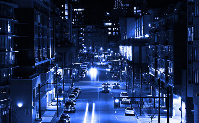
Blue is used to create a trustworthy and authorivative feel.
006 Purple:

Purple:
Associated with
- creativity
- imagination
- loyalty
- luxury
- royalty
- wealth
- romance (lavendar)
In design
- dark purples can give a sense wealth and luxury
- Light purples are softer and are associated with spring and romance.
Example:

Purple is used to highlight the idea of creativity.

007 Black:
Black
Associated with:
- power
- elegance
- formality.
- evil
- death
- mystery
- rebellion
- halloween
- occult
- mystery
Black, when used as more than an accent or for text, is commonly used in edgier designs, as well as in very elegant designs. It can be either conservative or modern, traditional or unconventional, depending on the colors it’s combined with.
In design
- Commonly used for typography and other functional parts, because of its neutrality.
- Black can make it easier to convey a sense of sophistication and mystery in a design.
Example:

The use of black as a background brings out the subject of the site.
008 White:
White
Associated with
- purity
- cleanliness
- virtue
- healthcare industry
- goodness
- angels
In design
Considered a neutral backdrop that lets other colors in a design have a larger voice.
- It can help to convey cleanliness and simplicity, though, and is popular in minimalist designs.
- White in designs can also portray either winter or summer, depending on the other design motifs and colors that surround it.
Example:

The use of white creates a modern aesthetic.
009 Grey:
Gray
Assocaited with:
- moody
- depressing
- conservative
- formal
- modern
- mourning
- professionalism
- sophisticated
Light grays can be used in place of white in some designs, and dark grays can be used in place of black.
Pure grays are shades of black, though other grays may have blue or brown hues mixed in.
In design
gray backgrounds are very common
gray is often used in typography
Example:

The use of grey gives a clean and formal appearence.
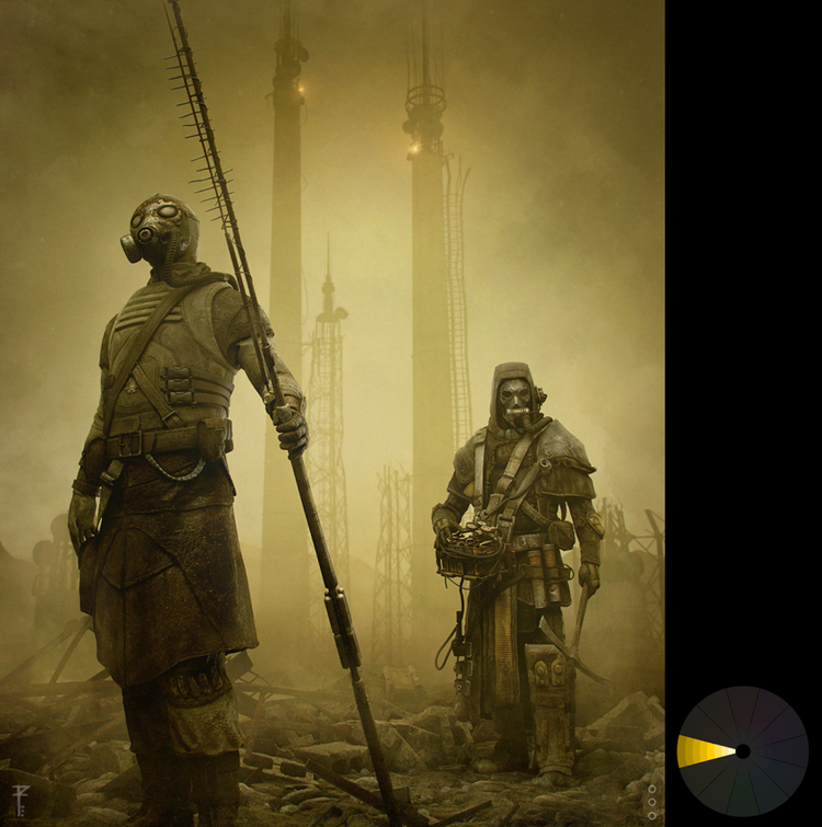
010 Brown:

Brown:
Associated with
- earth
- wood
- stone
- dependability
- reliability
- steadfastness
- nature
- wholesomeness
In design
- Brown is commonly used as a background color.
- It’s also seen in wood textures and sometimes in stone textures. It helps bring a feeling of warmth and wholesomeness to designs.
- It’s sometimes used in its darkest forms as a replacement for black, either in backgrounds or typography.
Example:

The brown colour creates an old fashioned appearence to create an vintage look.
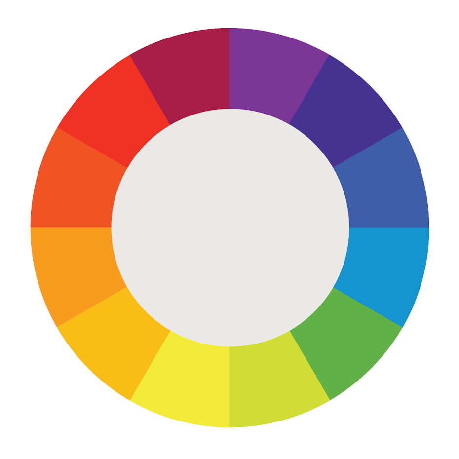
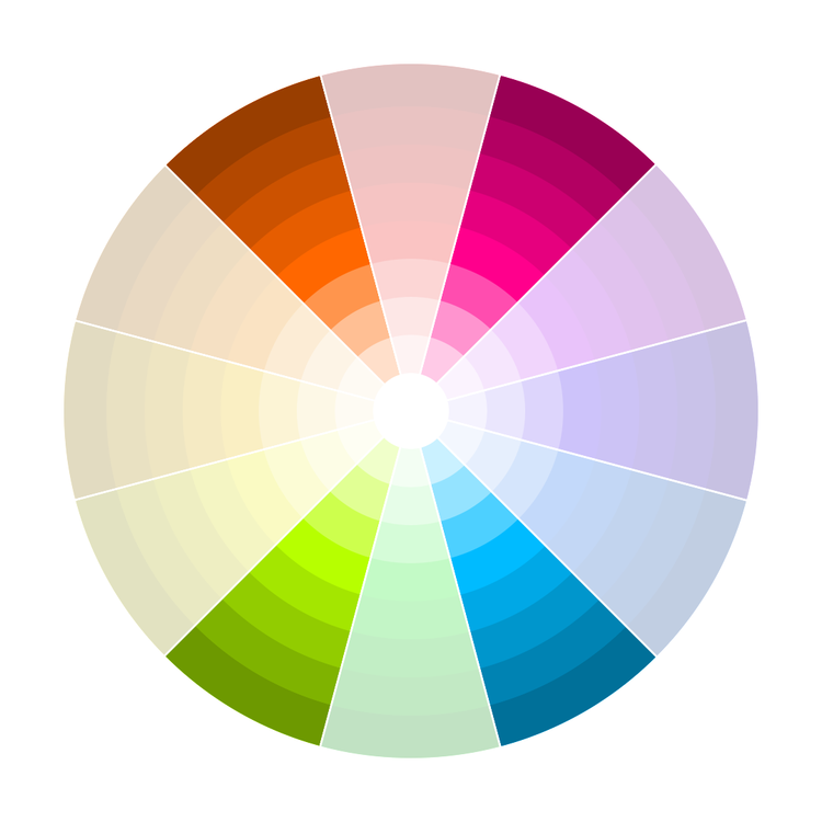
Color Harmony:
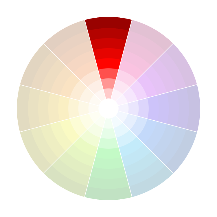
Monochromatic
A single hue with different tone/shade/tint.
Colour Palette:


Examples:
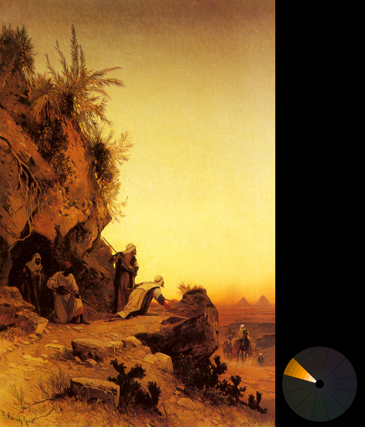
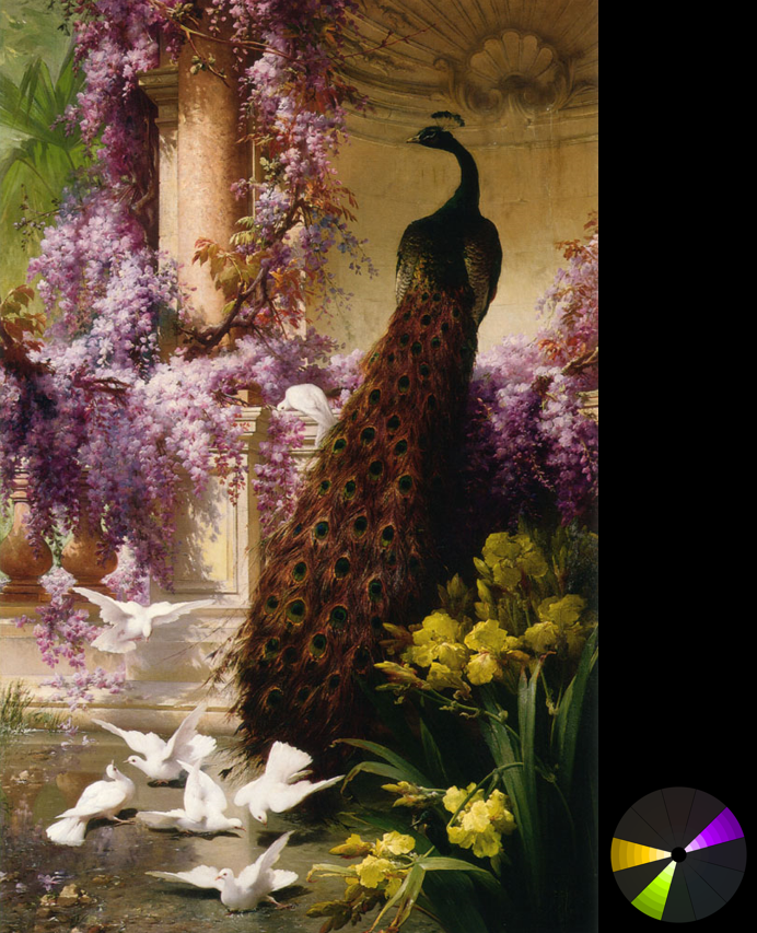
Analogous
Analogous schemes are created by using three colors that are next to each other on the 12-spoke color wheel.

Colour Palette:


Examples:


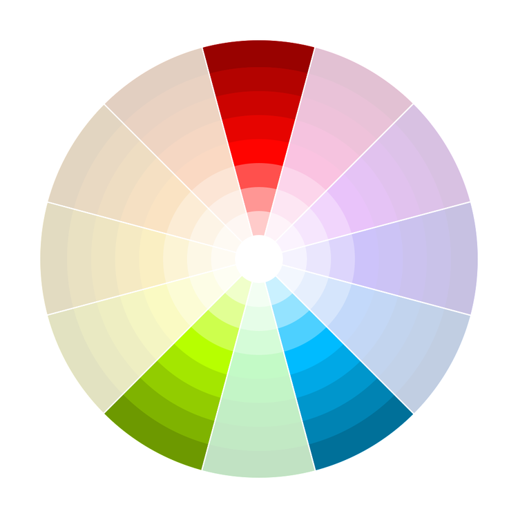
Triadic
Triadic schemes are made up of hues equally spaced around the 12-spoke color wheel.
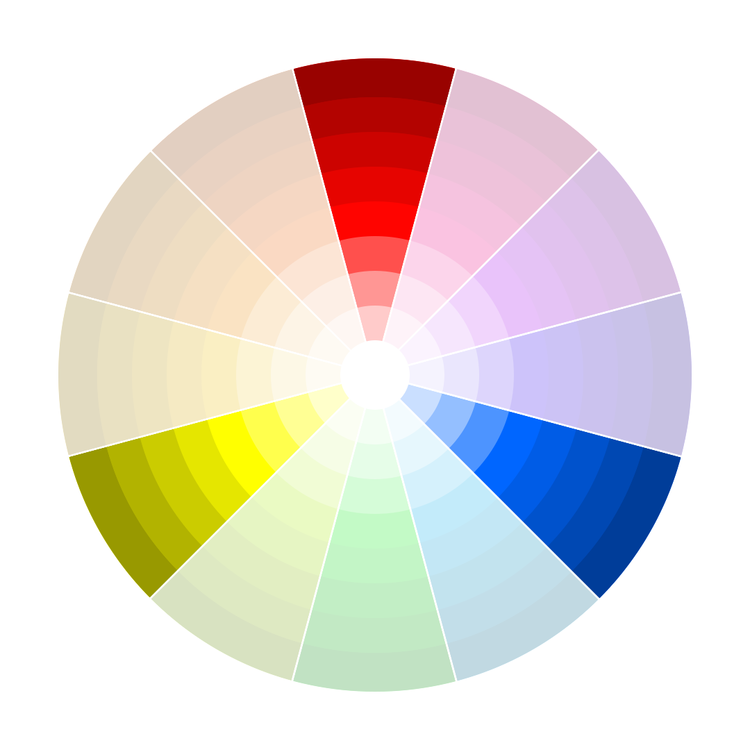
Colour Palette:


Examples:

Complementary
Complementary schemes are created by combining colors from opposite sides of the color wheel.
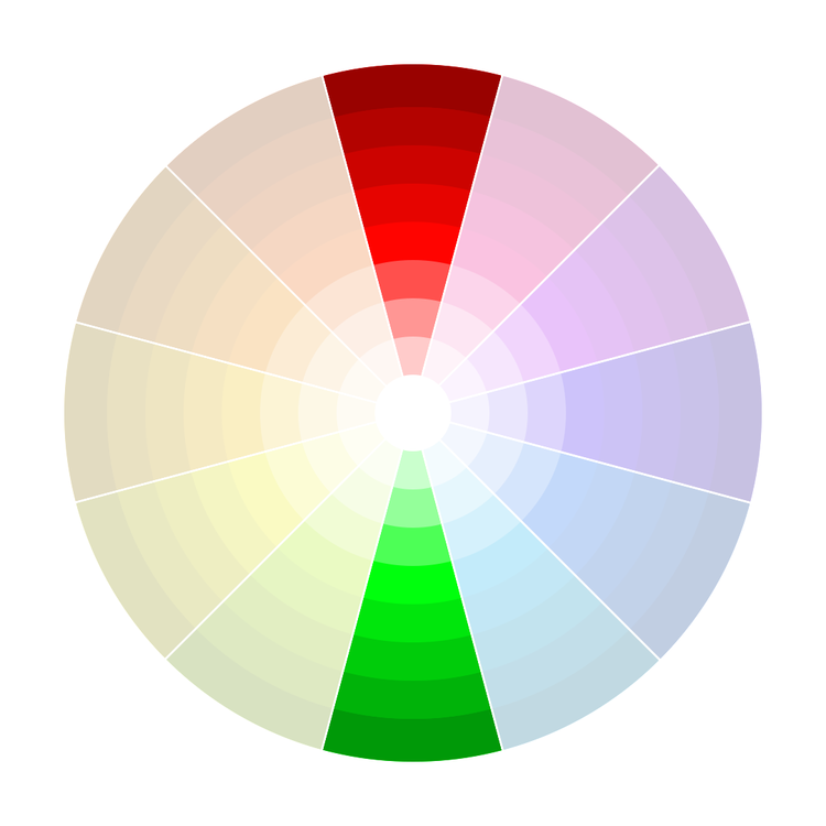
Colour Palette:


Examples:

Split complementary
Colors on either side of the hue opposite the base hue are chosen.
Colour Palette:


Examples:
Double complementary
Colour Palette:


Examples:
Summary:

Resources:
- SmashingMagazine
- Kuler
- Colrd
- Designspiration.net
- ShutterStock Spectrum
- colourlovers.com
- design-seeds.com
References:
https://www.smashingmagazine.com/2010/02/color-theory-for-designer-part-3-creating-your-own-color-palettes/
https://www.smashingmagazine.com/2010/01/color-theory-for-designers-part-1-the-meaning-of-color/
http://www.tigercolor.com/color-lab/color-theory/color-theory-intro.htm
https://www.blenderguru.com/tutorials/understanding-colors