Project EGO:
It is finally complete!

In almost every frame, there is something interactive.
I made use of pull tabs to narrate my story more effectively.
My Process is here:
The artists I referenced are mainly iraville, Pearfleur and koyamori
My artist reference research is here:
Every illustrator has his or her own style,so eventually I added my own touch to my panels.
Concept: Role-Playing Game Setting
I love games since young. Even now I have games like Pokemon and Digimon in my laptop. One of the driving factors for me to come up with this concept was definitely because I often game with my younger brother.

My friend told me I looked like this Pokemon.
I played League of Legends too. In short, the game called LOL. Sadly I forgot my password. (Twice some more, and I reached the highest level *insert eye roll*)
It is a game which players get to choose which character they want to play. There are characters categorized to things like Fighter, Mage, Archer, Assassin etc.
I always end up playing as Mage or Assassin. Partly because I use these type of characters more effectively.
Anyways, I decided to portray myself as a wizard in my Ego project.

I used purple to represent myself. This is partly due to the fact that personality tests always tell me purple is my soul colour or what not. The other reason was because purple is a colour associated with fantasy and purple.
To bring out the idea of role playing game, and the magical settings, I chose to used purple.
I mixed Holbein’s ultramarine with Pentel’s Purple and added a bit of Holbein’s cobalt violet to get this colour. For shadows and tone, I added more blues and some black. Some paints I often added were Pentel’s black and Holbein’s Prussian blue.
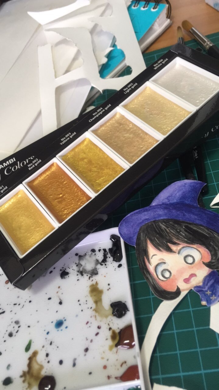
I used my gamsai tambi gold palette to decorate the clothes of the character. I chose champagne gold. The other golds may look too harsh and silver has no kick to it.
Panel 1:
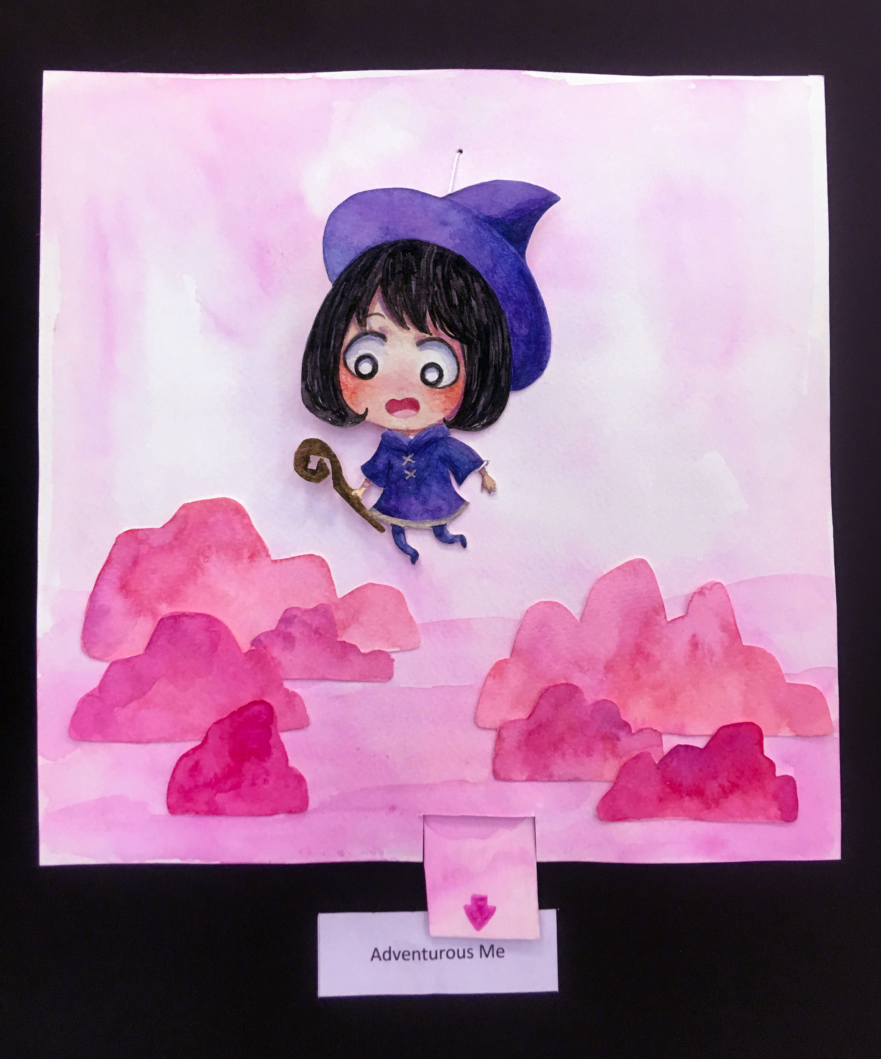
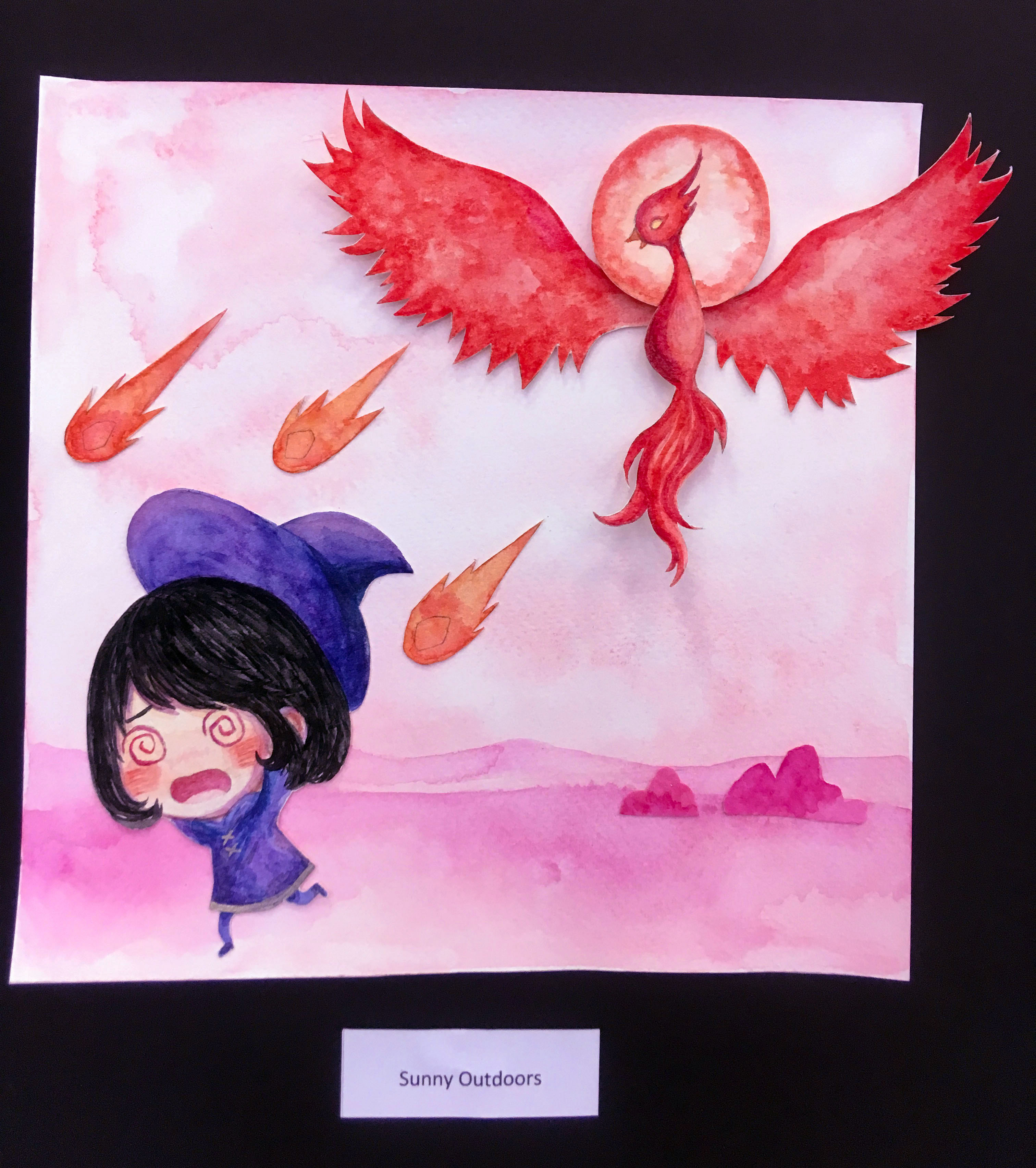
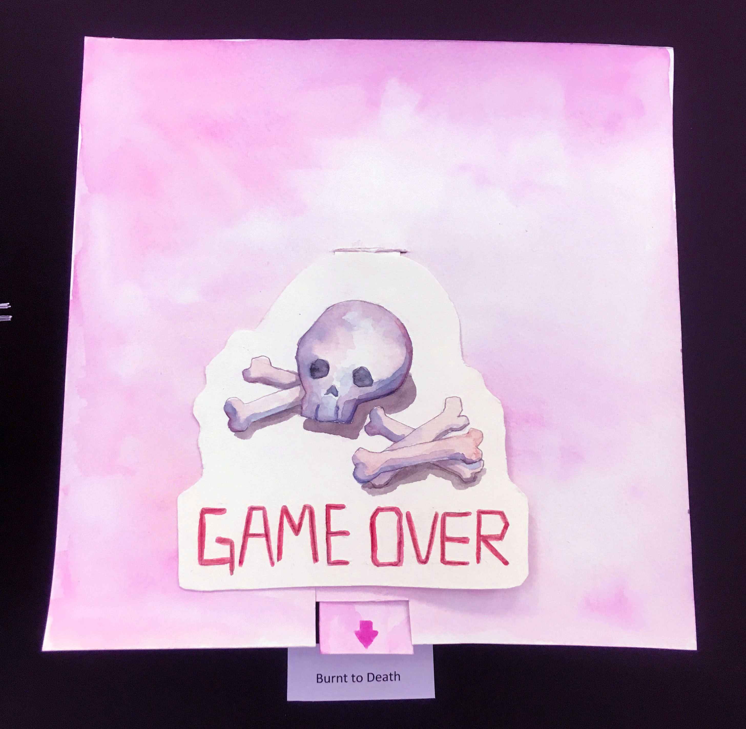
Adventurous Me + Sunny Outdoors = Burnt to Death
Colour choice: Pink, Vermilion, Scarlet Red
I wanted to use an analogous colour palette for the first panel. Thus I chose these colours.
To be honest I picked out Red and Vermilion first because this panel was about me getting burnt by the sun.
The context is that I have Eczema, and these years I am in a very unstable condition. Thus I cannot be in the sunlight. I’ll get sunburn and rashes if I get exposed to strong sunlight for too long. In the worst case scenario I will get flare up within 15-20 minutes.
Thus the SUN =DANGER to me. I chose to use scarlet red and vermilion to represent that. The phoenix represents the sun, attacking me HAHA.
It’s like how you need to fight the boss in the game at some stage. The phoenix is that one boss that ends me LOL.
I used Pentel’s reddish purple but added tones of water so it looked much lighter and brighter. Now it looks like pink. It brings out the playfulness for this panel, which is about me being adventurous. Pink is a happy colour to me and this is the first panel which is sort of like an introduction thus I decided to go with a very light wash of reddish purple, creating a pinkish look. I was careful to adjust the amount of water and strokes to influence the granulation. I didn’t want to much fringe effect to end up making the background messy. I wanted to keep it clean but still have texture.
Frames:
1st Frame: Adventurous Me
To poke holes in the background, I used my felt needle to get a clean opening. Which I threaded a white string through and attached it the pull tab. It is a pulley system to allow the character to move up and down. I didn’t stick the character onto the string directly, I had a piece of paper behind which I went around it using the string as well. This was to give it a wobbly effect. If not it would have been very rigid.
2nd Frame: Sunny Outdoors
Originally i wanted to make a tab for the phoenix so it could flap its wings. I used a brass plated paper fastener so that the wings could still move but I could not figure out how to add a tab to the frame. So it ended up not obvious the wings could move. But at the very least it added a pop up effect to the entire frame.
3rd Frame: Burnt to Death
Game over flips over to show: Try again? and a pile of ash and 3 hearts but with only 2 hearts filled. I attached a tab to the game over card. I cut a slit in the background to pull the tab over and folded it 3 times so that it will flip open if anyone pulls the tab. I think this is my favorite paper engineering technique. It is easy to do yet so interesting.
Many friends told me it was unexpected and it makes the panel more fun. Some one even commented that If I chose to “try again” I will probably just get burnt again.
Panel 2
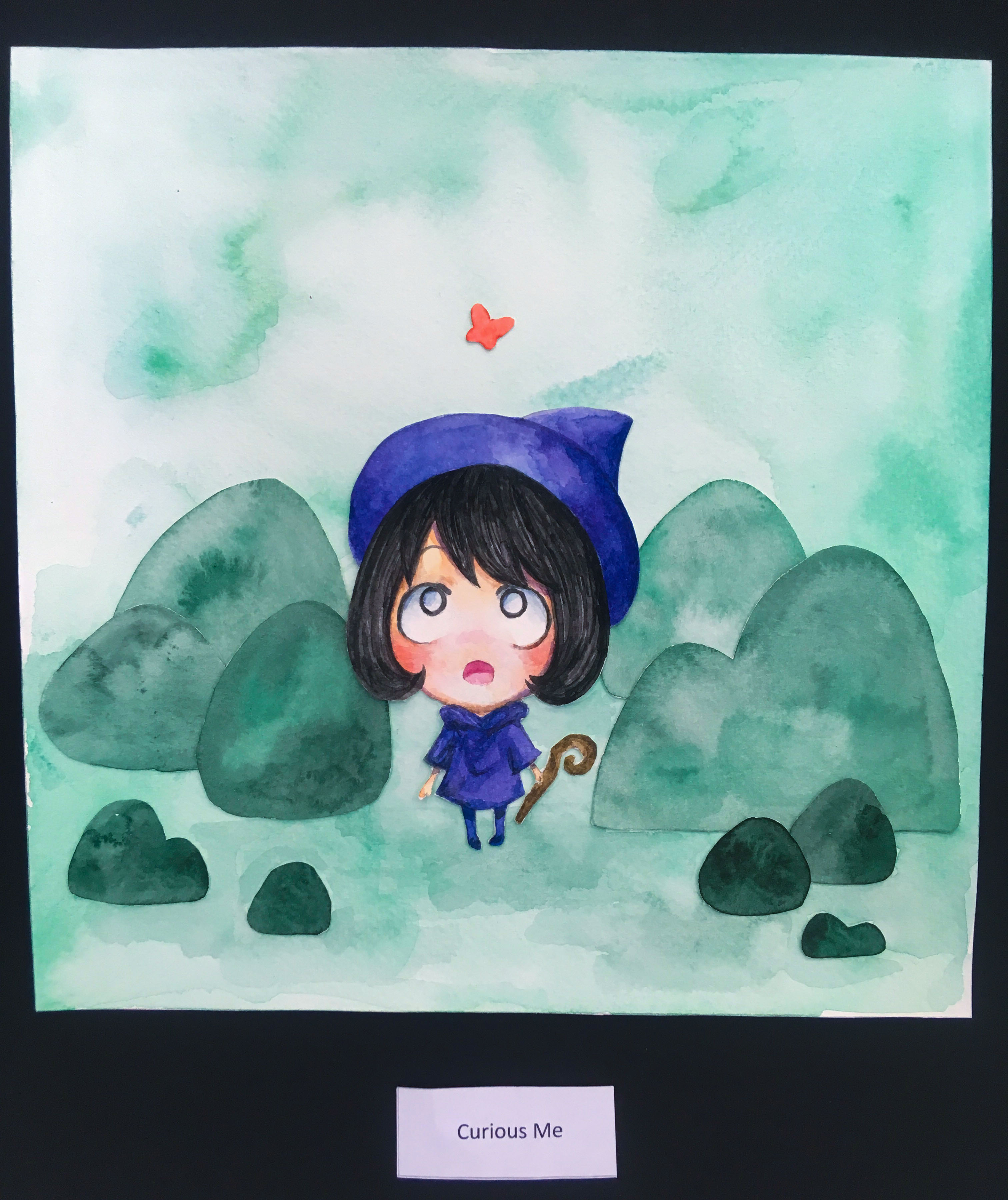
Curious Me + Sees bait = Naively falls for it
Colour choice: Dark green, Viridian, Orange, Pink
The setting here is now in the green forest which also matches what I want to convey.
Green is a colour associated with freshness, anew and growth. I am a naive person who believes in the most obvious lies. I am incredibly gullible.
I thought Hannah’s surname was Miles until one day I found out in the library while she was logging that her surname was Wong. *Facepalm* Fendi and Joel were laughing after they found out.
I also believed Joel when he told me he was mixed. He said something like half Thai or something. The afterwards he told me it was a joke.
Anyways, this is how easily I believe in people.
I used Holbein’s Shadow Green, which is one of my favorite paints to use in this panel. The granulation was incredible and it also matched the toned down violet I managed to mix out of a combination of paint. I added Pentel’s Viridian and Dark green to Shadow Green to created the muted green.
Frames:
1st Frame: Curious Me
I used Pentel’s Orange to paint the butterfly. Green and orange are complementary colours. Thus despite the butterfly being incredibly tiny, it’s presence pops. I was careful not to make the butterfly too big in case it clashes with the overall look of the frame. I was careful with the background as well. made sure the center was slightly lighter so that the butterfly will pop up as it is part of the focus.
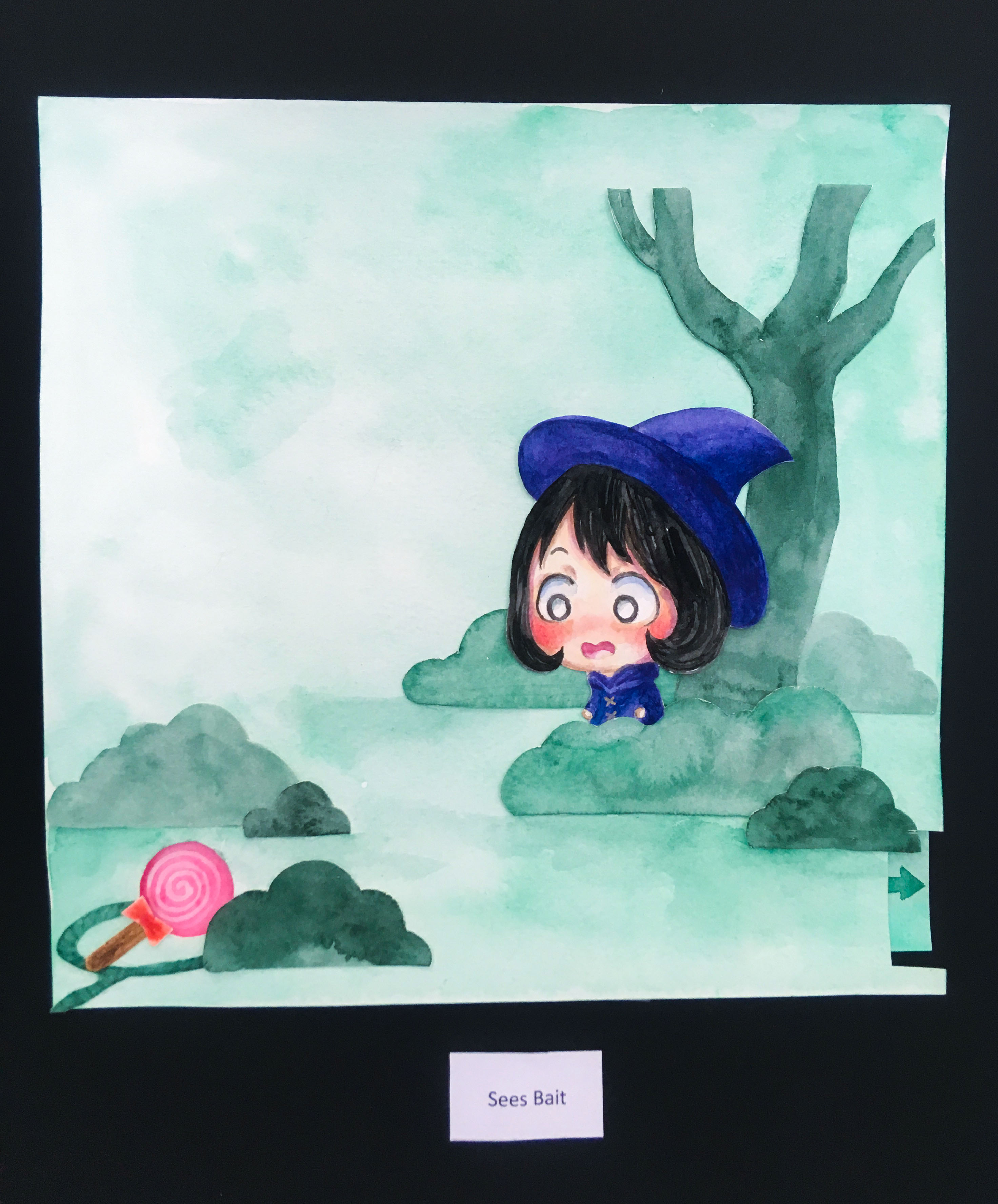
2nd Frame: Sees bait
Here, I had to establish the setting clearly. I still used the muted green I mixed out. For the lollipop I used pink. Again, to make the item pop up from the frame. There is a pull tab where pulling it will reveal that the lollipop is actually dangerous, depicted by a skull on the previously pink lollipop.
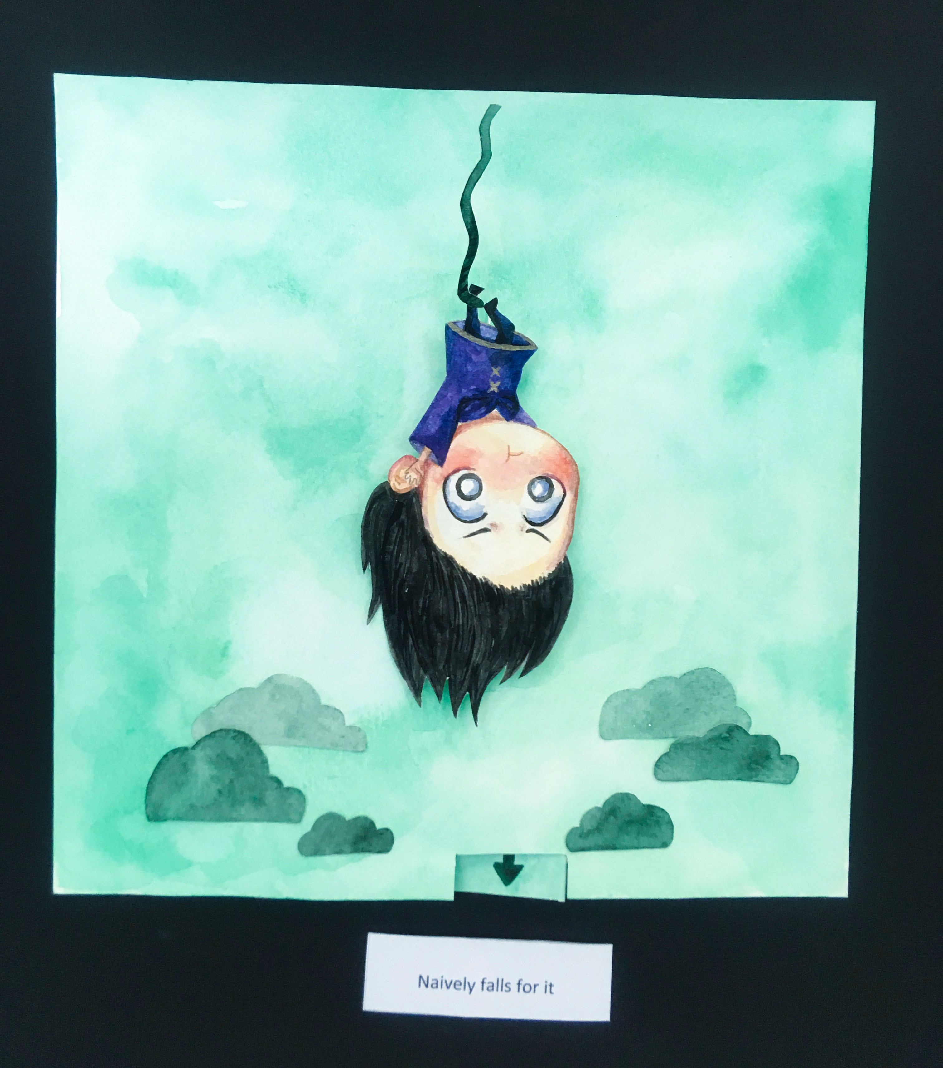
3rd Frame: Naively falls for it
Similar to Panel 1 frame 1 (Adventurous Me). I used string to create movement. I made the bushes smaller also to establish space.
Panel 3
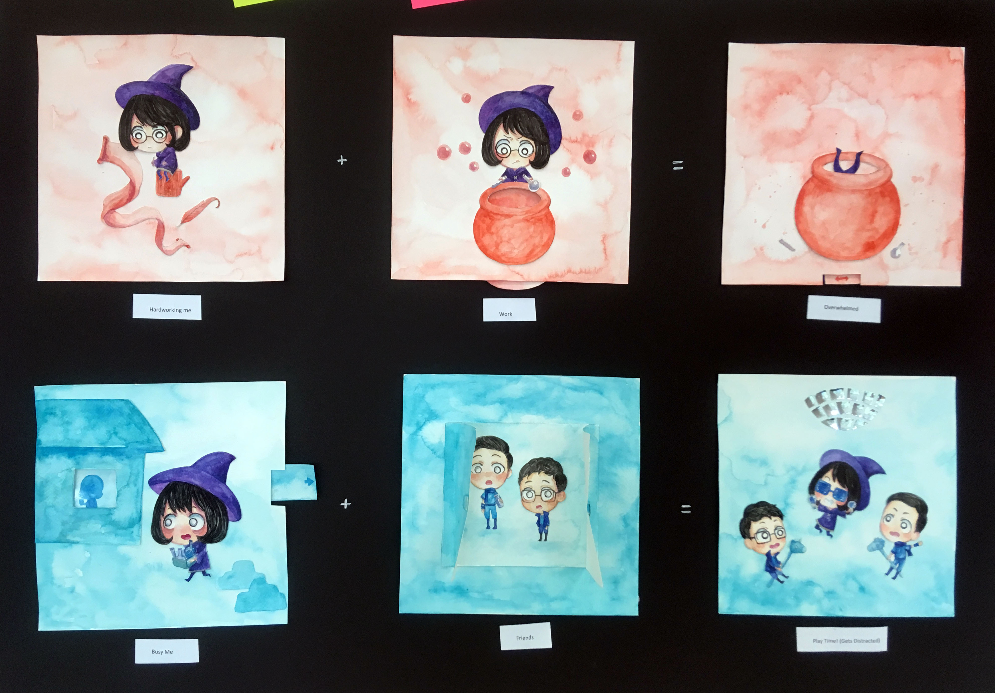
Hardworking Me + Work = Overwhelmed
Colour choice: Vermillion, Orange
Work is something intense to me, but honestly speaking I don’t really hate it I guess. It is something that I can also have fun with. Reason is simply because I try to make things enjoyable for myself. Thus I used orange which also represents energy. It is not as intense as yellow nor is it as strong as red, which is my take on work. Thus I decided to use orange. It is also to go with the purple coloured character. Orange and purple are complementary.
Frames
1st Frame: Hardworking Me
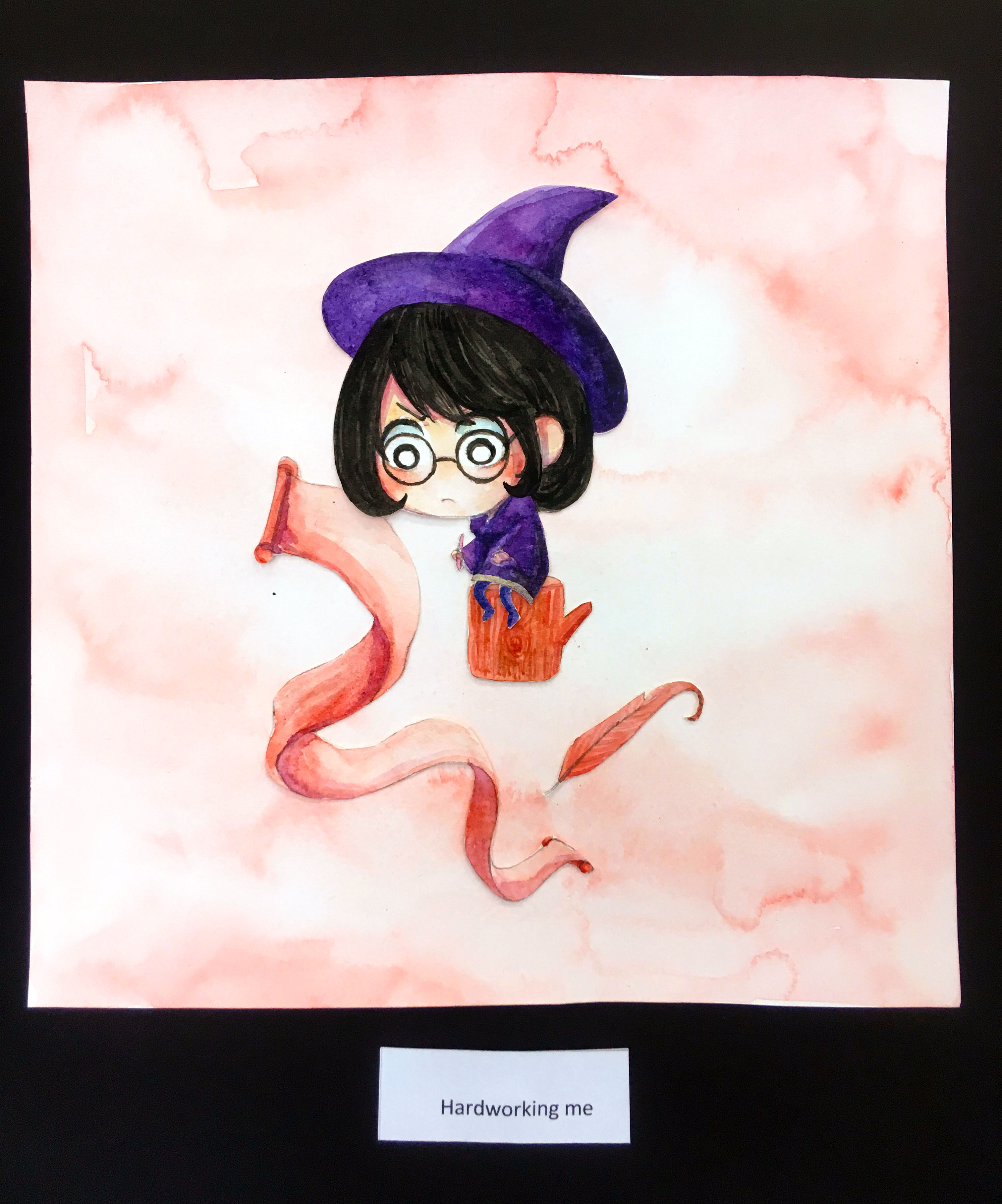
I added a bit of brown to the objects so as to mute the orange a little. It is to add a little dullness to the things as well. After all, work can be a little dull sometimes. I also used things like scroll and feather pen to show the idea of studying.
2nd Frame: Work

There is a spinning wheel which allows the colour of whatever is inside the pot to change colour as the viewer turns the wheel. It took me a few tries to get a nice shape that goes well with the frame. (The protruding part). It took me some time to figure out how I wanted to manipulate the layers too. Because I was wondering if I should or should not cut the back ground, but in the end I did. I poked a hole using my felt needle and carefully trimmed out the opening of the pot.
Precision was everything.
3rd Frame: Overwhelmed
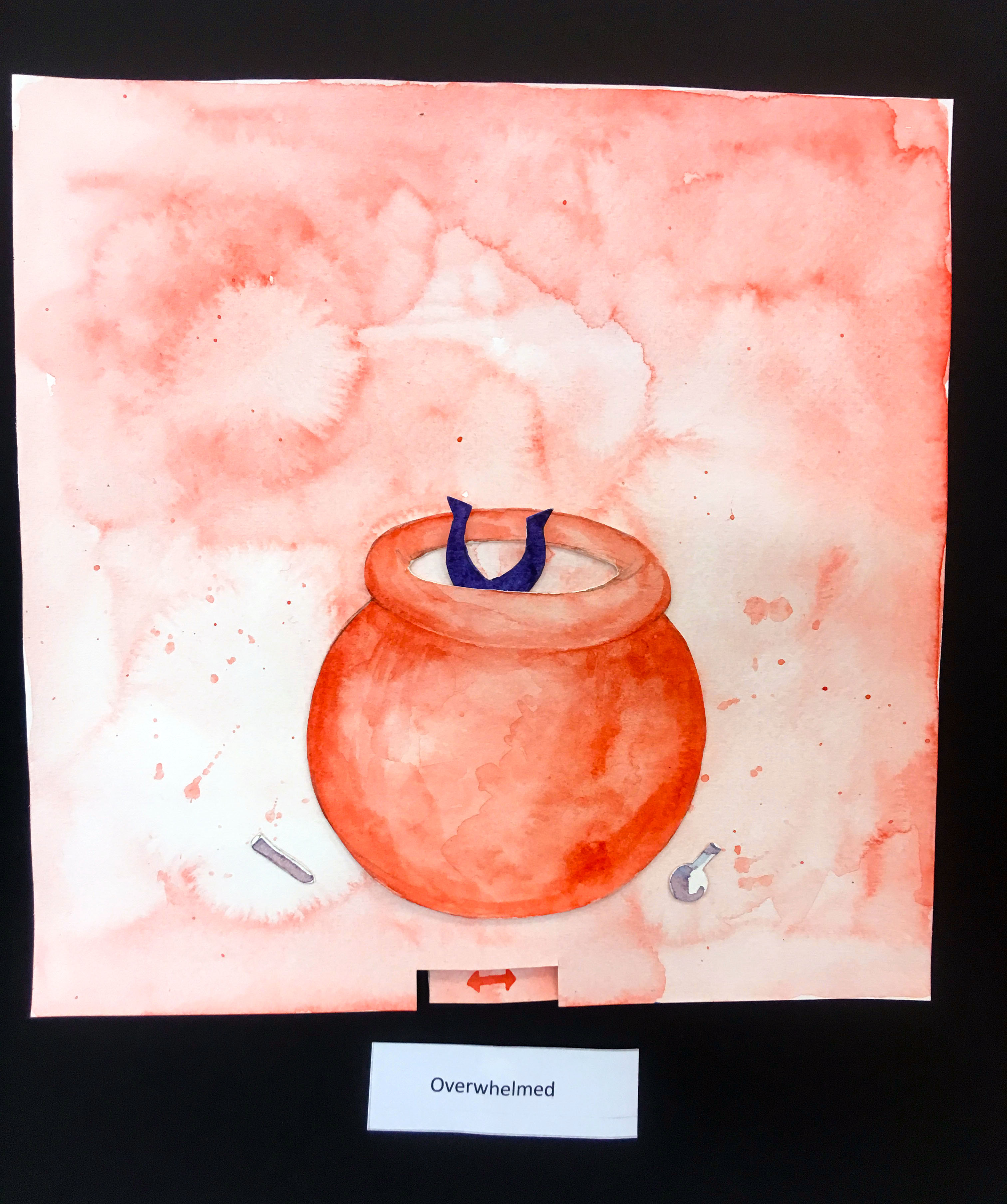
Again, I had to cut out the opening so that i can put the character inside. Me who has fallen inside the pot thanks to my carelessness or whatever. To create more texture and fringe effect, I added water and used a paint that has more granulation. I also splattered paint onto the background.It is to add in chaos and add to the messiness of the situation.
HAHA I tend to mess up things.
If this happened in real life I would not be surprised.
Nor will my friends HAHA They will probably say “Oh that’s so Hui En”. And then pull me out HAHAH.
Panel 4


Busy Me + Friends = Play Time! (Gets Distracted)
Colour choice: Turquoise, Peacock blue, Ultramarine
My favorite panel and also the panel that took the longest.
Anyway, I decided to feature my friends in my panel and it took me quite some time to get to this final idea. At first it was about treasure hunting and Joel and Fendi were portrayed as magical creatures but then I realized it wasn’t what I wanted. (It’s in my CPJ.)
Joel and Fendi are my study buddies, especially Joel. We always do work together. I look up to the 2 of them a lot. They teach me many things! I tend to be more productive when I am with them, but sometimes we end up playing and messing around. (Horsing around HAHA)
I wanted a zen and bright colour to show how I see my friends. I think they are pretty cool haha. I did not want a warm colour because it’s not how they are like. In the end I decided to use Holbein’s Turquoise to create the background. I added tonnes of water to get this blue looking background. This was exactly how I wanted it. Compared to other paints, perhaps Holbein’s Horizon blue, the diluted Turquoise does not lose its vibrancy and brightness. Basically other paints would not have created this look.
Different kinds of blue will convey a different emotion, I feel that this blue creates a mellow and gentle touch of happiness. It also gives me the feeling of comfort and trust, which is exactly how I feel when I am with my dear friends.
Frames:
1st Frame: Busy Me
The interactive tab allows a shadow to appear in the house. I cut out part of the plastic of my file and stuck it to the window. I did it just to add it the glass effect. The shadow is supposed to be Joel. Him and his milk carton HAHA. Joel always drinks milk in the morning with his oats.The house idea suggests the concept of common rooms, which is observed in role playing games. These places are where players meet.
I added some stones to establish the idea that I was outside. Initially I wanted to use bushes, but bushes in this colour just looks like clouds, so I used stones instead. The fail version is in my CPJ.
I also added eyebags to my character to add in the idea that I am suffering from lack of sleep due to work. Which is so true. BUSY BUSY. Trying not to drown in assignments.
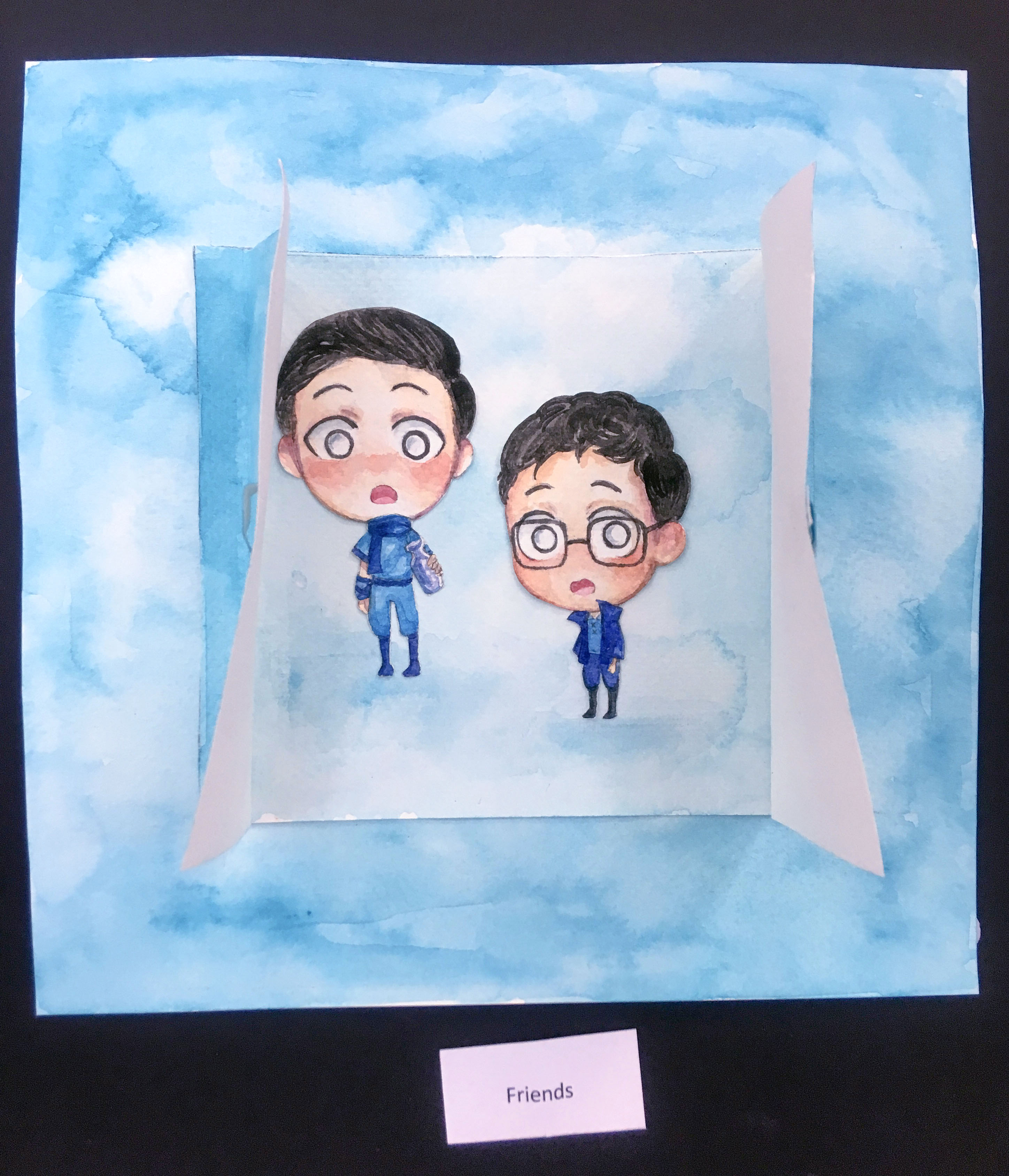
2nd Frame: Friends
I have 3 layers in total for this frame. First the background, second layer is the interior of the house and last layer is the door. I painted a lighter layer for the interior so as to make it more obvious that it is different from the background. In the photo above the door is opened, but before that the viewer has to open it.
Fran commented that she loved how Fendi and Joel appeared really shocked. HAHA.
3rd Frame: Play Time! (Gets Distracted)
The frame that took me at least 4 or 5 hours i think HAHA. First the number of figures. Three figure took me quite a long time. I painted them simultaneously but it was still taking forever. I wanted to do it well so I kept erasing when I was doing the sketch too. As for the background I had to be careful to control the water so the paint goes where I want it to, so as to create a lighter region in the center.
The disco ball took me at least 1.5 hours. It was really tedious. I failed a few times. I used my compass to draw out the circle on reflective paper. I tried 3 times until I got the perfect circle size. Then I had to cut them into pieces. Upon first try, little did I know that if i did not label I would be 100% confused and cannot piece them properly. Everything is mirrored once I turn the reflective paper since it is reflective only on one side. After I learnt my lesson from trying 2 times, I started labeling the pieces before I cut them.
Thank you friends 🙂
Couldn’t have done it without you guys hehe.
Thank you for being there for me!
Reflection:
I THOUGHT I COULDN’T MAKE IT.
I almost died making the small components for every single frame. I was so overwhelmed by all the other modules as well. I must say I was very stressed during the submission period.
I knew it would be a lot of work because I have to figure out the composition, colour and paper engineering.
But in the very end I could do it and I made it because my friends had faith in me and also encouraged me.
Thank you friends.
Thank you for pushing me to meet my limit. If it weren’t for you peeps I wouldn’t have taken this risk.
Now I have a better understanding of colours, watercolour, composition as well as pop up books.
I learned how verstatile paper was, how fragile and delicate yet flexible once you know the trick. I learned how my paint pigments interact differently, creating various hues, shades and tones. I discovered how colours symbolize different things and how it can add meaning to my work. I learned how colour allows me to show emphasis, focal point as well as depth and space.
Using traditional medium kind of limited my colour palette. Unlike digital I can’t just pick up the colour and pluck it into my painting. Instead, I need to mix slowly and experiment to obtain the colours I want. It was tricky. And to keep everything clean I decided not to use too many colours in the different settings since my character will be fully coloured, with flesh tint and etc.
Many of you commented you loved the outcome. You know what, it is because I have all of you that’s why it turned out so well.
I’m glad you enjoyed it!
This is also the first time, I truly felt proud of myself.
I really managed to boost my own non existent Ego HAHA.
But some improvements to note: expressions, and the orange panel was a bit less happening as the rest.
Anways, Thank you project EGO!
1 comment for “2D Ego: Final+Reflection”