Epilogue:
I discarded my first batch of quotes, my progress for the previous batch is here: https://oss.adm.ntu.edu.sg/lyeh0003/2d-forrest-gump-initiation-testing/
I must say I had a hard time trying to understand and break down the quotes. Not just that, It was my first time using photoshop and I felt intimidated at times.
Finals only:
https://oss.adm.ntu.edu.sg/lyeh0003/2d-forrest-gump-gallery/
Artist Reference:
BANKSY
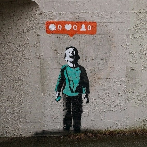
Previously I did research on artists such as Eugenia Loli and Randy Mora. Their works were unique and distinctive, however they used many elements in their artwork. For this project, I wished to challenge myself and use minimal elements to get my idea across. The decision to do this is partly thanks to my batch 1 quotes which gave me the platform to try out photoshop the first time.
Since the design should illustrate the quote in a clear cut manner, I wanted a series of clean, centralized designs which has a consistent style. Which, can be seen in Banksy’s graffiti.
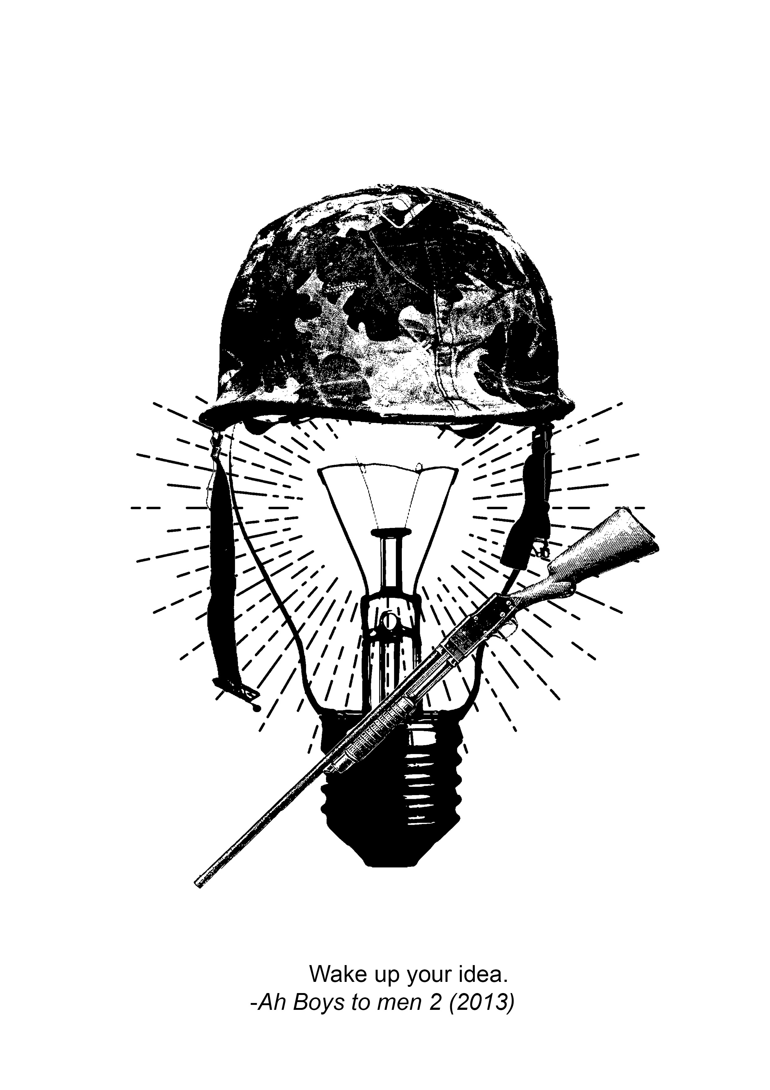
DESIGN #01

Keywords: Wake up, Idea
Related things: Clock, Time, Bed, Light bulb


These are initial ideas, and I realized that it was not very relevant to the movie. Since it was a movie about NS, I decided to contextualize it.

I thought of using those bells they use in Army or emergency bell to add in the idea of urgency. And put a little bulb getting out of bed, in a room that resembles that of the ones in the movie.
“Seriously, wake up, you are in National Service” (something like that?)
I wanted to try the idea above but I could not find any image that I wanted. Like the bed and alarm were particularly difficult to find. And i think it will be too messy because there are too many elements.

Towards the end I settled with this, but I felt that something was missing. Hence to reinforce the idea of waking up, I added rays of light radiating out from the bulb.
Before I clarified, I actually went to print it on transparency.
FINAL:

SILK SCREEN
Test Prints on paper


Test print on tote bag:
The print came out quite well. I tested it on the ADM bag (the other side).

Second test print:
Did it just in case I screw up later.
And, I actually did mess up.


There’s too much ink. The textures don’t really show.
After a few more test prints, I finally did the final print on my tote bag:


DESIGN #02
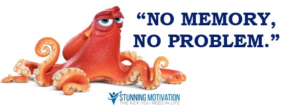
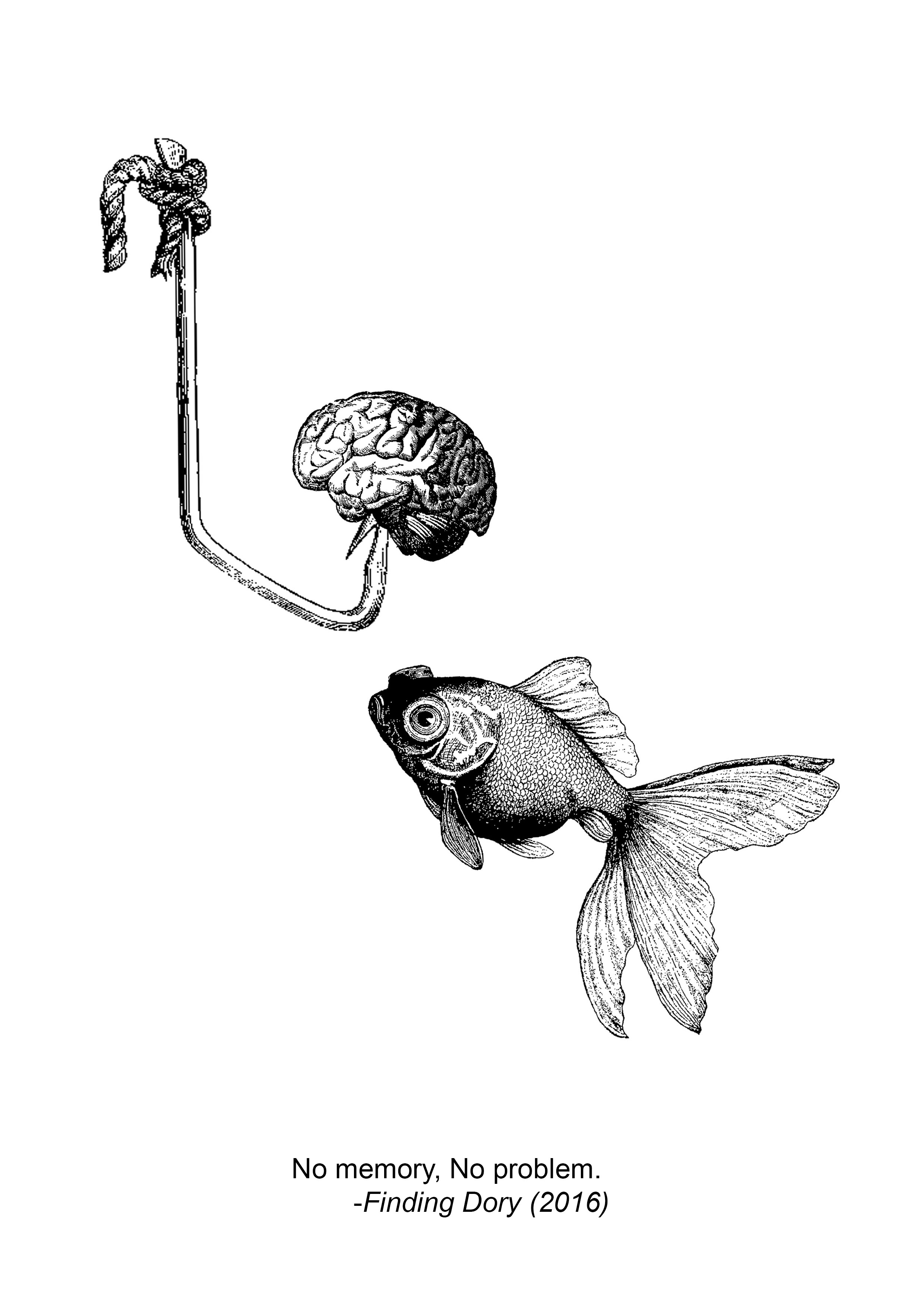
No memory, No problem. -Finding Dory
Keywords: memory, problem
Related things: Brain, goldfish, disc, thumb-drive, photos, headache, issues
Goldfish was the first thing that came into my mind when I saw the words “no memory”. Goldfishes are known to have extremely short term memories.
In addition, this movie is about Dory, a blue tang which cannot remember anything.
However, I felt that it would be easier to express the quote without contextualizing.
First Try:


Trying out different positions for the hook. liked how it turned out but I want to explore a bit more.
In this composition the goldfish goes towards the hook. As viewers we know it is dangerous and what it meant if the goldfish bites it. The point here is that, the goldfish never learns its lesson nor will it ever because of its 30 seconds memory. The brain is on the hook, representing the bait. However it can also mean that the goldfish eats its own brain, meaning that it probably will never have a brain that can help it remember.
Does it make sense?
Try again:

The idea of memories reminded me of film strips so I decided to use it in the composition. The goldfish looks out of place for some reasons.
Approaching it in another way:

I realized a glass of juice is not that representative.


This is very indirect as compared to the previous ones. I placed cassettes inside the juice blender. Cassettes represent records or collections of memories. The fact that they are in a blender meant that they will be destroyed, suggesting the loss of memories. The wine which represents festivals or celebration on the left relates to happiness and relaxation, which links back to “No problem”
Here I tried to ensure the different elements have a common style so I switched around the wine glass with different images. If not it’d be looking awkward next to the blender. (At least that’s what I thought)
Final Decision:

In the end I went back to this design. I liked both the blender and the goldfish but my friends commented that the goldfish made more sense. I agree too. Thus I decided to use this in the end.
DESIGN #03

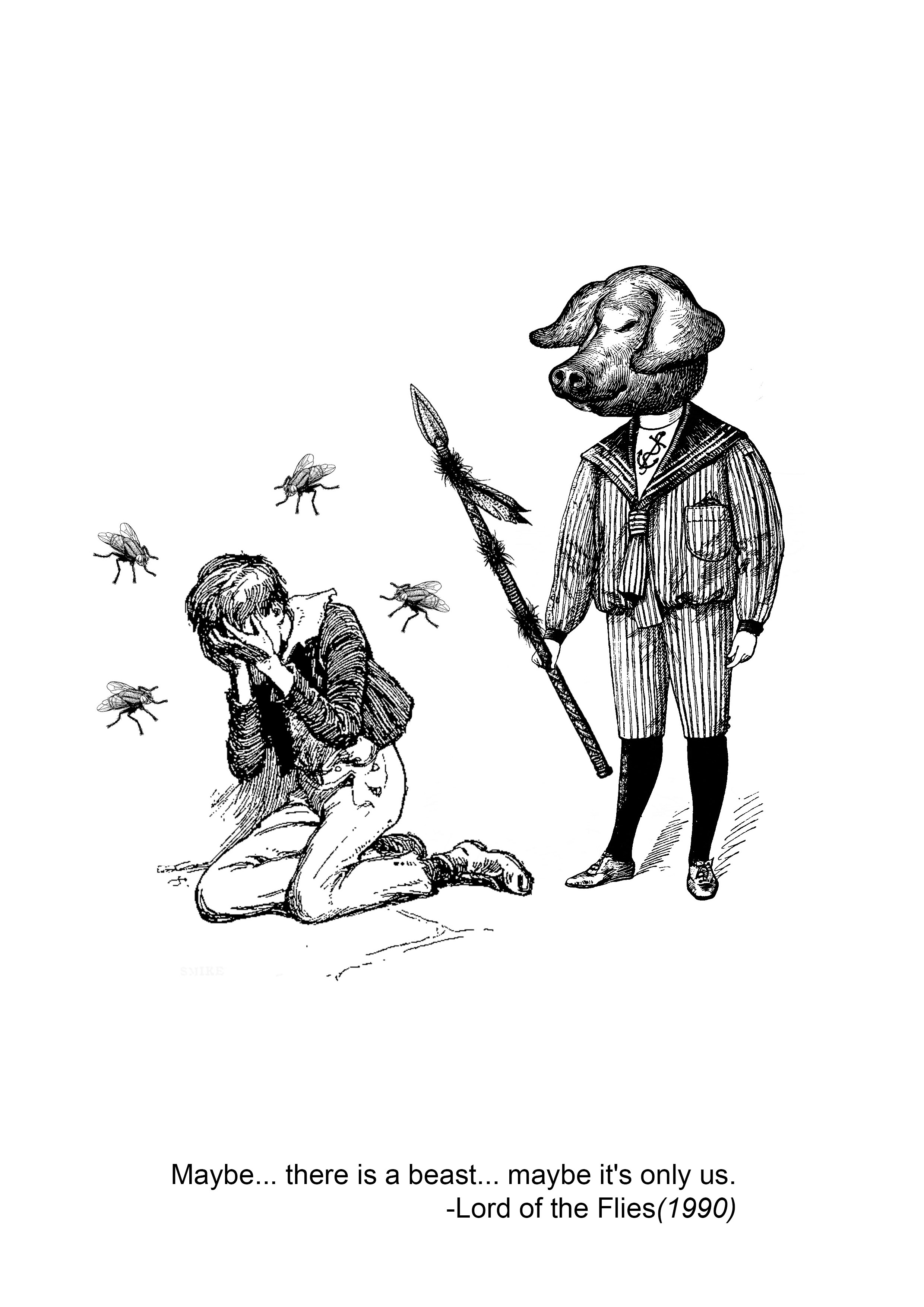
Maybe… there is a beast… maybe it’s only us. -Lord of the Flies
You have no idea how much I loved this masterpiece. It was my literature text in secondary school. After reading the book I went to watch the film. Lord of the Flies explores the conflict within humanity. The conflict of good and evil within humanity. From my perspective, I believe William Golding has a pessimistic attitude to this. In fact, I think he believes that evil would triumph good.
For some reason cat and mouse crossed my mind.
I came up with this:

But I realised that this has no relation to the movie or what so ever so I stopped immediately. I should use symbols in the movie.
Trying again:
In the movie there were a number of boys involved so I tried using an image with a few children. In the movie itself they were talking about the prescence of a “beast”. They were discussing whether it “comes out from the water” or whether it was “on top of the mountain”. Hence, I looked for an image of a sea monster.

Again: NOPE. I wanted to use several children since there were a bunch of them in the movie. To be honest I wanted their shadow to show a monster but when I was half way doing it I realized that I am still not showing the symbols in the movie.
I went to recall my literature knowledge.
Some things that are representative are:
- Spear
- Pig head
- Fly
- Conch
In context, this quote brings out the ugly side of humanity. It was said by Simon after he realizes that all the drama on the island could just be caused by their fear.

In the movie, certain scenes carry a strong message from William Golding.
In particular it is the last few scenes where chaos broke out that best demonstrates the main idea. So, here I tried to depict the last scene where Ralph, a character who represented democracy in the movie, was almost killed by his “friends” who became savages after siding with Jack, the antagonist. However, I found it a bit hard to relate to the quote.
People who do not know the book or movie probably will go “???”
Try again!


I went to change the angle of the spear. Me and my OCD. For some reasons, it’s not obvious even when I compare it like this. So why did I change it again…?

So now the question is, should I use the pig head or the fly head.
Or should I show that particular scene of “pig’s head on a stick” and add flies to surround the pig head instead.
Then I can incoporate both.
Anyways I went to try:


I went to consult my friends, in the end I went to re-position the flies. It made more sense to surround the boy with flies instead.
My dear classmates commented that the flies are too rigid. As in, flies usually do not fly in rows or in columns. They fly randomly and annoy people. Hence I changed up the positions. I made it less rigid but at the same time I tried to keep it organised. I did not want the flies to mess up the composition.
Final Decision:

DESIGN #04
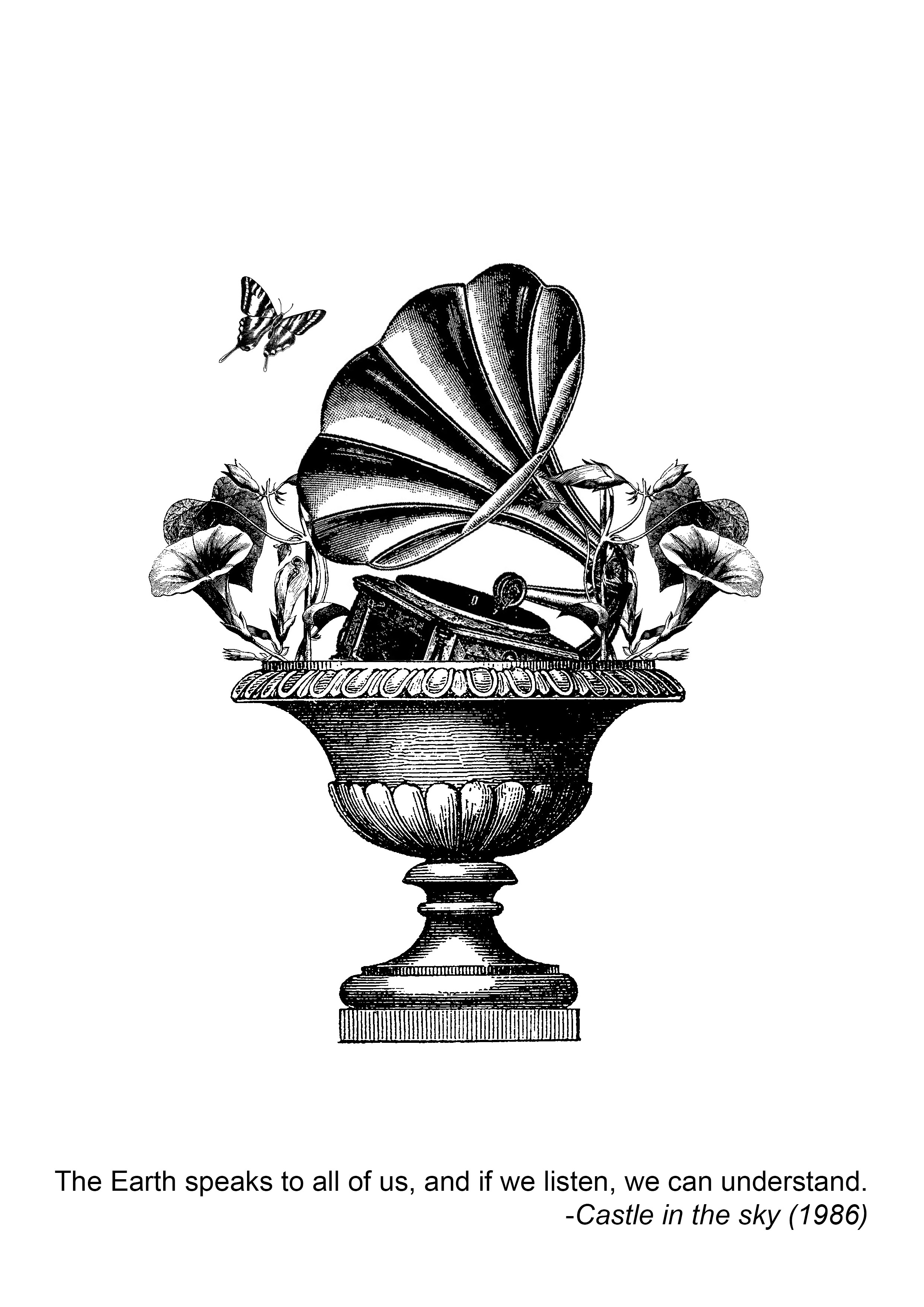
The Earth speaks to all of us, and if we listen, we can understand. -Castle in the sky
Keywords: Earth, speaks, listen, understand
I wanted to use lips at first to show the idea of speaking, but while i was looking through photos on google, it struck me that i should use paper cups. I still remember myself playing with string cups at home with my siblings. The reason why I chose this is because Castle in the Sky gives me a calmness. The way they depicted earth was very gentle and soft. The image I get from the quote was Earth whispering.
The word “understand” gives me an impression of a connection. The listener has to connect with the speaker to really understand what the speaker wants to say. Personally, I believe that if one does not try to connect emotionally, one will not truly understand what the other person is trying to convey. The listener must be engaged both physically and mentally. Therefore I choose to use to use a heart beat to represent the string.Before that I also considered using telephone wire but i felt that it was a bit too literal.
First Try:

The composition is a mess. I played around with Photoshop, converting real life photos into things i wanted. The style was not exactly what I was looking for. A senior commented that i should do something centralized instead. I also felt that it was not exactly relevant to the movie. It’s a bit random.
The movie is about castles after all, I really think I should include a floating island or a floating piece of land, then there are string cups coming out from the tree.
I’m kind of lost so I decided to play around:

What have I done to earth… it looks hideous…

The idea of speaks reminded me of a mic so I tried making use of the idea. Sadly It wasn’t exactly what I want, so i just played around and stopped afterwards.
Being desperate, I placed things that I thought were relevant together. But they just look like a mess:


The idea of “speak” reminded me of feather pens since they are used in letters. I got reminded of the word “message”, which led me to find images of pigeons.
Again, these are just part of my learning progress. I think I was still very lost.
After a while of struggling, I came up with this:


I used the gramophone and attached it to a tree. But it looks like the person is talking to the tree instead. I guess it’s confusing.
Trying again:


I wanted to make use of the gramophone as it carries the idea of music. In the movie, whenever elements of nature was involved, there was always this background music that plays. Another thing is that, music is a form of communication. Regardless one’s race, religion and background, music can bond and bring people together. Thus I wanted to make use of gramophone.
The gramophone also reminds me of morning glory, which is a type of flower. It represents elements of nature to me.
Final:
Reflection:
I realize that I could have made use of depth more. And the other thing I forgot to do.
FRAMING.
I could have made my prints into a set of poker cards like Randy Mora’s work. Which will tie in all my designs nicely since they are all centralized. This will also emphasize on the fact that they are one set of work. I liked her poker card series a lot. Yet I did not remember to make use of it. I am a terrible fan.
DAMN. Why is it that I only realized things after its over.
Anyways, I learned many things from this project. Photoshop itself was a big challenge. I’m lucky and thankful to have supportive classmates who helped me along the way. Without their help, I would have suffered even more during this project. I must say technical skills are my weakness, I should work on it. I am thankful for this opportunity to use photoshop and at the very least I got to overcome my fear to try something new.
I had a hard time but it was definitely worth it.
Another thing, I should have had more consultation with Ms Mimi. Partly its my own fault because every single time I will come up with something else and mess up whatever i did before. Or, I have some random thought and I forget about consulting because I want to try it out.
I really need to reflect on myself and ensure I’m on the right track.

Lastly, Thank you for the comments!