“I made a different kind of mistake in this project.”
A Story
I’m using my own characters and making stories out of them…
Story Title: Something Fishy
This is a short story I wrote myself. I decided to make use of it since I always imagined how I would illustrate the entire story or even animate it.
“Like an eel waiting for its prey, I laid there wide awake.”
Genre: Science Fiction, Fantasy
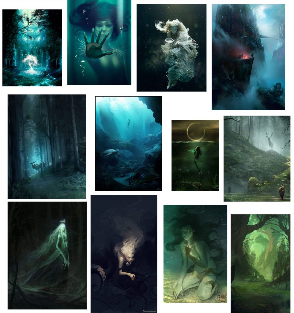
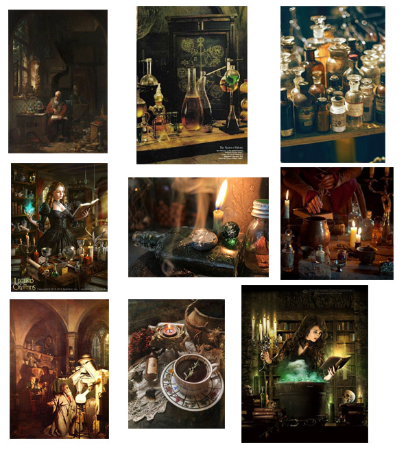
Moodboard:
Very different moods here…
I’m thinking of using a black background to create a mysterious mood.
I am going with a cool palette because the story is about fish and i want to bring out the atmosphere and environment.
Compositions:
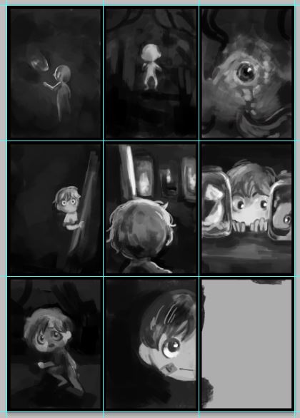

AGHH CANT DECIDE.
I went to draw out both of them on grey scale here.
I liked the close up composition but the 1st composition looked slightly more effective and mysterious.
So I went with it…
although I secretly wanted to do the close up.

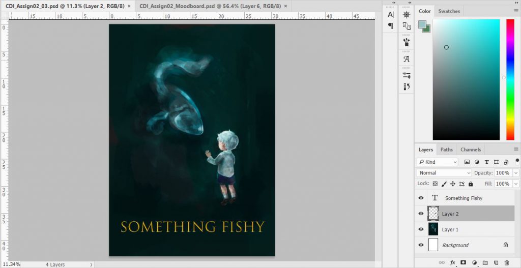

I threw in the words just to see how it looks but I don’t like it. By right I should fix that ugly font but I realised I did not like the image itself.
Is it the side effect from art block…
It looks like a rip off from The Shape of Water.

I DIDN’T EVEN REFERENCE IT??
WHY.
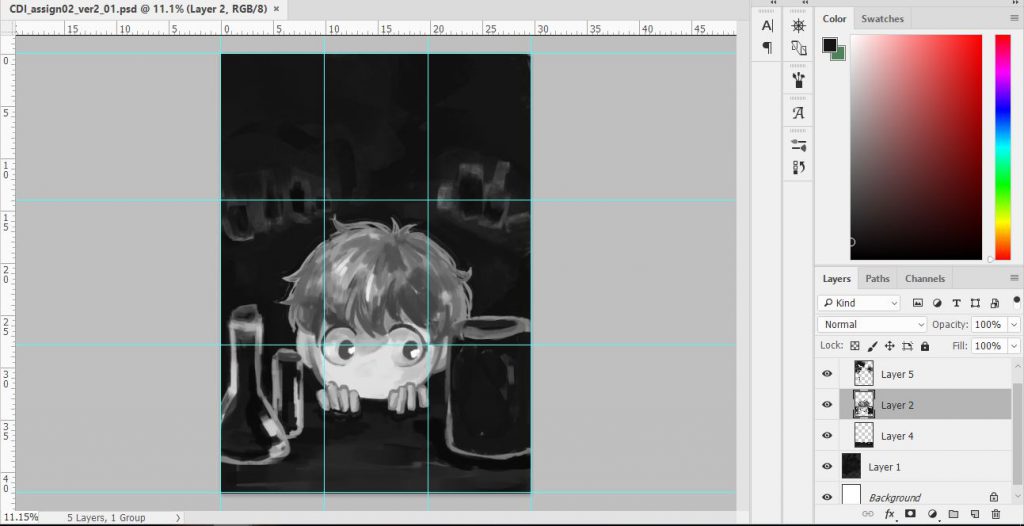
I AM NOT HAPPY WITH THIS.
WHY DIDN’T I FOLLOW MY HEART AND DO THE CLOSE UP.
![]()
After sulking for hours I decided to pick myself back up and execute the 6th composition.
At least I learned what happens when you don’t test out the colour palette. The irony is that I was listening to a tutorial on choice of colour… and the person talked about planning…
Colour keys

I asked a number of people for opinions, most of them responded: Depends on the mood you want to create.
So eventually, I decided to combine the last row: 4,5,6
Anyway, there can’t be only one hue in any object I paint in my poster.
Process
I cannot typography.
HALP.
It took me a while to figure out what works.
I realized that different word fonts can also contrast to help tell the story.
A friend of mine said the other fish was going to waste and I should use it to create texture so I tried making use of it.
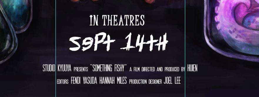
To put or not to put…(fake credits)
In the end I figured it looks better without since I have quite a number of things on my poster.
Even though I really wanted my friends’ names on my poster I decided to take it down.
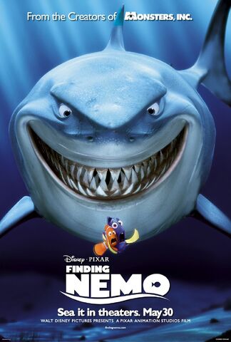
I kind of referenced the Nemo Poster format.
Final
IT IS DONE!
I really liked how it turned out YAYYY.
LE CAMPAIGN
Will you watch it?
Please say yes…
POSTER DOMINATION
I’ll place it at bus stops, mrt stations and where ever thats obvious.
LOL
Reflection:
“You will fail more than you succeed, but it is what you signed up for.”
Quote by one of my fave painters.
I’m still learning how to react positively to mistakes. If I had simply accepted the 1st design I would not have produced something like the final movie poster.
The 1st design was flat and looked like a copy of something else, I executed but realized it only later on. It is not a bad thing, really. After I re-considered it, If I never made this mistake, I would not have learned the importance of colour keys and pre-production preparation.
I need to stop underestimating prep work…
Anyways, I got to explore digital painting further. I am still very new to this medium but I think I’m starting to get used to it.




1 comment for “Digital Imaging_Movie Poster: Process+Final”