Project 1: Curating Self
I swear I was on the edge after I saw the brief.
I guess I’m going to be forced out of my comfort zone entirely.
How do you photography

Self is something that is familiar yet so uncertain.
I know who I am but yet there are many questions that I can’t answer when I try to ask myself.
This project is going to be a challenge.
But I shall challenge myself. (forced to)
Based on the brief, the 3 big things I need have to make use of:
- Framing and cropping
- Subject distance
- Vantage point or Angle
The main deal of this assignment was composition.
However, In class my teacher Ruyi also taught us about the role of visual elements. Things like the colour scheme, tone etc can also influence the mood of the image or film.
Therefore I would like to make use of both composition and visual components to enhance my final work.
Feeling insecure, I did some research on the internet about composition:
-Rule of Thirds
Position elements of interest along the dividing lines
(* image is divided into 9 equal segments by 2 vertical and 2 horizontal lines)
Adds balance and interest
-Balancing Elements
Placing main subject off-centre
but it can leave a void in the scene which can make it feel empty
-Leading Lines
guides the eye
which I tried playing around with
-Symmetry and Patterns
Adds harmony and balance
It’s just OCD to me, lol
-Viewpoint
perspective
-Foreground Interest and Depth
Makes image less flat
-Diagonals and Triangles
Interesting composition makes image more appealing
-Rule of Odds
The rule suggests that an image is more visually appealing if there are an odd number of subjects.
The theory proposes that an even number of elements in a scene is distracting as the viewer is not sure which one to focus his or her attention on.
An odd number of elements is seen as more natural and easier on the eye.
-Rule of Space
The rule of space relates to the direction the subject(s) in the photo is facing or moving towards.
Leads the eye
-Juxtaposition
The inclusion of two or more elements in a scene that can either contrast with each other or compliment each other
Task 1
Being entirely inexperienced with photography, I went to experiment with composition/position during the first shooting (which was fruitful)
The decision to take the photos in ADM is because i emphasize its outdoors, external and also highlight that I am now in a new environment which adds to my emotions/ feelings about myself.
( I can’t caption them if I want them aligned for some reasons )
Standing on the right of the staircase vs Standing on the left of the staircase
The position where I stood at affected the harmony of the photo.
In the one of the left (#1), I stood at the vanishing point, where the staircase leads up to. It created a sense of harmony as The staircase and the handrail leads the eye to the subject, which is me and the umbrella. In comparison, the photo on the right (#2) depicted some what a disrupted feeling. However, because of the fact that the position of the camera shifted, it’s not exactly a fair comparison.
But I personally felt that standing at the vanishing point would be a better choice as it can draw the viewer’s attention to the subject.
The Position of the Camera
The position of the camera affects the composition in a way as well.#1 is right in the middle of the staircase while #2, it was positioned more on the left. Personally, i felt that the presence of the handrail gave more “character” to the image. It was less flat compared to #1.
This reminded me the importance of props. Task 1 is pretty much tied to the usage of props.
I wanted to try adding motion to the photo and compare how its tone/atmosphere was different from standing still.
I guess it really depends on what the concept I want to show.
If i wanted to emphasize on emotions like loneliness i think standing still would be a better choice as the lack of movement adds a sense of silence to the photo. More like, the idea of solitude. Movement disrupts the stillness in the photo and breaks that harmony. Another thing is that movement seems to suggest that there is something the subject is going forward to or trying to reach. While standing still gives off a vibe as if one has given up. It adds a hint of helplessness to the photo.
Tiny details add to create the mood of the image.
Looks like stop motion haha
I tried to play around with position and motion once again.
#1 has its harmony disrupted. Again I was away from the vanishing point here. More like, I was away from the point the buildings were converging to.
(OCD)
#2 seemed less disrupted since I was right at the point. ( Blocked out the converging point)
#3 The lack of motion adds a hint of sorrow and hopeless to the image.
I tried indirectly showing the subject by also adding in the reflection.
An attempt to play around with composition again:
On the day of the 1st photo shoot I ended up with 100+ photos… and that was only for Task 1 (?!)
Photography is something new to me, I guess I really need to experiment and play around with the camera.
I will keep trying until I get it!!

Credits and Mention: Zhen Qi and Jocelyn for helping me out!!
Task 2
Once I saw the brief for My World, a few locations quickly emerged in my mind. Places like the library, where I frequently visited, in the pursue of knowledge. Also stores and cafes I liked to spend my days in.
After thinking about the different locations I liked visiting, there was a place that was close to my heart.
The Kitchen.

(The kitchen did not look so classy before the renovation)
However, it was only after the successful renovation that I started to frequent this place and eventually it became part of my universe.
It’s a place that makes me feel small every single time I enter it.
It’s a place where my mother prepares meals for my family and also a place where my siblings and I experiment.
It’s my mom’s studio, at the same time it was our playground.
We like to bake and play around with food ingredients.
—
I pondered for quite a while, about how I should capture the different parts of the kitchen.
The kitchen isn’t exactly very big yet it has so many things. Many things happened here as well.
Each and every item here had a story to tell.
I wandered around the place and tried to take photos from various angles.
As I thought about the task, I wandered around and tried to take photos from various angles.
This photo shoot taught me the importance of props and layout. In addition, the use of vantage point.
The fact that I positioned the camera at a lower angle, made the pots look huge, creating this overwhelming look. It is to show my emotions of amusement as well as how I feel about them. They are like aliens to me, I feel really small when I look at all these things.
Another difference was the cropping. On the left the photo is horizontal, however on the right the photo is vertical. It adds to the overwhelming feeling. The vertical crop kind of “stretches” the items.
What i wanted to convey through my photos was how the kitchen was a place that amuses me. I feel like an infant every time I walk into the kitchen.
My siblings and I are all interested in cooking.
Cooking is like magic, turning ingredients into something else. In fact my younger brother was trying to improve on his muffin recipe recently. He was baking with my mother. (sadly no muffins survived for me to take photos)
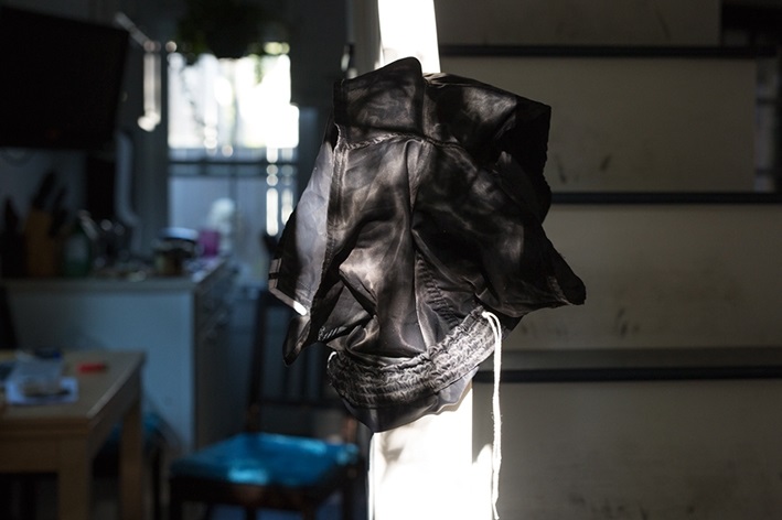
I really liked how Wolfgang Tillmans could capture wonderful still life. Usually when he has a subject to be the focus, he blurs the background or whatever that is less important.
For example in his works like Shorts on Banister (2016), Lighter Drop (2009)

The use of lighting here also brings the subject into life. I really liked how he played with the contrast to bring out the focus.

I particularly liked his Lighter Drop. There was a sense of serenity and calmness. Perhaps it is because of the colour scheme and the fact that there was light coming in from the background.
Here’s my attempt in placing something in the foreground to distract the viewer and to show that many things are going on here in the kitchen.
Honestly, I think my photography skills are non-existent.
My 2nd attempt, just to test things out.
At first when i snapped this I felt it was okay. However, when I wanted to edit it, I realised how bad/ unsuitable it was. The things are in disarray to show what happens in daily life, yet I felt that this photo was a big no no. The layout is very messy. Although the whole idea is to show the many things going on here or many hidden stories in the kitchen, this shot made it seem chaotic because of the cluttered arrangement. That was not what I intended. I wanted a shot that has many things but also a touch of order.
Trying again:
I added a warm tone so as to bring out my feelings about this place.
Which are amusement, excitement and delight.
Next time I should really borrow the DSLR from school to do it!!!
I used iPhone camera this time but I cannot wait to get my hands on a DSLR!!
Some sources:
https://petapixel.com/2016/09/14/20-composition-techniques-will-improve-photos/
http://www.photographymad.com/pages/view/10-top-photography-composition-rules


 #2
#2 


 and after editing:

 then cropped it, edited it:
1 comment for “4D Project 1: Thoughts and Process”