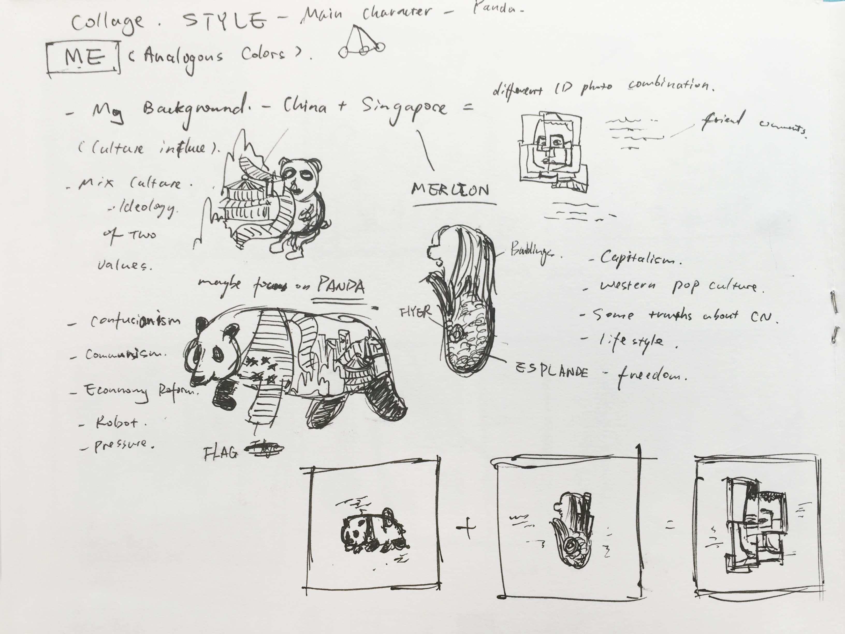
For Ego project, I decided to pursue the style of digital images college. Each single element in the compositions is carefully selected and has its meaning and symbolism. And in each composition, maximal 3 colors will be applied to portray the atmosphere and mood.
Reference
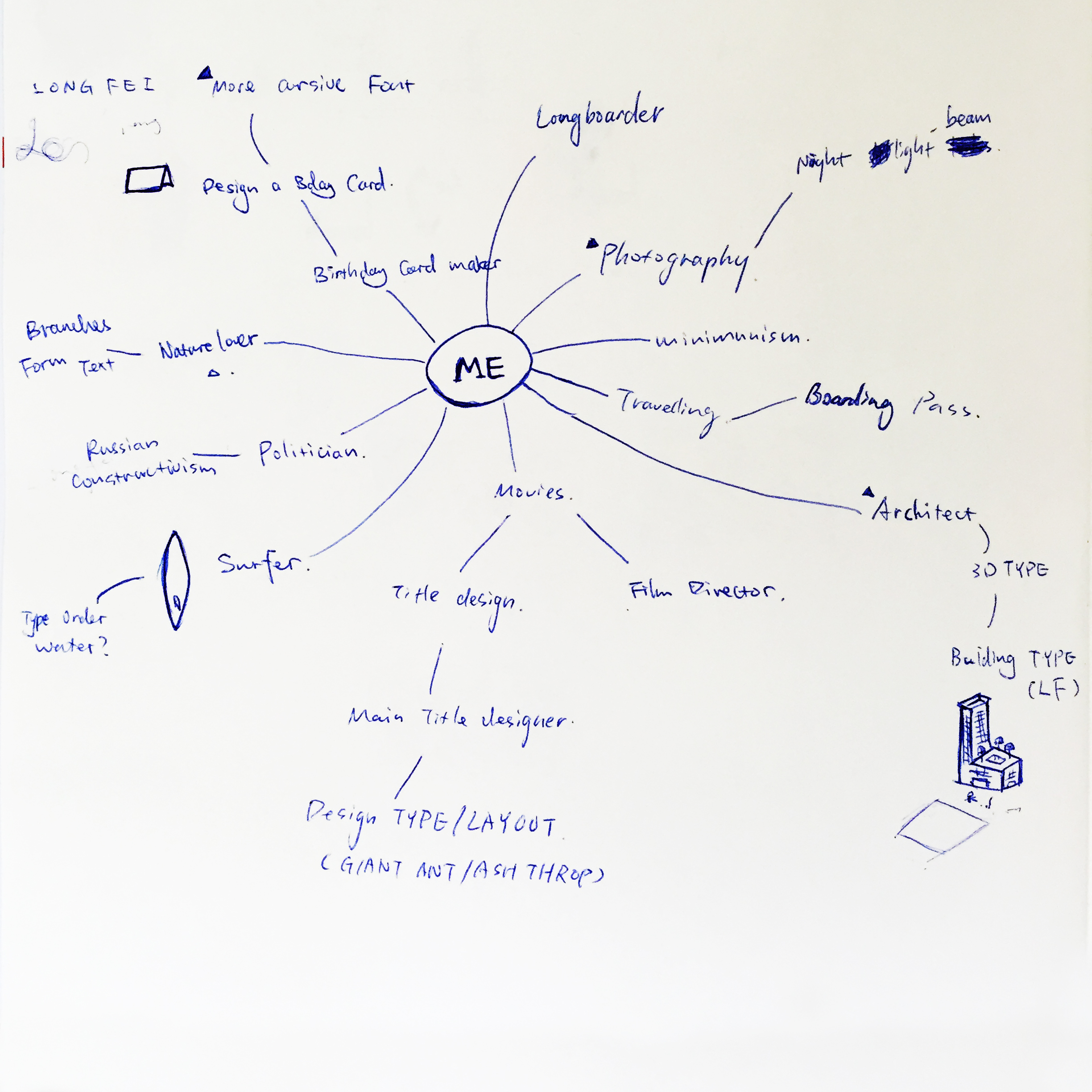
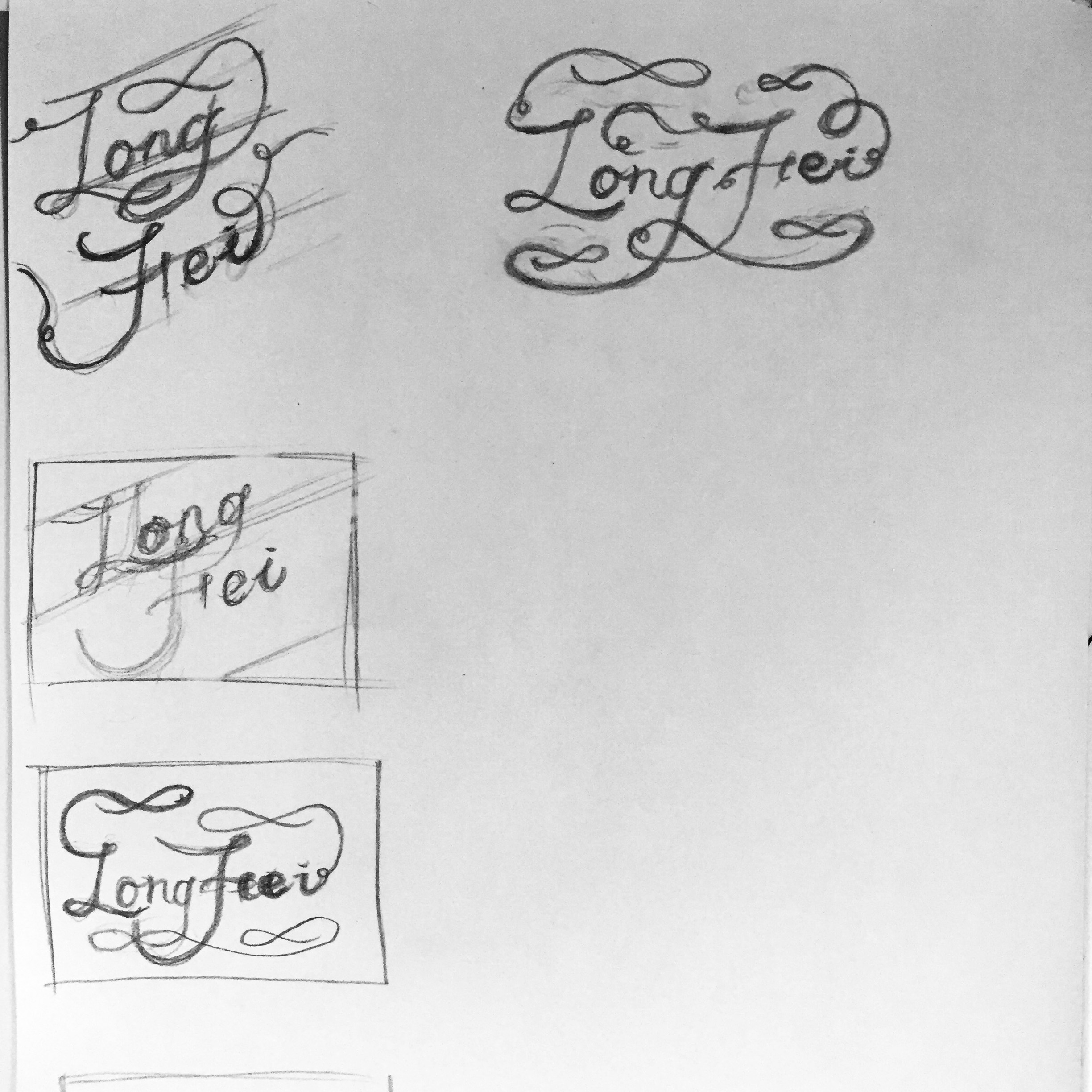
Concept Development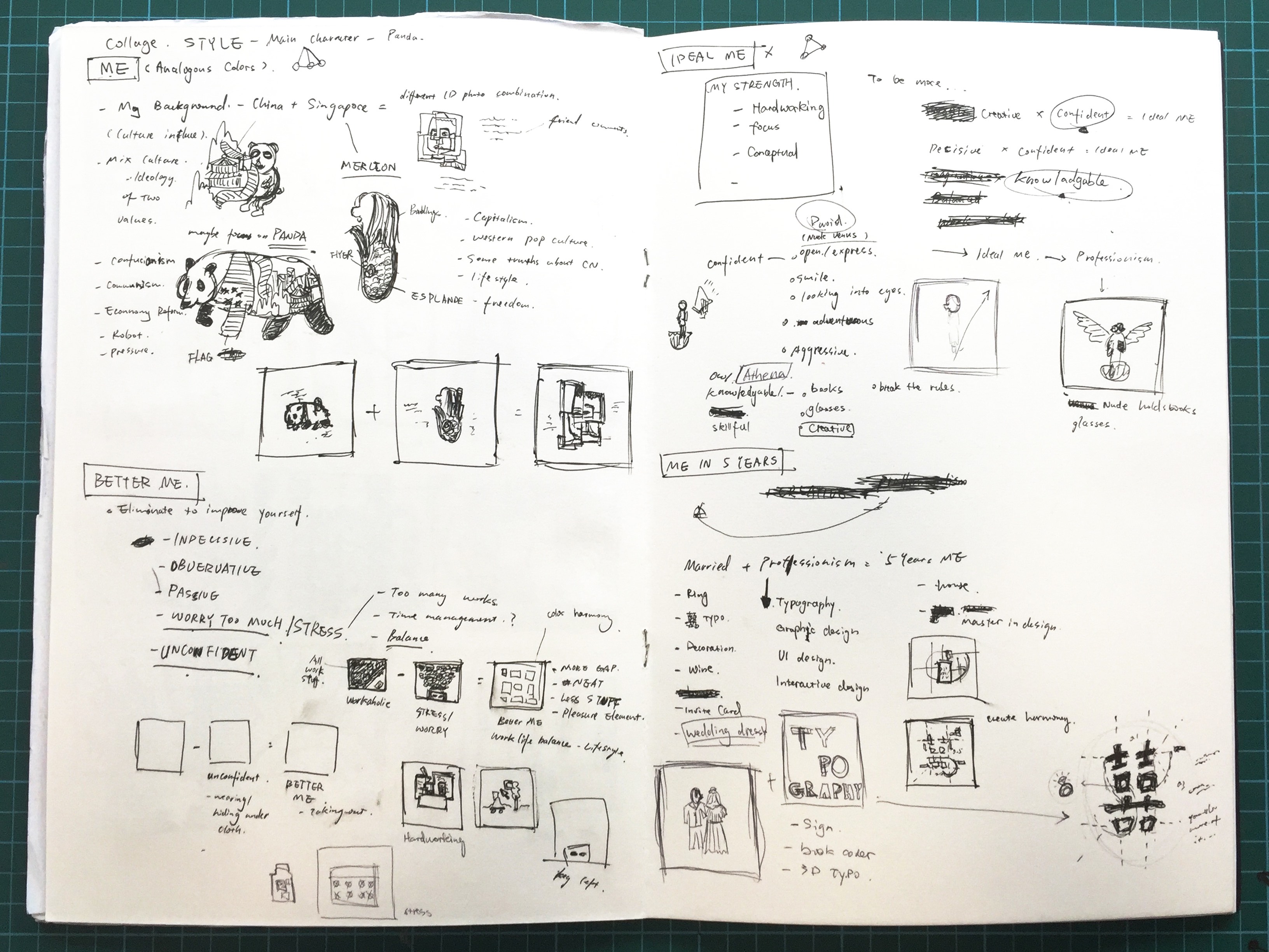
Test print in small scale
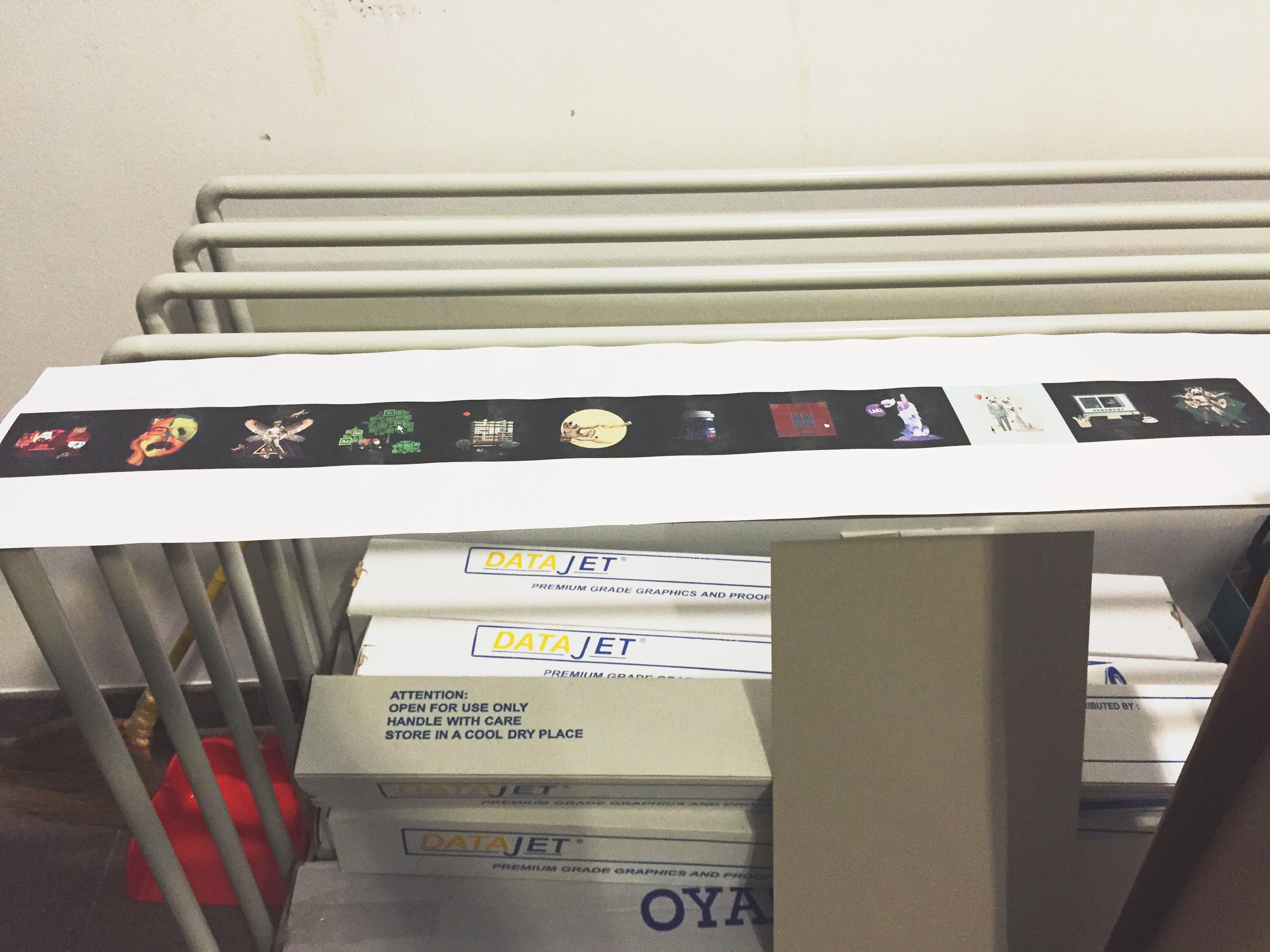
Final print in a0 size
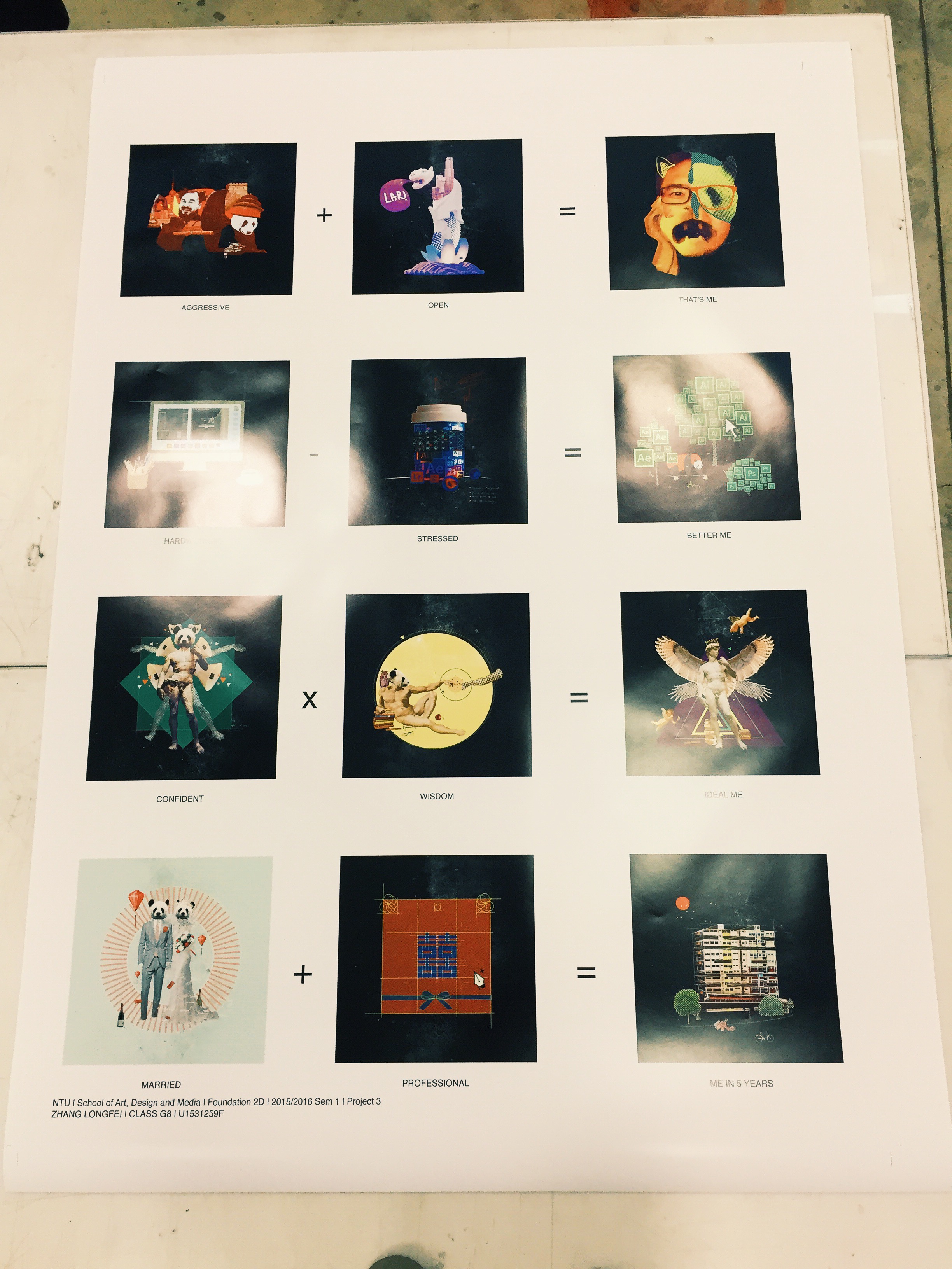
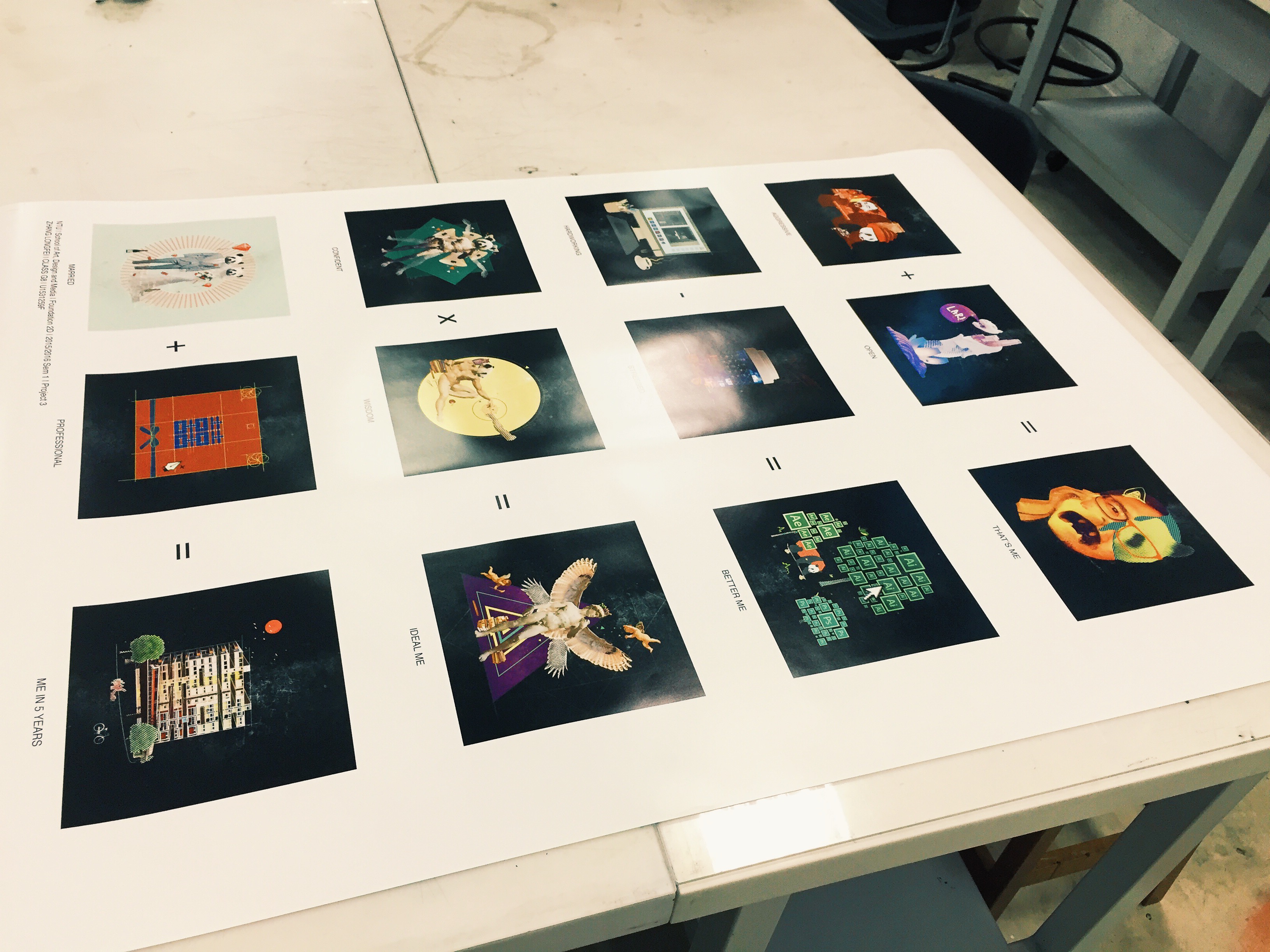
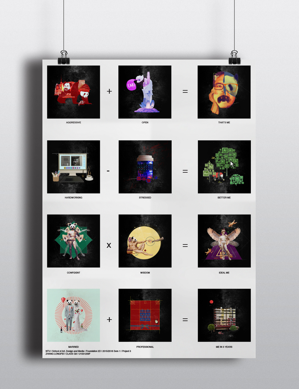
THAT’S ME
EQUATION
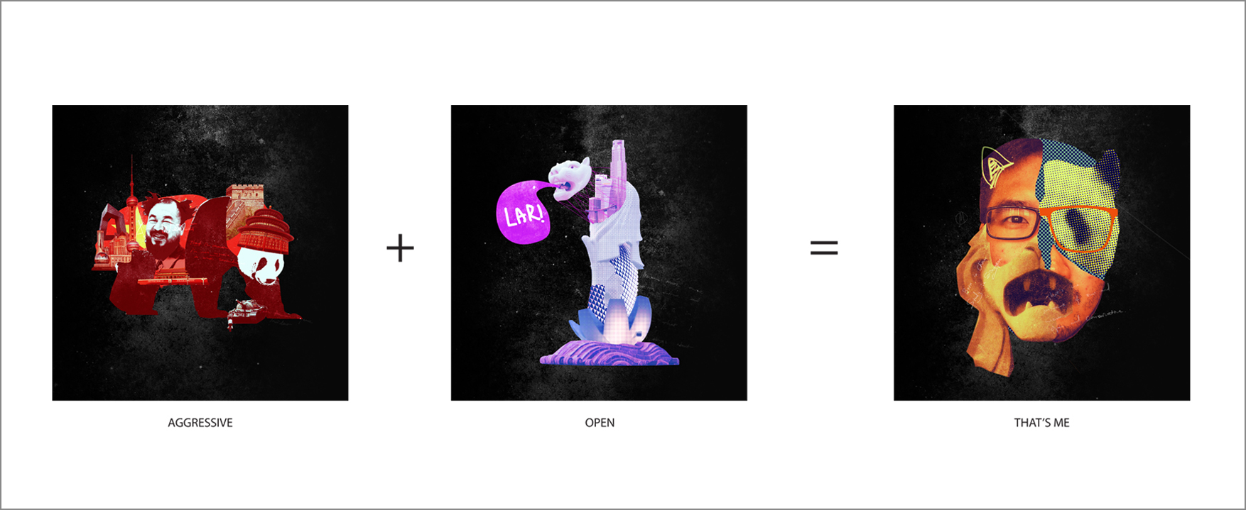

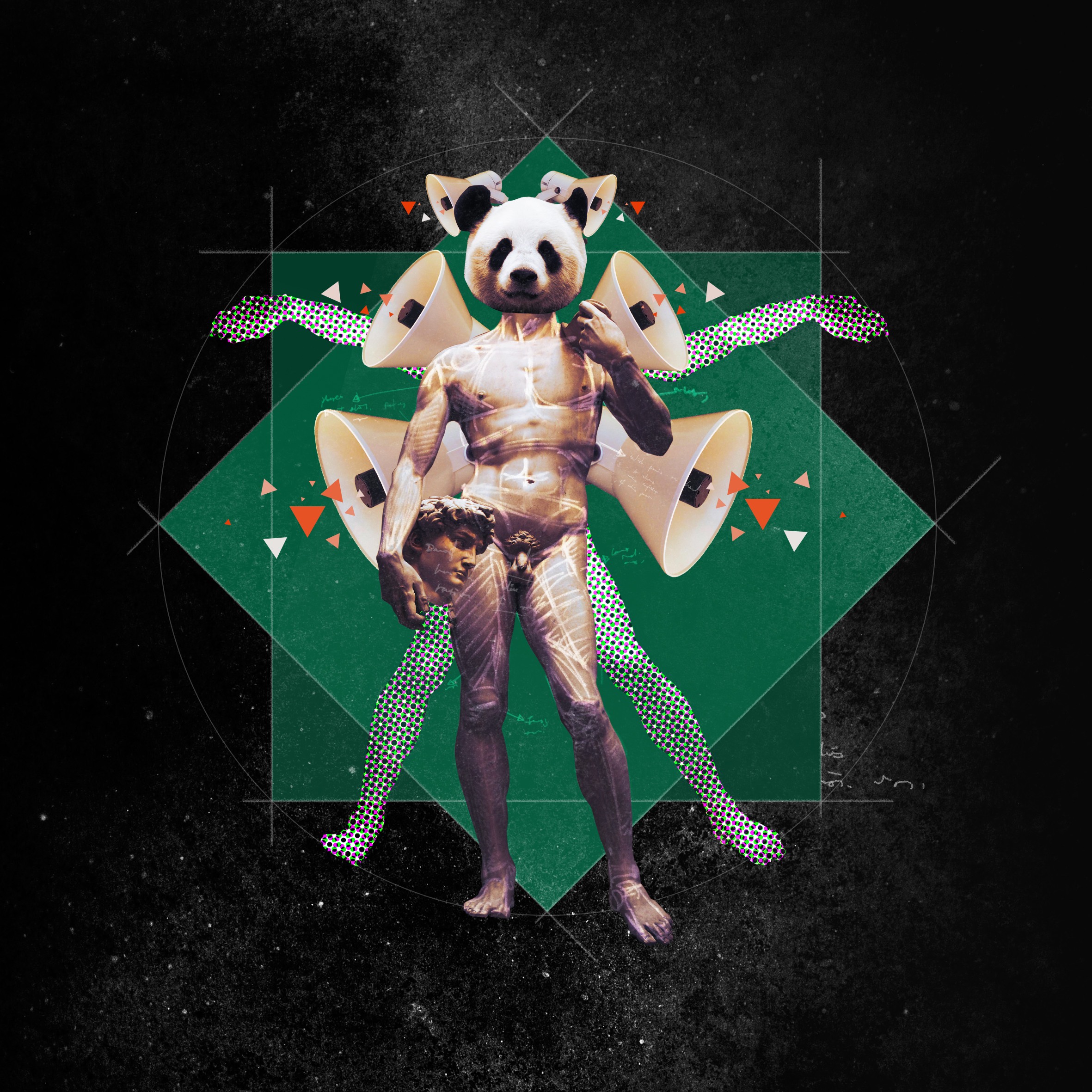
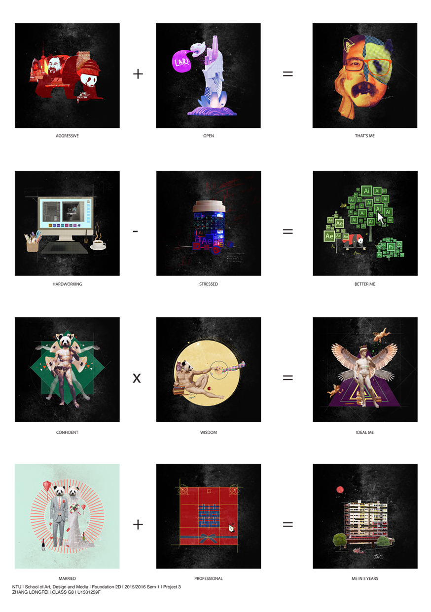
Aggressive
Though born in a semi-free society, I am more aware of social issues which occurred not only in China, but throughout the world. Imageries like high-rise Shanghai buildings, Tankman in Tiananmen Square protest of 1989 and artist Ai Weiwei represent my aggressive concerns towards what has happened in China. Panda also symbolises my hometown where panda lives. And analogous color scheme in this context, including red, yellow and orange, signify passion and revolution.

Open
After moving to Singapore, I was fully exposed to western culture and art, like Pop culture. I started to become more acceptable and open to unfamiliar things. Cool blue and violet color scheme gives a mystical atmosphere.
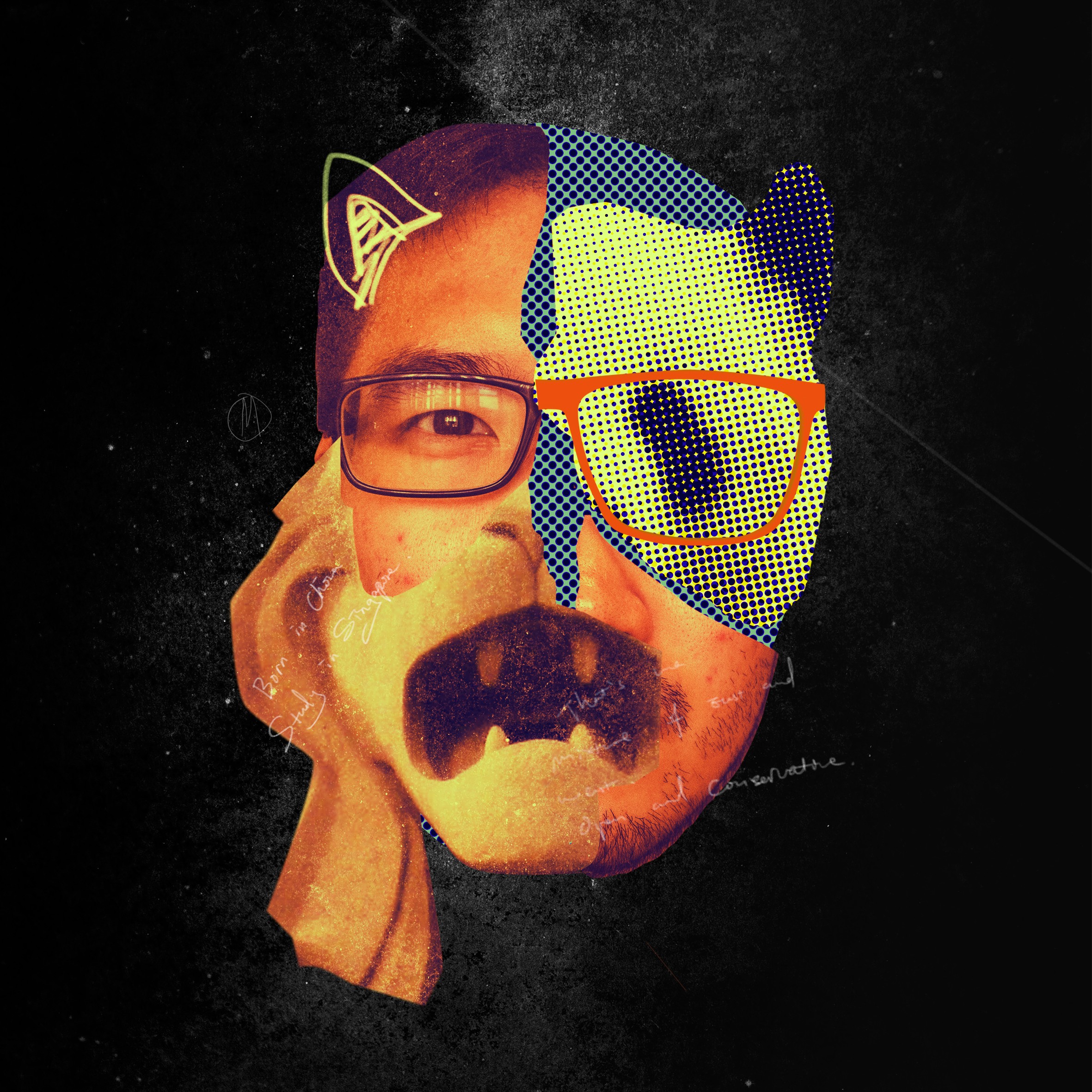
That’s me
ME myself is a mixture and influence of east and west. Panda is the main character in this series as the self portray.
BETTER ME
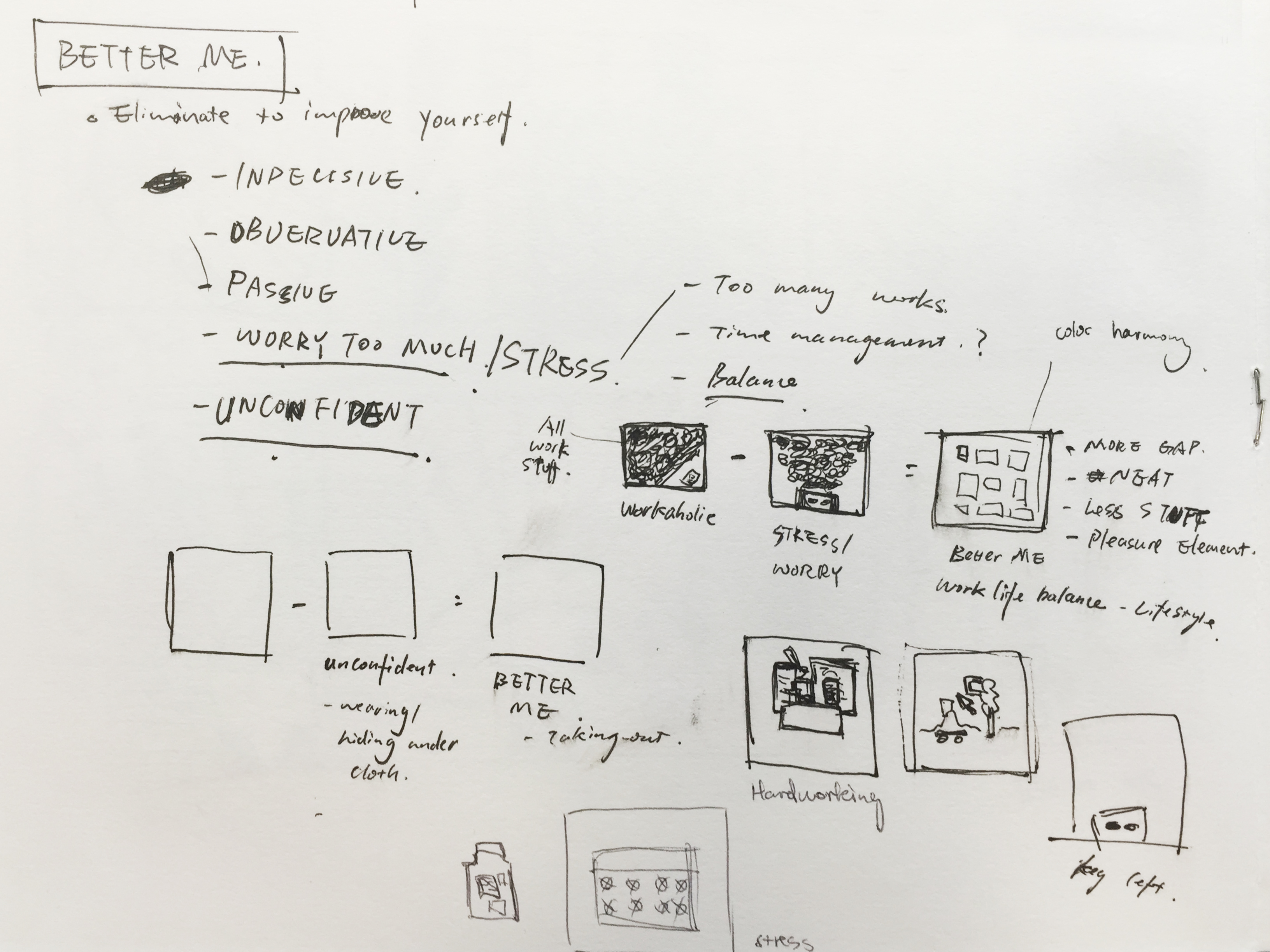
EQUATION

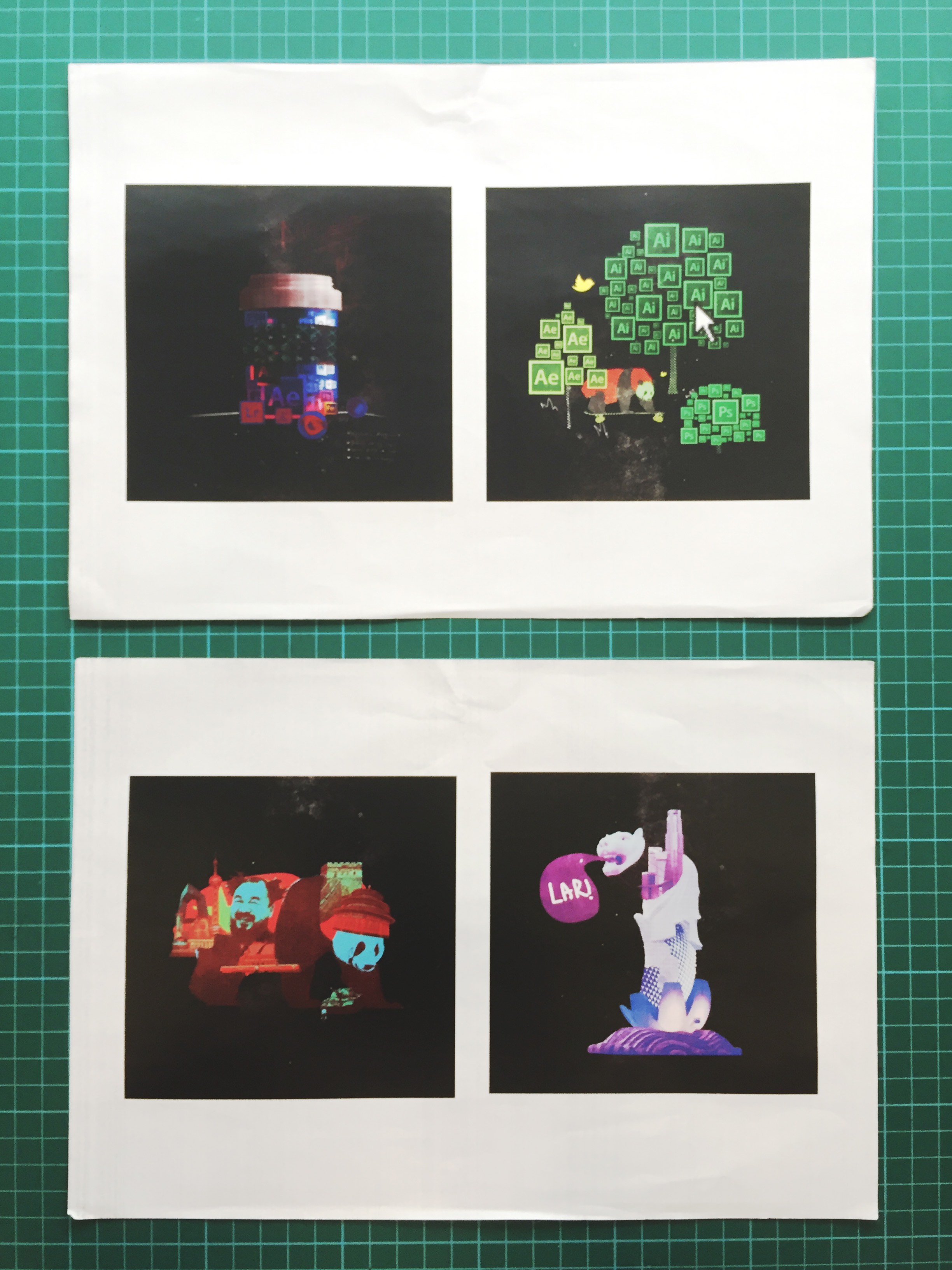
Hardworking
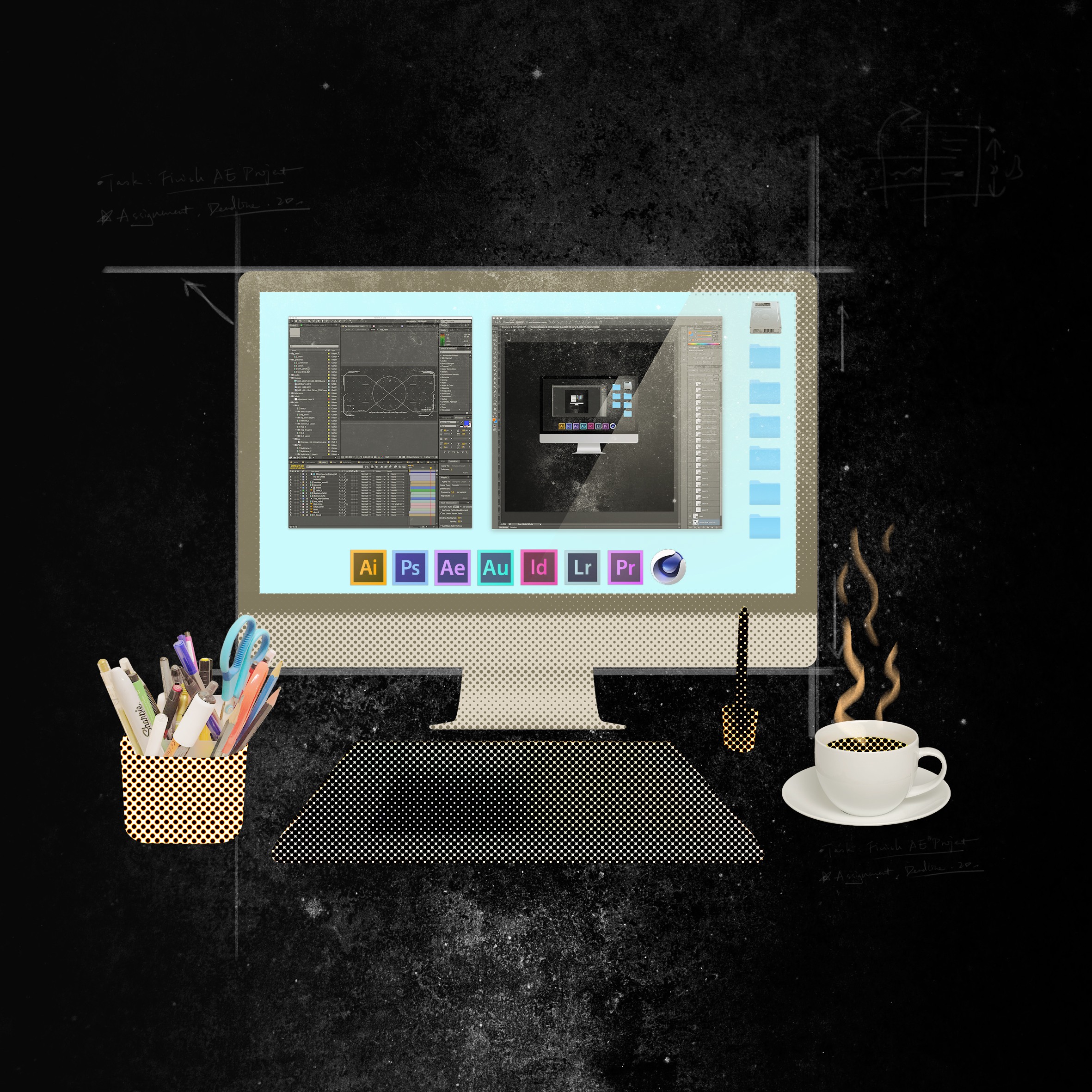
One of my strength is hardworking. I will put beyond 100% effort in what I’m doing and push myself into higher levels. Computers, pencil box and tablet represent my usual work place. Coffee signifies the long duration of working hours that I spend normally. Monochromatic beige color scheme creates a sense of calm , determination and softness.
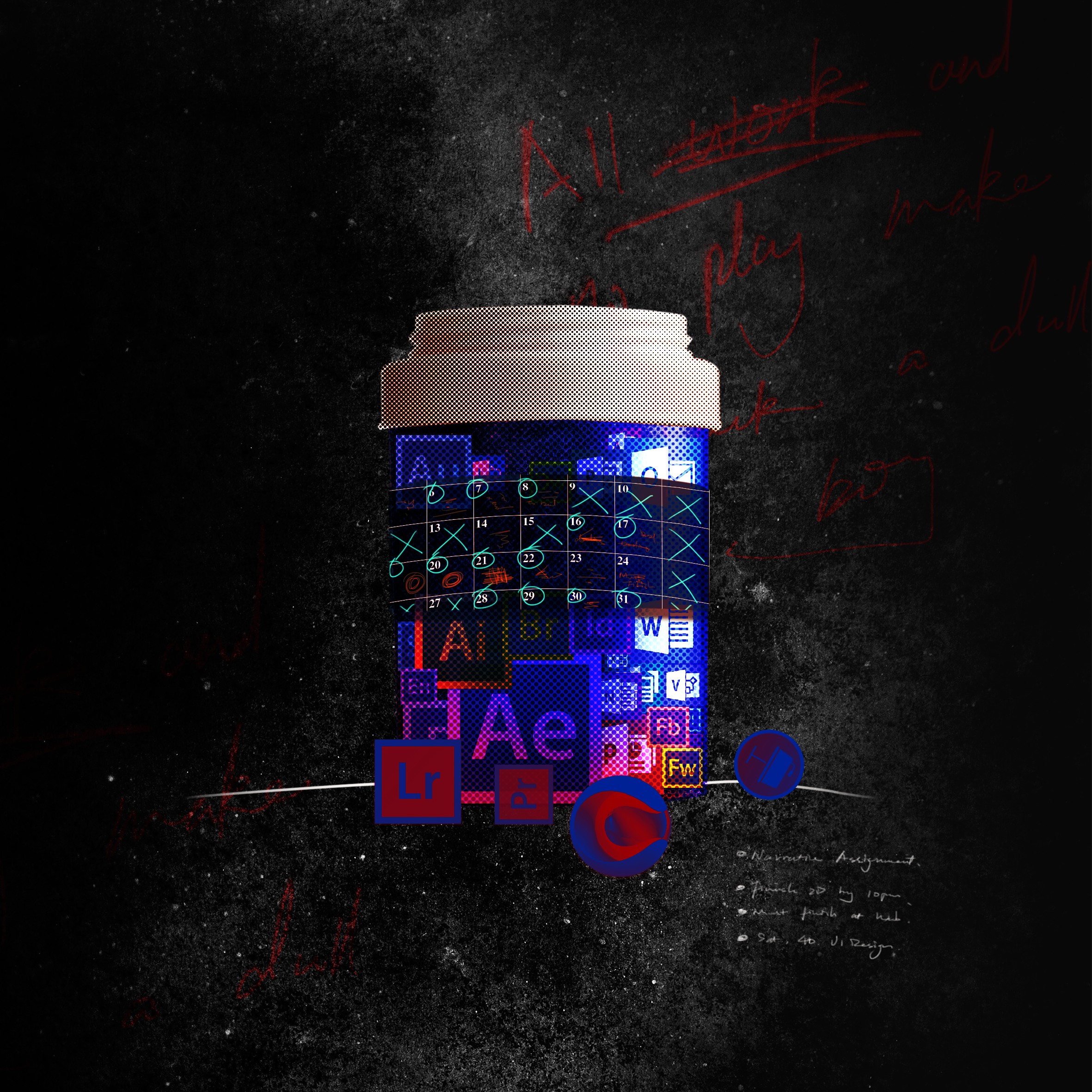
Stressed
After realising the whole calendar is completely occupied by works, I alway feel stressed and frustrated. the symptoms of Insomnia and phobia attacks me. Bottle of sleeping pills containing different kinds of software icons explains the reason why I can’t sleep. On the bottle is the label of a calendar with marks anywhere, which indicates bad time management. Behind are the scribbles saying ‘All work and no play make Jack a dull boy’ from the famous psychological horror movie The Shining, which depicts a man becomes a psychopath and tries to kill his family in a hotel after getting too much stress from his work.
Cool colors like violet, red and blue convey a very cold and uncomfortable mood.
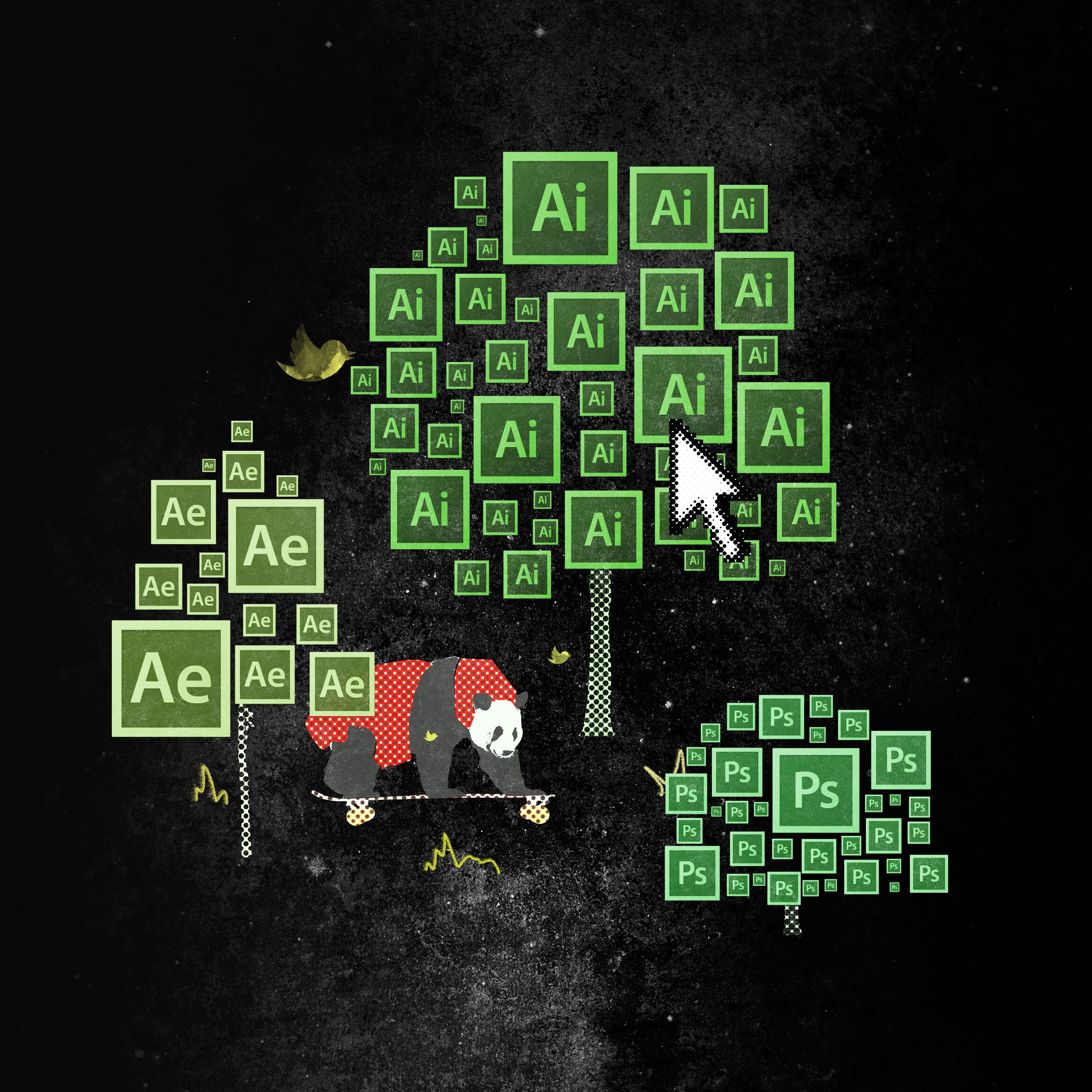
Better me
It would be better if I can balance between life and work and have a much more healthier lifestyle. That’s why, in the composition, there’s a visual harmony fusing working tools and natural forms. Trees have been formed by software icons and birds are from the twitter logo. The panda is cruising around and seems to enjoy his life there.
Complementary color scheme of red and green creates thought the strongest contrast but also the strongest relationship.
IDEAL ME

EQUATION
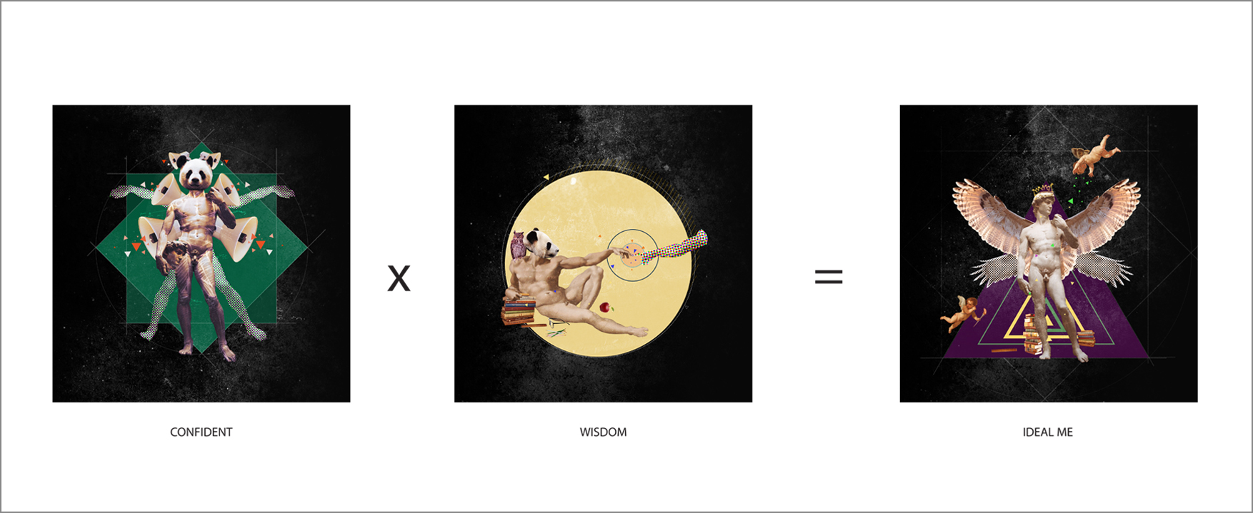
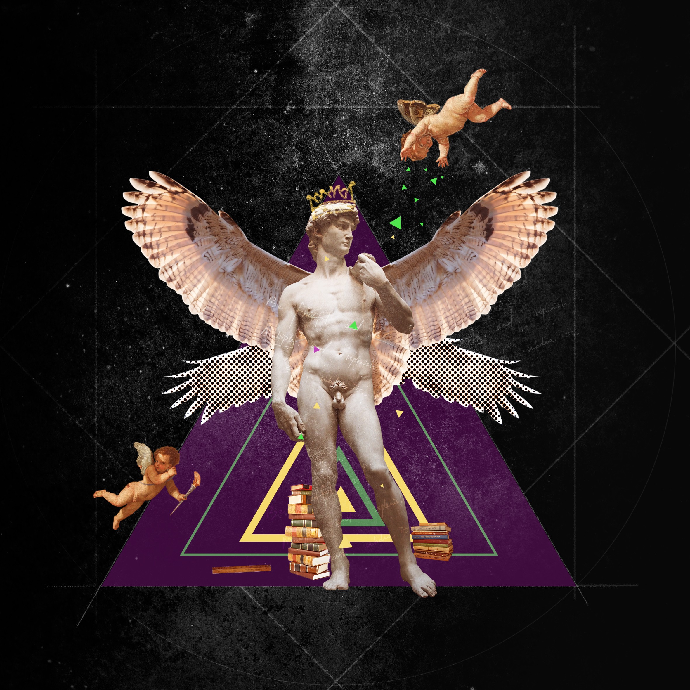
Confident
I want to be more confident in many areas, as sometimes I feel less comfortable expressing my ideas and thoughts. I used Renaissance works like Michelangelo’s David as the main subject and Vitruvian Man by Leonardo Da Vinci as the background. Both works indicates the concept of a universal man, a man can do all things if he will.
Green as the dominate color in triadic color scheme portrays the mood of liveness.
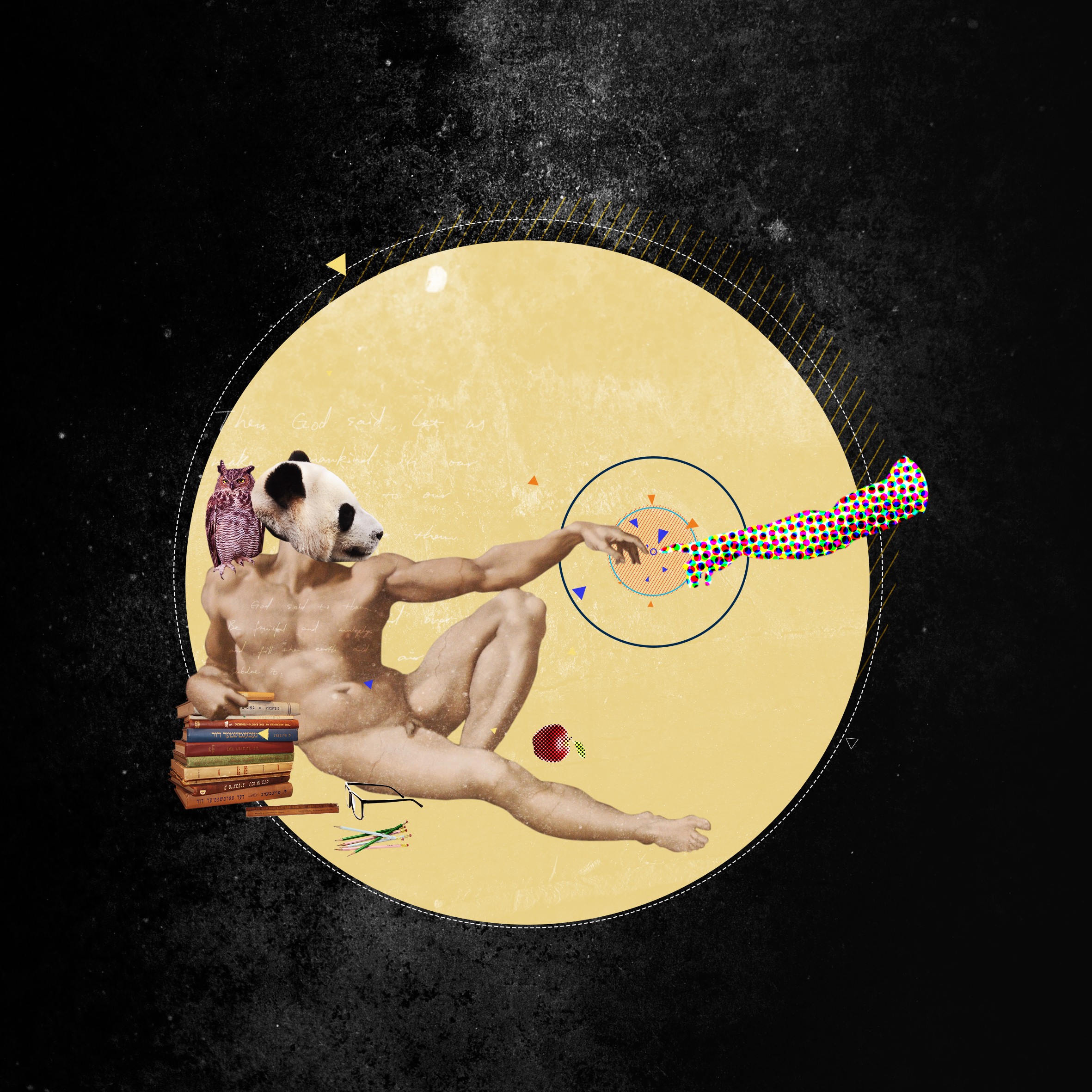
Wisdom
Be knowledgable and creative. I believe creativity is based on your capacity of knowledge. The more you learn, the quicker and deeper idea you can get. The story of God creating and enlightening Adam represents my eager of gaining knowledge. Apple, owl, books and so on signify the concept of wisdom.
Beige as the dominate color in triadic color scheme portrays a sense of knowledge and calm.
Ideal Me
As a whole, Triadic color scheme of green, beige and violet creates a high degree contrast but at the same time retrains color harmony. It creates a sense of depth and richness.
The combination of owls wings and David symbolise an ideal me with confidence and wisdom. And the geometric shapes, applied in this series, like square, circle and triangle, indicated my desire to pursue perfection in different fields.
ME IN FIVE YEARS
equation
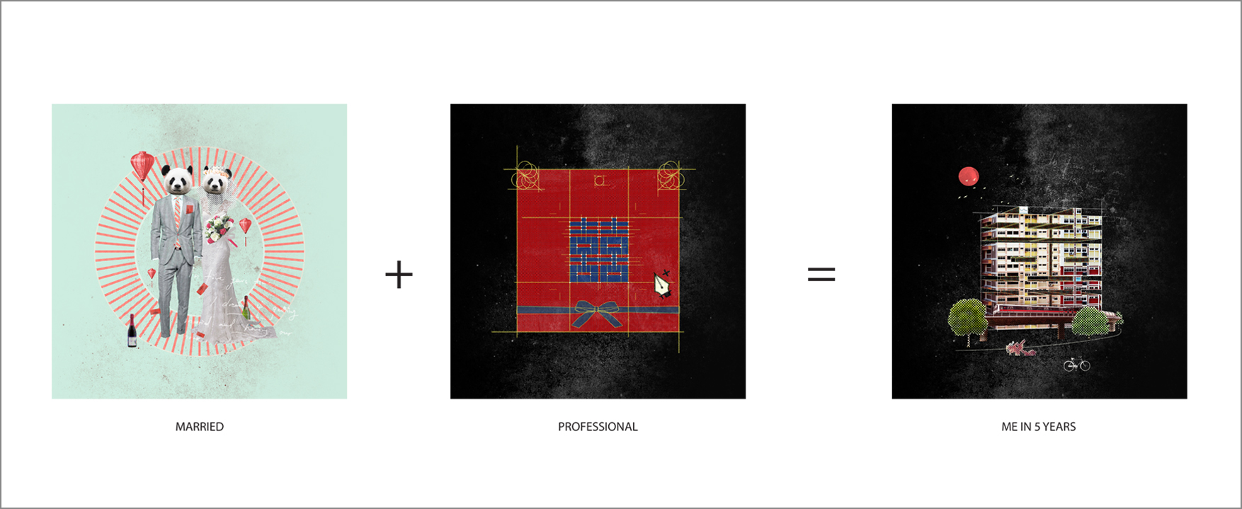
Married
After 5 years, I picture myself getting married with another half. The wedding will be as simple as it shows.
color scheme of aquamarine and light red best convey the minimalism in mood and style of the wedding.
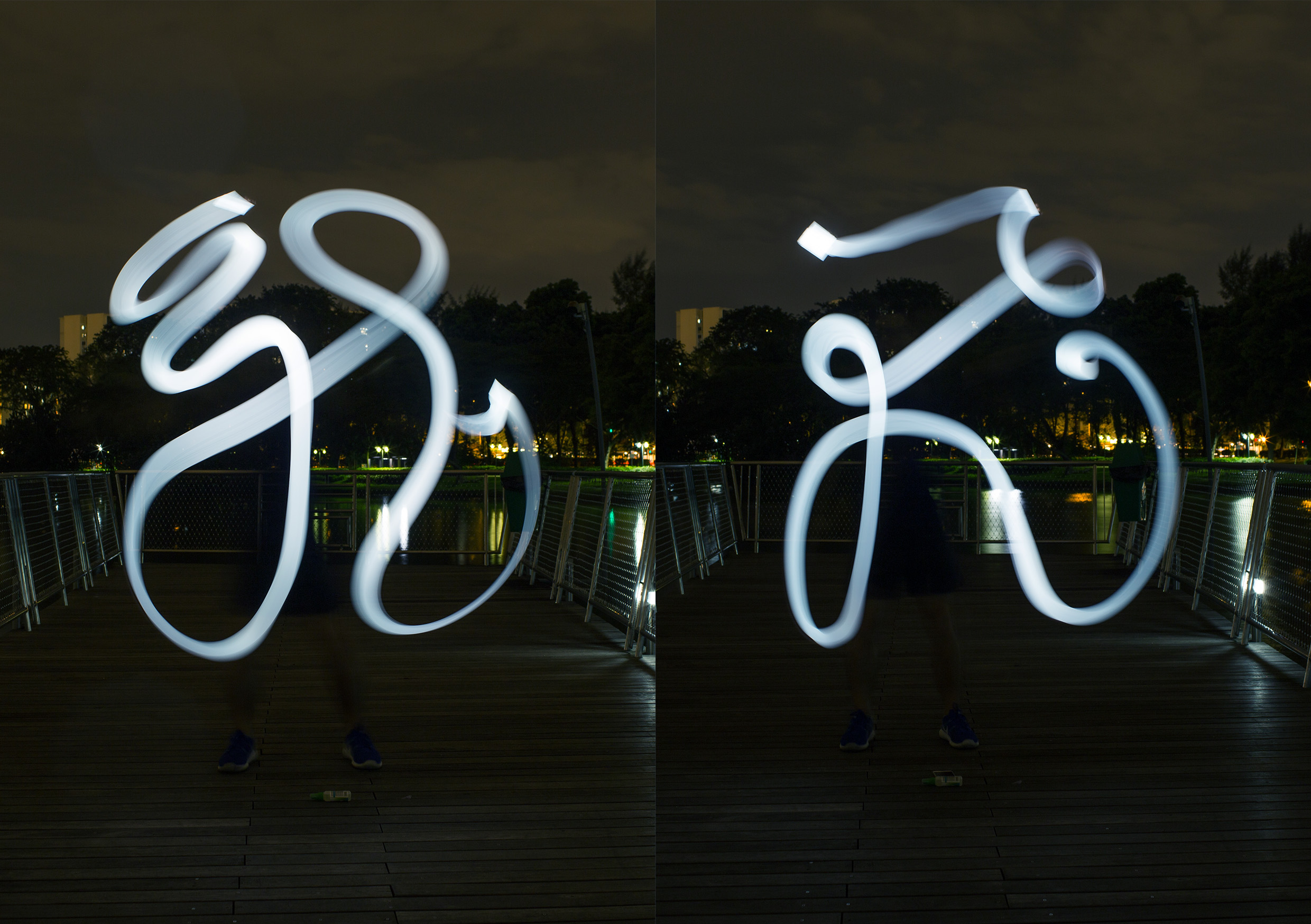
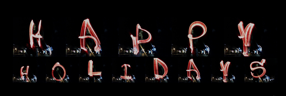
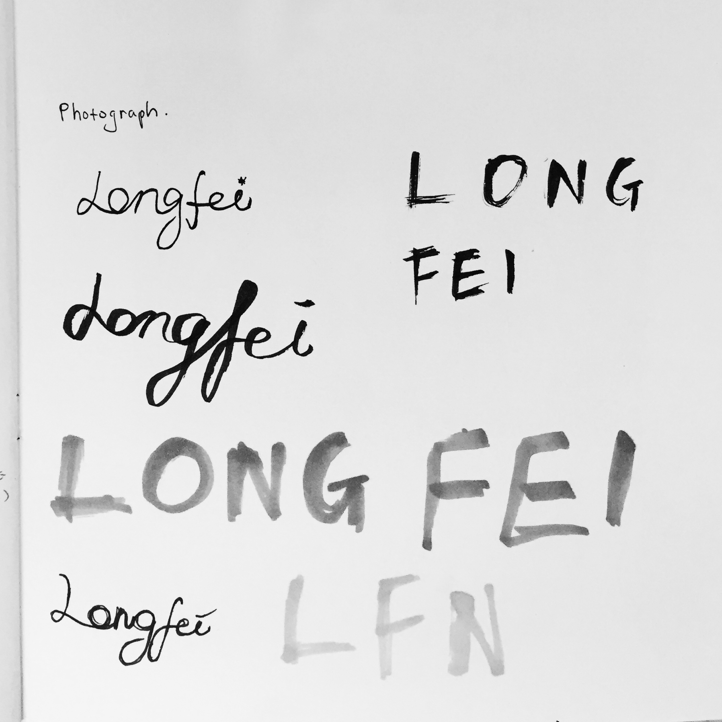
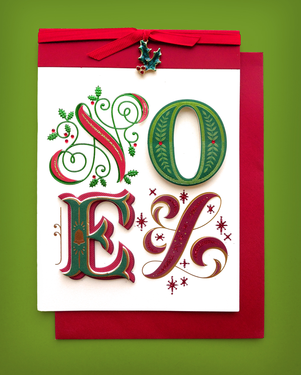
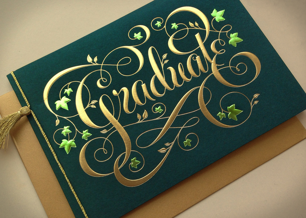
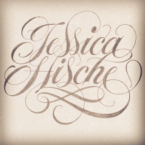
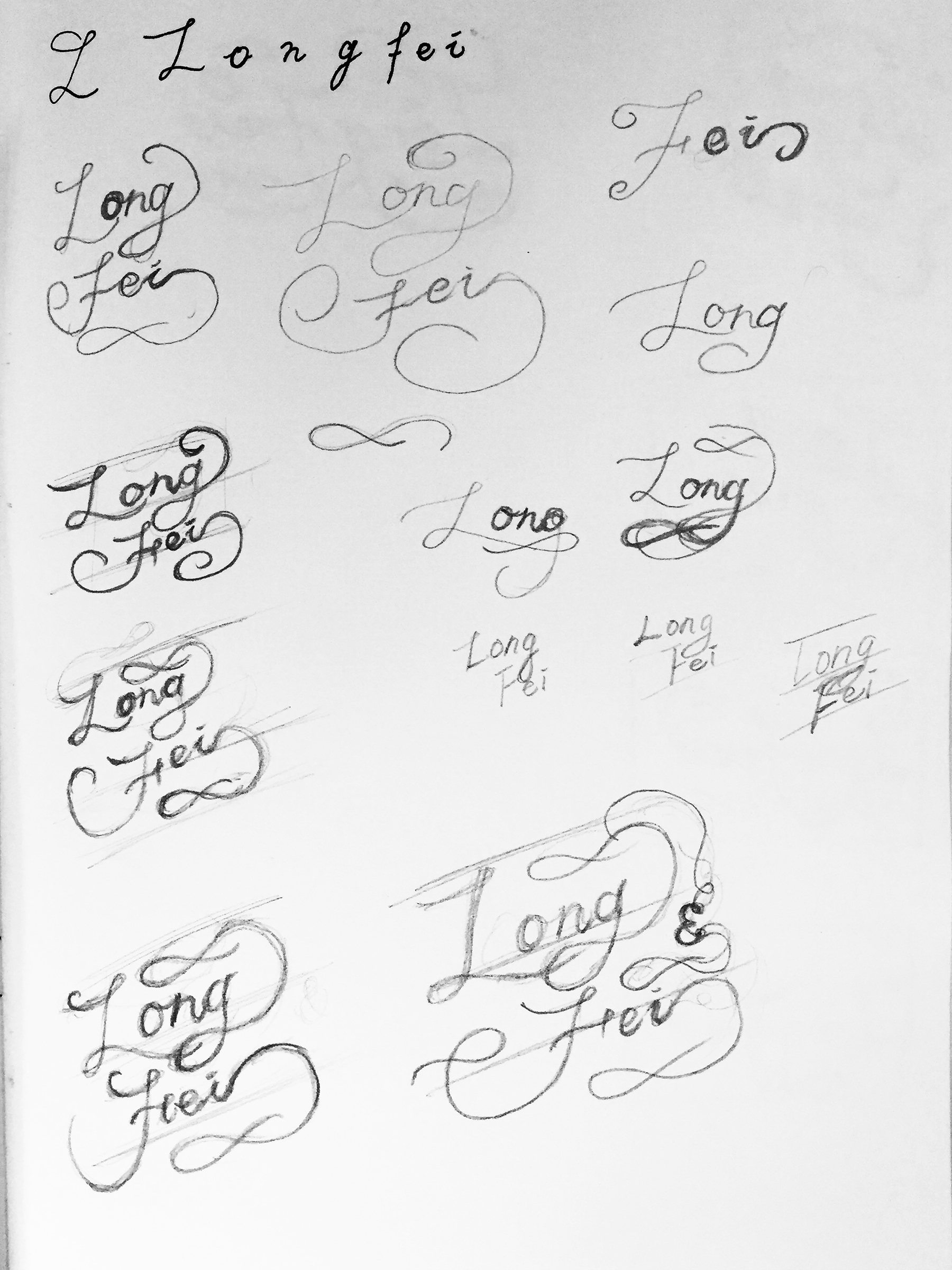
Professional
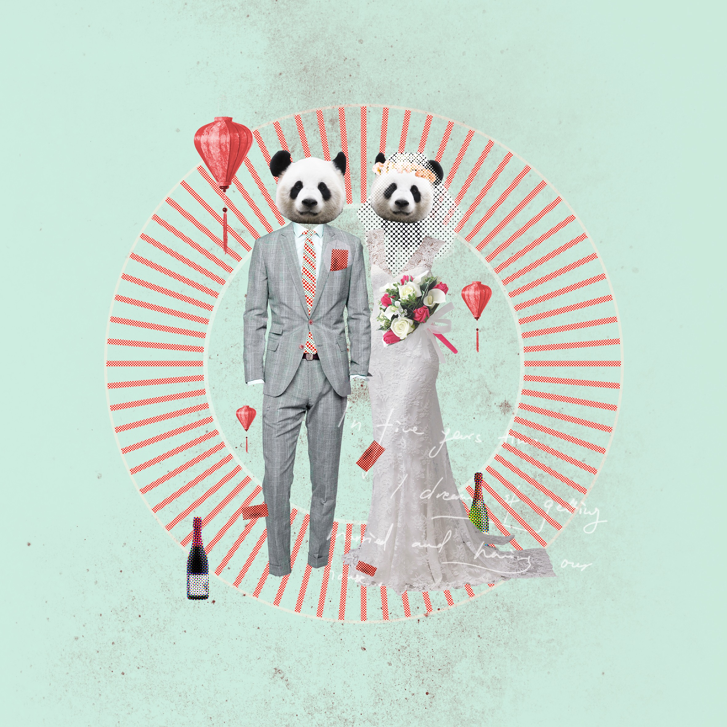
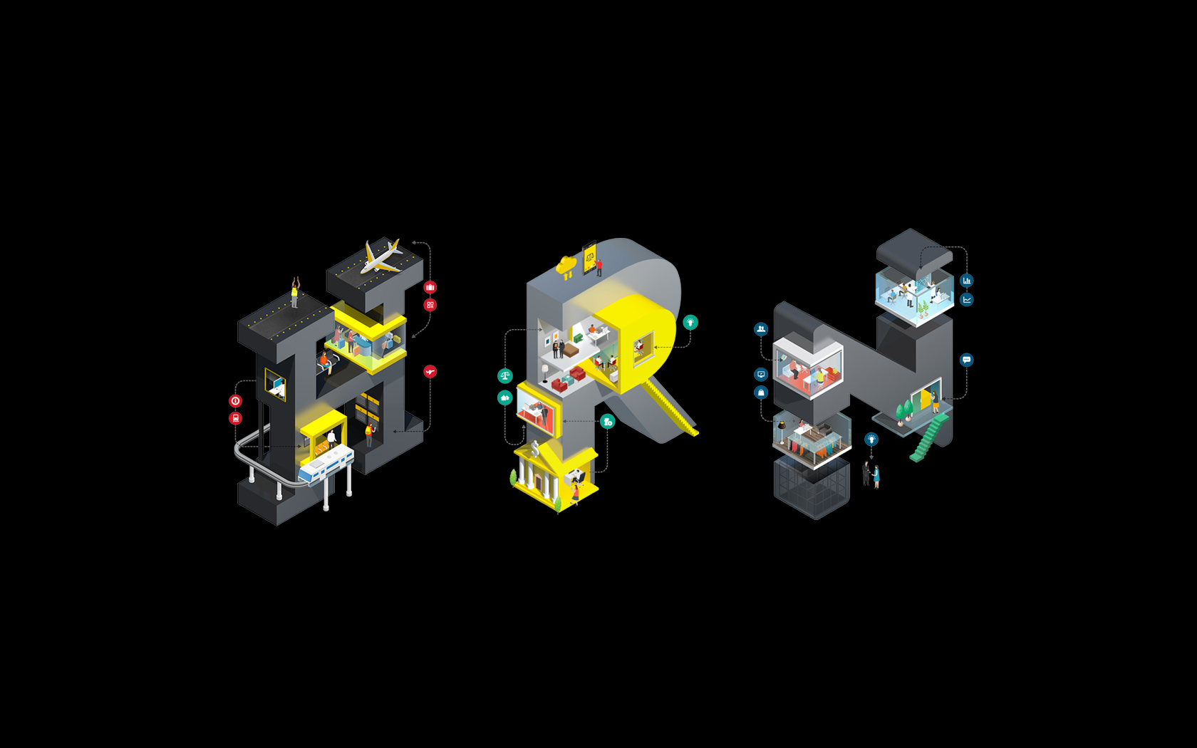
After graduating from school, I also want to be a specialist in typography and UI design, creating decent works for advertising and motion graphics. An myself wedding invitation card is an example of indicating my speciality direction and interest.
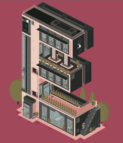
Me in 5 years
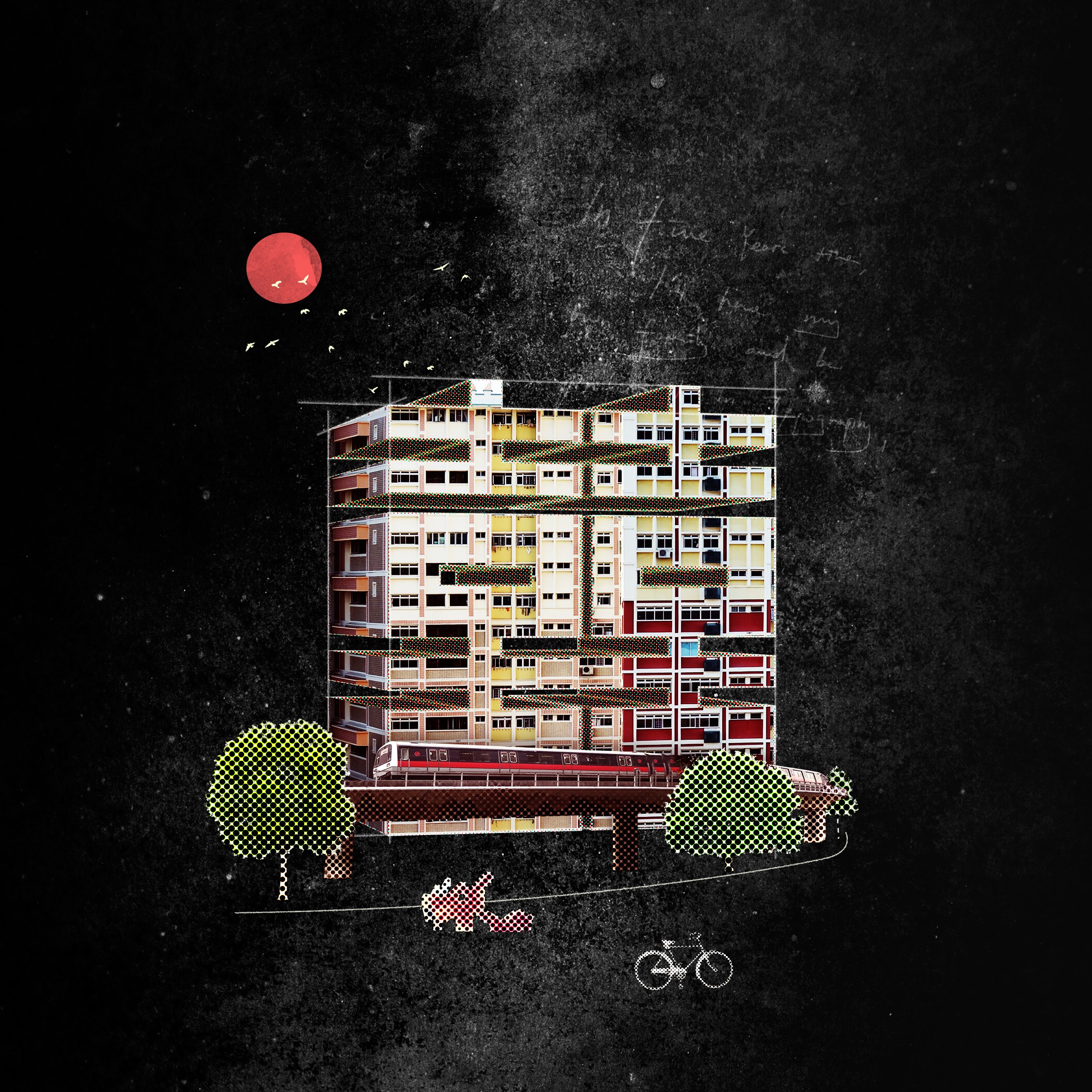
In 5 years time, I hope I can have my own family and house and do what I like. The 3D typographic building and trees portrays my plan in 5 years.
Warm color, red, green and yellows portray a mood of happiness and harmony.


Recent Comments