Closeup
Exhibition
@ School of Arts, Design and Media, NTU
MEDIA WALL
LED
15m by 2m
Media Art Nexus NTU
Actual Exhibition
@ North Spine, NTU
SWATCHBOOK
APPLICATION


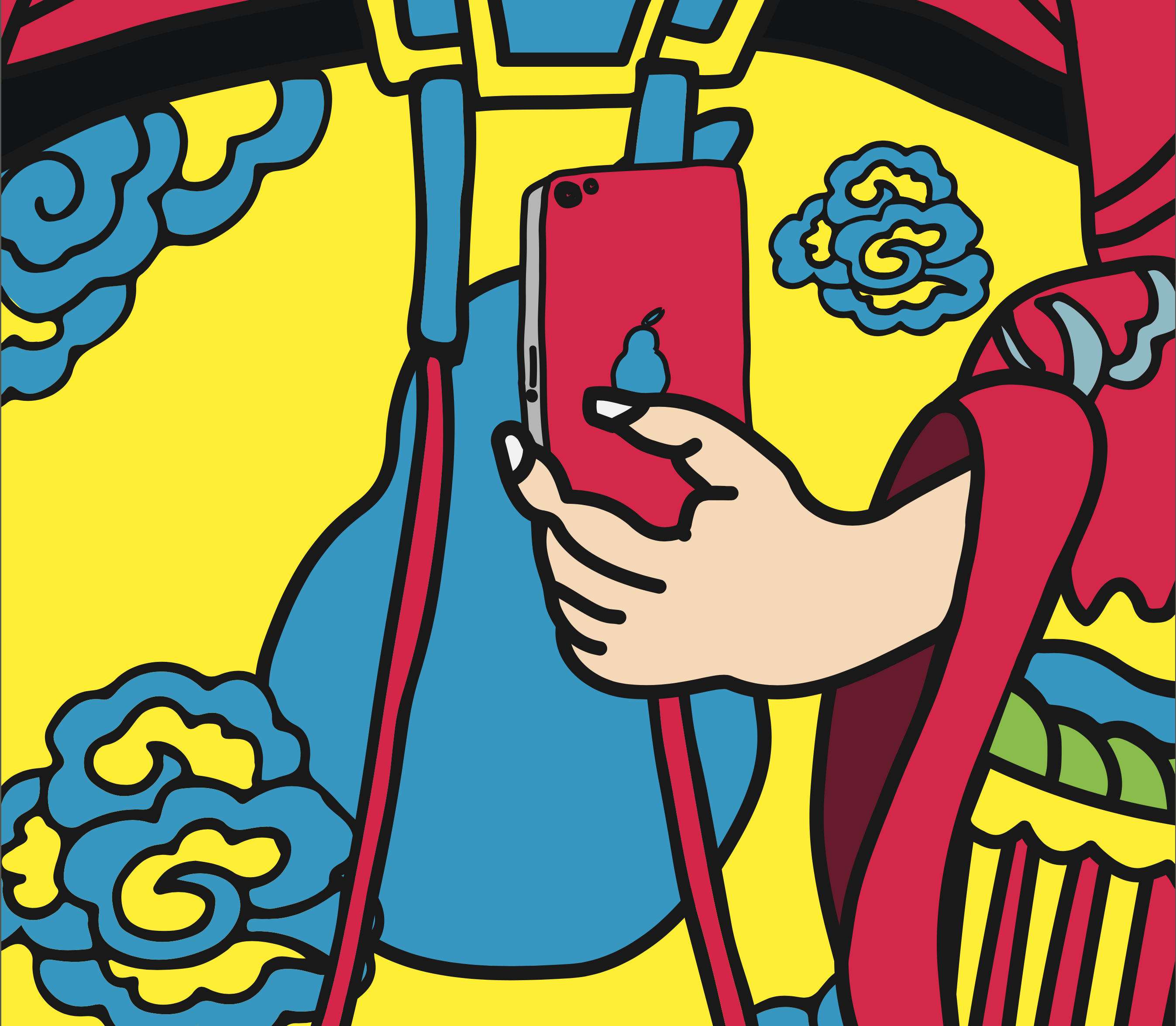
Based on my concept, “new door god”, I planed to design a door god poster. It contains a main god in the center and several elements surrounded.
Main God
I chose to use Apple and Steve Jobs as my main visual representation. Replacing the logo to a pear shape adds a subtle pun.
Steve Jobs as fortune god(left) and general(right)
Ritual tools
Referencing from how Chinese people worship their ancestor and god, I created Apple-related sacrifices and Ritual tools.
Servants
Mock-up
This is the first try-out with all elements, based on traditional fortune god door poster.

2017
Experimental film
3840×480 pixels
About
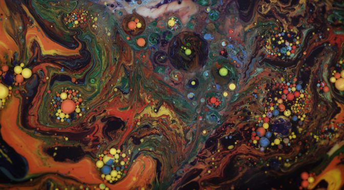
An experimental film which describes a life cycle of various abstract forms, from birth, maturation to death and allows audience to judge what creature they look like by imagination.
With the help of chemical reaction of putting food coloring in milk, the coloring molecules are pushed away to different directions continuously by milk molecules, which creates an unexpected “color explosion”. The autonomous chemistry not only creates chaos and but also serendipity and inspiration.
Media wall @ North Spine, NTU
Photo by Solomon Qeuk Jialiang

Having done some test shoot, I finally decided I will go for creating illusional creature with milk and paint.
It is been experimented by others for a lot of time that if you put paint and dish soup together into milk, it will create amazing effect.
The oil will create bubbles that will constrain paint into a sphere.
By mirroring 4 footages, it creates a nice patterns but lesser creature.
By only flipping once and feathering the edges, the visual becomes more lively and organic.
By twisting its hue, it gives more Alien-like look
It describes a birth of “The Thing” abstractly from nothing to complexity, and finally to nothing again, which indicates the nature of life.

2016
Porcelain and website
It’s an enjoyable journey of how we have developed a concept and a potential prototype, based on a certain artworks and its history. And this project also become an inspiration for me, as I have never learned about art history so systematically and thought about how to preserve human legacy in a contemporary way. Always looking back to what our ancestors have done can help us generate new ideas. So I believe I have benefited so much from my art history courses.

“Calendars” is done during 2004 to 2010 and contains 1001 offset prints with matte lamination. Each print is 30cm x 30cm and represents a page of calendar with a photograph. All pages spread out according to the year and date on 3 walls.
Heman Chong (b. 1977, Muar) is an artist, curator, and writer. he lives and works in Singapore.


The first impression of “Calendar” is I was overwhelmed by a massive and huge calendar with many details. When looking closer, I noticed the date and year of each calendar set to future time and there’s no human involved in any photo. Therefore, I thought the artist was raising a question on how environment been affected by human population through time being and empty space. But why it sets in the near future 2020 to 2096 confused me.
As I read the description, my initial impression is somehow related to Heman’s work. The project is experimenting with body of time, space and people. The brusque year let us step outside the current circumstance to get a better insight of our common dense spaces and how it influenced and change our identity. As the description says, the exhibition itself has been recognised as another public space, which becomes another view of others.
It’d be interesting if every photo has a location tag. So the contrast of uncanny atmosphere will be more amplified.
“Endings” & “No Endings” were done by Ringo Bunoan in 2013. “Endings” consists of variable size of framed book ending pages, whereas “No endings” is a book installation, which showcases several books are stacked from the floor to the ceiling, leaning against the wall.
Ringo Bunoan (b. 1974, Manila) is an artist, curator, writer and researcher. She lives and works in Manila, Philippines.
It drew my attention as soon as I saw the last words in every frame, which obviously indicates the artist had torn down the ending section of some novels and framed them. I found it interesting in reading the ending, because beginning and ending are the most important and tricky parts in a book. And ending is alway about looking back and regretting what the main character has not done. So I thought the artist wants to teach us a lesson. In order to get a regretless and happy ending in life, we have to try our best to get there.
And for the stacked books beside, I didn’t link it to “Ending”. It seems to me like an individual installation with different concept from “Ending”.
After reading the text, I got a different idea of what Ringo want to convey, which is many possible conclusions of , and in time. Ringo opens up a new way of reading, where audience are allowed to choose what to read and how to end a story. And ending pages are all removed from the books stacked against the wall. Intentionally the book spines are concealed to hide book’s name and author, which symbolises each story anonymous in more than one way. However, I would still suggest that letting audience read those novels will enhance the link between “Endings” and ” No Endings”.
Recent Comments