
PROCESS
| I decided to work with the medium of photography for this brief. Unlike creating illustrations or images from scratch to apply the colour theories with, i have to seek for subjects that already have colour theories being applied. Therefore location scouting and the framing of the shots are key in communicating the message to the viewer as distracting subjects or colours have to be excluded when taking the photograph. |
SEQUENCE 1 : TRASH

| My first subject is a trashcan located at 120 Prinsep street. The trash can was my primary focus as i felt the graffiti sticker and burn marks on the lid represented the gradual change over a standard public object in a specific environment. My main locations revolved around close ups of the trash can, the interior, and the general space around it. Light meter readings were also taken to give a rough gauge on what aperture range I’m allowed to work with. |

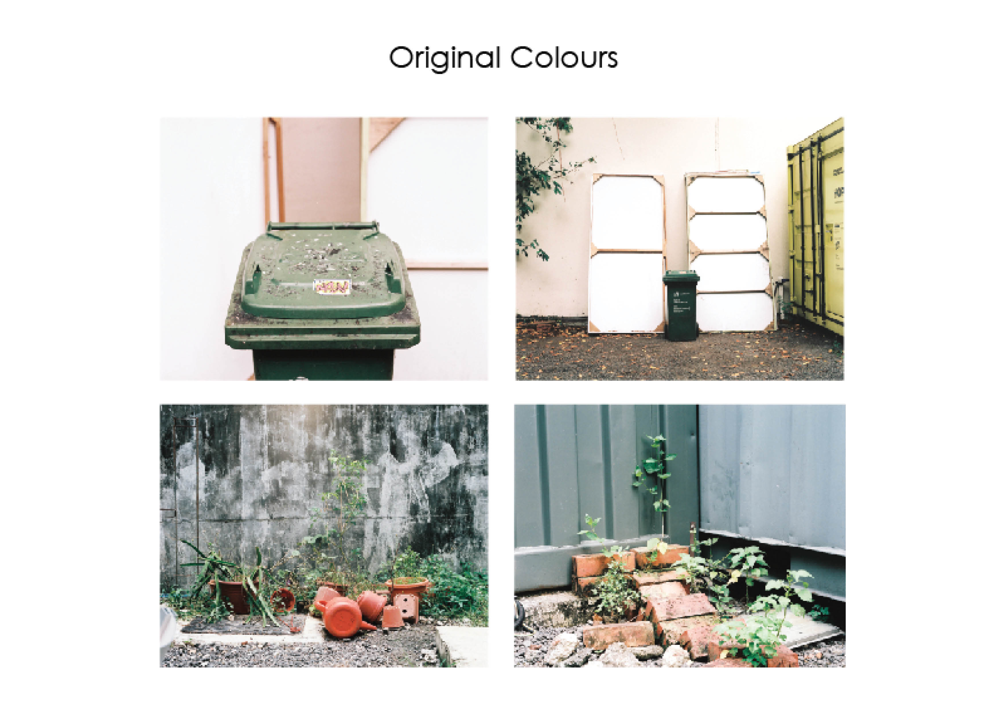
| The original colours that was captured on film had a cool overcast due to the cloudy weather that made the light diffused. The primary colours that stood out were the green, yellow, red/orange and pink. The main colour theory i wanted to apply was the complementary colour scheme along with the Split- complementary color scheme. In order to bring the colours to the foreground, I enhanced the colours by raising their contrast and saturation to allow the colour harmonies to stand out. |
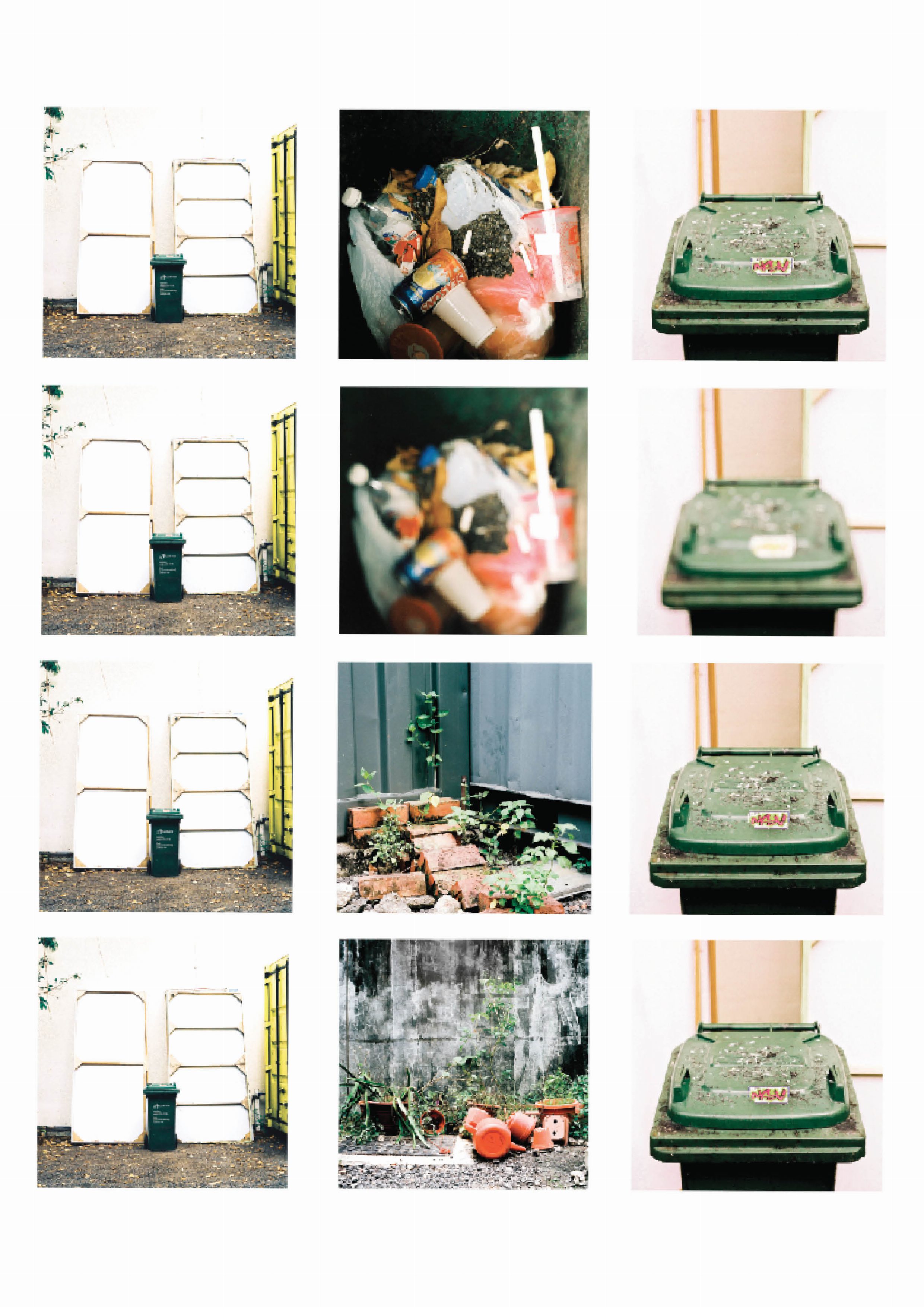
| There were a few variations for the line sequences that although follow a similar colour scheme, different photo subjects play an important role in relating the accompanying words to the understanding of whole sequence. I experimented with images being out of focus to capture the essence of the shot through colour instead of subject. What felt like a good idea in concept did not translate well in the final shot, highlighting the importance of shooting more safety shots and spares as they you never know when you need them again. Going back to the same location may not produce the same results as the light is dependent on the weather and the colour hues will change along with it. Editing the choice of images were then an important factor to take note of when creating the sequences. |

| The selected sequence is then layed out with the accompanying text to see if the they work together coherently and in harmony. Text is a strong element to create a narrative. For this example, the text provides ideas or insight on linking qualities of the subject to human qualities or emotion. |
SEQUENCE 2: CHAIR
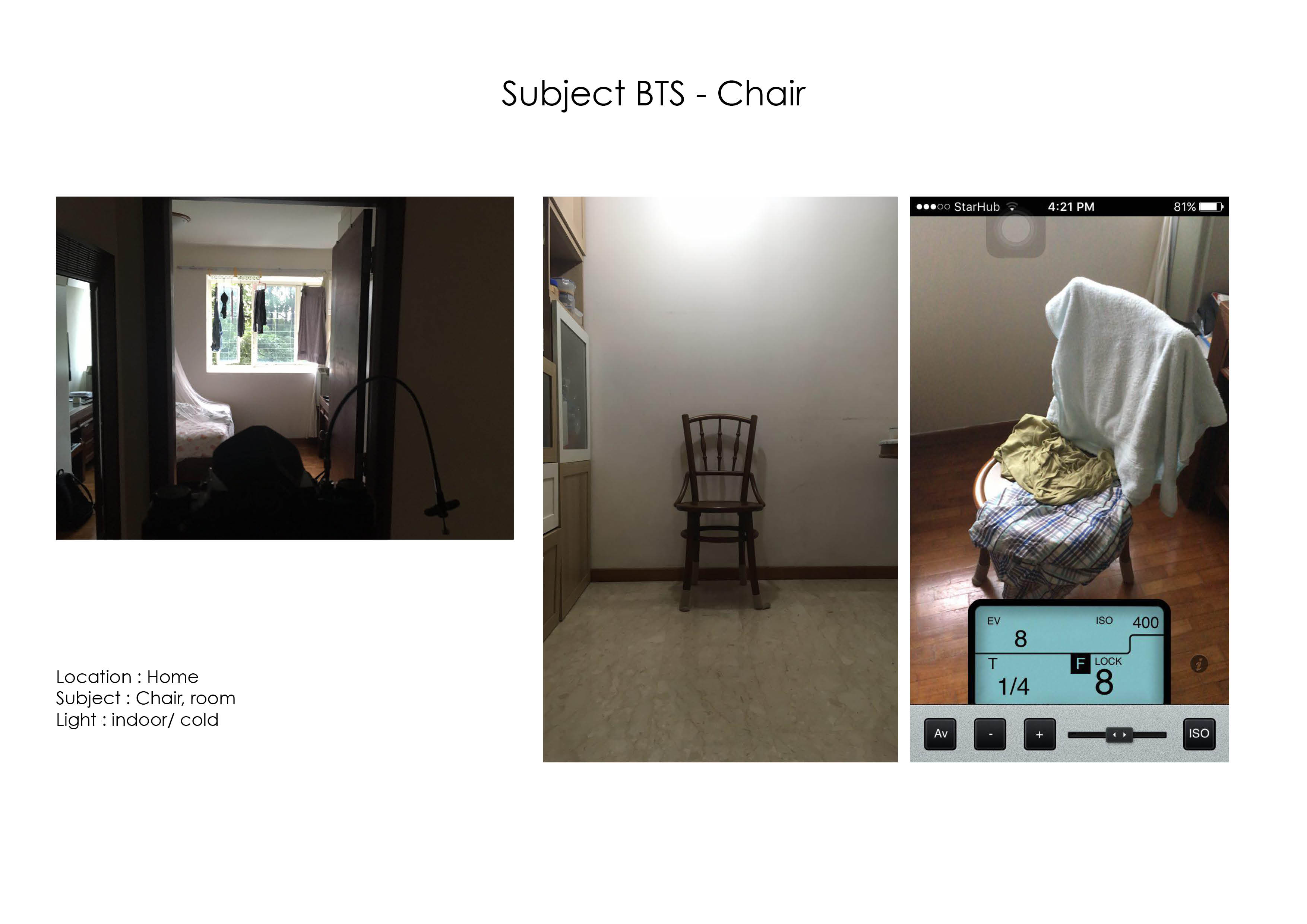


| My second subject for the project was a chair located in my house. The chair is a constant in every room that is occupied in the house, what gives it a character is the individual in the room and the objects the keep in it. The main colour scheme i wanted to showcase in this sequence was the analogous colour scheme from green to blue. |
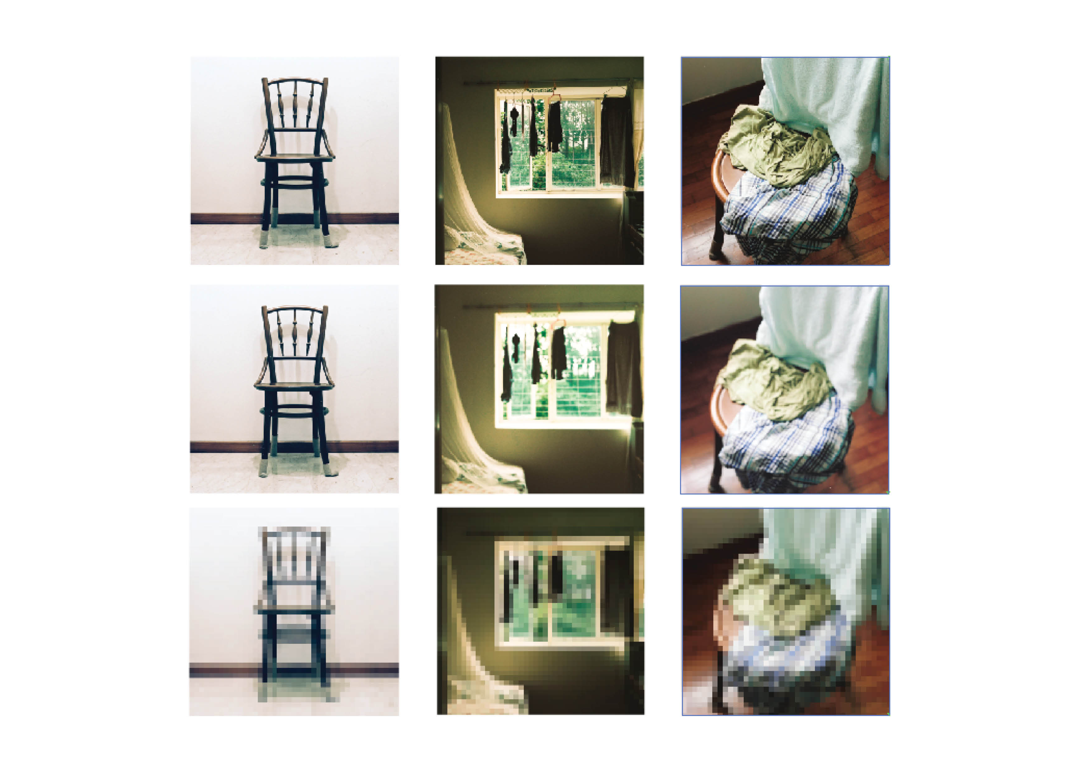
| Similarly I experimented with various effects on blurring the subject but after a few tries the concept didn’t really play out that well.
The original colours were actually very pleasant however the greens and blues are crossed each other too often and did not fit in a colour theory or harmony. The greens are then enhanced to be more illuminated and obvious to spot. The chair image on the right has the colours of blue, green, green blue and a reddish brown. I was advised that to continue with the split complementary harmony of blue, green and red, the blue green towel in the composition have to be adjusted. |
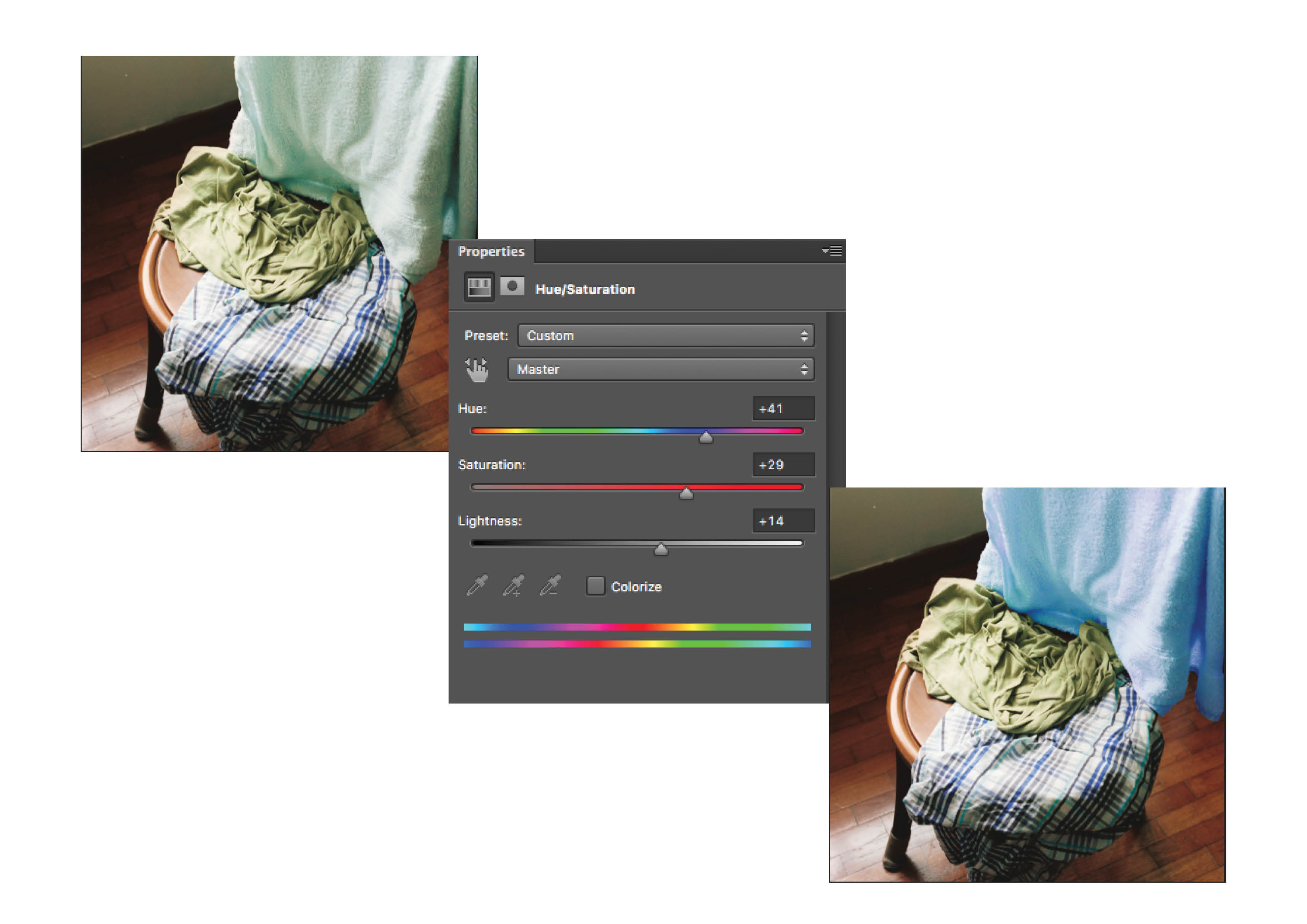
| The towel was masked out in Photoshop and it’s hue and saturation was worked on to bring it towards the blue colour tones. |
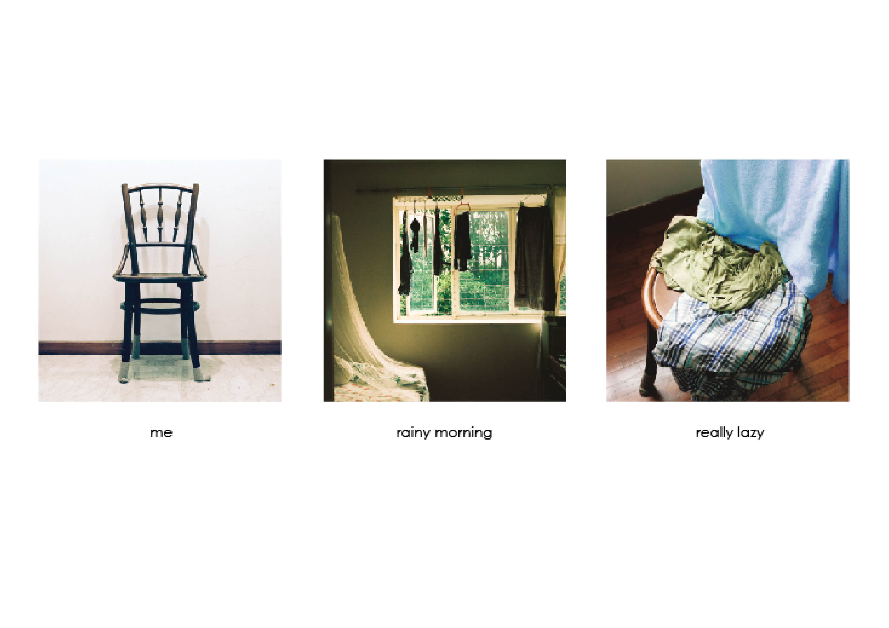
| After editing the colours on the towel, the blues were more prominent with less distracting colour tones. There is also a running theme of the “self” square being neutral in terms of colour, the “setting” square to be of a stronger, saturated colour, and the “response” square to be a balanced colour to it. |