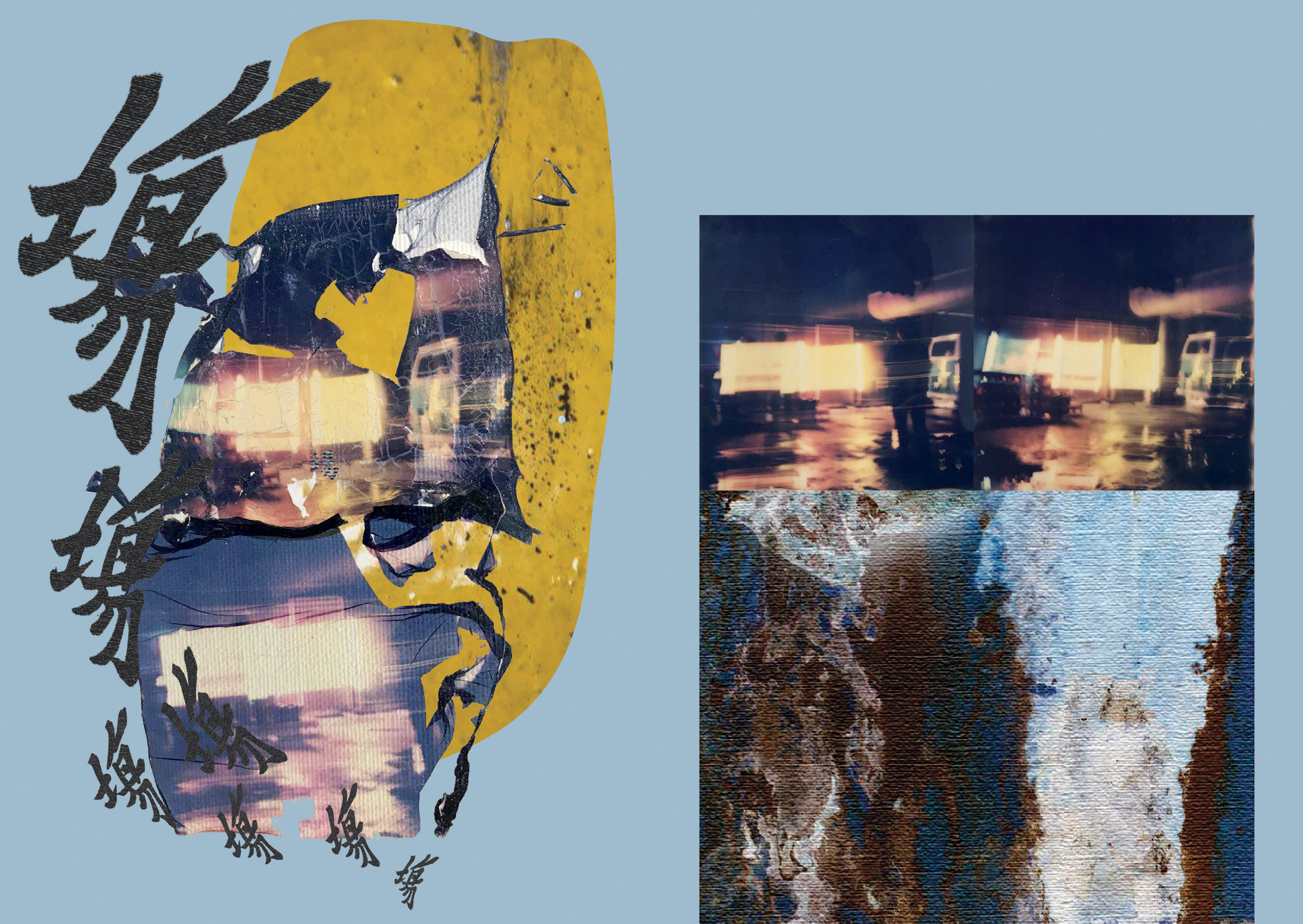
gonggong is the visualization of the ageing architecture of Golden Mile Tower in comparison to the new tenants that re purpose the space for a new young crowd. The zine places both raw textures and texts that are sampled from the brutalist architecture alongside organic photographs that capture the energy and life of the new entertainment spaces. In combination they create a sense of abrasiveness that reflects on both the vibe of the building as well as the energy of the people inhabiting it.
Cover
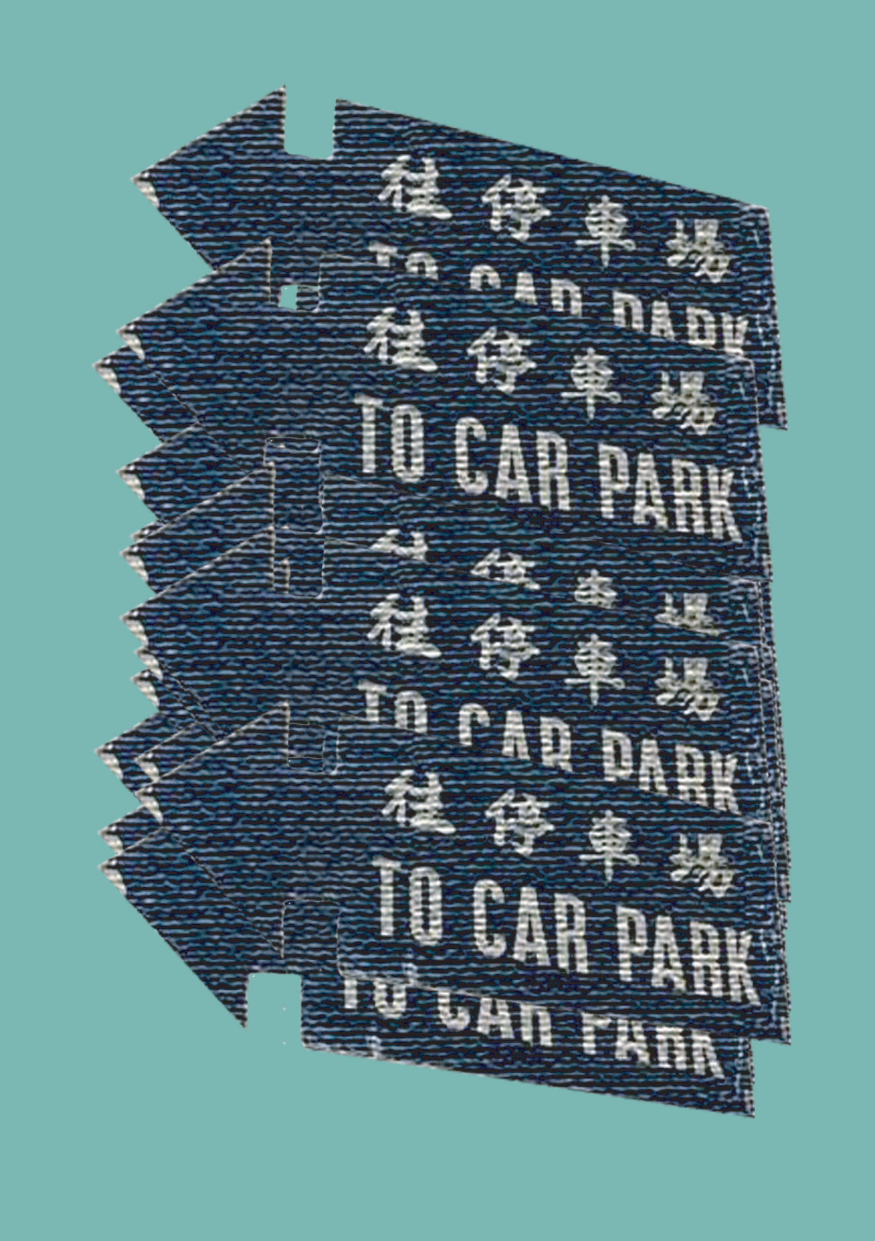
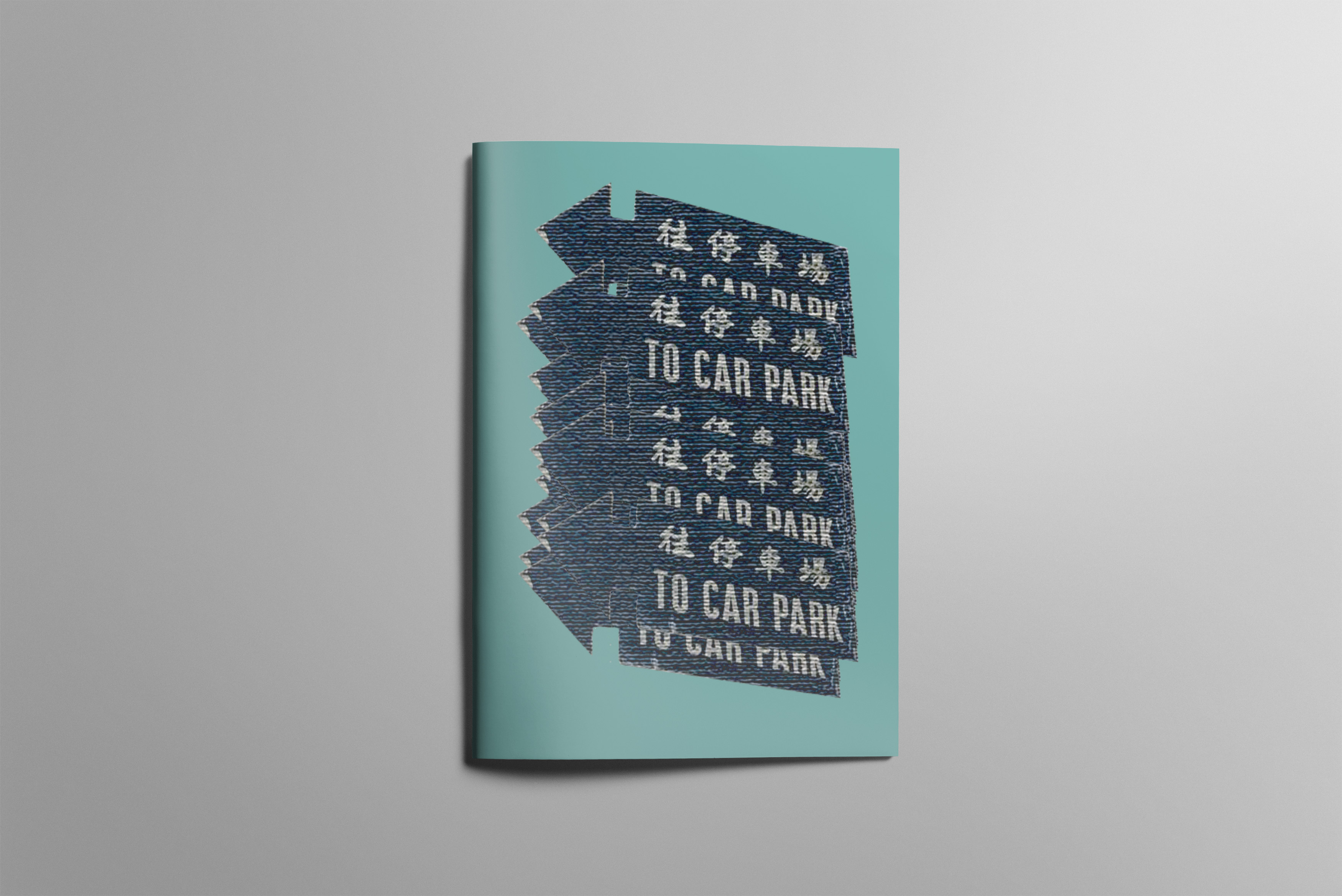
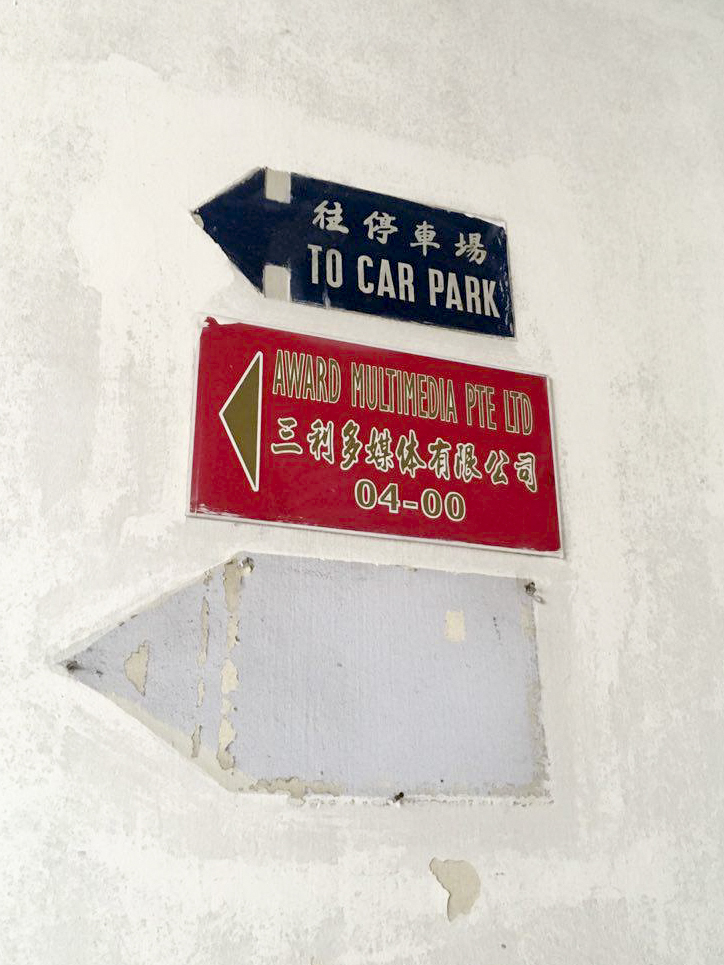
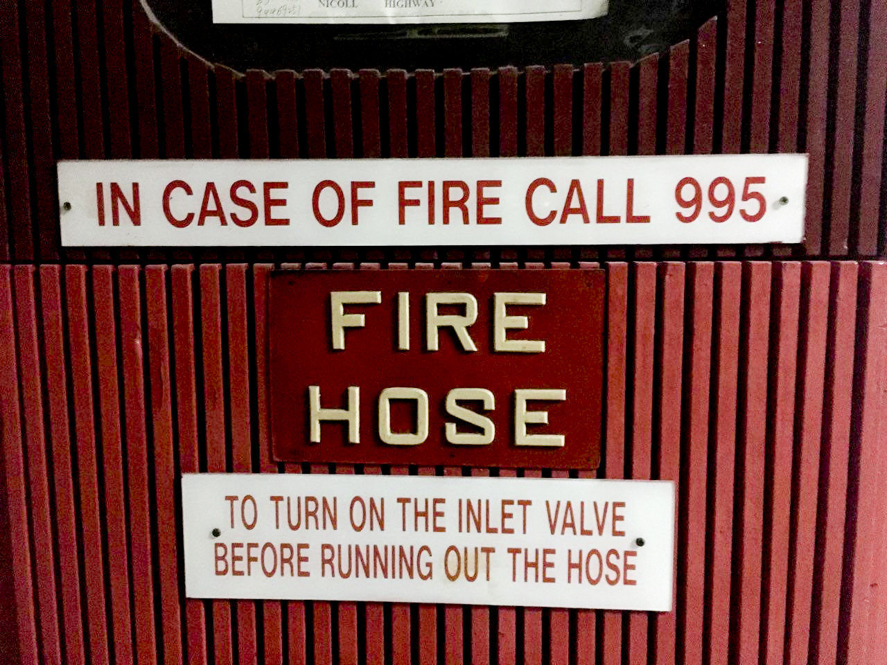
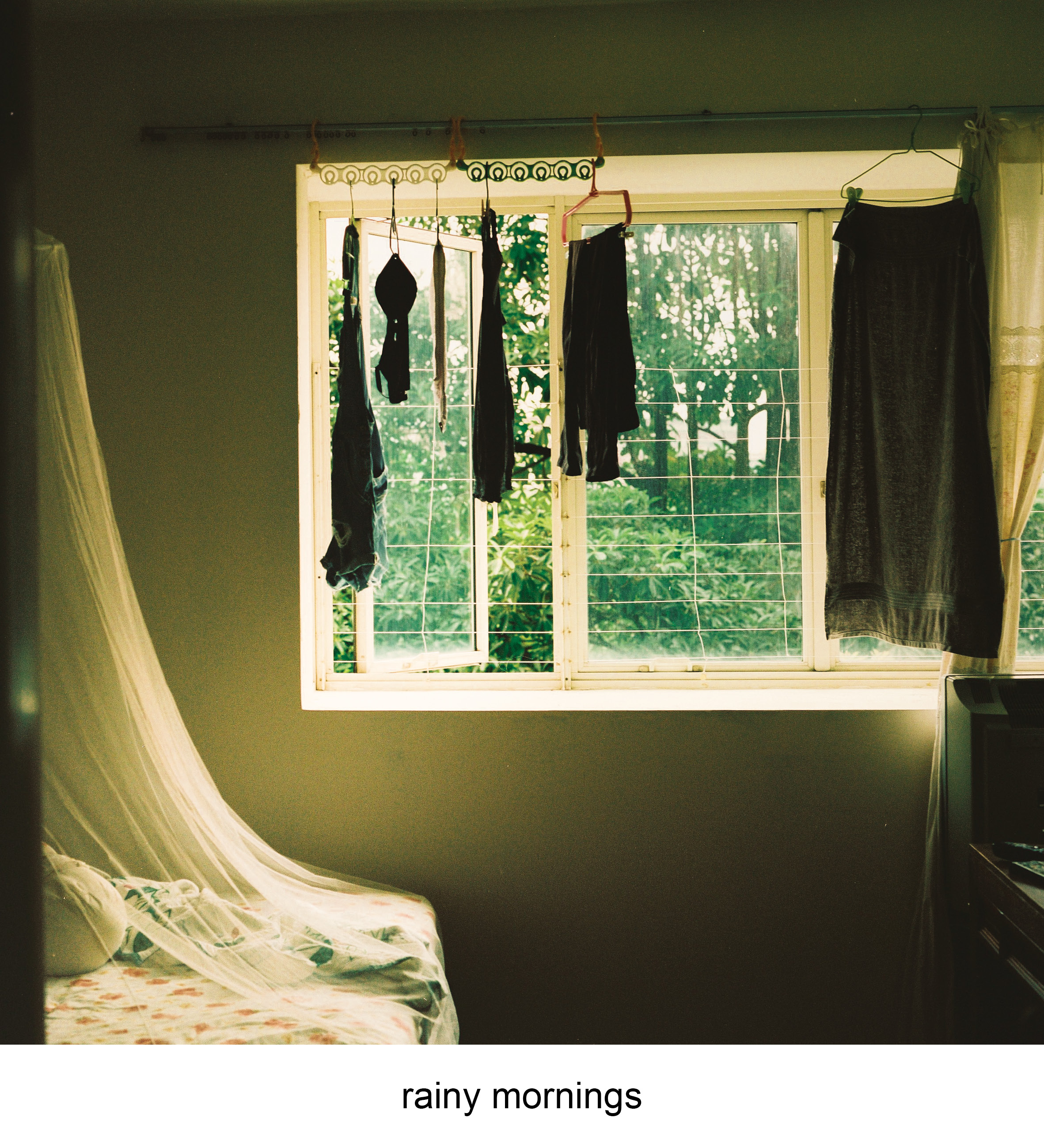
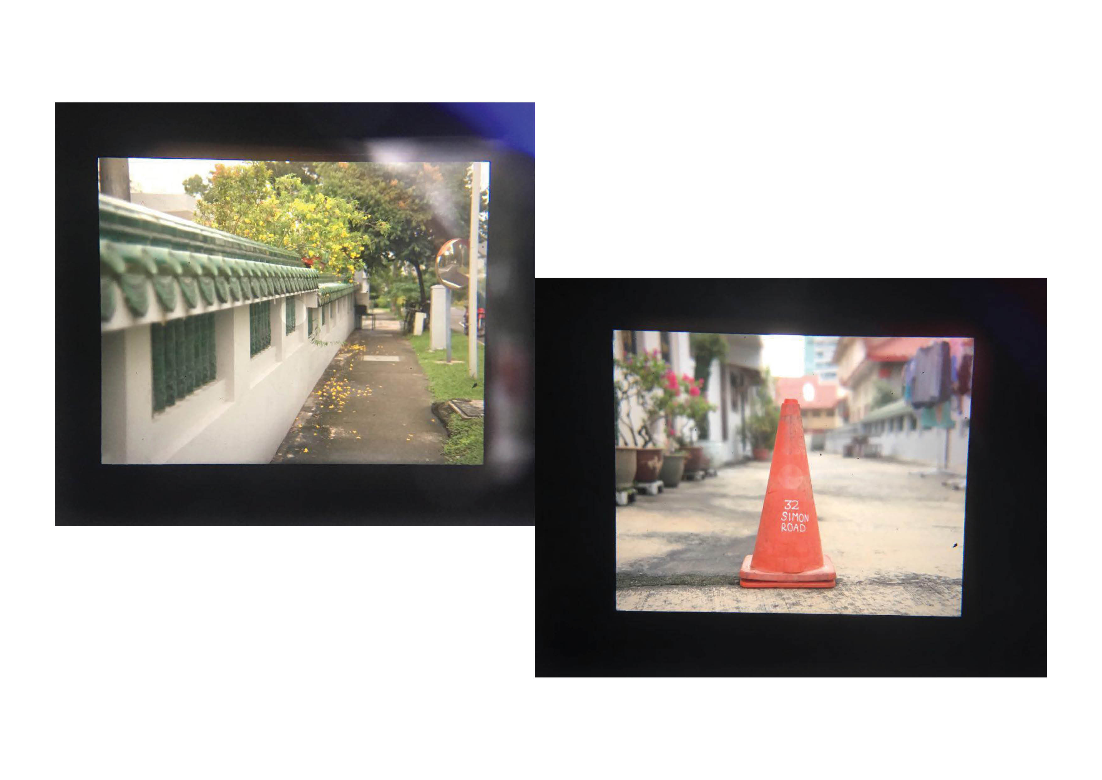
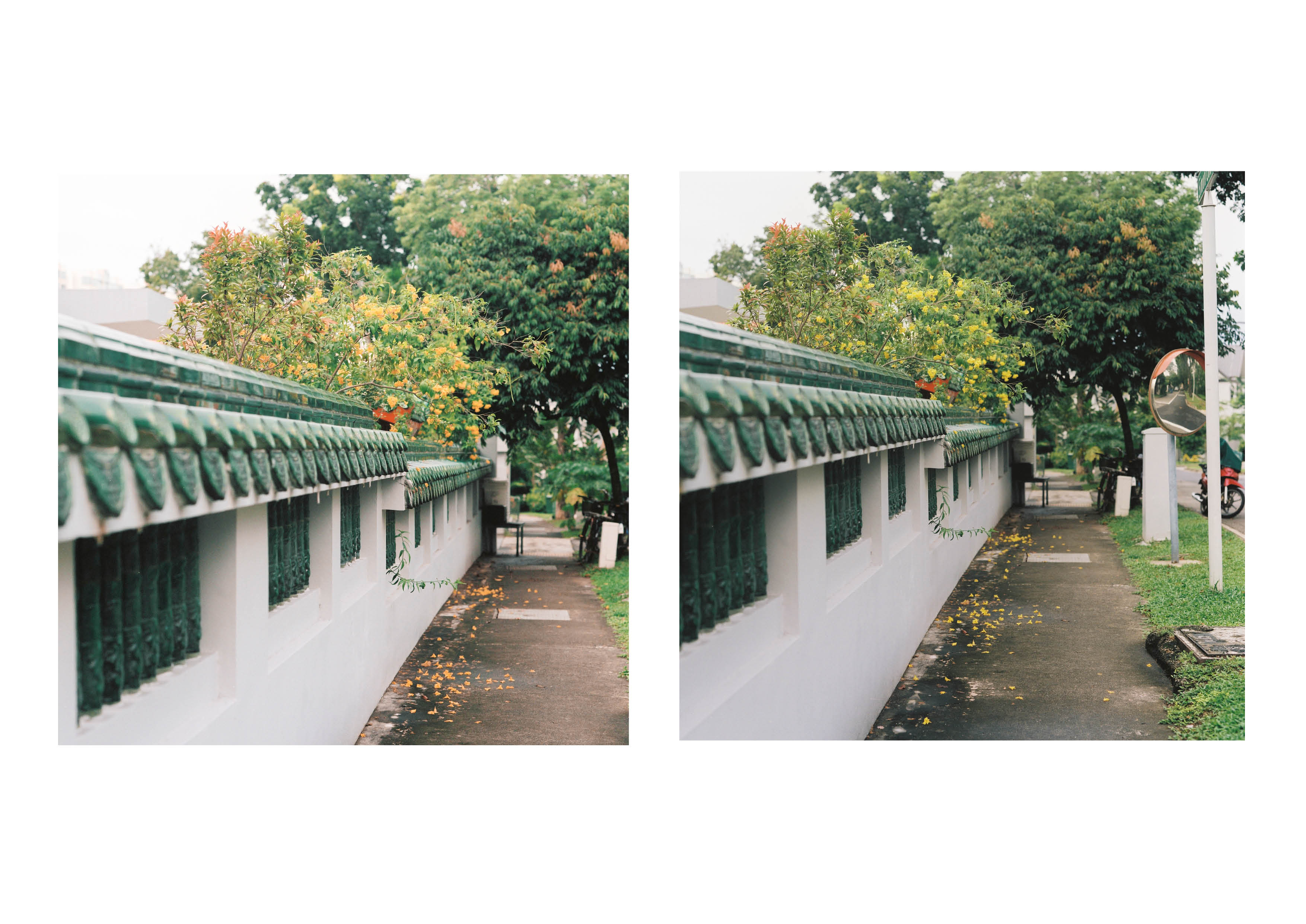
The zine starts with an ambiguous signage referring to a carpark, where the independent cinema and outdoor bars are located. It sets a prelude to the other pages to come with it’s dull and cool colours, suggesting the exterior of a building or book.
First Spread
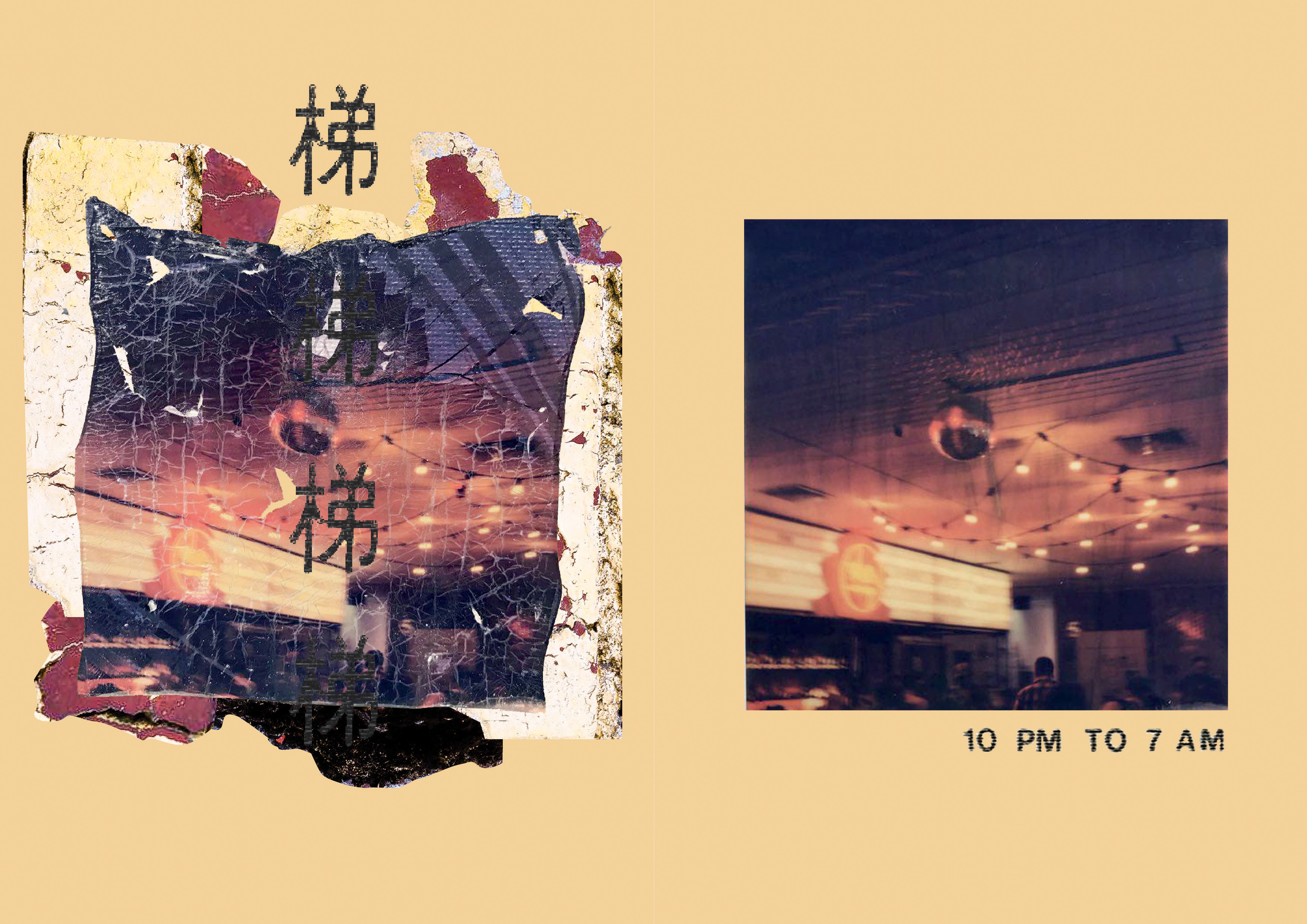
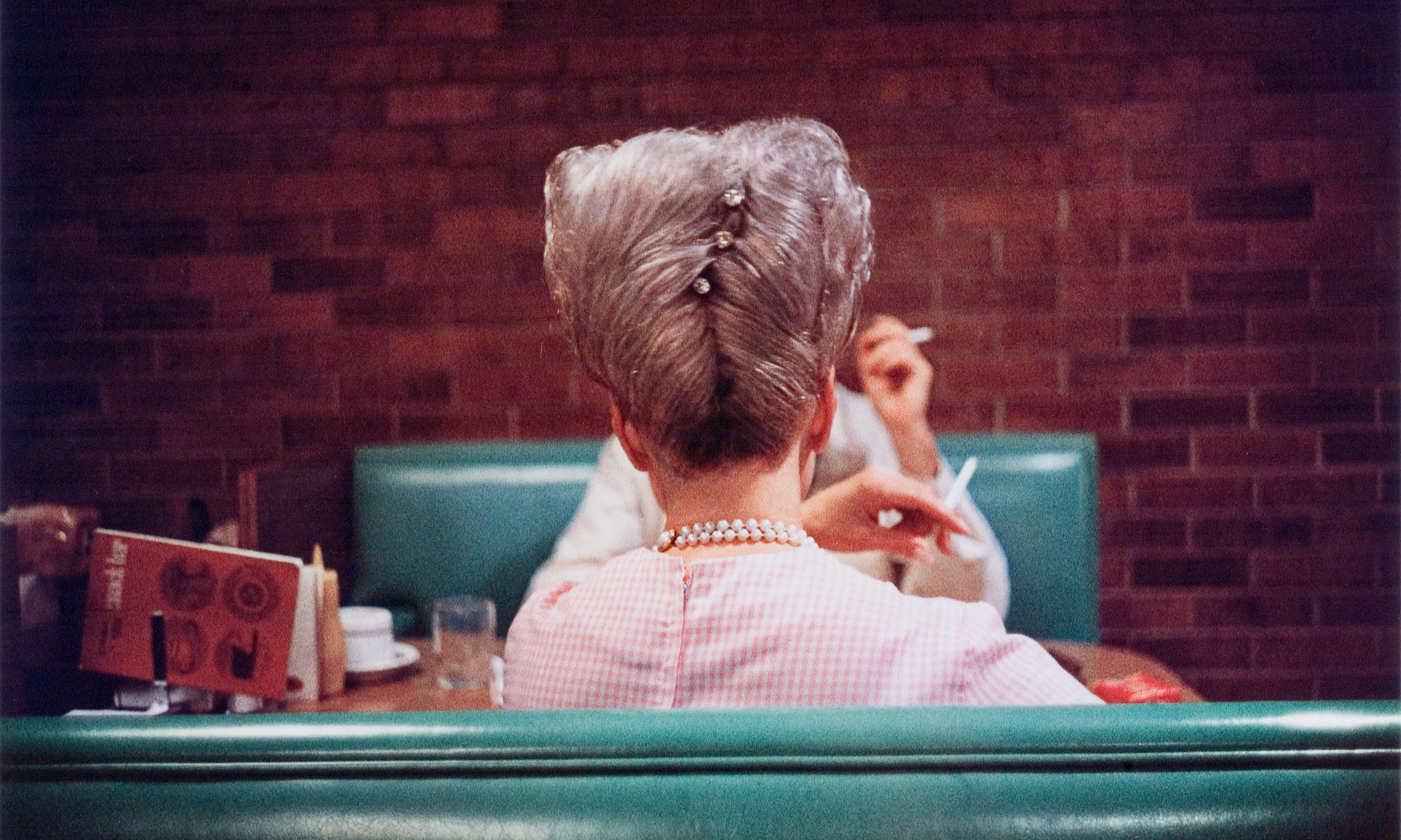
The first spread features the interior space of the cinema. The zine follows a format where the untouched imaged is contrasted with the warped version. The warped version is accompanied with textures sampled from the building, with a mandarin text that rolls over them. I used the text to set a soundscape of the space. Throughout the whole level you can hear music leaking in through a door or booming right in front of you. The characters in the first spread sets a build up on the sounds that are occuring, , with this example the sound is creeping in similarly to the movement of a lift.
Second Spread
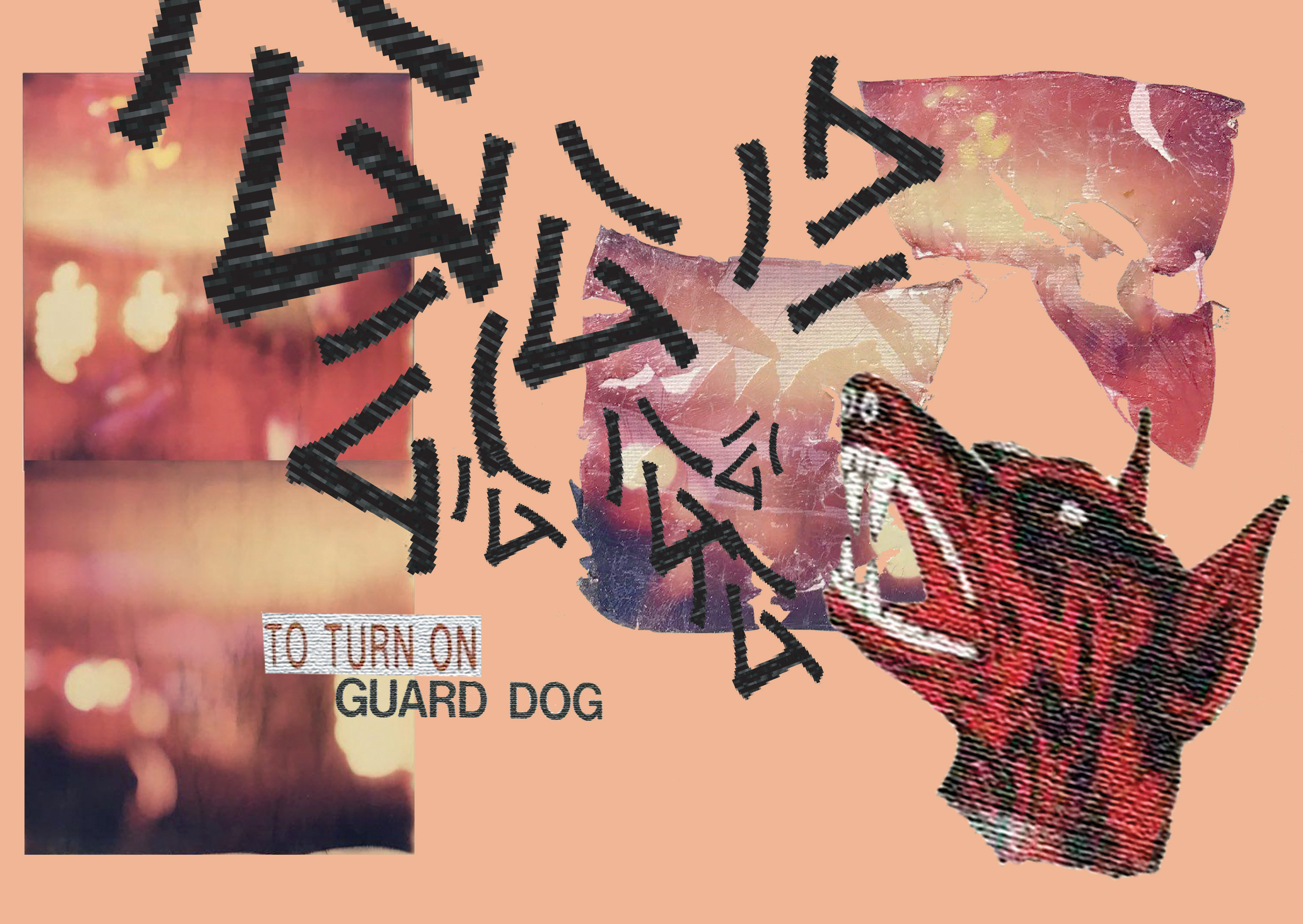
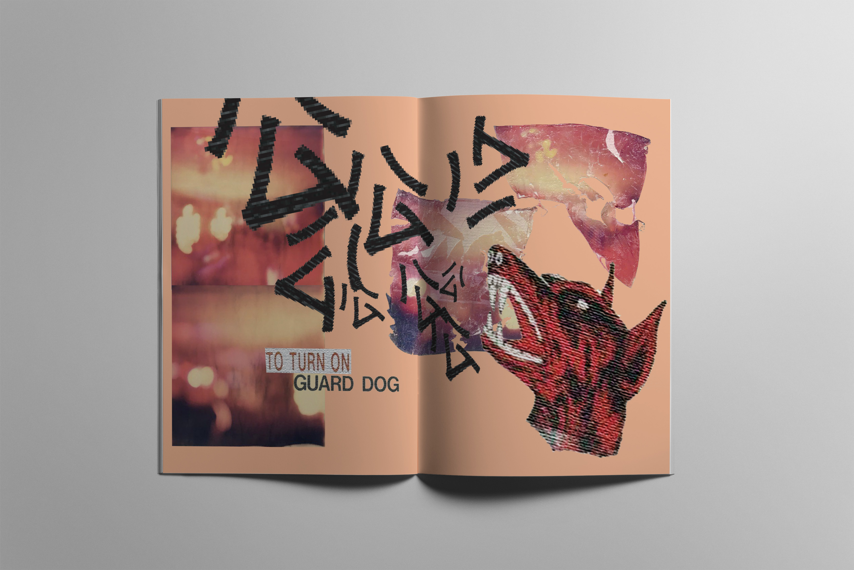
The middle spread plays acts as a crossing point for the warped images and the untouched ones. The texts are accompanied with a dog motif that heightens the energy through the colour and contrast. The texts “gong” when repeated at a loud volume mimics the sound of bass coming through the speakers. The loud and abrasive sound grows out of the frame as it grows larger and more textured. The mix of clean images and large distorted textured elements enhances the sense of discomfort caused by the music, crowd and sticky floors.
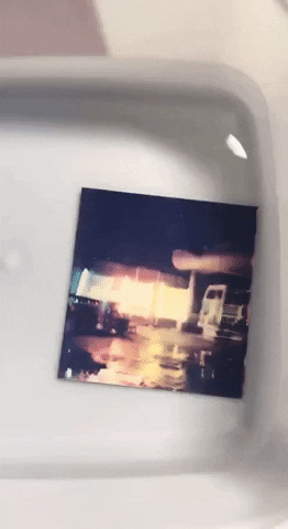
Third Spread
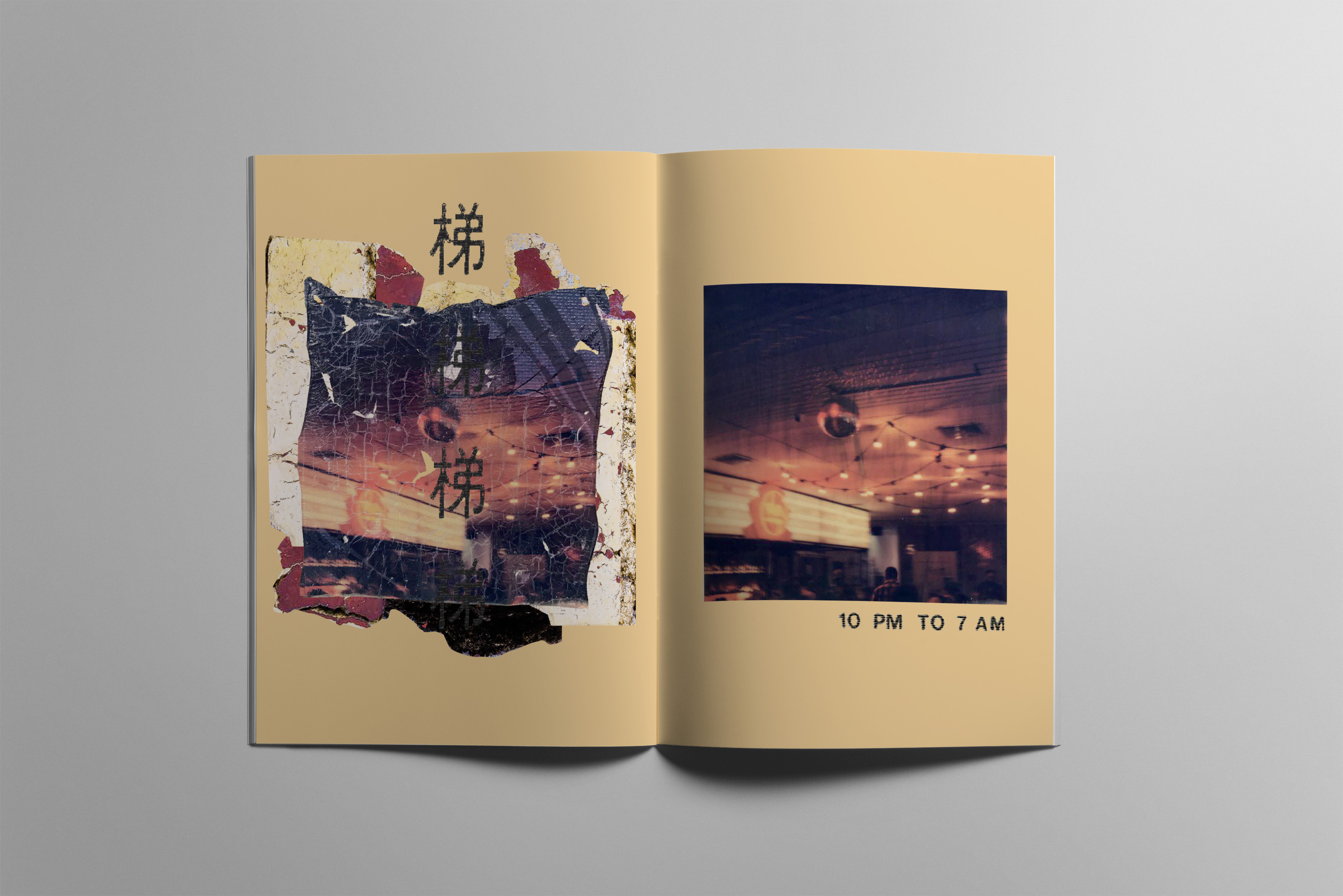
The third spread brings the viewer outdoors to the rooftop car park, where there’s a party going in a distance. The characters slowly diminish like a echoing cymbal as they grow smaller in scale. The use of blue and the night images brings the energy of the space down to a more calm mood. In this state the elements of the rust and decay the building has emerges from all the human activity that is occurring around the space.
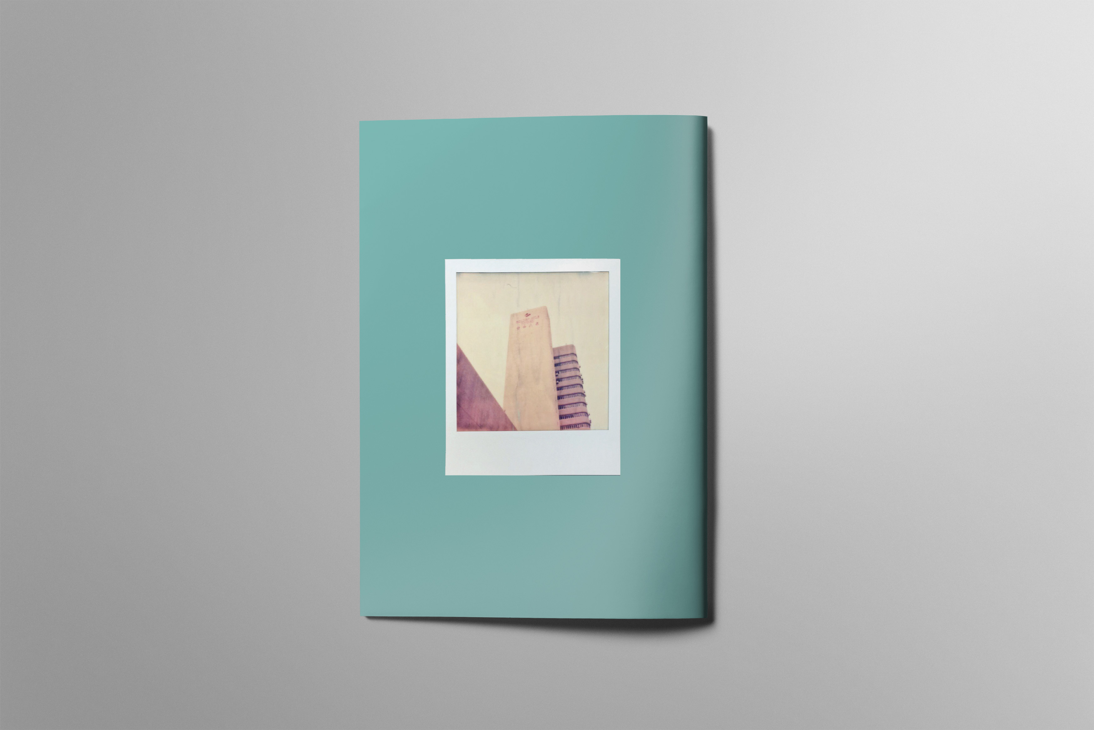
Back Cover
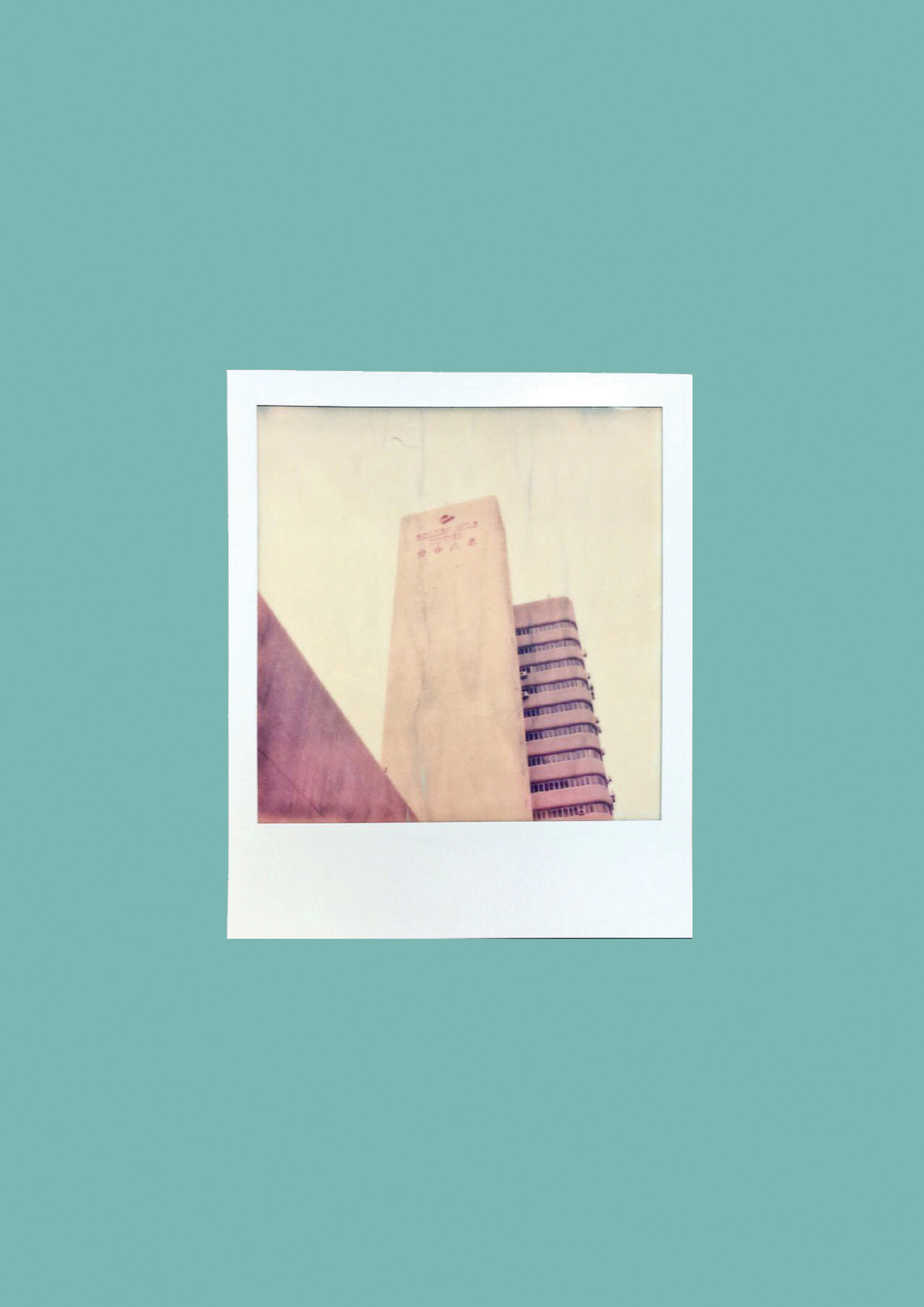
The zine concludes with an original photograph of Golden Mile Tower. My approach for this project was to bring the user to the selected space via colours and abstract imagery of movement, therefore there are not much hints on what the building is throughout the spreads. This image brings a name to the abstract imagery that the readers have been following throughout the spread.
The unique selling point Golden Mile Tower to me is the contrast in ageing architecture with the new tenants that re-purpose the space for younger crowds. The zine should reflect the grime and deterioration of the building while also showing energy and warmth from the gigs that are held at the new event spaces that occupy the building.
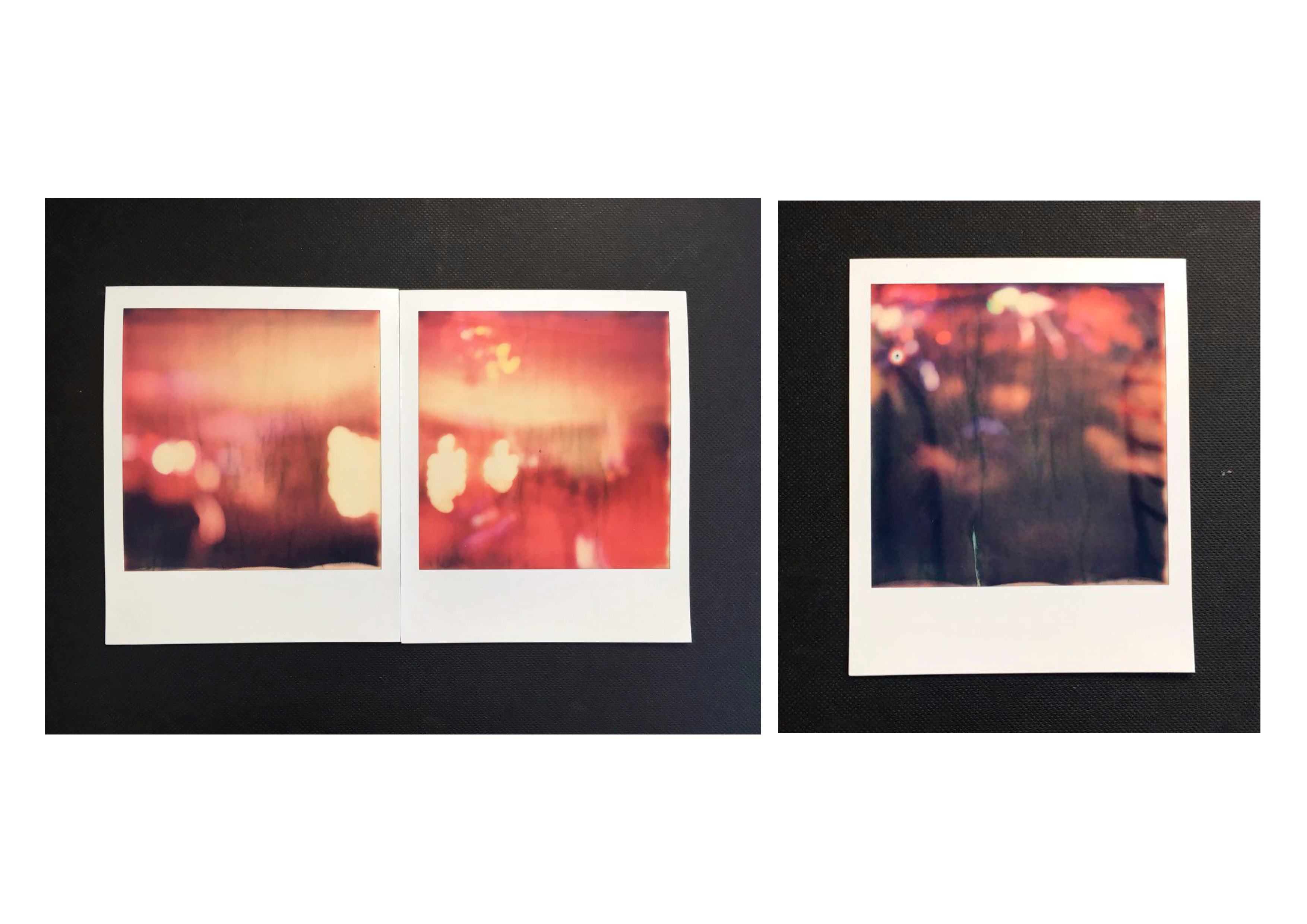
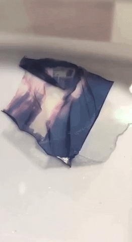
I took reference to Miun and her works with Polaroid emulsion lifts for my art direction. I planned to use photos captured with a Polaroid to express the organic energy of the space, through long exposures that capture light streaks and movement.
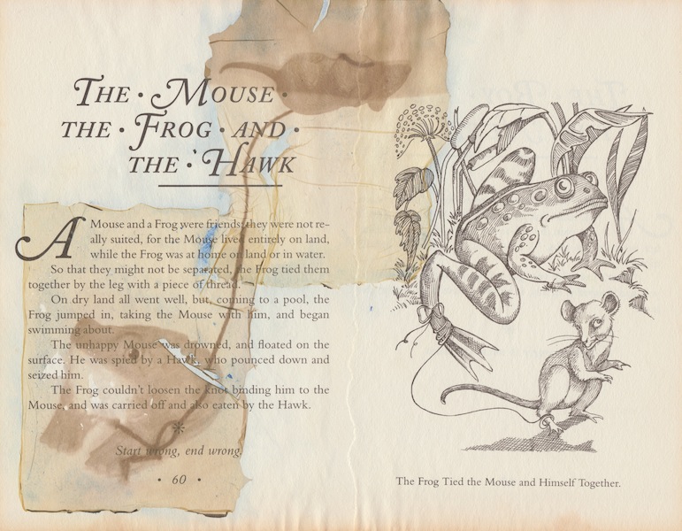
miun , The Great Illustration Classics Aesop Fablesmiun , The Great Illustration Classics Aesop Fables
The technique of overlapping the membrane-like Polaroid emulsions create this organic drapery around the frame of the image. I wanted to use this soft quality to represent the organic elements of the zine in comparison with the textures that will be sampled from the space itself. The texture of the images will thus enhance the element of life in them.
PROCESS
Photo of Car park Bar, Intermission BarPhotos of Middle Class Cigars Party
Soaking the imageSeparating the emulsion layers
Image on canvasImage on canvasImage on canvasImage on canvas
\
The emulsion lifts did not turn out as organic as i wanted them to be, some of them had cracks and tears that were not planned for. While trying to salvage the images i realized that the textures can be matched with textures that are found on the building itself. Not only does it reference the deterioration of the space, but also shows the fragility of new spaces.
Texture SamplesTexture SamplesTexture Samples
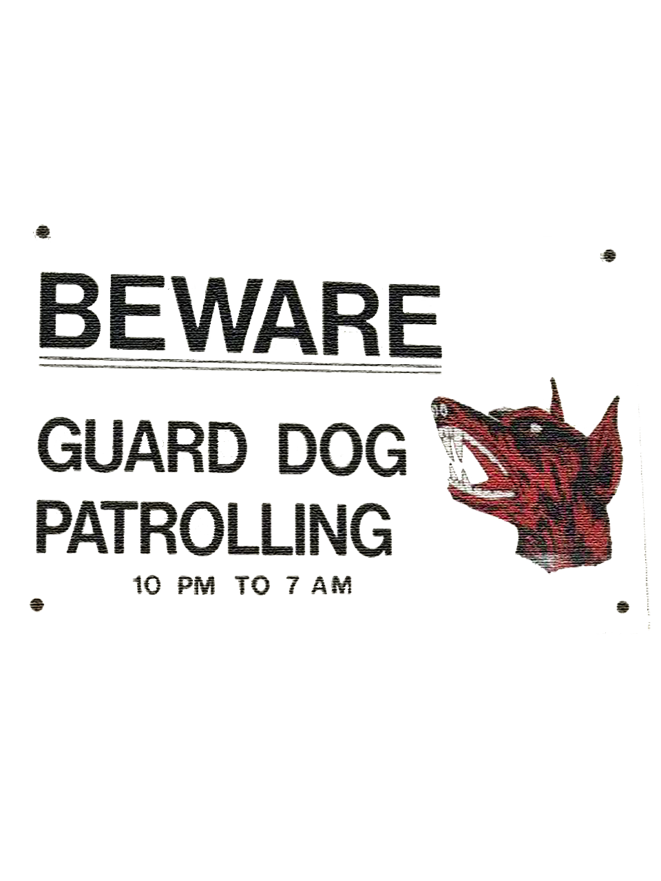
To bring a narrative character into the zine, I decided to include sampled texts from the existing signs in the building. The letter forms and characters are unique to the space as they seem to not be touched since the 80s. The guard dog motif appears in multiple areas in the building, becoming an iconic irony of referring their own security guards as guard dogs.
Before I started my research on my location, I had to research on methods of research. Research methods are split into Primary research and Secondary Research. Primary research revolves around gathering new data via field research while Secondary research is to gather information that already exists.
Looking further into the various forms of research, there are qualitative and quantitative data. Qualitative data includes
Direct observations
Open ended surveys
Focus groups
In depth interviews
Oral history
Participant Observation
Ethnographic observation
Contextual analysisOut of the various forms of qualitative data, I will be focusing on direct observation, participant observation and context analysis as it’ll be the most plausible methods within the current timeframe.Quantitive data on the other hand is data that is able to be quantified with numeric variables. Such data includes number of shops, human traffic, etc.The researcher’s stand on the location plays a big factor in the location research as we have different experiences and expectations entering the place. You need to take into consideration the biases of acknowledging if you are an insider or outsider of a space.
Before going to the actual site for observations, I set a few guidelines and questions for myself.
Who are the key subjects?
Where do you belong as a researcher?
What happens at a specific place and time?
When do things happen and are there an identifiable pattern?
Are there differences in personal assumptions of the place and if the “locals” agree in it?FIELD RESEARCH
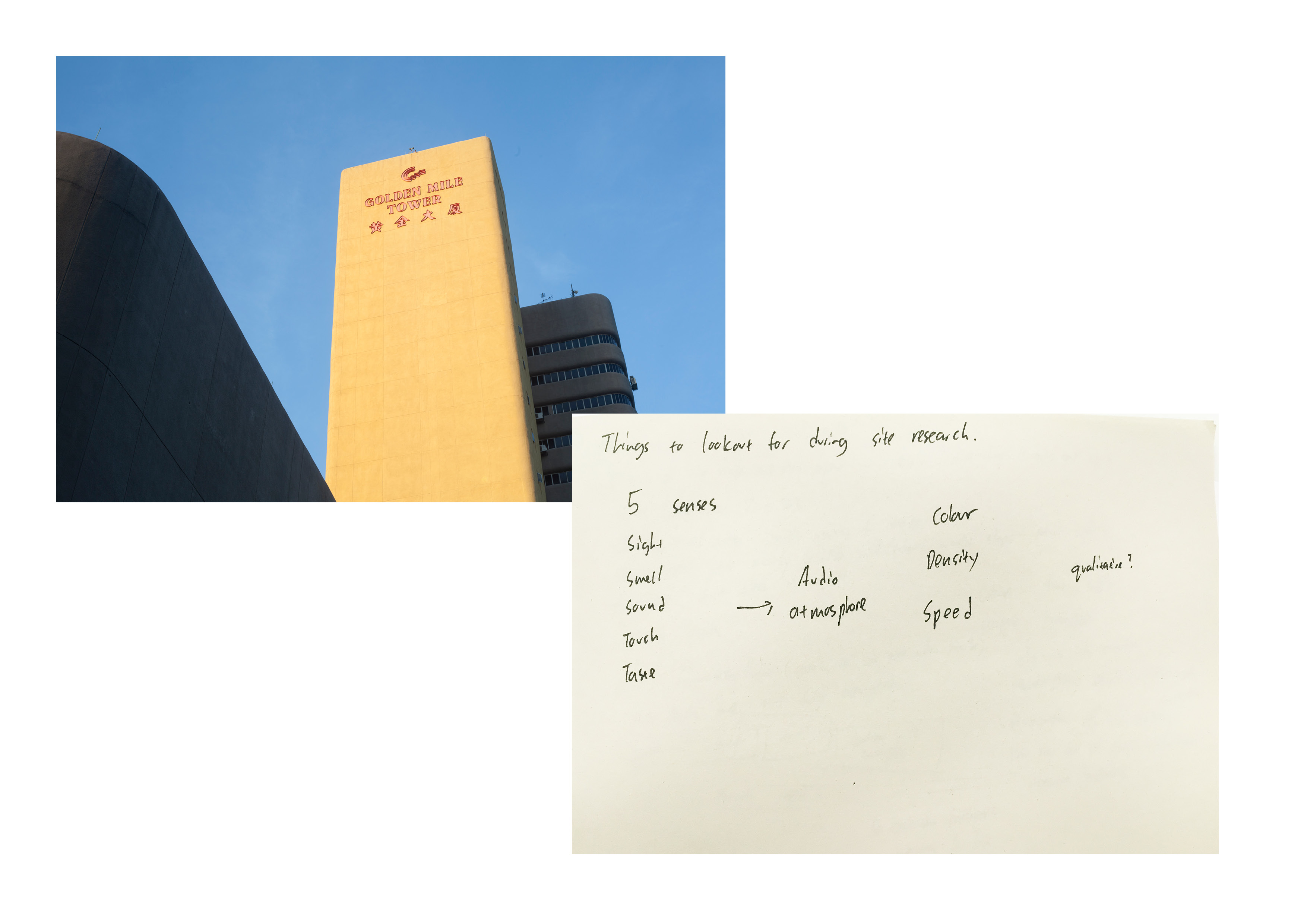
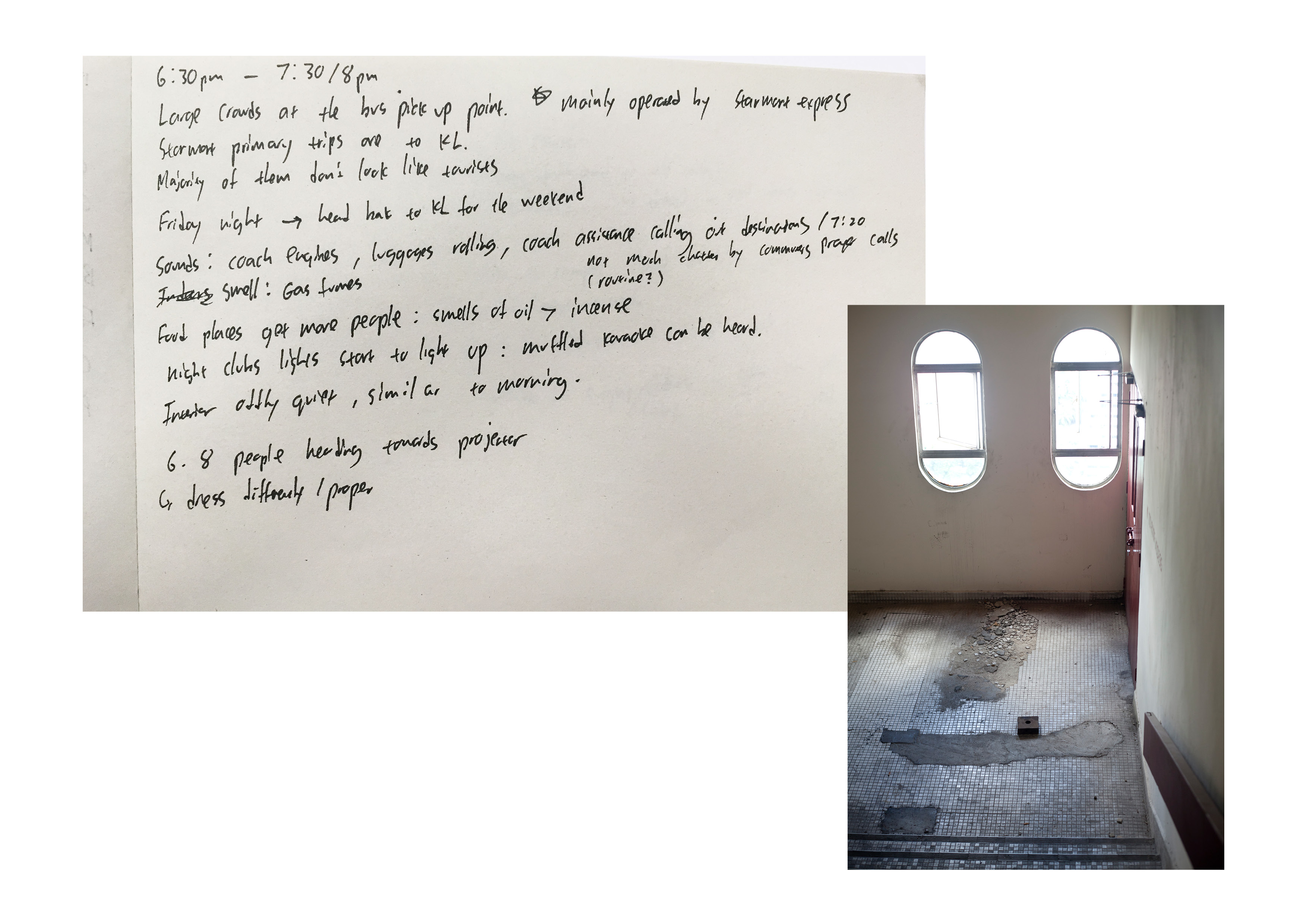
I tasked myself to focus on the 5 senses and just take note on everything I observe on a Friday from morning till the late night through sound recordings, videos and written notes.
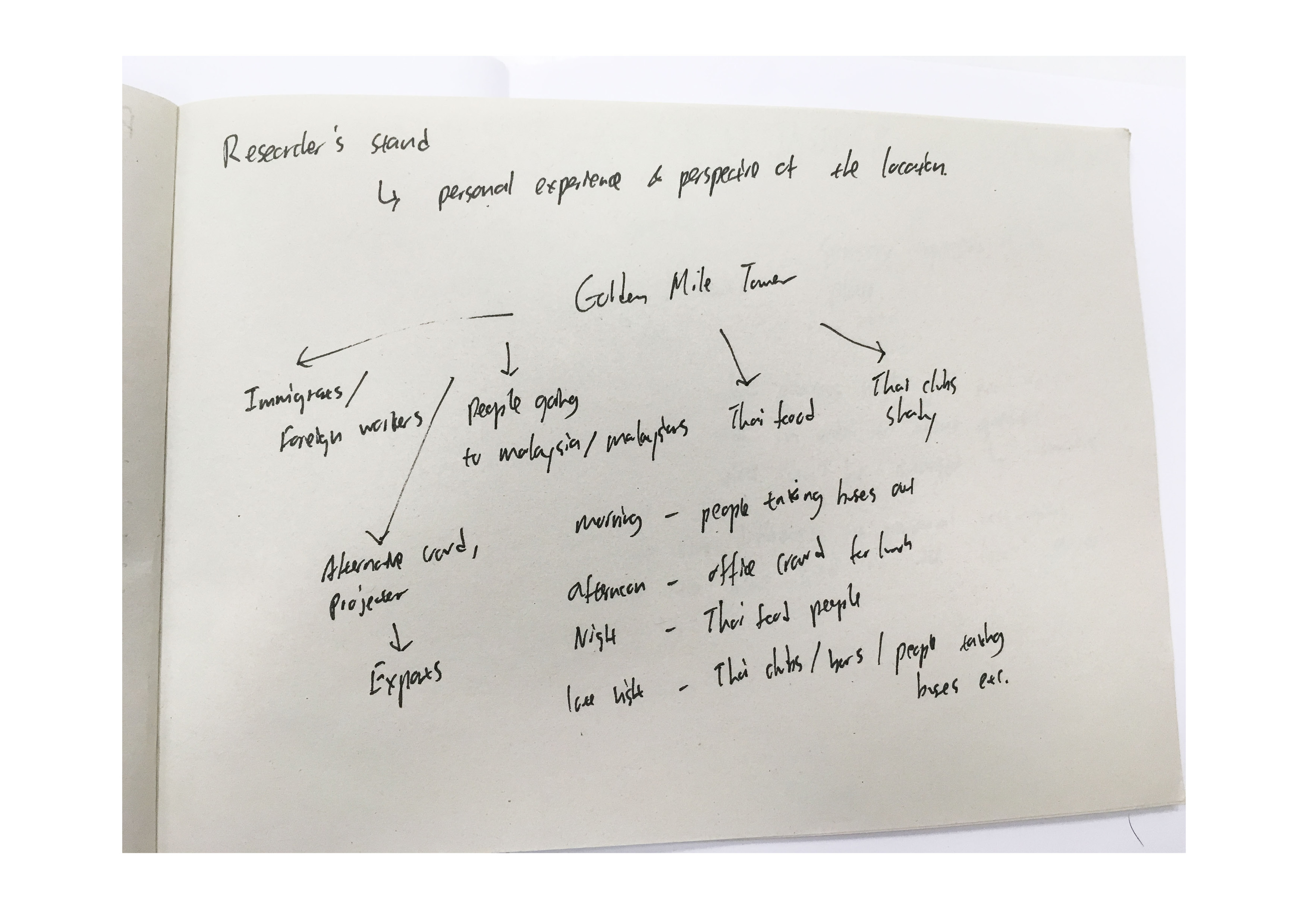
After observing the activities that occur throughout the day, I decided to split the activities based on different areas of the building. In summary, each area depicts a prominent activity that contributes to the space’s character and uniqueness.
FRONT STAIRS
Golden Mile Tower houses Star Transit, a coach service that provides daily shuttles from Singapore to KL or Johor. Their operations run from 0645 in the morning all the way to 2359 at midnight. Their busy periods run early in the morning, during dinner and towards the last few trips out of Singapore. The commuters that travel during the peak hours look like it’s a normal routine, often just carrying a backpack or a small luggage. There are very little expat tourists/backpackers contrary to my assumptions.
SPIRAL STAIRCASE
The spiral staircase is an iconic structure of Golden Mile Tower as it links the ground floor to the two main functioning theatres of the space, Carnival Cinemas and The Projector. Golden Mile Tower originally housed the theatres Golden 1, 2 and Golden Studio which are recently repurposed for new cinemas. Projector expanded their operations and included Intermission Bar that hold music gigs every other weekend. The patrons that attend stand out from the usually crowd as they head towards the lift that brings them straight to the cinema at level 5.
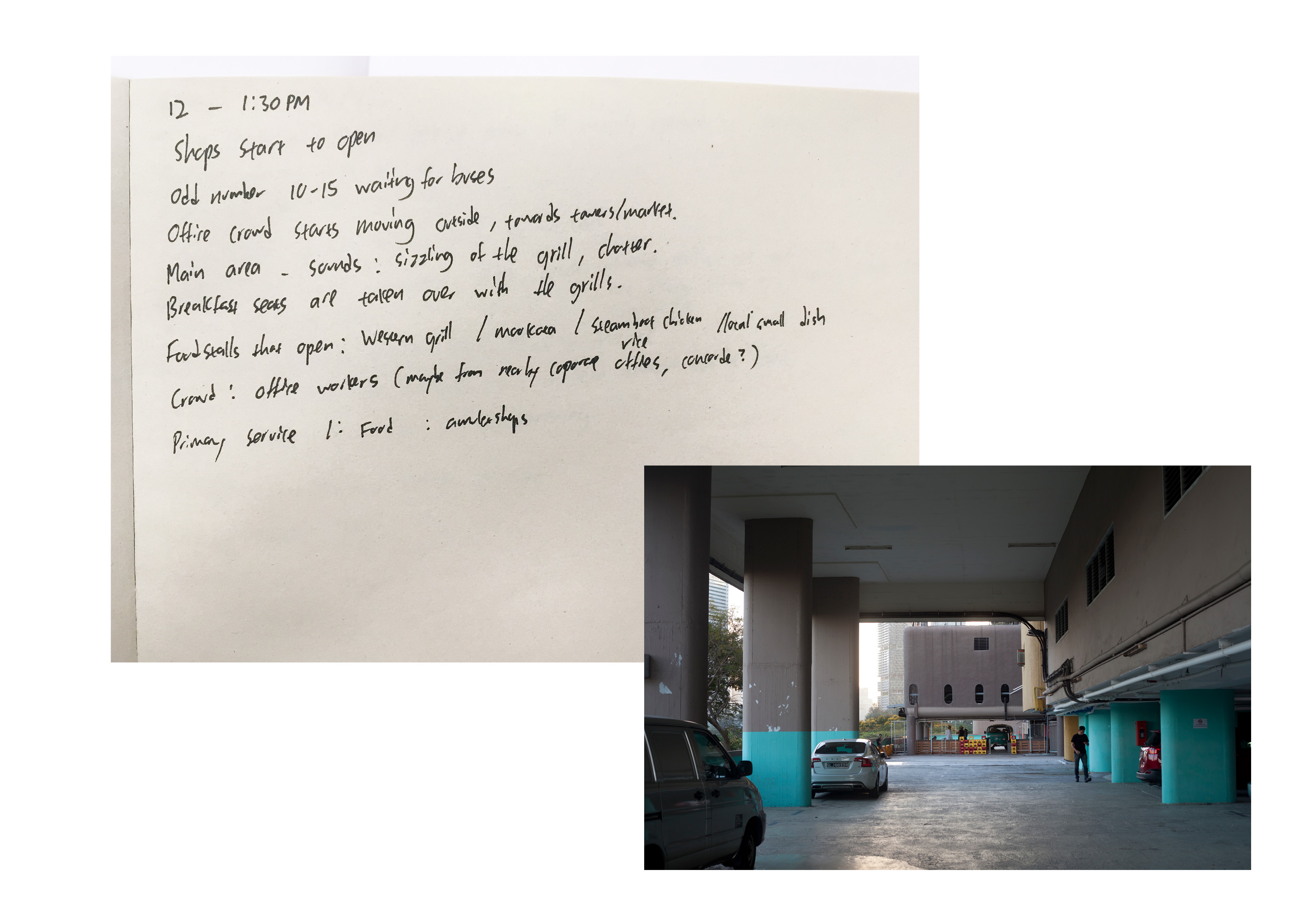
MAIN SHOPPING COMPLEX
Contrary to the general assumption that the complex is famous for it’s Thai Bars and Thai food, there are a very low percentage of Thai-related shops that occupy the building. The shops are inhabited by old tenants either running amulet shops or offices that are not open to the public. There are offices that are located from level 7 – 22 which are only 2/3 occupied. The activity of the shops can be describes by the smell throughout the day. The corridors in the morning have a strong incense smell as it grows to the smell of cooking food during lunch. In the evening there’s the stench of stagnant oil and frying meat that wafts around as the mookata restaurants begin to get crowded.
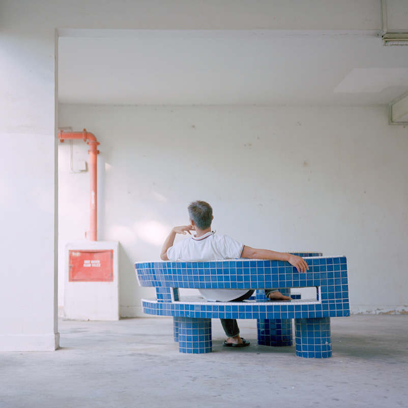
ROOFTOP
The rooftop is probably the most interesting to me as it features the ageing architecture of the space in contrast to the new establishments that are occupying it. With $3 flat parking after 5pm, it was a great place to just hang around while doing my research. Golden Mile Tower sits awkwardly in place with other oddly shaped buildings along Beach Road. The building features brutalist-like architecture with round corners and seem as if it’s made out of multiple modules. There are visible signs of age and detoriation when the walls are seen up close. The metal signs have rust and the concrete walls and floors have huge chunks missing from them. As the carpark act as an roof space, there is clear views of the Kallang basin and portions of the city skyline. The space is occupied at night by a bar which run parties mainly by expatriates. It gets crowded from 10pm onwards till late around 3am.
My selected data can be presented in the video below. They feature the sounds that occur at the respective timings across the day that enhances the experience and vibe of the area.
As Golden Mile Tower reaches it’s halfway mark of it’s 99 year old lease, there are attempts to reacquiring the land via enbloc. It brings forth the question of the sustainability of the new initiatives such as Projector and the rooftop bars. I find the unique selling point of the area the deterioration of the old architecture in contrast with the new tenants that are repurposing the space for a younger crowd.
A few weeks back, we had a lecture from a multi media artist Tad Ermitano via a webcam. There was a funny irony of him sharing his work on manipulating surveillance through a surveillance-like application, Skype. It brings light to the many conveniences we use now and how absurd they are if you take a few steps back and look at the interactions as a whole.
As we move into the age technological advances, we create cameras and processes that are able to capture and project live with almost no latency. It becomes the norm to have “no lag” and “1080 HD pleas” in the things we use. Ermitano plays with that expectation we have in his work Twinning Machine (2012) .
The project had multiple reiterations and also included choreographed pieces with dancers. The version I saw was the one at the Singapore Art Museum, where the the audience sees their reflection in the screen as if captured from a cctv. One would expect it to just be a recorded image playing back in real time. Ermitano however glitches and warps the timeline to replay the captured image in random times. This abstracts the audience from their conscious view of themselves on the screen. Just with the act of manipulating the replay of the recorded clips, he creates an alternative version of the audience. The project image does not move the way the audience expects it to as it creates a identical copy of them that behaves at it’s own will. I feel this simple manoeuvre puts the audience in a spot when they find out that they have no control on how the image is moving. And just with this simple manipulation of recorded image, it makes you question how recorded data can warp the understanding of what you see.
Ermitano also created sound art and ambient music projects. It prompted my curiosity behind how sound artists actually intend their projects to be appreciated. There’s rarely a hook, beat or rhythm for audiences to follow when it comes to ambient sounds compared to the structure of music we are used to. Ermitano replied that curiosity by explaining that when creating a sound scape, he creates a medium and a space for the individual to explore. Everyone comes into the space with their own background of knowledge and experiences with sounds, therefore each approach is unique to the participant. Although I agree to the idea of having personal experience, I still find the gap of introducing such works to people who are new to them. I often have peers dismissing such projects to just noise or a random montage. I guess it boils down the the approach on experiencing art. The participant has to put in work to get an equal rewarding experience out of it.
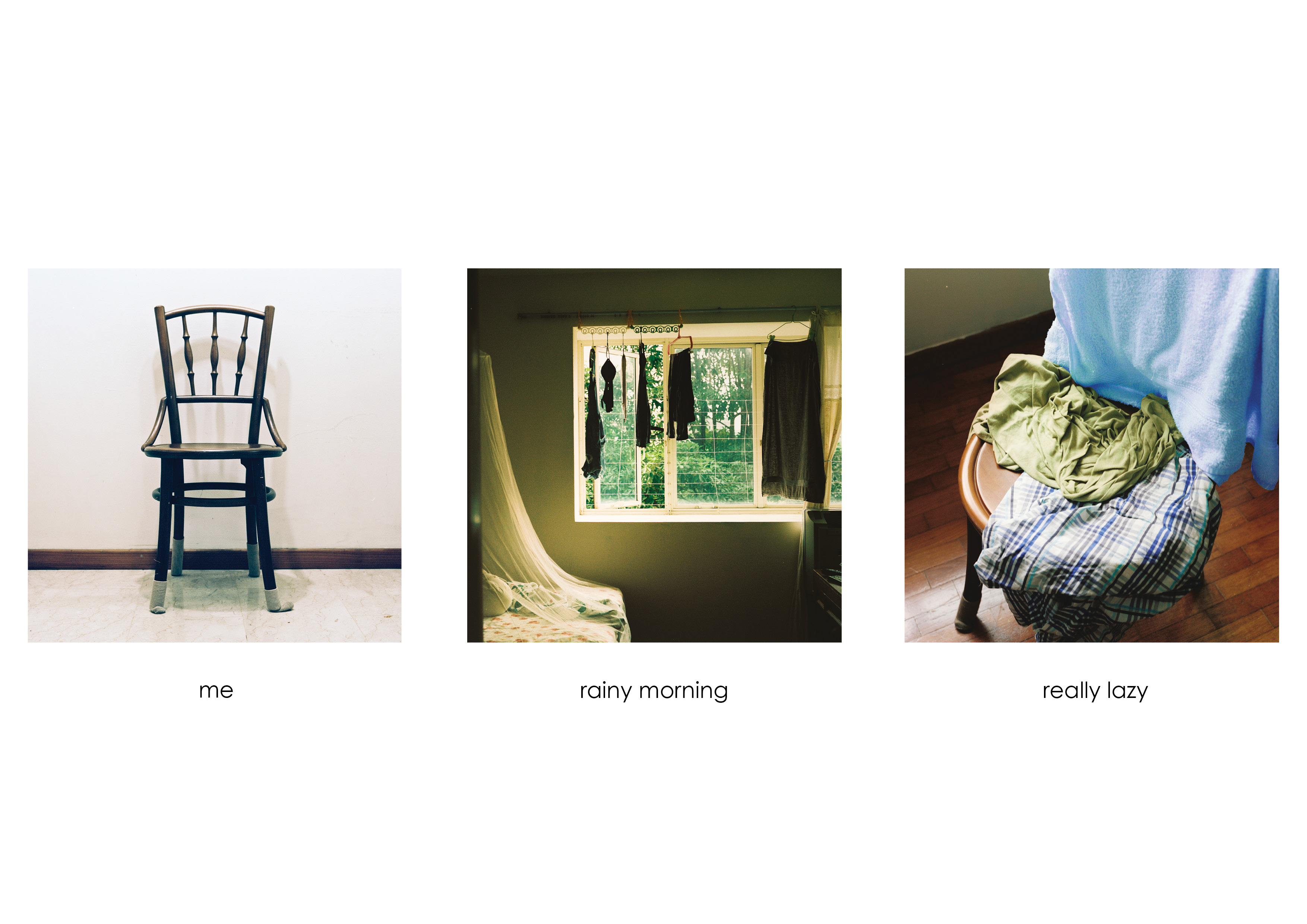
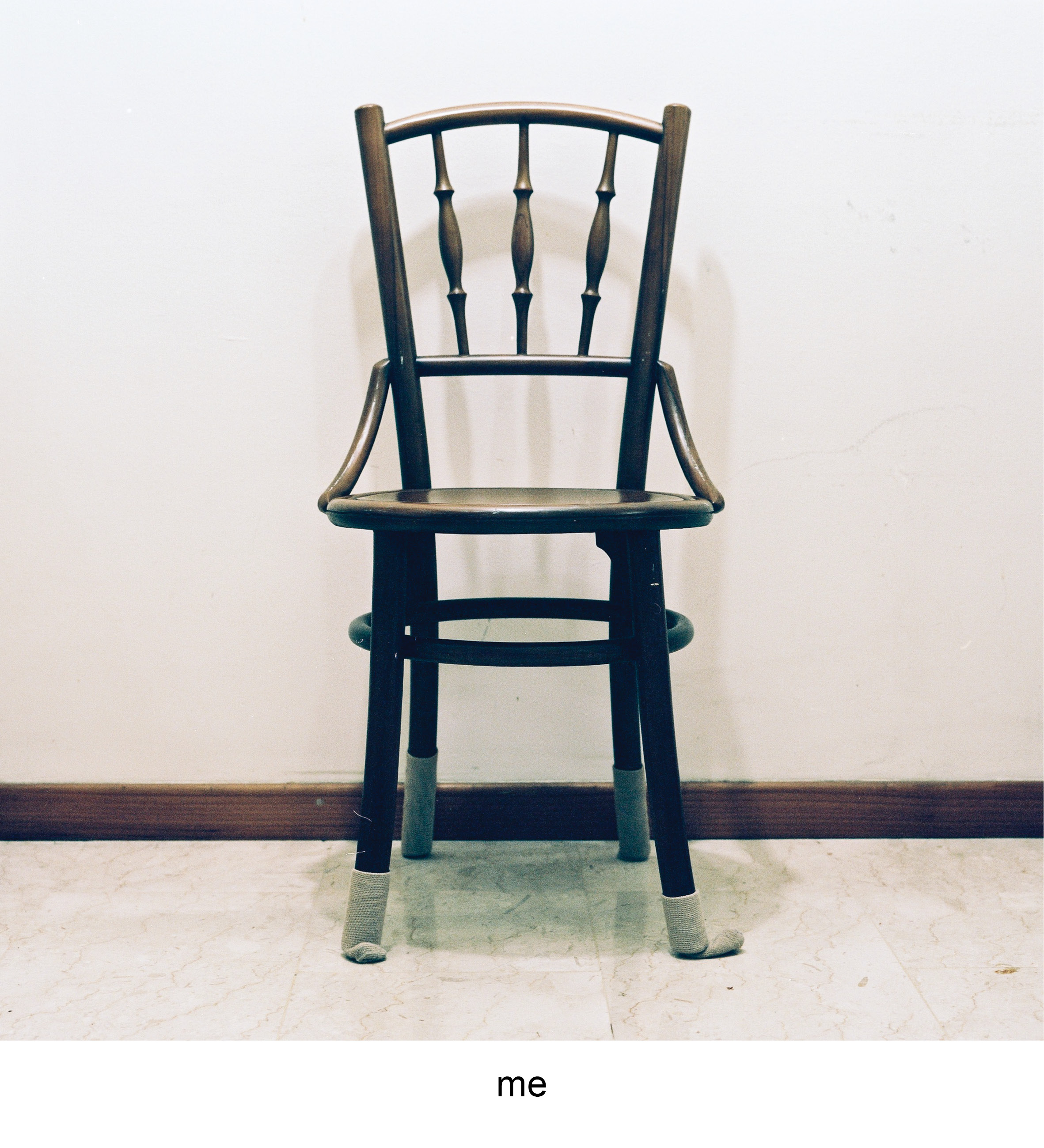
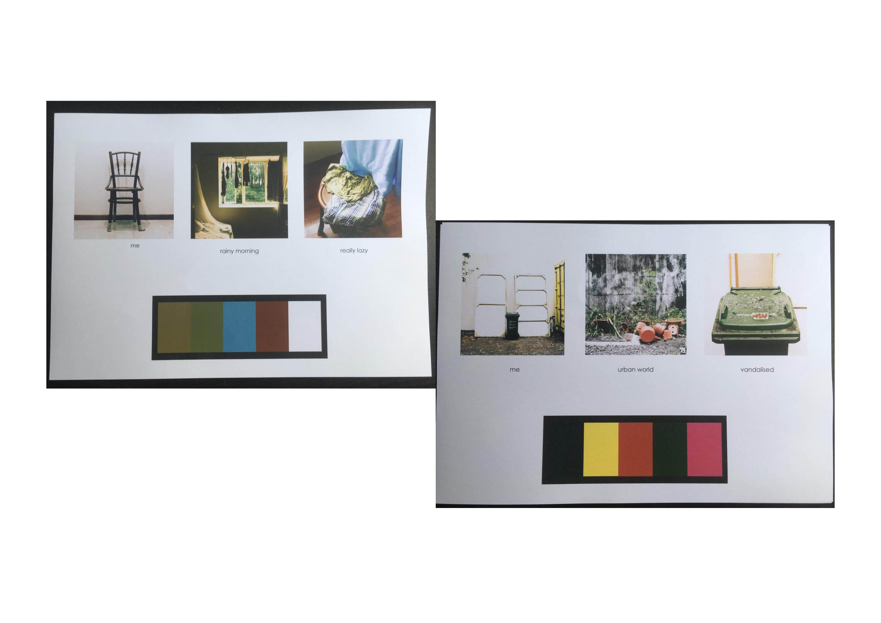
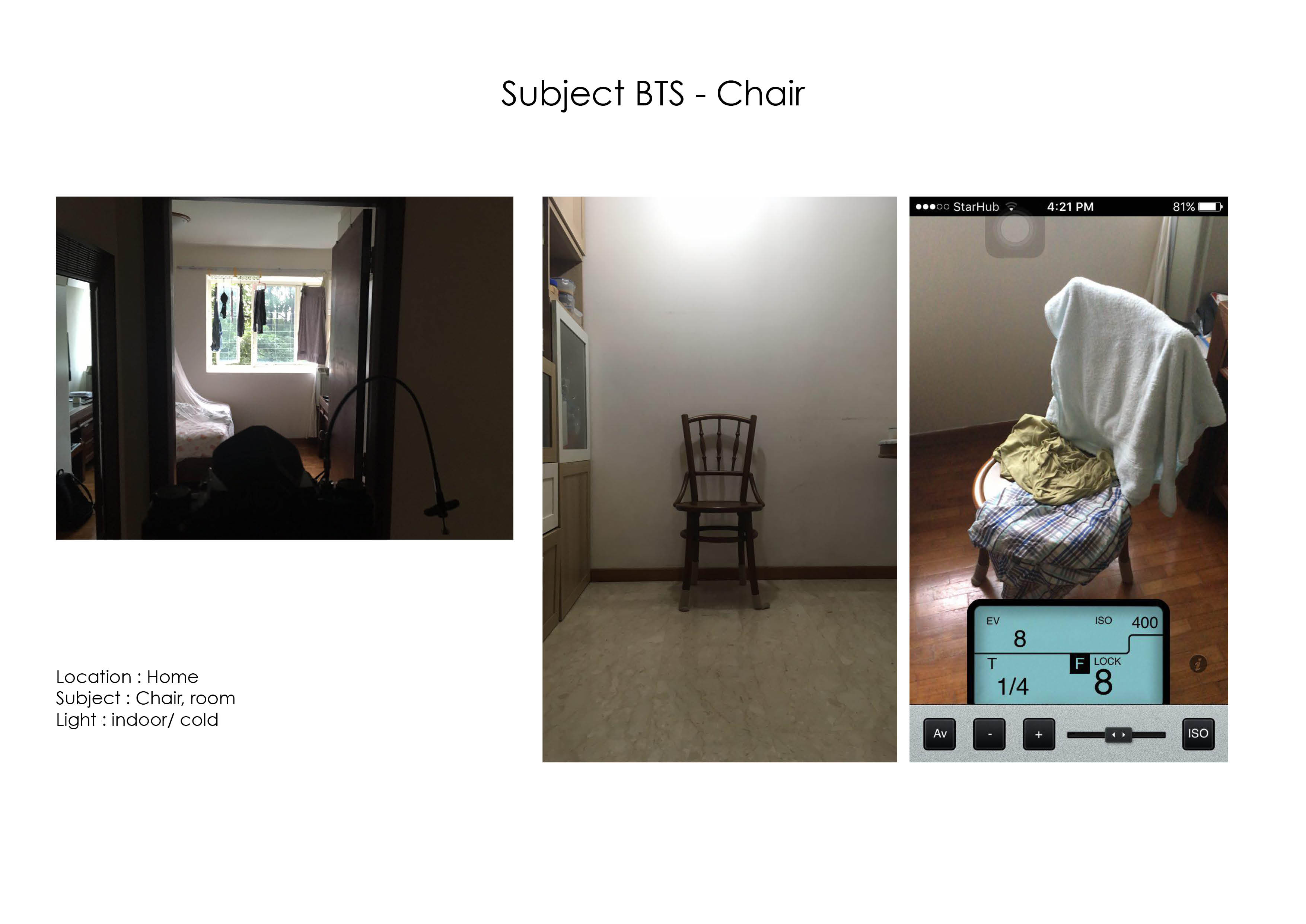
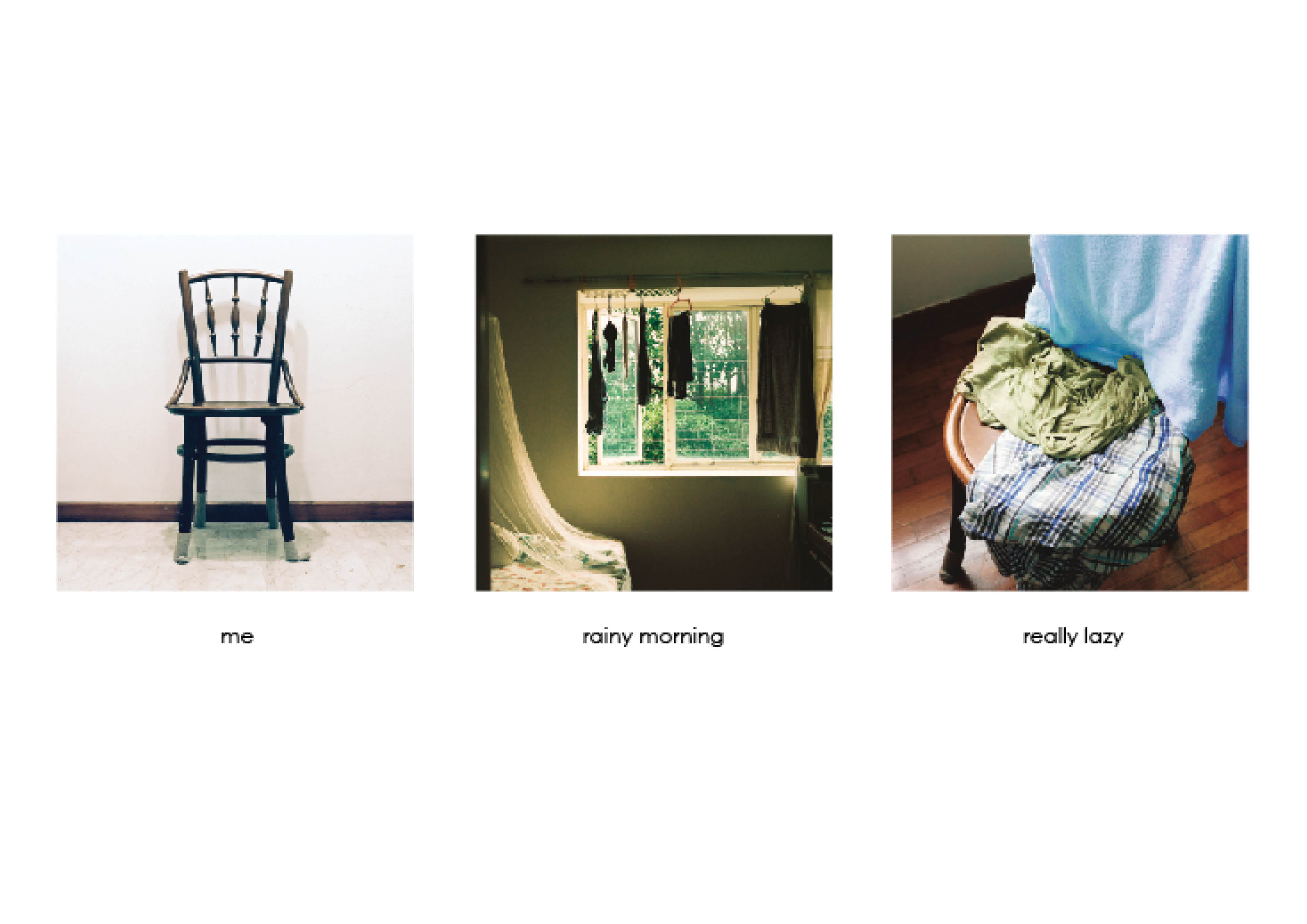
This project is a study on banal objects and how they adapt and change in the environment they are placed in. In the first equation I identified myself with a chair at home. Through the cozy weather when in rains, I get really lazy. The chair is a victim of my laziness as it takes up my sloth in through holding onto my clothes and laundry that will be dealt with later in the day
The colour harmony that is present throughout this equation is the split-complementary through the colours of green, blue and brown. The first photograph shows the chair in a neutral setting, where the individuality of it is played out through the presence of only a single deep brown colour of the chair.
The second photo shows a room, where the cool green colours from trees outside mimics the indoor hue when a gentle rain goes on in the morning. The gradient also splits the green into analogous green yellow.
The last photo shows the combination of both compositions with the chair being draped with clothes of blue and greens. It depicts the laziness of throwing clothes haphazardly on the chair and ties up the mood of the weather.
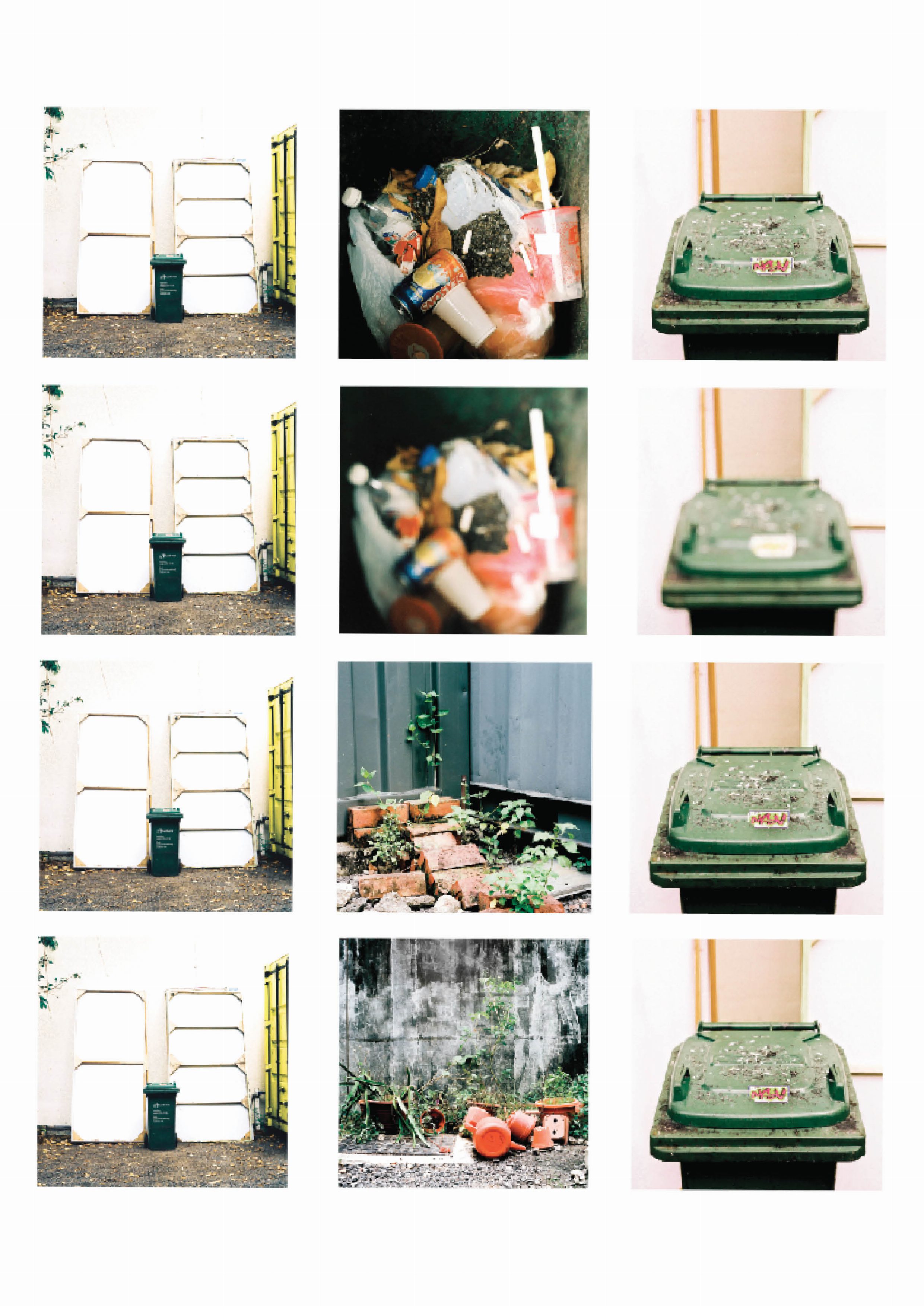
trash
trash
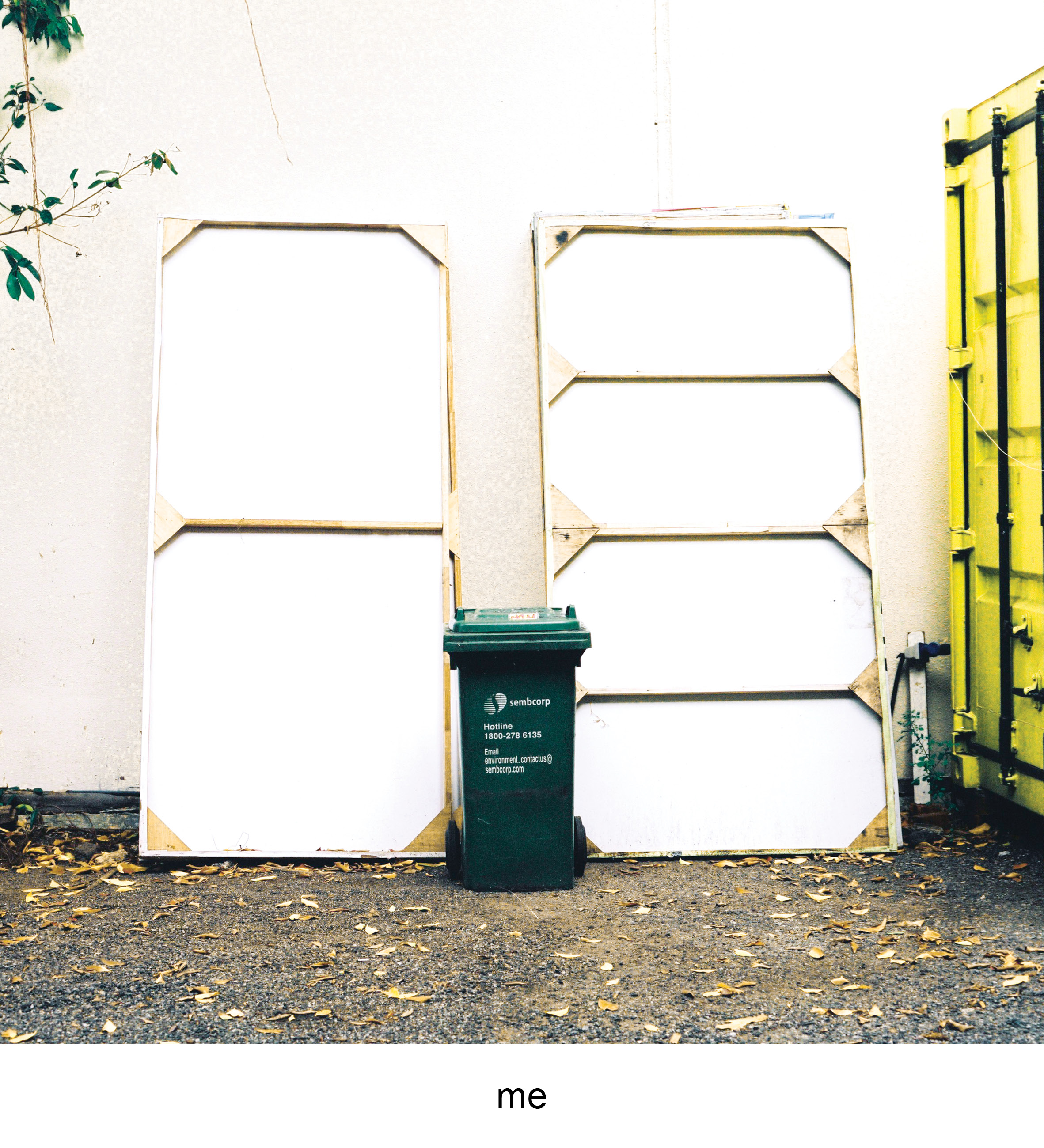
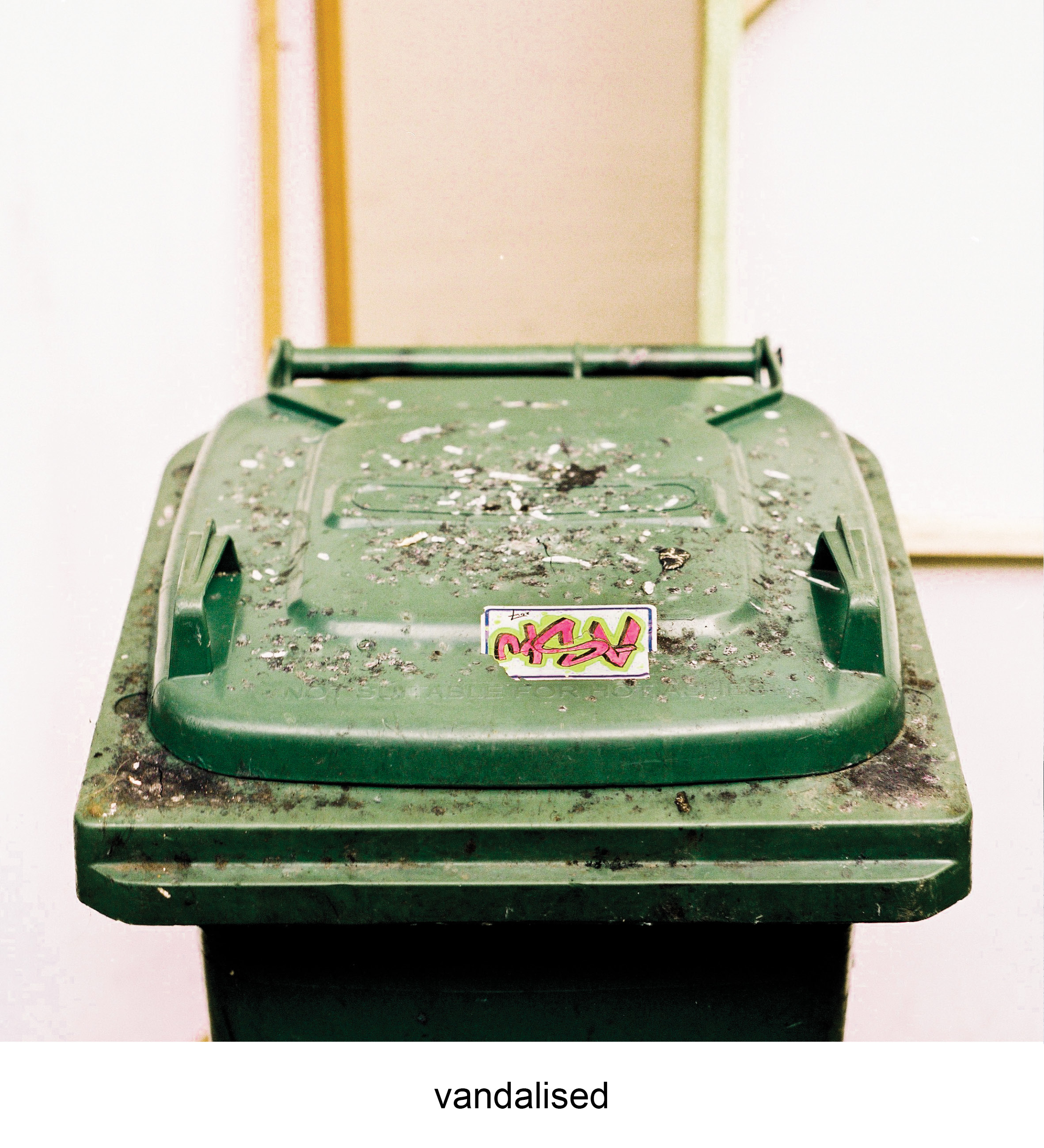
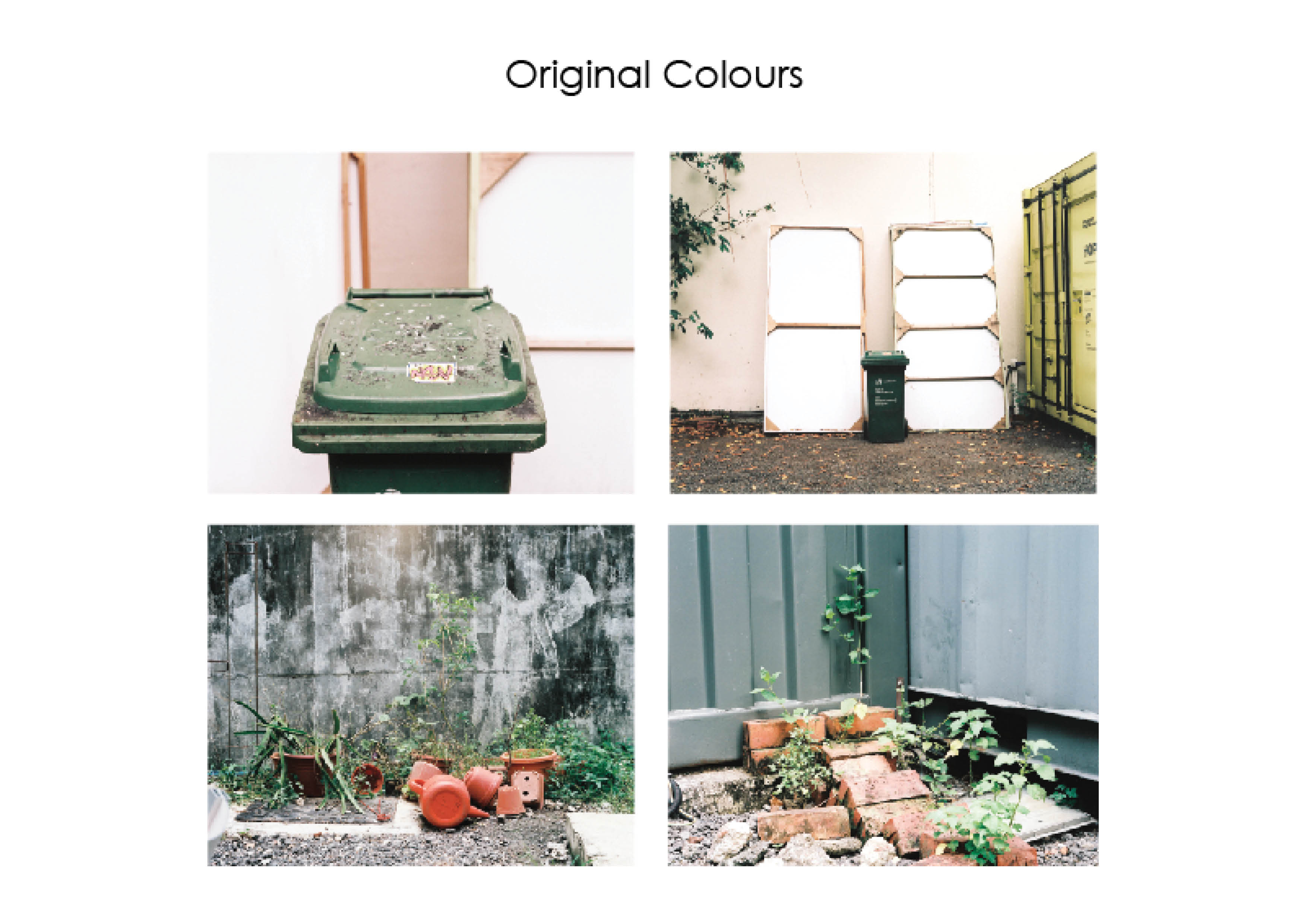
The green Sembcorp trash can is a common object that is found in almost every registered address. It sits right outside the compound with the address noted on the side. The trash bin to me is great representation of the activities that occur in a set place. Through its exterior and contents it leaves small traces that hints on the attitues, lifestyle and things the occupants of the address does on a daily basis.
I identify myself with this trash bin as I felt it represents the the effects of urban life to humans, the jarring mix of dirty concrete and gravel compared to green fauna that is creeping through the cracks. Presented through the graffiti and cigarette marks on the trash bin, I echo the sentiments of the vandalism that is left on it. Living in the concrete world is not ideal but you have to stand through it.
The colour harmony used across equation is the split complementary colour scheme of green, orange and purple. The first photo uses an analogous green yellow, that highlights identifiable green of the trash bin in a neutral setting.
The second photo introduces an environment with the contrast of greens of the plants with the bright orange plastic pots and watering cans. The contrast brings a sense of uneasiness where one object do not belong with the other.
The last photo is a close up of the trash bin that presents the aftermath of what the environment has done to it. Similarly, there is a new contrast of colour of green and purple. However the green is not natural but in a plastic form of a trash bin and a new form of conflict is given through the bright purple of the graffiti. The uneasiness is replicated again however subverted as the green is “natural”, plastic instead of a plant.
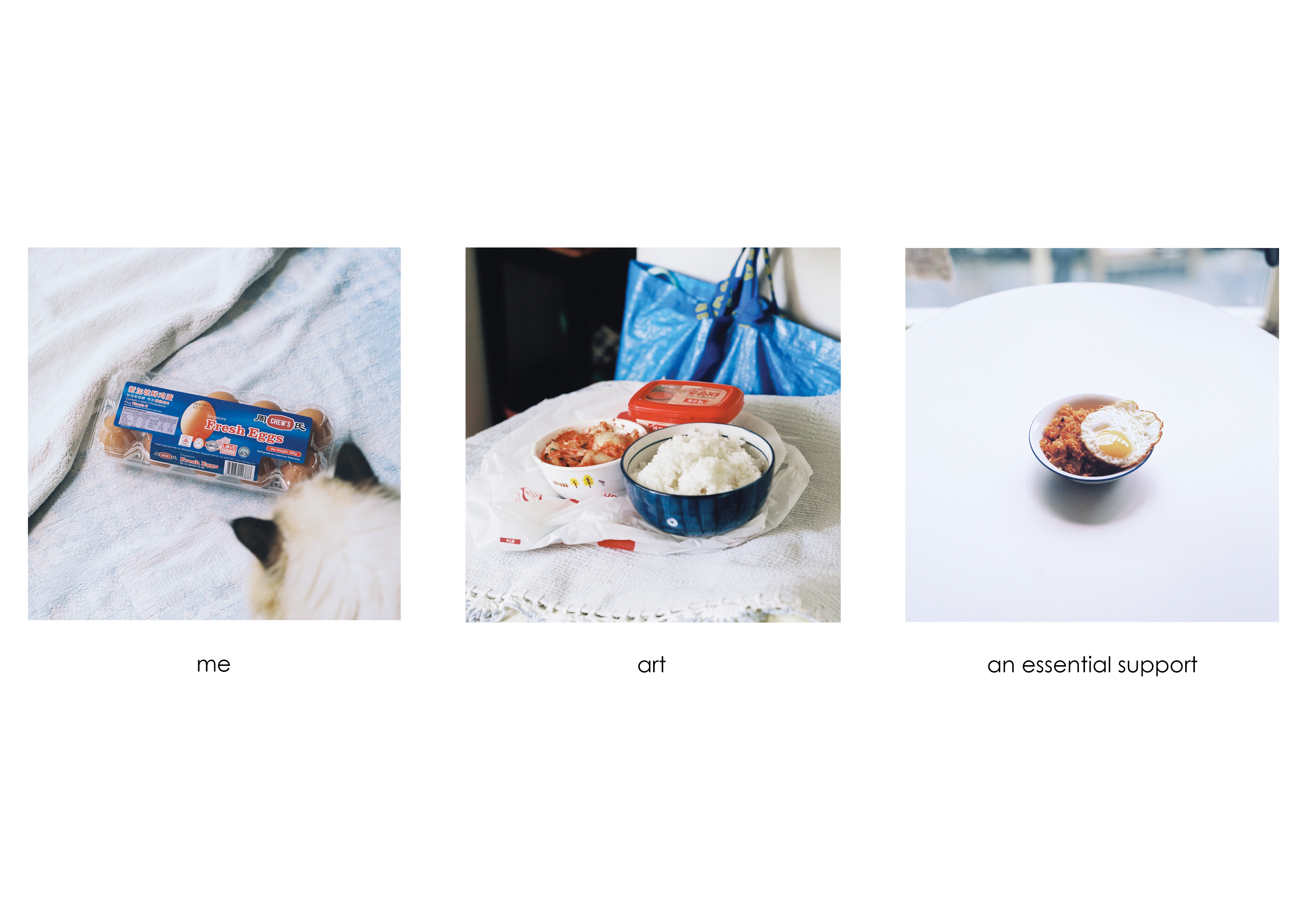
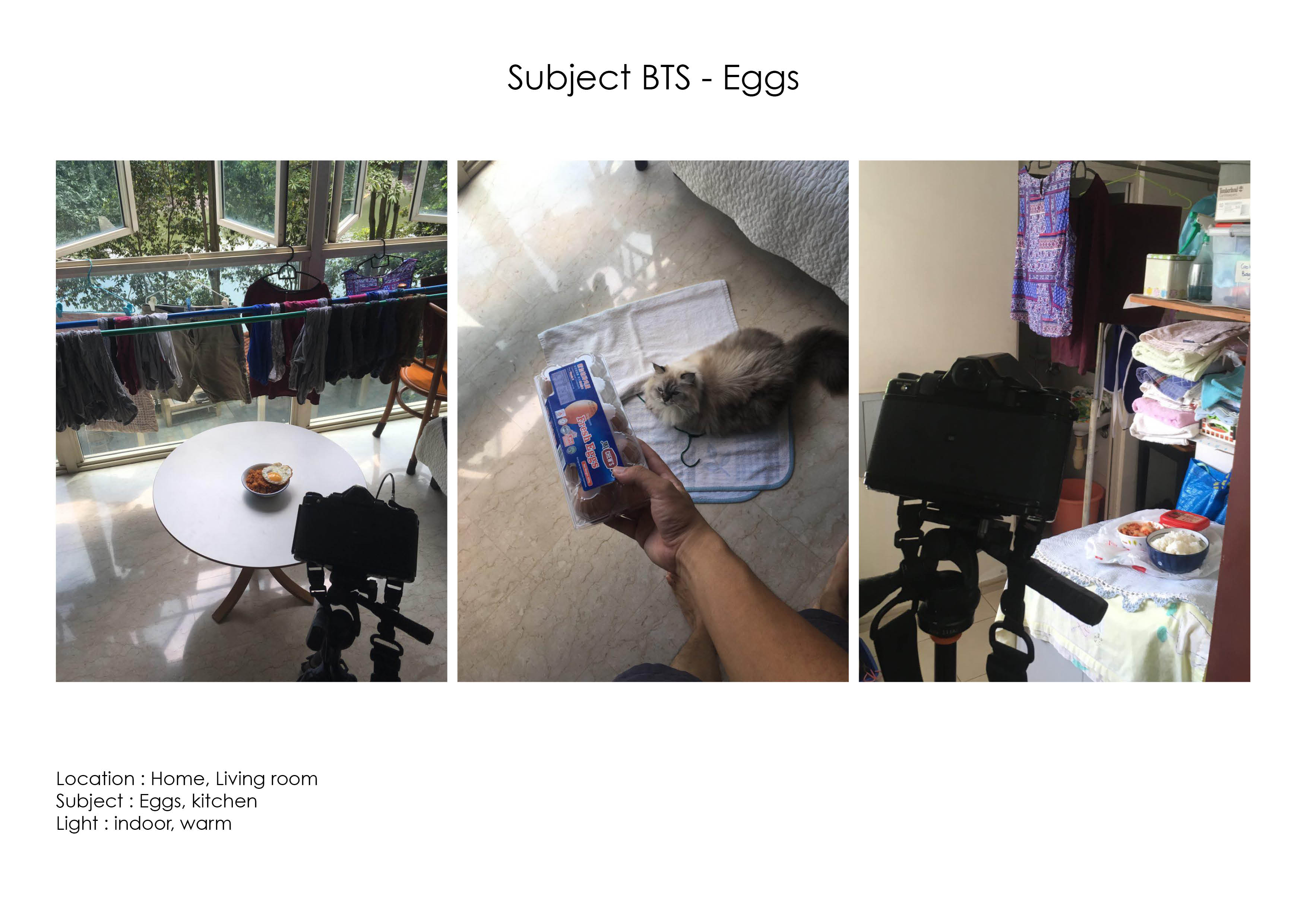
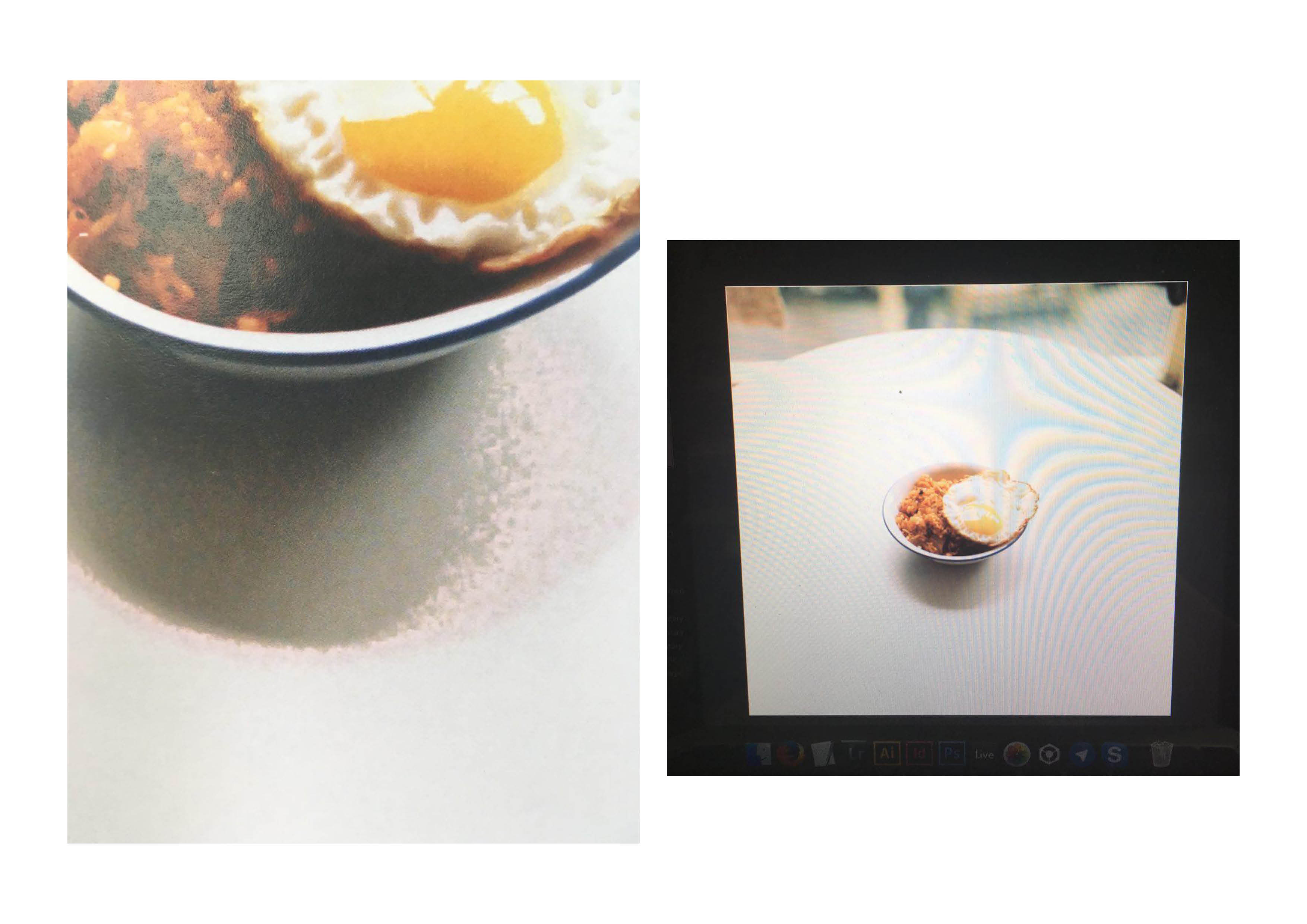
Eggs
eggs
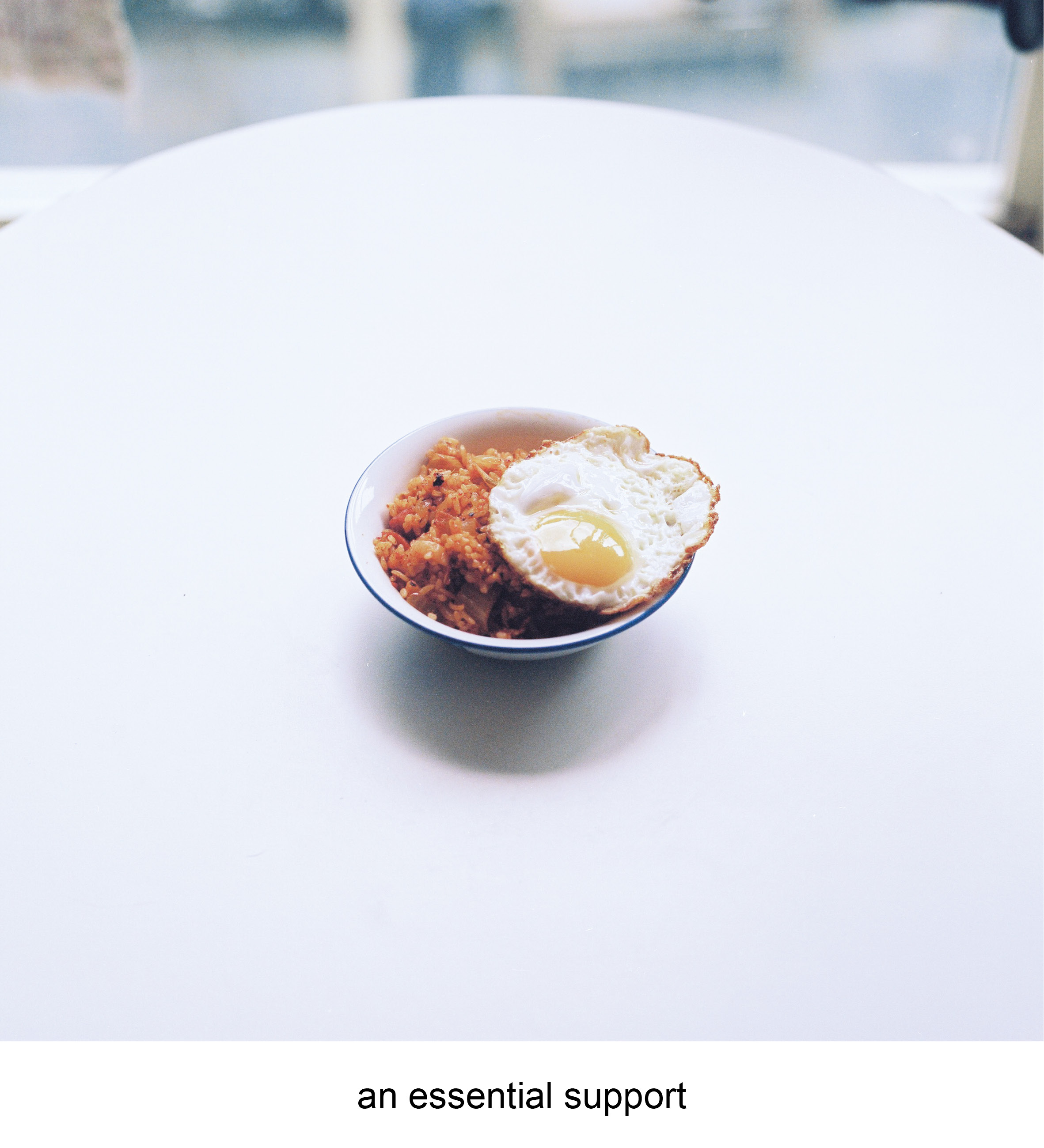
I don’t actually enjoy eating eggs usually, but they are my favourite ingredient. Fried eggs are the ultimate support in any dish. You can have a random plate of maggie which may be nice, but it becomes so much better when topped with a gooey fried egg on top. Fried eggs don’t taste much alone but they bring a dish to a whole new level of comfort.
The (super) fried egg is a metaphor of what i want to do in the future as an art assistant/technician. I hope to be able to be the support of artists in the future, bringing them advanced technical support in both traditional and contemporary mediums, allowing their work to be more impactful and timeless.
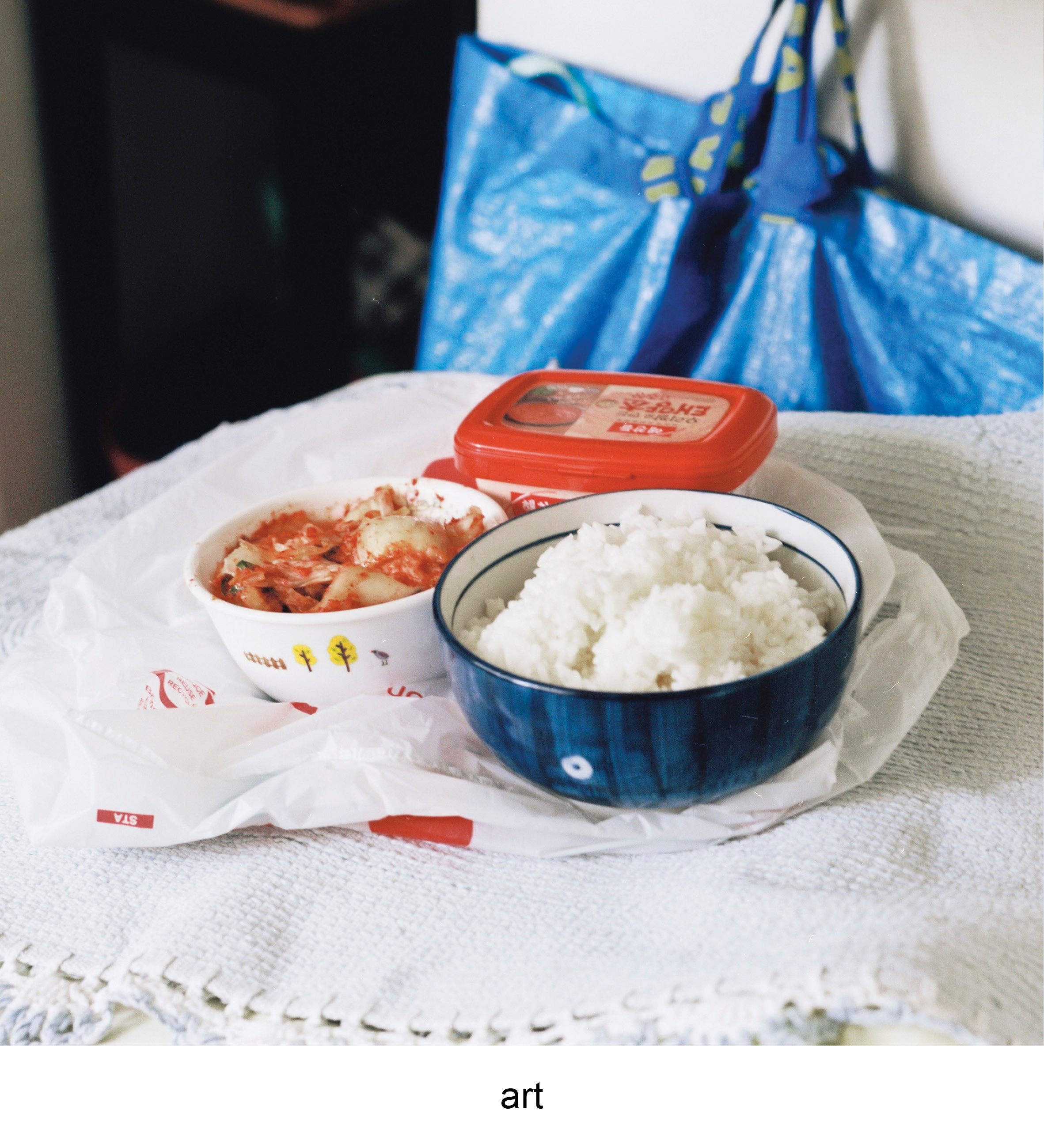
This equation uses the colour harmony of the triadic colour scheme of blue, red and yellow. The first photo shows the eggs in a neutral setting, uncooked and in shell. There is a sense of individuality in the composition as the primary colour in it is blue with hints of red from the packaging and shades of the eggshell.
The second photo introduces the elements of red through the red pepper paste and kimchi in the bowl. The photo of raw ingredients to kimchi fried rice introduces a new subject of a finish dish, or a metaphor for art. The red complements the surrounding of blue tones from the Ikea bag and the blue bowl. The colours work together in sync as there is a balance of striking colours such as red with the cool colours of blue.
The last photo is culmination of both blue and red and a slight touch of yellow from the egg yolk. The final dish showcases how all elements work in harmony with no colours standing out, as a perfected dish.
temple
temple
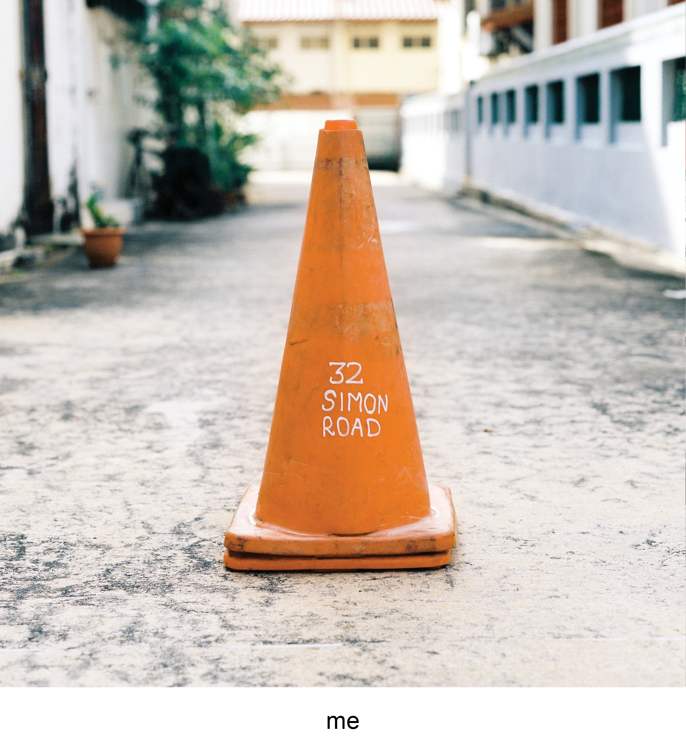
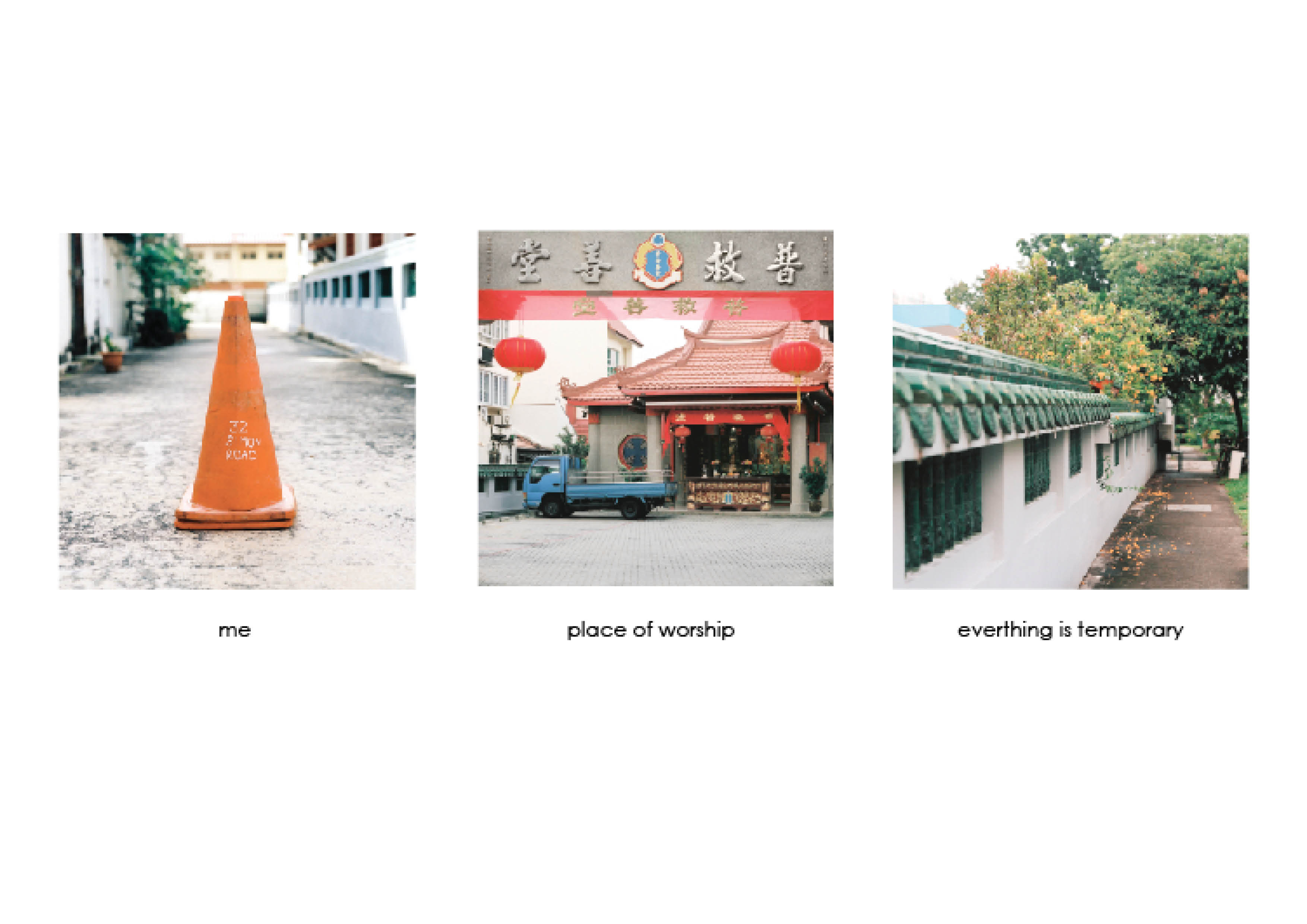
The last object i identified myself with was the traffic cone. Similarly to the trash bin, some of them have their addresses marked on them. Places don’t linger in a person’s mind generally unless they have a memory that is attached with it. They get special when the memory or event of it is strong, you start having a emotional connection to non living buildings, which is part amusing and yet nostalgic.
This traffic cone is the address of the temple my granddad’s ashes are placed in. Places of worship usually have the connotation of death with the current generation of mine where quite a few people I know do not follow a religion or faith. Temples then becomes a ritual of sorts where you only visit to pray or visit the dead. I personally find myself contemplating the idea of death whenever visiting the dead.
People die but everything still goes on, I believe the physical presence is temporary, but what you do passes down to those who are still in the earthly world.
The last equation uses the tetradic colour scheme throughout the photos with the colours of blue, green, orange and red. The colours are relatively balanced
that made a more neutral vibe for the whole equation. The first photo features the traffic cone where the primary colour of orange, similarly setting the neutral state of the object.The second photo introduces the environment, where the main colours of red pops out. The red accentuates the idea of a temple, through the identifiable drapery and red lanterns. The red does not seem to striking as the effect is muted by the dull blue truck with hints of the green fence.The last photo has larger bulk of green which brings the mood of the equation closer to a relaxed state due to the trees and fence that blends in. There is a small highlight of the orange from the flowers of the trees that connect this photo to the first photograph of the “self”. The metaphor of the flowers falling off the tree while the main tree is still up and healthy brings forth my sentiments of temporal physical self in the world. The orange unlike the first photo is muted takes up less attention, this also represents the insignificance of the self in a larger spectrum of the world.
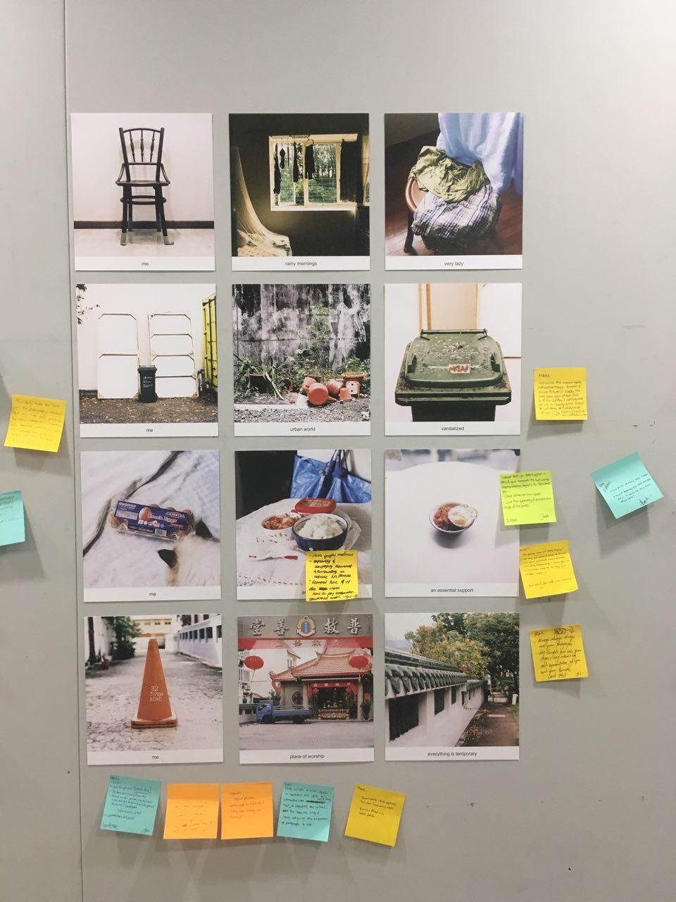
FEEDBACK
crit day
I was really relieved on crit day when the colours in the various colour harmonies can be seen by my peers. The difficulty in using photographs in the project was the natural state of the subjects, where you cannot control what elements that would be in the composition. Altering the colours afterwards also is not foolproof as some objects look awkward when colours are removed from them.
Joy brought in an interesting note on how people recognize objects for their colour. For example the Ikea bag and is easily recognizable due to it’s well known branding. It also works for banal objects such as the trash bin and the traffic cone as these objects are known based off the colour. Colour have the ability to play on their connotation to relate with the viewers. Looking back at this project I feel there are avenues to experiment subverting the common connotation with some colours. The idea of how we link certain colours to objects but when they are in a different colour it would bring a new reaction, emotion or even irony to them.
My third subject is are eggs on kimchi fried rice. The egg to me is the ultimate compliment to basically any food. It doesn’t taste like much and don’t really add much flavour to a dish but it makes it so much better. I hope to see myself as a service for the arts in the future, similar to the function of a fried egg. The main dish/art can exist, but I will be able to provide support to make the end product even better.
For this sequence I plan to use the triadic colour harmony that features red, blue and yellow. As the shoot is in a controlled environment at home, I had more control in terms of including elements within the image taken.
I included small elements such as the NTUC plastic bag which have vibrant red and blues into the image to reinforce the colour theme. The backdrop also featured a blue Ikea bag that provided blue and yellow tones into the image.
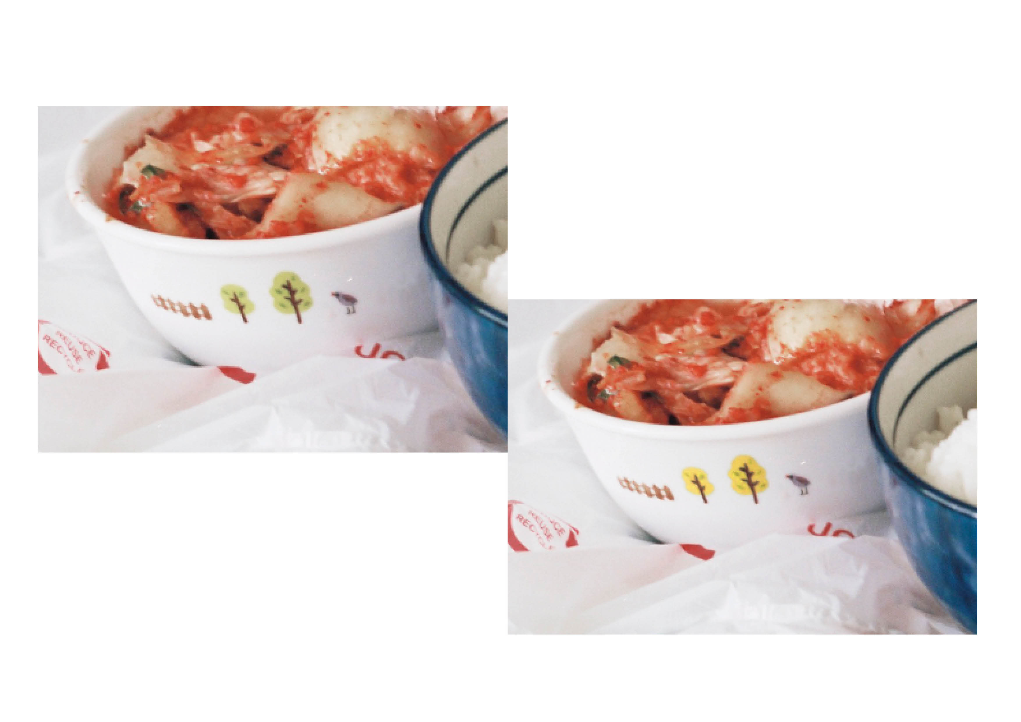
Eggs – BTSEggs – Original colours
The original colours of the shots leaned towards an orange hue. I had to correct the overall warm glow of the photographs and then increased the saturation and luminance of the reds and the yellows to make sure they do not blend with the background.
The primary colours should come from the subject, which is the elements of the kimchi fried rice. I then enhanced those elements to allow them to stand out with the aid of colour.
Eggs – colour correction
As the main 3 colours in the chosen triadic harmony are red, blue and yellow, I had to correct the colours of some details and elements that may be distracting. For example, I edited the the trees on the bowl to have a yellow finish instead, to avoid introducing another colour into the triadic colour harmony.
Eggs – Colour Correction
I also corrected the glow of the yolk to be more yellow. However after consultation with my tutor and peers, the original colour way suited the sequence better.
Eggs – Text edit
Due to the issues that came up during print (which will be covered in later), the final image was left un-cropped with brought in elements of the window in the background. This also introduced some greens in to the image which I then attempted to alter the hues to match the blues in the sequence. It was a pity I wasn’t able to salvage the crop but i guess that was takeaway i can keep.
alternative career options
SEQUENCE 4
Temple – BTS
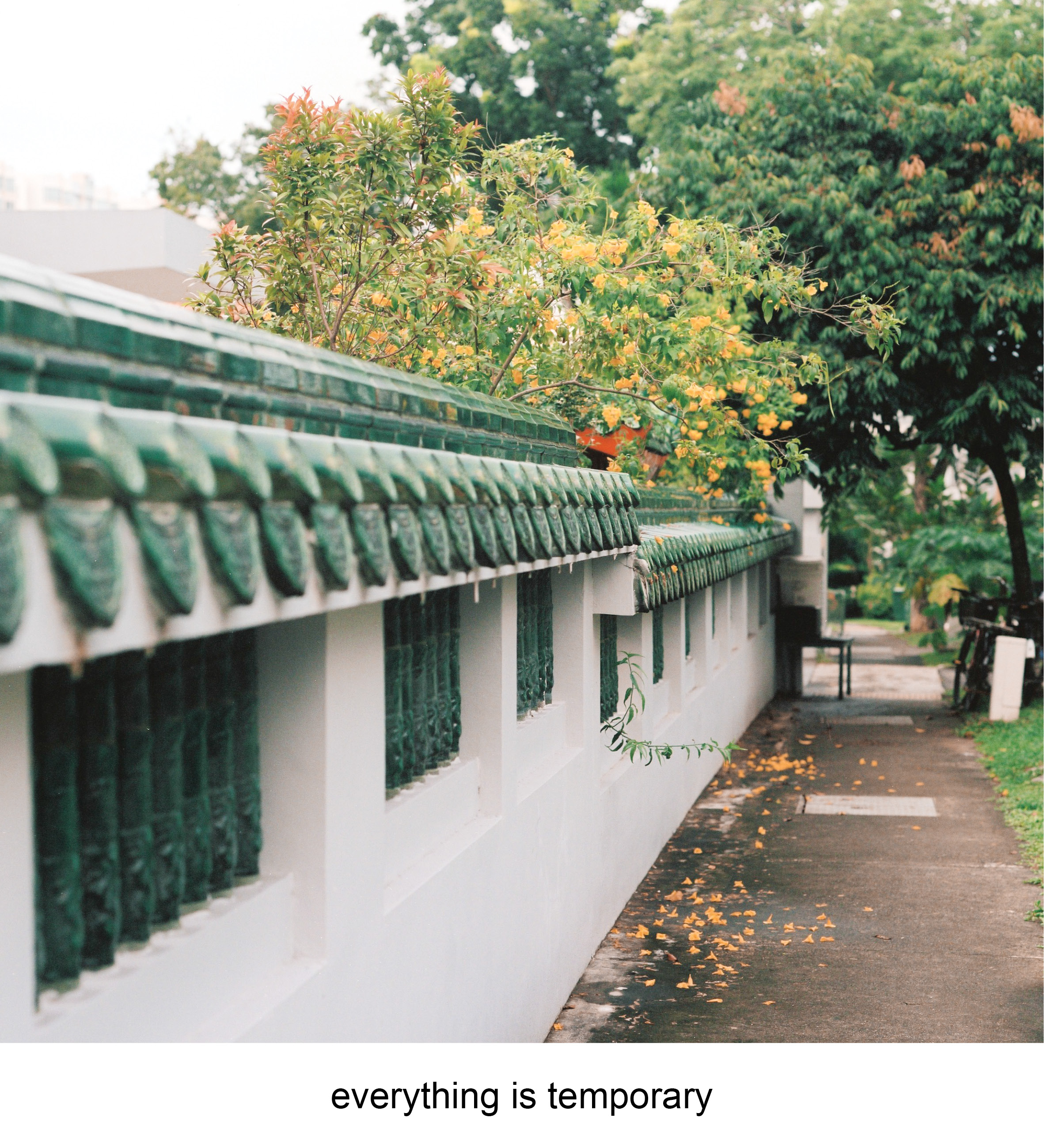
The fourth and last sequence revolved around the temple as a subject. There is no main subject in focus for this sequence but rather the idea of the connotation a location holds.
I identified myself with a traffic cone marker beside the Phoh Kiu Siang T’ng temple that had the temple’s address on it. It alone does not have any meaning but in the compound of a temple it becomes a small landmark holding the name of the place of worship.
The temple is special to me as it holds my grandfather’s ashes. Places of worship to me slowly grew to becoming places that holds death or becomes the resting place of the dead. It brings about the idea of how earthly life is temporary and cyclical. I represented this idea through the last square which featured a flowering tree with some flowers falling off and slowly losing its colour on the floor. After walking around the space for awhile, I figured that the tetradic color harmony of blue,green,orange and red stands out in the location.
Temple – BTSTemple – Original colours
The original colours that came out from the camera were well saturated. However to match the tetradic colour harmony, the yellows in the image had to be converted to orange. There are some elements that are sitting in between orange and red that have to be corrected to suit the harmony too.
The biggest change was the colour of the flowers as i felt if i altered it they would look strange. Thankfully they turned out alright and i also decreased the saturation of the traffic cone to allow it to match the hues of the orange flowers.
Temple – Colour correction
After the consultation, I received feedback that the signage of the temple was distracting as it introduced a muted yellow into the colour harmony. After getting quite abit of help from my fellow classmates, we figured the easiest way of getting rid of the yellow is to match the signage with the granite colours of it’s backing.
Temple – Colour correction
One other issue that surfaced was the last square which lacked a colour for it to be part of the tetradic colour harmony. The composition lacked the blue of which there were various options to work around it with. One of the options is to change the colour harmony to a split complementary of green orange and purple. I decided to stick with the tetradic harmony for consistency throughout the series and added a light blue outline to the building on the top left. It’s pastel finish camouflages in well and blended well with the hues of the sky.
Temple – Text edit
TEST PRINTS
Test Prints
After the first two equations were approved, I went ahead to try out some test prints to see if the colours come out right. I printed the photos on 250 gsm matte paper as i felt the colours may go off if I were using a thinner paper. I chose matte over glossy as my previous experience with gloss resulted in prints being too saturated and the reflection could be pretty annoying
Pixelation!
Just when i thought all was well, the reality of bad quality lab scans hit me real hard. One of the rice compositions was heavily pixelized as the lab scans of my film roll was low in resolution.
Commercial film labs in Singapore cater for the general crowd, so the scans are just sufficient for web publishing. This was a factor i totally overlooked which was made worse as I cropped into the image of the rice bowl. After various tries on salvaging the original image through digital means, the pixelation was way too horrible to be exhibited on the wall for crit.
I therefore used the uncropped version instead, that thankfully suited the colour harmony as well as bringing the whole homely vibe of the line together.
I decided to work with the medium of photography for this brief. Unlike creating illustrations or images from scratch to apply the colour theories with, i have to seek for subjects that already have colour theories being applied. Therefore location scouting and the framing of the shots are key in communicating the message to the viewer as distracting subjects or colours have to be excluded when taking the photograph.
SEQUENCE 1 : TRASH
Trash – Site BTS
My first subject is a trashcan located at 120 Prinsep street. The trash can was my primary focus as i felt the graffiti sticker and burn marks on the lid represented the gradual change over a standard public object in a specific environment. My main locations revolved around close ups of the trash can, the interior, and the general space around it. Light meter readings were also taken to give a rough gauge on what aperture range I’m allowed to work with.
Trash- BTSTrash – Original Colours
The original colours that was captured on film had a cool overcast due to the cloudy weather that made the light diffused. The primary colours that stood out were the green, yellow, red/orange and pink. The main colour theory i wanted to apply was the complementary colour scheme along with the Split- complementary color scheme. In order to bring the colours to the foreground, I enhanced the colours by raising their contrast and saturation to allow the colour harmonies to stand out.
Trash – Drafts
There were a few variations for the line sequences that although follow a similar colour scheme, different photo subjects play an important role in relating the accompanying words to the understanding of whole sequence. I experimented with images being out of focus to capture the essence of the shot through colour instead of subject. What felt like a good idea in concept did not translate well in the final shot, highlighting the importance of shooting more safety shots and spares as they you never know when you need them again. Going back to the same location may not produce the same results as the light is dependent on the weather and the colour hues will change along with it. Editing the choice of images were then an important factor to take note of when creating the sequences.
Trash – text edit
The selected sequence is then layed out with the accompanying text to see if the they work together coherently and in harmony. Text is a strong element to create a narrative. For this example, the text provides ideas or insight on linking qualities of the subject to human qualities or emotion.
SEQUENCE 2: CHAIR
Subject BTS – ChairSubject BTS – ChairChair – Original Colours
My second subject for the project was a chair located in my house. The chair is a constant in every room that is occupied in the house, what gives it a character is the individual in the room and the objects the keep in it. The main colour scheme i wanted to showcase in this sequence was the analogous colour scheme from green to blue.
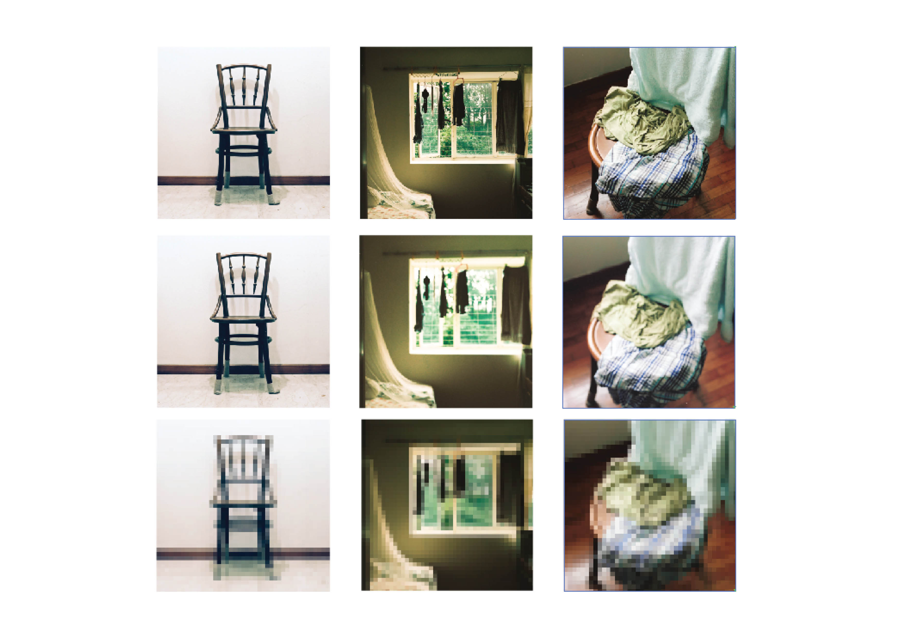
Chair – Drafts
Similarly I experimented with various effects on blurring the subject but after a few tries the concept didn’t really play out that well.
The original colours were actually very pleasant however the greens and blues are crossed each other too often and did not fit in a colour theory or harmony. The greens are then enhanced to be more illuminated and obvious to spot.
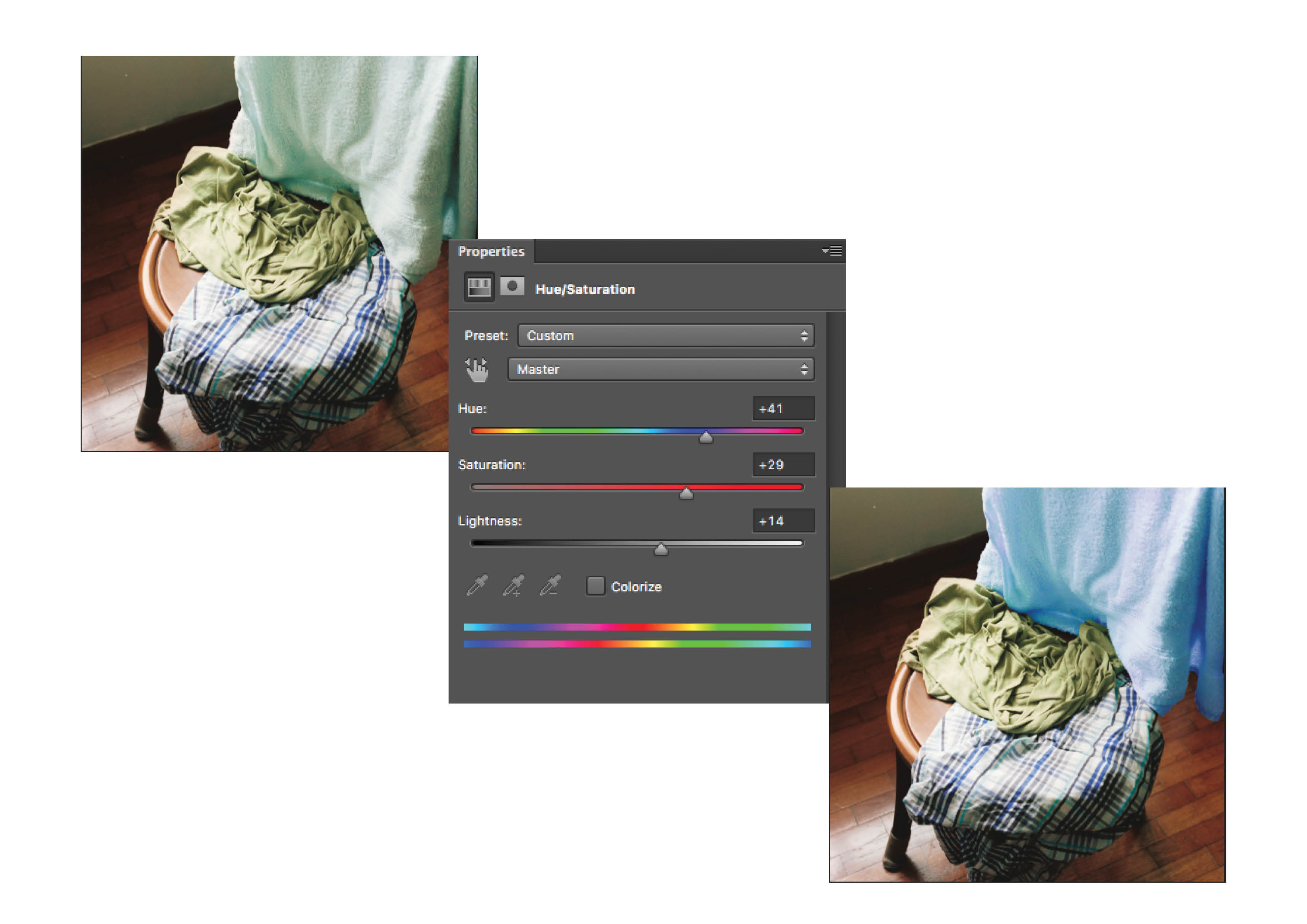
The chair image on the right has the colours of blue, green, green blue and a reddish brown. I was advised that to continue with the split complementary harmony of blue, green and red, the blue green towel in the composition have to be adjusted.
Chair – Adjustment
The towel was masked out in Photoshop and it’s hue and saturation was worked on to bring it towards the blue colour tones.
Chair – Text Edit
After editing the colours on the towel, the blues were more prominent with less distracting colour tones. There is also a running theme of the “self” square being neutral in terms of colour, the “setting” square to be of a stronger, saturated colour, and the “response” square to be a balanced colour to it.
The final project for 2D features the exploration and understanding of colours and colour theory. Through any 2 dimensional medium we have to portray self, in a setting, and our response in 3 boxes.
Our work requires us to cover one of the colour theories/harmonies that are listed below:
Acknowledging my illiteracy in illustration and any forms of drawing technique and know how, i wanted to approach this project through photography. I find inspiration from a few photographers who utilize colours as a strong form to communicate emotions and atmosphere without relying heavily on the subject they are shooting. The artist i researched on are Uta Barth, William Eggleston and Nguan.
UTAH BARTH
Utah Barth
Uta Barth is a contemporary German photographer who is interested in the translation of photographic perception to human percerception. Her subjects are often elusive and common such as curtains that are layered with strains of sunlight that abstract and distort in her photographs.
Uta BarthUta Barth
Some of her photos are also intentionally not in focus of which gives an impressionistic approach to understanding the image. The usage of colours and framing suggest an atmosphere for the image rather than providing the realistic recreation of the moment.
WILLIAM EGGLESTON
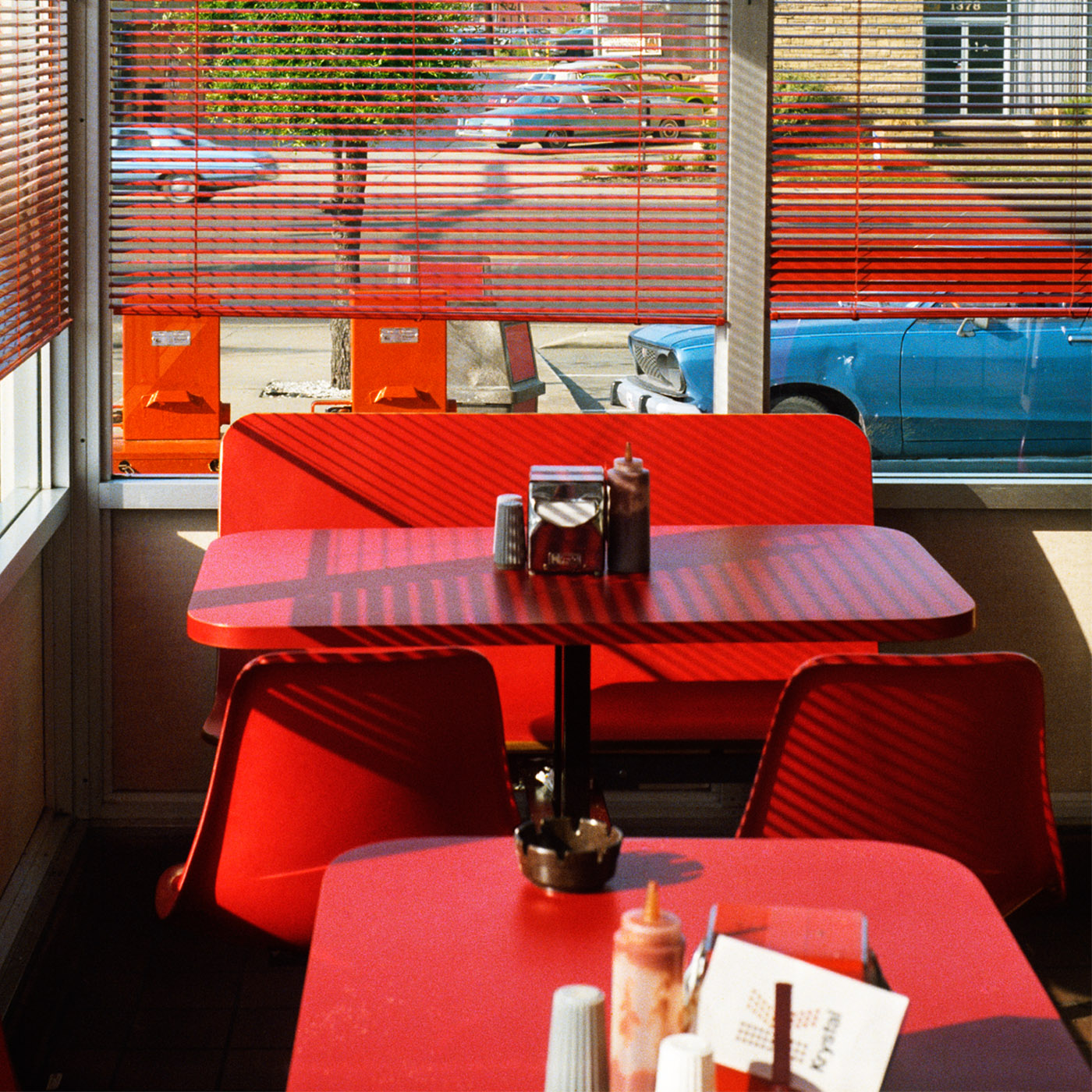
William Eggleston
William Eggleston is an American photographer who is famous for his high contrast and saturated images and is known for working with the colour red in his images. He utilized a process called the dye transfer process to bring out the strong saturation in the colours red and yellow.
William EgglestonWilliam Eggleston
Dyes used in the dye transfer process are very spectrally pure compared to normal coupler-induced photographic dyes and the dye transfer process possess a larger color gamut and tonal scale than any other process including inkjet. Through this process, the colours in the image are grouped together and enhanced by the strong contrast and saturation. This brings life to the scenes of his photographs where the attention is being focused on the setting of the place rather than the human subjects that are in the image.
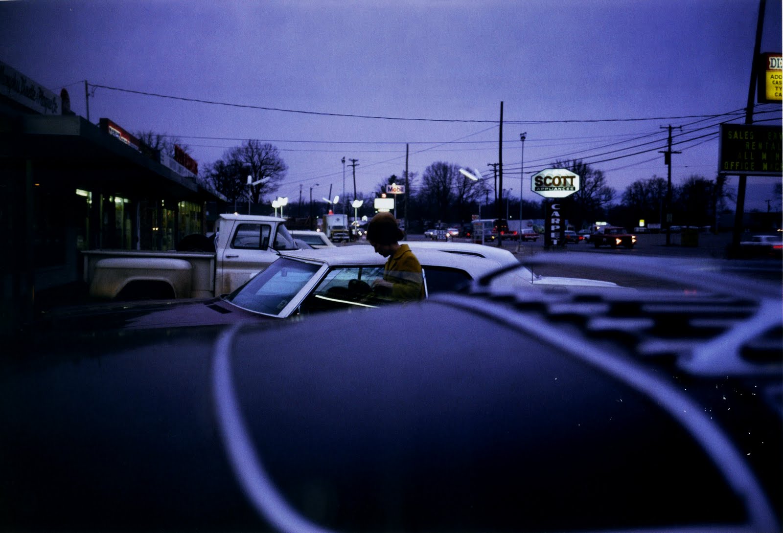
NGUAN
Nguan
Nguan is a Singaporean photographer who captures fantastical versions of Singapore mainly through documentary methods. His images are a mix of street photography with still images of architecture and random objects often depicting human emotions. He utilises a pastel tone over his images that indulges the photographs with a surrealistic vibe.
NguanNguan
As a Singaporean recognising familiar landmarks and icons, it brings a sense of loneliness and longing through the change of colour. Through the lighter hues and values of the colours, the photographs bring a second layer of emotion even from still objects.
Other than the control the artist have in the colour to communicate ideas and emotions, I felt that one of the more important factors to take note of going into my project was the framing of the images.
To avoid other colours creeping in and throwing my colour harmonies off the chart, I have to seek out compositions that suits a colour theory i’m working on and make sure I exclude all distractions that may disrupt the colour flow. This adds a small challenge of firstly finding subjects that can represent myself, a setting and a response, and secondly making sure the colours work in my favour in terms of emotion or atmosphere.