SURVEY
For my survey, I created the questions with the intention to find out the relationship between the current households in Singapore and recycling; mainly on
- How often do they recycle
- What items do they recycle
- What discourages them from recycling
- What design solutions would they be the most effective for them to recycle more.
Here’s the Survey link:
https://forms.gle/ij6KvQAyhm4cmHPY6
Basic information about the participants and recycling
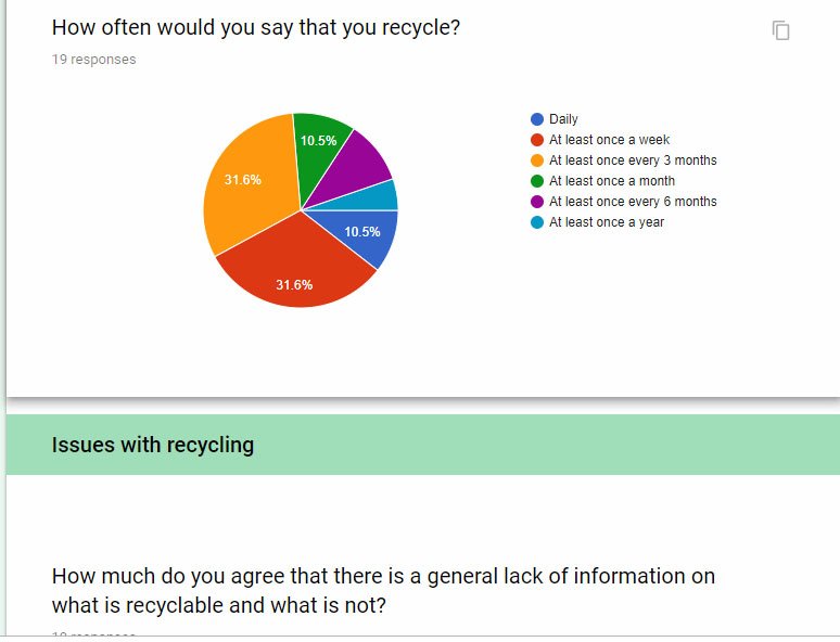
As of today, I had 19 responses in total, all of whom have recycled before. Paper and plastic seems to be the most common item that the participants tended to recycle, with food and cartridge boxes being the least common.


Recycle bins near households seems to be the most popular choice for recycling, with recycle bins outside of their homes taking up almost the rest of the pie chart.

As for how often the participants recycled, there is a wider variation of responses, with most recycling at least once a week and at least once every 3 months.
However, most of my participants ended up being in their twenties, as I ended up only sending out to my friends. Since I wanted to know more about the other members of the household, I decided to add in another question after the first round of survey, to ask them to tell me more about how their household recycle.


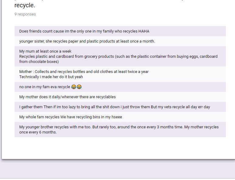
Based on new responses, it seems that most of the other members of the household especially the parents, either do not recycle or recycle on rare occasions.
In conclusion, based on my research, it seems that it seems that there is a lack of a initiative in the families to recycle together as a habit, with only one or some members of the family recycling from time to time. So I think in order to increase the domestic recycling rates, we should push all members of the families to recycle together in each household so that recycling becomes accepted as a habit instead of a chore.
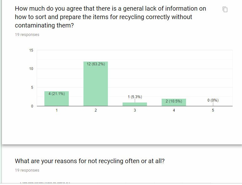
For the next section, I tried to get information on the reason or reasons why families are not willing to recycle as much as it is desired. For the most part, it seems that the general lack of information on how to sort and the extra steps required to separate and prepare the items tend to be why many family members tend to stray away from doing so regularly.
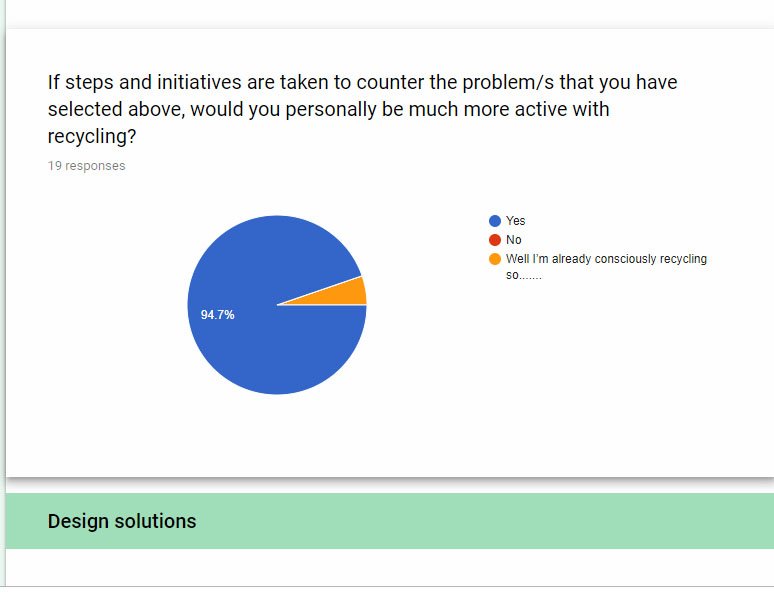
Here I asked people for suggestions on what they think would be a good solution for pushing people to recycle more, and the two most popular suggestions tended to be better instructions or labels and incentive driven initiatives.
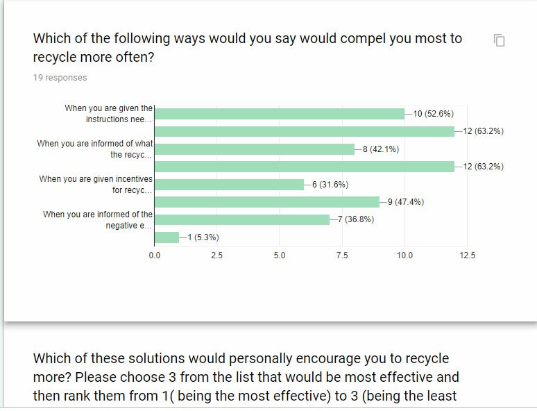
And here I gave a range of suggestions on ways to encourage people to start recycling and what they thought would be effective on them. And better instructions for both identifying the recyclables and as well as the process, plus incentive driven programs were the popular ones.
Conclusion:
Before the survey, I was intending to focus on the adults in the households in order to encourage domestic recycling but through this survey, I decided to focus on the whole recycling together as a family to promote recycling as a family habit rather than just the adults. This survey also helped me narrow down how my deliverables can effectively target them; 1 to better instructions or labels and 2 to motivate recycling culture through incentives.
Aim of the infographic:
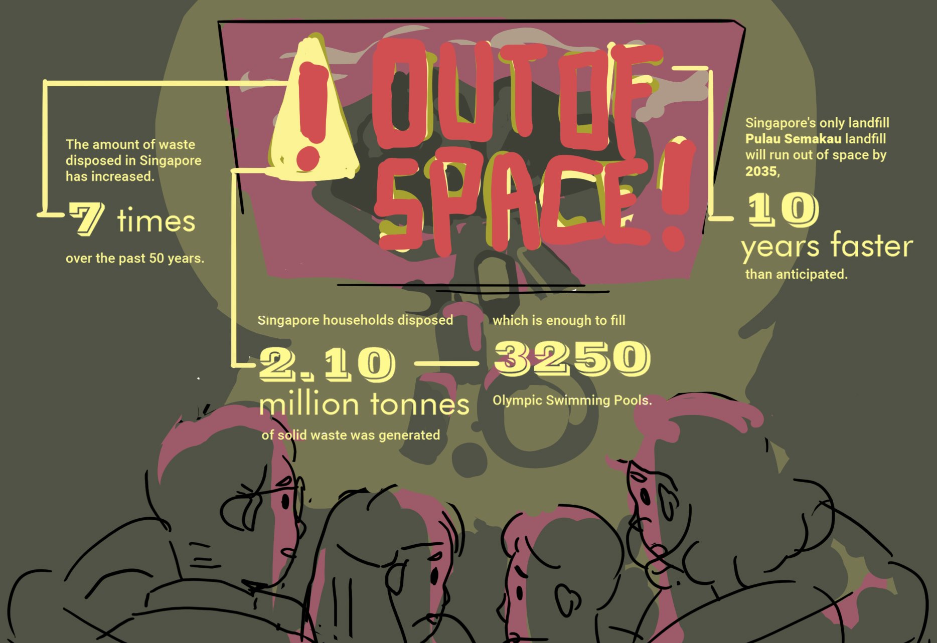
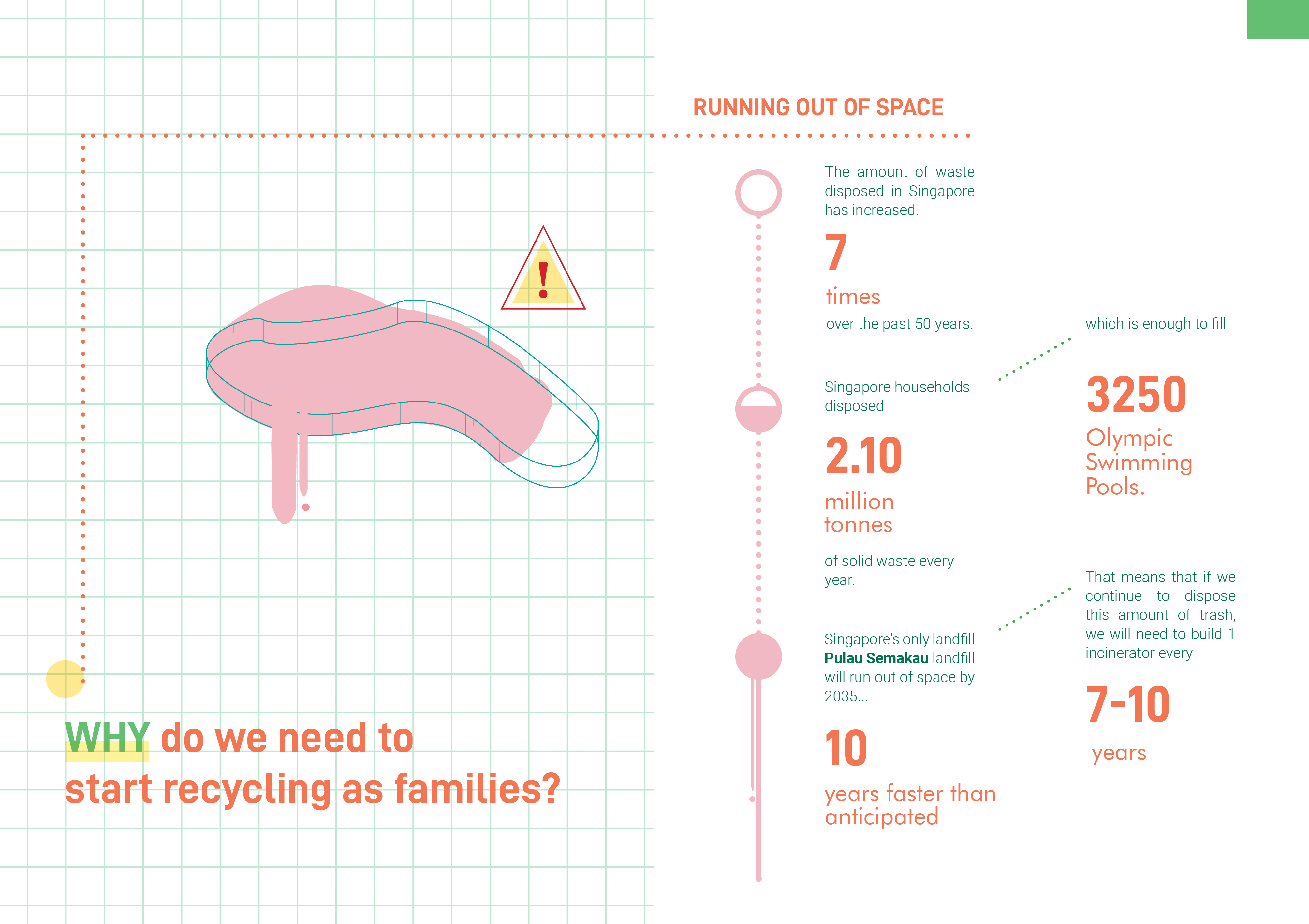
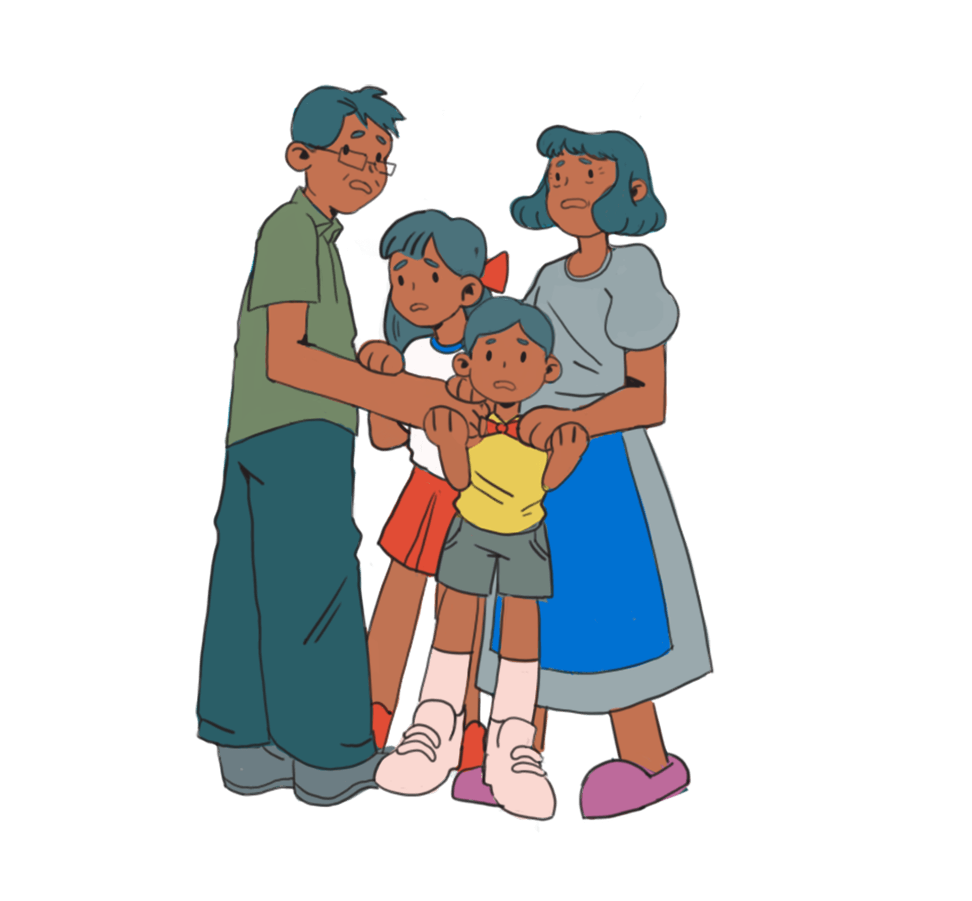
So after my survey, I decided to target households and urge them to start recycling together as a family. In my infographic explanation exempt, I decided to write about the negative consequences of not recycling, in particular Pulau Semakau running out of space, in order to encourage them to start recycling.
Here’s the final paragraph that I came up with
“Despite many efforts and initiatives done by the governement to recycle better over the last decade, Singaporean families are still not recycling enough.
However, we no longer take things for granted like this as our only landfill, Pulau Semakau is running out of space faster than anticipated when we are sending over tons of recyclables along with the trash.
This infographic hopes to urge Singaporean families to start the habit of recycling together as a family to save our landfill as well as the earth, supported by the data from a Personal survey, Straits Times, and NEA”
As for the title at first I came up with
“Make it a habit, instead of a chore”
But I decided to go with
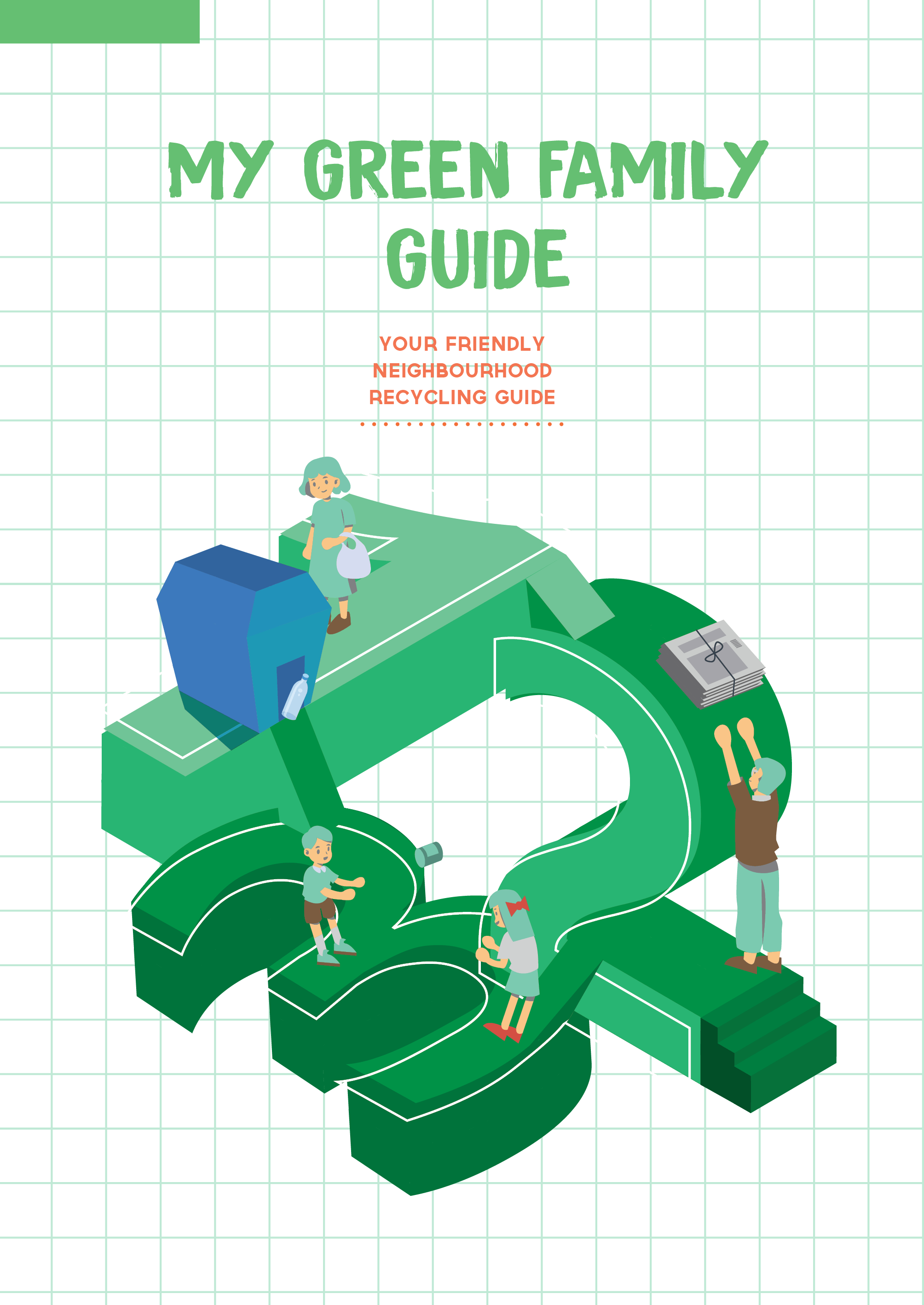
“Let’s start recycling as one big family” (before its too late)
So that it goes better with my target audience being families.
And for my title, and some of the numbers in my statistics I decided to go with this chalky font so that it will link to education and it was kid friendly as well.

Graphics of the infographic:
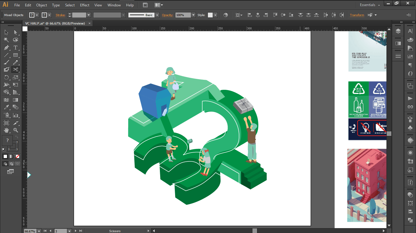
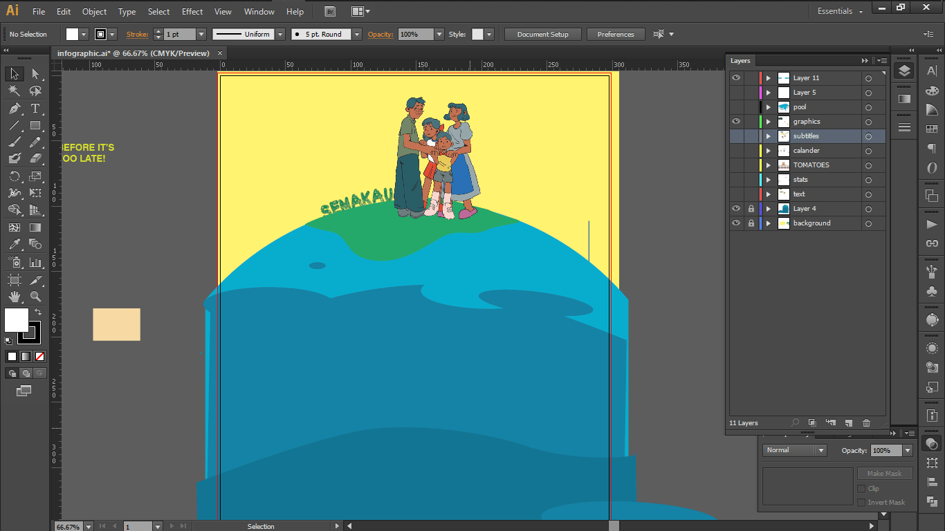
Since I wanted to create a sense of urgency for households to start recycling, I decided that a graphic that depicts the severity of our landfill running out of space and the impact that it would have on each family. Therefore, I decided to compose my graphics with a family trying to stay afloat on an expiring Semakau with all the infographic surrounding them to make it look like they are being cornered by the “statistical behaviors” of our current households.


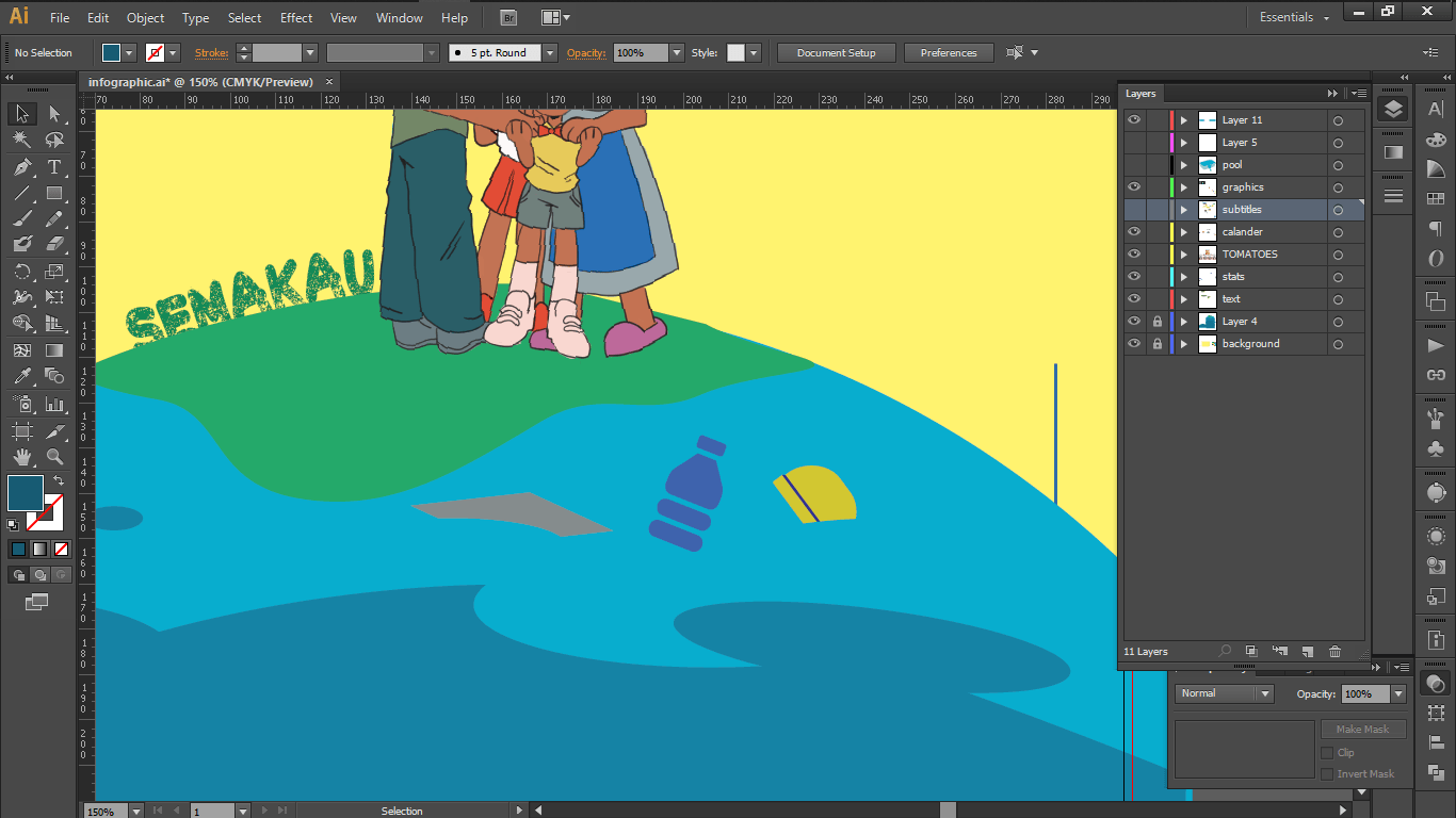
Then i divided the earth into different colours of waves so that it can help me divide the information into levels later on. I then started filling them up with floating trashes in the water.
Content of the infographic:
So first I tried to find information and numbers that would easily catch people’s eyes when they are glancing at the poster so I decided to research more instead of just depending on my survey to get bigger and more accurate numbers in order to urge people to start recycling as a family together.
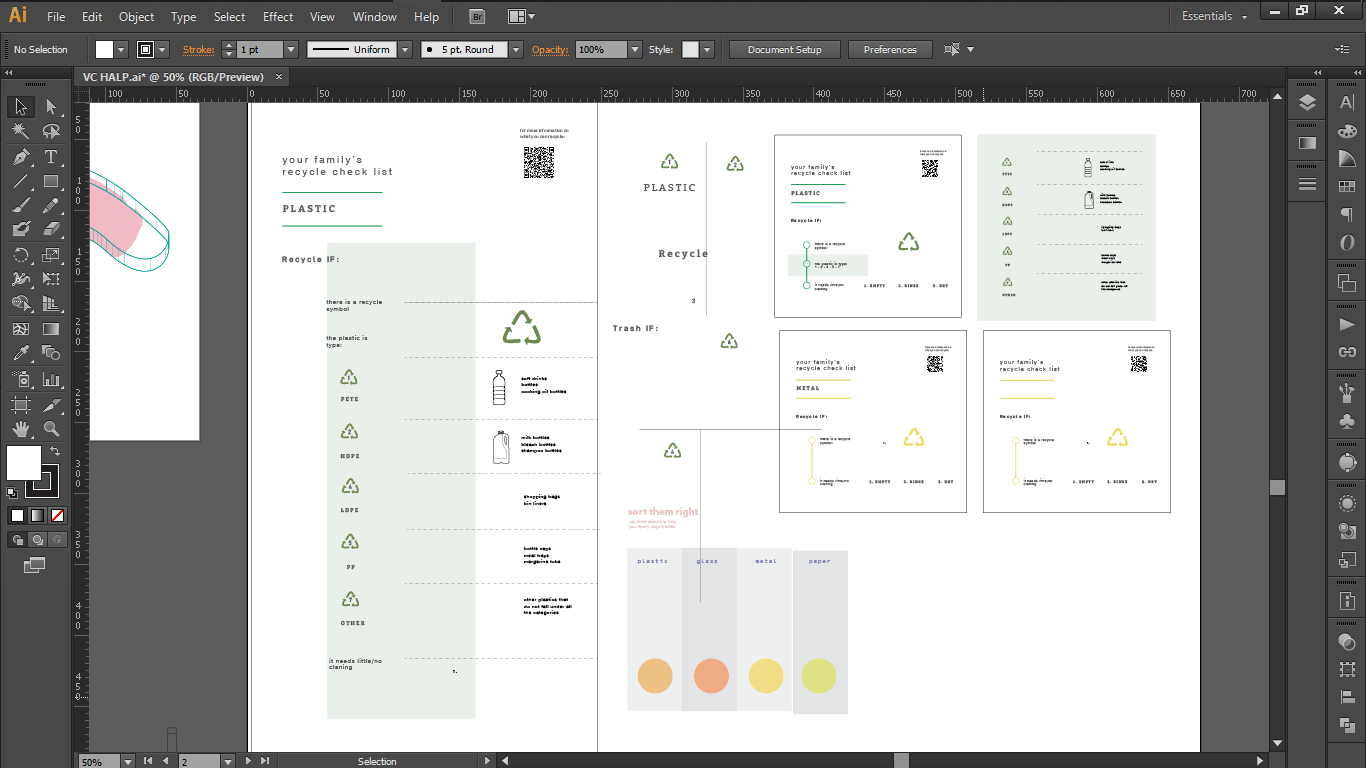
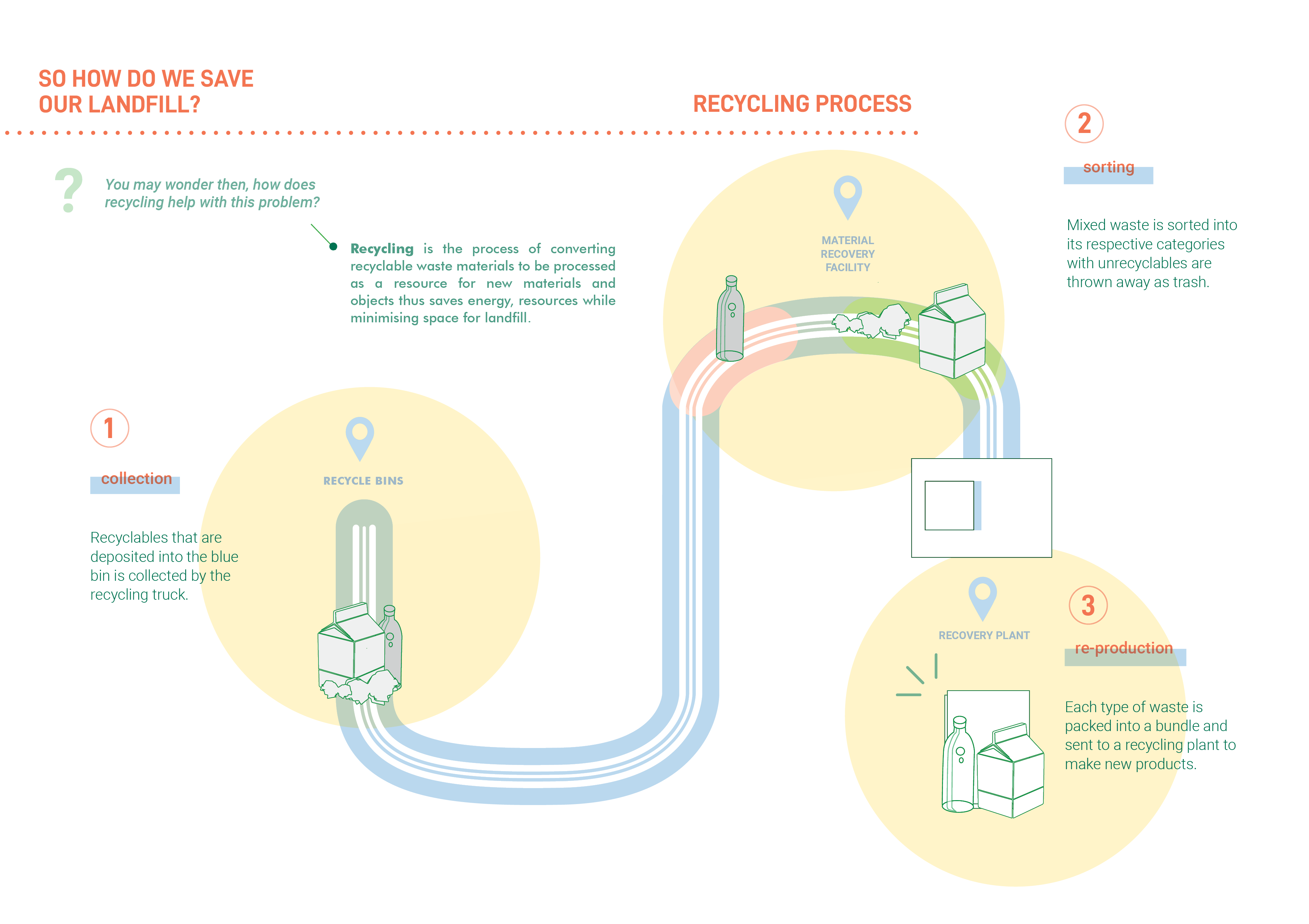
And as for the infographic graphics I wanted to incorporate the recyclables from the bin; paper, plastic, and metal.
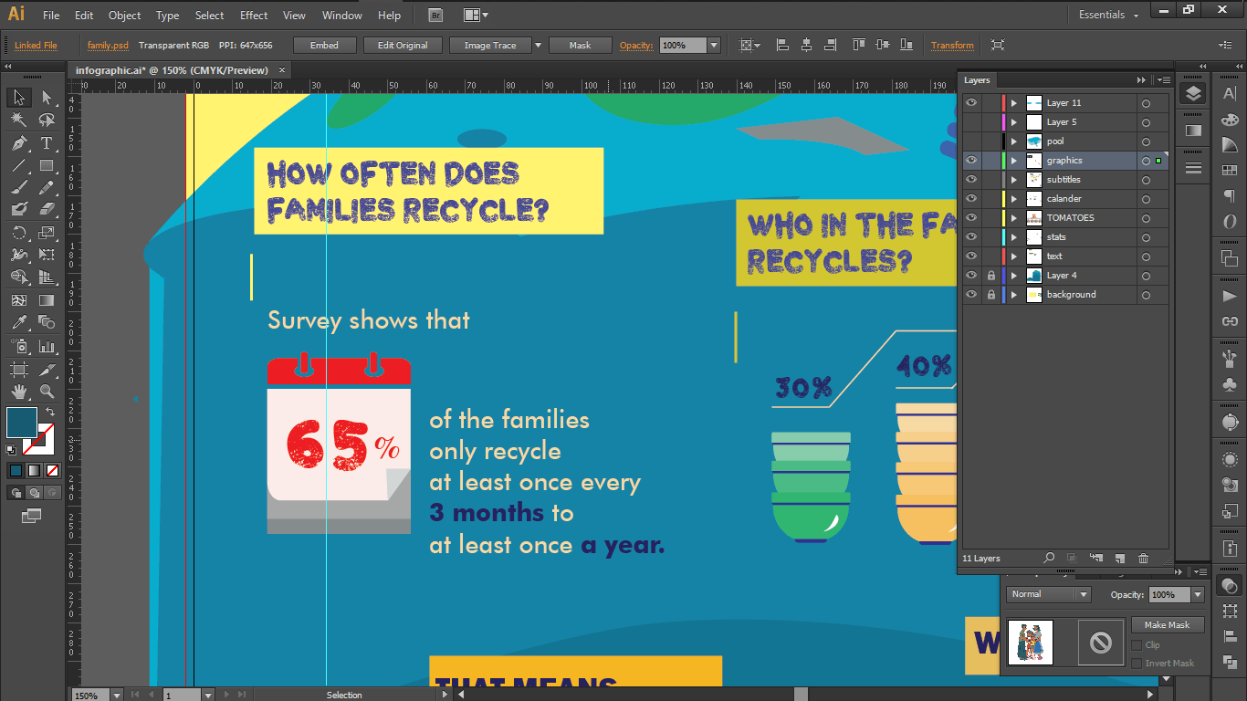
So the first information I had was a set of information I have gathered from my survey on how often does families recycle?
I decided to shorten this information in order to make it more impactful, collating the results from at least once every 3 months to at least once a year into a total percentage so that it seems more detrimental. So in the end, I translated this information to the fact that only 65% of the families recycle at least once every 3 months.
Since this was about how often households recycle, I decided to use a graphic of a calendar.

The second set of information is another survey result I got, when asking them who in their families recycle.

(Since this was a question I added later on, I only had the later answers listed :.))
I decided to collate them into numbers by categorising into 3 categories: No one in the family recycles, At least one other member recycles and Everyone in the family recycles.
And since it was related to family, I decided to use stacked bowls in order to express their numbers.

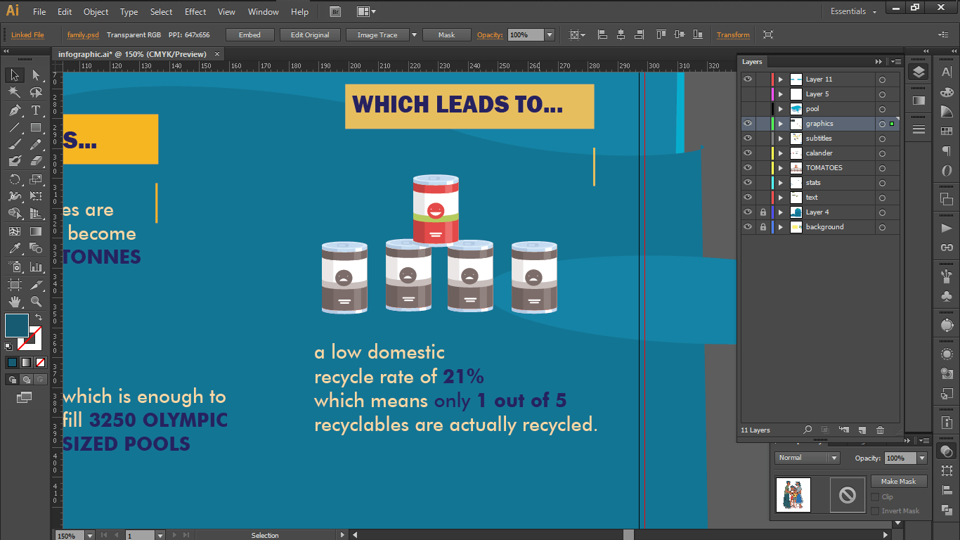
And from there I wanted to talk about the low domestic rates with the number from NEA, and in order to express the relevance of the number, I decided to go with a group of cans to show what the statistic would mean. I decided to use the colour contrast, as well the smiley face on the cans to show contrast.

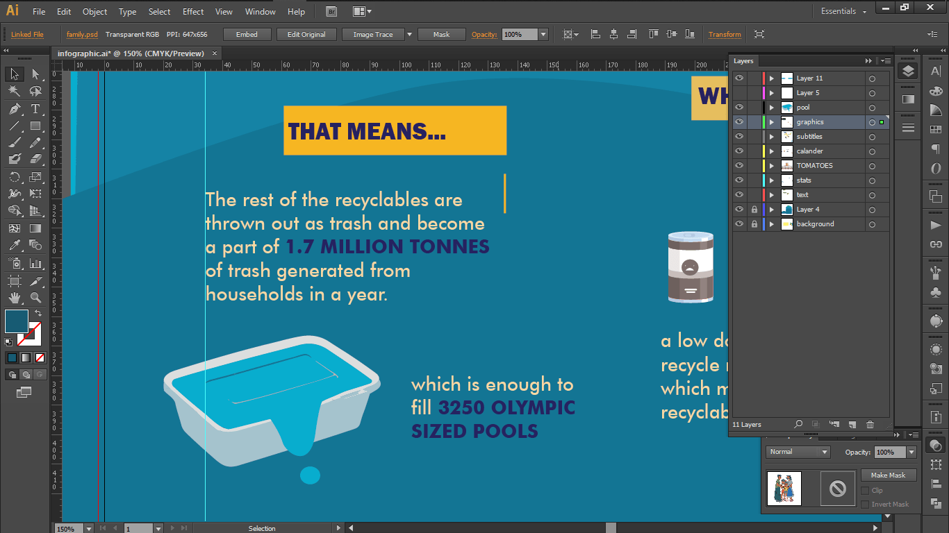
Last but not least, I decided to go a statistics with the largest number to depict how much actually waste we are producing every year. I decided to use the plastic food container to draw comparisons to the olympic swimming pool.

I also decided to add signposts in order to allow viewers to move through the graphics in addition to colours.

Here’s my final design!
After feedback, I tried to edit the design again for a bit, this time increasing the family size, as well as tried to take out odd gaps but following the composition that has been suggested by the class.

I aso added in a household at the back to further make sure that I am addressing the issue of lack of recycling at home by families.
This project helped me learn a lot about how to make surveys, and as well as how to put those results into a compelling graphic with organised numbers and statistics which I believe I still have a lot to improve on. :,D


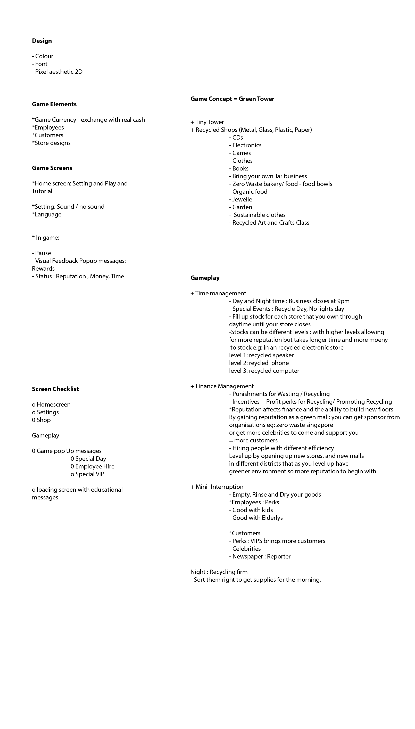


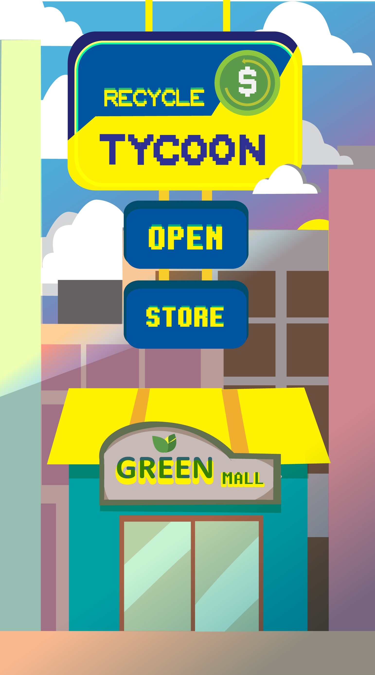


 dESIGN SOLUTION
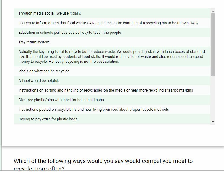


