

THEME
Hope to me is seeing things in a positive light whenever you are stuck in difficult times. So the final way that I decided to convey this idea is to represent the medical tools as space objects. I wanted to visually reshape the medical tools to a set of fun space components, since space to me is the representation of new possibilities in hopes of highlighting that getting treatment is to take care of yourself to get better.
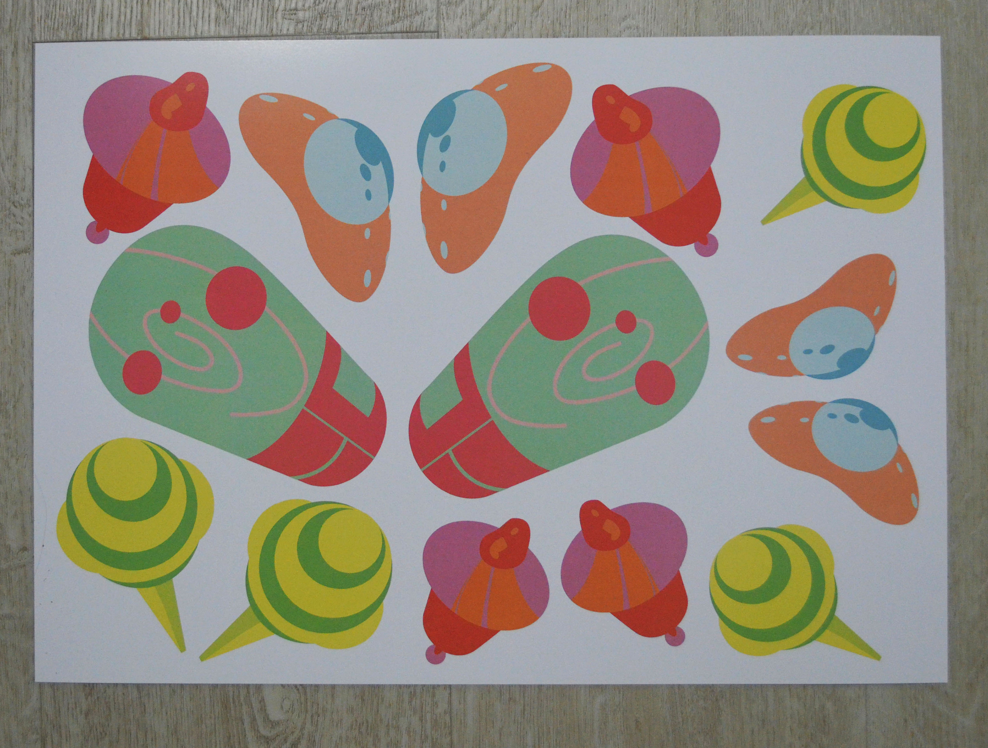
So here are my final list of 4 designs:
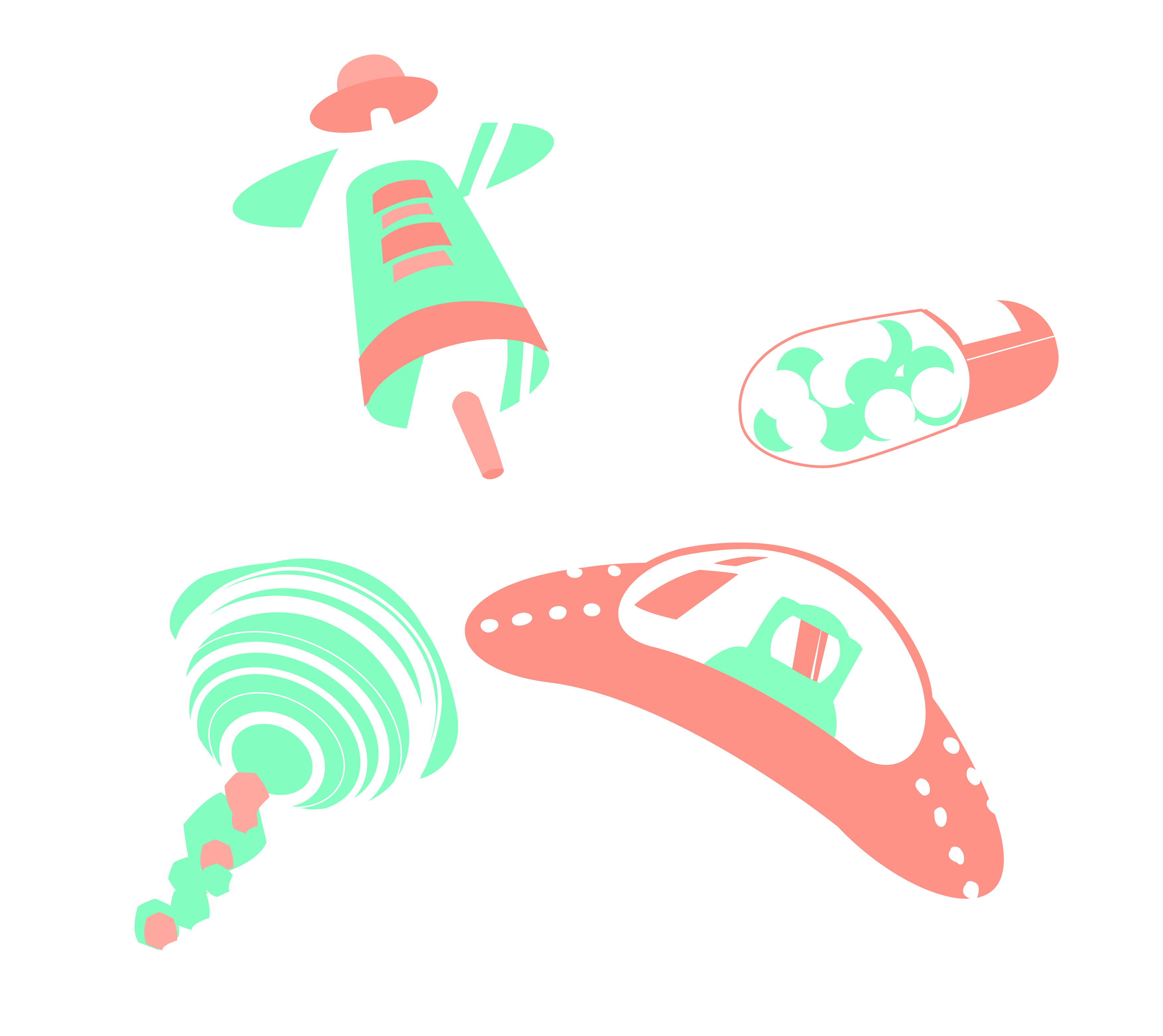
- Plaster as Space ship
- Syringe as a Satellite
- Pill as a Space pod
- Lollipop as Saturn
Idea generation
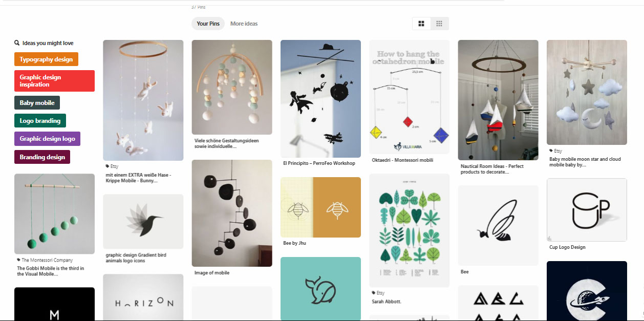
Pinterest board:


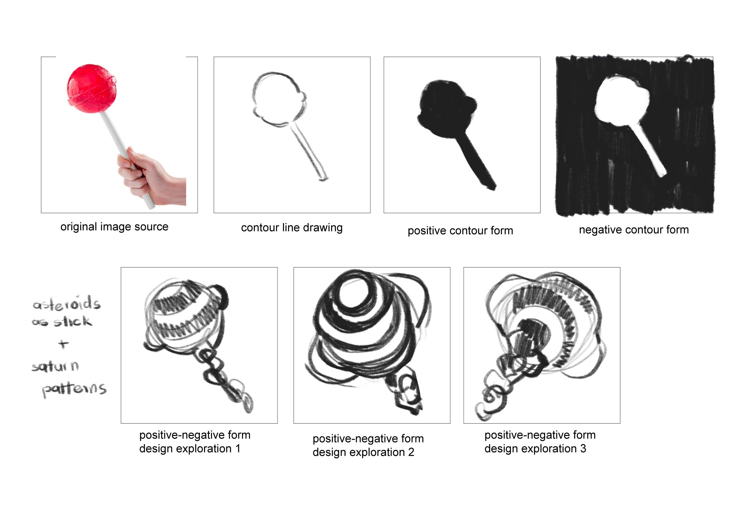
1st Attempt

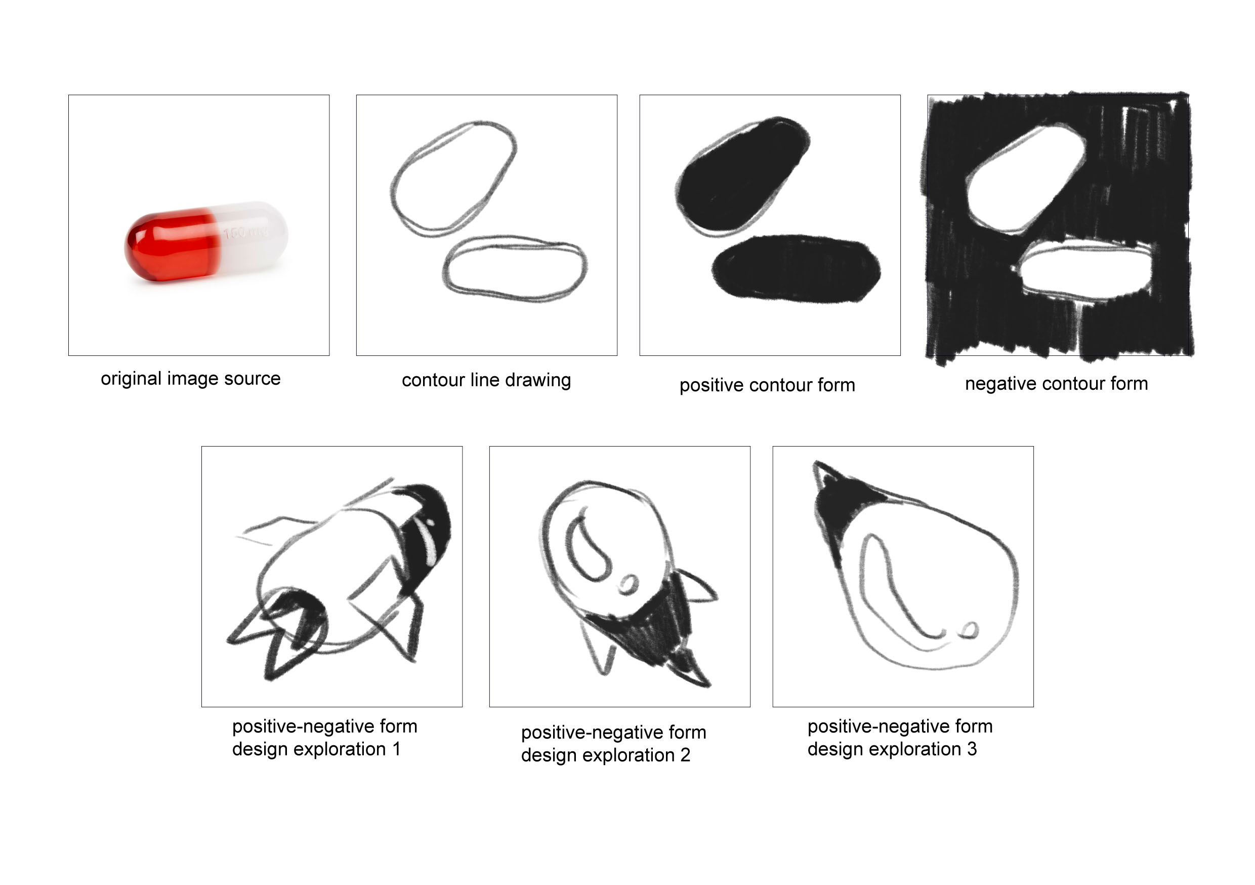
I ran into some difficulties when it comes to simplifying the shapes into forms instead as they are very illustrative. I also was thinking illustratively, adding details that are not really necessary to convey what I want. I was also not nailing the perspectives. So my goal was to get rid of the flames and details like the little windows and rework on the forms so that they are more simpler.
2nd Attempt
After consultation, I realised that I was still focusing on details, so I decided to take out even more details like the astronaut and the medical beads in the pills. I also decided to further simplify the asteroids on the lollipop and the details on the syringe to make it look less syringe-like.
3rd Attempt

Again, I was still thinking illustratively, instead of symbols. Therefore I decided to forgo even more details and instead focus on getting the outlines and the colours to convey the idea of hope.
FINAL
As for the forms, I generally steered clear from sharp edges and instead tried to round all my outlines so that they are smooth and soothing to look at. I also tried to vary the perspectives to give them depth and make them resemble less of their origin as medical objects.
As for colours, I decided to go with complementary colours that are not too loud but colourful enough, and to balance the contrast, I added some analogous colours as well. I also chose colours based on their healing properties and ensure that they go well with my intentions.
E.g: I used red and its tints to represent energy as core of the life pod pill.
Here is my reference.
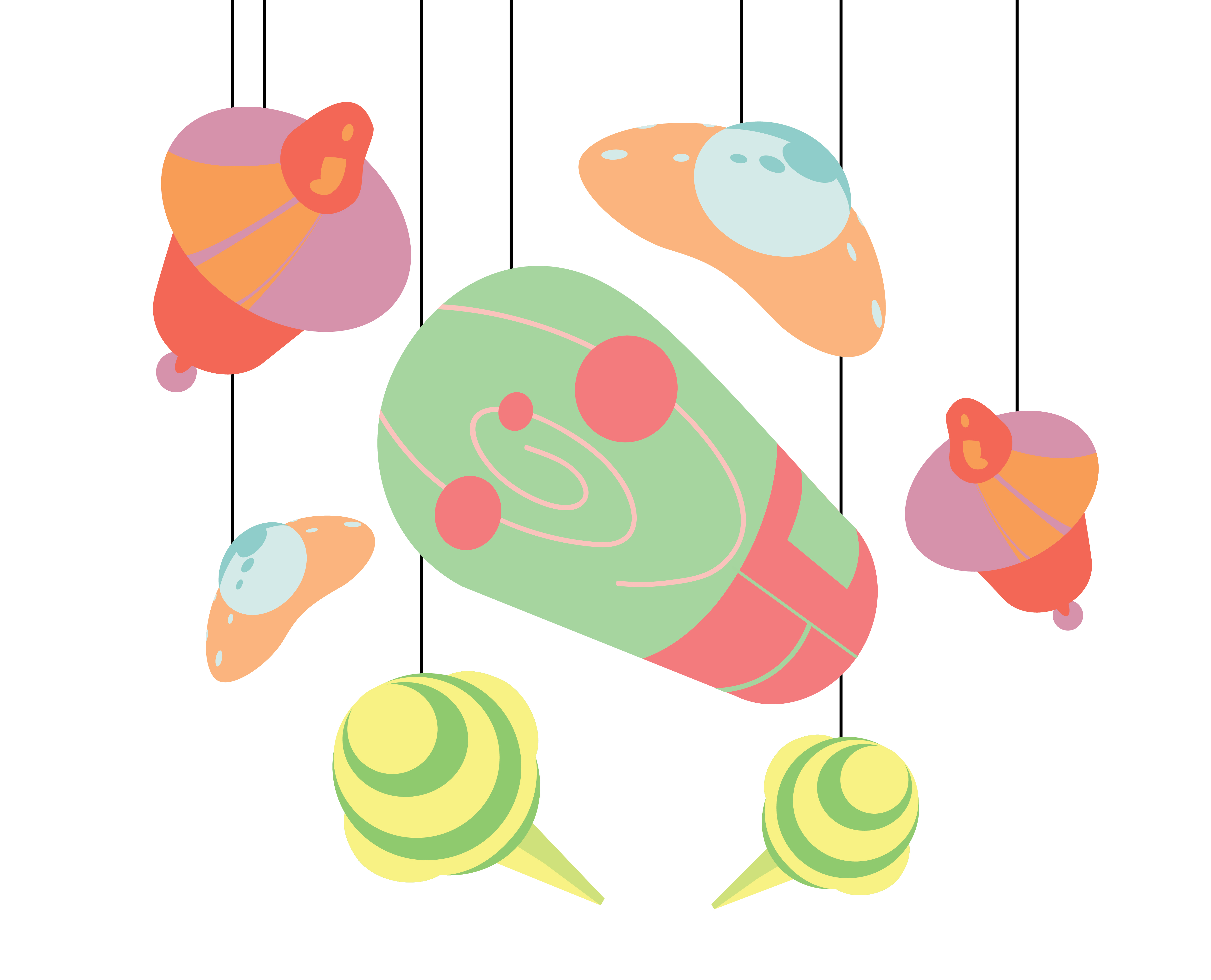
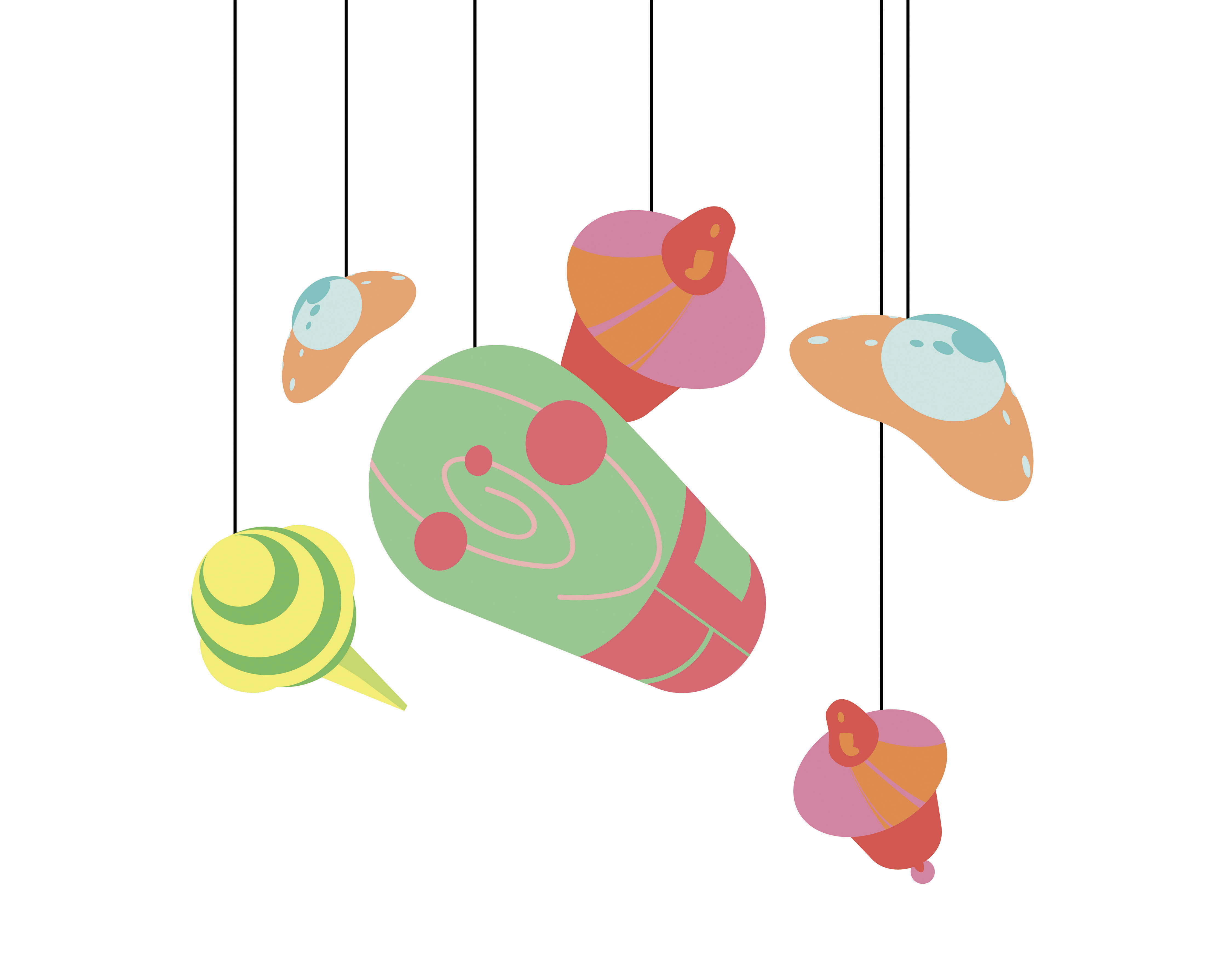
As for the arrangement, I wanted to create an orbit with the designs I have with the core (pill) in the middle.
(One of the lollipops died however while I was redoing the mobile so I came up with another arrangement)
Problems Encountered:
I definitely struggled a lot with the form making, and to the end, did not resolve all the simplifications that needed to be done, just like how the orbit in the pill was still relatively detailed.
As for the technical parts, I ran into multiple problems.
Printing:
I decided on printing at ColorVisio with 250 gsm white card, so that it won’t be too thick but thick enough to withstand the white glue that I was planning to use. However, when I got back home and started assembling I realised that the two sides don’t match up as I had forgotten to reverse the image…
Since I didn’t have time to reprint, I ended up printing at home with the thickest paper that I had – 160 gsm. The colours were sadly not as vibrant as the printing shop.
Lastly, since we were given time to fix the mobile after presentation, I decided to go to print at Xorex, with a 250 gsm art paper. The colours were not as vibrant as ColorVisio to me, but it was definitely better than the printing at my home so I decided to go with that.
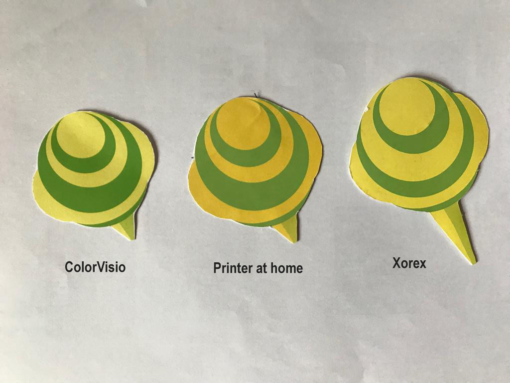
(Final print)
Craftsmanship:
I ran into quite a lot of problems here as well. I decided to use metal wires to create an orbital frame of the mobile since I thought that the width span needs to be at least 30 cm. But I had a hard time trying to bend them into a perfect circle even after hammering and bending them with pliers. I also had some difficulties trying to balance them with threads.
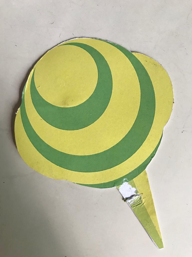
Sticking the designs back to back with a thread in did not go as smoothly as I thought. After the presentation, I went back to stick the designs with spray mount but I ended up destroying one of my lollipops. :,)
I think it would definitely have been easier if I inserted a transparent sheet in between the designs first before stringing the sheet instead of the design like one of the classmates did.
To wrap everything up, I unexpected learnt many things about form making and craftsmanship.
As for the technical process, I learnt the importance of using the right crafts for maximum efficiency, which I definitely learnt the hard way since I ended up spending way too much time making things. (I got myself an exacto knife the second time, and it was way faster and neater than I did with scissors.)
As for form making, even though I have not yet nailed at the process, I am definitely more conscious of the need to convey meanings without explicit details but instead with form and colours.