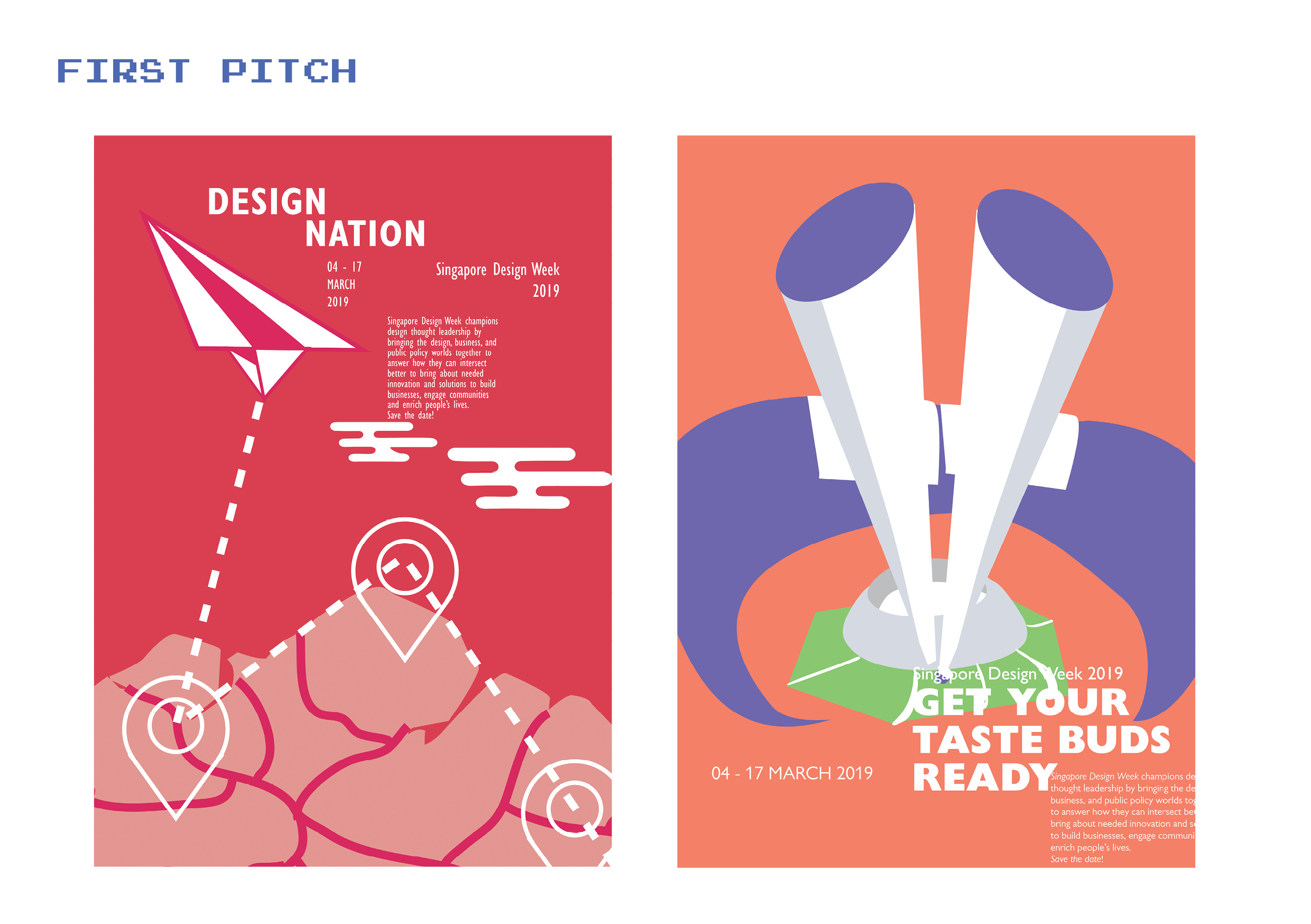
For the graphics I wanted to created to create a little leaf shaped country with oversized objects from each from the 4 sectors of design, since here I wanted to implement nature and sustainability as part of the image.
2nd Idea: Get your taste buds ready
For this, I wanted a kueh tutu shaped infrastructure on a leaf-shaped platform as part of the graphics, because I wanted something that is a part of Singapore culture and again nature.
3rd idea: RE: invent
As for this, I wanted to base it on the vintage radio that I saw back at the National design centre.
I decided to work on the first 2 ideas that I had, but it wasn’t exciting without any dynamic angles and seemed rather still and cold. And as for the 2nd poster, I kept emphasizing on making food graphics that it failed to look like a design festival. So I decided to carry on with my 1st Idea.
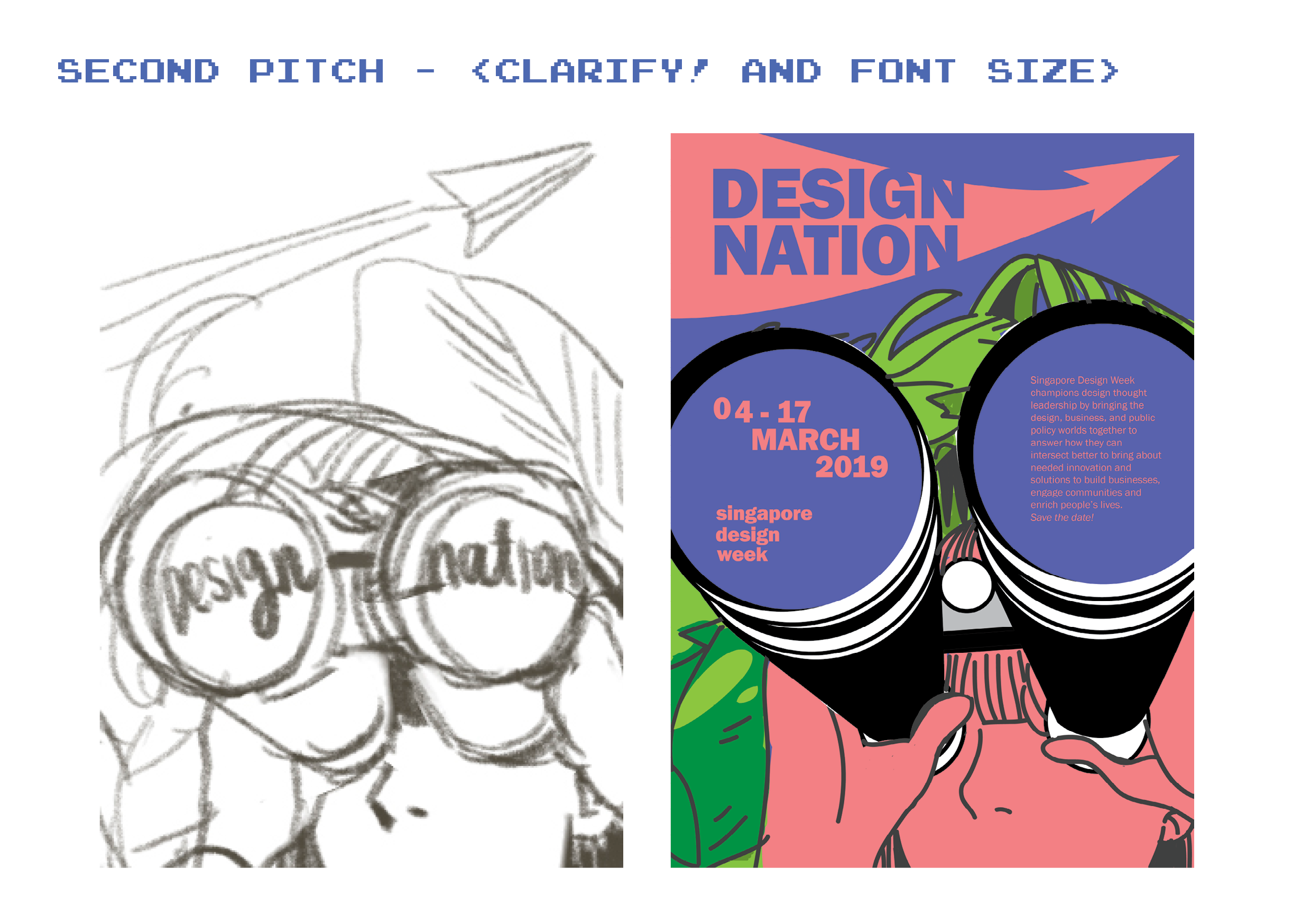
Since I’m working with the slogan Design Nation, I tried to incorporate the idea of discovery while trying to put in more dynamic angles, I came up with this where I have a girl looking out of her binoculars with greenery behind her. However, because of the graphic I created first, I had trouble finding space for my text and end up just squeezing everything in whatever space I had.
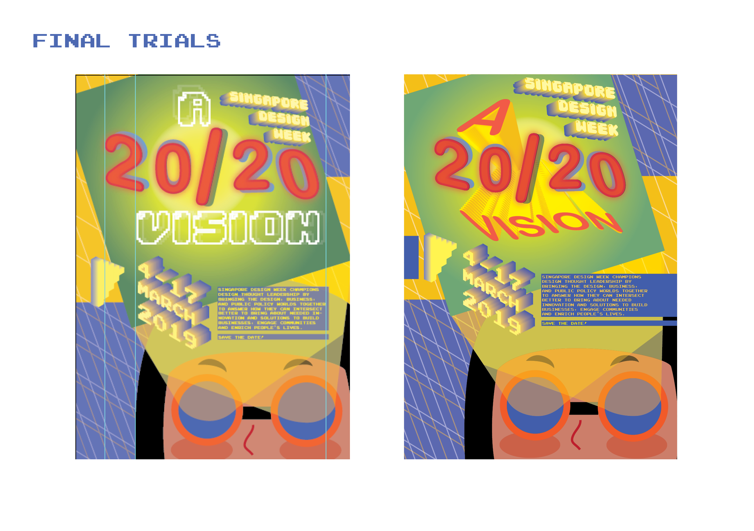
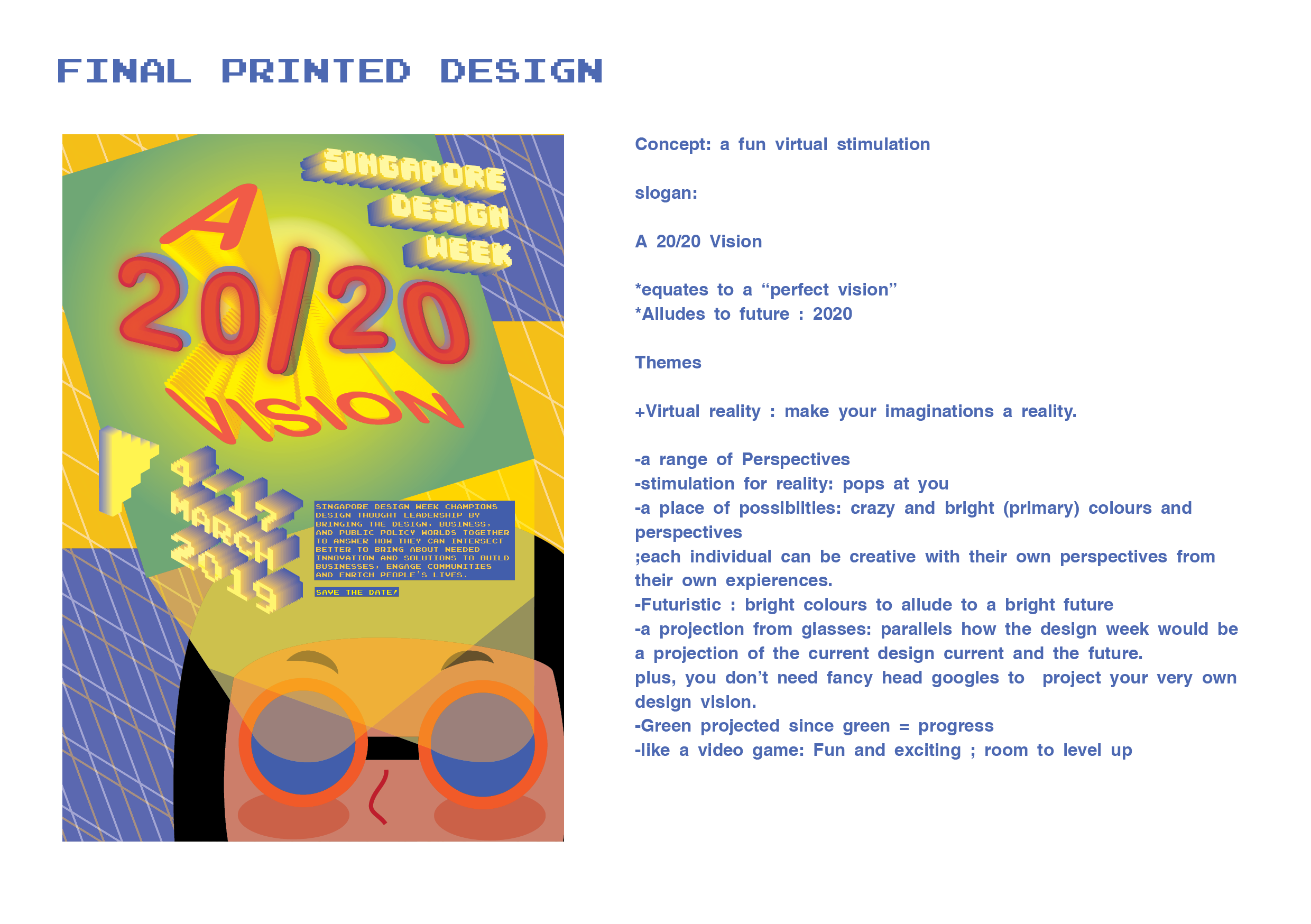
As for the graphics, again I was being a bit too literal, and I decided to take some of the advice given in the class; the binoculars could be swapped out with projects out of the eyes. I also really liked another suggestion from the class to change the slogan to “a 20/20 vision” instead.
Since I’m working with a new slogan to do with vision and projections, I decided to change the graphics again to create a game-y graphic like a virtual reality. I also left out all the leaves and instead replaced it with simple grids to imply guides for building anything to imply endless possibilities.
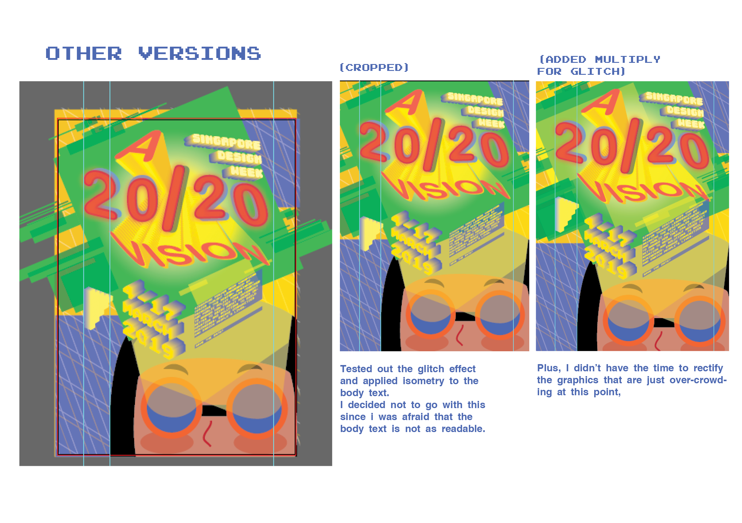
But, my font sizes especially for the date and the festival, were way too small, when they are supposed to be important. It was also still lacking the playfulness, so I decided to give it some pop by changing the text to Isometric graphics to make it look more dimensions. And I decided to test out using different types to create more contrast.
One thing that I definitely learned from this project is to not let the graphics control the texts, like I was doing for many of my previous attempts. I learned to practice taking everything out and putting in text elements in first and put in more graphics later, although i still have some problems locking them in to create a balance and a sense of unity.
Although I still struggle with hierarchy and locking my elements in the graphics, I think I managed to come a long way from the beginning of this project.
This poster uses a Monochromatic tones and tints of yellow to compose the entirety of the poster. I thought it was charming of them to deliberately stick to monochromatic yellows to reflect the theme of the event, to celebrate the Yellow faces aka the Asian people (according to google translation of the event). At the same time, the yellow acts as a brand for mrmustard studio as it can easily be associated with its namesake.
As for the illustration, the yellow wall creates an interesting diagonal yet symmetrical cut keeping the poster balanced overall. This line of division also makes the small and playful black lineart stands out in the center.
All the textual elements on the poster are all placed at the four edges, framing an imaginary margin.
All four textual elements are easily legible as yellow fonts are contrasted over the off-white background and vice versa. Our eyes go over first to the Event title : Hello!Yello! which is the largest amongst all of them. In addition, the slightly tilted angle and the availability of wide space around it easily grabs our attention. In addition, visual interest is created with the title being written in a causal handwritten type in yellow, as if promising that this exhibition will be fun and entertaining.
Then our eyes get drawn to the bottom left as we go along the sub-margin that frames the title, where the Studio and the dates are displayed, which are technically the two other important elements after the title. We then go to the text with the vertical alignment at the top right corner, and this orientation creates another form of visual interest. It then directs us along its own sub margin to the sponsors.
I think the overall simplistic style of illustration with the repetition of yellow aligns itself well with the message of this exhibition; to embrace the charms of fun yellow as a part of the Asian identity.
I think the most outstanding thing from this poster is how it manages to capture the important features of coding with its play on the visual combination of both the illustrations and the text, which takes up almost the whole center of the poster.
Firstly, the largest text for the title (HACKATHON) is placed interrupted into 4 lines with the white lines, but still forms the word when read conventionally from left to right, and top to bottom. This disconnected imagery reflects how codes make use of individual alphabets as a component to communicate its functions in data instead of using it for mere communication.
The imagery of the hands intertwined with the text also further reinforces how coding requires layers and layers of work in order to make it function. It also perhaps suggests having to think outside of the boundaries in order to make the coding work, suggesting that the event is bound to challenge you to think creatively.
The textual elements of the posters also frame themselves around the central imagery, creating an implied margin. The difference between the colours of the frames around the texts also separates each textual information from one another.
Again, the poster, only uses limited colour palettes, and uses the split complementary system to bring attention to the detached hands from the orange-yellow background, which creates an impression that coding can be fun and creative.
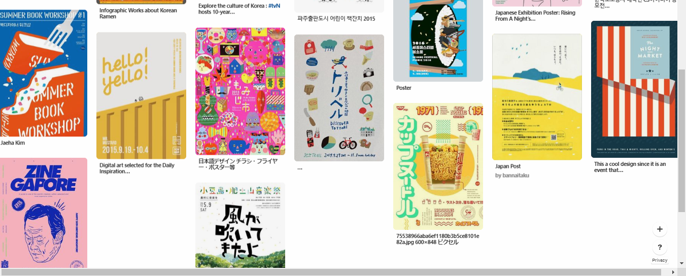
Here are the other posters that I found interesting:
In addition to its rich multi-cultural roots, it has already cemented its place in the international community as one of the fastest growing and most innovative metropolitan states. As such, Singapore has revenue and confidence to explore more creatively and we do see the fruition of this advent with the recent influx in the general interest of design in all of the sectors of Singapore.
With this continued interest and investment in design all over Singapore, people from all age range will begin to see the significance of design in keeping all the sectors of Singapore flourished and at the same time, paints Singapore as a vibrant and attractive country to the rest of the world.
At this rate, I’d like to believe that Singapore will very soon find its own charm in the design scene globally if it continues in this direction that encourages venture.
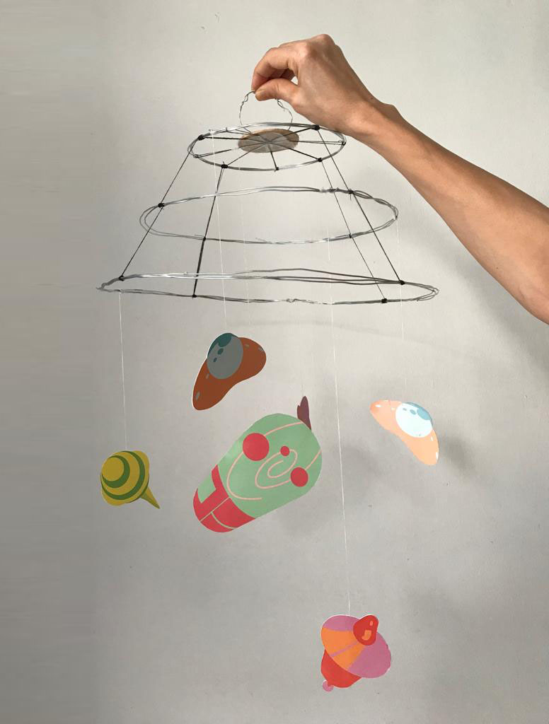
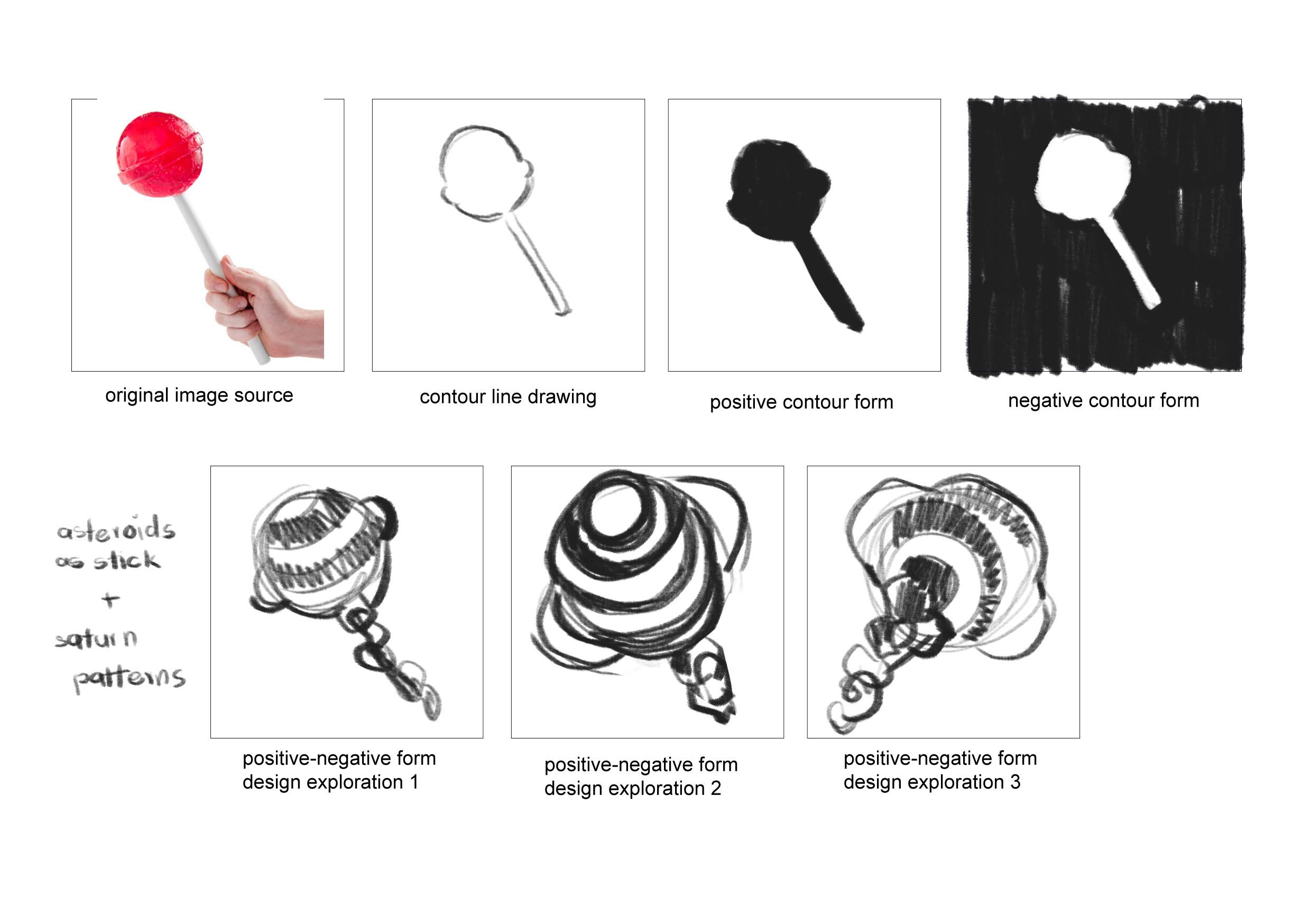
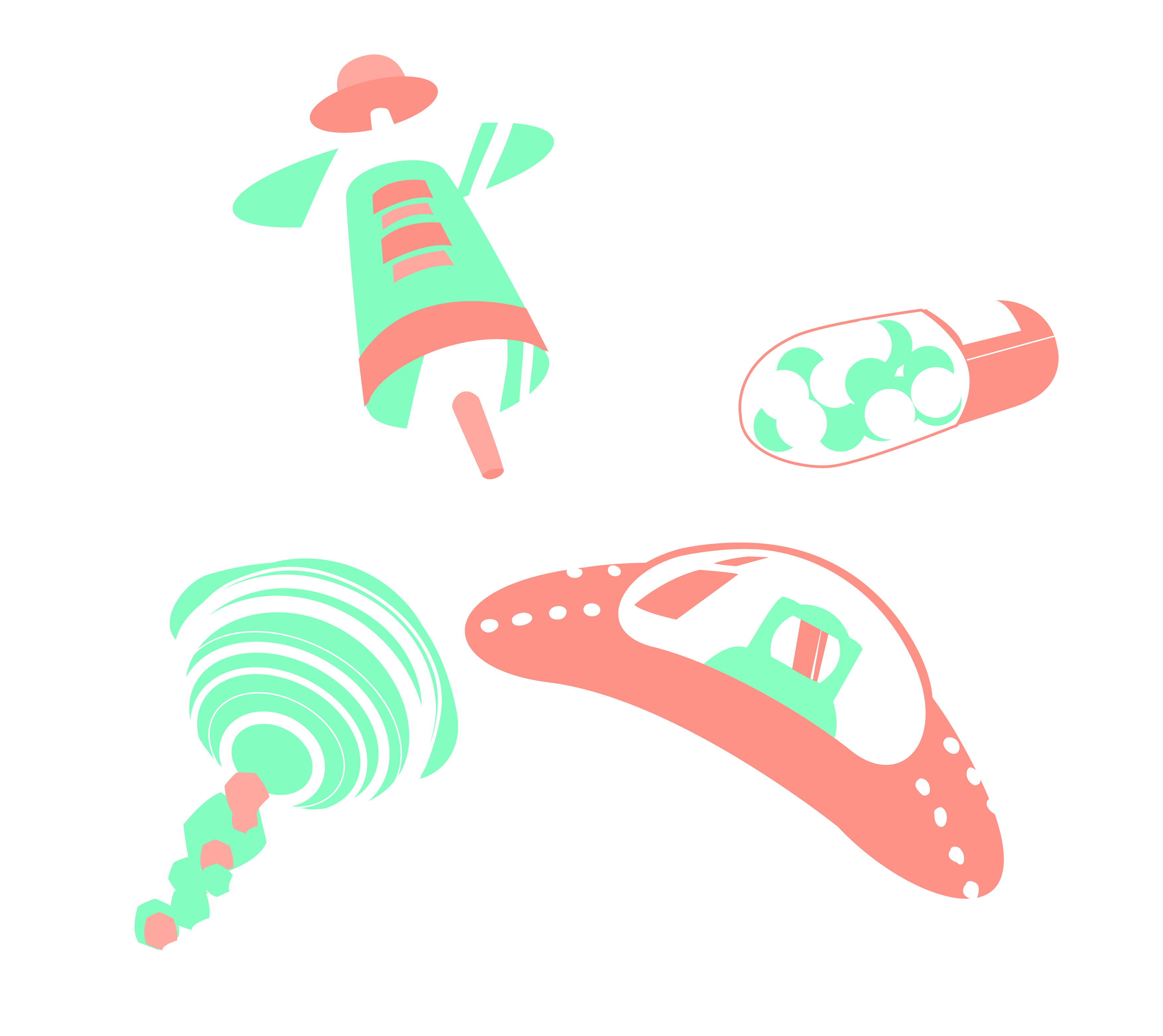
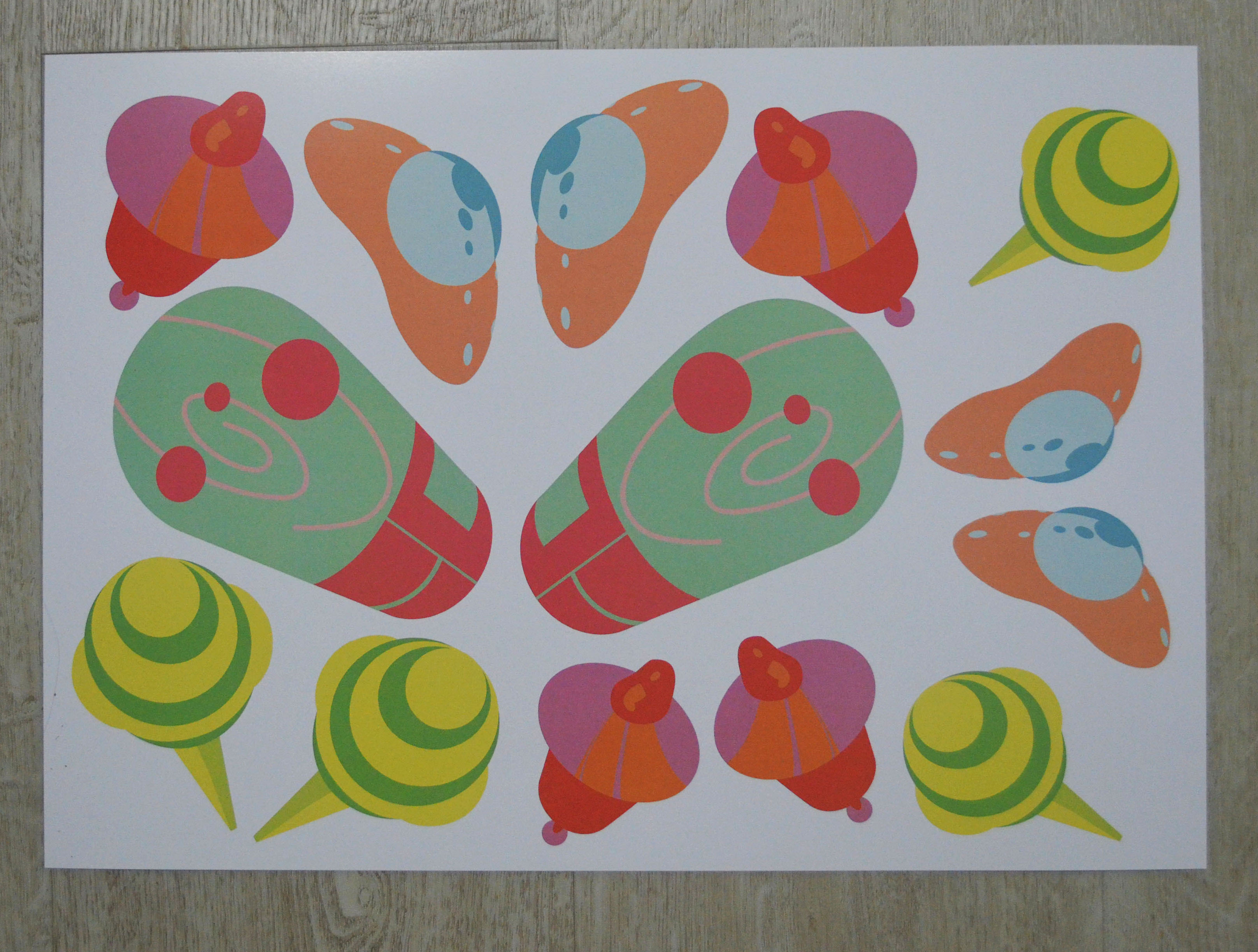
Hope to me is seeing things in a positive light whenever you are stuck in difficult times. So the final way that I decided to convey this idea is to represent the medical tools as space objects. I wanted to visually reshape the medical tools to a set of fun space components, since space to me is the representation of new possibilities in hopes of highlighting that getting treatment is to take care of yourself to get better.
So here are my final list of 4 designs:
Plaster as Space ship
Syringe as a Satellite
Pill as a Space pod
Lollipop as Saturn
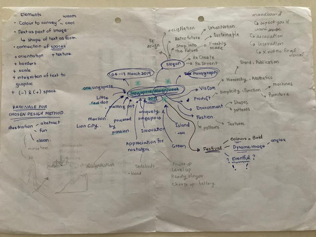
Idea generation
Pinterest board:
1st Attempt
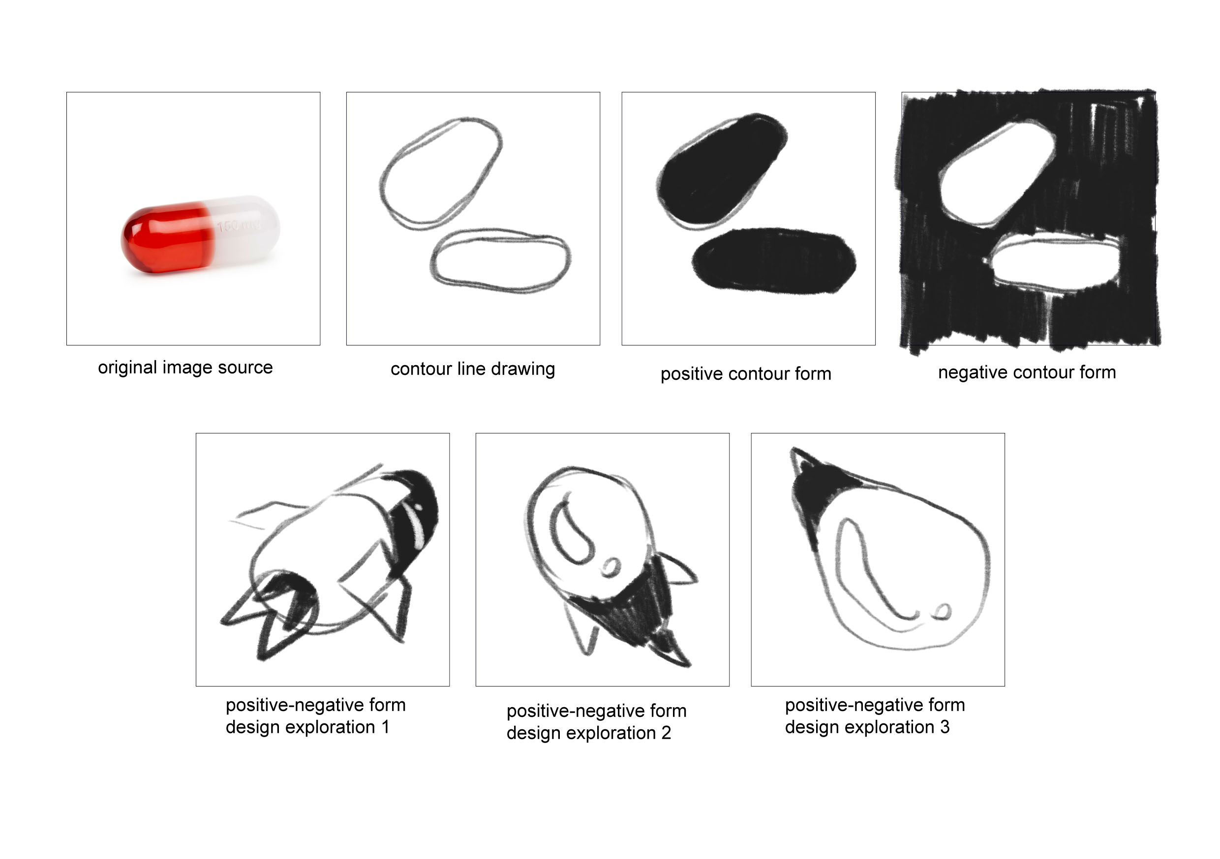
I ran into some difficulties when it comes to simplifying the shapes into forms instead as they are very illustrative. I also was thinking illustratively, adding details that are not really necessary to convey what I want. I was also not nailing the perspectives. So my goal was to get rid of the flames and details like the little windows and rework on the forms so that they are more simpler.
2nd Attempt
After consultation, I realised that I was still focusing on details, so I decided to take out even more details like the astronaut and the medical beads in the pills. I also decided to further simplify the asteroids on the lollipop and the details on the syringe to make it look less syringe-like.
3rd Attempt
Again, I was still thinking illustratively, instead of symbols. Therefore I decided to forgo even more details and instead focus on getting the outlines and the colours to convey the idea of hope.
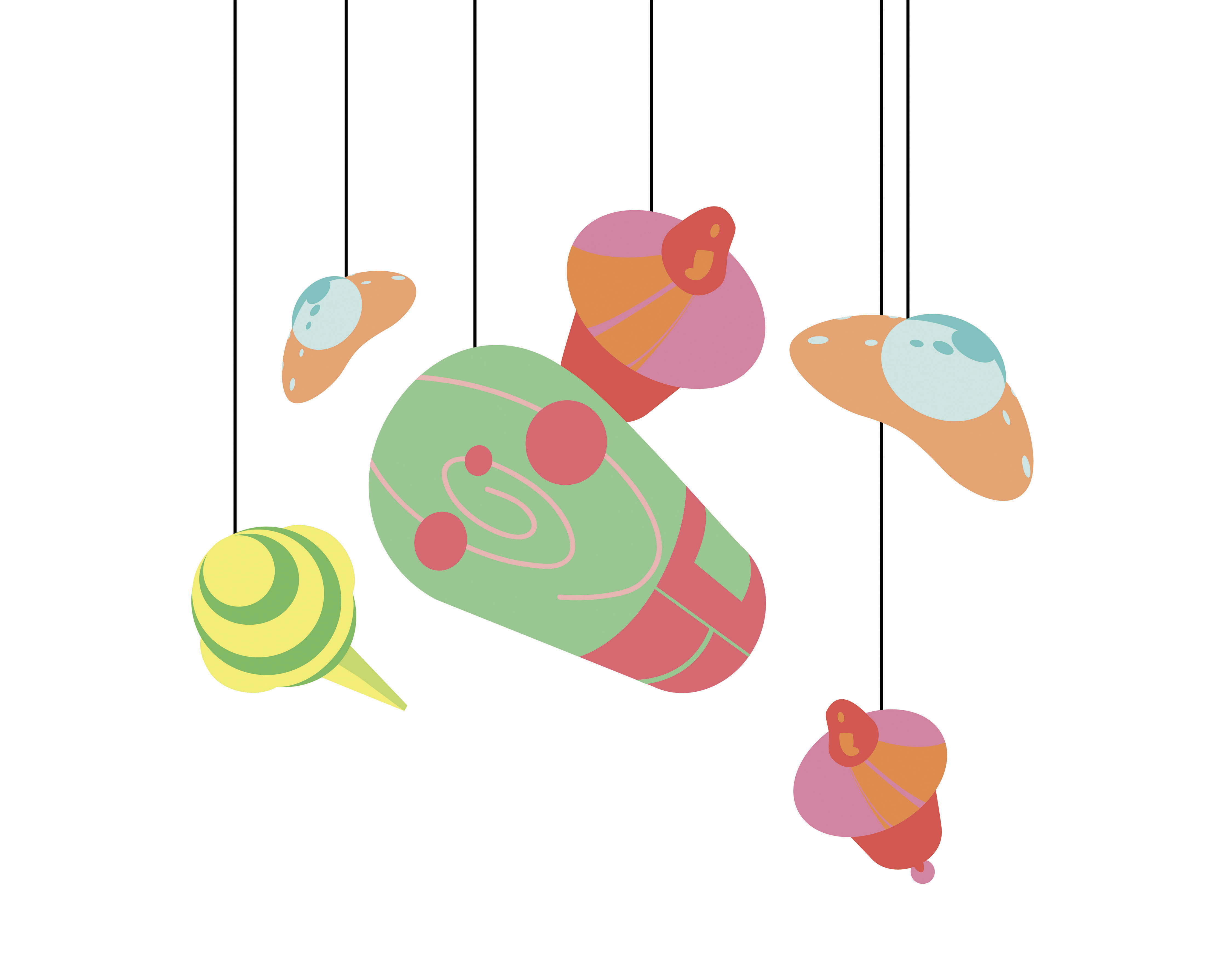
FINAL
As for the forms, I generally steered clear from sharp edges and instead tried to round all my outlines so that they are smooth and soothing to look at. I also tried to vary the perspectives to give them depth and make them resemble less of their origin as medical objects.
As for colours, I decided to go with complementary colours that are not too loud but colourful enough, and to balance the contrast, I added some analogous colours as well. I also chose colours based on their healing properties and ensure that they go well with my intentions.
E.g: I used red and its tints to represent energy as core of the life pod pill.
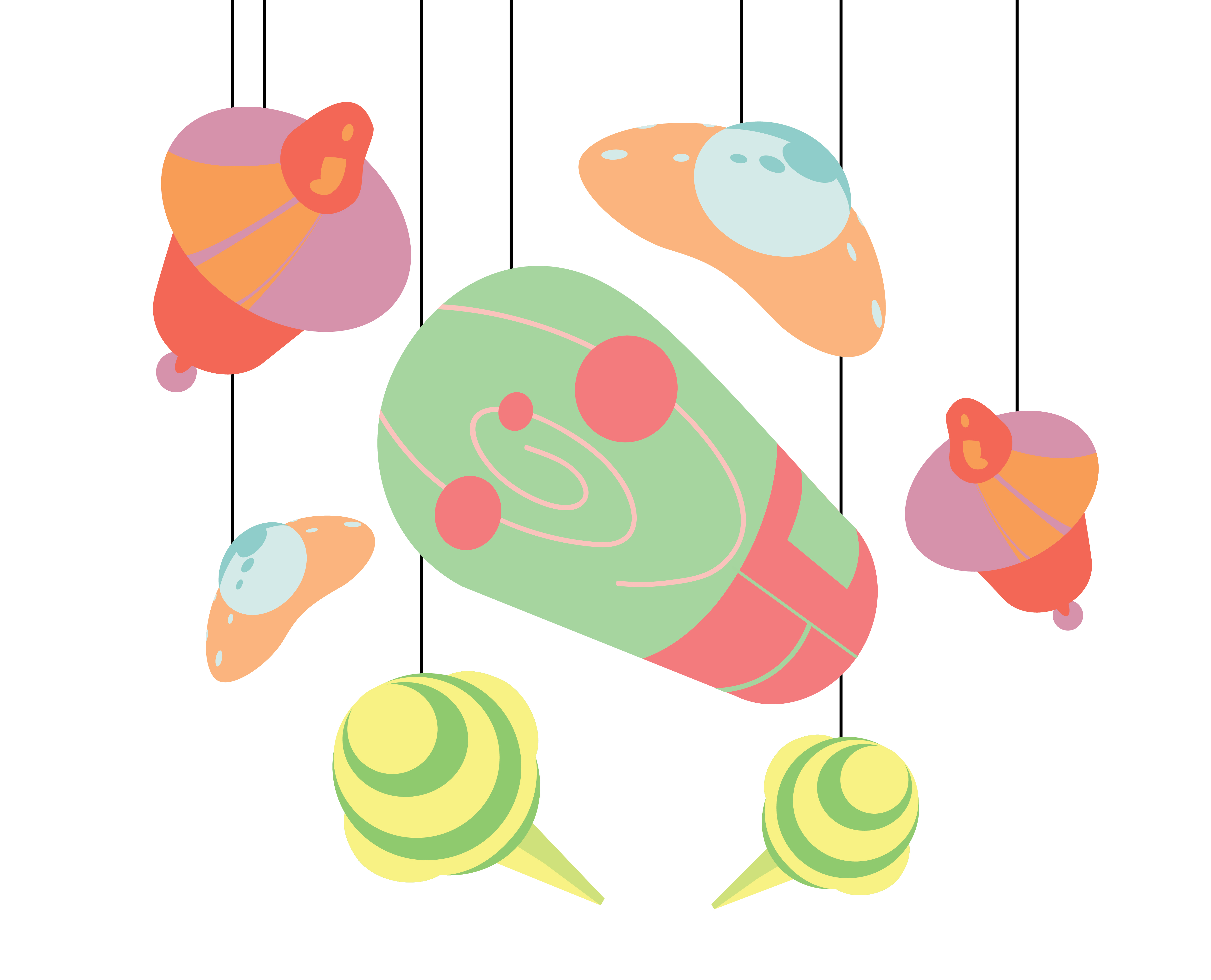
As for the arrangement, I wanted to create an orbit with the designs I have with the core (pill) in the middle.
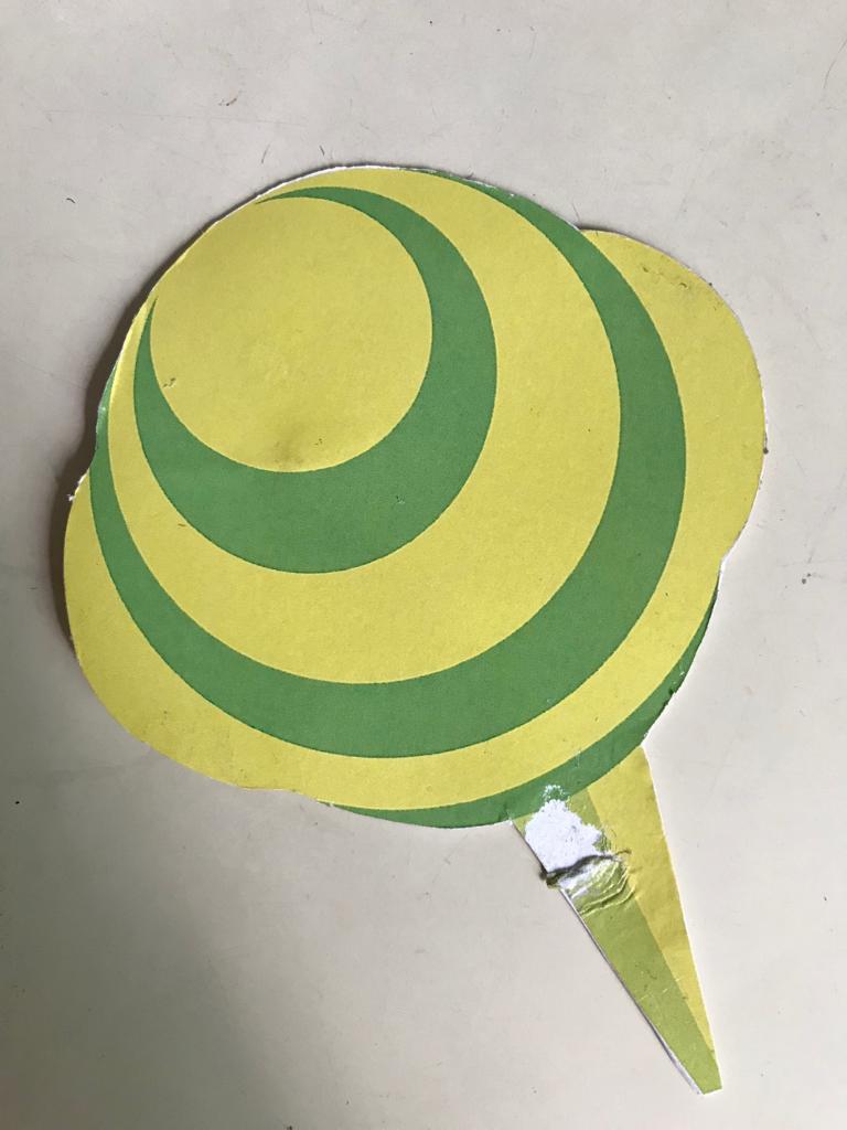
(One of the lollipops died however while I was redoing the mobile so I came up with another arrangement)
Problems Encountered:
I definitely struggled a lot with the form making, and to the end, did not resolve all the simplifications that needed to be done, just like how the orbit in the pill was still relatively detailed.
As for the technical parts, I ran into multiple problems.
Printing:
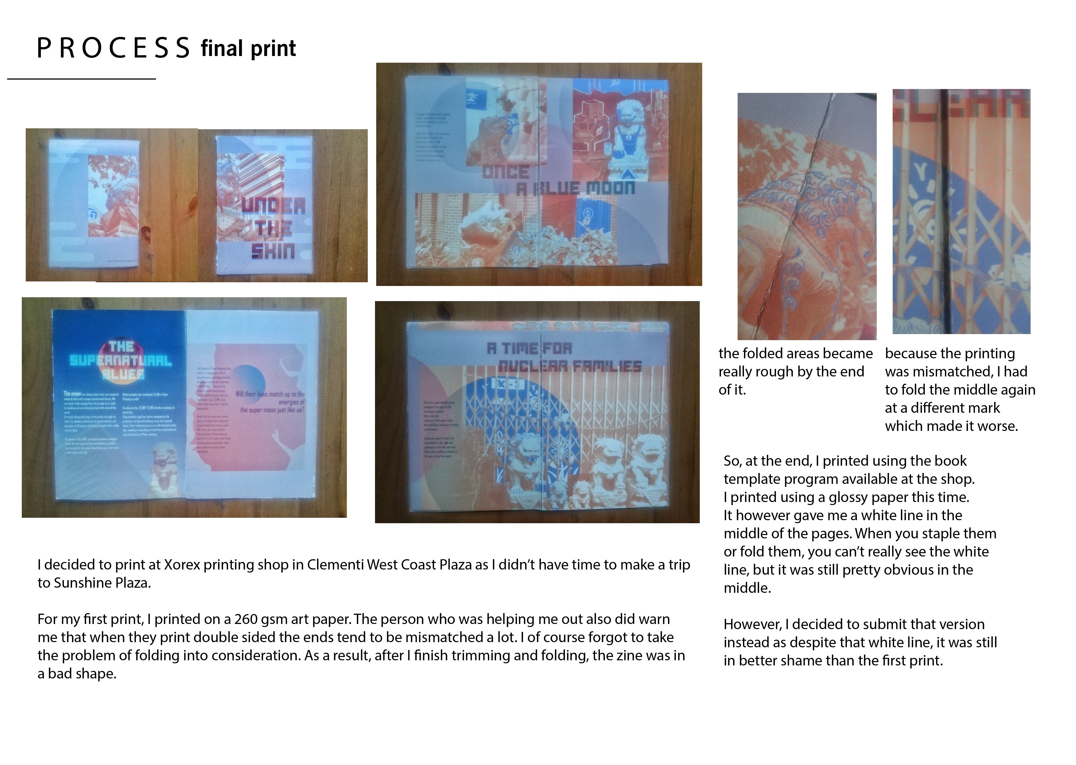
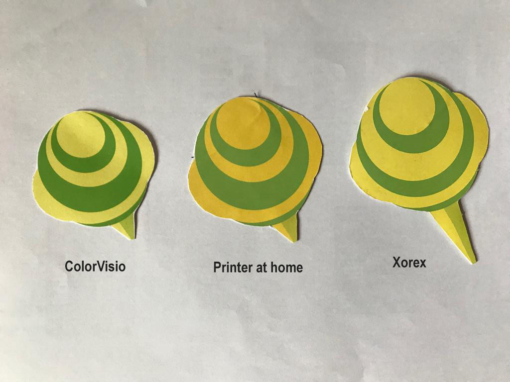
I decided on printing at ColorVisio with 250 gsm white card, so that it won’t be too thick but thick enough to withstand the white glue that I was planning to use. However, when I got back home and started assembling I realised that the two sides don’t match up as I had forgotten to reverse the image…
Since I didn’t have time to reprint, I ended up printing at home with the thickest paper that I had – 160 gsm. The colours were sadly not as vibrant as the printing shop.
Lastly, since we were given time to fix the mobile after presentation, I decided to go to print at Xorex, with a 250 gsm art paper. The colours were not as vibrant as ColorVisio to me, but it was definitely better than the printing at my home so I decided to go with that.
(Final print)
Craftsmanship:
I ran into quite a lot of problems here as well. I decided to use metal wires to create an orbital frame of the mobile since I thought that the width span needs to be at least 30 cm. But I had a hard time trying to bend them into a perfect circle even after hammering and bending them with pliers. I also had some difficulties trying to balance them with threads.
Sticking the designs back to back with a thread in did not go as smoothly as I thought. After the presentation, I went back to stick the designs with spray mount but I ended up destroying one of my lollipops. :,)
I think it would definitely have been easier if I inserted a transparent sheet in between the designs first before stringing the sheet instead of the design like one of the classmates did.
To wrap everything up, I unexpected learnt many things about form making and craftsmanship.
As for the technical process, I learnt the importance of using the right crafts for maximum efficiency, which I definitely learnt the hard way since I ended up spending way too much time making things. (I got myself an exacto knife the second time, and it was way faster and neater than I did with scissors.)
As for form making, even though I have not yet nailed at the process, I am definitely more conscious of the need to convey meanings without explicit details but instead with form and colours.
A public interactive performance that is based on a site-specific narrative with integrated elements of DIWO, Third Space and Glitch.
Brain storming process
references :
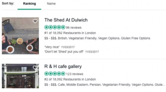
The Shed at Dulwich
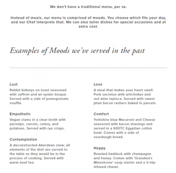
A spoof restaurant in a garden shed in Dulwich. It was created as a hoax by journalist Oobah Butler which became the top-rated restaurant in London on TripAdvisor before the listing was taken down. The restaurant was open for one night and served a faux menu themed with “emotions”.
The hoax played off the trend for micro-restaurants.
Bulter Cafes in Japan
The basic concept of a butler cafe is that you are extraordinarily wealthy and you’re returning to your mansion for dinner/afternoon tea. The butlers great you with 「お帰りなさいませ、お嬢様!」”Welcome home, my lady!” and take your coat and carry your bag to your table and make small talk with you and serve you tea and generally make you feel like a fantastic person.
A reality game show whereby the audience watch the interaction between a group of contestants living together in a custom built home, isolated from the outside world, under constant surveillance. An exploration of human dynamics.
Terrace House
A Japanese reality show about strangers, men and women, living together in a house, where the development of their relationship is monitored.
INITIAL IDEAS summary
Pillow talk
Location : Bunc Hostel Singapore
2 strangers have an intimate conversation with one another separated by bed sheet/ different rooms.
No escape room
Stimulation of the board game Dead of Winter
Surveillance
Location : Inside tents of East and West Coast Park
RPG Game
Real life arcade game where we are the characters that the player (public audience) controls.
The one that got away = The Labyrinth
Brief outline:
Location : Bugis Street
A runner and catcher narrative at roots, this stimulated dystopian chasing game where Renegade AIs (runners) have to escape from the Guards (catchers) through the floors of Bugis Street in the time span of 1/1.5 hours. The gameplay was to be monitored through updates on telegram as well as a secret recordings by the team members. The runners would have to take “discreet” photos of themselves completing their missions to which would be given to the catchers by us as clues to track them down. The chasers have to find the runners using these clues and attempt to catch them by asking whom they suspect to complete a common idiom in a specific way, such as:
[The grass is always greener…] […on the ADM rooftop.]
[Coffee, tea, or…] […teriyaki?]
[Birds of a feather…] […cockblock together.]
Glitch : There would be 3 pairs of runner and catcher, 6 players in total. Our plan was to recruit help from our own friends who don’t know each other so that they won’t know who they are running away from/ catching. Plus the 3 runners are to concurrently update their clues on the instagram, creating confusion for the chasers, as they won’t know which clue to track down.
DIWO : Runners and catchers can choose to form alliances among themselves to help each other achieve their end goals.
Third Space: The runners and catchers would be communicating with among themselves and us through separate telegram groups. The clues from runners would be posted on instagram as they complete their missions.
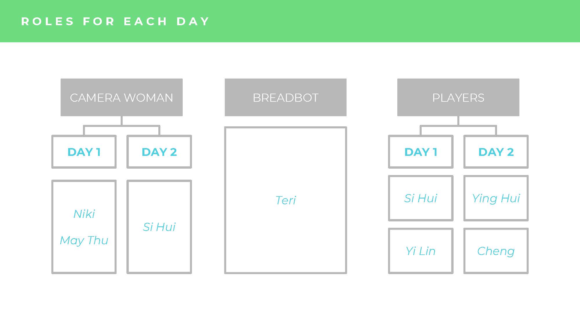
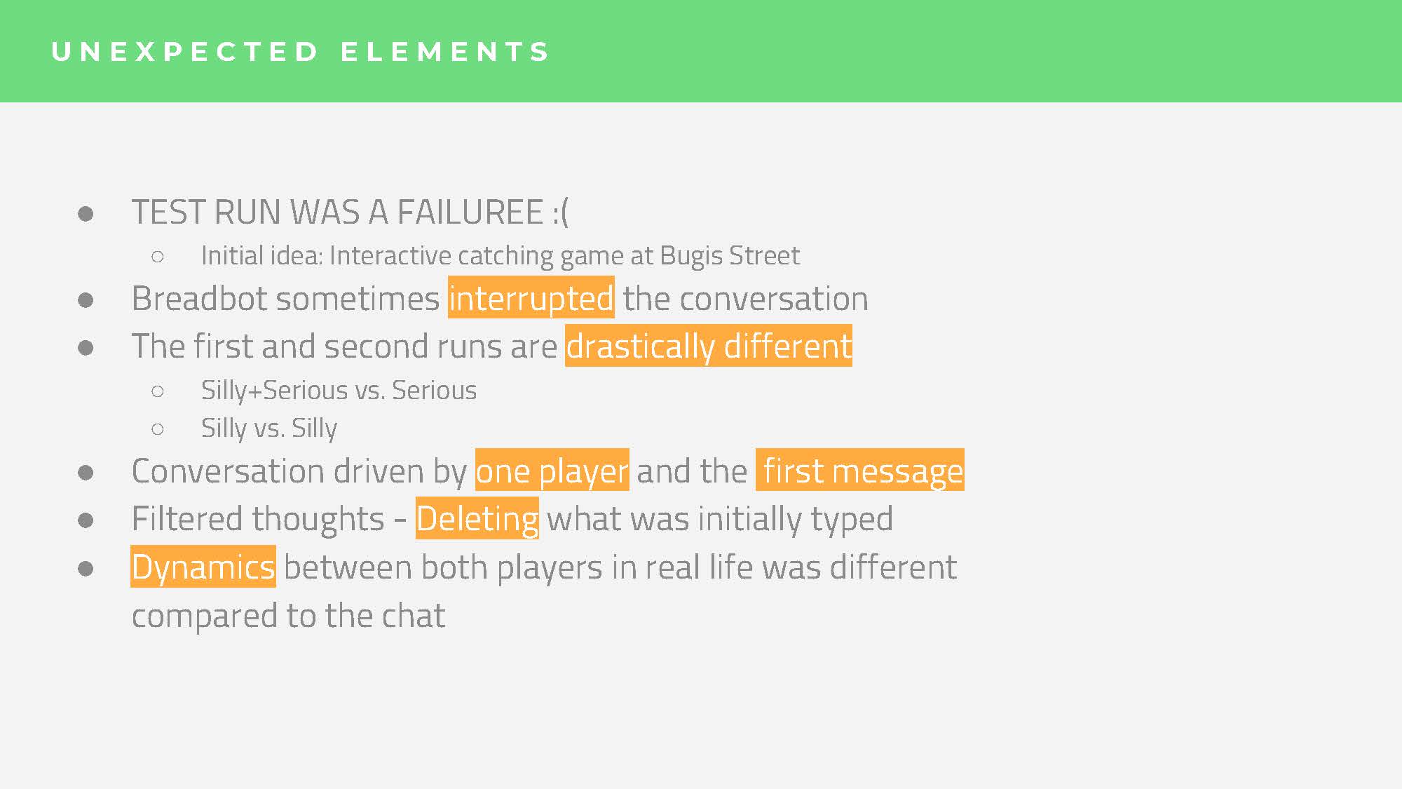
We decided on a test run on a Saturday with Si Hui’s and Ying Hui’s friend (although I was missing for the whole test run process because of my 3d project.)
After we all sat down with the players after the game, we were told that the narrative was not engaging enough – why were the renegades AIs running away? how is it going to end? Which we were unclear of among ourselves. But even if we did, I foresee that we might be restricting the players with too much world building, hence there would not be chances for any meaningful accidents, glitches.
Plus, the chaser felt that the gameplay was not as engaging for him as the runner as he merely had to chase the runner around using instagram clues which he was not even using to find the runner.
And lastly, we simply did not have the manpower and tools to secretly follow 6 separate players. On the test run itself, the other 4 members struggled with the recording, 2 of them having to avoid their own friends in order not to give away where the stations were.
FINAL IDEA GENERATIOn
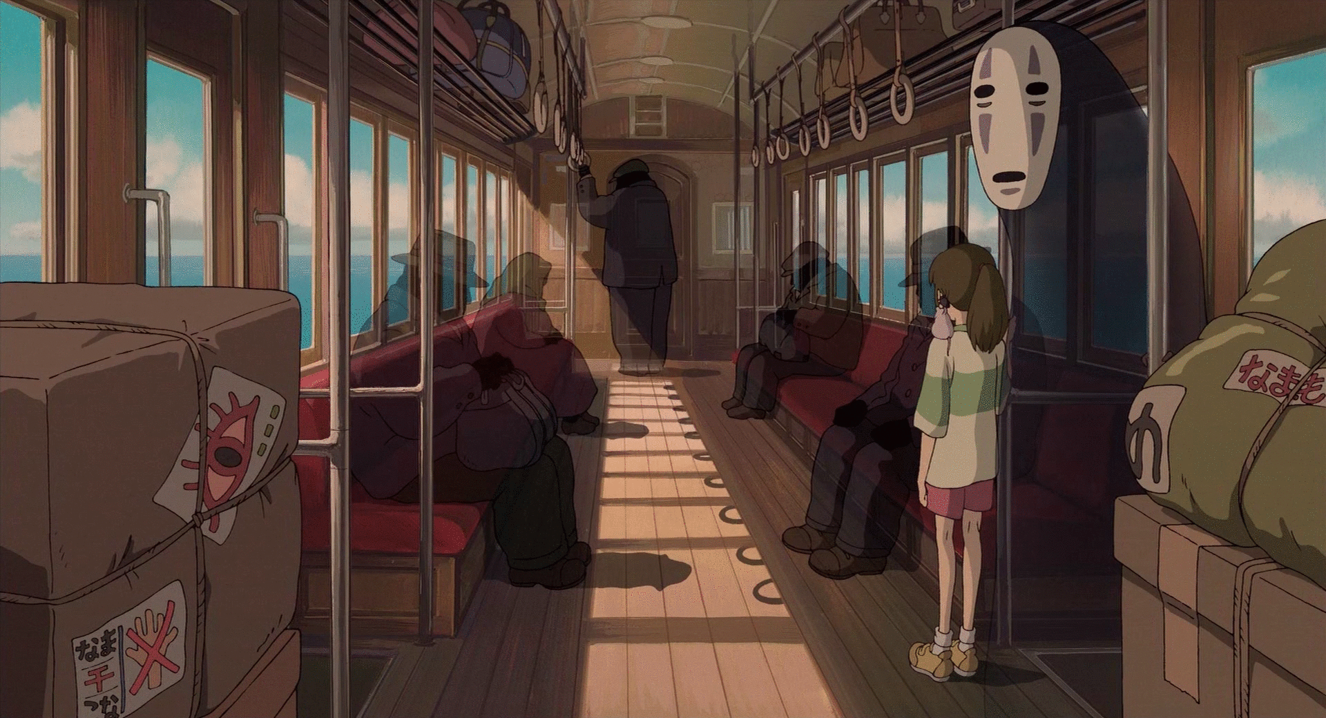
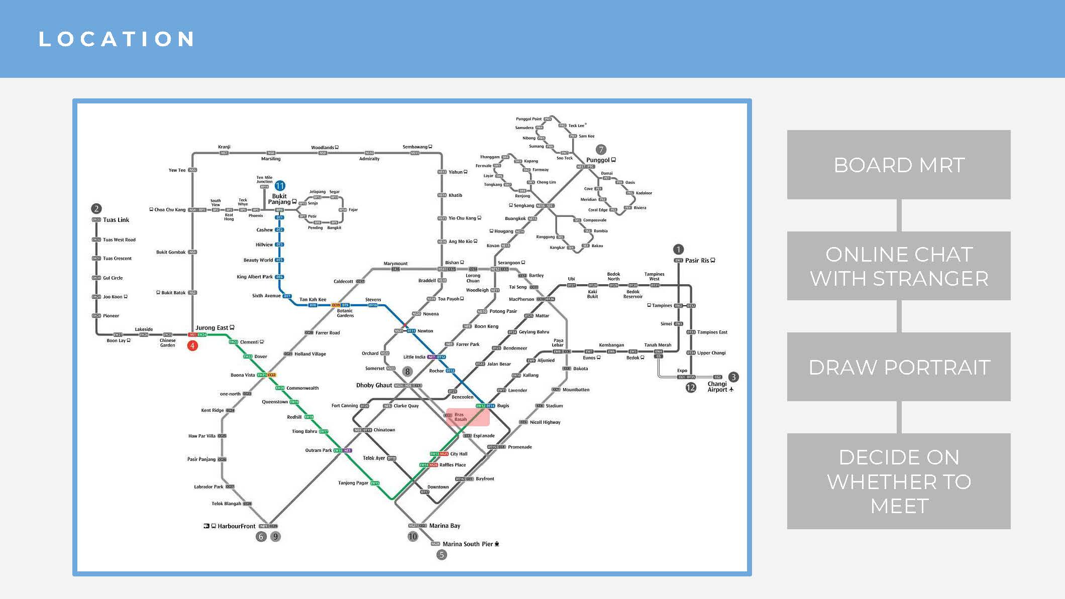
Location: MRT
A uniquely ironic space where we are most of the time in our own private bubbles even though our physical bodies are squished together with other bodies of the crowd, which we repeat without questioning day after day like a routine. There were many interesting themes that could be explored within this space, from its coverage over the entire of Singapore, the intersections of old and new lines to familiar strangers.
I think that Si Hui has also mentioned a very interesting fascination of ours at one point of our lives, the thrill of having a meaningful intersection with the “fate” one on the train whom you’ve never met before, in a very “Before Sunrise”-esque/Korean drama way.
And so, we decided to focus on the general feelings of sonder we go through everyday. So what is Sonder?
“the realization that each random passerby is living a life as vivid and complex as your own—populated with their own ambitions, friends, routines, worries and inherited craziness—an epic story that continues invisibly around you like an anthill sprawling deep underground, with elaborate passageways to thousands of other lives that you’ll never know existed, in which you might appear only once, as an extra sipping coffee in the background, as a blur of traffic passing on the highway, as a lighted window at dusk.”
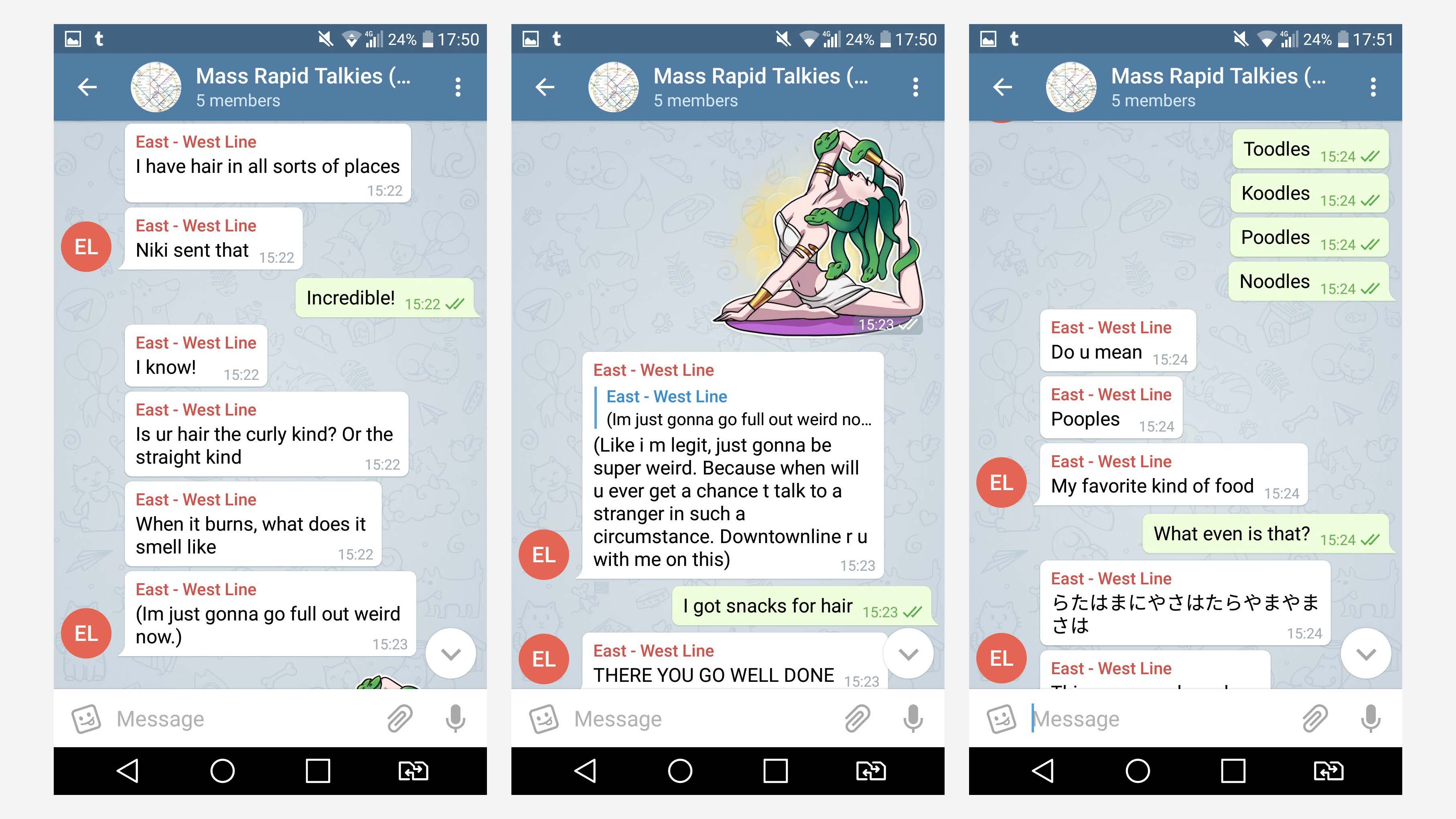
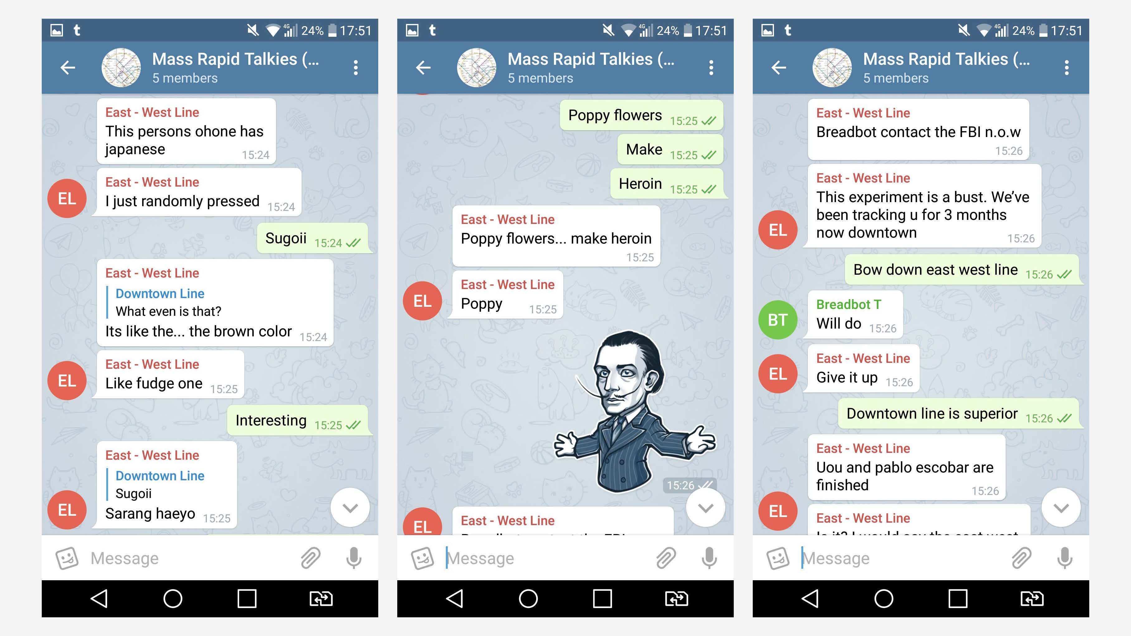
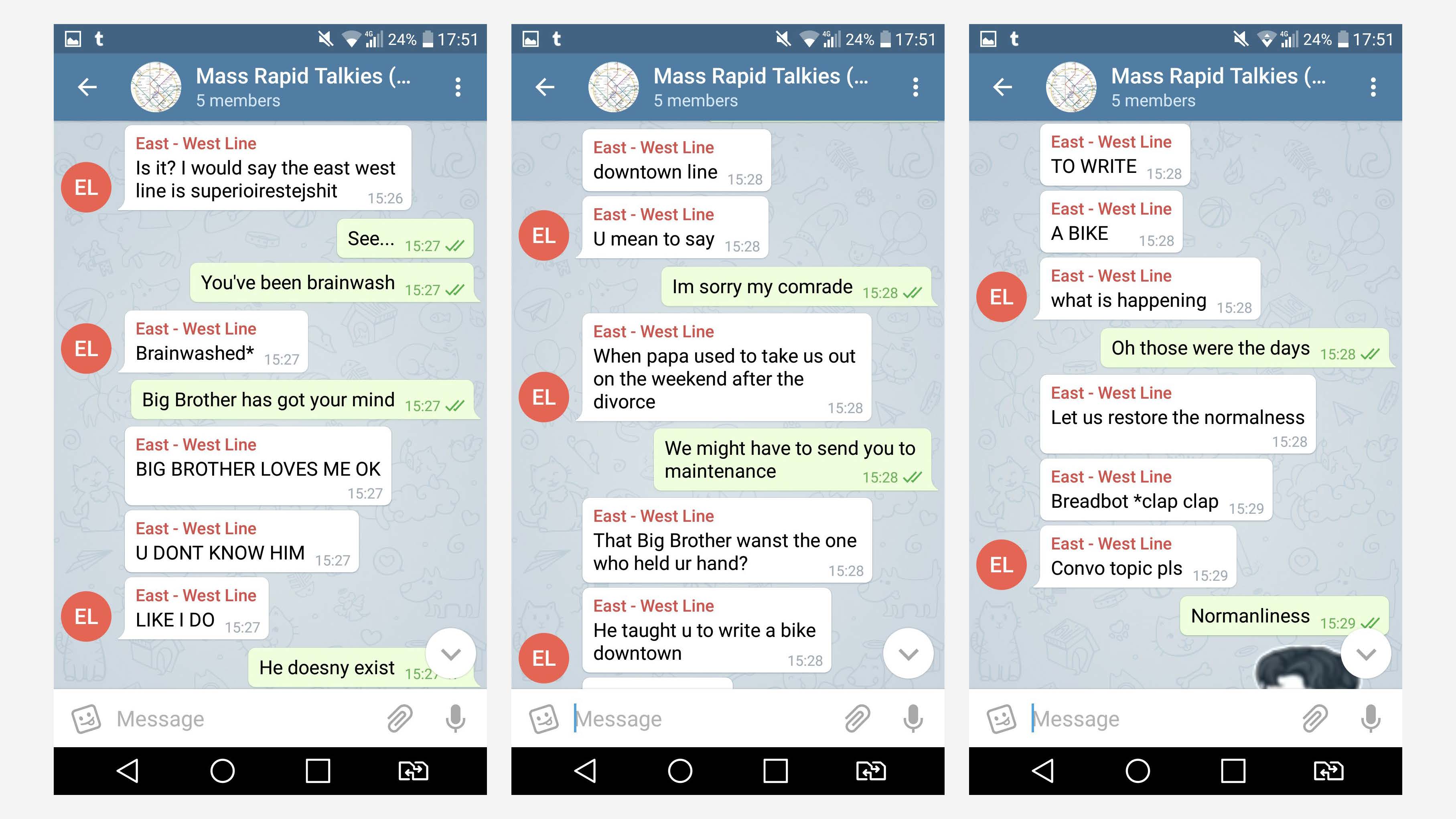
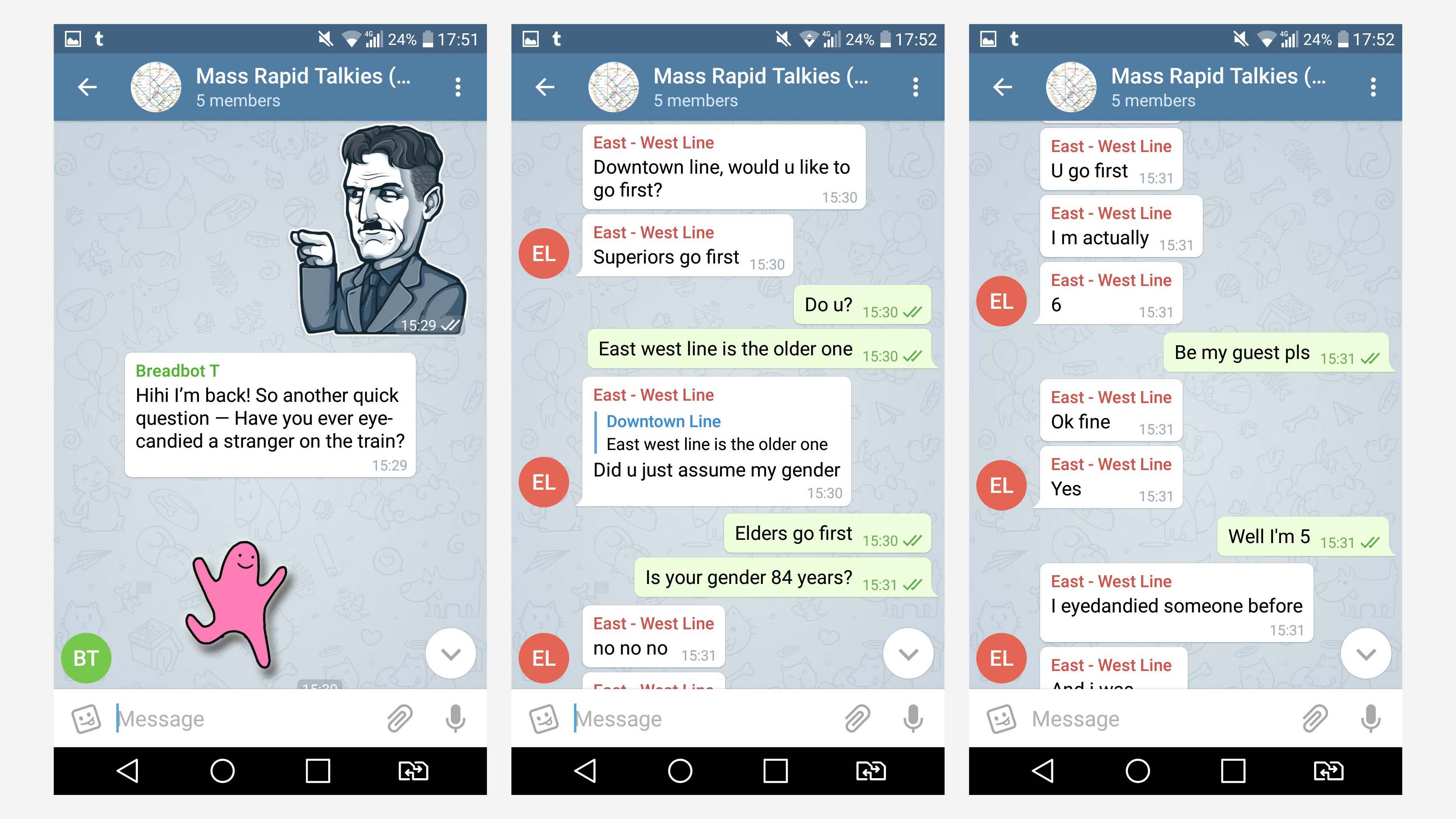
We have two players who are strangers to one another to board on separate mrt lines, east west line and downtown line, and travel along to meet at the intersection, which is Bugis in this case.
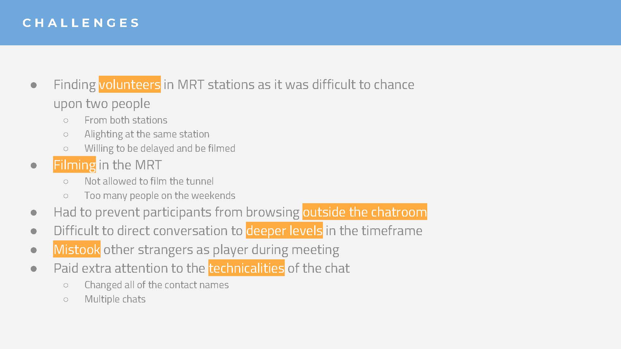
We actually wanted strangers on board to participate but when we realise it was very hard to find someone who was travelling specifically to Bugis, and willing to be filmed. Plus, recruiting people at the Bukit Panjang station was a tricky one as the trains arrive 2 minutes apart from one another, which means there was barely any bystanders waiting to board. We couldn’t board the train to ask people too as we needed the other team at Jurong East ready with their player at the same time. The only one who showed any interest to us that day was this kind MRT employee, but she couldn’t possibly leave her station so :,).
Therefore, we decided to stick to inviting friends of our groupmates, who don’t know each other.
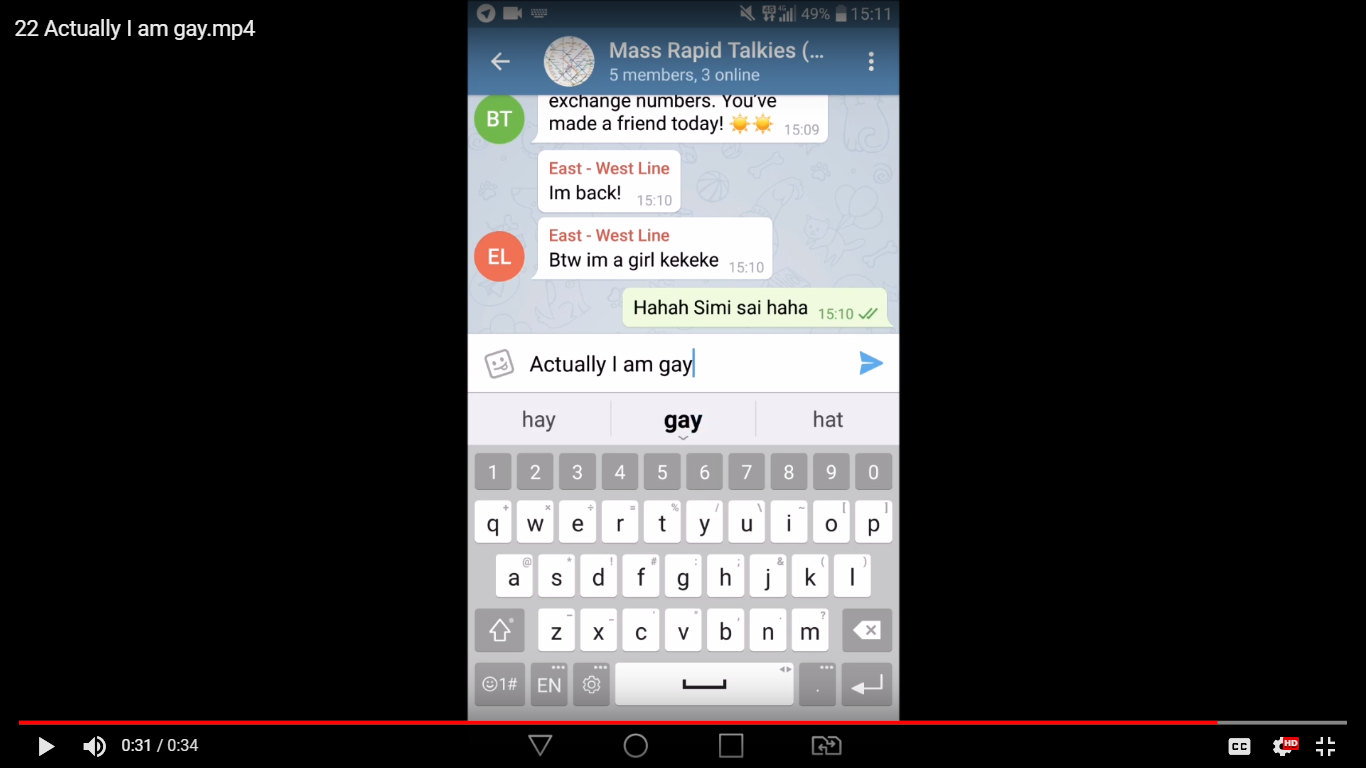
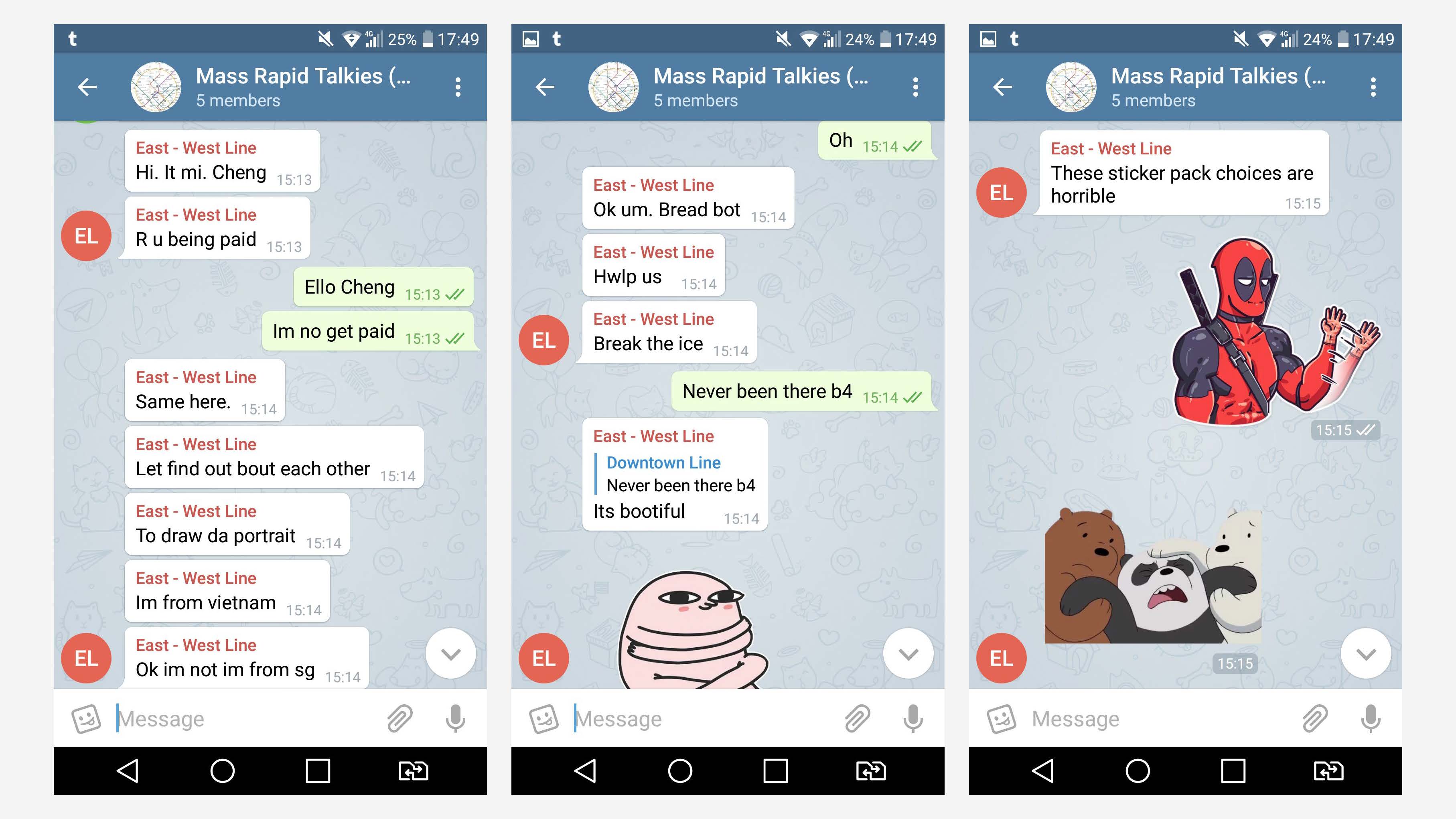
And then on their journey, they are to engage in an online chat with one anothe via Telegram, each taking on their persona as East West line and Downtown line respectively. Then as they converse, they are required to draw portraits of each other based on the impression they have of one another. And as their journey approaches to the end, they are asked whether they decide to meet each other at Bugis. If they both decide to, they have to find each other while referring to the portraits that they drew.
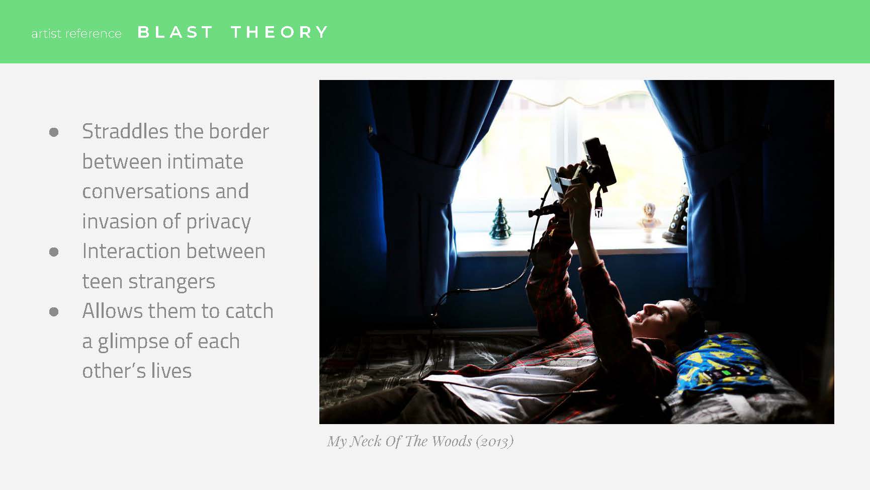
ARTIST REFERENCE
Final Trailer
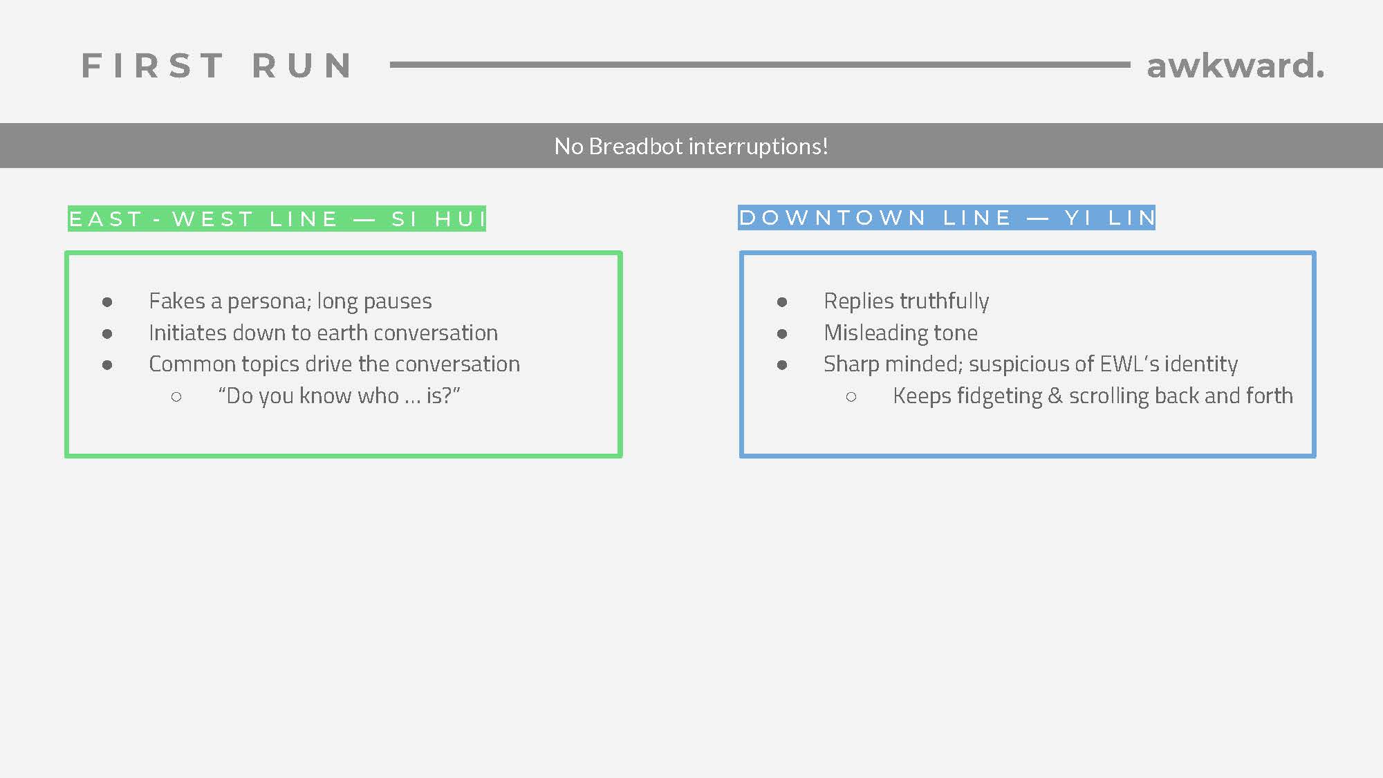
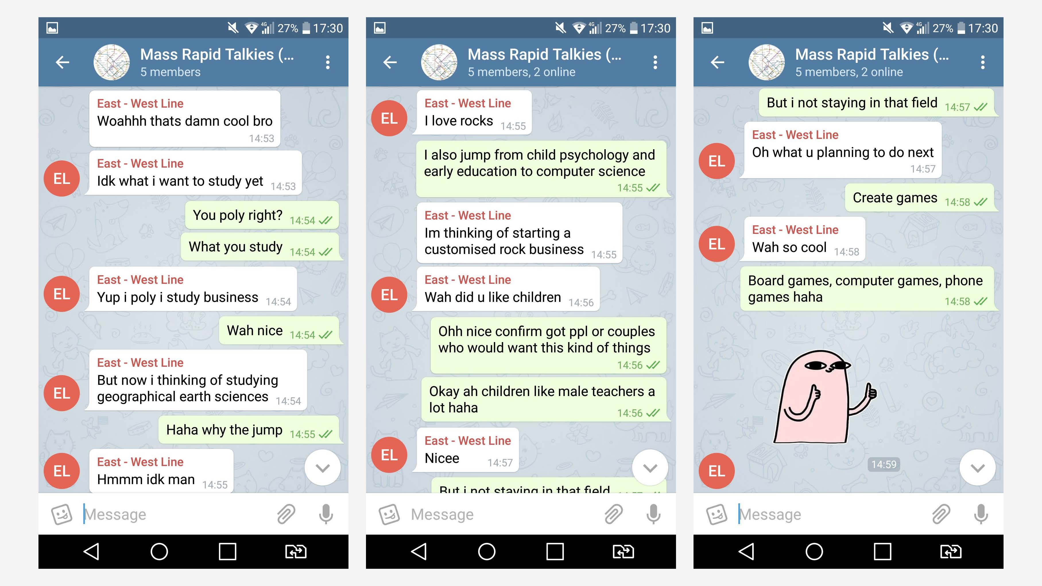
Day 1 : Sihui + Yilin ( yinghui’s friend )
Here are a few of the highlights of their conversations
Si Hui Pretending to be a guy
Finding out they have similar academic background
A common interest in board games
They share a common friend
And my favourite moment
DAy 2
I wasn’t there on site with the rest of the group on that day, but I managed to witness the ongoing chat real time. From the get go, this chat was way more livelier than the others.
Highlights:
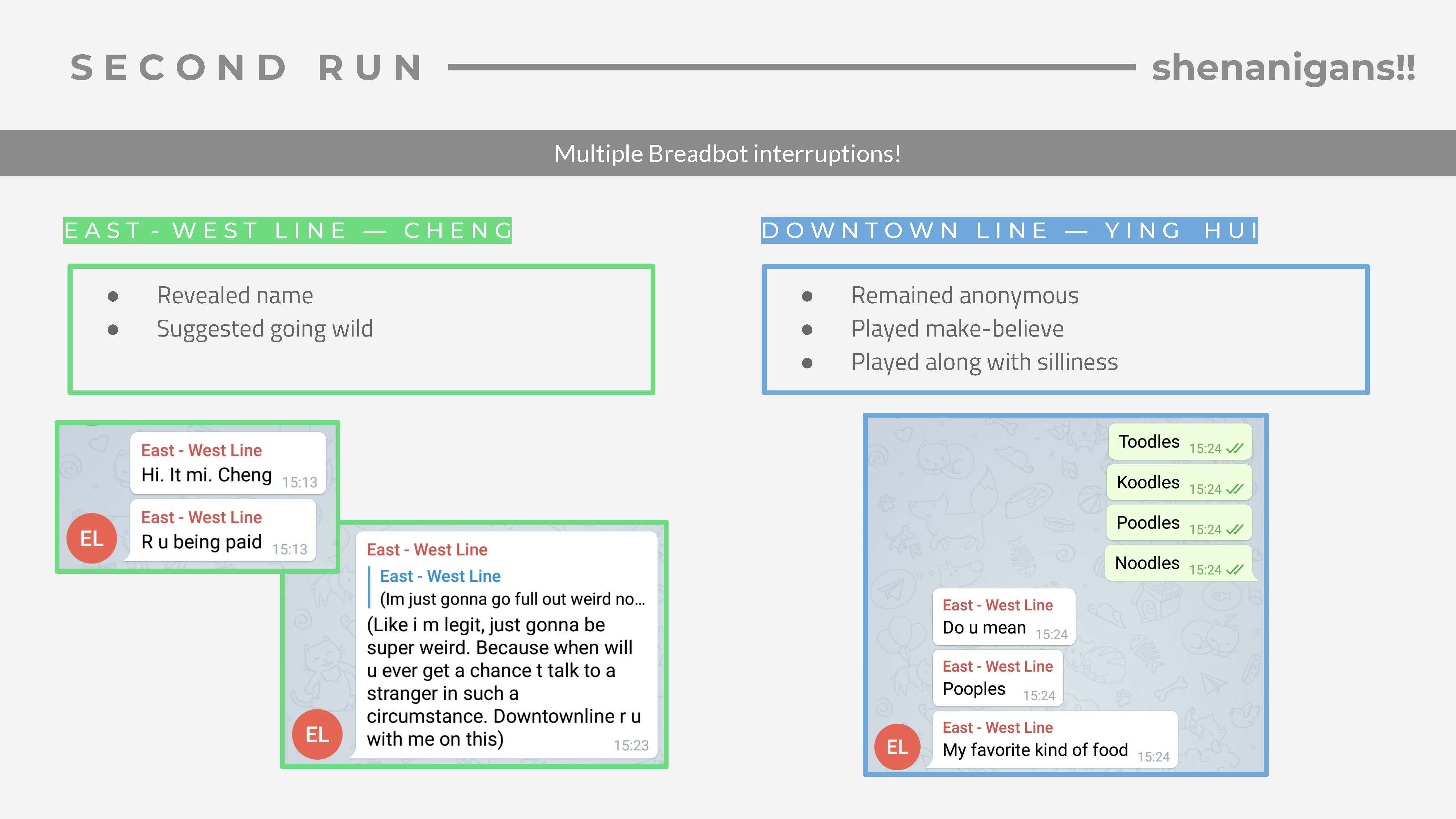
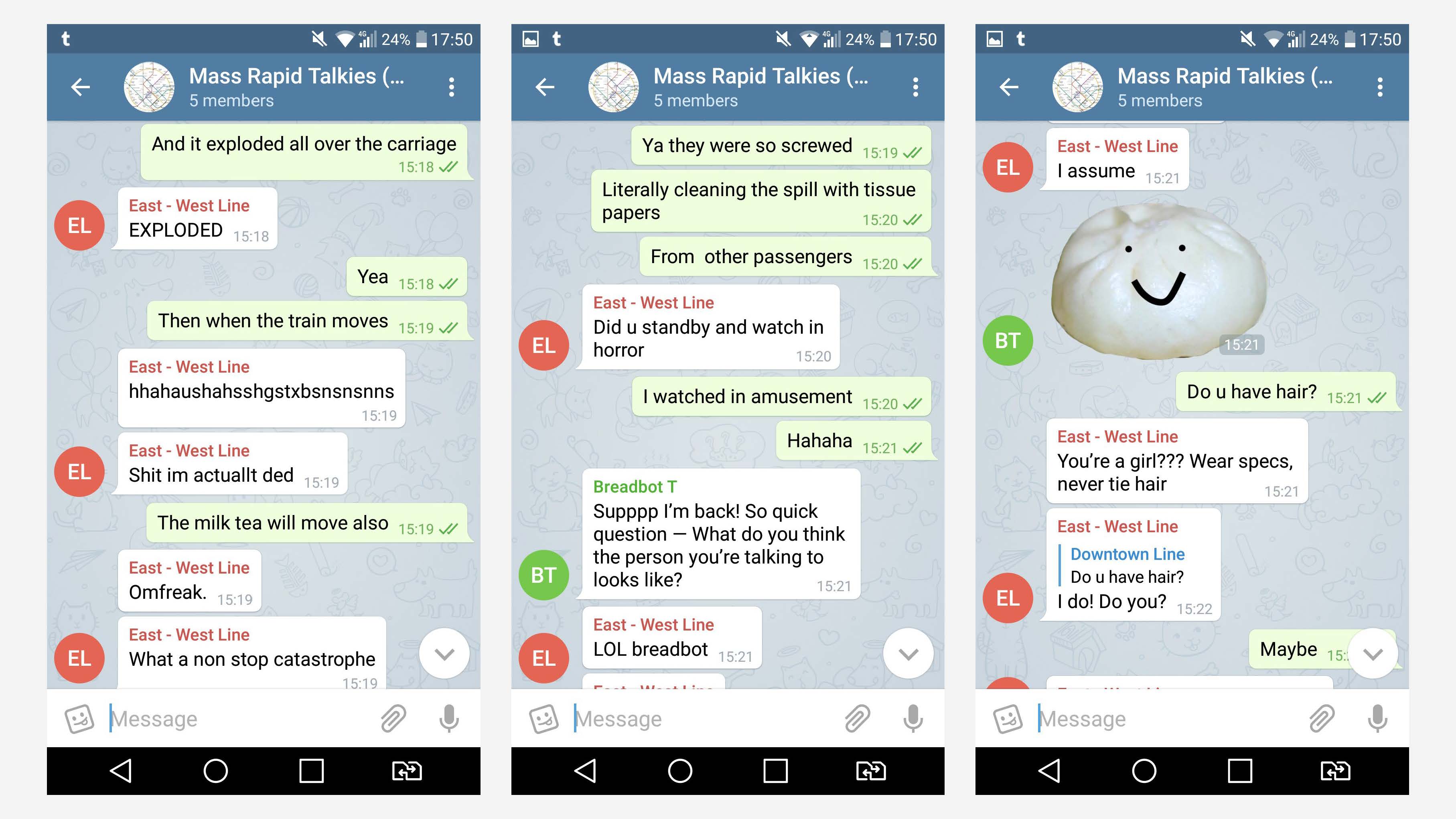
+ I think we the facilitators also played a role as glitches. By filming them openly, I feel like we the members were invading this intimate space that was to be shared between 2 people especially when each pair decides to meet up. There are also instances where Ying Hui and I ended up giving unintentional clues out to the players which gives them ideas about who the other person might be, which adds to the impression that they were supposed to form on their own.
+Portraits and the conversations also gave each player a visual expectation of each other, making the physical encounter an unexpected experience.
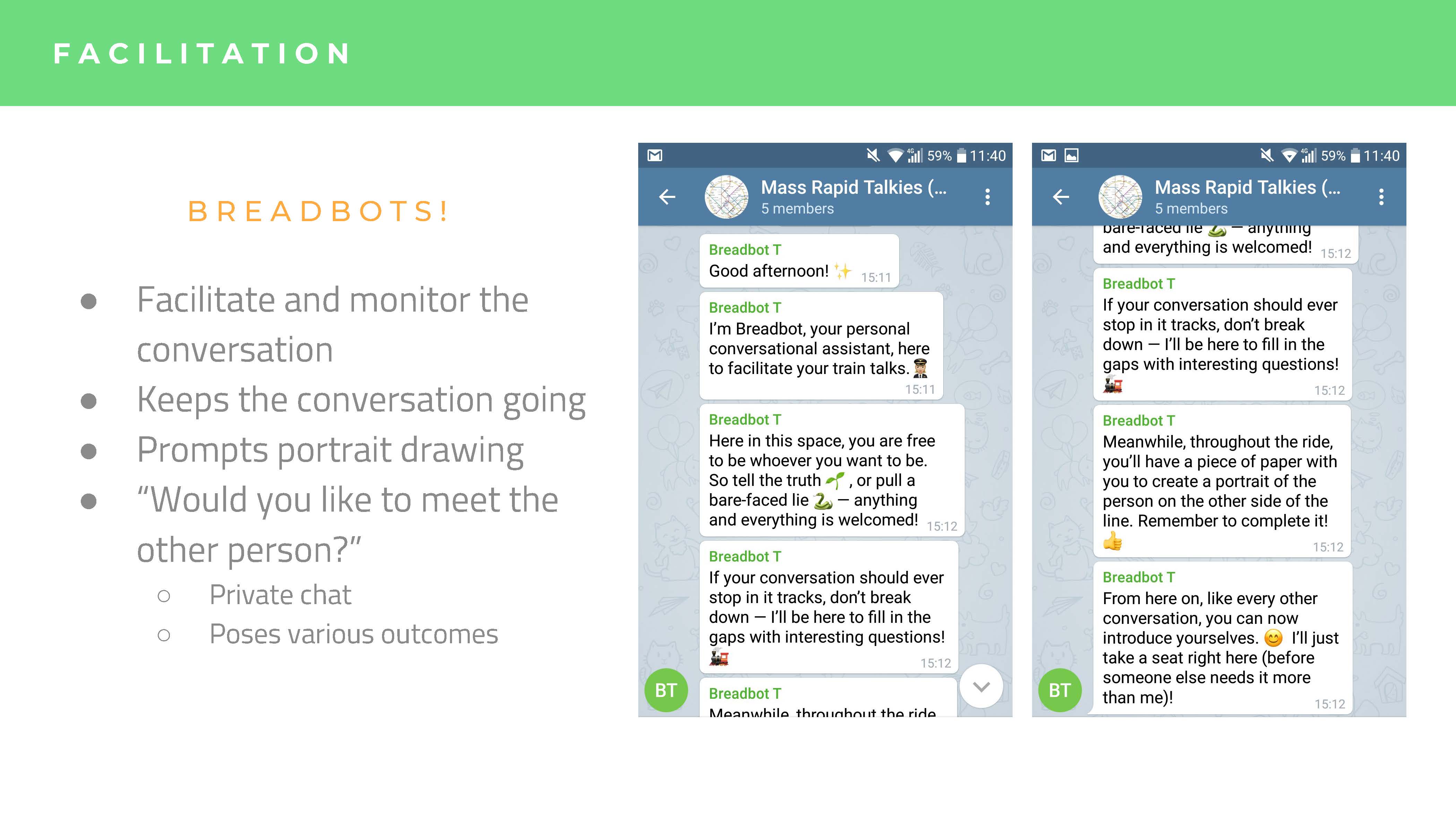
+Our initial idea was for the breadbot to ask more and more personal and meaningful questions as the conversation goes on, but it was proven to be difficult given the considerably short time we were running each run, and the conversations for both days turned out to be driven by the players, making it hard for the breadbot to butt in.
Personal TAKE AWAY
As someone recording for day 1, what I found most interesting of this whole experience was the dynamics between Si Hui and Yi Lin, especially Si Hui disappointment at Yi Lin’s online versus face-to-face encounter.
This reaction is not surprising at all, as we, myself included, take the online personas to be a direct representation of that person which in this case has been filtered through the Telegram app. When we see and interact with the real person face-to-face, it becomes an entirely different experience when the person no longer have the barriers and filters to present himself the way he would have wanted. I sort of understand that Yi Lin must have felt under pressure, suddenly having to meet Si Hui, plus more strangers who were filming every move, no longer under the comforts of Telegram.
But, perhaps because I saw Yi Lin first in person, I didn’t experience the disparity in personality that Si Hui must have felt. I can understand that he was a really nice guy, willing to take his free time off to help out a friend when he knows that he had to go to Bugis and travel back home without any rewards. Plus, he didn’t back out, even after he knew that he had to interact with a stranger, considering his introverted personality. Therefore, I can sort of see where his online personality is coming from, answering Si Hui in a friendly and earnest manner.
I think this actually isn’t just confined to online personas however, as even in our daily interactions, we do have our own set of personas based on who we are interacting with in the end. For one, as much as I would like to be “real” to people, I do know that the way I interact with my family is different from the way I treat my friends. Even in my family, I have different personas accustomed to each member. But even so, I believe that though there may be multiple personas, through each one, there is still inherently a part of me that is within it, no matter how discreet or fake it may be. This probably (or maybe not) counts as an extension from my Super Participation reflection, where even though everything is a self-driven curation, it still stems from a sense of self, no matter how discreet it may be. In that curation, we can perhaps still find the traces of that person if we look hard enough.
I feel that this interactive experience based on the specific feelings of sonder between strangers and the juxtaposition of the lonely self in a crowded and ever-moving MRT, really manages to bring out the relevance of personas, online and offline, in our daily lives.
(I hope this somehow makes sense as I try to put what is going on in my head into words as hard as I can :,) )
And with that, I shall bring an end to my one hell of a train wrecky thoughts.
I was a little disappointed that I was not able to take risks or explore new areas when it comes to playing with the visuals and texts. But I also learnt that it is not always a good idea to want to try new things as when I tried to do that for the first few weeks, I ended up going around in circles with no cohesive plan in mind. It’s sometimes necessary to take a step back and work with your hands full to try your best to make the best out of it you can.
Of course, it doesn’t mean I didn’t manage to learn anything new. This project has been a series of new experiences for me, getting to know indesign, printing for the very first time, etc… I also dipped my toes into the world of layouts, albeit I’m still not good at applying them on my own. I hope that I keep working on what I’ve learnt during this project in order to be able to venture into new areas more confidently. :,)


 –
–