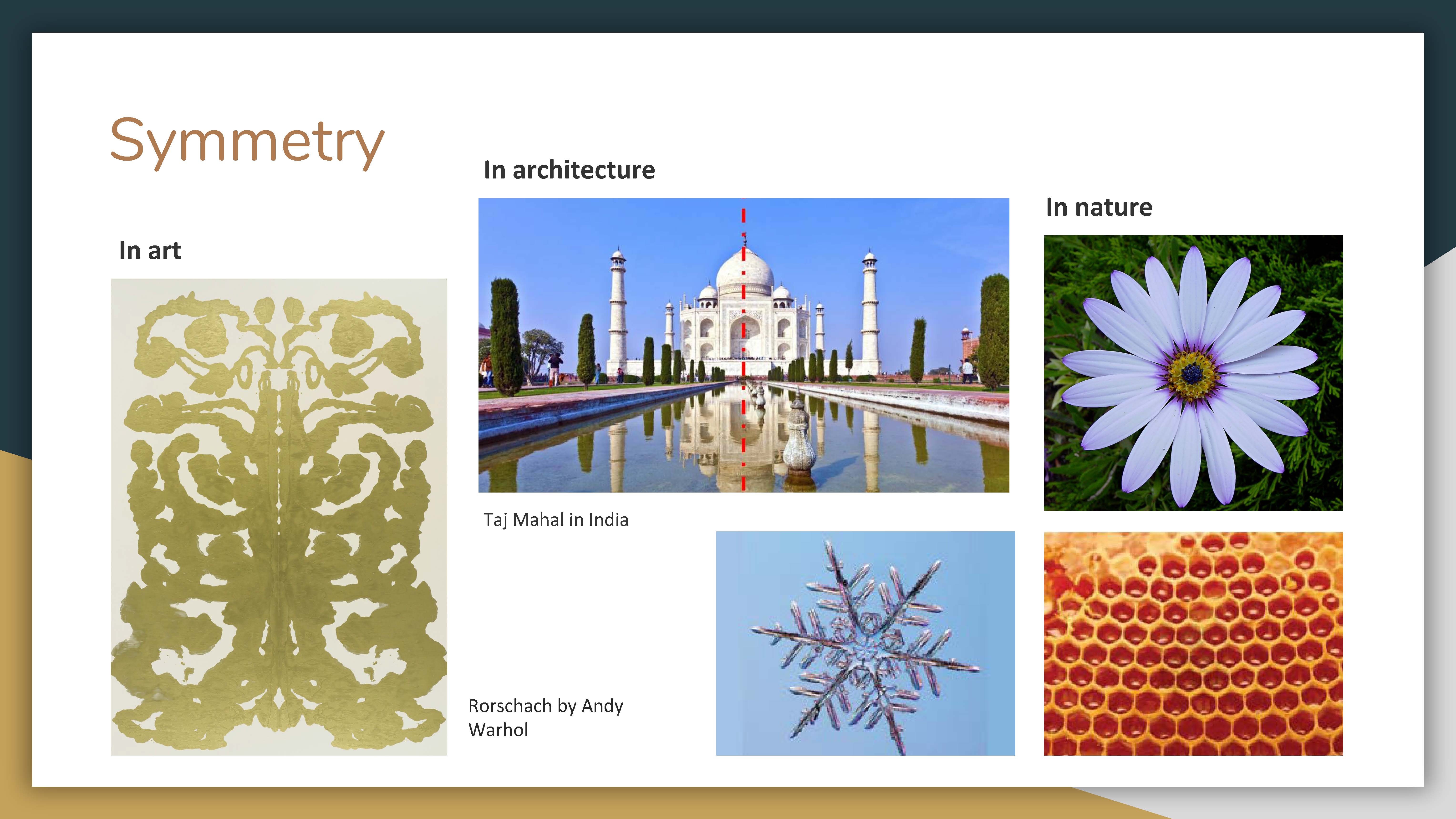
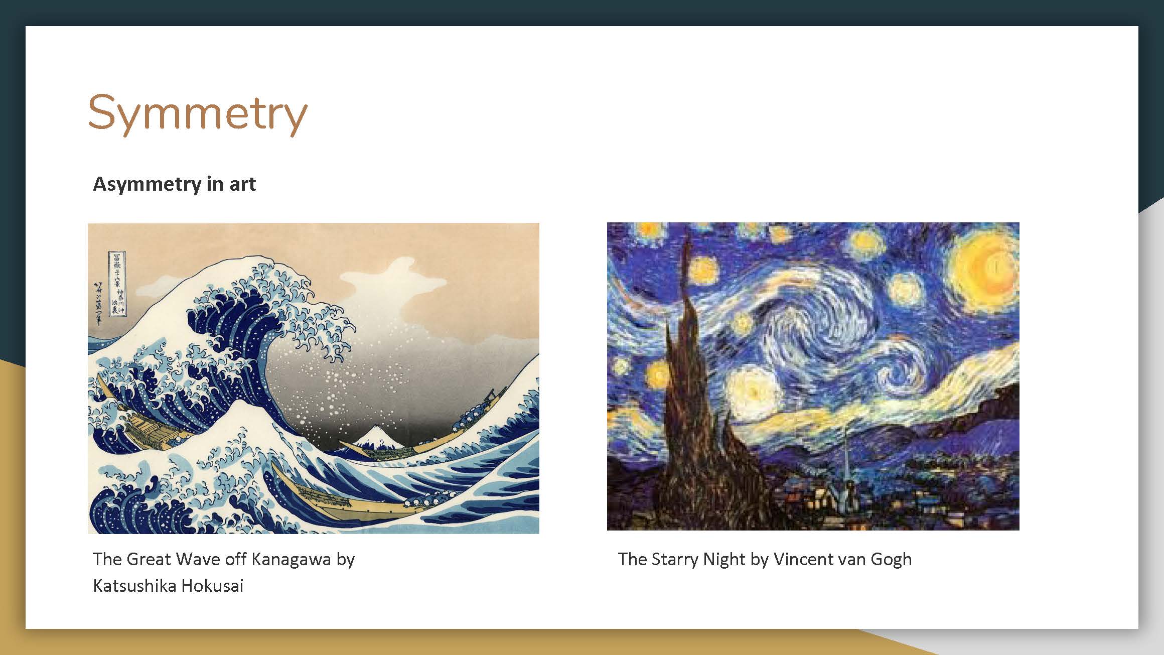
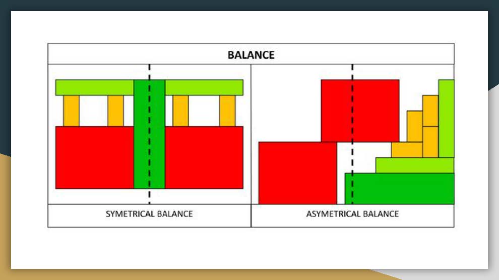
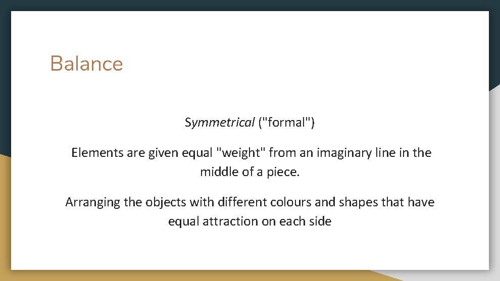
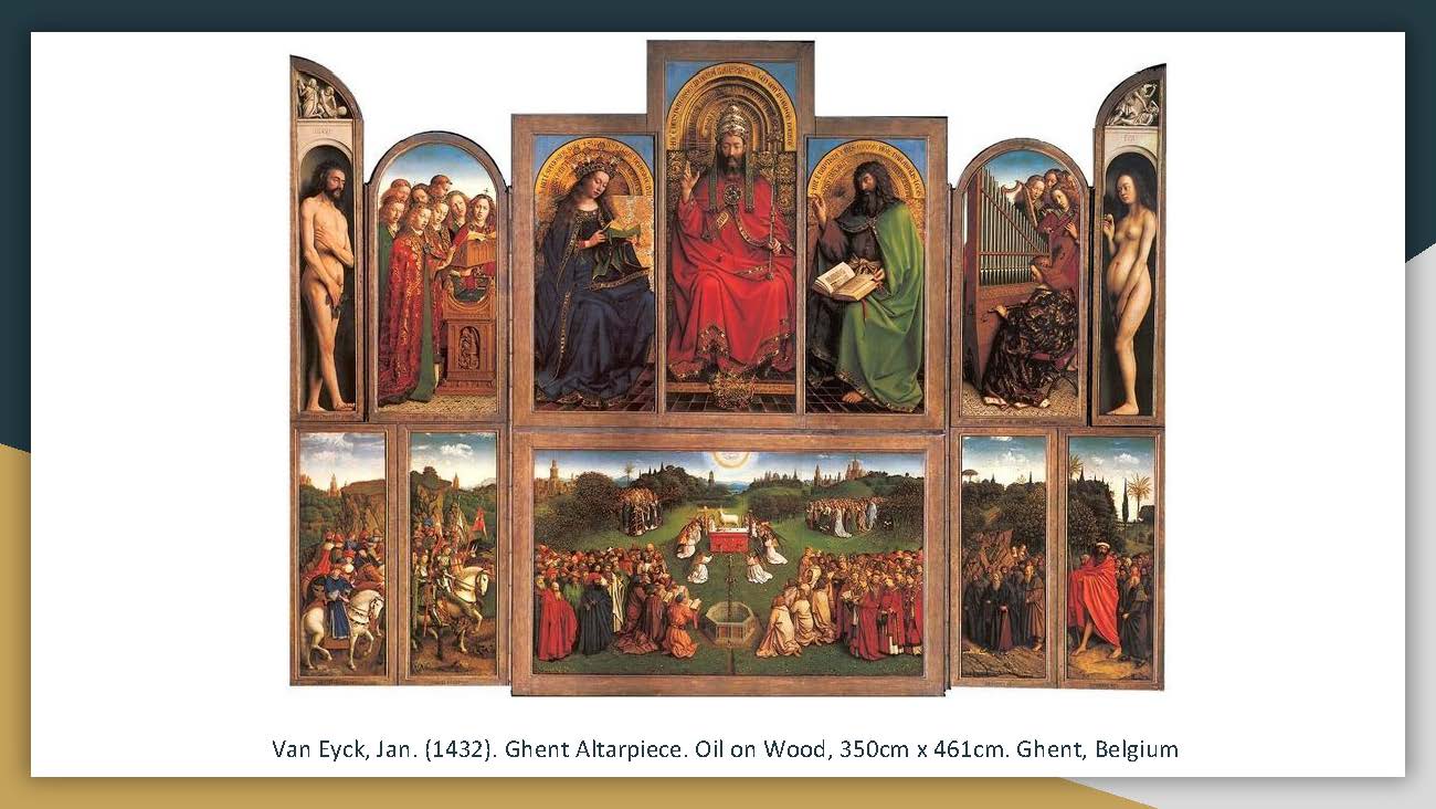
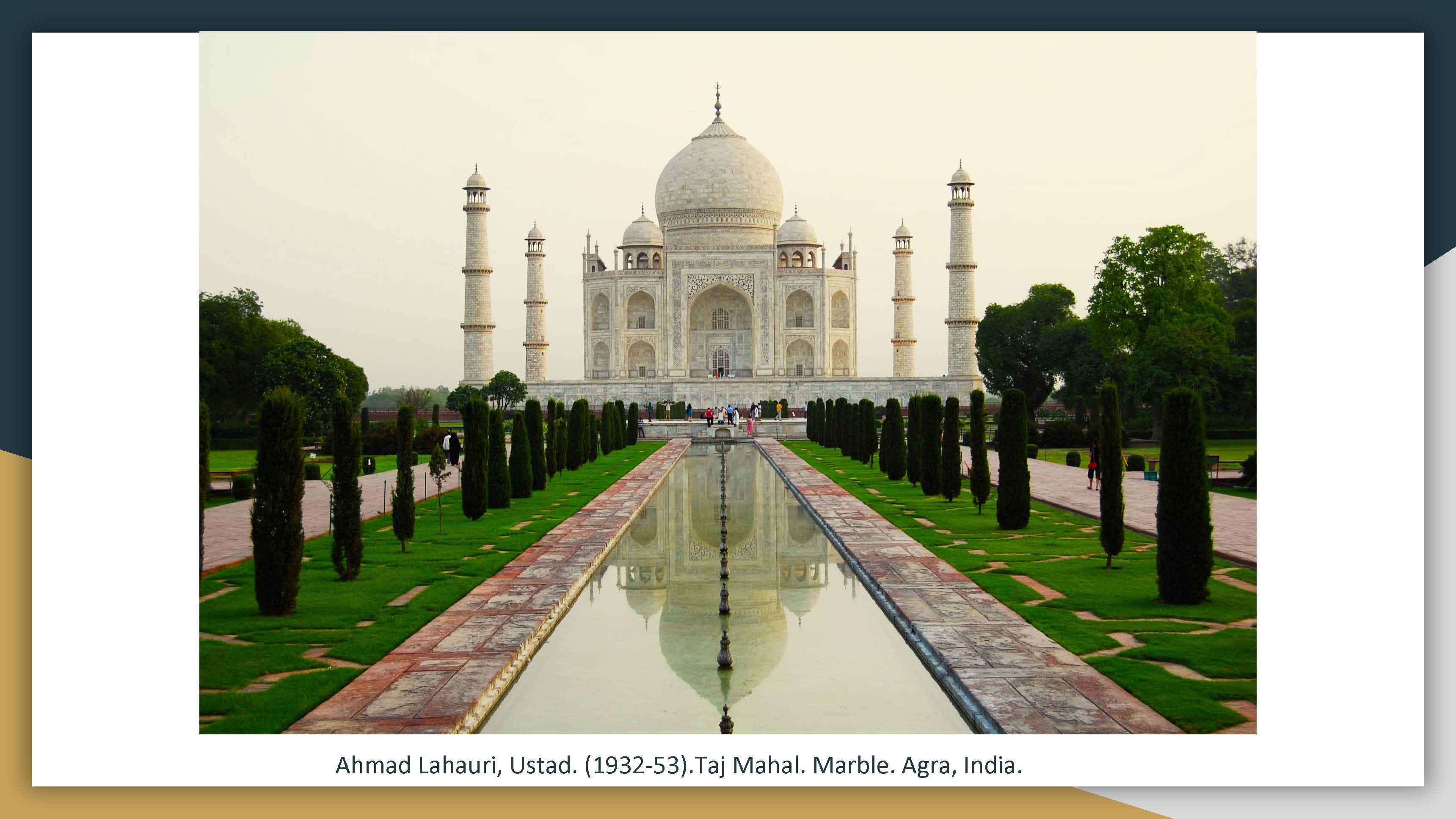
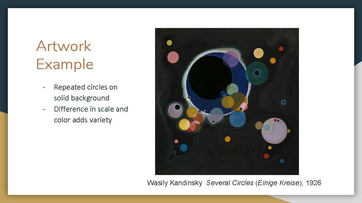
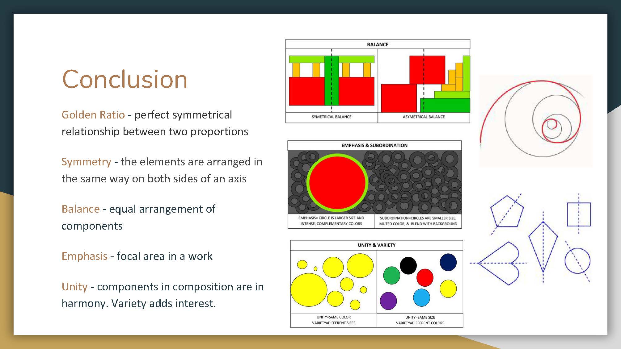
Research: Color Theories


Inspiration: Pinterest!

Malika Favre
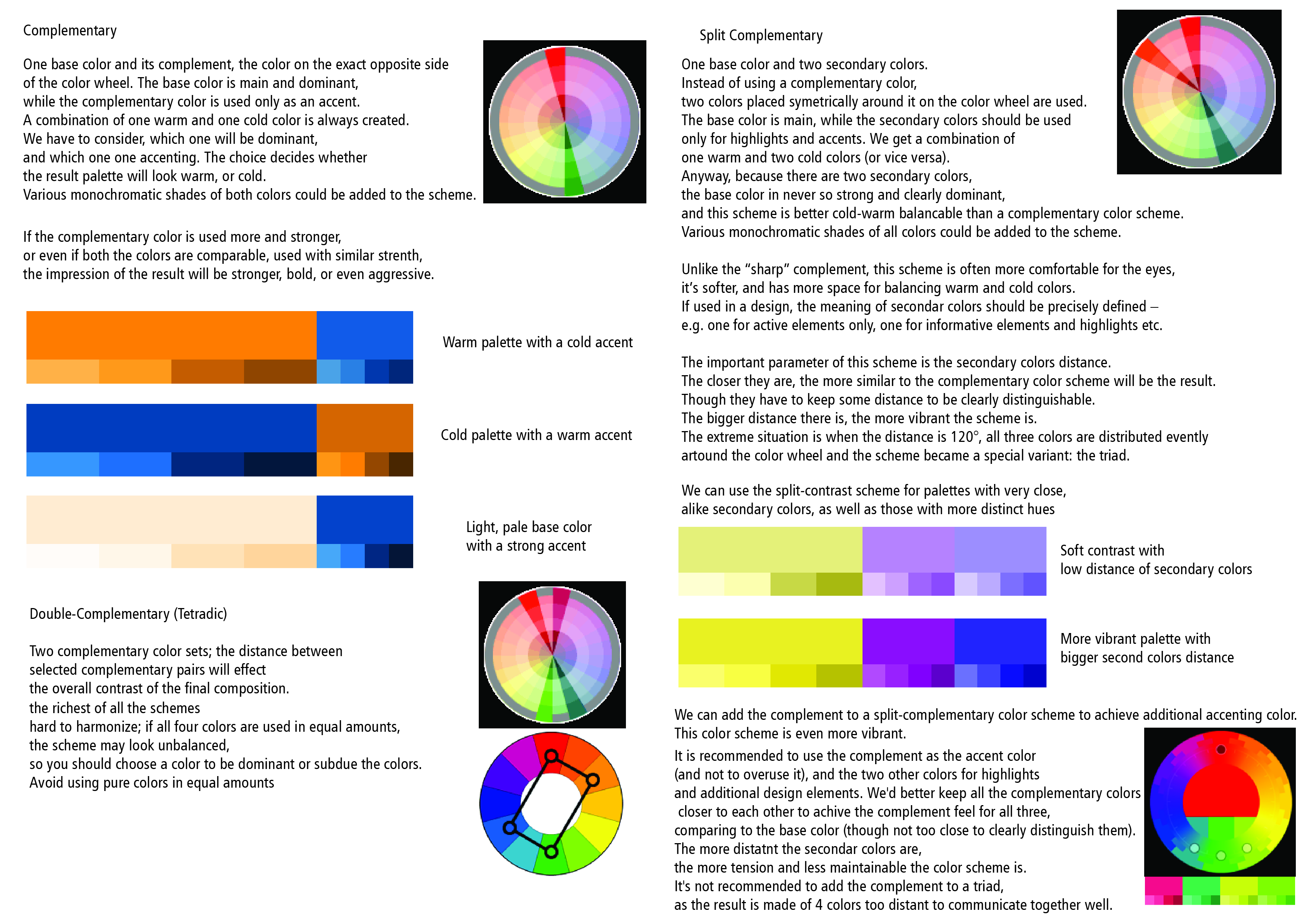
[Complementary]

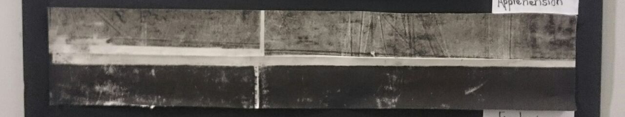
Igor Piwowarczyk Matte
[Monochromatic]
I really liked the clean aspect of the pieces, only utilising limited colours which is just like this project.
Process
While I was coming up with ideas for project 3, I knew I wanted to attempt creating my own content from scratch, be it traditional or digital illustration. I finally decided on digital illustrations, as I believed that it would be more flexible and efficient to create generate colour palettes more efficiently. I also decided on illustrating simple compositions with limited elements as I wanted to focus on the colour harmony. At the same time, I wanted to challenge myself by creating more personal works as I tend to stray away from that. So after some brainstorming, I decided to do what I’m good at, diss myself with a set of digital illustrations.
[DISCLAIMER: the colours may seem off as I saved them only in cmyk]
1:
Me = Closed-off
Compared to other people, I think it is undeniably that I tend to be way more closed-off. I am always afraid and unsure of how I should convey my thoughts and feelings to another person, often leading to choosing not to say anything at all.
When I think of being closed-off, mimosa’s automatic mechanism to fold its leaves in, when touched. This aspect is synonymous with my closed-off quality where I automatically tend to hide away from confrontations or avoid having to speak of my inner thoughts and feelings.
And thus, I decided to compose the piece as a face obscured by mimosas.
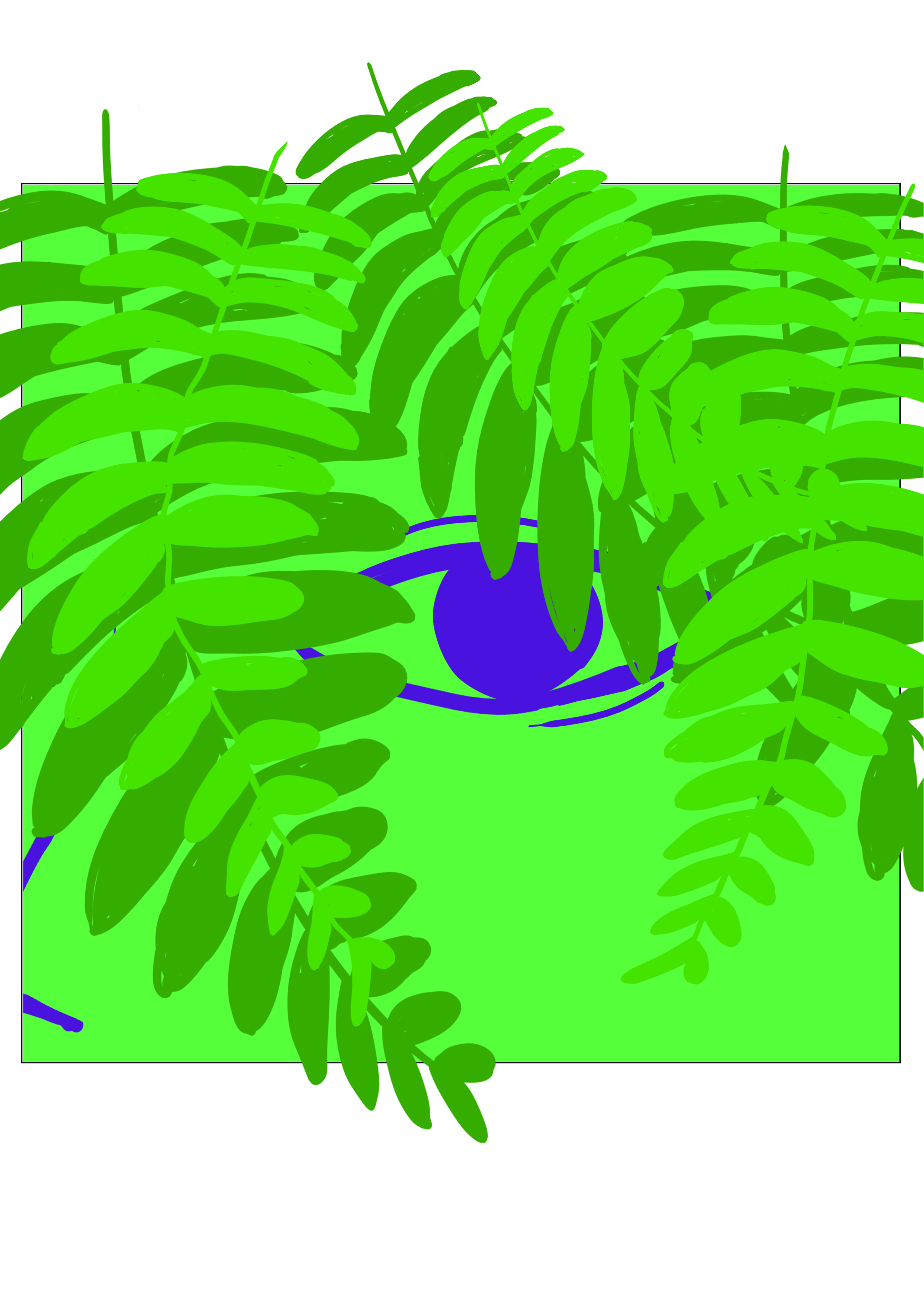
This is what I first came up with. However, upon consultation, I decided to stick to monochromatic colour scheme with green instead, as I wanted to camouflage the face, which would reinforce my habit to hide away from being personal.
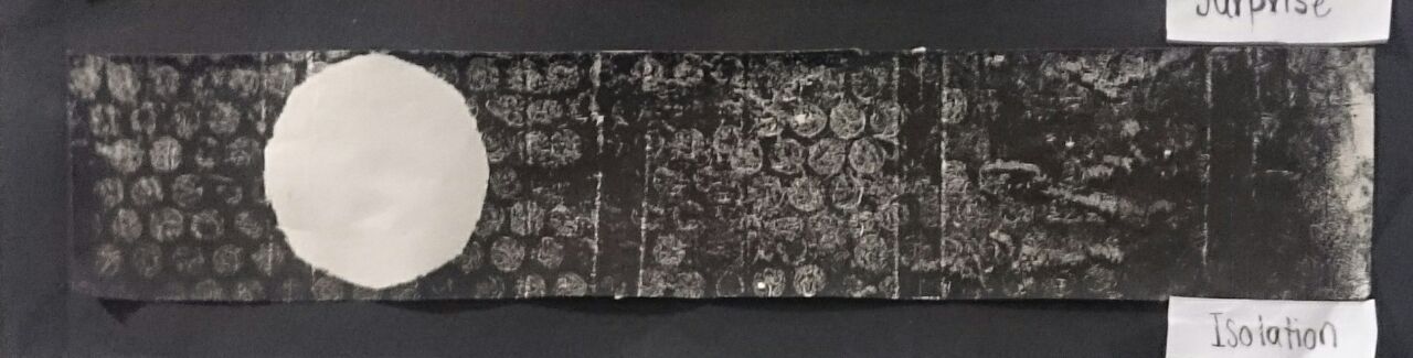
And here’s my final composition for the piece. I added in a keyhole in the eyes, as I wanted to imply the extent of my habit, where exceptions to open up are hard to come by, and “unlock”. Setting: New people
As a result of my said quality, meeting new people and having to socialise with them tend to wear me out before I get close to them as I overthink about the things to say and such in order to make a good impression.
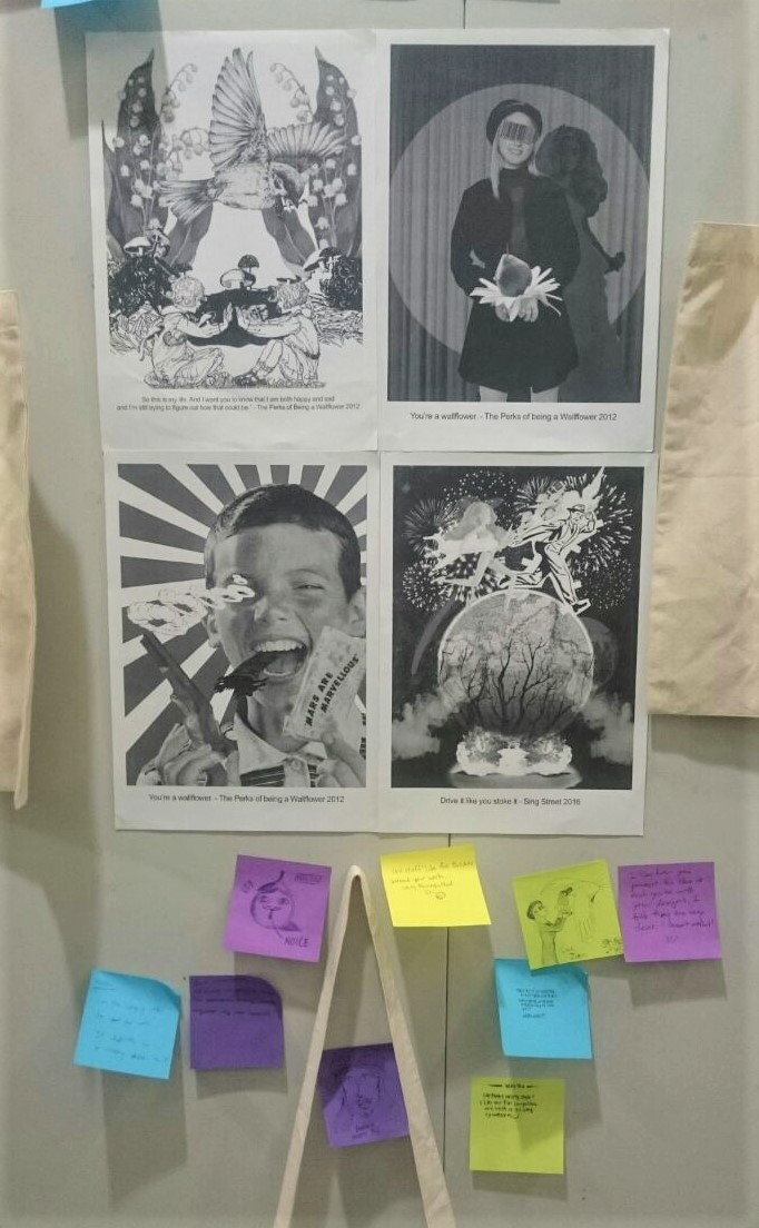
I decided to compose a symmetry of a faceless person and let them occupy the majority of the space to create a sense of unease and intimidation. I decided to use a complementary colour scheme as I wanted to create a stark contrast to bring out this unsettling nervousness I feel.
Here’s my first sample. After consultation, Joy commented that the wrap that I used on the faceless figures made them look fat instead of the worm’s eye view that I intended it to look like.
 So I decided to edit the composition again which led me to this. However, I got carried away and forgot to take the colour scheme into consideration again as I ended up pairing blue-green with red instead of red orange.
So here is my final piece. Composed with complementary blue green and red orange, both similar in intensity as I want to bring out the feelings of intimidation and discomfort.
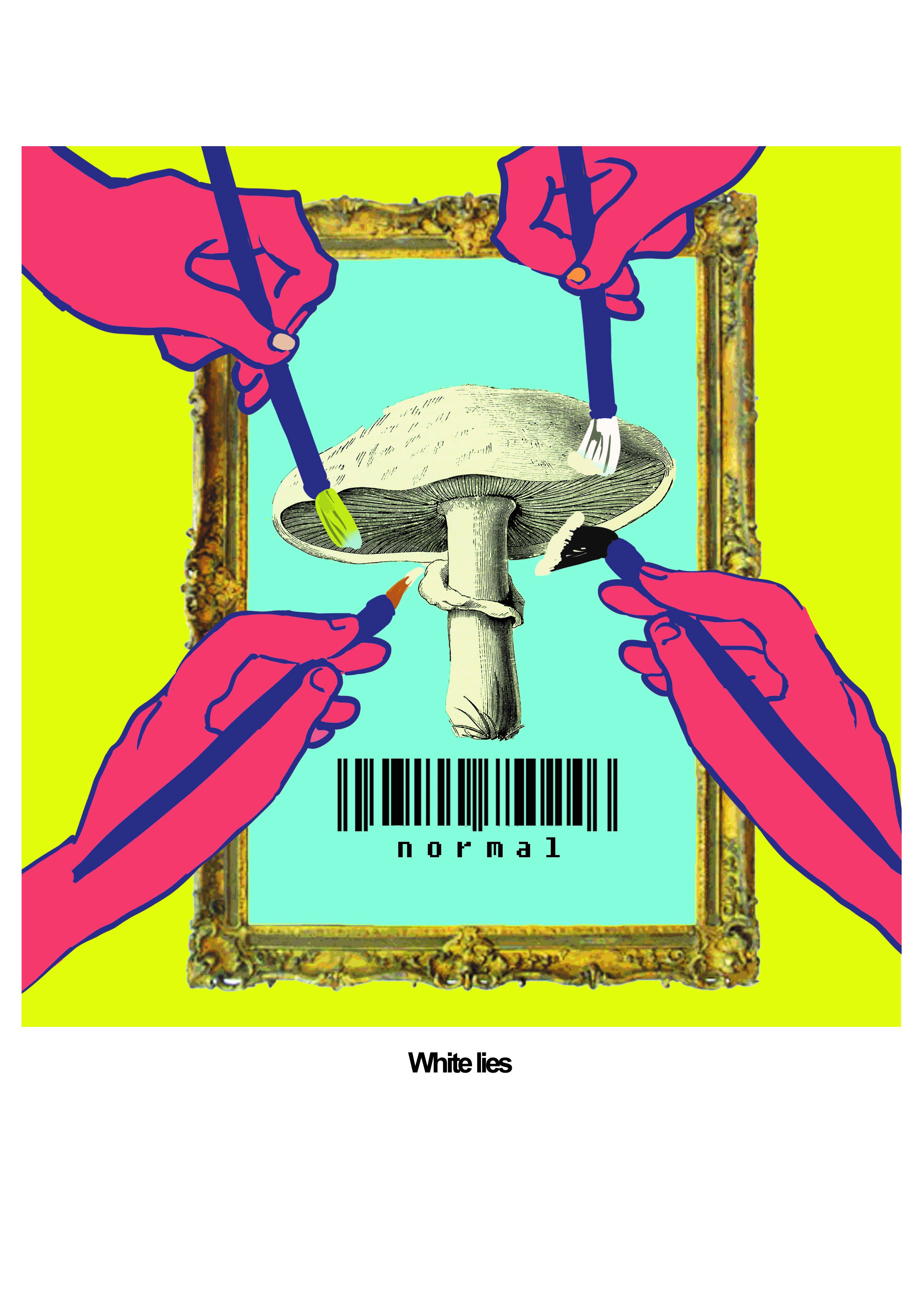
Result: White lies
As a result of being under pressure when meeting new people with my closed off personality, there are some instances where I blurt out white lies. For instance, claiming that I listen to certain songs or bands when in fact I never do… I also tend to stay away from giving too much information about myself.
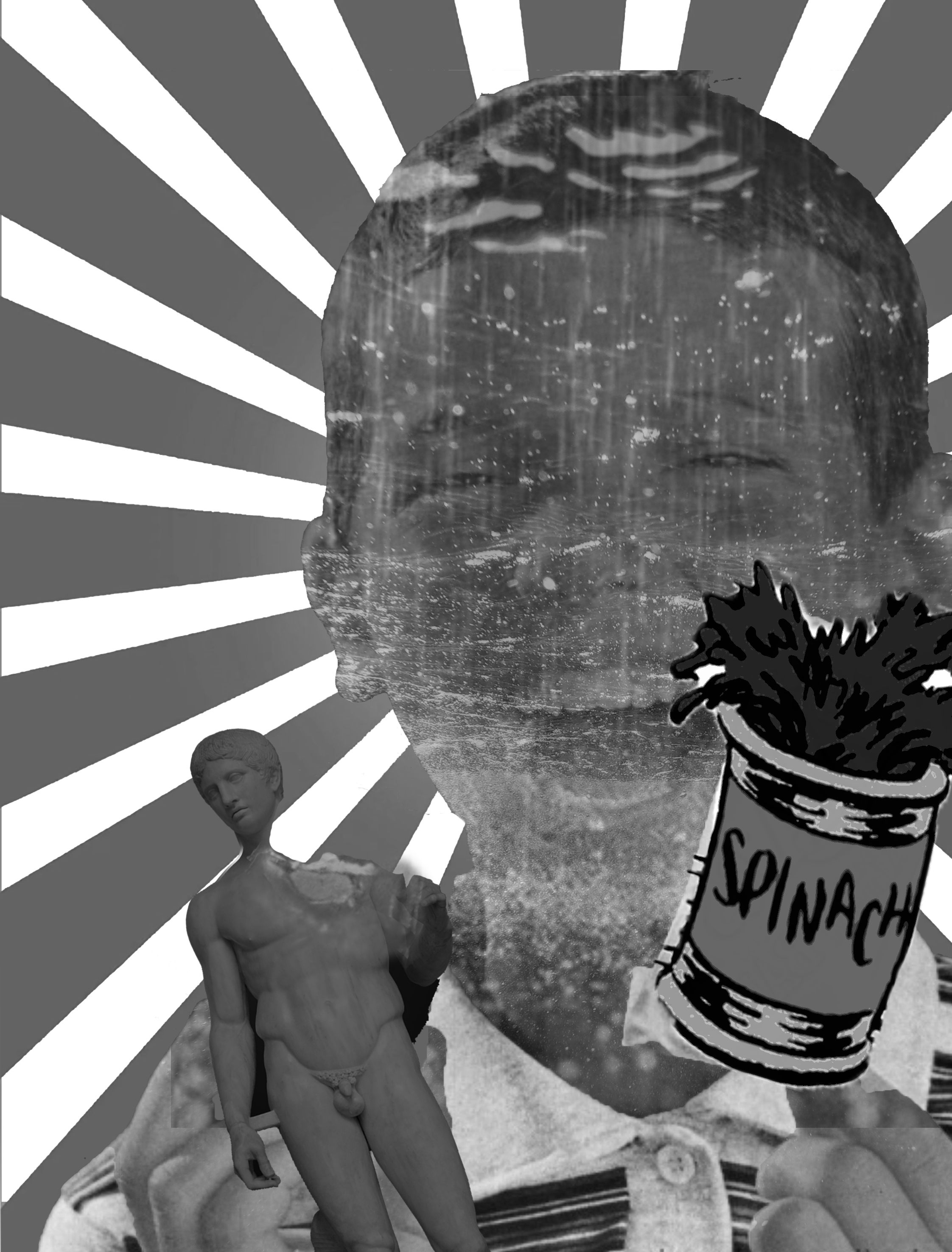
In this case, since it is about curation of my own image, i decided to compose myself as a portrait of a mushroom with a barcode “normal”. This suggests that this built image is unnatural and the strange combination of an illustration of a mushroom and a barcode further states that in the hopes of becoming ideal, I instead become a weird concoction. This is further emphasized by omniscient hands painting this portrait which suggests that this portrait is indeed manufactured.
I decided to try the triad colour scheme as I wanted the piece to be more harmonious in a strange way in order to show that I am attempting to showcase this perfected image of myself when I am struggling to do so, such as how harmony is hardly achieved with 3 colours.
 Joy suggested that I should try to change the colour of the hands as in my first attempt, the colours were too brown when they should be red as a triad scheme suggests.
Thus, here is a final piece.
2:
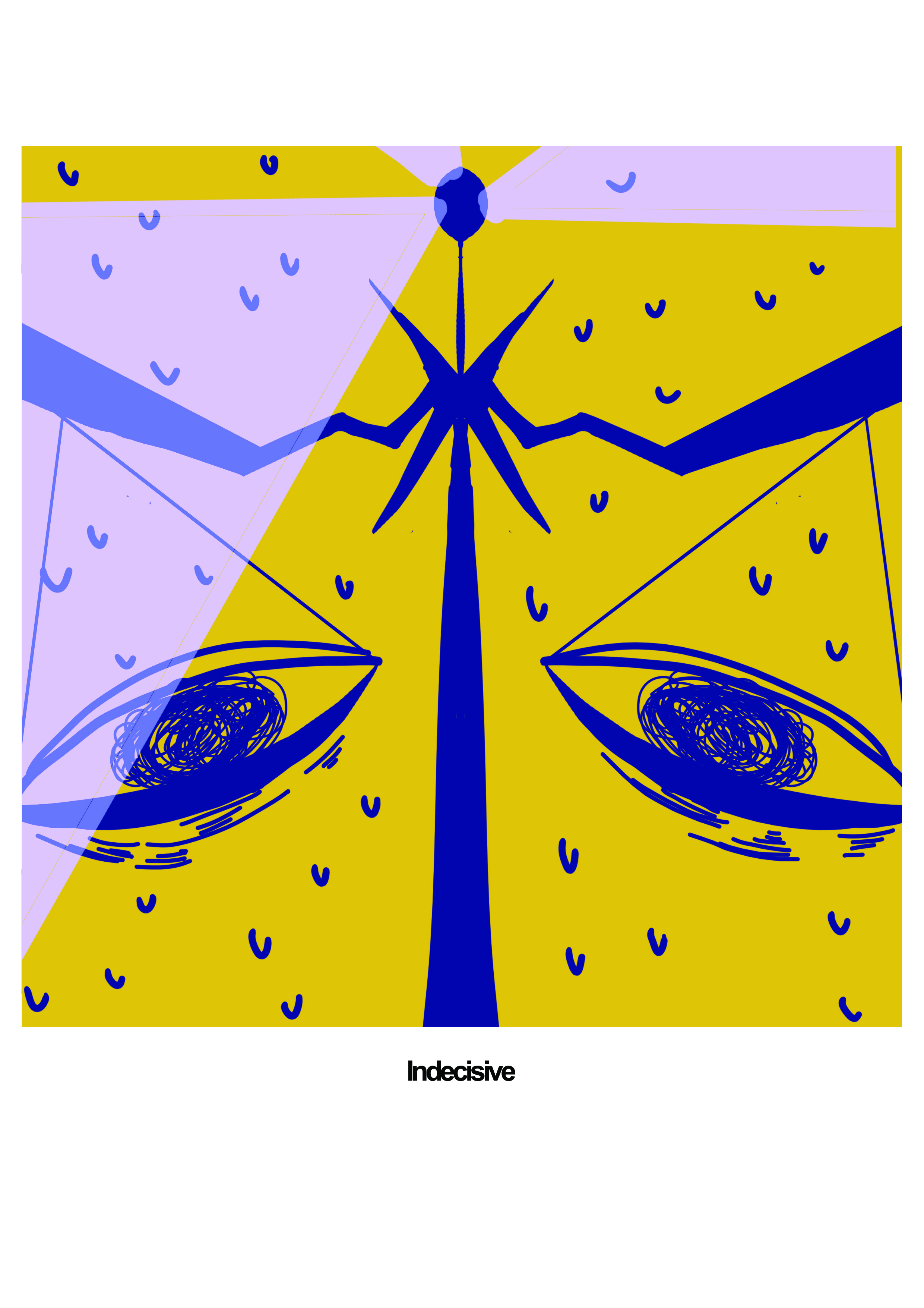
Me: Indecisive
I think there is nothing much I can say about this, except that I either overthink way too much or that I can’t think constructively at all about decisions.
So I wanted to implement a balance scale in my facial features as it reflects my internal struggle of weighing the potential consequences of each decision, no matter how small they may be.
I thought complementary colours would be the most suitable in conveying this internal struggle. Again, I chose the intensity of both the blue and the yellow to a similar extent as I wanted the stark contrast to create anxiety.
And here was what I came up with for the first round of trial.

Although Joy was generally okay with this, I thought that this composition was lacking in some ways so I decided to implement symmetry to imply the creases in the eyebrows and add in some light sirens. I also implied motion of the swinging scales and added more sweatdrops to amplify the nervousness.
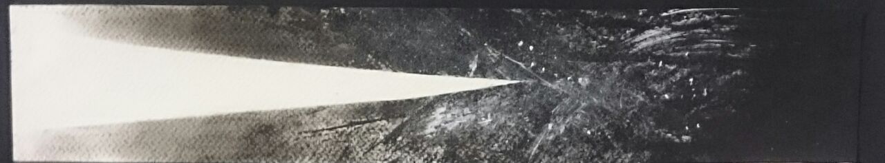
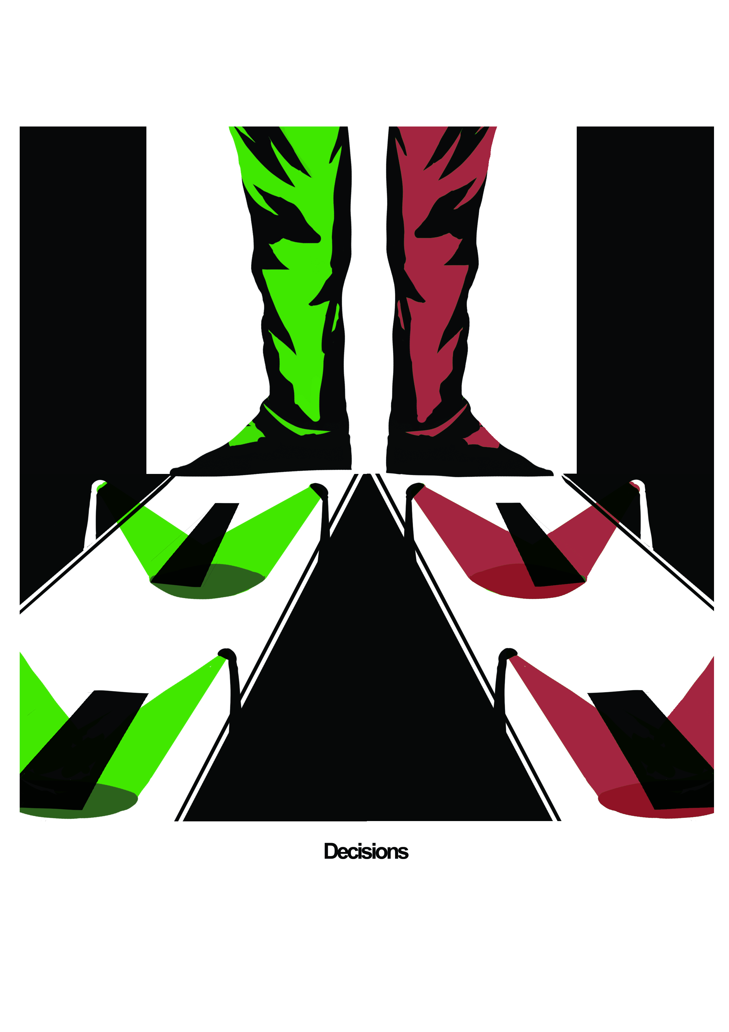
Setting: Decisions
Once we make a decision, we can never truly change that certain decision ever again, no matter how big or small of a consequence it had. From that moment, the outcomes are separate into 2, diverging from one to never meet again.
I integrated the use of symmetry and the divergence of roads to fully bring out this idea. I also added an optical illusion of 2 legs, which can both look like a pair of legs of a singular person or 2 different legs to further push this idea of alternate realities, when making a decision ends up creating 2 versions of yourselves in 2 different realities.
This was what I came up with in the first round.
 I however decided to use complementary colours of the same intensity as I wanted to highlight the severity of each decision and its differing outcomes. This further implicated by how each diverging road and each leg corresponds to each coIour. I also added in some spotlight to further suggest this immense pressure one might feel before making a decision.
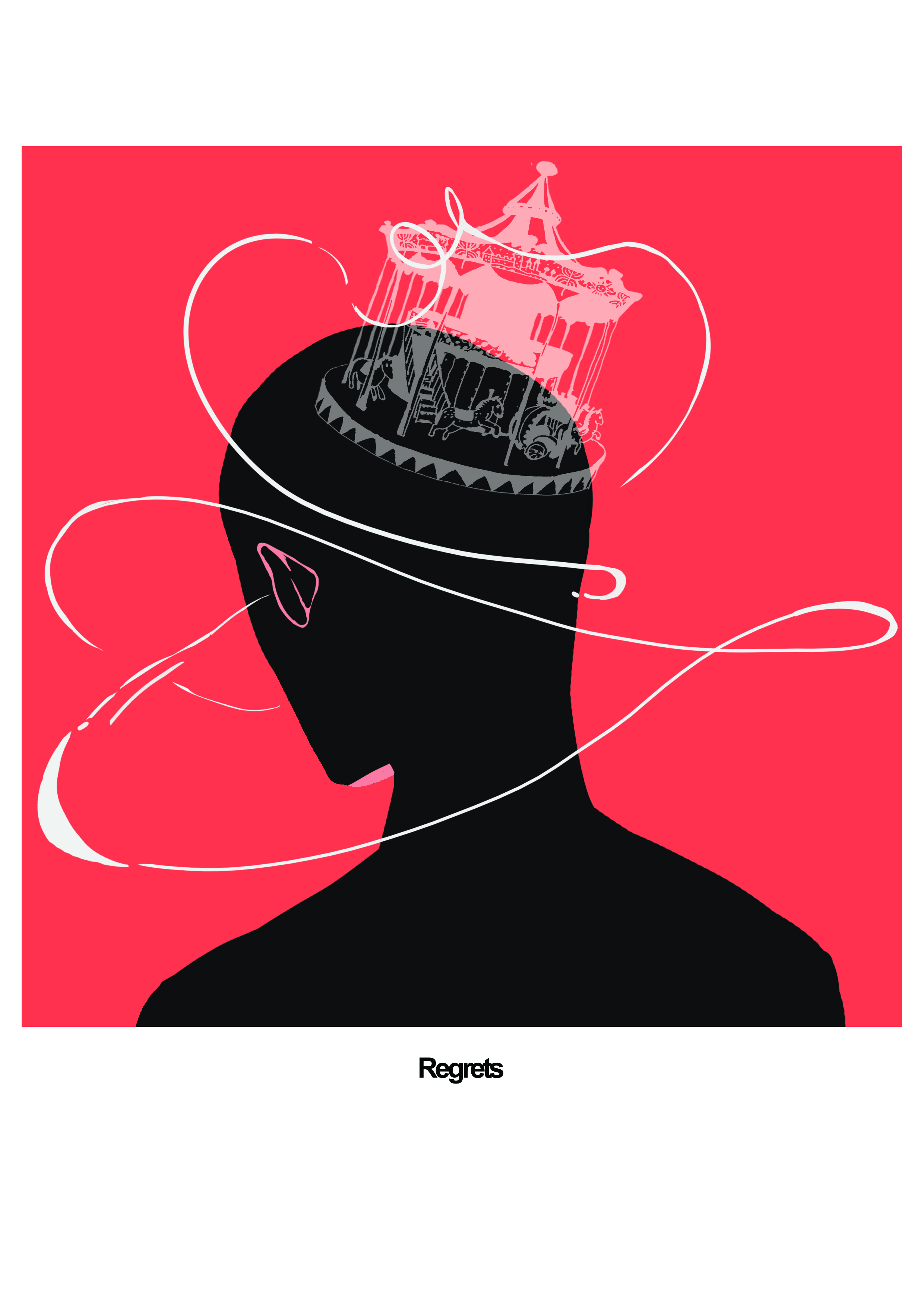
Result: Regrets
When you make decisions after overthinking about it, you can’t help but look back to the decisions you made and think about the “what if I choose to do the other thing”.
I used a carousel on a silhouette of a figure with spirals surround the figure. The going round and round motion of the carousel is reflective of the endless loops of what ifs I tend to play back again and again in my head. The spirals around the person like that of streams of music depicted in comics and such, also suggests how this endless loops traps individuals without allowing them to move forward. Lastly the silhouette suggests that when we are stuck in this predicament we are like empty husks of shadows simply slaves to the past.
I decided on monochromatic scheme with reds, as it further accentuates this entrapment, the figure being trapped in this hue of sinister red.
3:
Me: Addict
I always have a different obsession that I am addicted to at specific times without fail. ( For instance, throughout this project I was very into all the oogui videos and basically all other food videos lying around youtube…)
And even though I acknowledge my own addiction, I still continue to participate in that addiction without any effort to get out of the predicament.
Thus, I composed myself as a figure lying down face up with the mouth opening to gatchapons raining down. The lying figure is synonymous to my resigned attitude towards addiction, without any efforts to resist contents being fed straight to my mouth figuratively. The rain of gatchapons also highlights how the subject of obsession tends to take over your subconsciousness. Finally the crane suggests that you are not in control of your own actions, slave to the source of addiction.
I also decided to use the analogous scheme of red with red violet and violet in lighter tones to reflect my resignation, me being comfortable in addiction even if I am fully aware of my state of mind.

Setting: Procrastination
I clearly have a problem with procrastination, particularly with my inaction to counteract against it.
I wanted to convey this lack of action using a figure sitting down comfortably in huge piles of laundry. The figure is dressed in comfort clothes seemly not bothered by the piling clothes, in fact embracing it by utilizing it to procrastinate further, in this case to stare at the moons. The piles of laundry create a triangle motive leading to the character who is tiny compared to the mountains of laundry again creating an emphasis on the piling consequences of procrastination. The moon cycle implies that time seems to be passing slowly, even though it is being wasted nonetheless.
I used triad scheme of yellow, red and blue to create a harmony that suggests my dangerous yet blissful ignorance while spiraling down this endless procrastination.

Result: Deadline apocalypse
This dangerous combination no doubts leads to my unsurprising downfall when it comes to commitments, the most detrimental one being school work during these few days.
I tried to emulate this by using a figure barely floating in the sea of hands which are grabbing the figure down into the red sea, in a gruesome and gritty manner. This is conveyed through how these hands are digging into the figure’s body parts.
I used the monochromatic red values to imply the inevitable demise that I brought upon myself and how it is inescapable just like how the figure is stuck in this stark red which implies doom.

4:
Me: Flaky
With all the aforementioned qualities, it is not surprising that I am flaky in general as well. It applies to all areas, from my commitments to opinions. When I was first trying to come up with what I could create to reflect this, I thought of a figure’s skin literally flaking off. But I wanted to be more figurative which led me to presenting myself as a pinata. A pinata is known to be made of many colourful compartments, which speaks to the conflicting feelings I have when having an opinion and such. The shirt colour being split into two further highlights my conflicting feelings.
I decided to use analogous colours of red, red orange and orange, and I used the duller tints as I wanted to imply that even though I attempt to flaunt myself in a colourful way like people that I admire, from putting on a pinata to confettis, my attempts are rather superficial as I still do not have my own colour like I desire from my objects of admiration.

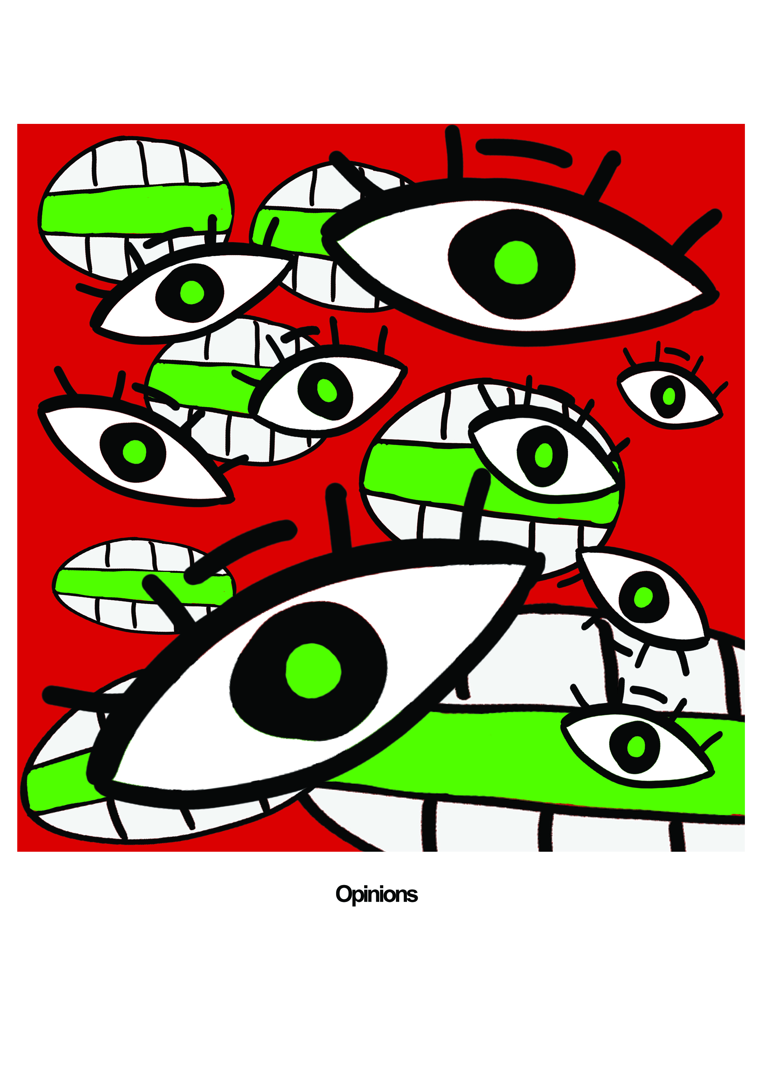
Setting: Strong opinions
People all around me all seem to be full of confidence, with opinions of their own. I objectified them as just eyes and mouths, as charismatic people tend to make constant eye contact as well as convincing speaking skills. This overpopulation of these intimidating facial features again highlights how I tend to be easily intimidated and submit to them.
I used the complementary colour scheme using stark red and green of the similar values again to create this sense of unease and intimidation. Plus they are vibrant compared to my flaky self, thus my tendency to be easily convinced by their views instead of forming my own.
Result: Hypocrite
Finally, strong opinions combined with my flaky self equals to the production of my hypocritical self, where I am concoction of people’s opinion instead of my own and passing it off as myself.
At first I thought of slices of meat or mummies to represent this concept. In the end, my obsession with food videos helped the conceptualisation of this piece, a taiyaki ice cream. The ice cream is separated into layers, to emphasize that I am made of opinions influenced by an array of different people. The taiyaki represents me attempting to shove a range of opinions without much success, underlining the defect in this idea that I would be fine as long as I accustom my opinions to the popular ones. The spotlight and the plate held in a sophisticated way also reflects how I try to present myself in the most idealistic way, even if it means that I am not forming opinions of my own.
I used a split complementary scheme with yellow orange, violet and blue to bring out the fish in yellow orange to be the focal point which aligns with the idea that no matter how much I distract others with my curated image, in the end, me attempting to curate this image will eventually be exposed.

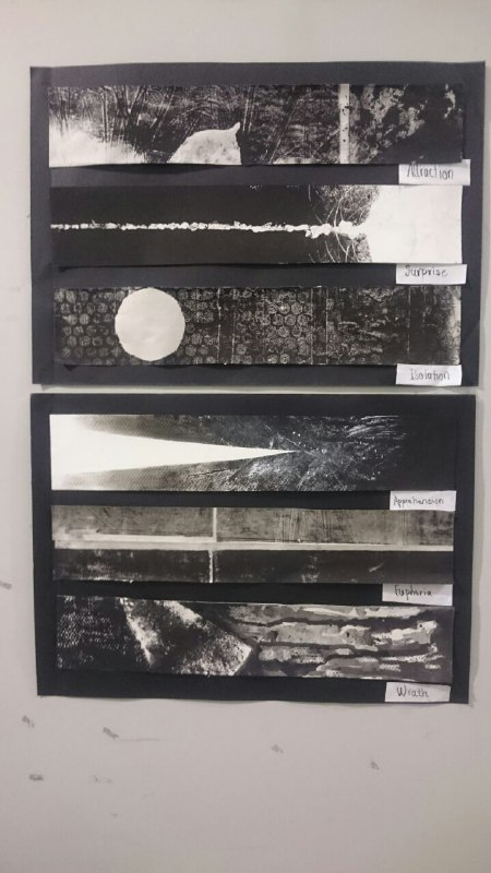
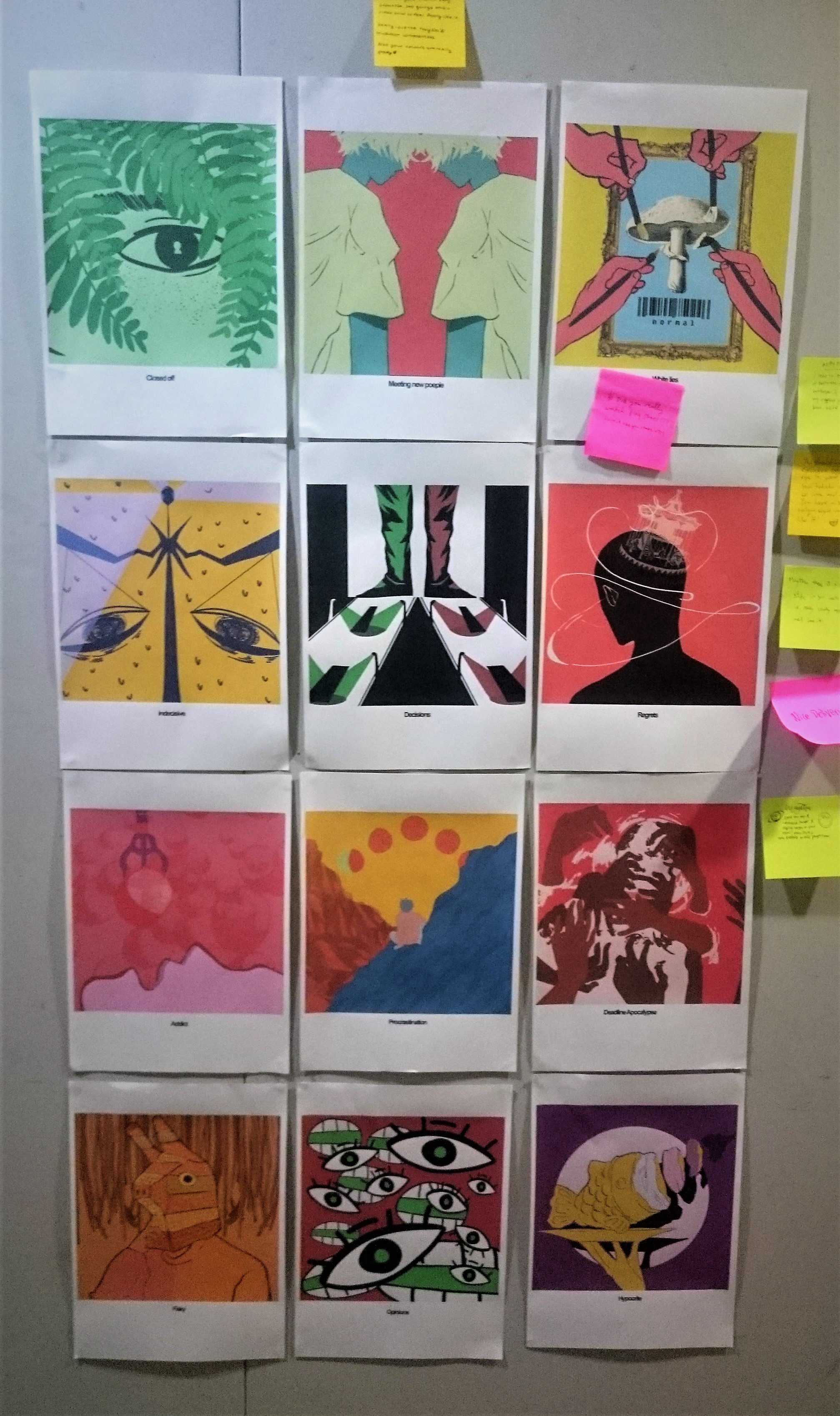
And here is my final pieces all lined up together in their respective equations:
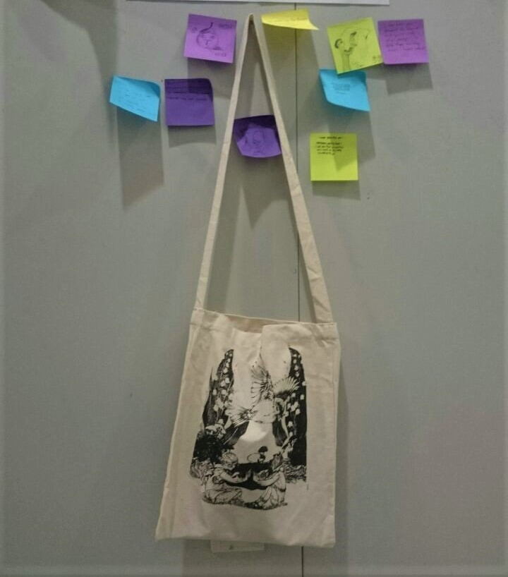
I printed all the pieces using an ink tank printer on a regular printer paper.
Final + Reflection
Feedback from Joy:
- She found the eye motifs in my pieces and would like to exploration on that part
- She also suggested I explore different paper production such as laser printing as some of the colours in some pieces turned out to be washed out especially the analogous ones. I personally would love to explore this, hopefully I am more educated about the printing process soon!
- She also seemed to enjoy the pieces with stronger blacks.
I really enjoyed this project as I got to explore my own illustrative style, even though I didn’t manage to illustrate some, such as the mushroom. Nonetheless, I am glad that I managed to make more conscious efforts when it comes to choosing colours now instead of just choosing what I believe is right. I also managed to bring some of the principles from the previous projects to good use, like the symmetries that I now love to use.
I would like to develop some of the compositions much more as I felt some of them weren’t unique enough, such as the Strong opinion piece. But overall, I am proud of myself for having explored this illustrative style and how they undoubtedly showed my growth from semester one, as I see myself integrating the principles more and more subconsciously.
I enjoyed the projects surprisingly despite all the struggles that I had with of course with all the guidance given to me. With that I’m out.