A prominent part of the Dada movement, where she contributed artworks in the form of photomontage where visual elements of different sources are transformed by integrating them into her own larger creative project.
She expanded the notion of what could be considered art by incorporating found elements of popular culture into “higher” art.
She addressed the issue of gender and figure of woman in modern society.
Dada Puppen (Dada Dolls) (1916)
Fabric, yarn, thread, board, and beads
A common belief among Dadaists was that technology caused humans to become more machine-like themselves.
When Dadaists did choose to represent the human form, it was often mutilated or made to look manufactured or mechanical.
Heads of State (1918-20)
Photomontage
A newspaper photograph of the German president Friedrich Ebert and his Minister of Defense, Gustav Noske +
iron-on embroidery pattern of flowers and butterflies.
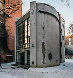
Dada and Russian Constructivists
To allow free combination of primitive shapes and often aimed to demonstrate how materials behaved and dictate the form of artwork.
Melnikov House
Unconventional tools : 2d, 3d, photo montage and collage
Toilet paper roll (Artwork by Anastassia Elias)
Other means of Canvas (Artwork by Hikaru Cho)
Old watch parts (Artwork by Susan Beatrice)
Book Sculptures : Guy Laramee
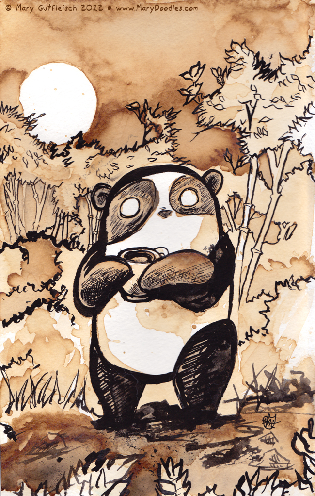
Mary doodles – Coffee art
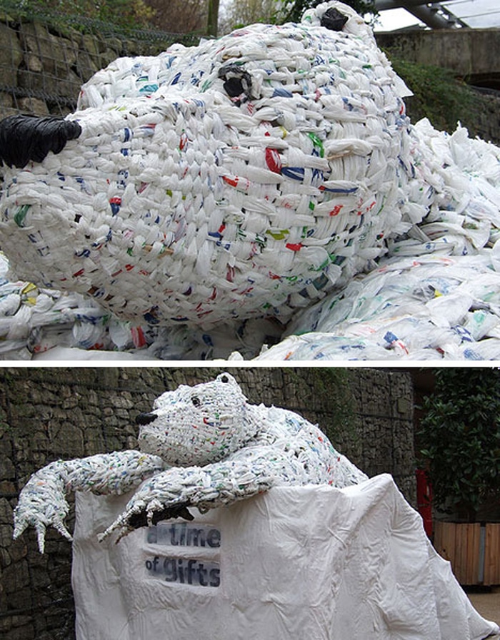
Plastic Bags ( The Eden Project )
pixel art
JObs – research + PRocess
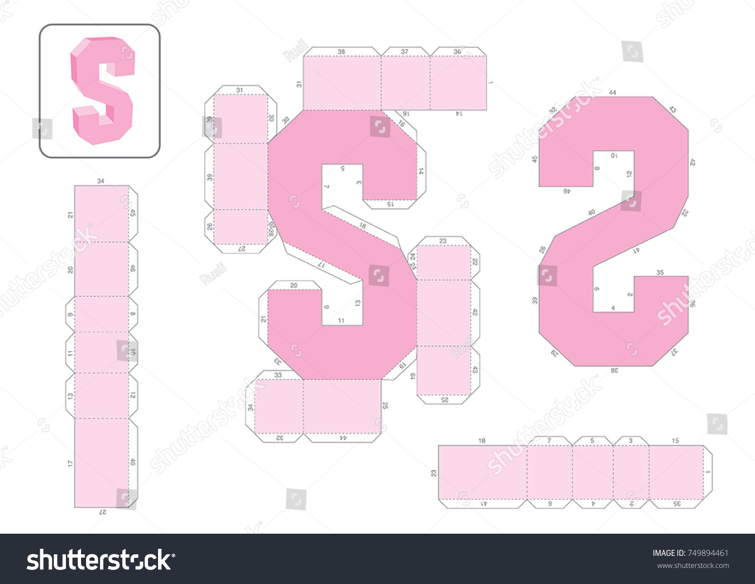
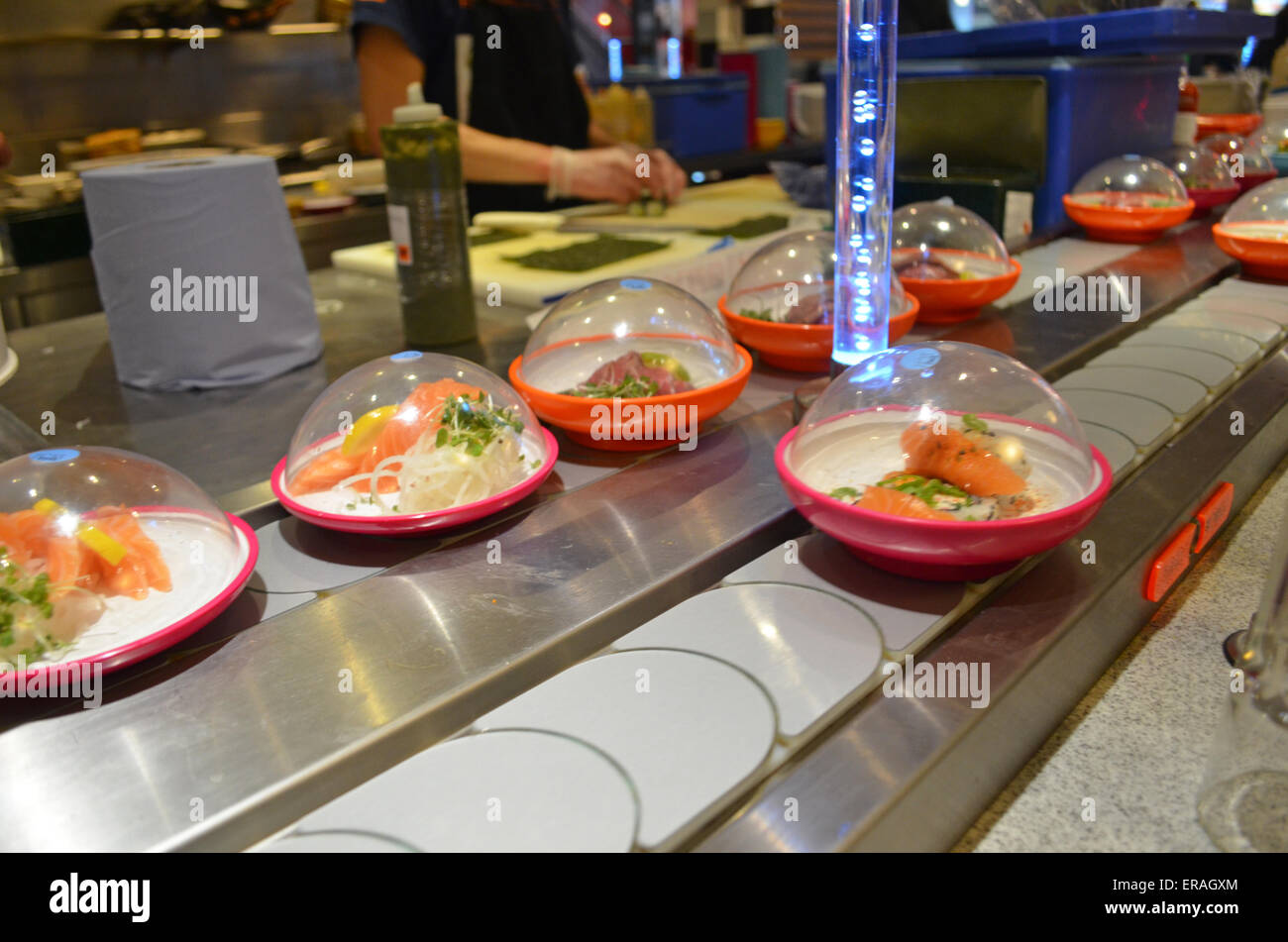
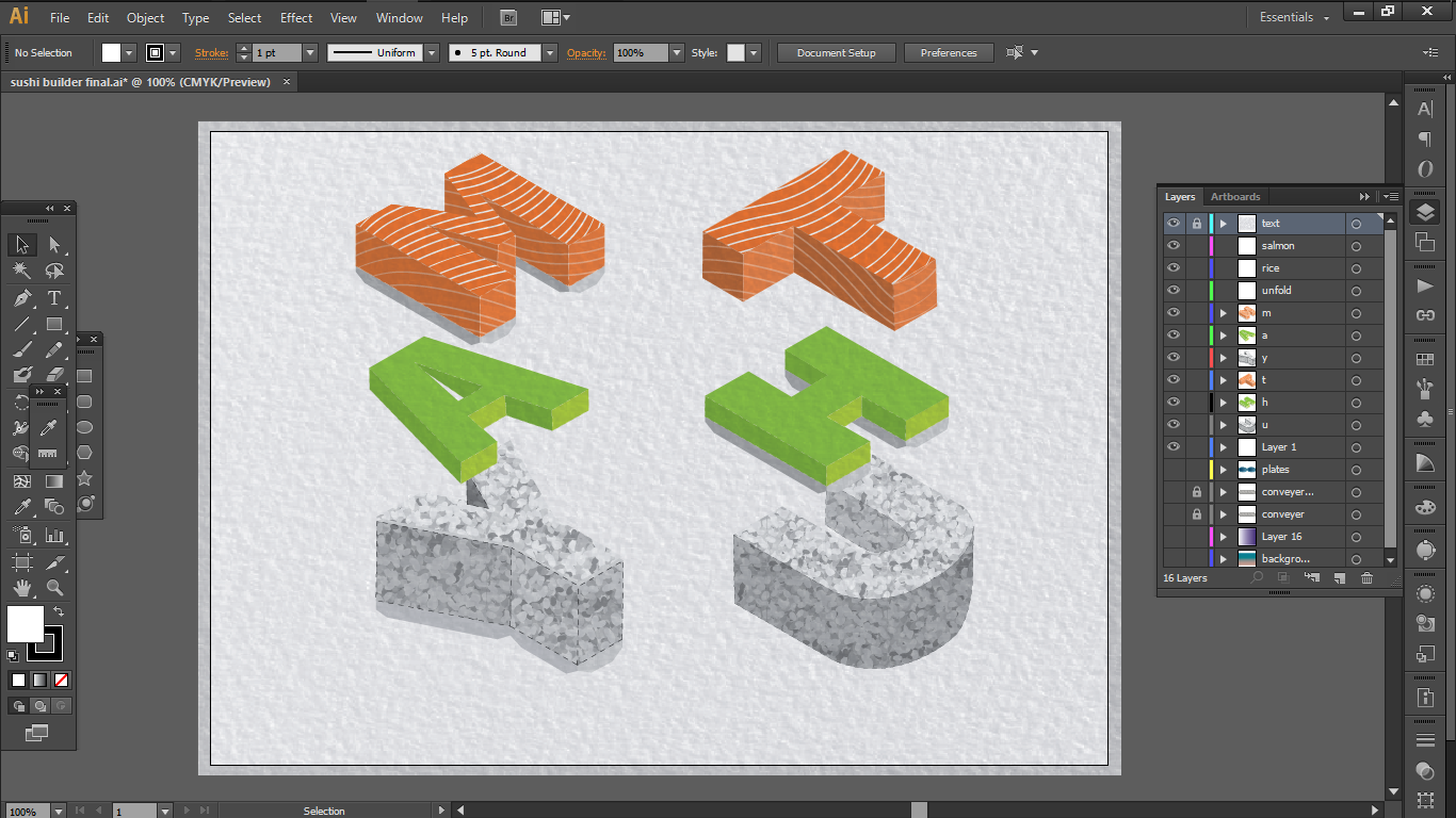
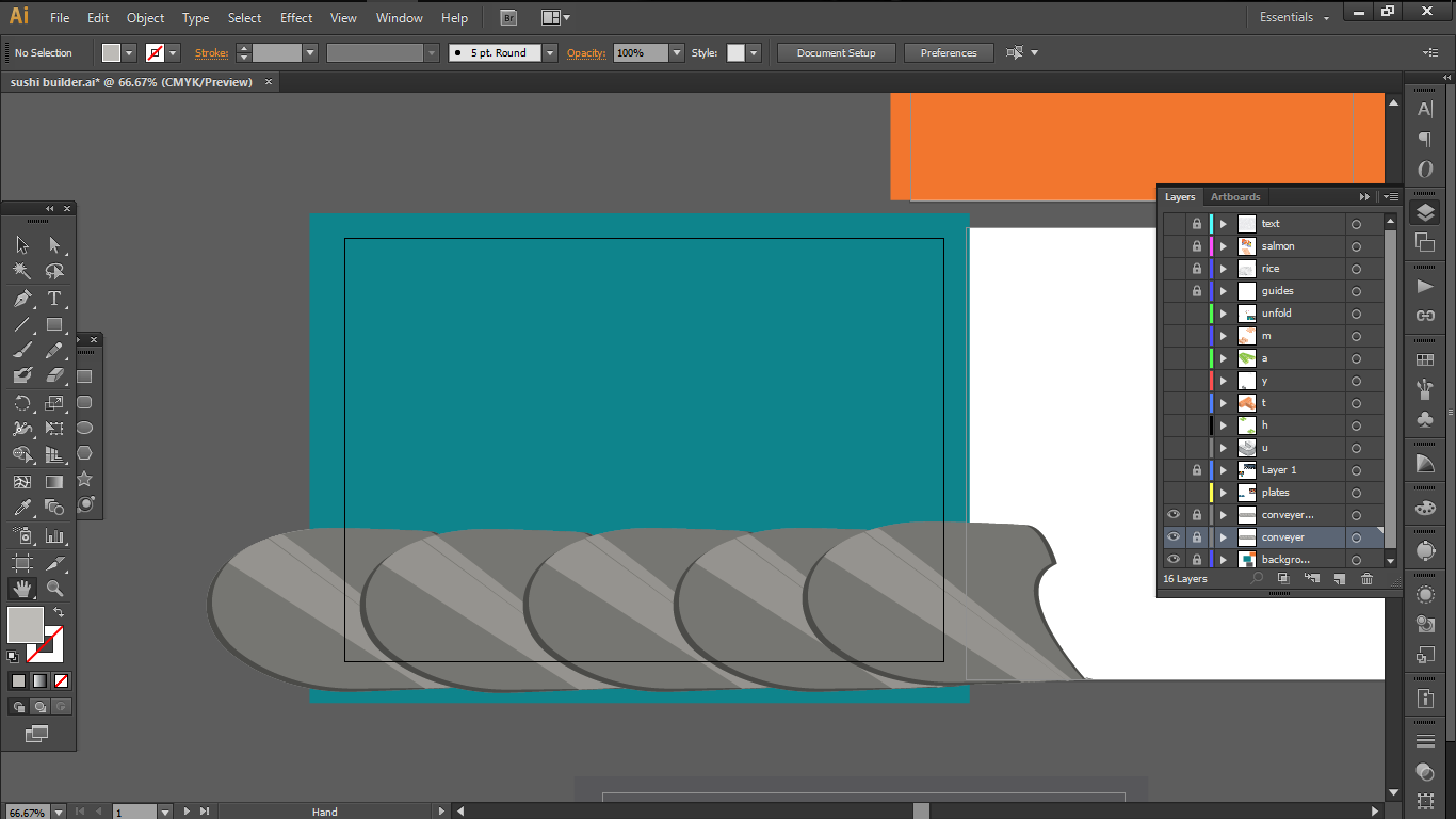
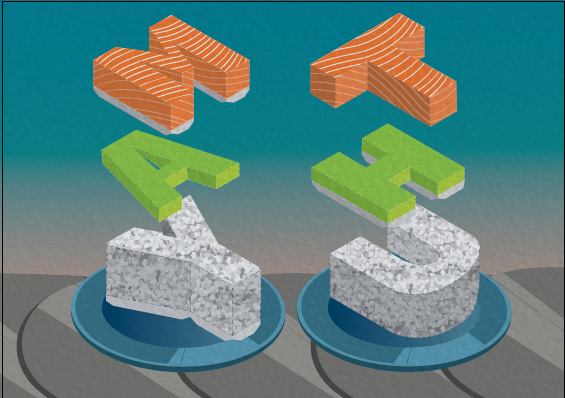
1. ) Sushi Folder – Sushi chef + paper doll folding
Both the art of sushi and paper folding requires precision and measurements. So i thought that these two jobs would fit each other really well when they are combined into one.
So here are the visual elements that I borrowed from the two jobs:
a.
A basic make up of a simple sushi : Salmon + Rice + Wasabi
b.
The template for the alphabets with paper extensions for folding
c.
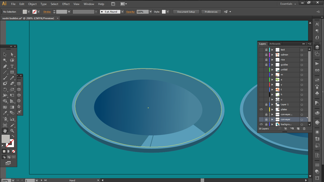
sushi plates
d.
Conveyor Belt
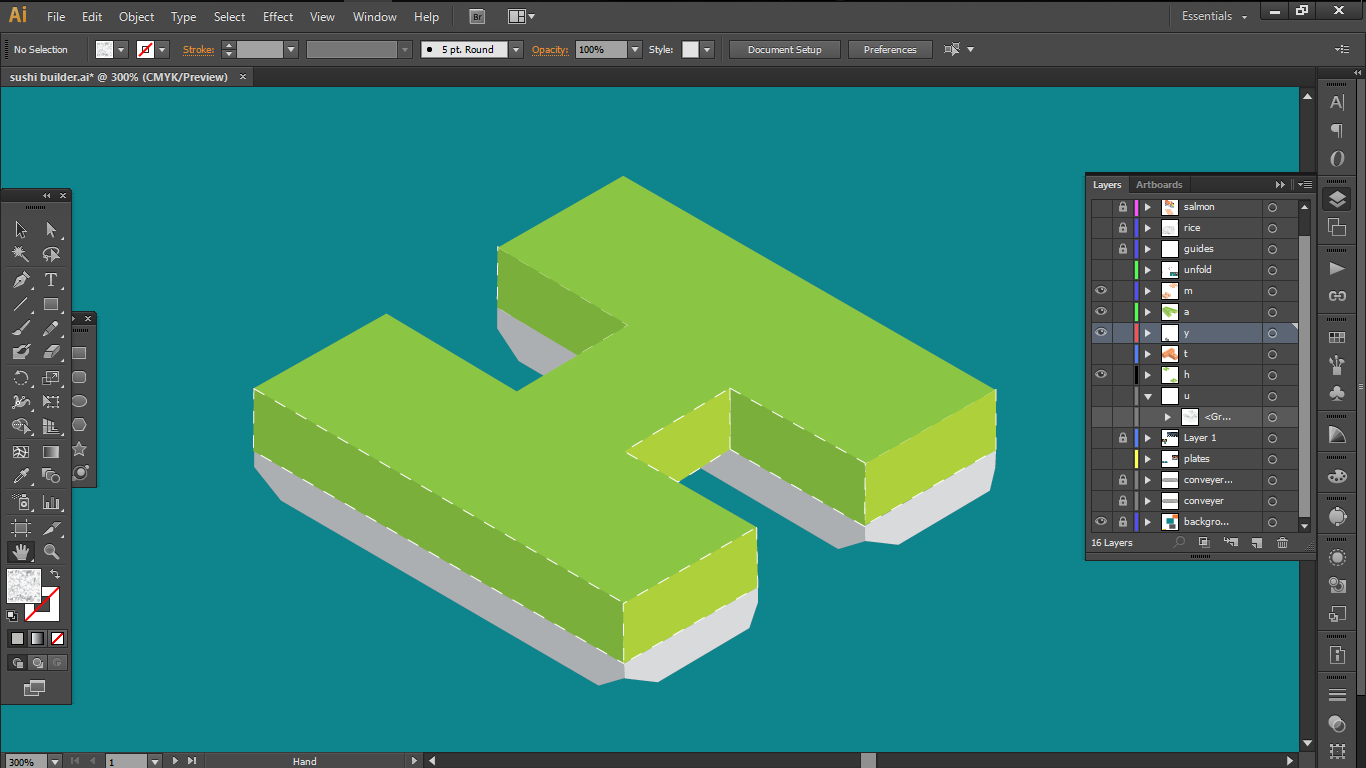
So i decided to work with Swis721 Blk BT Black font because I believed that its clean cut corners without any serif, plus its thick stem could be used to convey the blocky structure of a paper model.
I also decided on the complementary colour scheme as I wanted the main attraction a.k.a the salmon to pop out.
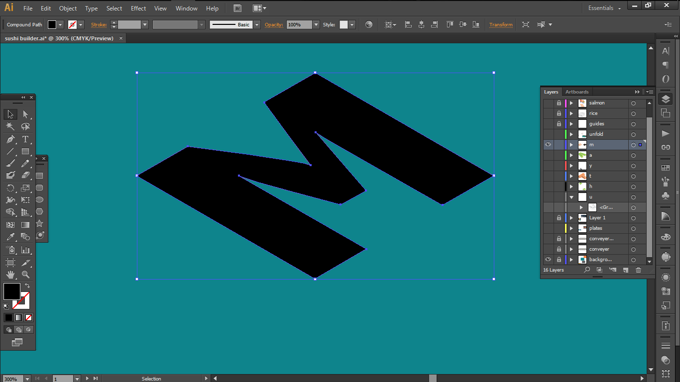
So first, I started off by extracting the outline of the fonts using the pen tool and laying the down in a 30 degrees angle to construct a 3-D model.
i realised that if you use shear things are much more simpler after I HaVe DOnE AlL thE LetTers So ThAts CoOl
Then i constructed the 3D-models in varying heights with proportional reference to the actual sushi
shortest = wasabisalmonlongest = rice
As for the patterns
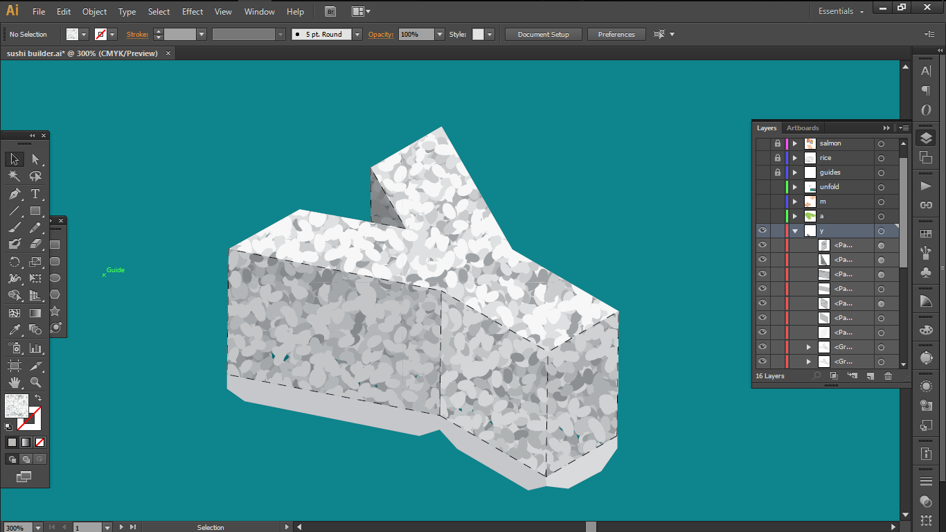
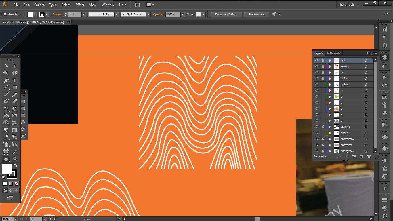
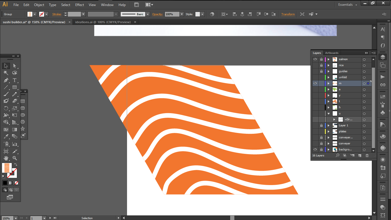
Salmon
In my first attempts, I drew white vector lines over an orange box to imitate the patterns of the salmon and create a clipping mask on the text. But that didn’t work out too well
first the outlines that I drew didn’t look too nice, as I was trying to replicate the real patterns of the salmon which ends up too messy in my opinionand most important of all the masking method was a failure in the end, since my models were at an angle but my masks were in frontal view. And I didn’t know how to fix that.
So I simplified the designs and made my own pattern.
with the help of youtube
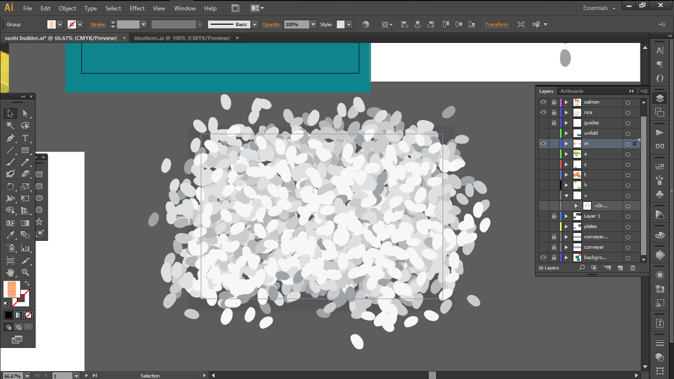
I also created a custom brush for each rice grain to create a rice pattern for myself.
For the finishing touches, I added the paper extensions from some of the letters in an alternating fashion and dotted lines as folding indications to reinforce the paper model folding aspect of my job.
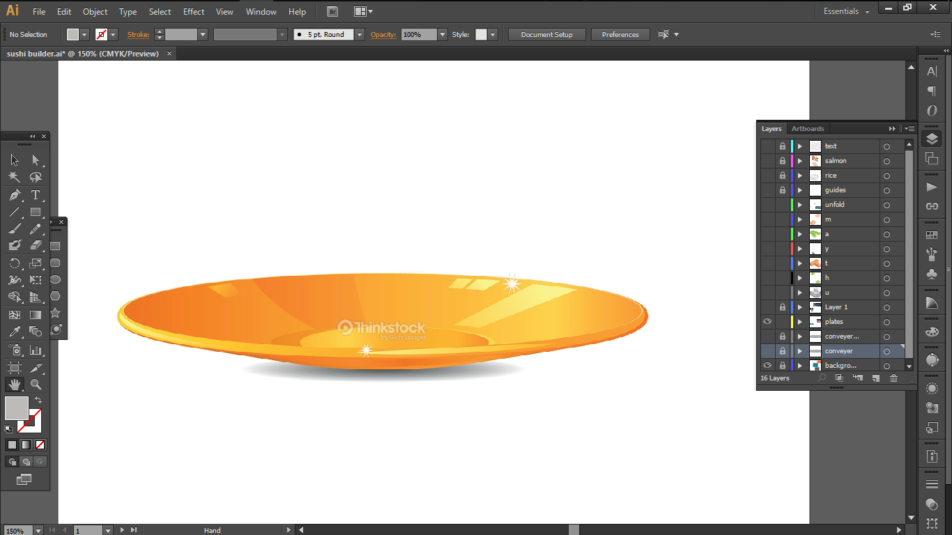
i also added a paper texture to reinforce the texture of paper models as well.next I made some shiny sushi plates, using ellipses and and vectorsand some shiny conveyor belts also made with pen tooland i added some finishing touches with a slight gradient to the background
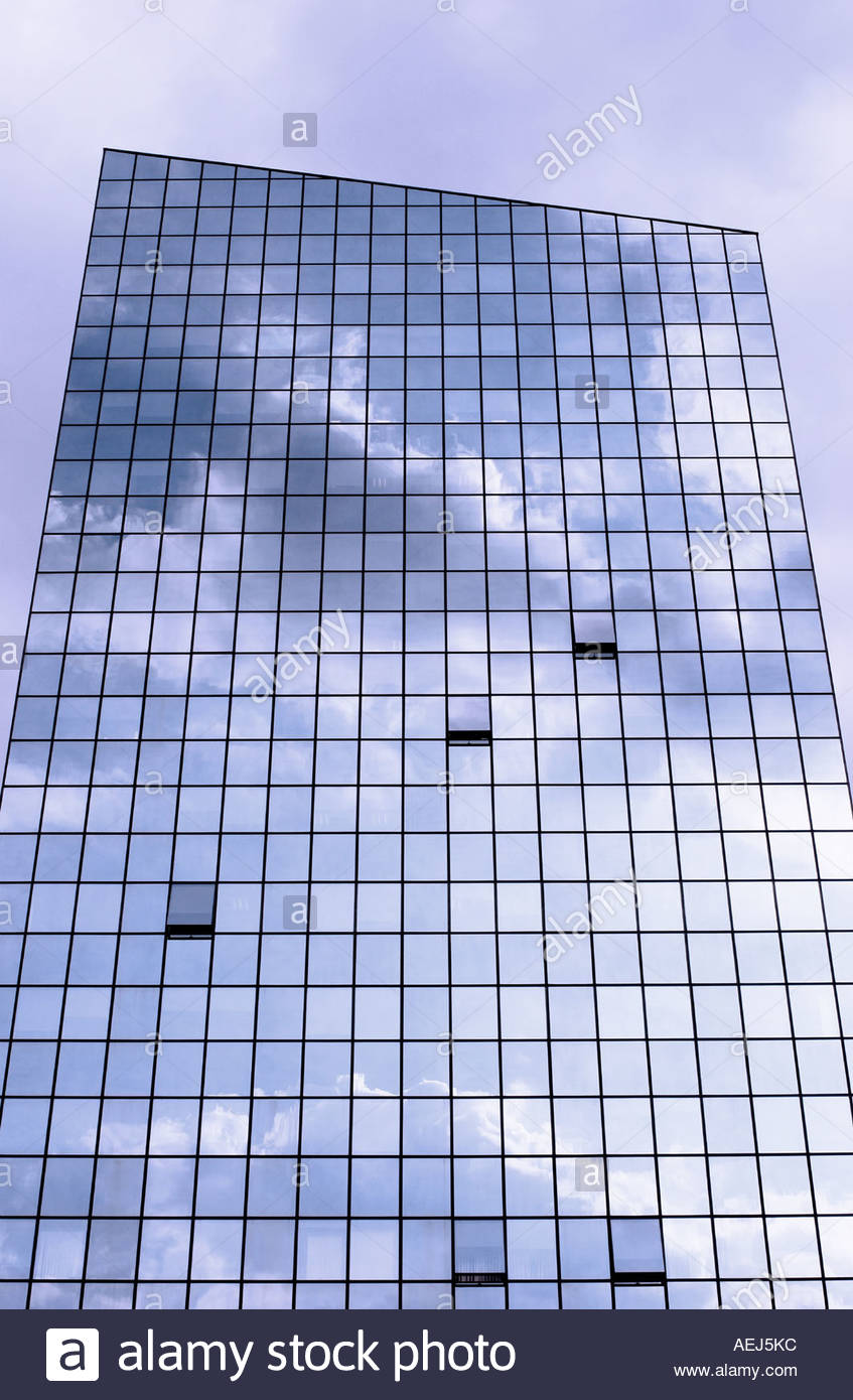
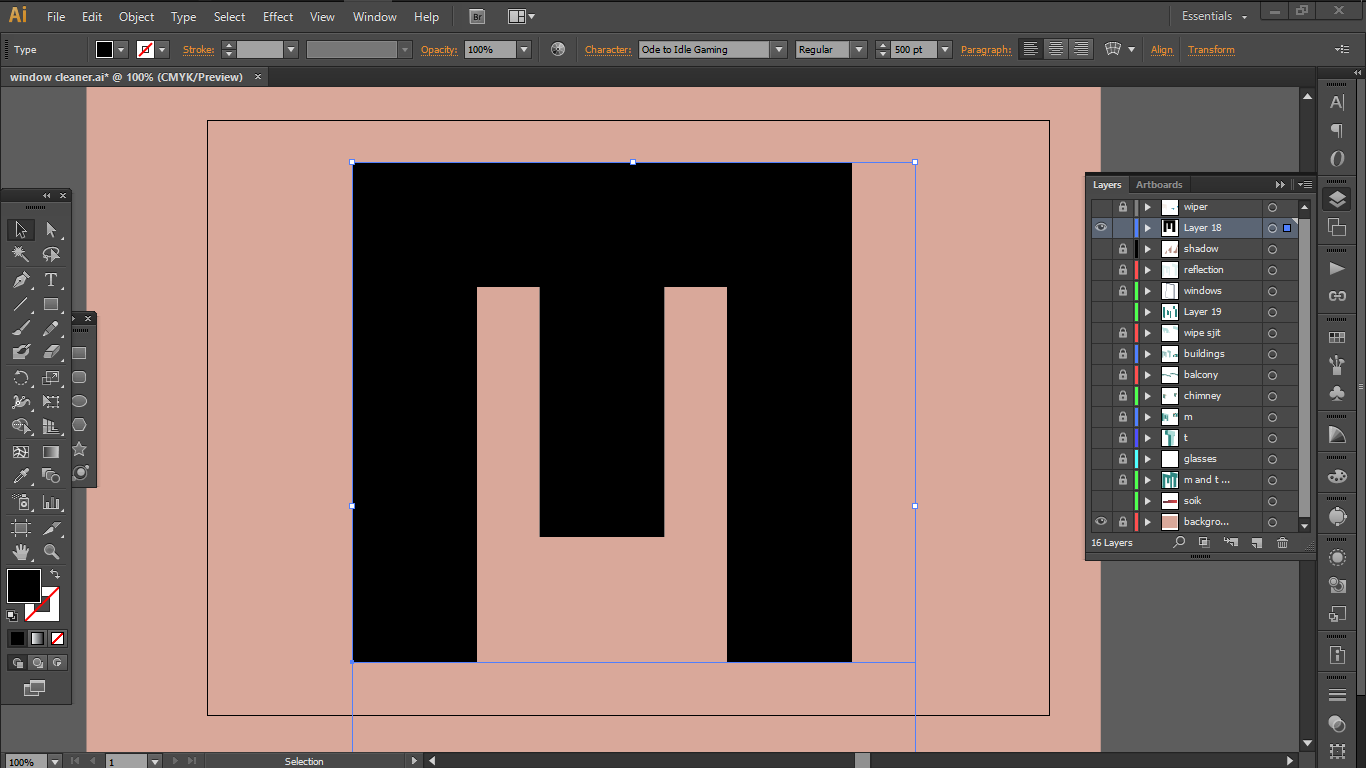
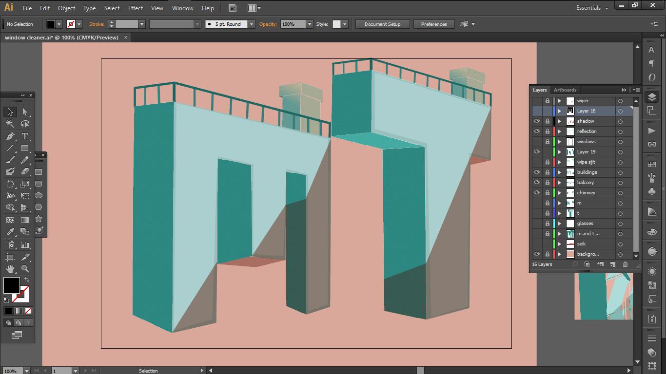
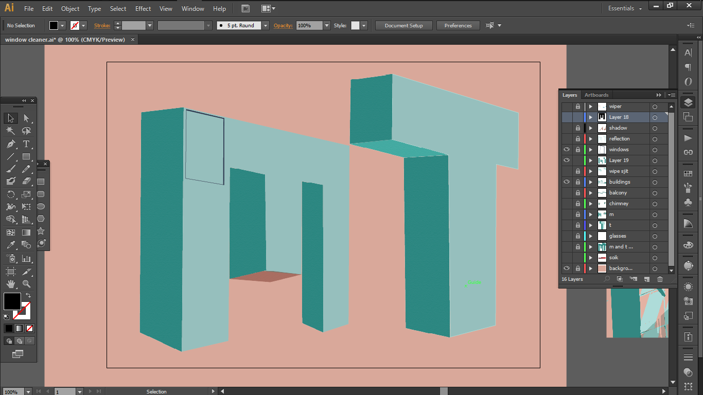
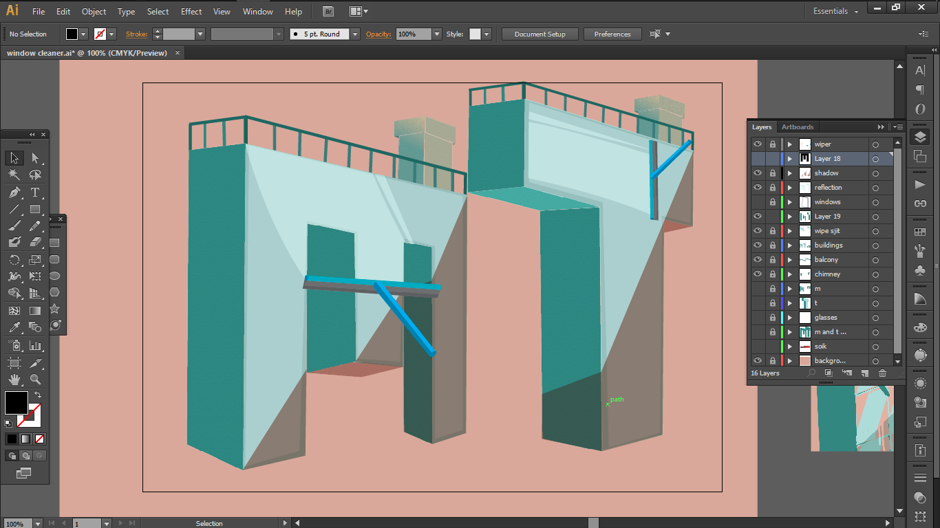
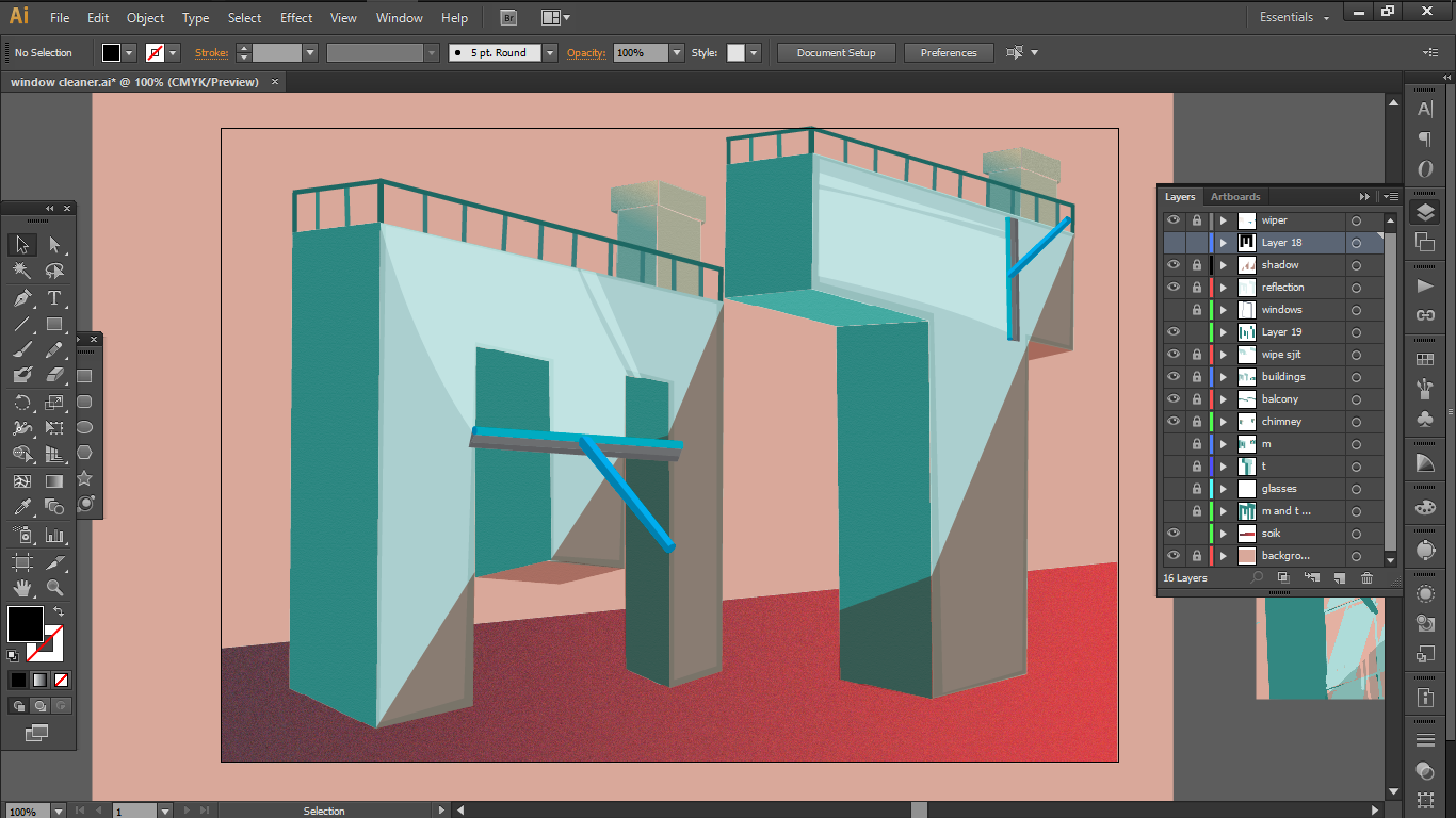
2 ) Window Cleaner
As for this, the visual elements that I picked up were
a.
the reflective window and the clean wipe
b.
the window cleaning tool
c.
tall glass buildings
PROCESS
i chose this font “ode to idle gaming” because I thought its angular and thick features would be perfect to portray buildings.i then outlined the font and changed the perspective to give it a more 3-D look. again i decided to go with a complementary colour scheme.i added the necessary vectors, shadows and a few other elements ; a balcony and a chimney to make it look like a 3-D building.i tried to add some windows but it looked too detailed so I decided to opt for a window texture that covers the entire font.next I added the window cleaner and a wipe mark to reinforce the idea of window cleaning.and I finished it off with a textured ground with a gradient to make sure that the fonts do look like buildings.
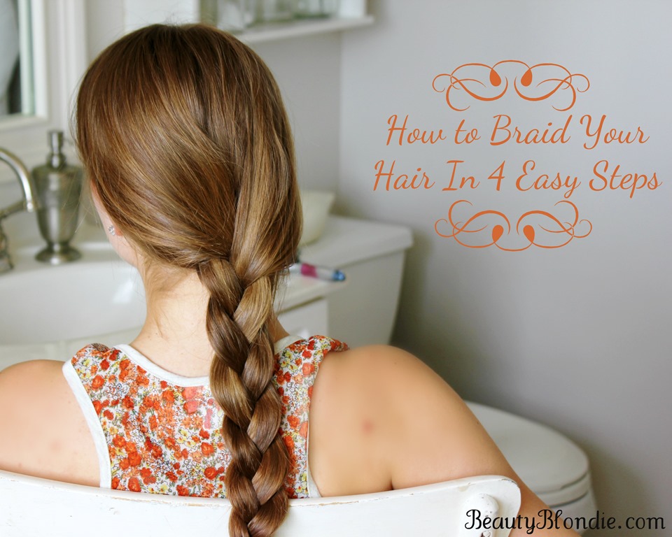
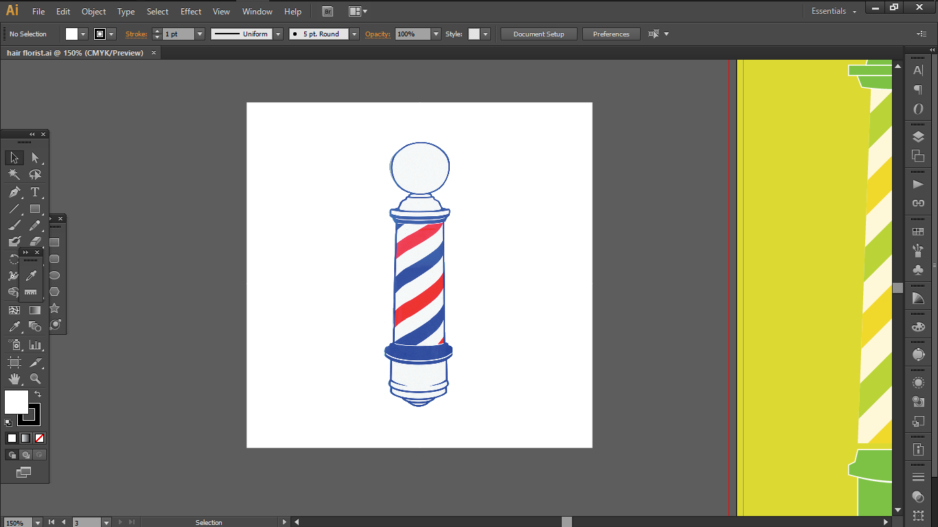
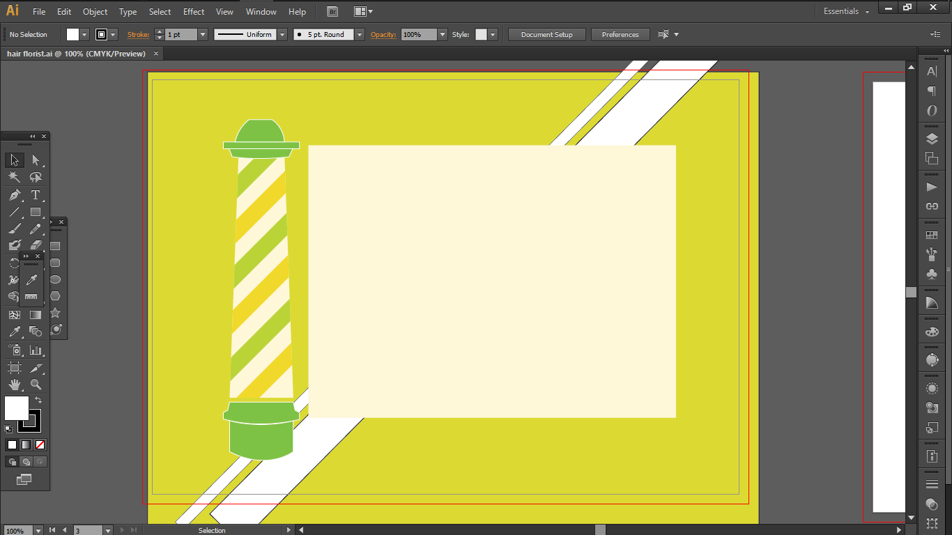
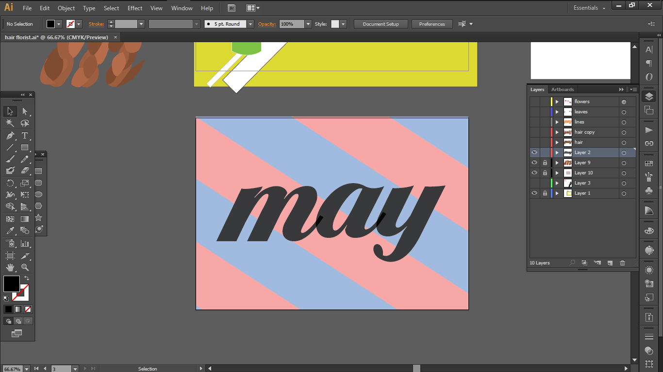
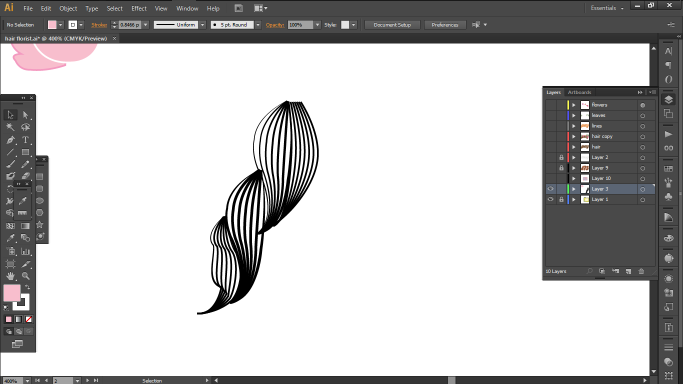
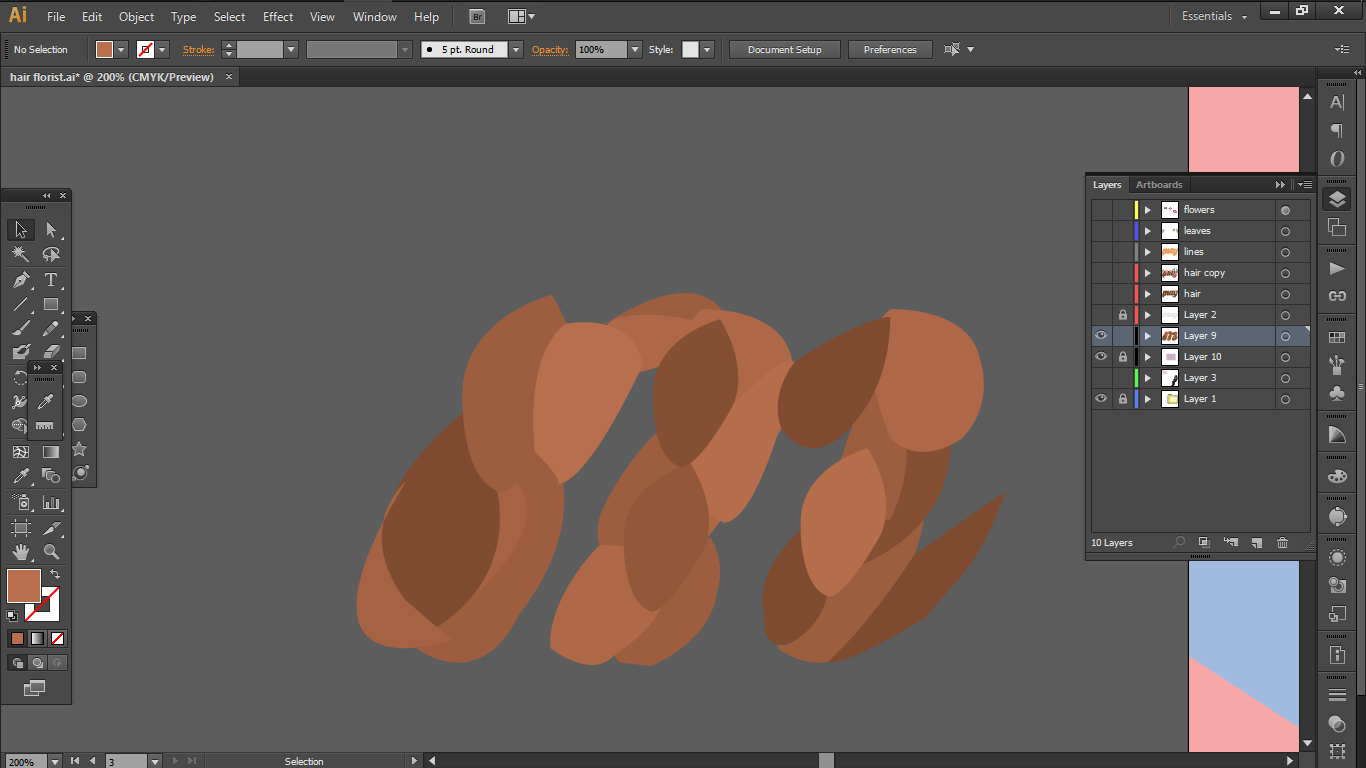
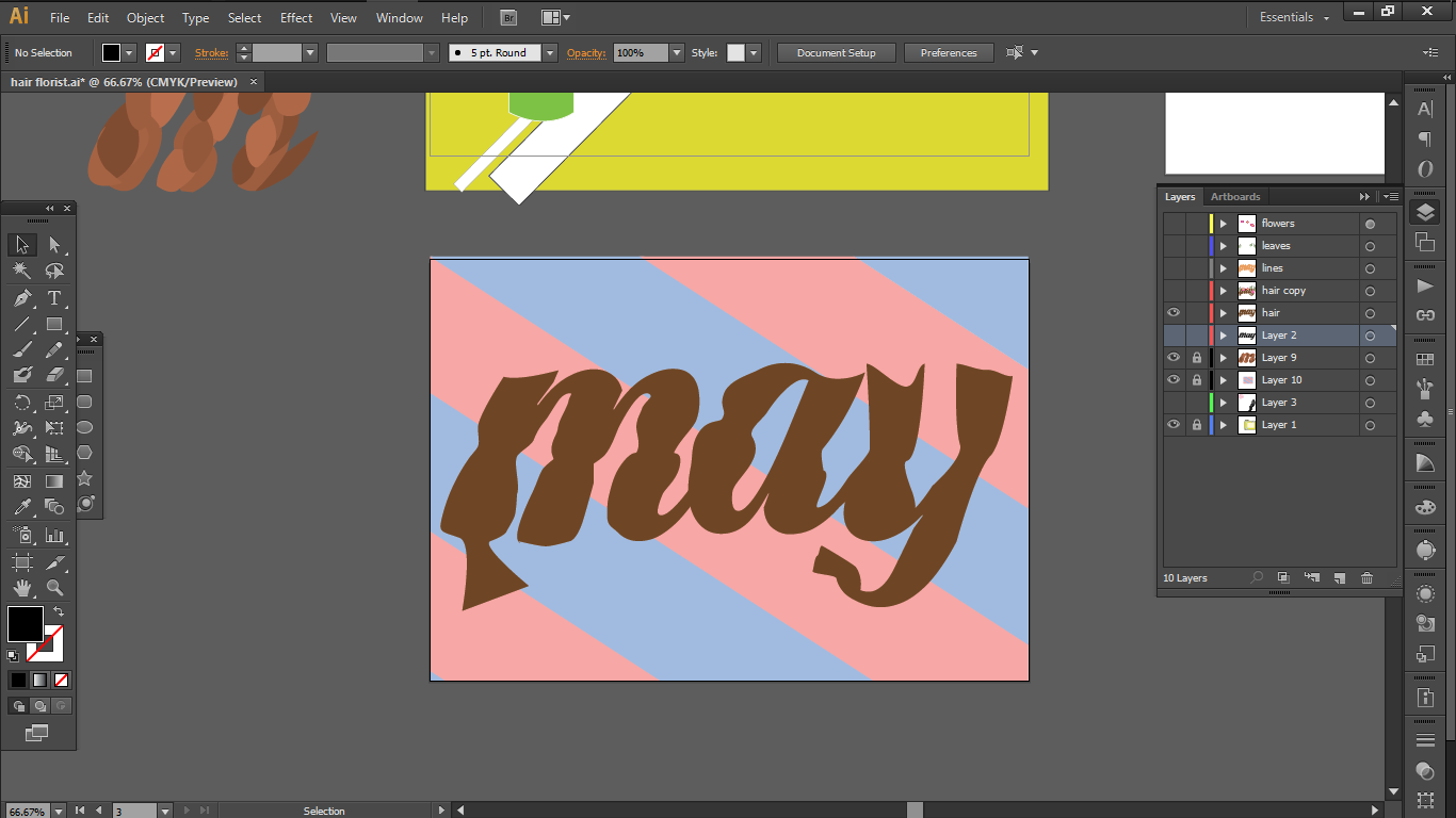
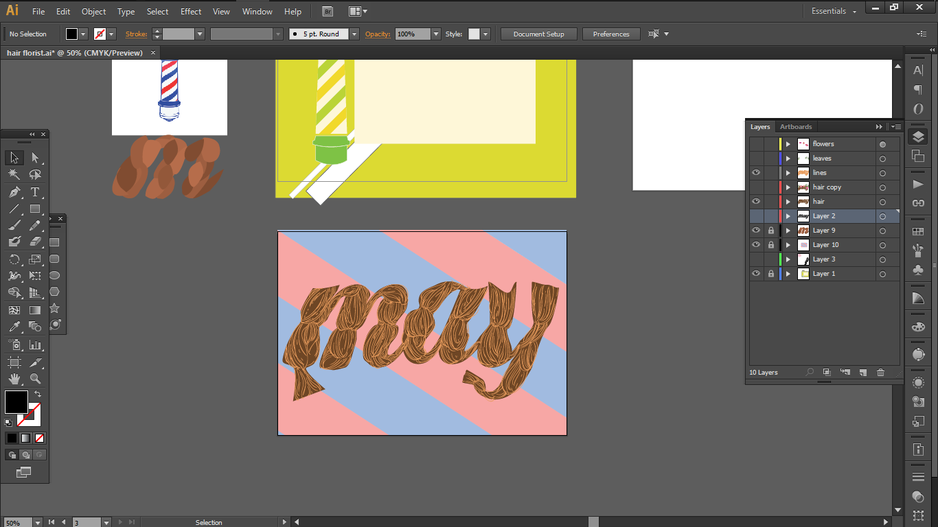
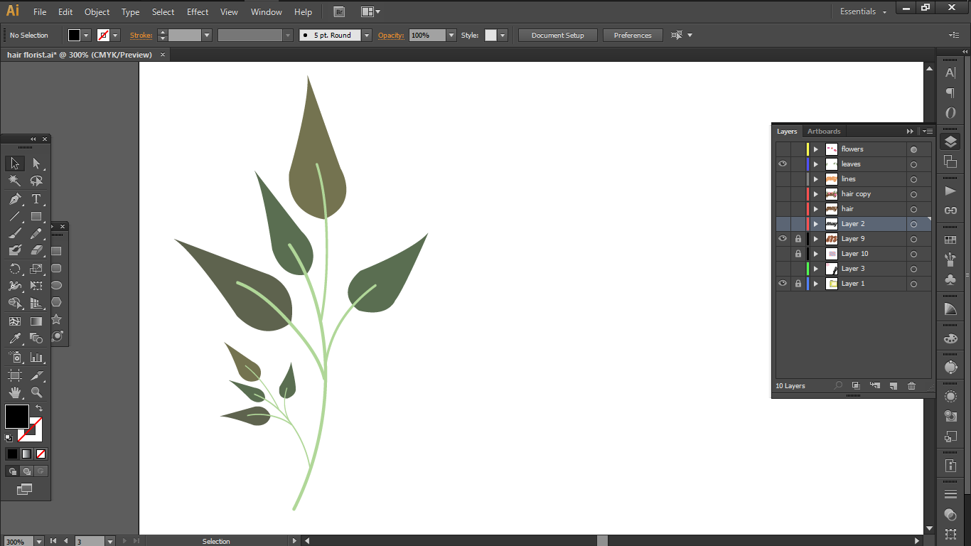
3 ) Hair florist
Over here, I wanted to combine the elements of braiding and vines as they seem to be similar in nature, in respect to the intertwining visual.
So the elements that I wanted to bring in were
a.
The interlocking braids
b.
Vine flowers and leaves
c.
Barber pole
Process
so first I wanted create a barber shop sign but after consultation, i realise that it was redundant so I scrapped that idea.so instead i decided to integrate the the barber pole pattern as a background. I also changed the blue and the reds to a softer colour to make it look softer.i chose this font because when the alphabets are placed next to each other, they connect, and I wanted to use that aspect to portray the connected braids.I tried tracing the the font next, but it was again too complicated.next I tried making the shapes but it didn’t connect well so I bailed on that plan too.so in the end I ended up warping the anchor points to make the font look like braidsand added in vector lines to create the texture of hair.i then worked on the leaves andand then i tried to create a vector of Clematisand here’s my final outcome
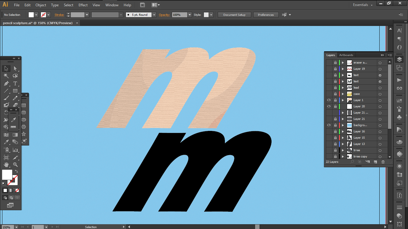
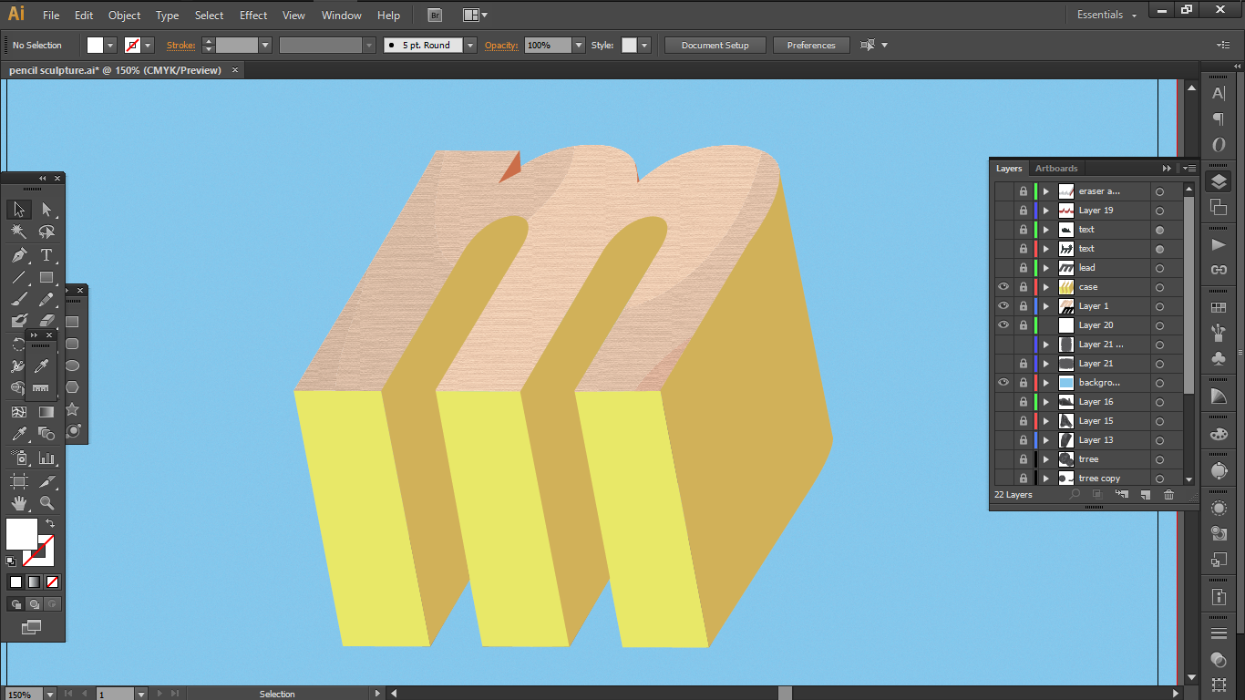
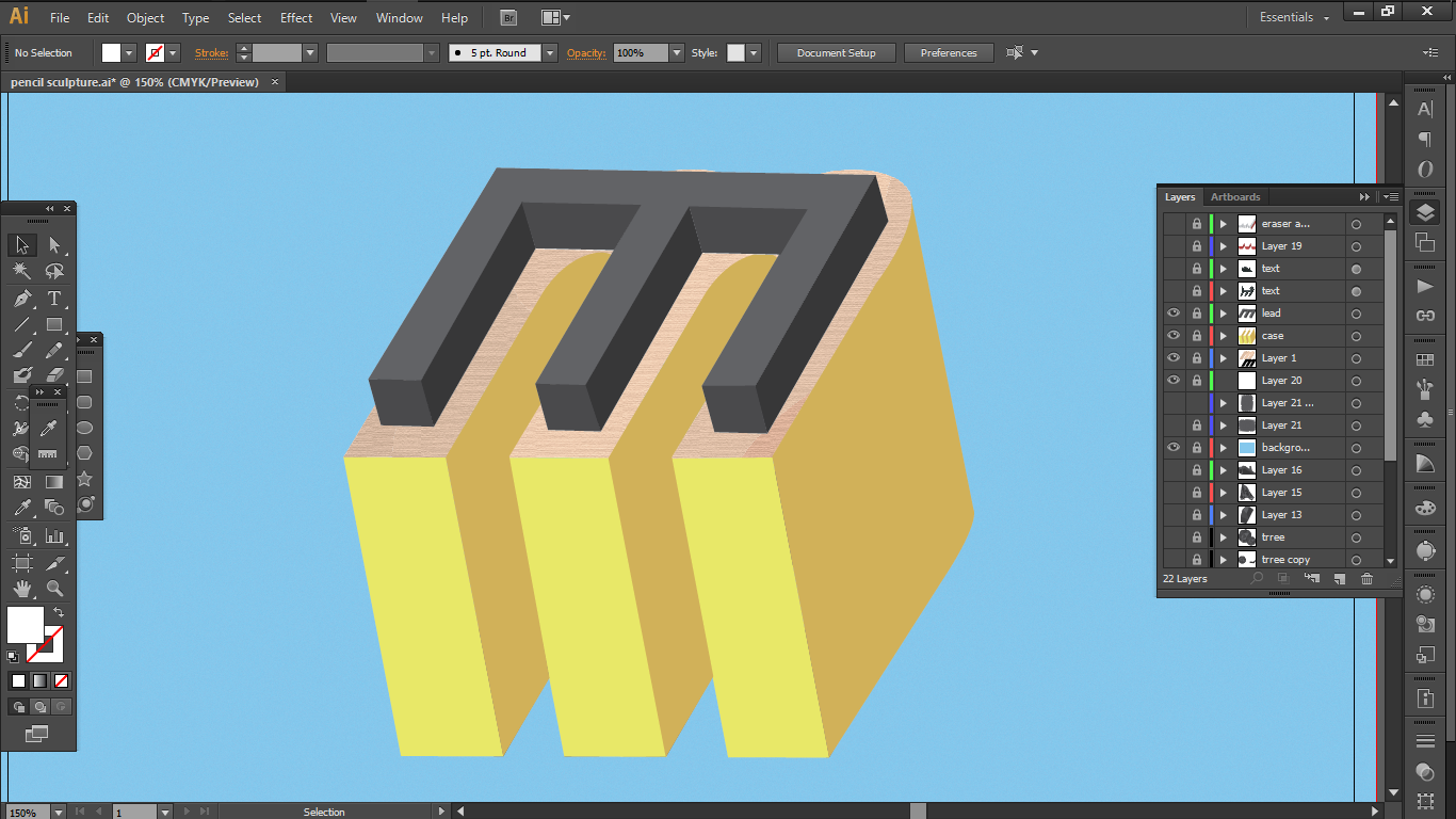
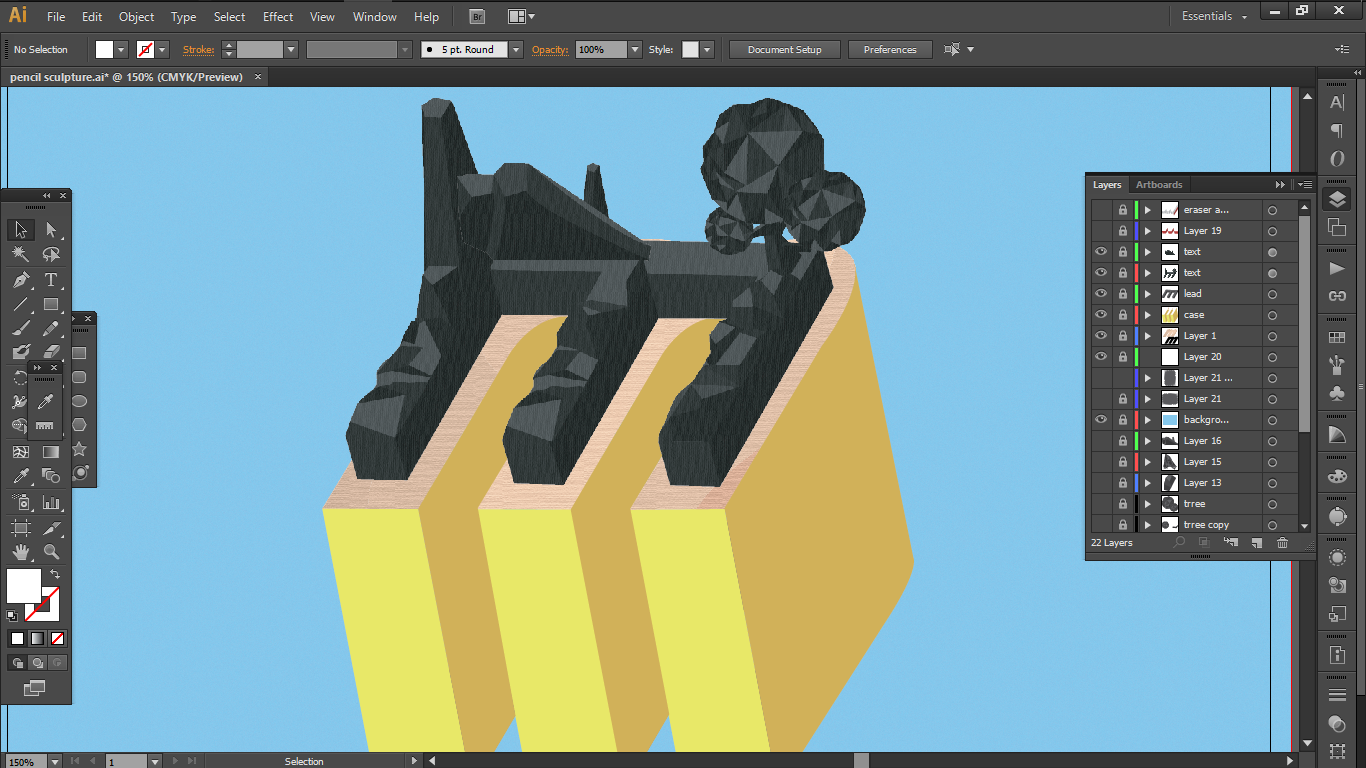
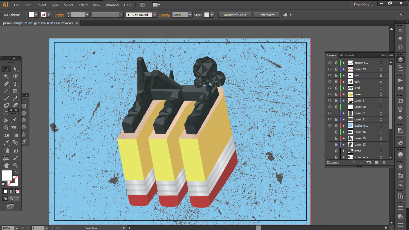
4) Pencil Sculptor
So for this, I extracted the following elements
a.
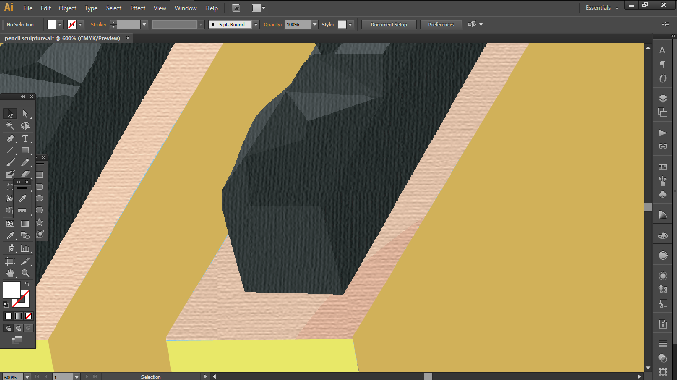
The texture of the wood
b.
the texture and the hard edges of the lead
c.
the basic elements of pencil; the metal ring holding the eraser
As for how I wanted to create this job, I discovered Low Poly art from pinterest and decided to attempt a very simple scenery in this style.
Process
i chose this font with as it had a good weight to hold all the elements together. I again extracted outlines of the font and edited it so that it is at an angle. I also added in a good texture by using vectors and textures..next i made the font into a long 3-D shape to imitate a pencil.Next I extruded a black block to imitate that of a pencil.and then I tried to imitate the pencil sculptures by attempting the low poly art method to depict a simple scenery.and then i added some texture over the lead to make it seem more like graphite.To finish it off, I added in some charcoal texture on the background and added the metal ring holding the eraser. The Triadic colour scheme of primary colours is used to balance the greyscale of the pencil lead.
Reflection
This project has taught me in learning to detect the important essence of any subject and extracting it to create our own work by applying the elements of design in other ways.
On the technical side, this project has pushed me to be more self initiative when it comes to learning new techniques and programs. Without the project, I actually wouldn’t have touched the tutorials or even the program itself.