
INTRO
I am an extremely clumsy person. I’ve made a lot of messes in my life and this project is a documentation of some of the more memorable ones.
I’ve decided to go for the line art style, moving away from flat vector illustration, which is something I’m familiar with and what most people are doing.
ARTIST REFERENCE
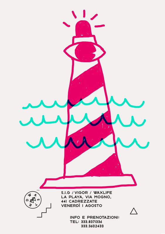
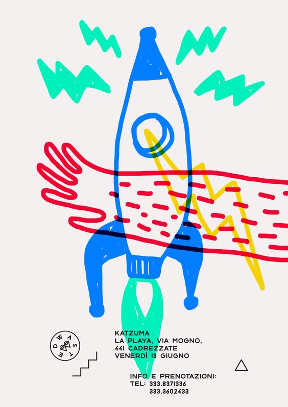
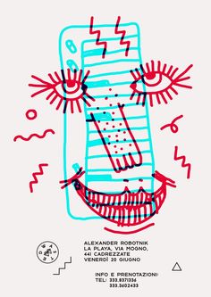
I chanced upon a line work artist called Marco Oggian on Pinterest. His art style is fun, quirky and has a vulnerable quality to it that makes it childlike and playful. He also uses bright colours that stand out on on an off-white background. His illustrations below are a series of flyer designs for an event called ‘WASTED‘.
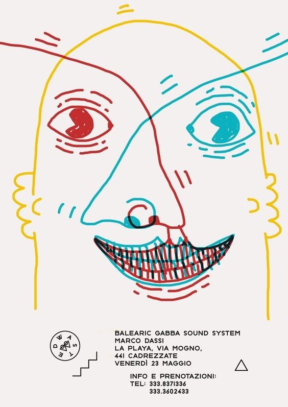
I especially liked the piece above because of how the red and blue overlapped and created a three d, double exposure effect. This was one of the main inspiration points I incorporated from Oggian’s art style into mine. Since my equations were distant memories, I wanted to use this effect to create that vivid illusion of a past, as if it were the actual recollections playing in my mind.
Instead of having messy, childlike lines like him, I went for neater lines. Since my equations are all about the messes I’ve made as a child, the sophisticated lines I opted for are how I represent me looking back on what I’ve done as a child, though I think I still am quite a messy person. The images below are styles I started out with and how I developed them.
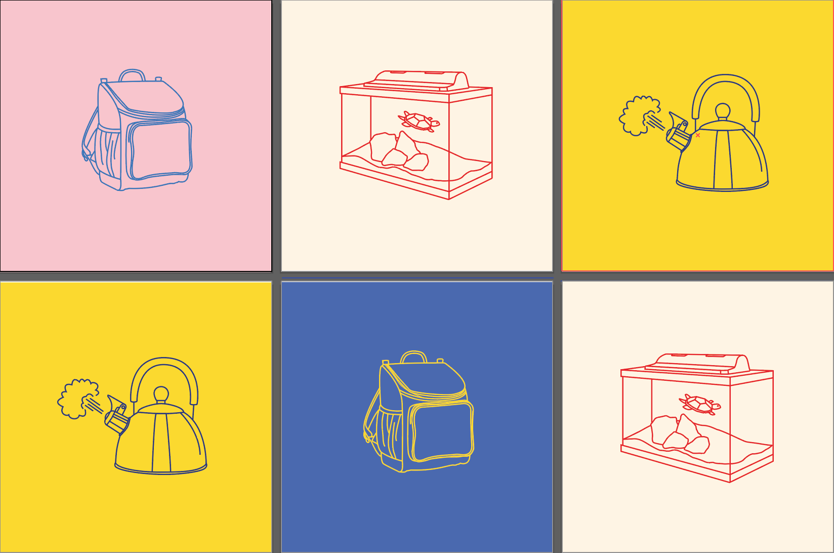

To find my style, I started out with simple lines with no background colour. I experimented with both complementary, split complementary and analogous colour schemes, making the back image a pastel version of one colour and the frontal image a striking and bold colour.
Following this, I added florescent yellow strokes and accents in each box. I also coloured the plain background an off-white tone to tie the whole series together.
THE EQUATIONS
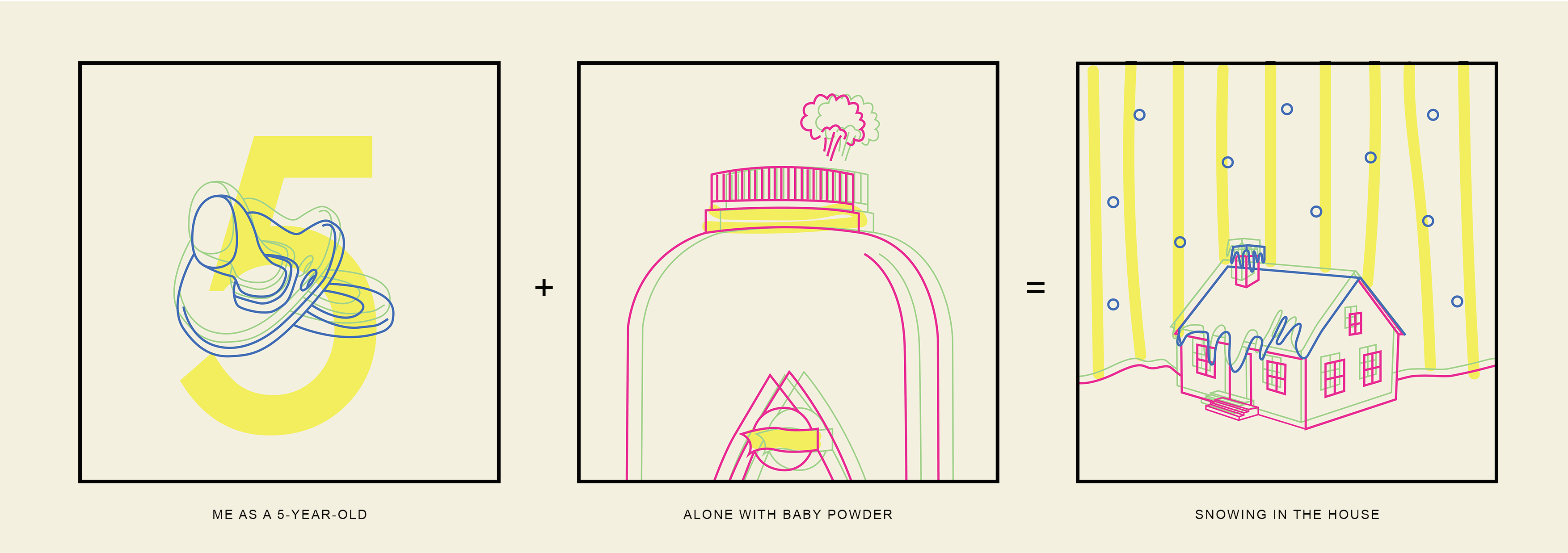
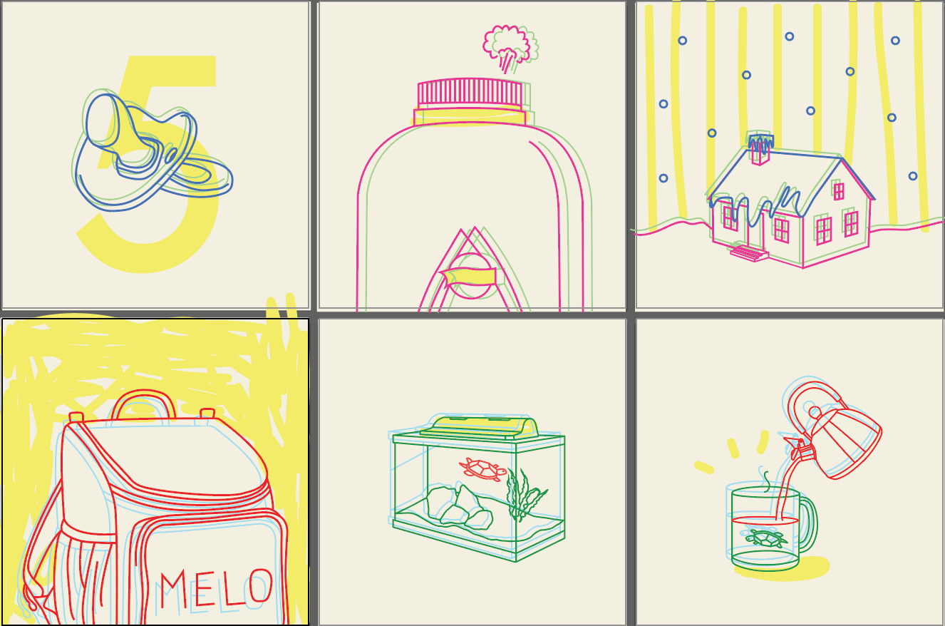
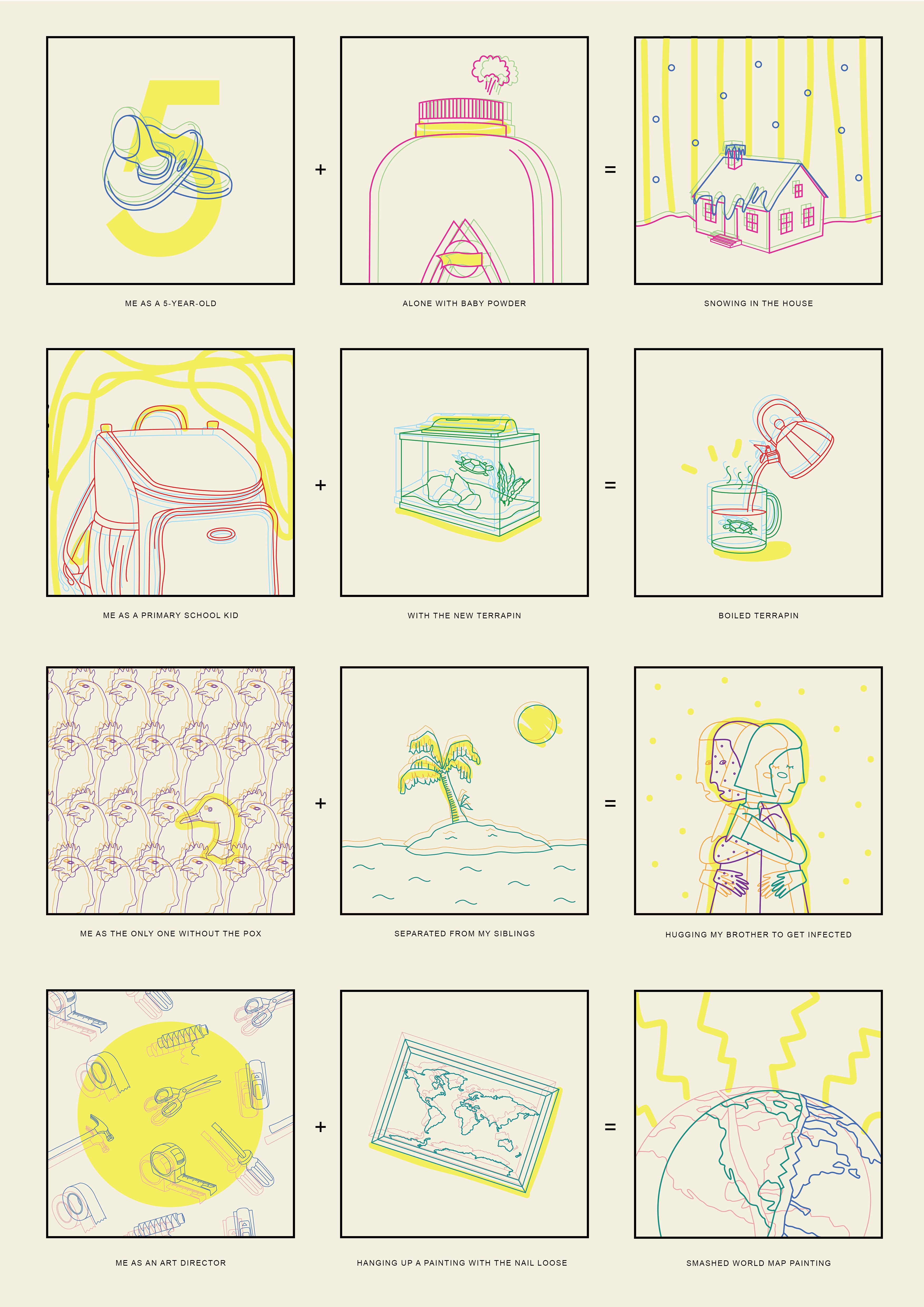
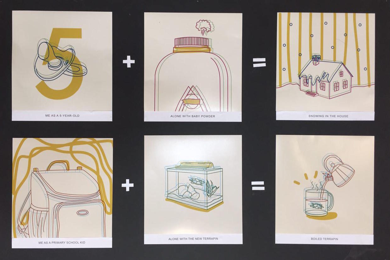
I do not recall this memory, but when I asked my mom, she told me this was one of the biggest messes I made as a toddler. She said she left me alone for a few minutes and when she came back it was snowing in the house.
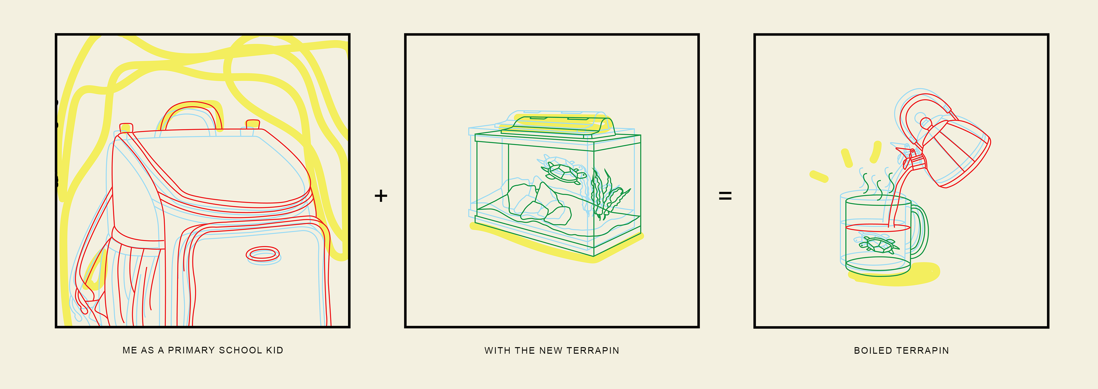
When I was in primary school, our family got a terrapin named Jaq. I wanted to make sure I was taking care of it right, so I googled terrapin care tips. A website forum told me the water should be 35°C for a healthy pet. Being the dumb kid I was, I poured boiling water into the tank, hoping it’ll warm Jaq up a little bit. Jaq swam towards where I was pouring and ended up all blistered. He passed away a few days after and I cried for weeks. I consider this the biggest mess of my life. 🙁
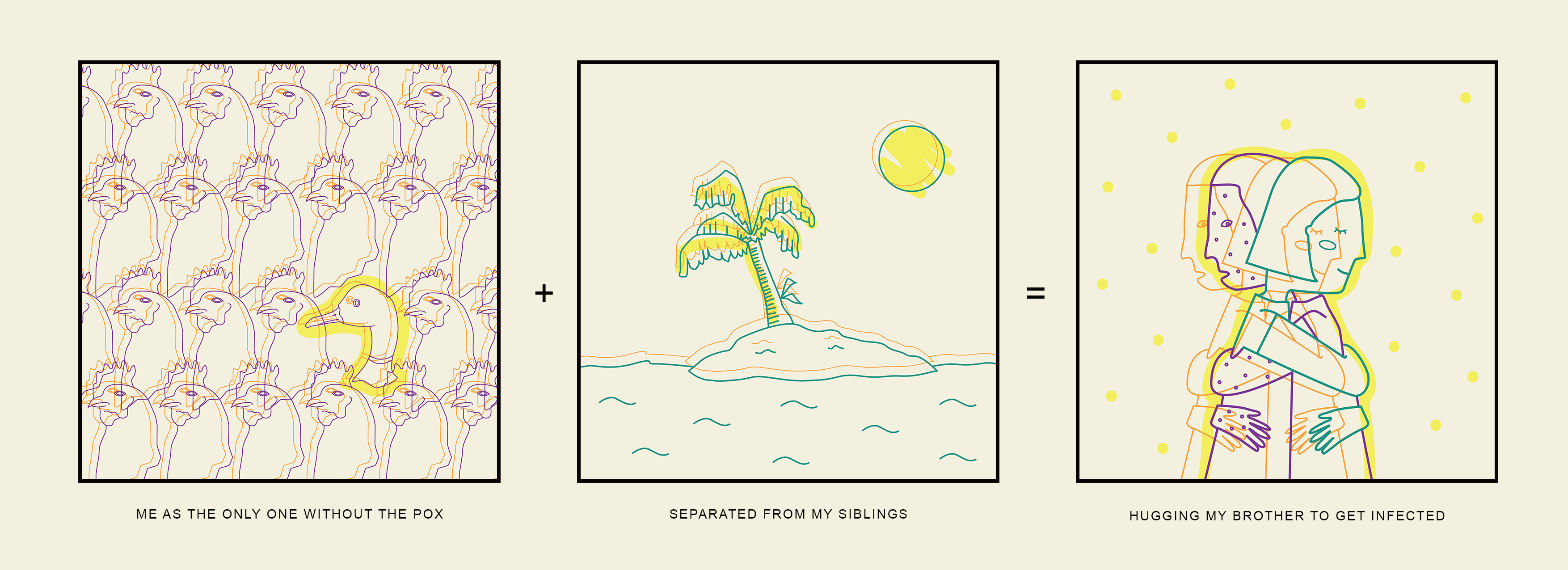
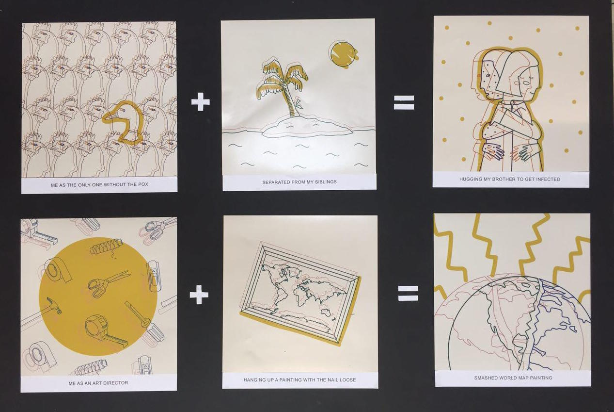
When I was in secondary school my elder brother and younger sister contracted the chicken pox. My mom separated me from them and I could only sit on a small sofa while the both of them got to be together on the big sofa. I felt like I was on another island and like I was the one with the disease instead. I thought I was missing out on something great so I hugged my brother super hard to get infected. I found a red bump behind my ear the next morn, and it was the worst month of my life.

In polytechnic, I had the opportunity to be the art director for a friend’s short film. One of my tasks was to hang up a painting. The original nail was already loose and when I tried to hammer it in even more, the hole got bigger but I tried my luck and hung it up anyway since we had to clear and leave the set. Seconds later, I heard a loud crash and the owner of the house screamed at me. Fun times.
Here’s everything together:
THE PRINT
The print was quite disappointing for me. I chose to print at Fujifilm in Harvey Norman with the photo printer, hoping that paying $35 would make the colours turn out more accurate than usual. I was wrong. My florescent yellows turned mustard and my bright reds turned brown. The whole artwork was dulled down.
Although the people around me, including Ms Mimi liked how it brought a different feel to the artwork, seeing the yellow so dulled down made me hate the print, almost. Looking at it now though, I think I see what they mean by a different feel and how the brown tones made it more moody and feeling.
Overall, it was a fun project. I liked exploring different styles and playing with colour and learning about how colour printing can go horribly wrong. It’s strange how these situations came to me rather quickly and in abundance. I didn’t have to wreck my brain for them, which says a lot about me. So I’d like to think of this project as a documentation of the past, and to remind myself to change my horrid ways. Maybe if I remember how horrible the outcomes of each situation were, I’ll learn to think thrice before doing anything stupid. Thx for reading!!! 