Custom Type // Assignment


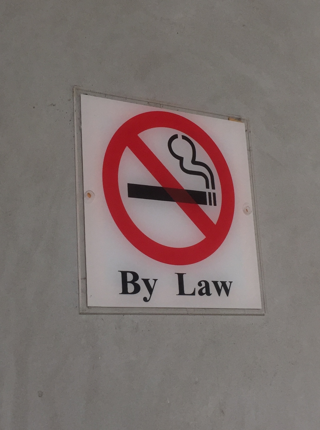
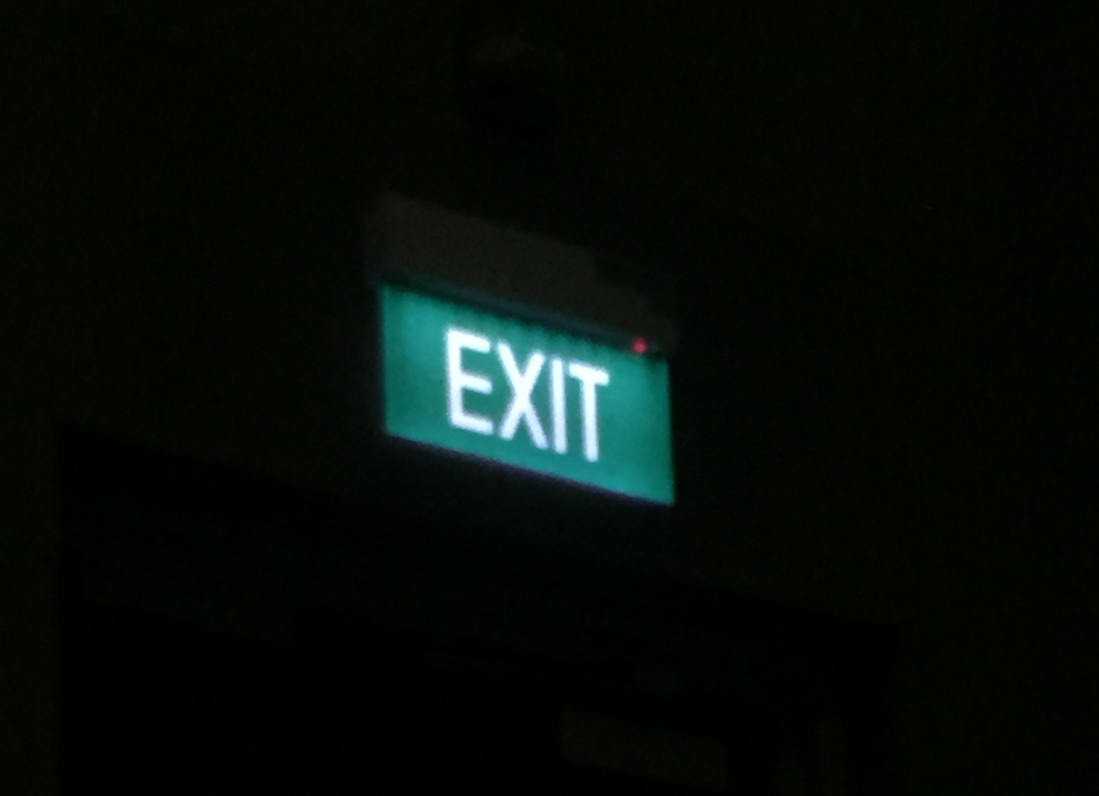
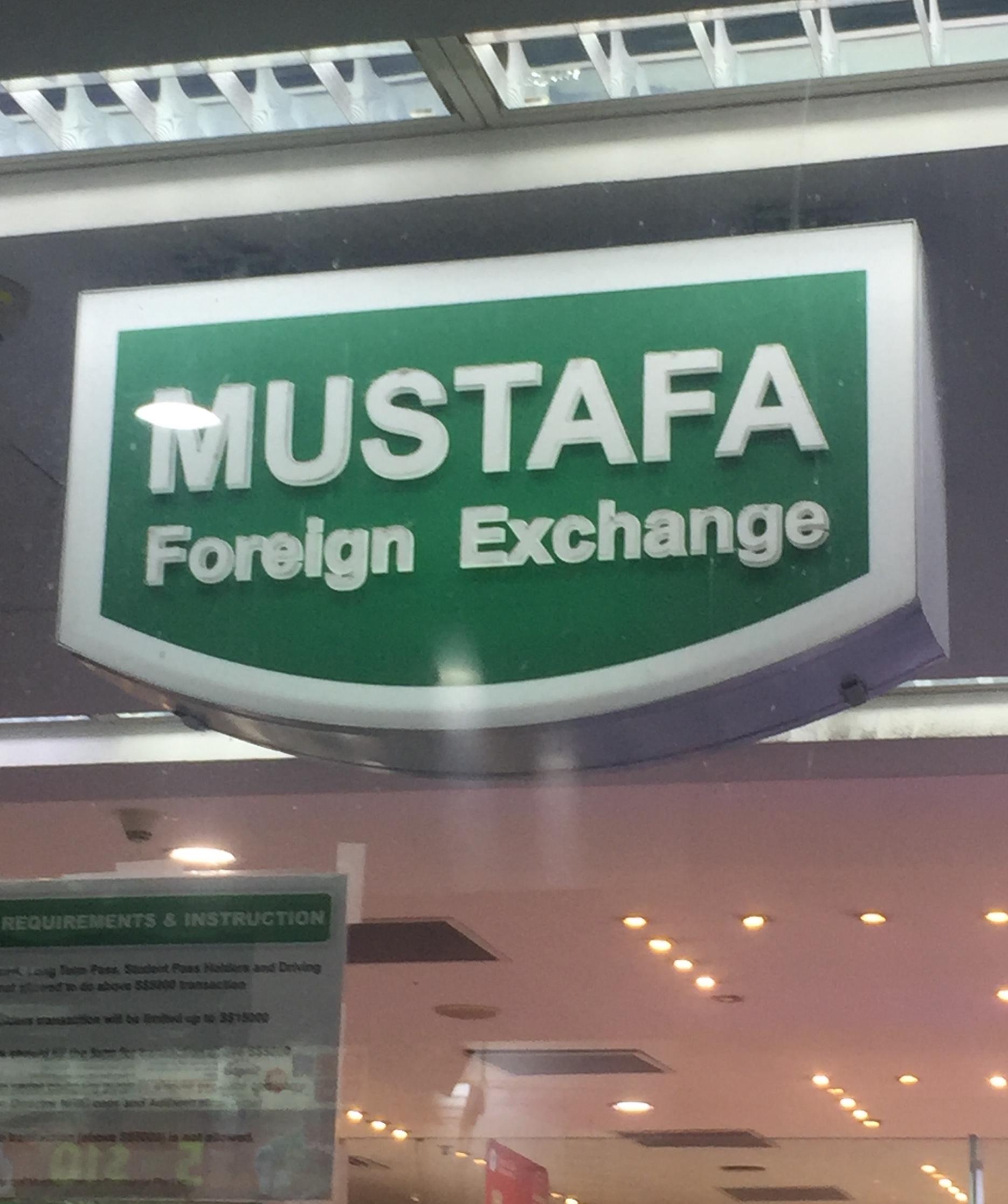
On my learning trip, I saw several typefaces and observed how they were used for different purposes. For example, signs of authority and caution used simple type, either serif or sans serif, as seen in fig. 1-4. In my opinion, sans serif typefaces such as grotesque sans work better than serif as they are easier to read from afar, so fig. 1 does not work as well as 2-4, which are clearer and carry a more serious tone.
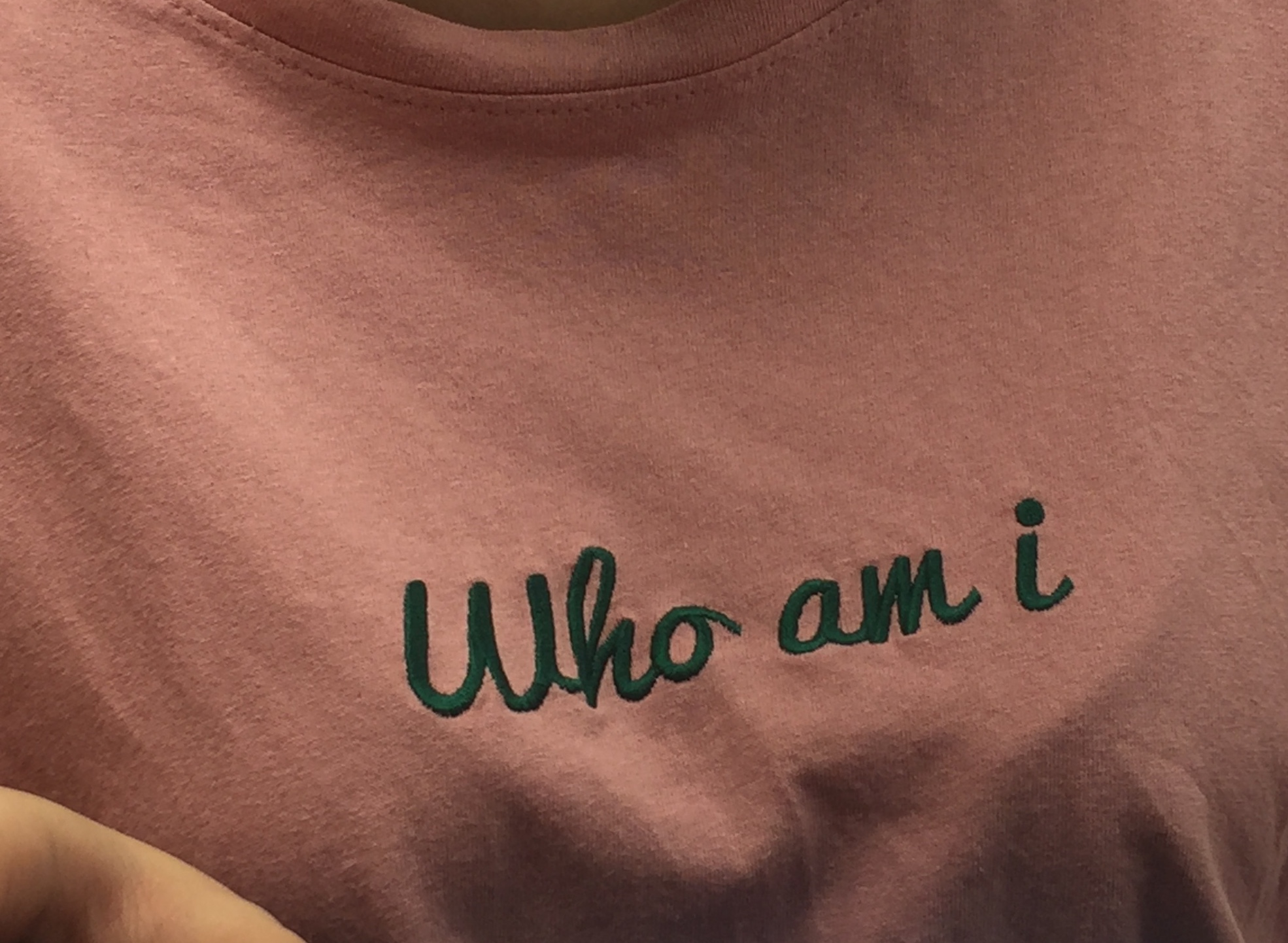
More decorative/fancy typefaces are used in food products and clothing embroidery as seen in fig. 5 and 6. The food product, “Ching’s Chutney” uses slab serif. This font may not be a very aesthetically pleasing typeface, but it gets the job done as appetising the consumer with the chunky nature of the slab serif. I also identified the embroidered text on my friend Claire’s t-shirt as cursive script. It was appropriate in conveying the thoughtful phrase “who am i” as it appeared to drift off and felt light.
Sometimes, simple sans serif font can also be used in household items like the umbrella in fig. 7. By elongating the grotesque sans type, and kerning the font, the overall type is given a more posh and proper feel to it.
Overall, though some fonts may be non-aesthetically pleasing, sometimes, it is more important to consider the uses of them first.


Coming into typography, I expected to learn about the structures of different typefaces and their uses as well as all the technical jargon like leading, kerning. I did not expect to learn the history behind each font and to go into such technical detail. I hope to learn more about how to use font so I understand why certain typefaces are used and how they work for different purposes.
My group is Spaghetti Italy and we will be learning about Comic Sans. It has been an interesting journey so far and I hope our presentation will be too.