Pandora Revisited was one long journey. So this post is organized into the following.
⚡️Flash Overview⚡️
1. The 3 magic words
2. Initial modules
3. Chosen module
4. Latex process
5. Problems & solutions
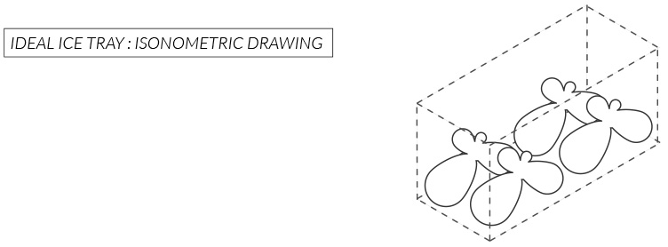
6. Ideal ice tray
7. Actual ice tray
8. Ice making process
9. Ice configuration
10. Looking back
1. The 3 Magic Words
These are the 3 words I was given to incorporate into my module and my understanding of them.
⚡️Shift: a slight change in position
⚡️ Offset: a spin off shape in a different position or size from the original one
⚡️ Join: different parts being attached to each other
2. Initial Modules
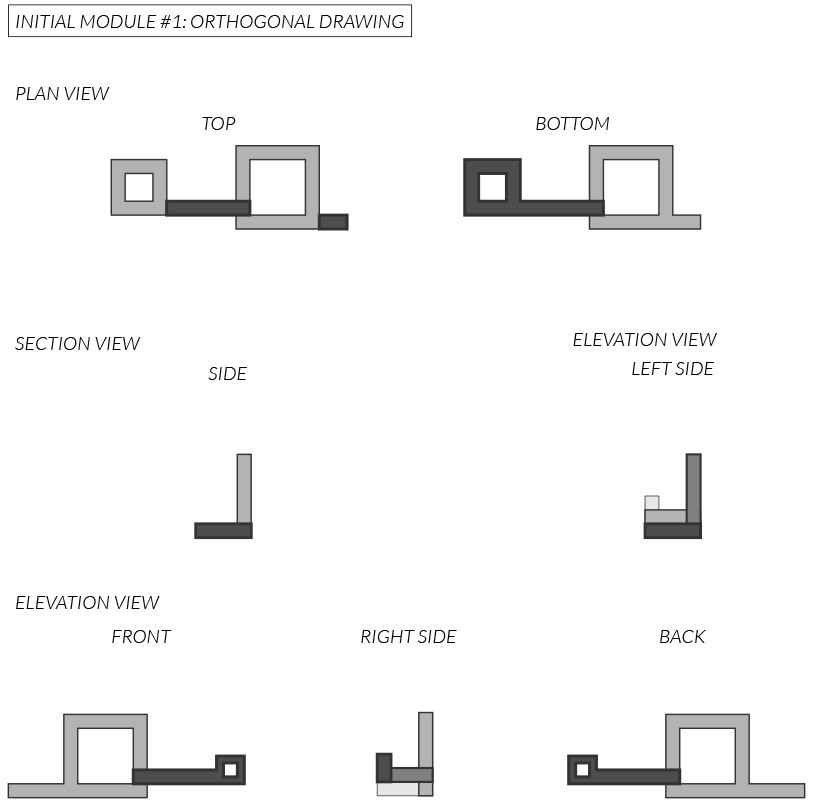
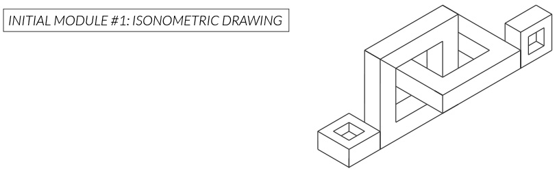
⚡️Initial Module #1
This was my very first module. I was thinking in terms of chains and linking each module together to create the final composition. It was difficult to use clay for creating straight lines for the squares. A better method would be to either use tools like a ruler to cut straight clay blocks or use foam.
The module was out of the picture when I heard we will be making ice trays out of it. It will be difficult to pull this module out of the tray let alone make an ice tray of it in the first place because of how the squares are linked to each other.
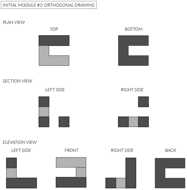
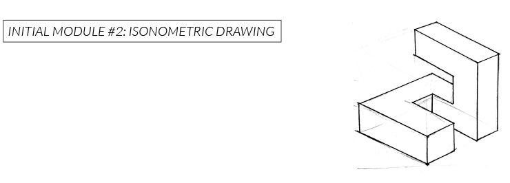
⚡️Initial Module #2
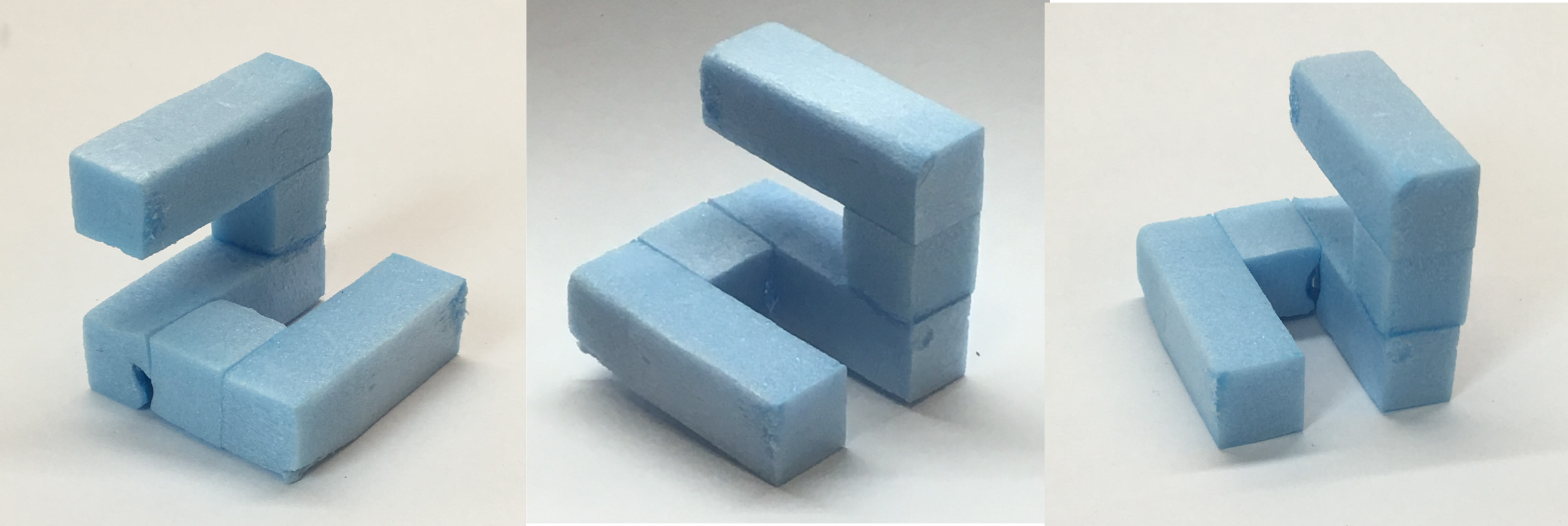
After realizing that complex forms like initial module #1 was not ideal for creating ice trays, I decided to simply the module. Learning from my mistakes, this time I also used a foam and a wire cutter to attain the straight lines.
This module was inspired by the shape of Korean characters (ㄱ, ㄴ, ㄷ, ㄹ). Viewing the module from different angles reveal each character.
For the final composition, this module can be stacked or pieced together like the Tetris blocks.
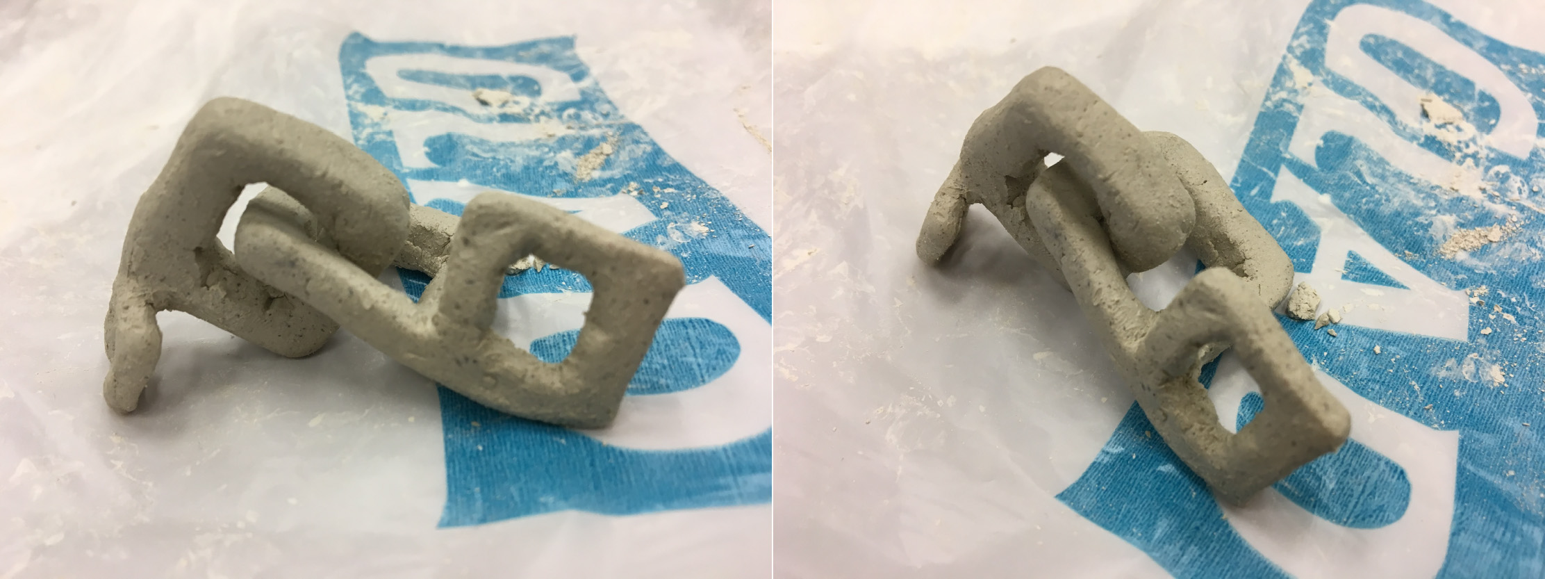
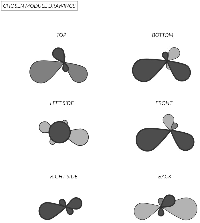
3. Chosen Module
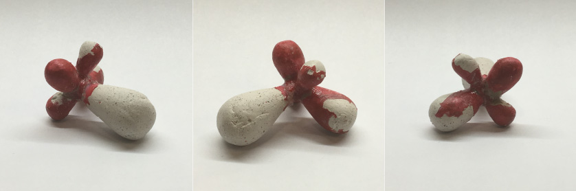
The module I actually chose to make an ice tray out of had circular lines rather than straight lines like the other initial modules. I chose this module over other for two main reasons. First, the ice trays we see in everyday life usually have molds in the shape of cubes. I wanted to against this norm and create a voluptuous round mold. Second, I was curious to see how the ice molds will turn out to look like for this module.
After creating the module, I realized it somewhat resembles a break water. Funnily enough, the module will be replicated in ice and will melt to become water.
4. Latex Process
After creating the modules, the next step is to create a temporary mold out of it. This mold will allow us to make replica of the modules. With 4 to 6 replicas we will create the final industrial silicon mold. This last mold will be our ice tray.
There is 2 ways to create a temporary mold. One is a brush-on latex method and the other one is a press-in silicon method.
I only used the brush-on latex method because it was more suitable for the shape of my module. My chosen and initial modules all had a certain amount of length. Thus, it would be difficult to press it into silicon and get all the details. The press-in silicon method would be more suitable for small sized modules or flat ones.
⚡️ Secure your module on baking paper
I actually sort of cheated for this part. I forgot to bring baking paper back to hall. So I secured my module on a plastic smooth surface. It worked pretty well because it was easy to detach the latex module in the end.
⚡️ Brush a thin layer of latex for the first 1-3 times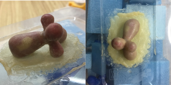
This is the most important step because it will determine how your mold will turn out. I tried to keep two things in mind. First, brush a thin layer of latex that covers every nook and corner of your module. Second, do not forget to brush latex around the bottom surface where your module is touching the baking paper (plastic surface). This will allow you to have a proper mold that have edges that you can hold onto.
⚡️ Brush a thicker layer of latex
The struggle is real. It is a fight of patience. Apply a thicker layer of latex that covers the whole of your module at least 7-9 times. Let it dry for a hour before you apply another layer.
⚡️ Repeat until you get a thick white layer of latex on your module
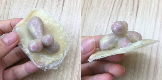
You will know your mold is ready when it become hard to see the color or texture of your module beneath the layer. When it is completely dry, pull the latex layer off your module.
Tada you got your brush-on latex mold now!
5. Problems & Solutions
⚡️ Problems
Problems problems everywhere. I found out maybe I chose the wrong module for my finals when I was done with the latex process.

It was impossible to pull the module out from the latex mold because of all the curves it had. Also, the holes on the bottom were too small for the whole module to come out.
Pulling the module out by force did not end well.
I cut the latex mold to make the holes bigger.
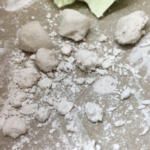
Creating a plaster module ended in failure as well. This was largely due to the difficulties in pulling out the plaster replica.
⚡️ Solutions
Professor Cheryl helped me settle into 2 solutions for the final ice tray.
1. Create replicas of initial module #2 and pour industrial silicon over it
2. Pour industrial silicon over the latex mold of the chosen module
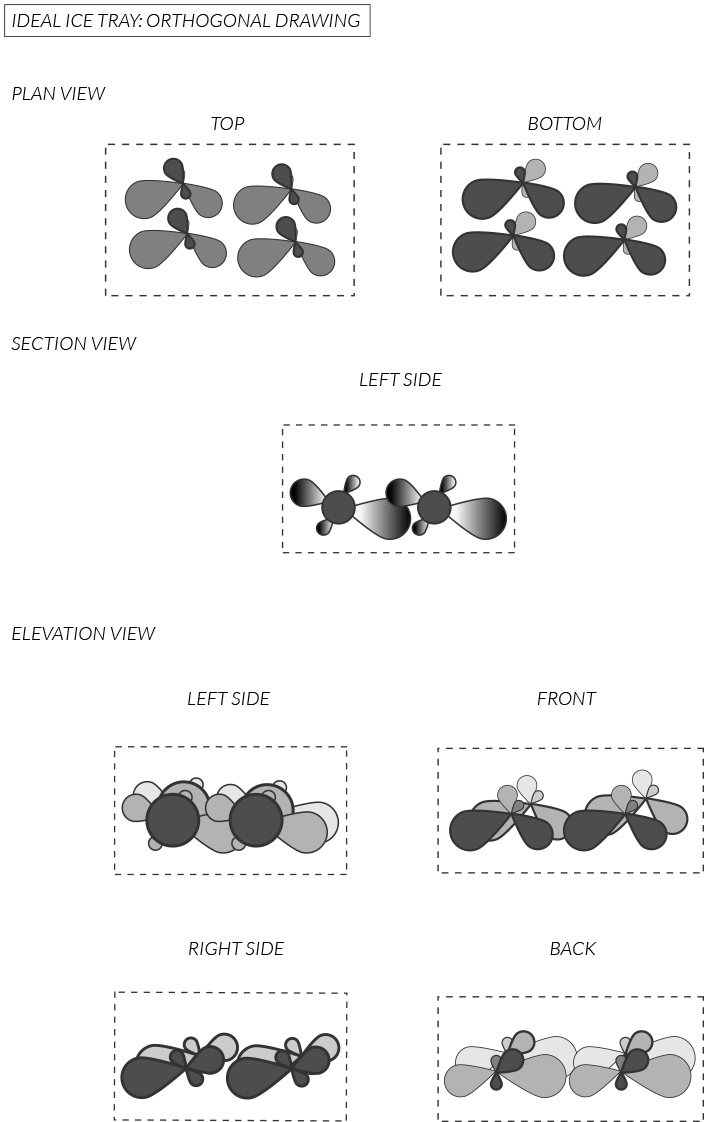
6. Ideal Ice Tray
I want the configuration of the ice replicas to be done by hand. Ideally, the ice replicas can be stacked on each other like break waters. So ideal ice tray will be 4 molds side by side and not attached to each other.
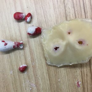
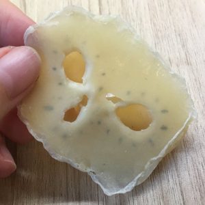
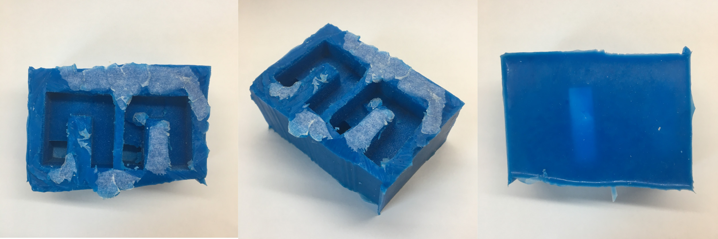
7. Actual Ice Tray
So the actual ice tray looks nothing like my ideal ice tray but things go down right? You’re supposed to make the best out of what you have.
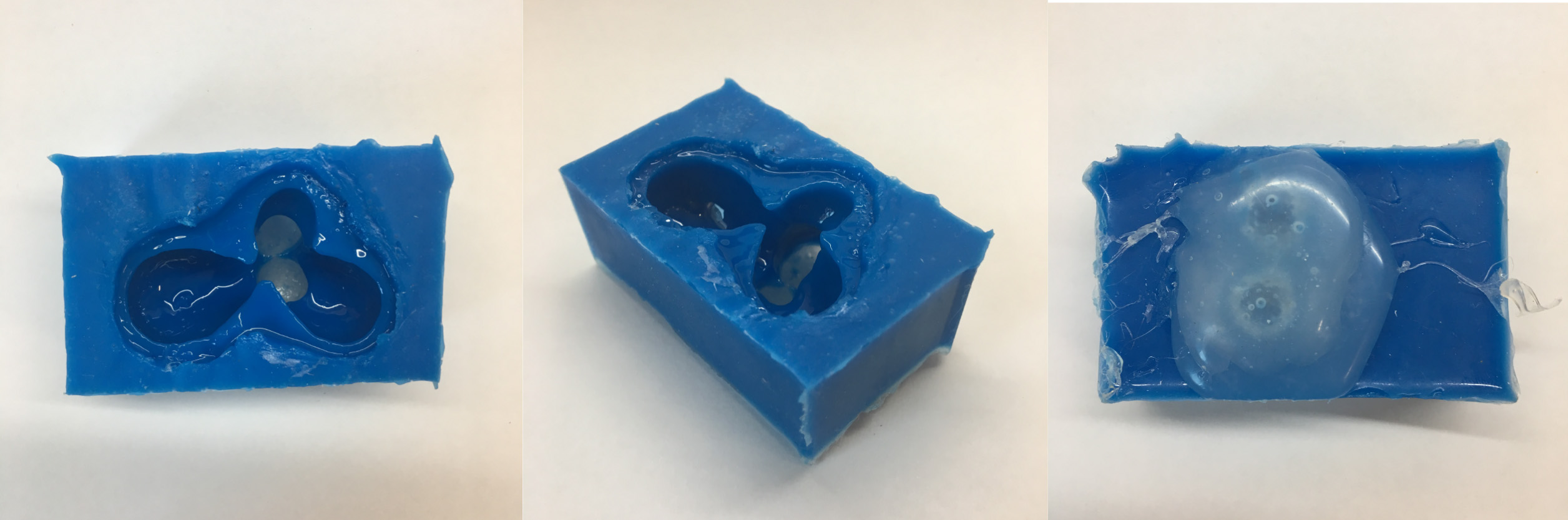
⚡️ Solution 1:
Create replicas of initial module #2 and pour industrial silicon over it
Positives:
-can create two ice replicas at a time
Negatives:
-the modules/replicas cannot be taken out
⚡️ Solution 2:
Pour industrial silicon over the latex mold of the chosen module
Positives:
-was possible to create an industrial silicon mold from a latex mold
-relatively easy to separate the mold and module because the mold has a wide opening
Negatives:
-can only create one ice replica at a time
-the bottom was filled with hot glue gun to cover the holes


 04. Sadness (Homesickness)
 05. Joy (Delight)
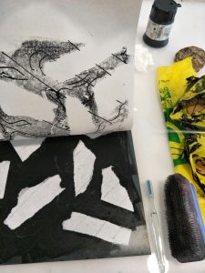
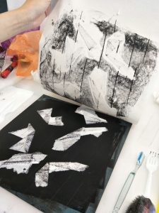
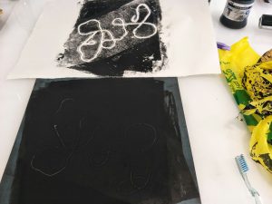 I used strings to attain continuous curved lines. To me it seemed fit to present the emotions of fear or anger. Whenever I get nervous or frustrated I would get a wriggling sensation in my stomach. I felt like strings could represent this feeling. While experimenting I found that the amount of ink applied to the lithograph significantly changes the amount of texture that will be imprinted on the paper. So for the picture shown above, I lifted up a certain amount of ink in the area where I will place the string with scrap paper. Not only did this create a interesting block of grey in a black background, the curves of the string became more visible. I think curves would have been even more visible if I was able to get yarn instead of sewing thread.