Final Project // Haw Par Villa

**For the comprehensive post click here

Group Members
Amanda, Clara, Fizah, Minjee
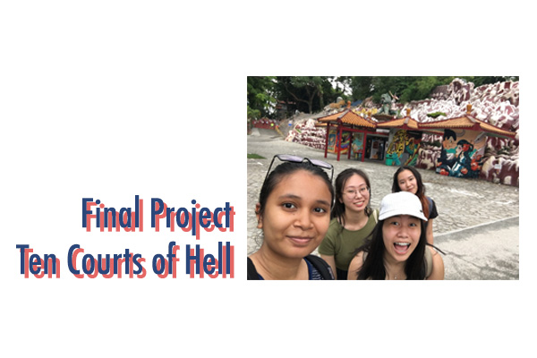
 

Final Project
Our final project was a board game called “Ten Courts of Hell”. Two players make up a team. One player will be in ADM playing the game on a physical board game. The other player will be in Haw Par Villa as the pawn. The two has to work together and communicate via Instagram Live. As they move along the board game, they will encounter at least 10 stations and each 10 stations will challenge the pair to work together to get through it. The ultimate goal is to reach the last station before the other team to win. 


Research
Our ideas went through a drastic change. Initially we wanted to create a performance based on ghost and participant’s reactions. The participant’s interactions with the surroundings will influence how the ghost will act. However, we realized it is difficult to pursue this idea for three main reasons. First, a suitable location. Not only was it not site specific but it is also difficult to find a place where we could set up our performance without having to go through long processes of getting permission. Second, the idea was a bit complicated. It was hard for people to understand the idea when we explained it to them. This made us worried that there will confusion when we actually execute the idea. Lastly, we were not sure how to incorporate 3rd space.

After some consideration and getting inspired by the project “Can You See Me Now (2001)”, we decided to change our idea to a board game in Haw Par Villa. “Can You See Me Now” is a chasing game between the players online and players in the streets. We got the inspiration for 3rd space from here.

For research, the whole team visited Haw Par Villa in person. We learnt about the ten courts of hell and noted the punishments each courts give out. As we walked through Haw Par Villa, we found locations that resembled the punishment of each court and came up with ideas for games. For instance, one of punishments for the 2nd court is being drowned in a lava pit. We found a red arena in Haw Par Villa and decided to make our players play the “Floor is Lava” game.


Documentation

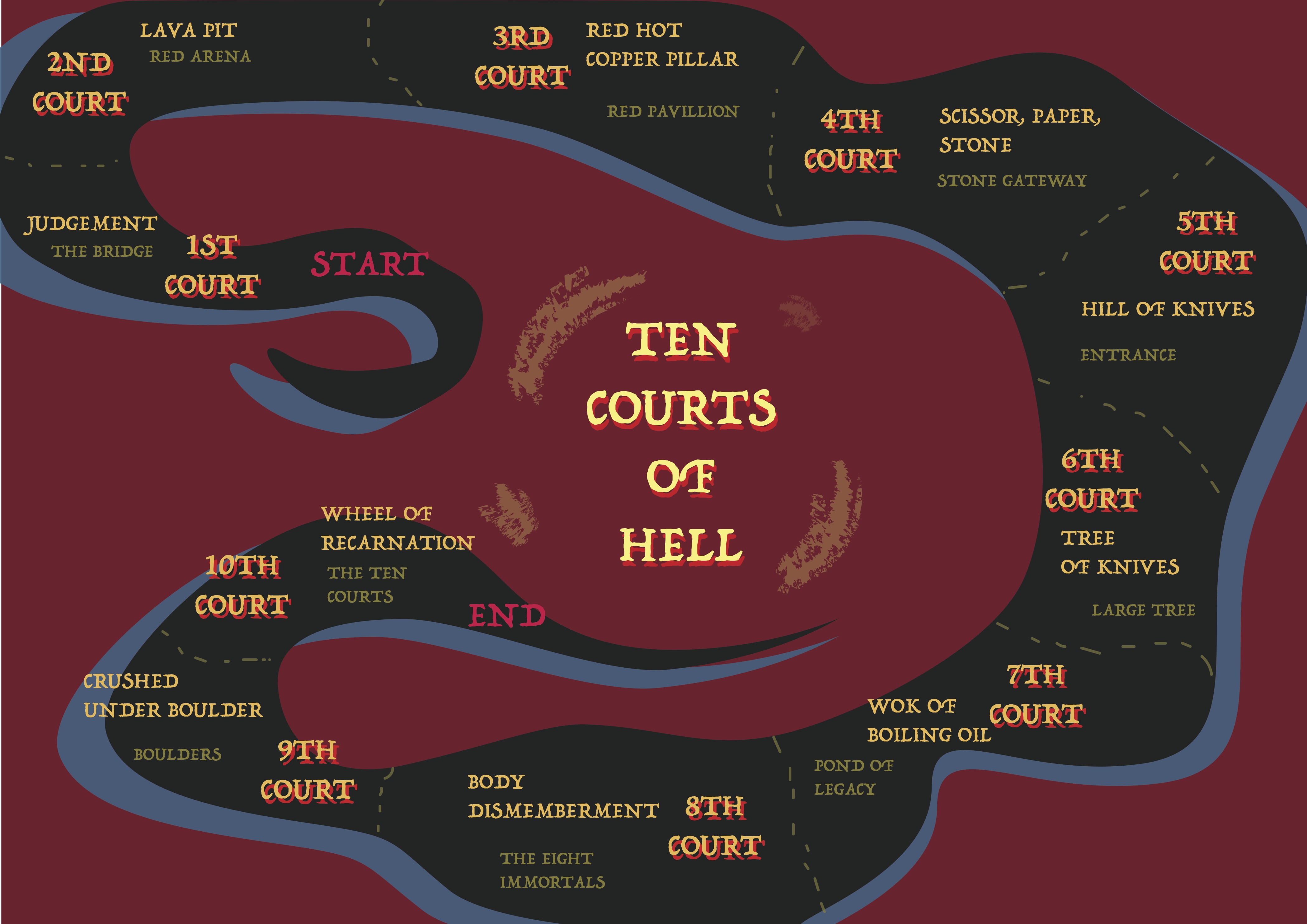
Above is the board game we created our game. Since this was a game that did not exist anywhere else, we had to personalize many of things. In addition to the board game, we created the dice. The dice only had the numbers 1 and 2 because there are only 10 stages in the game and we did not want the players to finish the game too soon.

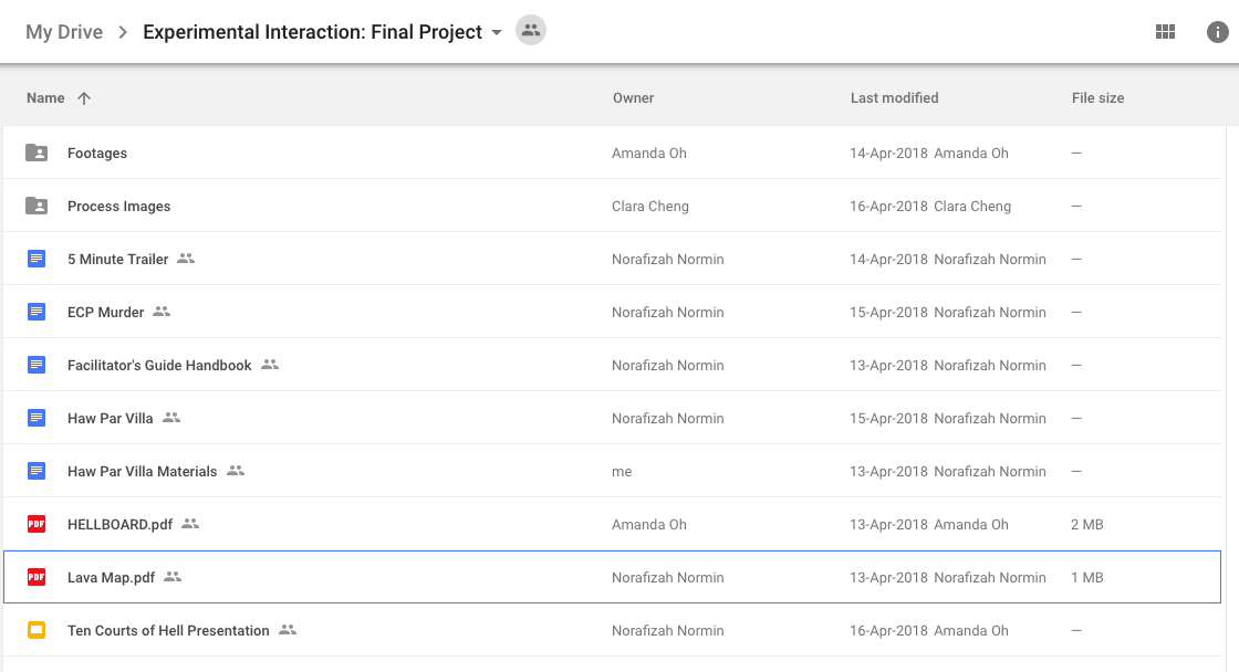
The screenshot above is all the work we put into the final project. To highlight some of them, the “Facilitator’s Guide Handbook” is a PDF handbook we have made for our group mates, in other words the facilitators. This is to make sure we had a handbook we can always refer to when we forgot the instructions for the games or the location we have to move to. In addition, by giving the same instructions to the players we were able to ensure fairness. Another document is “Haw Par Villa Materials”. Some of the games included was balancing a pingpong ball on a spoon while going down a slope in a limited amount of time, going through a box of goo to find marbles, and so on. Each station had a different game and this meant that a different set of materials were required for each station. So in this document we created a checklist where we could make sure we have prepared all the things we needed.

To document the actual occurrence of the game, we had three people working as the camera crew for us. Two was recording each of the Haw Par Villa players while one was in charge of recording both the ADM players. The process could be also be viewed on Instagram Live.

(To view the videos for explaining each game for each station and trailer please check out the comprehensive post linked at the top)


Challenges & Reflections

I feel like the biggest challenge for our team was coming up with an idea that was not too complicated. Because we had a bit of an extensive idea at first which was great but maybe bit difficult to achieve, we had trouble coming up with an alternative to that. But in the end, I love the idea we came up with it and it went really well.

Another challenge was the actual preparation for the “Ten Courts of Hell” game. There was a lot to prepare. Ten different games placed in ten different locations that is related to each court of hell. The materials and rules had to be settled as well. 

Testing out each game really helped us polish up the game and be ready for any confusions during the actual execution. Sometimes we would also realize we need to change the rules so we can incorporate both the ADM player and Haw Par Villa player.

Overall regardless of all the hours and work we had to put in, I am proud of our team and work. It almost felt like a mini Freshman Orientation Camp (FOC). Which is funny because all the members of our group are part of the Programmers for camp next year. I feel like the incorporation of Third Space worked well because the ADM players and Haw Par Villa Players did not have much trouble interacting with each other via Instagram Live. In addition, we were able to have feedback and input from live streaming audience on Instagram. For example at one point, there was a viewer who was telling us it is going to rain soon. However, there is one thing I feel like I could have done better as an facilitator. While going over the videos taken to create the trailer, I realized I was too excited and into the game. I could have been more neutral and partial. For instance, when the opponent team was having technical trouble with their camera, I should have perhaps paused the game to give them more time to deal with it.

ZINE // research & progress

**To view the final product click here

Research

Zines are usually:
-self published
-self circulated
-often inexpensive or free
-topics too controversial or niche for mainstream
-independent publishing
-not about rules or knowledge but about freedom and power
-not supposed to appeal to everyone. It is exclusive.

These descriptions inspired me to create a zine that is personal and exclusive to me. I decided to create a guide to a locale that shows the personal experiences I had there. The zine will be like an illustration album of what I experienced.


The location I chose was City Hall.  I decided to explore the areas that are in a walkable distance from the City Hall MRT station.

Here are some of the rules that I kept in mind when I was doing my research of the locale.

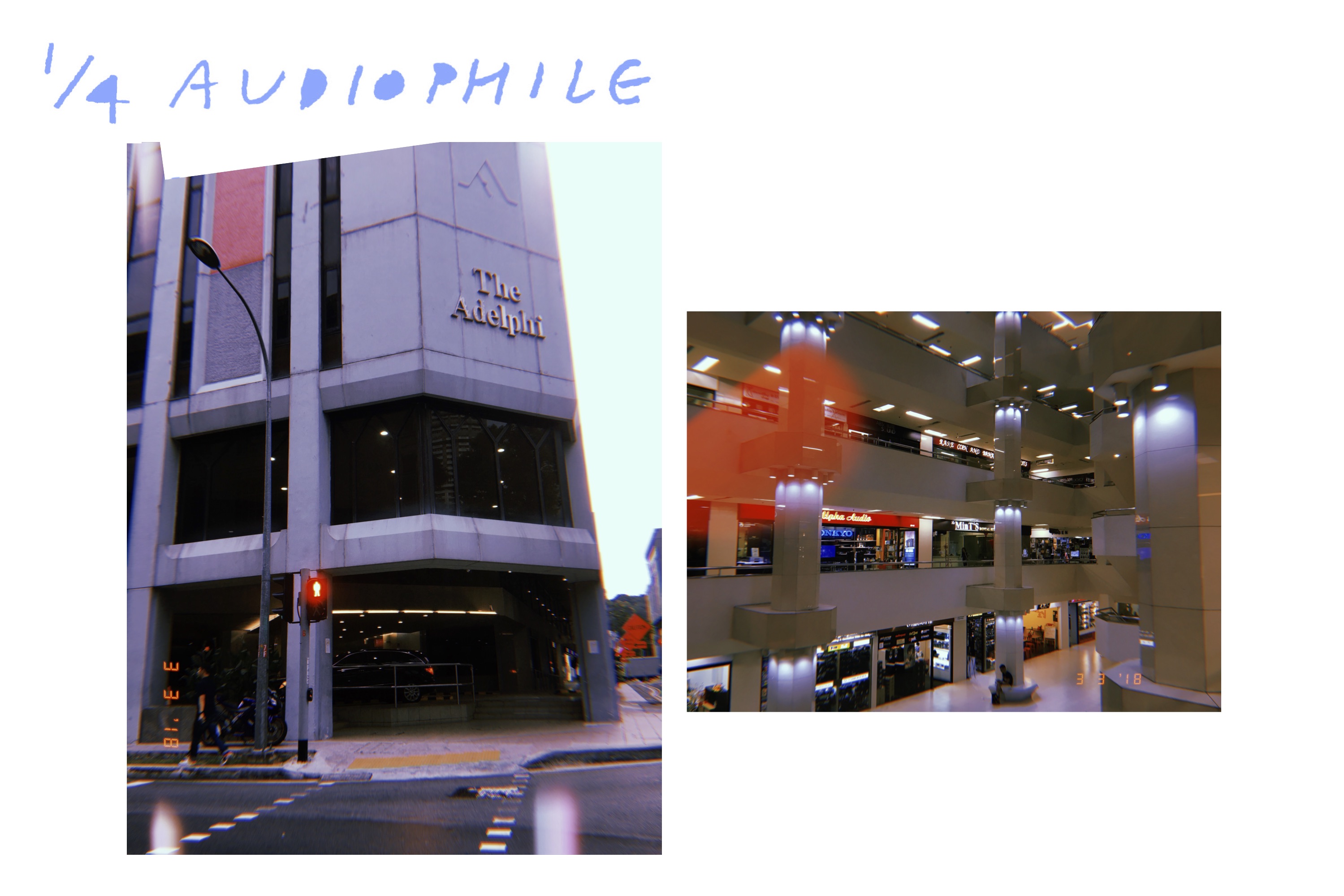
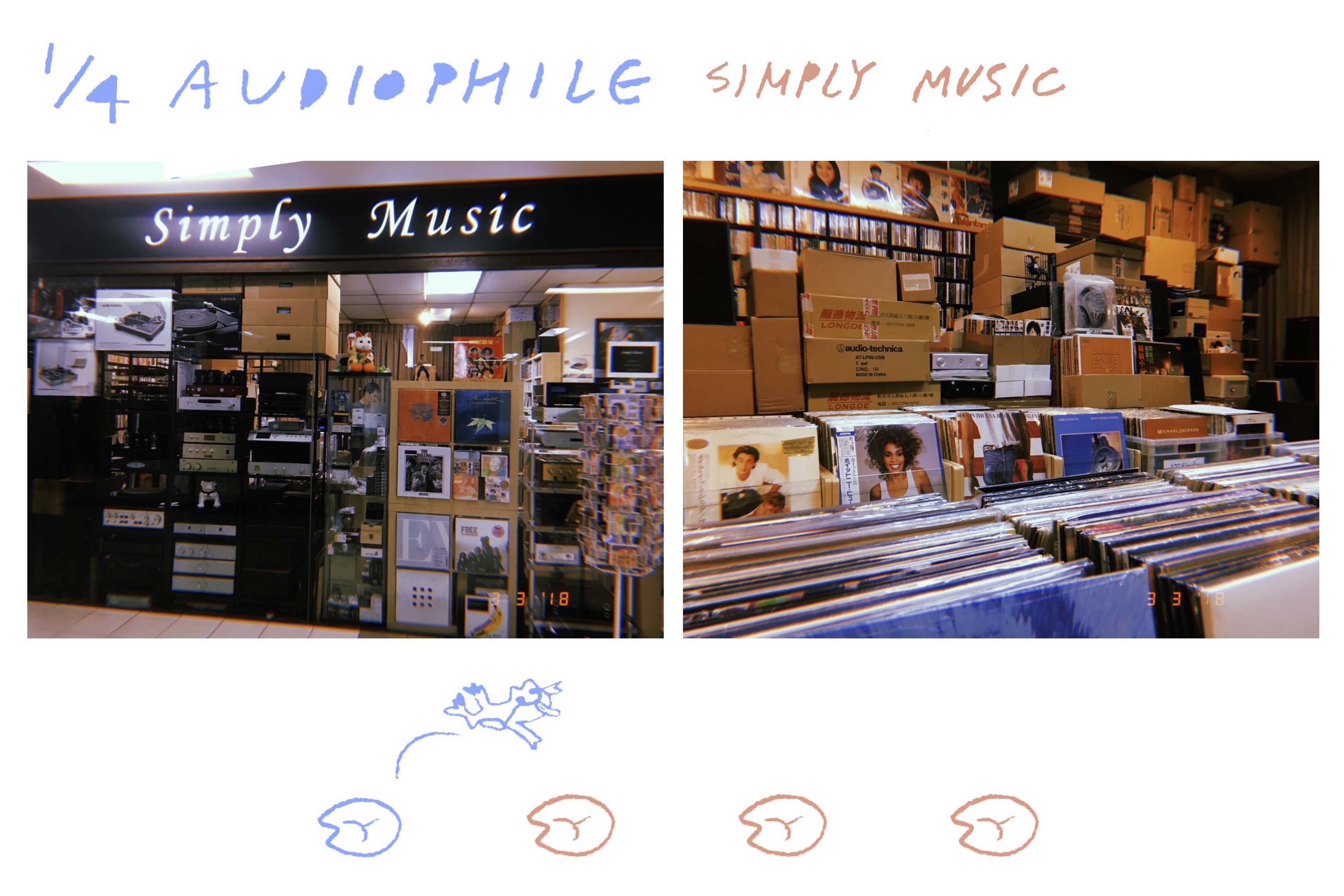
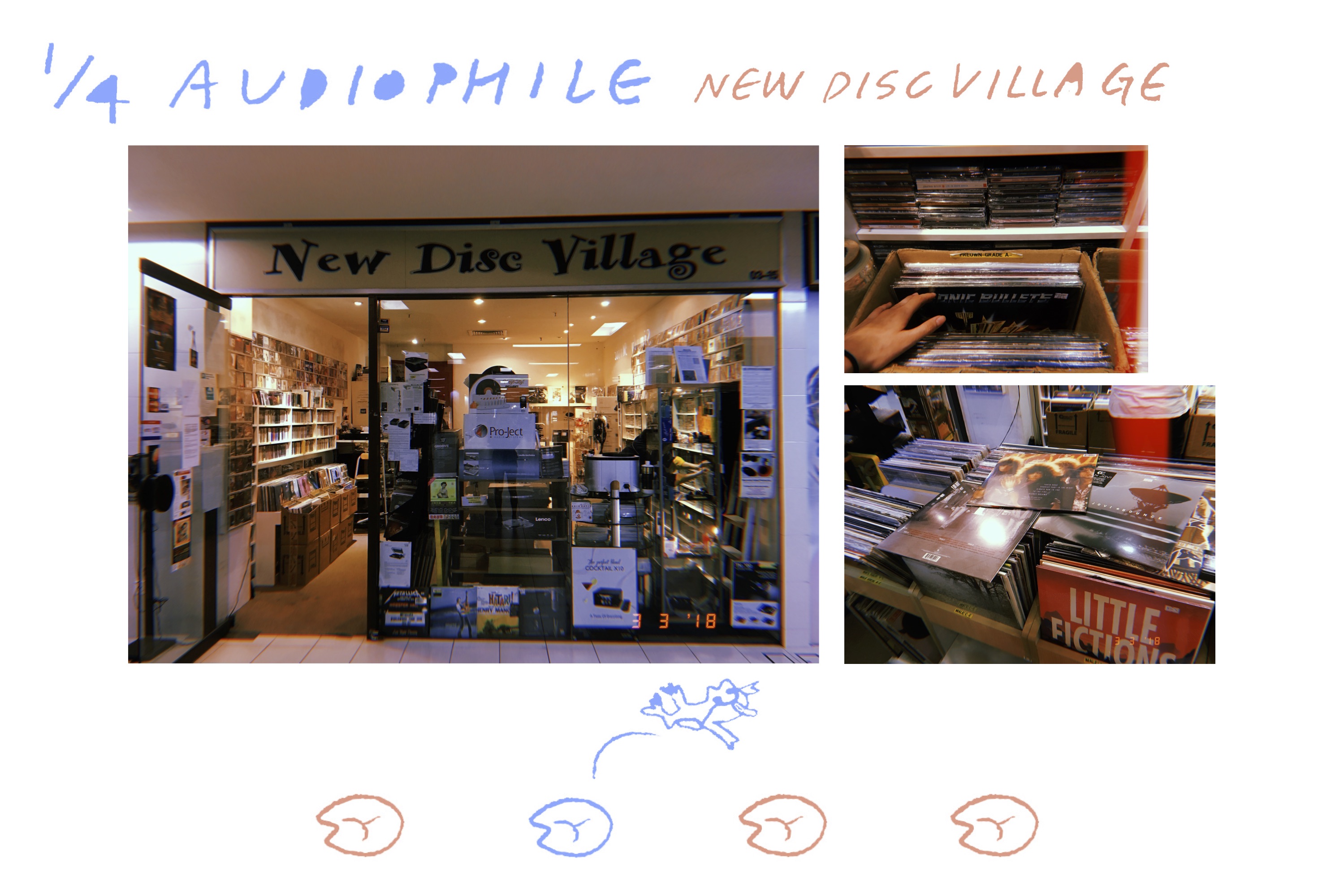
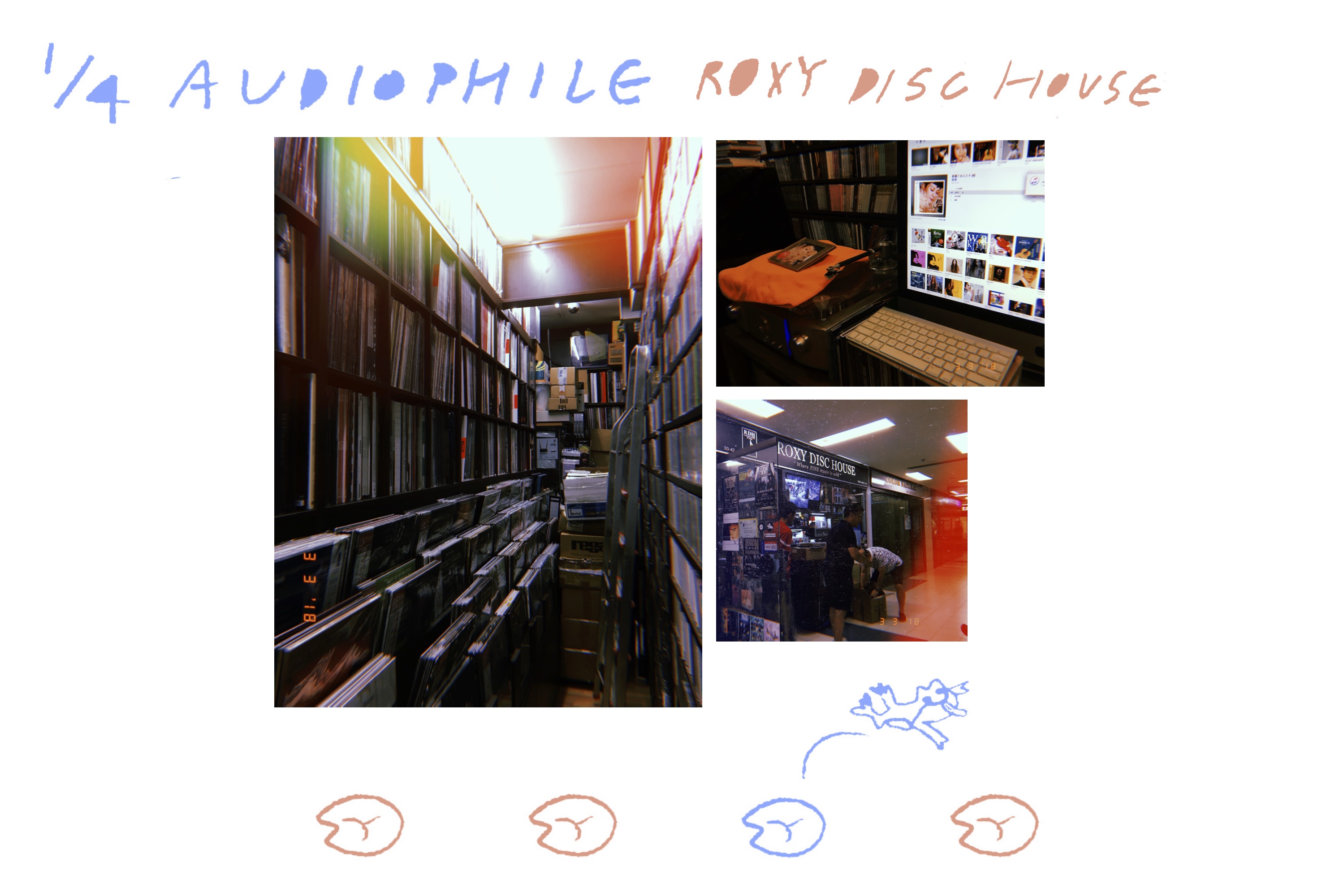
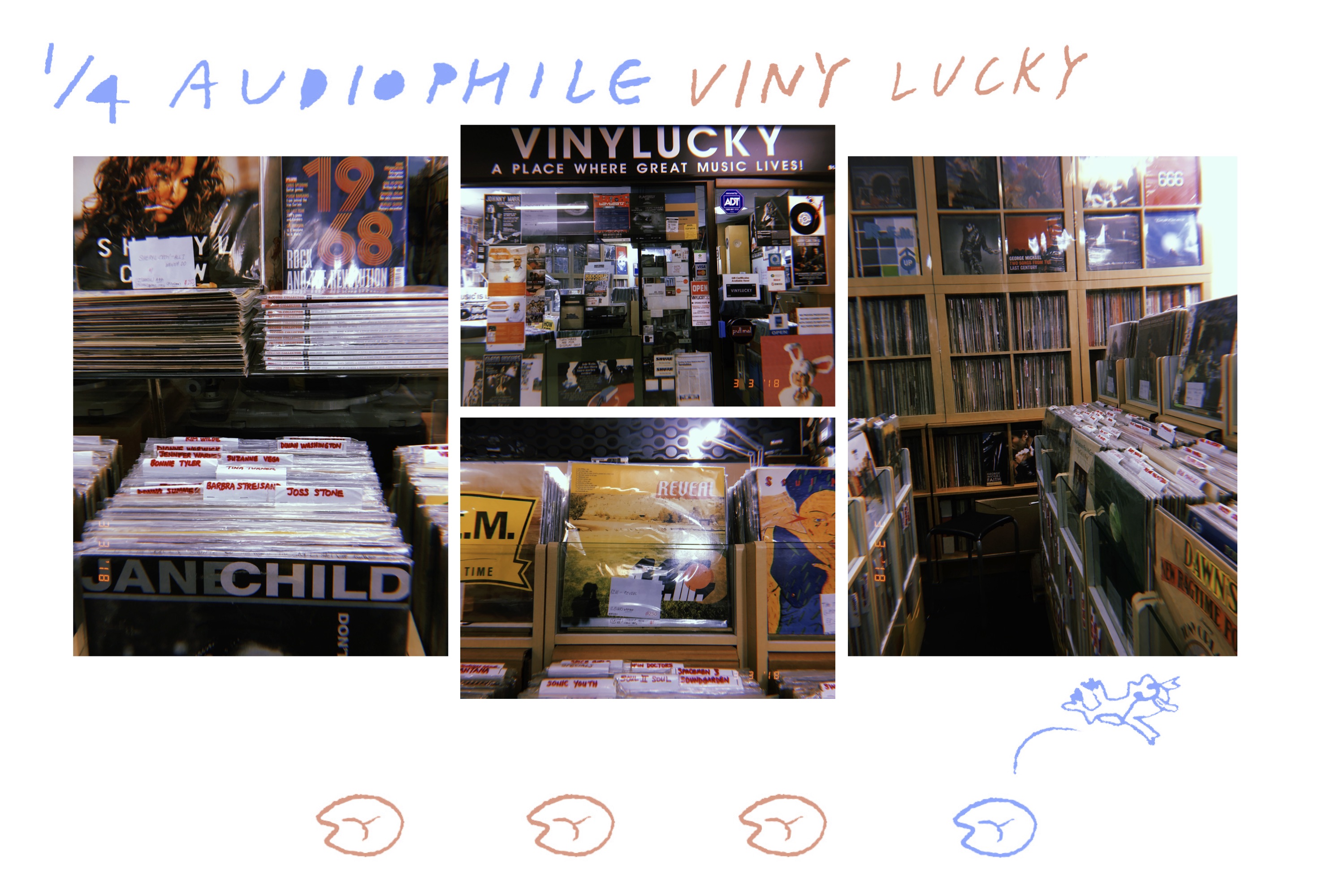
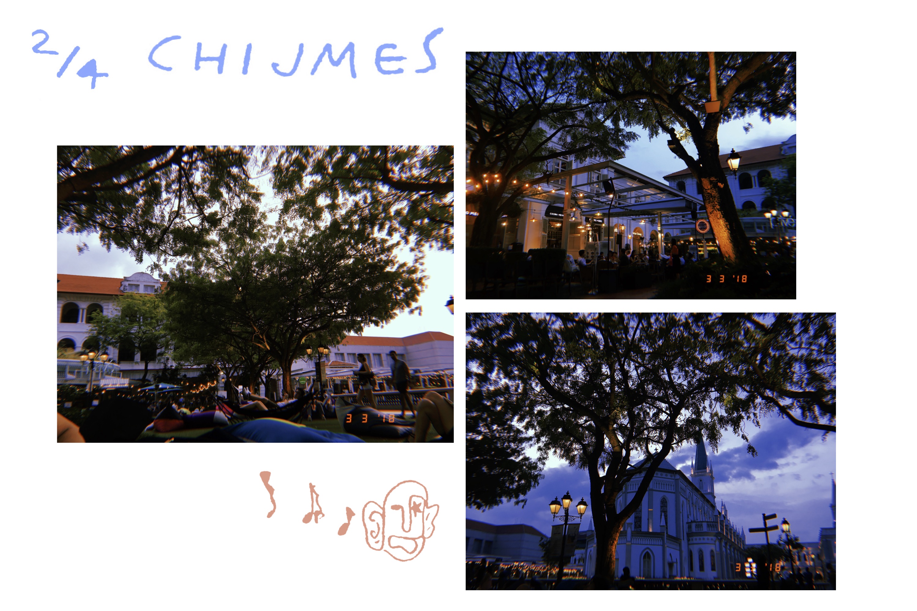
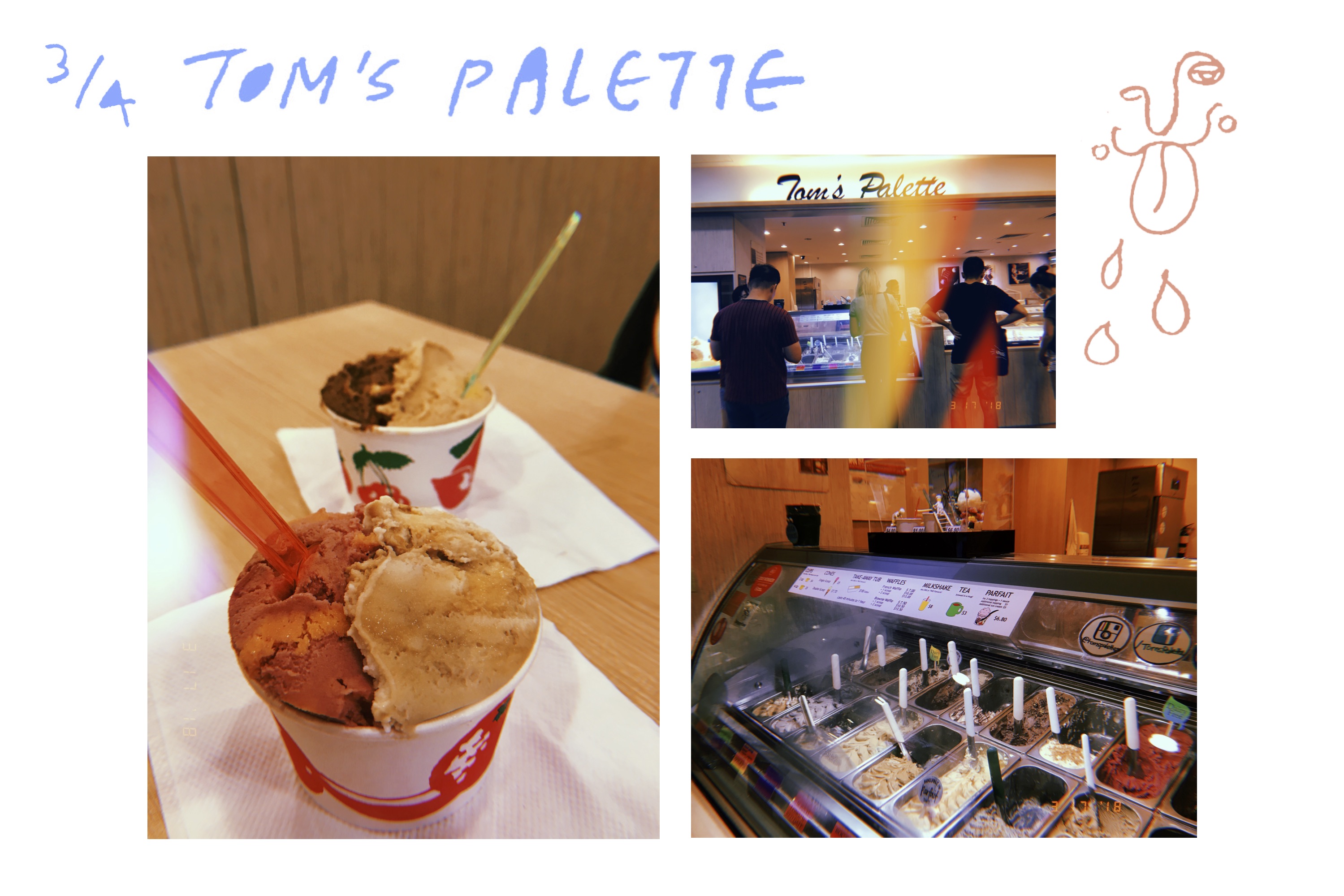
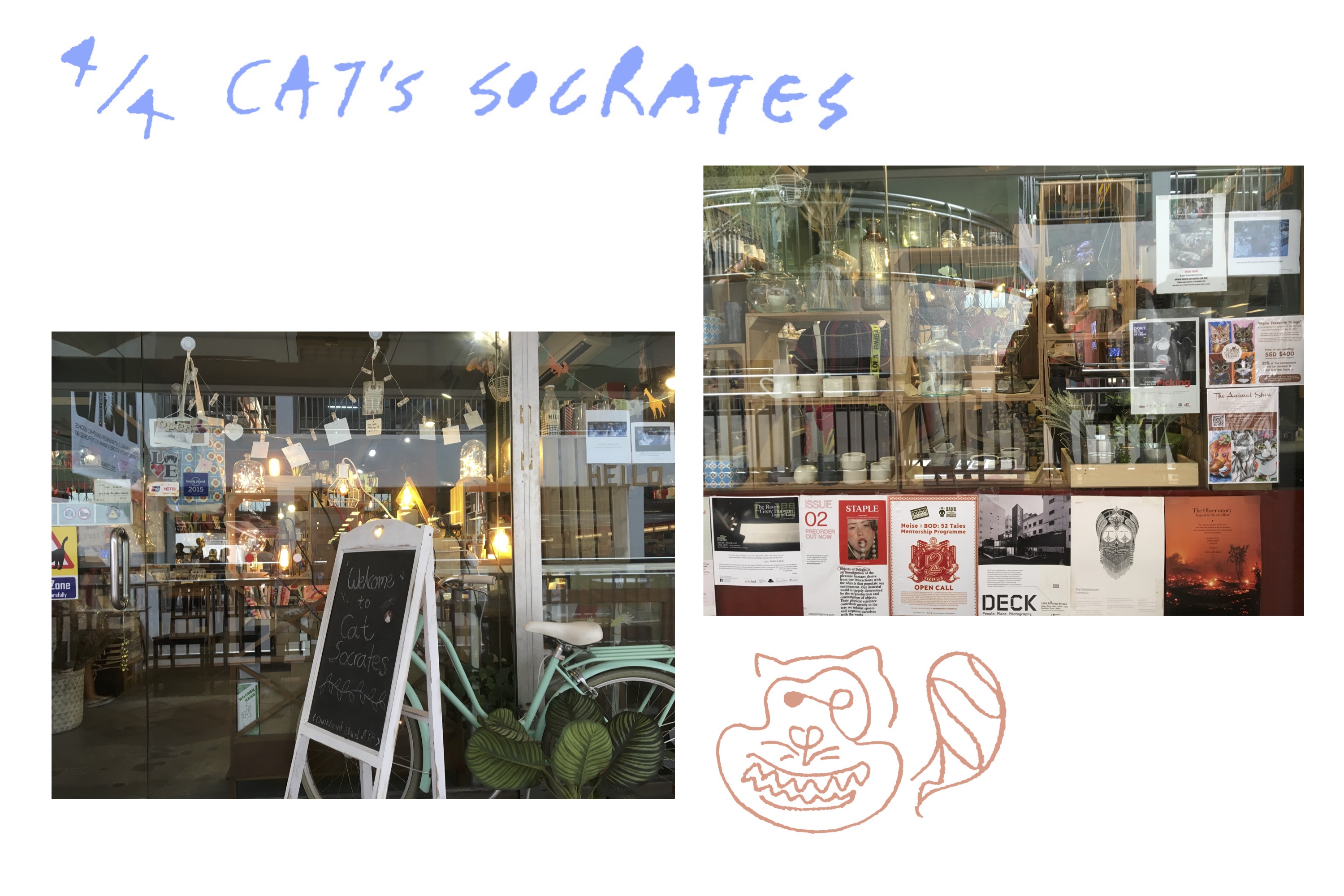
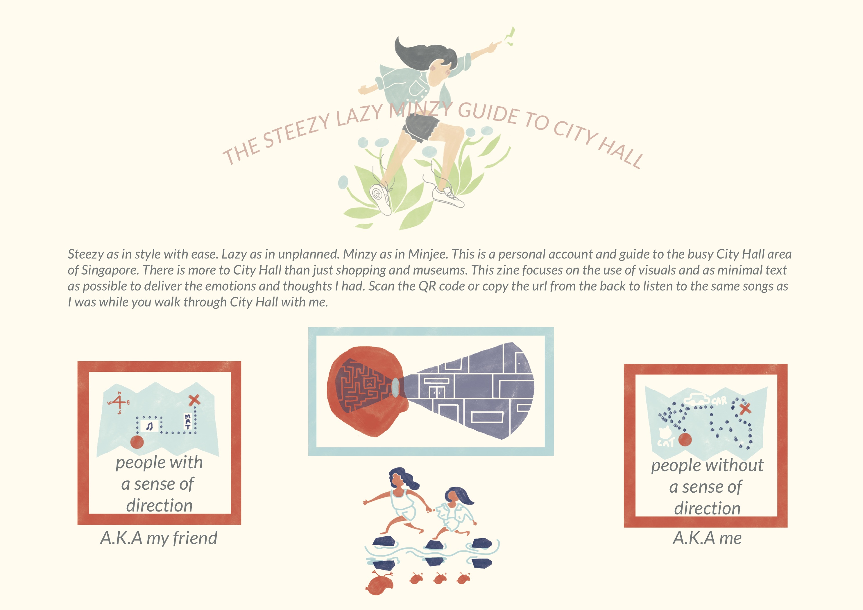
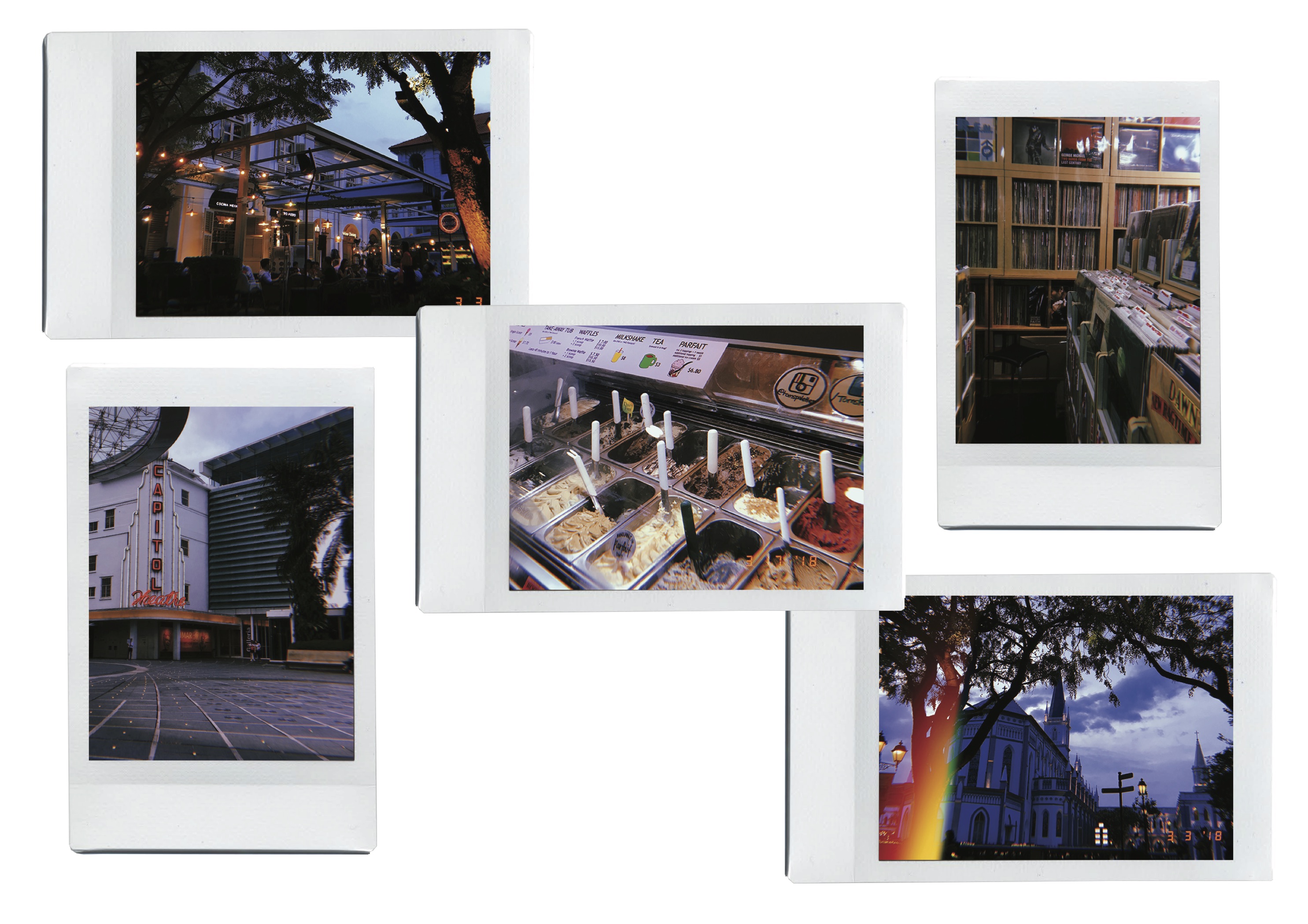
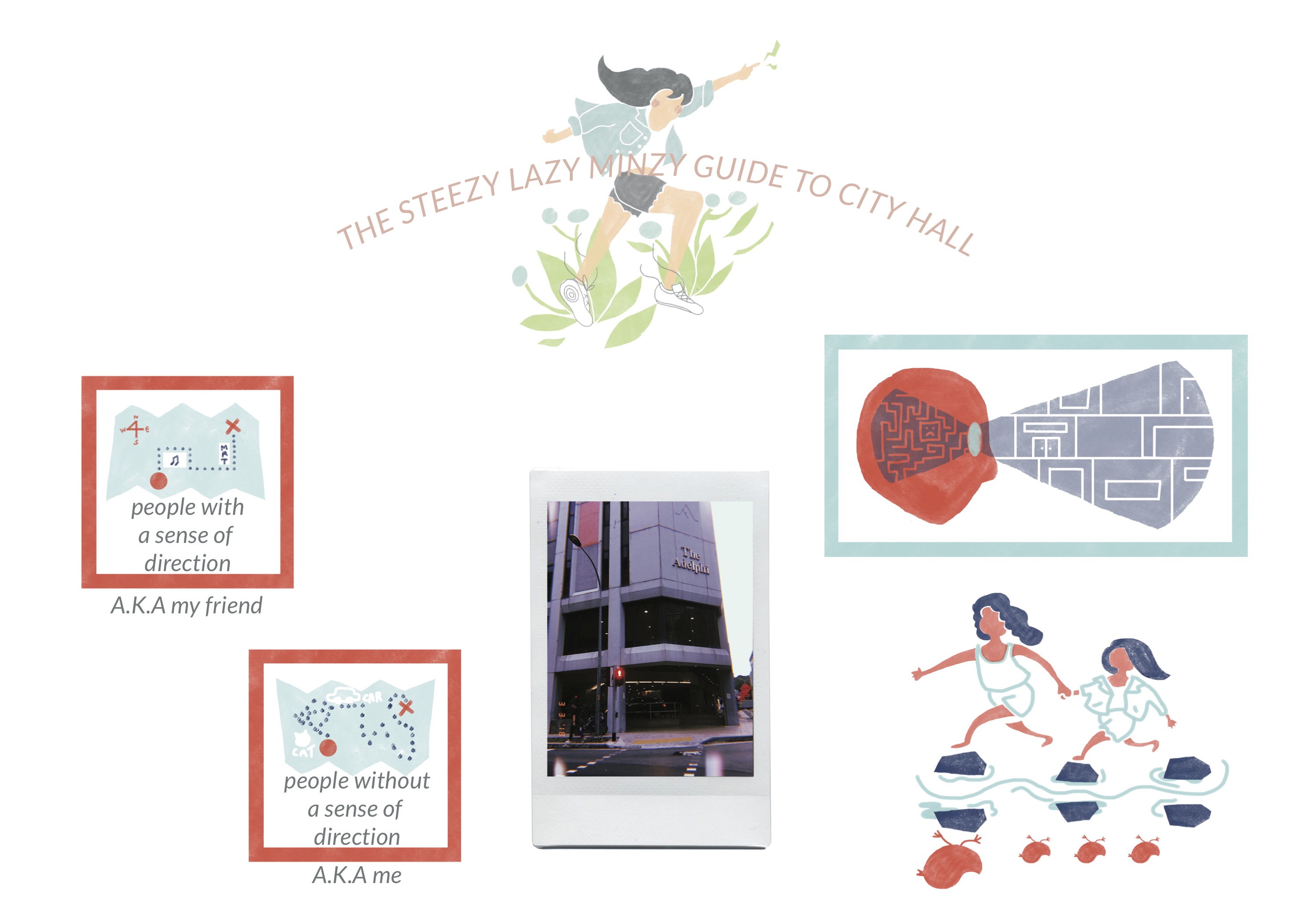
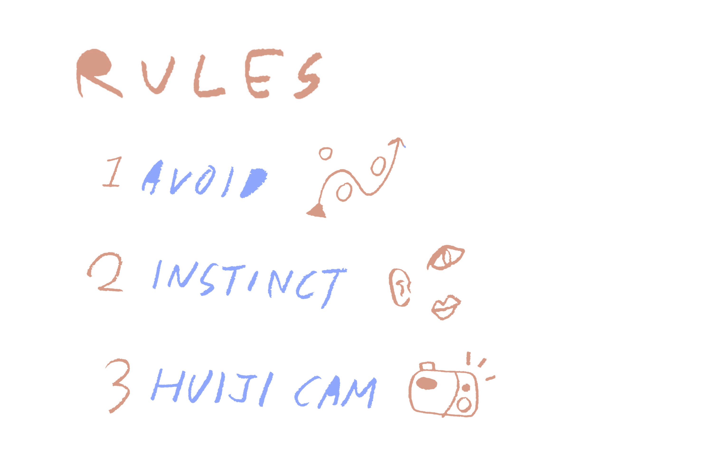
Rule number one: avoid. City Hall is a bustling area well known for shopping and its many museums. I wanted to show that City Hall had more to it than that. So I decided to try and avoid the main locations people would usually go to.

Rule number two: instinct. There are two types of people when it comes to traveling. First, the ones who plan months and weeks before a trip and has an excel sheet with all the locations and prices. Second, the ones who plan on the plane ride. I am more of the latter. To make my experience more realistic and true to myself, I decided to go as unplanned as possible and follow my instincts. I will go around the area without a plan or schedule. I will eat or rest or decide to skip some locations I had in mind if I wanted to at the moment.

Rule number three: use the Huiji camera app. It has become so easy to click as many photographs you want with your phone. I wanted to go back to the analog film style where you would carefully choose your photographs because there is a limit to how many you can take. I tried to limit myself to taking only 3 photographs in each location so I will only capture the most precious moments.


The first location I went to was The Adelphi which is a building of heaven for audiophiles.

The first impression I had was ‘orderly messy’. There was so many stores in straight rows. But the items being sold are usually vinyls, record players, vintage cameras, camera analog films, good quality speakers, and so on that was displayed in a orderly mess. Both battered and old vinyls were stacked neatly in crates or shelves. However, there were crates and shelves everywhere.

There were so many stores that it felt like a maze to me.

The laid back vibe in the building was noticeable as well. Some of the shop owners and customers seemed to be quite close to each other. It seemed to be a tight knit community where you could exchange records or where regulars would get a discount or secret notice when the record they have been looking for comes in.


There were 4 main record shops that was memorable to me.

First, Simply Music.

They had a moderate mixture of both old and new vinyls. Example of the old vinyls that could be found here was mostly old movie soundtracks like the OST for ‘My Fair Lady’. One of the newer vinyls that I saw here was the ‘Divide’ album by Ed Sheeran.

Second, New Disc Village.

The best memory I have of this shop was how the seemingly grumpy and uninterested shop owner wordlessly appeared and placed 3 Bon Jovi Vinyls in front of me and my friend when we were looking for them.

Third, the Roxy Disc House.

This shop was a bit different from others. While most shops had mostly English oldies, this shop had more Asian oldies than English. The Asian oldies ranged from Japanese, Chinese, and even some Korean.

Also unlike the other shops that generally used crates and short shelves, this store was full of long shelves that reached the ceilings.

It was really interesting to see the juxtaposition of old and new as well. Surrounded by old vinyls and CDs were a modern Mac laptop better than the one I had and great speakers to play Japanese music.

Fourth, Viny Lucky.

This shop had the most diverse collection of genres and music. Also, it was organized with tabs that had the specific names of each artist so it was easy to go through the vinyls.


After the long walk in Adelphi we decided to chill at Chijmes. We rested on the bean bags and watched the sunset. The small fairy lights, fluorescent lights, music playing from nearby shops. They all helped set the mood. We were lucky enough to catch a live performance as well.


For refreshments we went to Tom’s Palette which is a special ice cream store. They have very diverse ice cream flavors. One example is salted egg yolk.


Cat’s Socrates is located near the Bugis Art Friend that ADM students are probably very familiar with. I liked the location of Cat’s Socrates because it reminds me of how venturing out of your usual path helps you discover new things.

Cat’s Socrates felt like a melting pot of Tiong Bahru. They had all the badges, pins, patches, ceramics, indie books, children’s books, fairy lights, and so on. They even had a cat.


Layout Reference

I wanted to use as minimal text as possible. I wanted to communicate using visuals so it’s easier to be in the same mood and vibe as I was when I was in the situation.

I will use straight rigid boxes for some the locations and some more free flowing ones for other locations depending on its vibes.


For the photographs I would like to photoshop them into polaroids to match the analog vibes. Plus the frame will help it fit into the layout of the comic book style.


As I used the Huiji camera app which is inspired by analog film, I decided it was only right to use polaroids.


Artist Inspirations

Tom Haugomat

I really admire his illustrations. He usually illustrates wide sceneries with people in them. They are simple but yet so expressive. I think this is due to two main reasons. Firstly, his color palettes helps set the peaceful mood.

Mark Conlan

Like Haugomat, Conlan’s illustration has the simplistic vector style as well. But it differs in how his illustrations tend to show more abstract ideas rather than sceneries. They are expressive in a different way.


Process

Sketches & Illustrations & Colors

I wanted the illustrations in my zine to look like quick sketches or doodles in a travel journal. Like the inspiration artists, it should capture the essence and mood while being simplistic rather than elaborate. I also wanted to use a limited color palette. The illustrations will only be created using 3 to 4 colors for a sense of unity. As a result, this could end up in using an unrealistic color to represent something.

I also planned to introduce a different color palette for each location. This will help viewers feel like they are entering a new location like I am.

Different color theories were taken into consideration for each location as well.

For instance, the 3rd row that consists of the yellow, light green, and dark green is for the 2nd spread. The 2nd spread shows the different stuff I found in the Adelphi record stores. Overall it was very calming to be in the record stores. As a result I used analogous colors. The harmony between the colors gives a balanced mood that helps create the ambience I felt when I was at the record stores.


Storyline

Despite the various locations I have actually been to, I ended up using only some of them.

Adelphi
Cjimes
New Disc Village
Roxy Disc House
Simply Music
Vinylucky
Tom’s Palette
Cat’s Scorates
On the way (things spotted while walking around)

There are only a limited number of pages so I decided to choose only the most crucial ones. For Cat’s Socrates, I realized it was closer to Bugis MRT station than City Hall MRT station so I decided to take it out.

For my first encounter with Adelphi I decided to talk about how it seemed like a maze to me and I was overwhelmed by it. There were so many stores and hallways that I was not sure where to start. The fact that all the stores were selling similar items; records, did not help me distinguish between all of them. I wanted to talk about how lucky I felt to have my friend guide me through the place. So I illustrated how the simple structure of Adelphi seemed like a maze to me, difference between people who have a sense of direction and those who do not, and a representative image of my friend guiding me through the place.

The illustration of my friend leading me through Adelphi is one my favorites. It is the bottom one in the layout shown above. The person leading the other in the front is my friend. She is depicted bigger than me to exaggerate the fact that she is in control of finding the way. I also illustrated the actual outfits we were wearing that day. We are shown to be jumping over stones. The reflection on the other side shows her as a mother duck and me as one of the baby chicks to represent how I felt when I was following her.

For the 2nd spread I wanted to show all the objects I saw in Adelphi spread around. Personally, Adelphi record stores were like a treasure hunt where you had to look around to find stuff so I wanted viewers to have the same experience. Hence, the reason for the organization in the spread.


For the last spread I used polka dots for an energetic and happy introduction to Tom’s Palette ice cream store because that was how I felt when I saw all the choices they had.


Photographs

Initially I have planned to add the photographs I took with the Huiji camera app. They will be photoshopped as polaroids to add onto the analog vintage vibe.

So I measured the size of actual polaroids so that when it was printed it will look realistic. When I placed the photographs on the zine, however, they looked too rigid and out of place in comparison to the illustrations. I think this was for two main reasons. Firstly, the color palettes did not match up so overall it looked like two different things going on. For the illustrations I usually used pastel like colors. The photographs, on the other hand, were vintage film like dark colors. Secondly, there was no interaction between the photographs and illustrations. For instance, the two might have looked more natural together if there were illustrations drawn on the polaroids or scribbles on it.

As a result, I decided to focus on the illustrations and not use the photographs. I think this helped me think outside the box and straight lines and have pages that are more free flowing on spreads 2 and 3.


Music

I felt like music was a big part of this journey to record shop and to put in a personal touch to the zine because I love music. Also, it would help the audience to feel the same ambience I was feeling through a set playlist. I was interested in creating a new experience where the audience will be listening to an audio while reading. Below is the playlist I created for my zine.

To help the audience access the playlist, I created and added the QR code to the link at the back of the zine. I added a shortened URL as well for those who might be having trouble accessing the QR code.

Symposium Hyperessay

Maria X walked us through the telematic performances. These included performances such as “Satellite Arts Project (1977)”, “How To Behave (2003)”, “The Lightroom (2002)”, and “If Not You Not Me (2010)”. One of the most memorable projects mentioned was “Hole in Space (1980)” is where they take the performances to the streets. A public communications sculpture was placed in two different regions; New York and LA. These sculpture shows televised images that attract both the sights and hearing. Or as quoted “Sever distance” between the two regions. Another main example was “Telematic Dreaming” by Paul Sermon. Here the performer and audience meet telematically. So the experience itself would be 1:1 but the performance was shows to the public. With this in mind, it is worth wondering how this fact changes the performance.

The other keynote speaker Matt Adams introduced us to other performances as well. One was “Kidnap” where the performers agreed to be taken to a secret location. However, although they granted permission to be ‘kidnapped’, the timing of the ‘kidnap’ was unexpected. The spontaneous kidnap along with the bad over the head makes everything real.

The first performance by Jon Cates and Annie Abrahams occurred on the Friday. It was a performance with collaborators from different regions. Latencies were called out and we were shown their ceilings. Afterwards, humming, hand movements, and assimilated water drippings were shown. Some of the quotes we could hear in the background were “many of my favorite artists aren’t artists” and “don’t ask for the truth if you can’t handle it”. The performance also takes advantage of the universality of the performers. Some Russian sayings could be heard along with Korean sayings like “어디야” which can be translated to “where are you”. This continues onto a disturbance or destruction. One of the examples of these quotes are “you reach a point in a life where the dead outnumbers the living”. The performance ends with the closed eyes of the performers.

KINETIC BEASTS // plover birds research

When I was assigned the crocodile and plover bird, the first thing that came to mind was a childhood picture book.

The main characters are Bill the Crocodile and his “toothbrush” friend Pete the bird. How they help each other seemed to be the perfect representation of the win-win relationship the animals have with each other.


After observing the Plover bird in flight, I came to the conclusion that it has hovering wings. It tends to have a small wings that are elliptical in shape.


Above demonstrates the range of motion a bird has during flight. Different angles can be observed in both the usage of wings and elevation of its body.


Within Plover birds there are different colors. The most common one seems to be the Egyptian Plover Bird which has a mixture of black, white, greyish green, and orange red feathers.

Features to remember are:
-spread wings have an elliptical shape as it is broad at the base (towards the body)
-absence of hind toe allows it to run quickly
-short bill


Bones of the wing area of a bird. As demonstrated in the motion of flight, the wings bend in many angles. These skeletons show the various angles. In order it is spread and tucked in.

Research Critique 3: Glitch & The Art of Destruction


The Glitch project embraces problems, inconsistencies, and accidents as it’s process and outcome as a whole relies on it entirely. As each member of the group takes turns editing the photo, there is inconsistencies. There is no procedure or rules on how to edit so the outcomes are always inconsistent. The next member in turn to edit does not know what the previous member’s intentions or their image on the final outcome was so they ‘accidentally’ alter it.

For the Destruction project, problems, inconsistencies, and accidents are what cooking was all about. There is inconsistent sliced pieces of bacon and there are accidents like preparing enough bowls. But all these was embraced and seen as part of the process and performance. As mentioned in the Glitch Studies Manifesto. “There is an obvious critique: to design a glitch means to domesticate it. When the glitch becomes domesticated, controlled by a tool, or technology (a human craft) it has lost its enchantment and has become predictable.” The best part about cooking is although there is a recipe, each dish would taste a bit different depending on who cooked it and the accident that happened along the way such as replacing a sauce that you do not have.

The medium in the Glitch project was originally a normal photograph. It has been transformed through deterioration and destruction. The photograph was taken down part by part to create a new montage by the broken pieces.

In the destruction process, deterioration and destruction transformation is part of the process. The original medium which was the ingredients have been transformed during the cooking process. It’s original state is no longer recognizable because anything that catches the attention of our five senses has changed.

Glitch and destruction, to me, is an act of artistic expression because it is unpredictable. Like what Randall Packer says in a conversation with Jon Cates, “But the way to not be stuck is to focus on glitch as a form of surprise and as a way of glitching people’s expectations.”. Like how Jackson Pollock might have a vague idea of how he wants to splatter paint, glitch art also only has a vague idea of intention. The result is solely dependent on what happens. As such, art is supposed to evoke a feeling in a human being. And surprise is one feeling.