Dear OSS,
The project “My Line is Emo” is over.
(The process taken to create the piece can be found here)
This post is about
discussing the final product I have created and to go over the evaluation I was given as well as evaluating myself.
 01. Fear (Apprehension)
Represents the apprehension I had as I was packing to head to this mysterious new land. I had no idea what to expect. The curvy looped lines stretched along the strip represents not only the confusion but also the writhing feeling in my stomach. The randomly placed rectangular marks gives more dimension. The range of values in each rectangular marks illustrates how I would move back and forth from either thinking confidently “I got this” and nervously cooking up nervous scenarios such as “But what if”. The contrast between the straight lines of the rectangles and looped line also helps exaggerate the confusion.
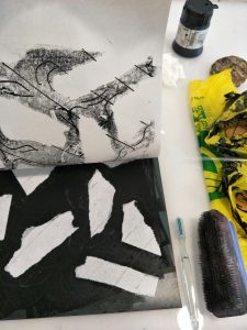
The marks were created by the use of string and the angle of a lithograph. At first I placed a thin piece of sewing thread on a lithograph. Afterwards I unevenly applied ink onto the surface of the lithograph. This created the imprint of the curvy looped lines and rectangles with different values.
02. Anger (Frustration)
Represents the frustration I felt when I first arrived in the unfamiliar country. Starting from my arrival at 4AM Singapore time I was stranded alone to solve things on my own lugging a bag half my height. My problems did not end at the airport. Even simple things like having a hard time memorizing names in an unfamiliar language as well as getting used to Singlish was hard for me “sia”. Aware of the fact that the same actions can represent different meanings in each culture, I decided to choose actions that all humans regardless of culture can relate to as a way to represent frustration. I chose the action of crumpling objects and scribbling To me, the crumpled folds and messy lines shows the let out of heat and felt appropriate to represent frustration. Thus, I used the two actions to create the marks for this strip. After several attempts I was able to attain a strip dark in value to show the low sunken feeling of being angry.
The marks were created through three steps. First, crumpling plastic bags. To capture the texture of the crumpled surface, I crumpled the bag and then flattened it. After doing so I applied ink on each flattened side. One side will allow the plastic bag to stick to the lithograph while the other side’s ink will be imprinted on the paper. Second, once the paper was placed on top of the lithograph that had crumpled plastic bags on it, I pressed the paper down by using a scruffy brush. This helped give more texture to the marks. Lastly, I took the bottom edge of a toothbrush and dragged it across the back of paper and scribbled. This created the messy scribbling shown on the strip.

03. Surprise (Surprise)
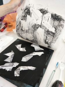
Represents the initial feelings of surprise when I arrived in Singapore. I felt like I was dropped onto an island unprepared. This thought was exactly what surprised me the most because I did prepare prior to coming to Singapore. I printed out maps, took notes on my phone, marked dates on my calendar, and on and on. Thus, I was further taken back with the fact that I was still lost when I arrived in Singapore. Things did not go according to plan. There are two main components I used to present this feeling. First, the blank organic shapes. They represents the lost me in Singapore. I chose to use shapes that are organic instead of straight lines because that would give a feeling of order and structure. In other words, the opposite vibe of what I intended. Second is the diagonal lines. The diagonal lines passing through represents the fast paced city of Singapore where everyone seems to know what they are doing. This is in stark contrast with me who is quite lost. The contrast is reaffirmed by the value and thickness of the shape of the two subjects as well. The first subject of organic shapes are light in value and lumpy. On the other hand, the second subject of diagonal lines are thin and dark in value. Overall, it helps create the feeling that the blank spaces are stationary or slower than the background where diagonal lines are swooshing by.
The marks were created in mainly two components. The first was ripping out the notes I have taken down to help me navigate Singapore. These were placed on the lithograph and ink was applied over it so it creates a blank space. The second is creating the diagonal lines. Once the paper was placed on the lithograph with ink applied on it, I ran the edge of a toothbrush against the lithograph to create the lines.
 04. Sadness (Homesickness)
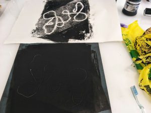
Represents the infectious characteristic that sadnesses like homesickness possesses. Like how one small crack can lead to another bigger one, one depressed thought leads to a trail of them. I showed them through series of lines intertwined and connected to each other to emulate a crack. The strip as a whole is bland because to me homesickness is feeling empty and missing a part of yourself.
The marks were created through trials. To create the lines that emulate cracks I used sewing thread. I realized when I placed the string soaked in ink on the paper the marks were too clear and not fit for the hazy bland look I was going for. I realized by flipping the paper I was able to use the back of the paper were the ink seeps through the achieve the mood I wanted.
 05. Joy (Delight)
Represents the feeling of joy that I had as I discovered and learned more about Singapore and started to find my place here. While I related my personal experience and situation for the rest of the emotions, I decided to choose a comparatively generic way to express delight. This is because compared to the other emotions which could be felt in different ways depending on the individual, I felt like delight could be felt in a common way. I decided to choose a generic expression that is used to describe delight; “burst of delight”. As a result, I attempted to illustrate the bubbly explosive feeling of delight. The long ink trails that starts from the left top corner helps emphasize the active feeling of delight.
The marks were created by spraying ink mixed with water. Water was added to the ink to making it more flowing. This allowed more splatters to be created. In addition, to give the feeling of ‘bubbly’ I placed the cap of a green tea bottle (which I was delighted to find a drink I used to have back at home in Singapore) in the center of where I was spraying the ink. To create the strip, I sprayed a strip of paper at least 5 times bigger than the assigned strip dimensions. I intended to crop out any random area as delight is sudden rush of emotions.
06. Love (Fondness)
 I used strings to attain continuous curved lines. To me it seemed fit to present the emotions of fear or anger. Whenever I get nervous or frustrated I would get a wriggling sensation in my stomach. I felt like strings could represent this feeling. While experimenting I found that the amount of ink applied to the lithograph significantly changes the amount of texture that will be imprinted on the paper. So for the picture shown above, I lifted up a certain amount of ink in the area where I will place the string with scrap paper. Not only did this create a interesting block of grey in a black background, the curves of the string became more visible. I think curves would have been even more visible if I was able to get yarn instead of sewing thread.