This model was built based on the dipping motion of the plover bird. Whenever it picks up food from the ground or from between the crocodile’s teeth, the bird makes this tilting movement back and forth.
I reinterpreted this movement as an oscillation in this abstract model. The model would move back and forth like roly-poly toy.
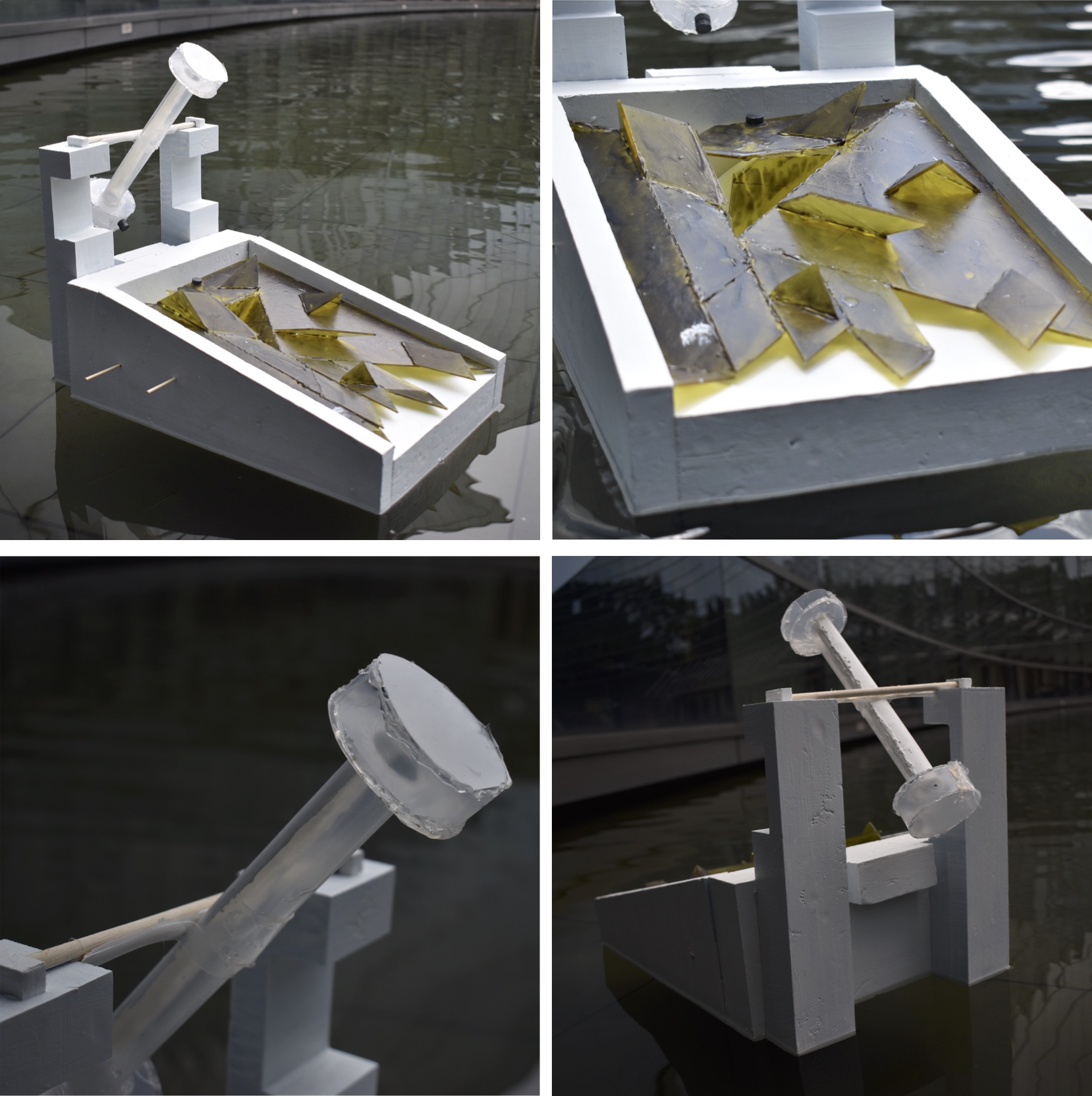
The model consists of three different parts: base, stick, end. The base is the half circle you can see in photograph in the center. This base is half a circle to allow the model to rock back and forth. A weight (a coin in this case) is added to the middle of one the sides. I found that different weights (5 cents, 10 cents, 20 cents) made the base rock back and forth in different speeds. The stick is the long pole in the center. The end is the two circles at either end of the stick. They are of equal weight and allows the stick to oscillate up and down on the base.
Prototype 2
This model was more focused on a realistic representation of the plover bird. In addition, it was taking into consideration of storing water in it and letting the water out as the bird oscillates back and forth. A paste that changes color when it is heated up was applied to the bird because both the plover bird and the crocodile is attracted to heat.
As shown in the sketch above, the bird was planned to be hollow in the center to allow water to be stored. When it attains a certain level, the water would pour out of a hole in the center of the bird’s head. The bottom of the bird is not hollow. Instead, it would have a hole in its center to allow the bird to oscillate back and forth like the idea in prototype 1.
It was also originally planned to attach a magnet on the bottom of the bird’s beak. This will allow the bird to ‘pluck’ and pick up metal particles or other magnets whenever it oscillates.
The problem with this, however, is that once one side of the birds gain weight as it picks up more metal particles, the bird will not oscillate as the weight will not be balanced on each side.
Final
The final model is combination of prototype 1 and prototype 2. It take its main abstract form from prototype 1 but take the water storing and pouring function from prototype 2.
To see the final results and process check here and here.
**To see the final PDF by Brendan and me click here
We had a lot of ideas for our crocodile and plover bird kinetic beast but not all of it worked out. So here are some of the explorations, challenges, and potential changes that could be made.
?Overview? 1. Pot pot boat (challenges & potential changes) 2. Magnet repulsion (challenges & potential changes) 3. Sails (challenges & potential changes) 4. Magnetic dam (challenges & potential changes) 5. Thermochromism 6. Additional explorations
Our kinetic beast was able to float in the waters of ADM but we wanted more. What if it was able to propel itself forward on its own? Both crocodiles and birds are attracted heat so we decided to draw inspiration from a pot pot boat (also referred to as pop pop boat, popping boat, and etc) that uses heat to move forward.
In theory, a pot pot boat is a toy that uses a simple steam engine. The steam engine in this case is usually fueled a candle or vegetable oil burner. The engine of a pot pot boat consists of two parts. The boiler room and an exhaust tube that is connected to it. Heat is applied to the water, water in the boiler evaporates, steam is produced. The molecules of steam is more widespread than water and thus needs more space. So the expanding steam pushes out the water from the exhaust tube and propels the boat forward. A popping noise is made when this happens. This is where the pot pot boat gets its name.
In our case, we had a small flat candle warming up a metal plate fashioned out of an aluminum can. The metal plate, which is the boiler room, is connected to two straws. One straw will be sucking in water into the boiler room while the other is pumping out water. The water that is pumped out should move the kinetic beast forwards.
When we tested it out the boat was floating alright but did not move forwards. We were unable to hear a popping noise either. However, the candles were heating up the boiler room.
Potential changes can be not using exhaust tubes (the straws) that are too narrow and short to propel the whole boat. We could have used bigger ones. With a combination of bigger straws a bigger boiler room that could let out more steam at once, perhaps the boat could have moved. In addition, a bigger candle could have been used to heat up the boiler room more quickly. This will lead to more frequent pops as the steam is let out.
Our bird is the tube with two round circles on either end as shown in the photos and illustration above. It is supposed to oscillate up and down whenever water is poured into the tube and it pours out. To assist this process we decided to incorporate magnet repulsion.
In theory, there is two sides to a magnet. A part that repels and a part that attracts other magnets or metal pieces. We wanted the magnets secured on to the boat to repel the bird tube so it is always dithering.
In our case, we will be attaching small flat coin magnets on the edge of the tube. Another magnet will be attached the white boat body of the kinetic beast.
When we tested it out it worked out in one scenario and did not in the other. The scenario that worked out was when we were experimenting. We attached a magnet to the bottom of the tube. With a magnet in our hands we tried repulsing the magnet attached to the tube. It worked really well in this scenario.
The other scenario is when we attached the magnets to the kinetic beast. This did not work out.
Potential changes could have been better measurements for the location of the magnet and having magnets above the bird tube. As we attached the magnets in the locations and height that we thought was right it might not have been close or far enough for the repulsion to occur properly. Better measurements could have been another exploration that could have been made. Another potential change is having more magnets. Having a canopy sort of structure above the bird that repulses the tube from the top as well might have made the movements bigger and more noticeable.
Sticking to our boat idea and getting inspired by the movement of bird wings, we tried to make sails for our kinetic beast. The idea behind it was to use the dithering movement of the bird tube to pull open the wings. So no external energy will be required to open the wings.
In theory, the wings should open whenever the bird tube declines. There are strings attached to the top of the bird tube. This string in turn is attached to the pulley of the wings. When the bird tube is stationery and parallel to the ground, the strings will hang loose as shown in the photograph with diagrams above. When bird tube declines and leans towards the kinetic beast, the strings will be pulled tight. This will make the sails open.
In our case, this theory did not work. As shown in the gif above, you can see the strings being pulled tight but this did not trigger the pulley. Which in turn did not trigger the sails to open up. The sails remained stationery while the string did alternate between hanging loose and being pulled tight. So only half of the theory worked out.
Potential changes could have been using a different kind of string. Perhaps the string we used was too thin and was not strong enough to trigger the pulley. Furthermore, there may be alternative ways to use the dithering movement of the bird tube to trigger an opening of sails. In addition, the problem with using the sails was not giving enough room for the bird tube to oscillate. As a result, the oscillations became smaller as well. Finding the right balance for the bird tube to oscillate is difficult and we did not want to add additional weight that might potentially ruin the balance. Also, there was no guarantee that the kinetic beast will sail with the wings either so for these various reasons we decided to eliminate the wings.
Plover birds are known to pluck insects or food particles from crocodile’s teeth. To imitate this motion and incorporate it into our kinetic beast, we thought of a magnetic dam.
In theory, when the bird tube tilts down towards the yellow acrylic sheet two things should happen. The water from inside the tube should pour out into a container and the magnet on the bottom of the tube should open up the container door. (Please refer to the illustration in the banner above) It would be like opening up a dam door.
In our case, it did not work out for several reasons. First, the magnet was not strong enough to lift something. Second, the bird tube has to oscillate back and forth. Once the dam was lifted it would stay stuck to the magnet and the bird tube. Thus the bird tube will be unable to oscillate because of this extra weight.
Potential changes could have been making a manual dam that opens when you pull it. But at the same time this solution is not in accord with our intention of using the natural dithering of the bird tube to open the dam.
The dictionary definition of thermochromism is property of substances to change color due to a change in temperature. As mentioned, both the crocodile and plover bird are attracted and influenced by heat. We decided to incorporate this characteristic into our kinetic beast.
In theory,when heat is applied to the thermochromism substance the color should change in a visible matter.
In our case, it worked. Brendan managed to order thermochromism powder that we mixed with water, acrylic, and white glue. This paste allowed us to pain the powder on a surface. When the surface meets heat either through the form of hot water from the fountain or a lighter, the colors changed. The GIF above demonstrates this color change. The top of the bird’s head changes from dark grey to transparent white.
In our final model, we applied this paste on the yellow acrylic sheet. The paste made the sheet look like a mossy green like the skin tone of a crocodile. When hot water is poured out of the bird tube, the color of the yellow acrylic sheet (as shown in the photograph above) changes.
One of the suggestions Professor Cheryl gave was a different version of the magnetic dam (number 4 above). Our final kinetic beast has a yellow acrylic sheet and hidden crocodile teeth beneath. Seeing this she suggested that we could have used the magnet on the bottom of the bird tube to lift a small portion of the acrylic sheet to reveal the hidden teeth beneath. This would have not only taken advantage of the dithering of the bird tube but also imitated the motion of a crocodile opening and closing its mouth. In addition, the teeth beneath would become more visible.
Zines are usually: -self published -self circulated -often inexpensive or free -topics too controversial or niche for mainstream -independent publishing -not about rules or knowledge but about freedom and power -not supposed to appeal to everyone. It is exclusive.
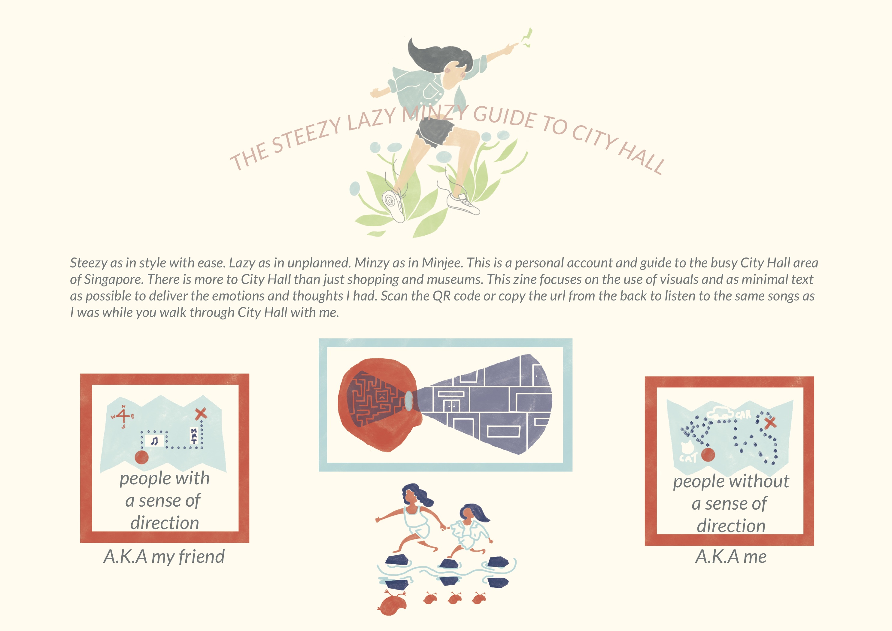
These descriptions inspired me to create a zine that is personal and exclusive to me. I decided to create a guide to a locale that shows the personal experiences I had there. The zine will be like an illustration album of what I experienced.
The location I chose was City Hall. I decided to explore the areas that are in a walkable distance from the City Hall MRT station.
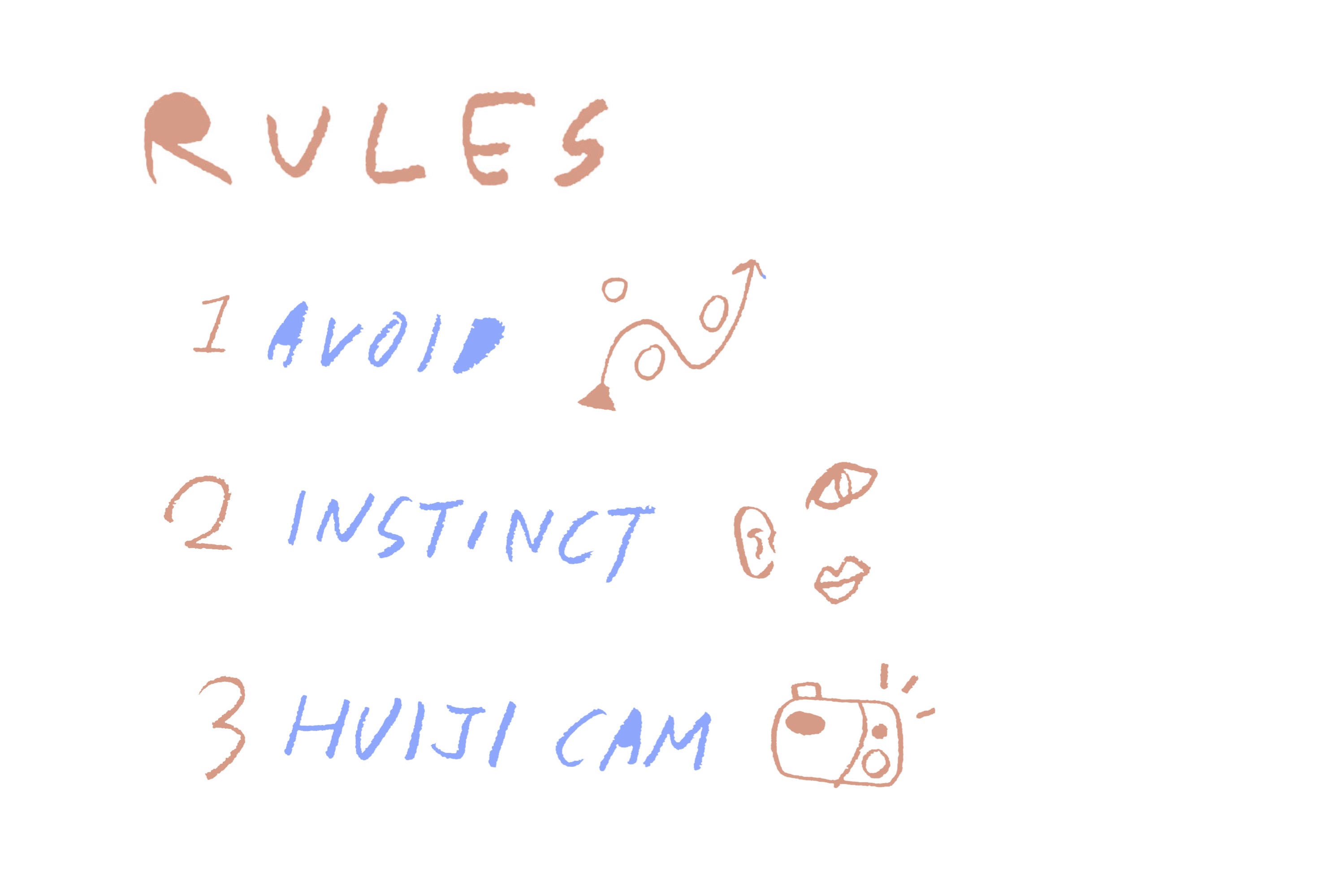
Here are some of the rules that I kept in mind when I was doing my research of the locale.
Rule number one: avoid. City Hall is a bustling area well known for shopping and its many museums. I wanted to show that City Hall had more to it than that. So I decided to try and avoid the main locations people would usually go to.
Rule number two: instinct. There are two types of people when it comes to traveling. First, the ones who plan months and weeks before a trip and has an excel sheet with all the locations and prices. Second, the ones who plan on the plane ride. I am more of the latter. To make my experience more realistic and true to myself, I decided to go as unplanned as possible and follow my instincts. I will go around the area without a plan or schedule. I will eat or rest or decide to skip some locations I had in mind if I wanted to at the moment.
Rule number three: use the Huiji camera app. It has become so easy to click as many photographs you want with your phone. I wanted to go back to the analog film style where you would carefully choose your photographs because there is a limit to how many you can take. I tried to limit myself to taking only 3 photographs in each location so I will only capture the most precious moments.
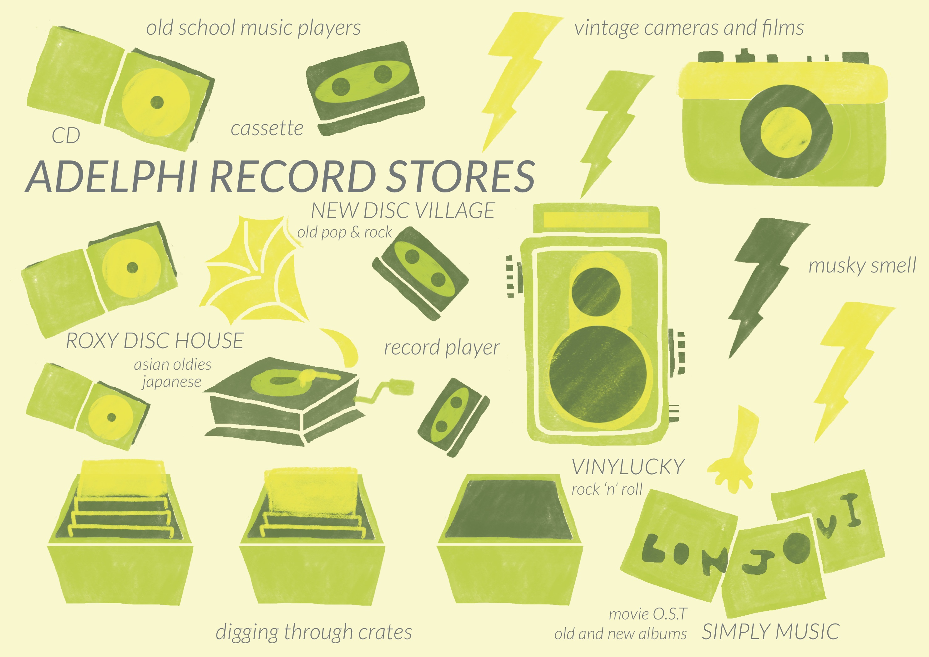
The first location I went to was The Adelphi which is a building of heaven for audiophiles.
The first impression I had was ‘orderly messy’. There was so many stores in straight rows. But the items being sold are usually vinyls, record players, vintage cameras, camera analog films, good quality speakers, and so on that was displayed in a orderly mess. Both battered and old vinyls were stacked neatly in crates or shelves. However, there were crates and shelves everywhere.
There were so many stores that it felt like a maze to me.
The laid back vibe in the building was noticeable as well. Some of the shop owners and customers seemed to be quite close to each other. It seemed to be a tight knit community where you could exchange records or where regulars would get a discount or secret notice when the record they have been looking for comes in.
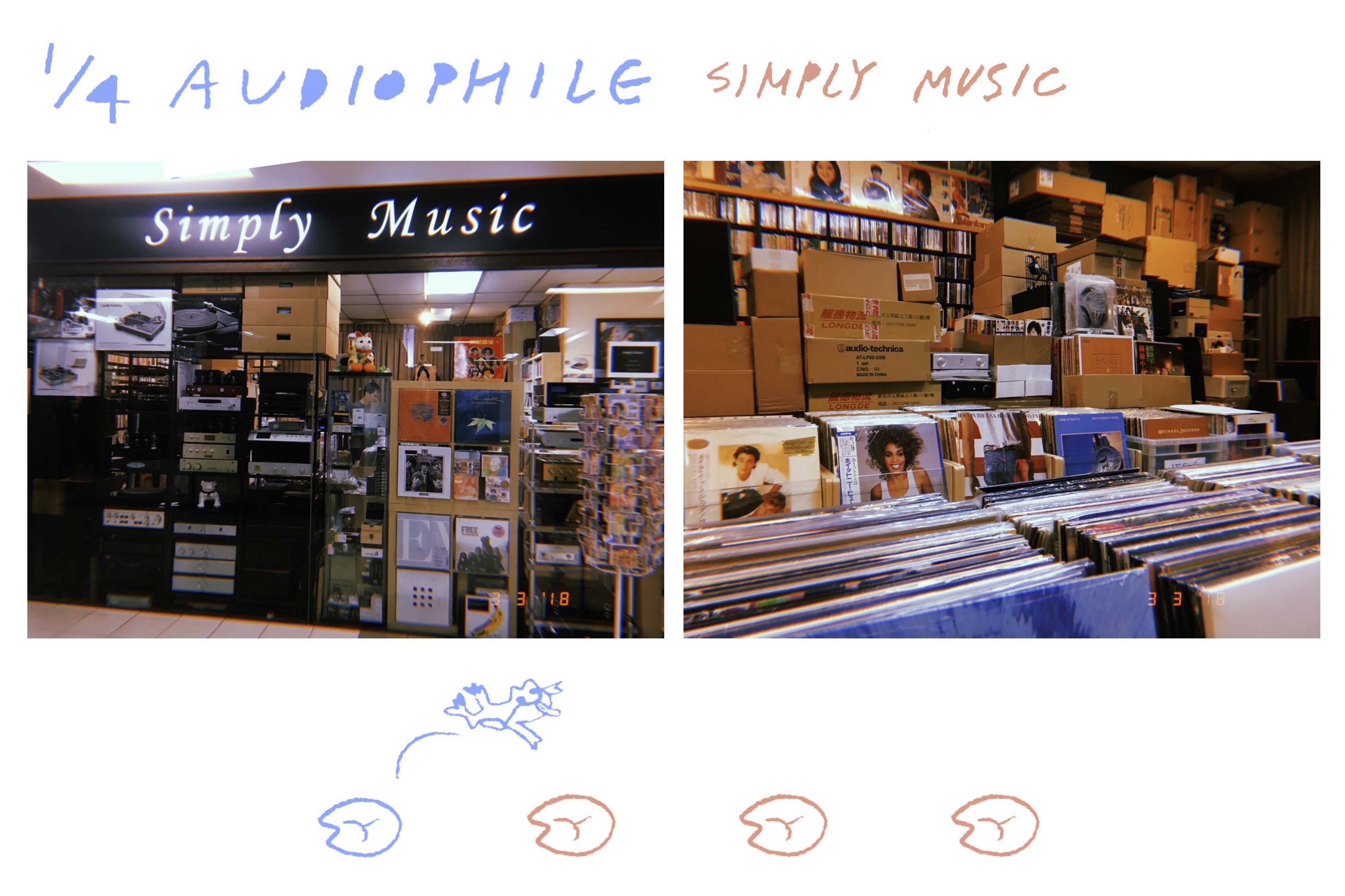
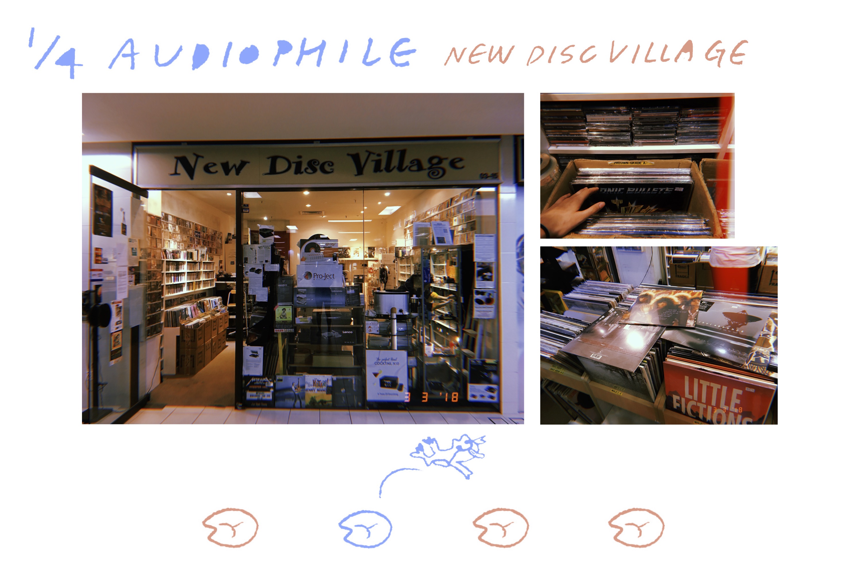
There were 4 main record shops that was memorable to me.
First, Simply Music.
They had a moderate mixture of both old and new vinyls. Example of the old vinyls that could be found here was mostly old movie soundtracks like the OST for ‘My Fair Lady’. One of the newer vinyls that I saw here was the ‘Divide’ album by Ed Sheeran.
Second, New Disc Village.
The best memory I have of this shop was how the seemingly grumpy and uninterested shop owner wordlessly appeared and placed 3 Bon Jovi Vinyls in front of me and my friend when we were looking for them.
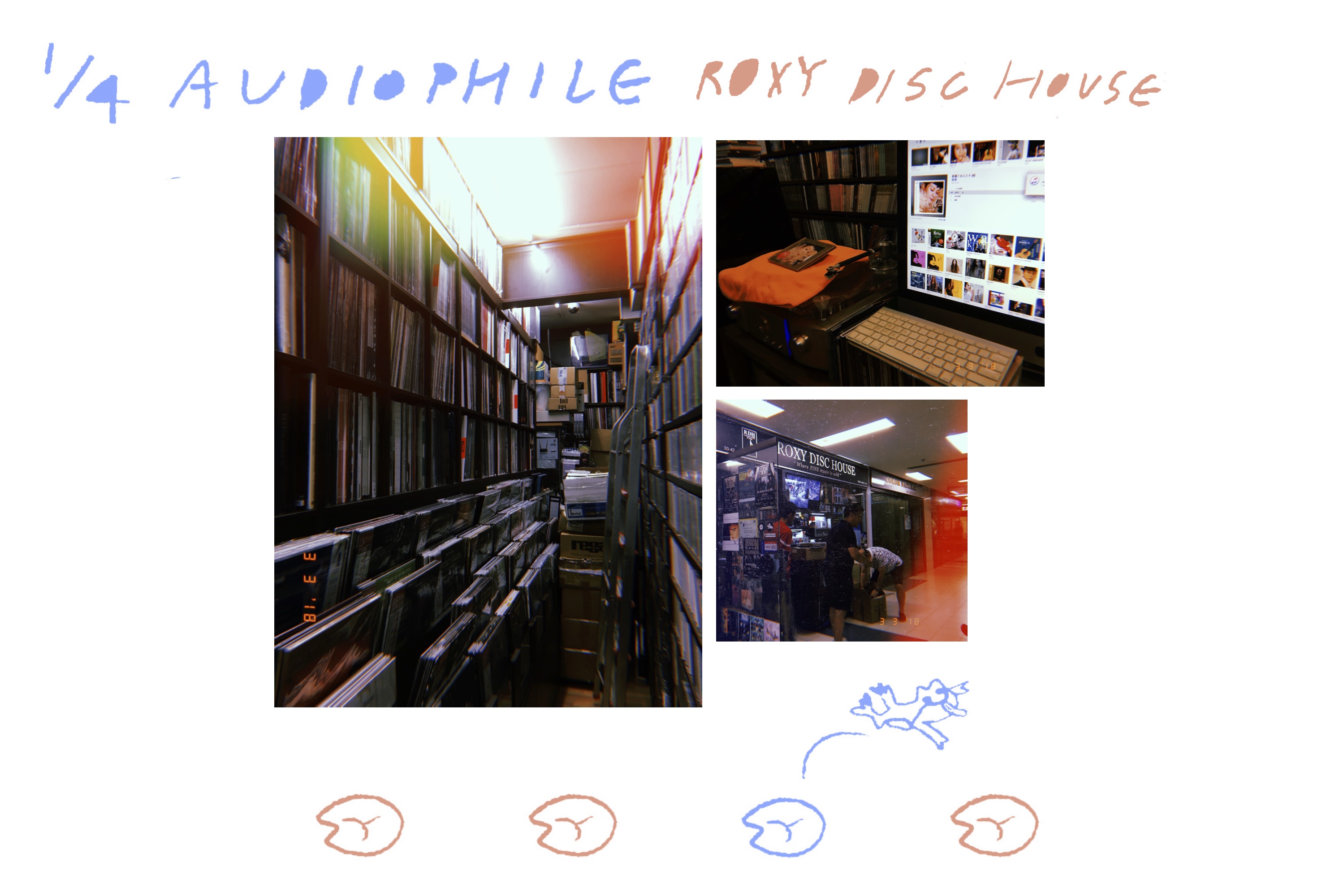
Third, the Roxy Disc House.
This shop was a bit different from others. While most shops had mostly English oldies, this shop had more Asian oldies than English. The Asian oldies ranged from Japanese, Chinese, and even some Korean.
Also unlike the other shops that generally used crates and short shelves, this store was full of long shelves that reached the ceilings.
It was really interesting to see the juxtaposition of old and new as well. Surrounded by old vinyls and CDs were a modern Mac laptop better than the one I had and great speakers to play Japanese music.
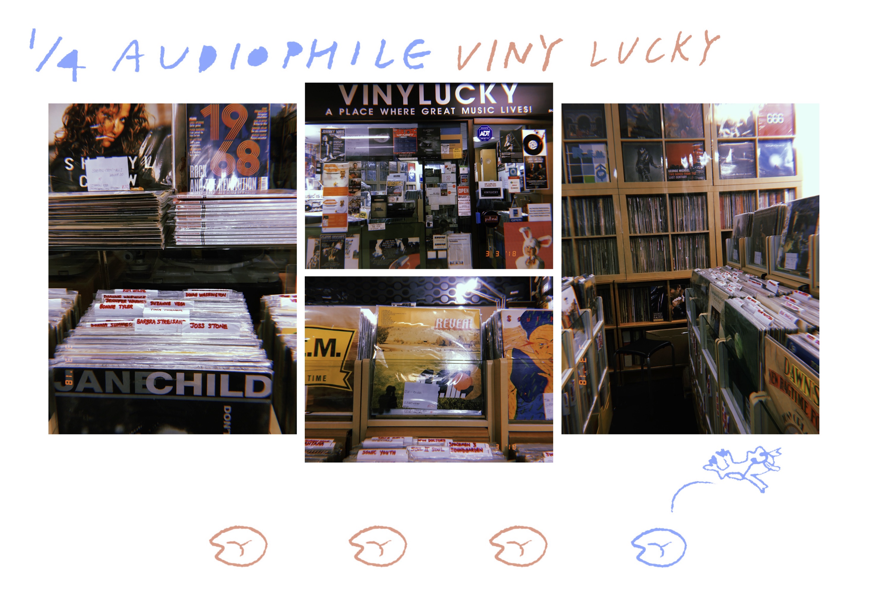
Fourth, Viny Lucky.
This shop had the most diverse collection of genres and music. Also, it was organized with tabs that had the specific names of each artist so it was easy to go through the vinyls.
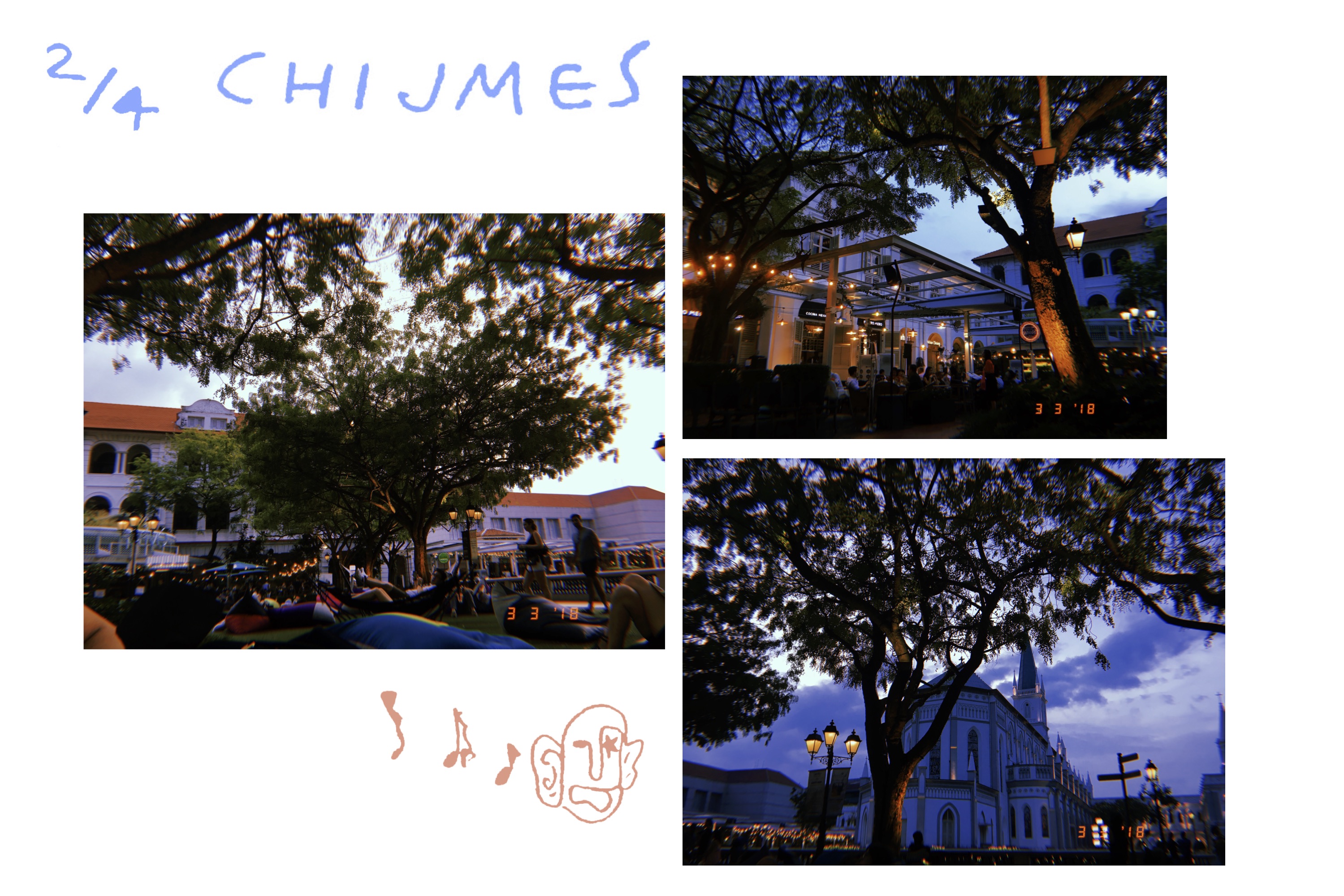
After the long walk in Adelphi we decided to chill at Chijmes. We rested on the bean bags and watched the sunset. The small fairy lights, fluorescent lights, music playing from nearby shops. They all helped set the mood. We were lucky enough to catch a live performance as well.
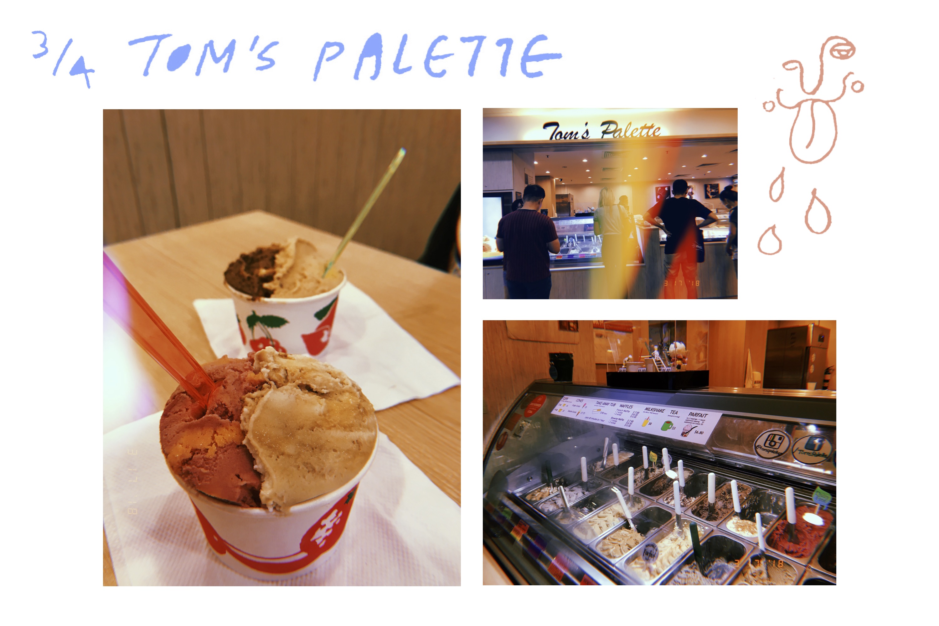
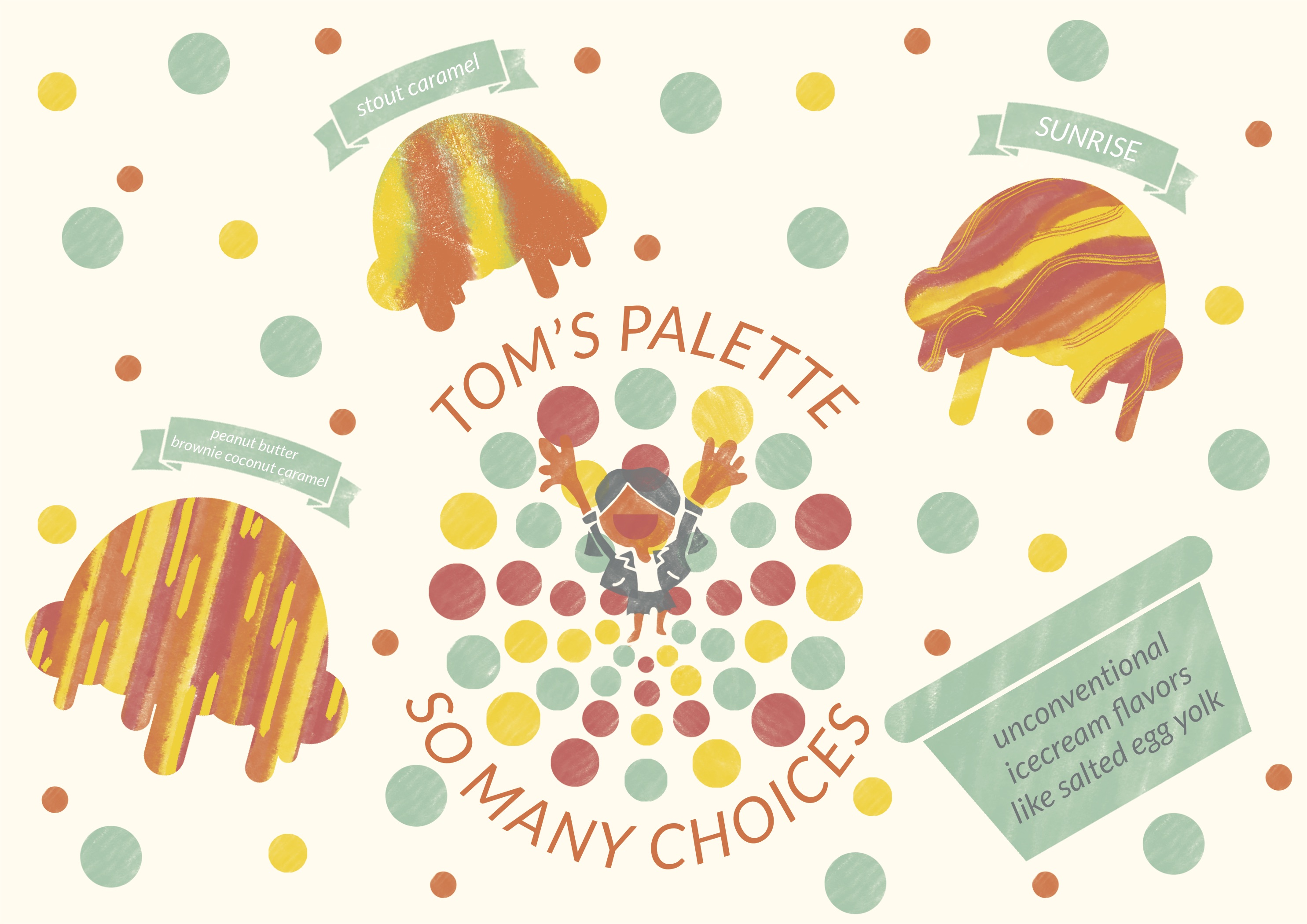
For refreshments we went to Tom’s Palette which is a special ice cream store. They have very diverse ice cream flavors. One example is salted egg yolk.
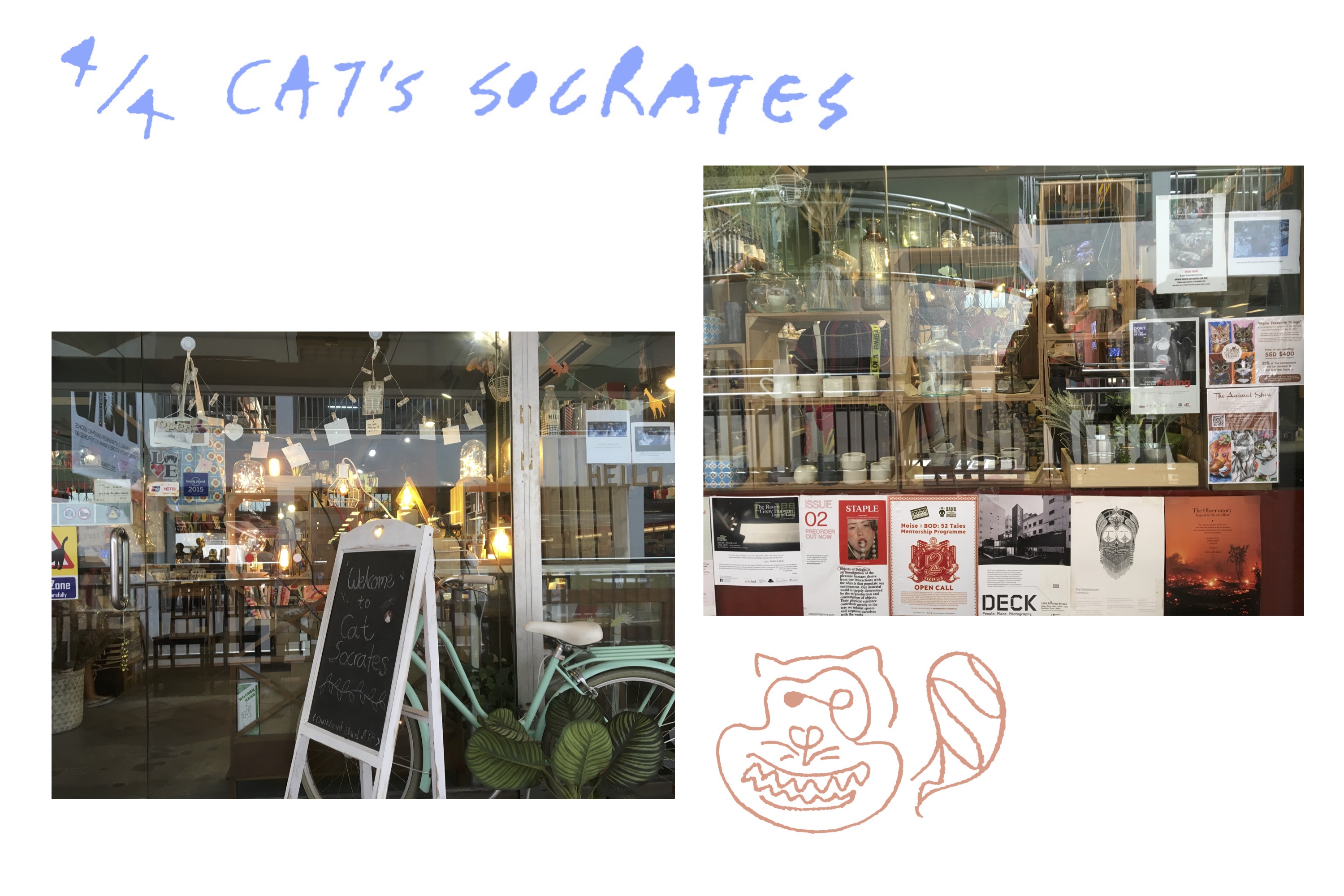
Cat’s Socrates is located near the Bugis Art Friend that ADM students are probably very familiar with. I liked the location of Cat’s Socrates because it reminds me of how venturing out of your usual path helps you discover new things.
Cat’s Socrates felt like a melting pot of Tiong Bahru. They had all the badges, pins, patches, ceramics, indie books, children’s books, fairy lights, and so on. They even had a cat.
Layout Reference
I wanted to use as minimal text as possible. I wanted to communicate using visuals so it’s easier to be in the same mood and vibe as I was when I was in the situation.
I will use straight rigid boxes for some the locations and some more free flowing ones for other locations depending on its vibes.
For the photographs I would like to photoshop them into polaroids to match the analog vibes. Plus the frame will help it fit into the layout of the comic book style.
As I used the Huiji camera app which is inspired by analog film, I decided it was only right to use polaroids.
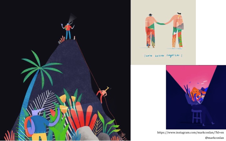
Artist Inspirations
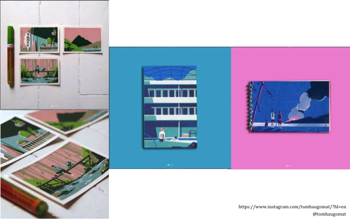
Tom Haugomat
I really admire his illustrations. He usually illustrates wide sceneries with people in them. They are simple but yet so expressive. I think this is due to two main reasons. Firstly, his color palettes helps set the peaceful mood.
Mark Conlan
Like Haugomat, Conlan’s illustration has the simplistic vector style as well. But it differs in how his illustrations tend to show more abstract ideas rather than sceneries. They are expressive in a different way.
Process
Sketches & Illustrations & Colors
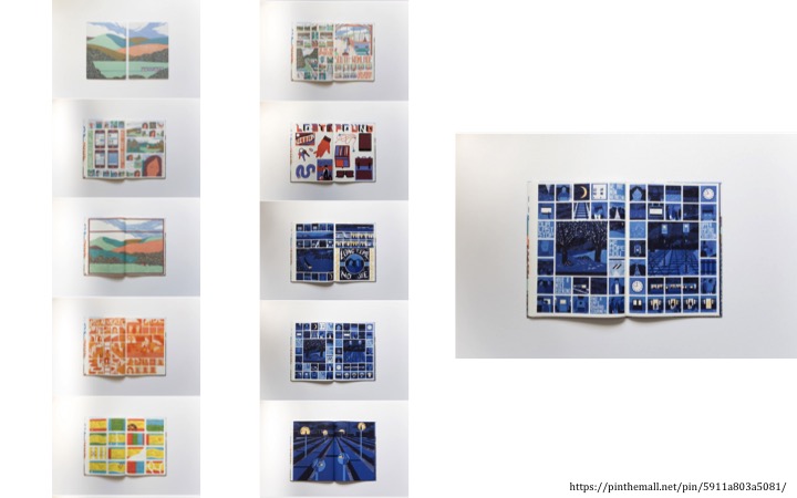
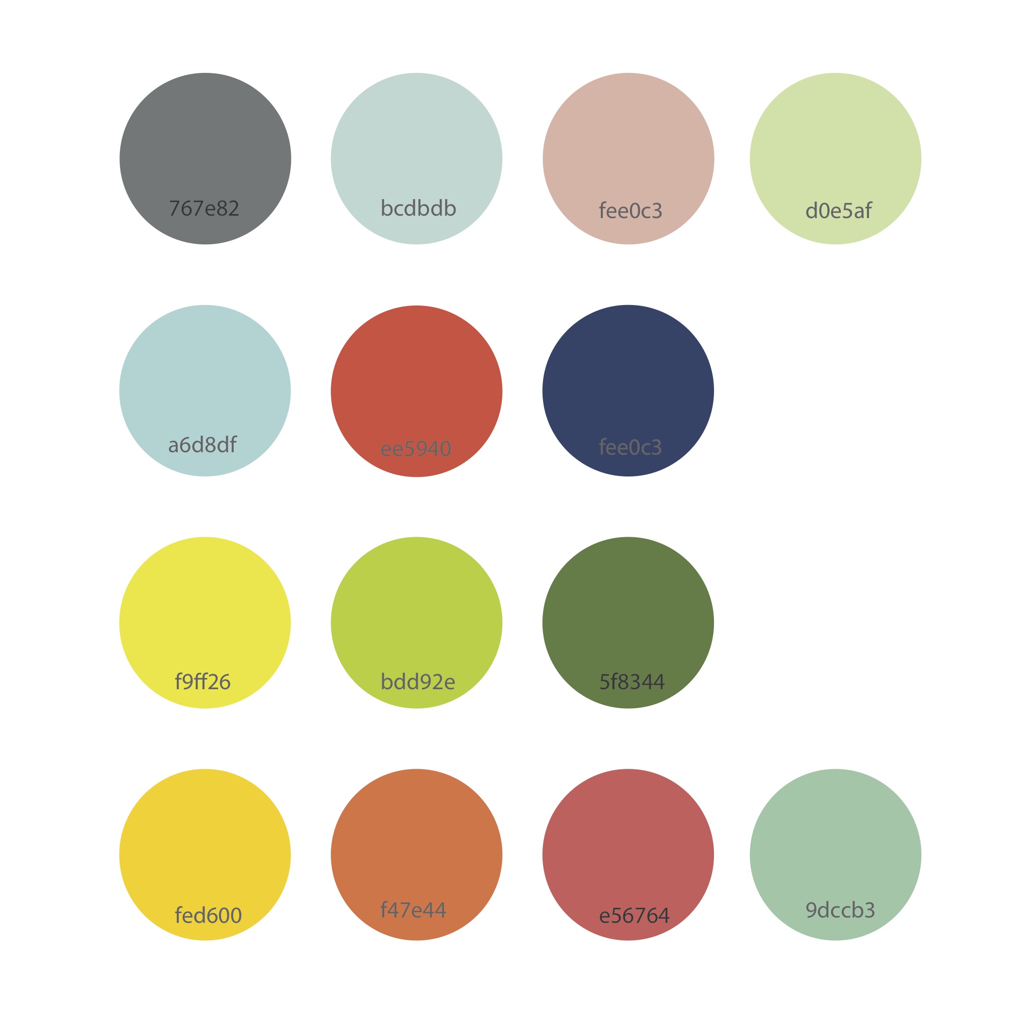
I wanted the illustrations in my zine to look like quick sketches or doodles in a travel journal. Like the inspiration artists, it should capture the essence and mood while being simplistic rather than elaborate. I also wanted to use a limited color palette. The illustrations will only be created using 3 to 4 colors for a sense of unity. As a result, this could end up in using an unrealistic color to represent something.
I also planned to introduce a different color palette for each location. This will help viewers feel like they are entering a new location like I am.
Different color theories were taken into consideration for each location as well.
For instance, the 3rd row that consists of the yellow, light green, and dark green is for the 2nd spread. The 2nd spread shows the different stuff I found in the Adelphi record stores. Overall it was very calming to be in the record stores. As a result I used analogous colors. The harmony between the colors gives a balanced mood that helps create the ambience I felt when I was at the record stores.
Storyline
Despite the various locations I have actually been to, I ended up using only some of them.
Adelphi Cjimes New Disc Village Roxy Disc House Simply Music Vinylucky Tom’s Palette Cat’s Scorates
On the way (things spotted while walking around)
There are only a limited number of pages so I decided to choose only the most crucial ones. For Cat’s Socrates, I realized it was closer to Bugis MRT station than City Hall MRT station so I decided to take it out.
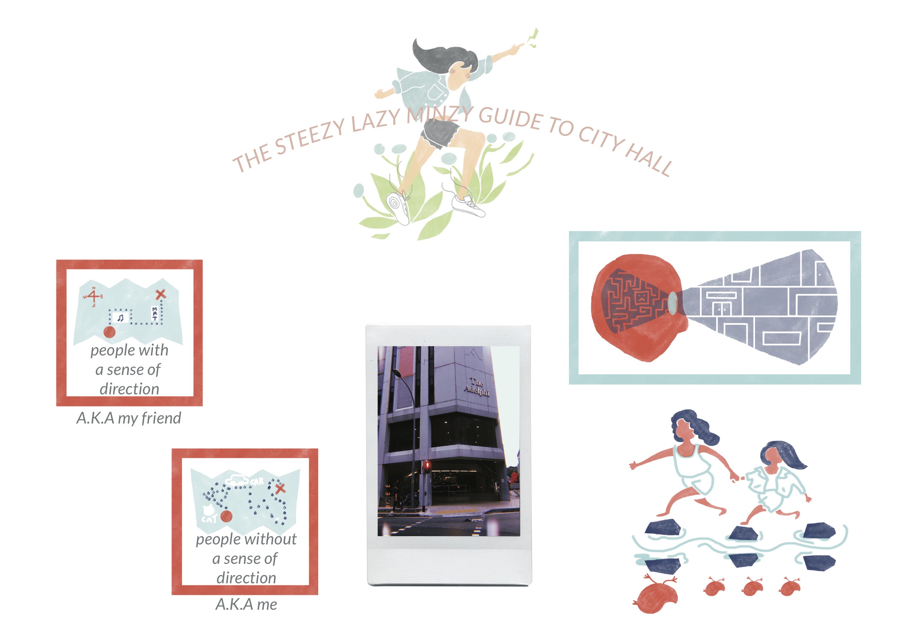
For my first encounter with Adelphi I decided to talk about how it seemed like a maze to me and I was overwhelmed by it. There were so many stores and hallways that I was not sure where to start. The fact that all the stores were selling similar items; records, did not help me distinguish between all of them. I wanted to talk about how lucky I felt to have my friend guide me through the place. So I illustrated how the simple structure of Adelphi seemed like a maze to me, difference between people who have a sense of direction and those who do not, and a representative image of my friend guiding me through the place.
The illustration of my friend leading me through Adelphi is one my favorites. It is the bottom one in the layout shown above. The person leading the other in the front is my friend. She is depicted bigger than me to exaggerate the fact that she is in control of finding the way. I also illustrated the actual outfits we were wearing that day. We are shown to be jumping over stones. The reflection on the other side shows her as a mother duck and me as one of the baby chicks to represent how I felt when I was following her.
For the 2nd spread I wanted to show all the objects I saw in Adelphi spread around. Personally, Adelphi record stores were like a treasure hunt where you had to look around to find stuff so I wanted viewers to have the same experience. Hence, the reason for the organization in the spread.
For the last spread I used polka dots for an energetic and happy introduction to Tom’s Palette ice cream store because that was how I felt when I saw all the choices they had.
Photographs
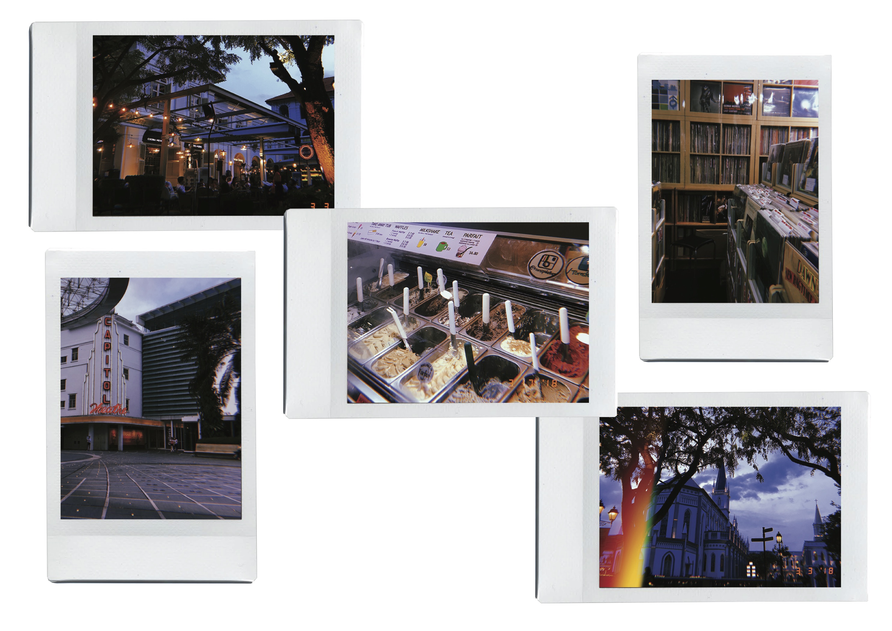
Initially I have planned to add the photographs I took with the Huiji camera app. They will be photoshopped as polaroids to add onto the analog vintage vibe.
So I measured the size of actual polaroids so that when it was printed it will look realistic. When I placed the photographs on the zine, however, they looked too rigid and out of place in comparison to the illustrations. I think this was for two main reasons. Firstly, the color palettes did not match up so overall it looked like two different things going on. For the illustrations I usually used pastel like colors. The photographs, on the other hand, were vintage film like dark colors. Secondly, there was no interaction between the photographs and illustrations. For instance, the two might have looked more natural together if there were illustrations drawn on the polaroids or scribbles on it.
As a result, I decided to focus on the illustrations and not use the photographs. I think this helped me think outside the box and straight lines and have pages that are more free flowing on spreads 2 and 3.
Music
I felt like music was a big part of this journey to record shop and to put in a personal touch to the zine because I love music. Also, it would help the audience to feel the same ambience I was feeling through a set playlist. I was interested in creating a new experience where the audience will be listening to an audio while reading. Below is the playlist I created for my zine.
To help the audience access the playlist, I created and added the QR code to the link at the back of the zine. I added a shortened URL as well for those who might be having trouble accessing the QR code.
Dear OSS,
for Foundation 2D Week 1 my class will be working on “My Line is Emo”.
The project is about creating 6 strips where each represents a different emotion in the primary emotion categories that consists of love, joy, surprise, anger, sadness, and fear. Emotions will be presented through the technique of mark making.
I want to have a constant theme that ties all the emotions into one story. The story I chose is related to my personal experience and the movie Lost in Translation (2003) directed by Sofia Coppola.
Growing up I had to be constantly on the move. Every 2 to 3 years I would move to a new area and sometimes even new countries due to the characteristics of my father’s occupation. Whenever this happened I had to go through the phase of being “lost in translation”.
To me Lost in Translation (2003) accurately captures the alienation and slight discomfort it causes you when you are dropped into the middle of no where.
Thus, for project 1 I would like to walk the viewer through the emotional phases of moving and adapting to a new environment based on my experience of coming to Singapore for the first time.
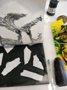
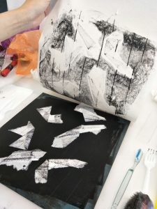
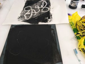
Experimentation #1: string I used strings to attain continuous curved lines. To me it seemed fit to present the emotions of fear or anger. Whenever I get nervous or frustrated I would get a wriggling sensation in my stomach. I felt like strings could represent this feeling. While experimenting I found that the amount of ink applied to the lithograph significantly changes the amount of texture that will be imprinted on the paper. So for the picture shown above, I lifted up a certain amount of ink in the area where I will place the string with scrap paper. Not only did this create a interesting block of grey in a black background, the curves of the string became more visible. I think curves would have been even more visible if I was able to get yarn instead of sewing thread.
Experimentation #2: tissue, choice of pressure tool, lines I wanted to capture the texture of my mark making tool as well so I chose tissue that has a bumpy surface. I wanted to show the emotion of surprise. One of the things that surprised me was that the canteens in the school do not provide tissues. As a messy eater who only been to food courts where tissues are provided this was surprising and hard to get used to. I created marks that cartoons use to show their characters shivering around the tissues to exaggerate the surprise. In addition to the shiver marks I drew straight diagonal lines to give a sense of movement to my piece. I wanted to emulate that feeling of being alone in the city not sure where to go to while everyone around me are rushing on with their lives.
For my second try I tried folding the tissues. To me being surprised is a sudden reaction that leaves an impression on me.So I wanted to use straight lines in contrast to the curves used for fear and anger through string. At first I was unable to capture the bumpy surface of the tissue as shown in the photo. So for the second try I lightly rolled my roller soaked in ink over the tissues so it would create a mark on the paper.
Experimentation #3: plastic bag In addition to the trying to capture the texture of tissues I wanted to capture the rough texture of a crumpled plastic bag. I chose plastic over tissues or paper because it would be easier to press down and thus the crumpled marks will imprint better. I found it was easier to apply bit of ink on both sides. One side will imprint the ink on paper and the other will allow the plastic bag to stick to lithograph. Compared to the tissues, the plastic bag creates a more grungy impression on the paper as it has sharp angles.
Looking back through the combination of experimenting, talking to other classmates, and critique from our professor I realized I was overly focused on my theme of “Lost in Translation”. Yes, sticking to the theme is important but as I have the freedom to choose whatever mark making tool I want and can make a tool as well if I want, I should be more considerate of what tools I can be using. The tools could also be related to what emotion I am trying to show. For instance my plane tickets or the forms I had to fill out could be incorporated to give a further personal touch.
In addition, my original plan was to decrease the value of the black and white strips as is moves on from fear to falling in love with Singapore. However, I found it difficult to execute this change in value. Due to the different sizes and textures of the mark making tools as well as the difficulty in controlling the right amount of ink applied I was unable to do so.
Lastly, as I was putting this post together I realized I should have taken more pictures. It would have helped me remember how I got certain marks and would have supplemented this post with visuals.


 This model was more focused on a realistic representation of the plover bird. In addition, it was taking into consideration of storing water in it and letting the water out as the bird oscillates back and forth. A paste that changes color when it is heated up was applied to the bird because both the plover bird and the crocodile is attracted to heat.


 Rule number one: avoid. City Hall is a bustling area well known for shopping and its many museums. I wanted to show that City Hall had more to it than that. So I decided to try and avoid the main locations people would usually go to.
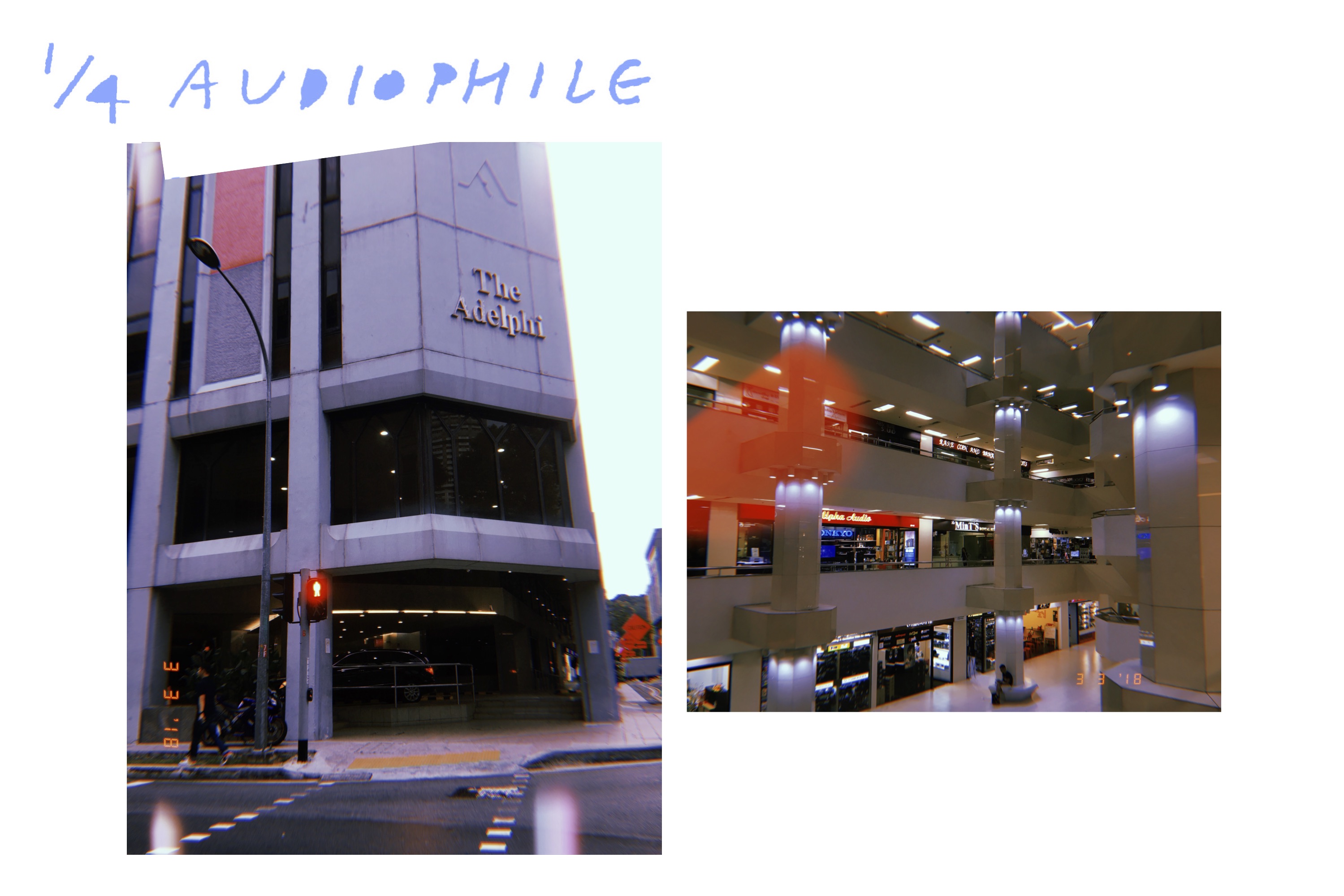


 I used strings to attain continuous curved lines. To me it seemed fit to present the emotions of fear or anger. Whenever I get nervous or frustrated I would get a wriggling sensation in my stomach. I felt like strings could represent this feeling. While experimenting I found that the amount of ink applied to the lithograph significantly changes the amount of texture that will be imprinted on the paper. So for the picture shown above, I lifted up a certain amount of ink in the area where I will place the string with scrap paper. Not only did this create a interesting block of grey in a black background, the curves of the string became more visible. I think curves would have been even more visible if I was able to get yarn instead of sewing thread.