
Research
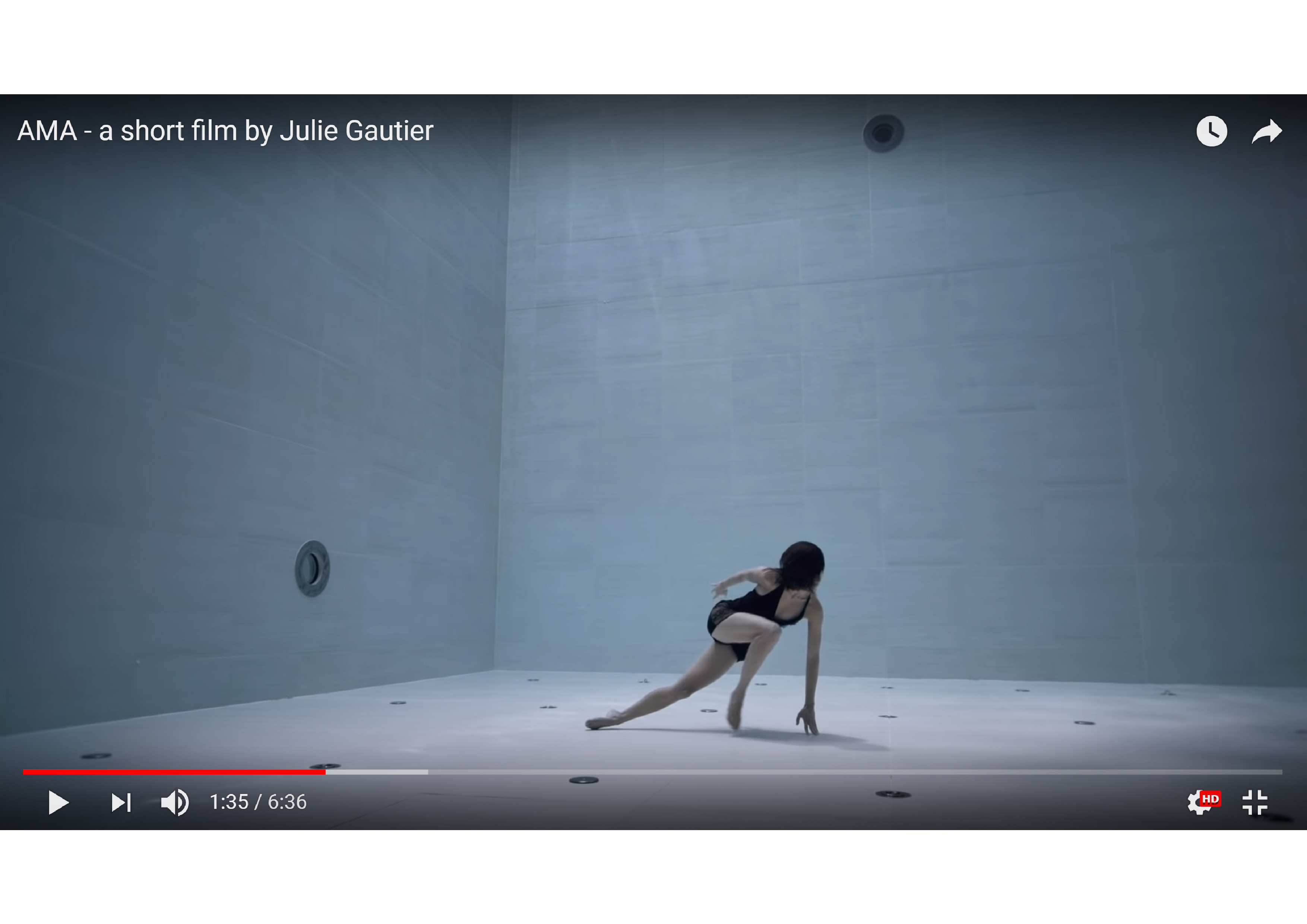
Dance piece: AMA
After watching the dance, these were the concepts I associated it with:
- Opposing forces that mutually reinforce: force of the dancer’s motion versus the viscous drag force of the water
- Stretching/dragging out of time and gesture (slow-motion): gestures are magnified and rendered in slow-motion because of water resistance
- Paradoxical weight: simultaneously heavy and weightless impression of dancer who alternately sinks and floats
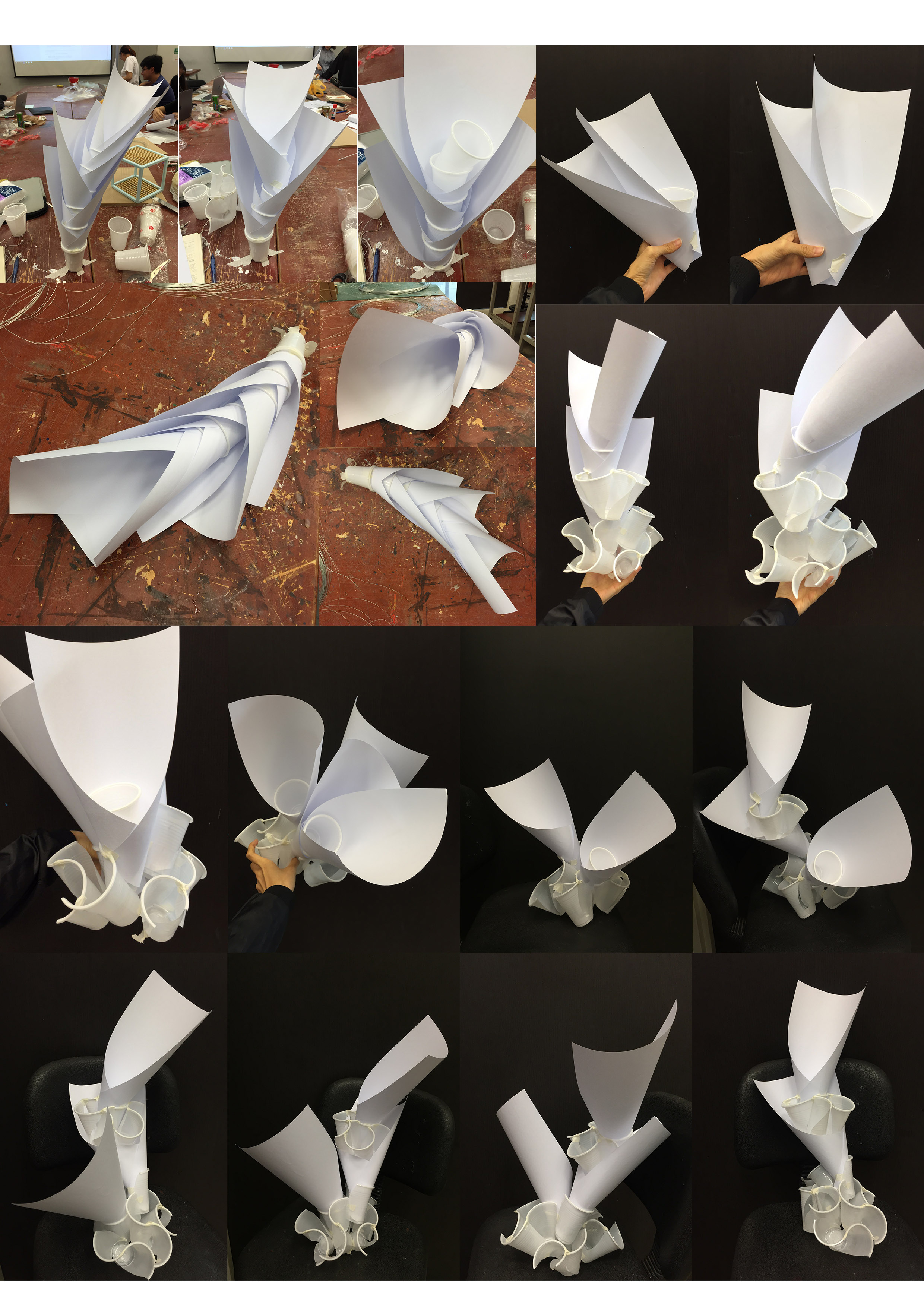
From these words I visualised how I might represent opposing forces that showed both opposition and harmony in either direction or change in magnitude. The form of a cone resonated with me in its possibility to represent my concept of a force: its pointed tip indicating direction and the conical “flanks”/plane that extended outwards suggesting a convergence/divergence of increasing/decreasing strength of the force. I thought of combining multiple conical structures and stringing them together with another material like wire to further allude to direction.
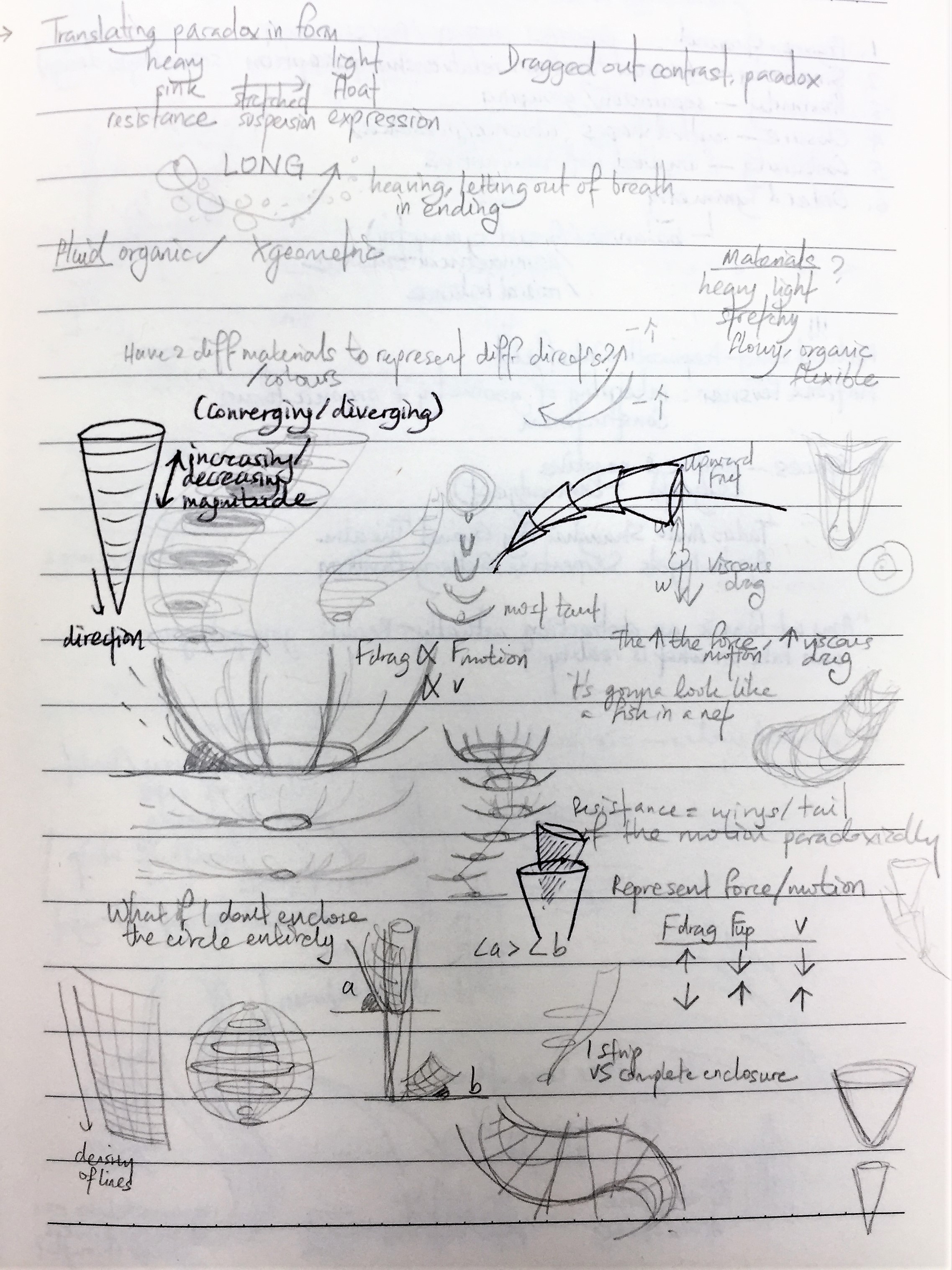
From here I thought of the materials that might be good for making cones and thought of paper. But by chance I discovered plastic cups in the storeroom which I thought had a conical structure I could experiment with so I started to explore ways of manipulating cups. Thereafter my working process became heavily driven by material qualities of the cup (very much like my first assignment with satay sticks).
Development
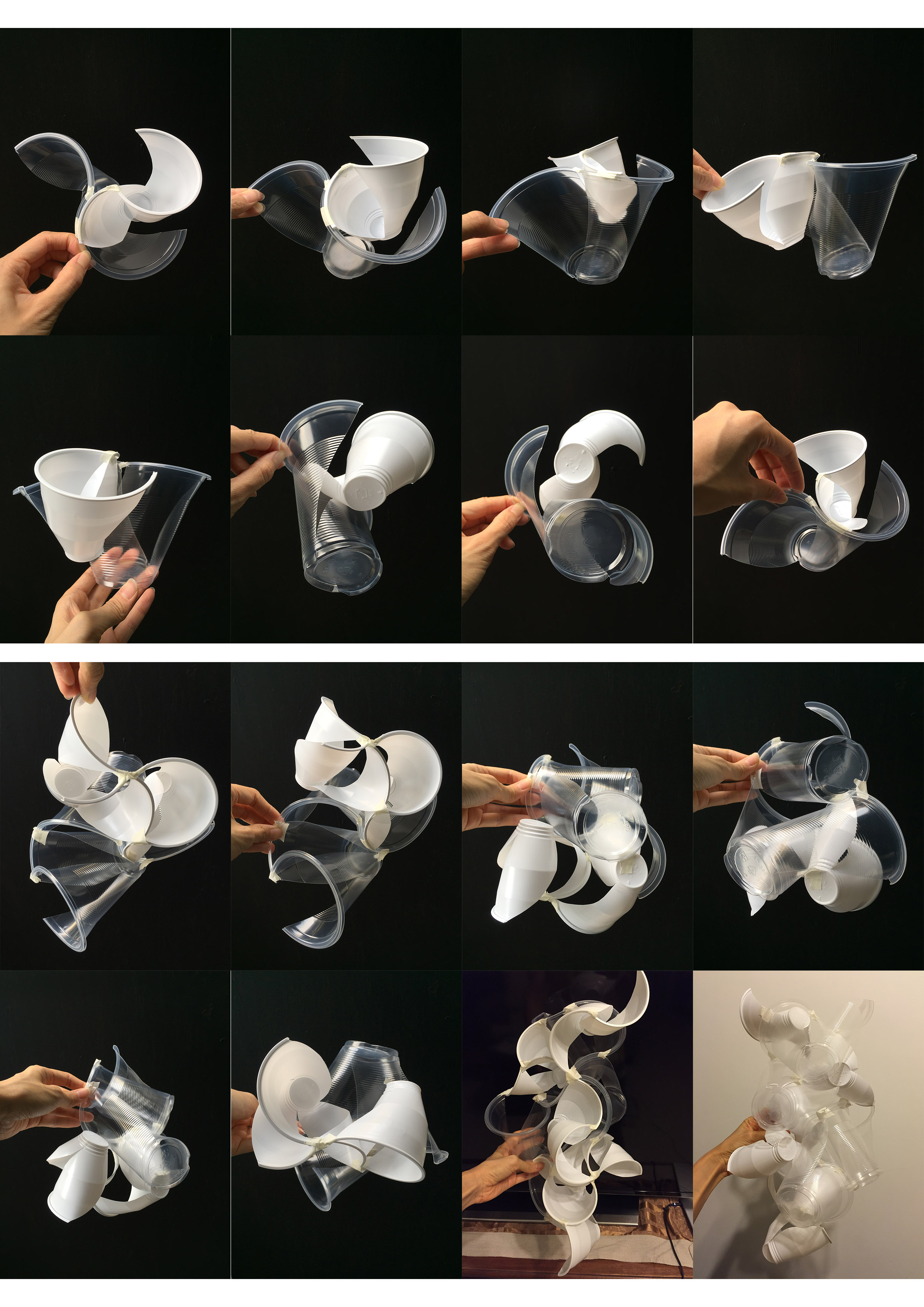
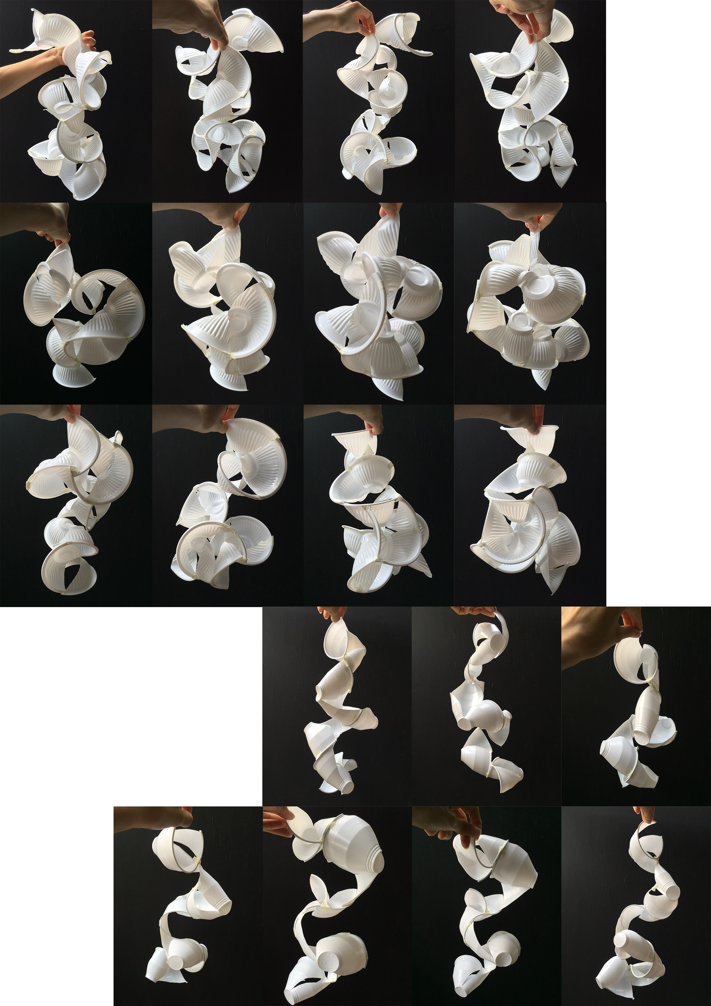
I experimented with different ways of cutting up cups and joining them together and found that joining them by the curves formed by their rims gave interesting forms.
Ways of cutting:
- Vary number of cuts: 2/3, 4 was too much
- Vary type of cut: straight down/curves (went with curves for its more organic form)
- Vary length of cut (how far down to the base of cup the cut went): halfway/all the way down, affected curvature of forms that could be made
Ways of joining:
- Rim-to-rim (following curvature flow)
- Rim-to-rim (trying to complete circular form)
- Base-to-base
- Rim-to-base
- Random stacking
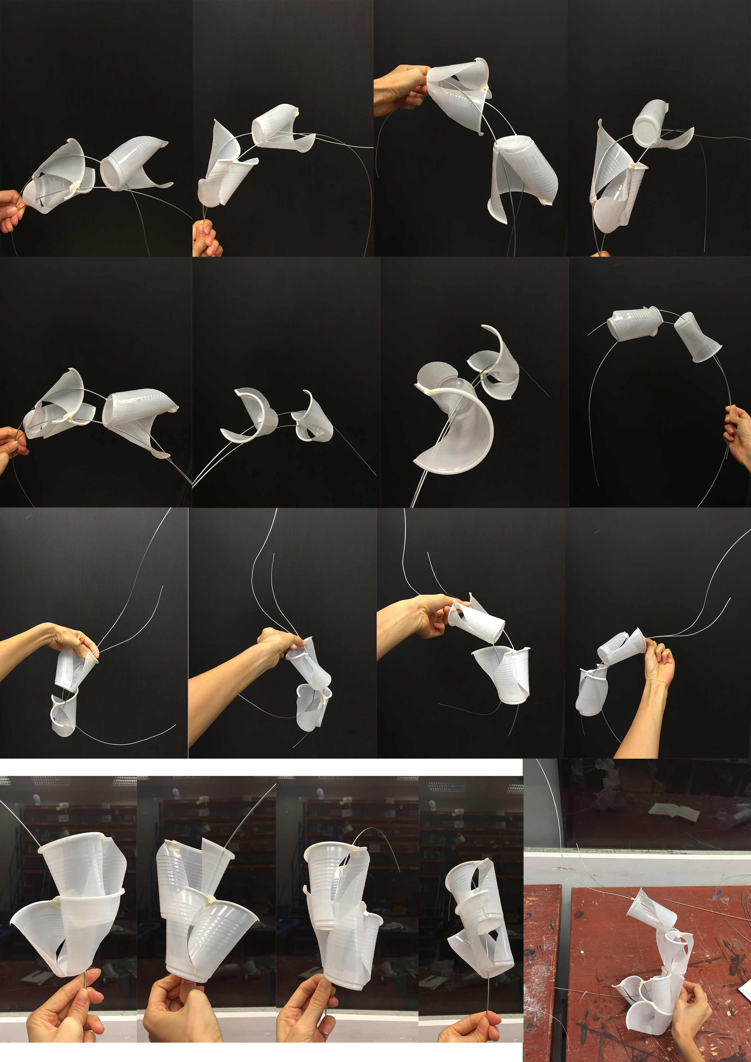
I tried out my wire-strung cones idea by stringing wires through holes poked through the bases of the cups, varying their curvature and ways they crossed:
- Stacked cups strung together didn’t look very visually pleasing
- Separate cups strung together just looked like cups, purpose of using cups for their curves/conical structures lost
- Cups joined together by curves with wires strung through didn’t look very cohesive (colour + direction)
Joining cups by their curves resulted in a form that didn’t really fit my intent of using the conical structure of cups in the first place and the visual I had of it, but I was quite keen to use the form for my final because it looked interesting. The form of the joined curves was also somewhat suggestive of the nature of gestures in the dance, so I thought I could proceed with it.
Nonetheless I tried making conical structures with paper as well as I had initially planned to, then thought of combining them with the cups even. Instead of using wires to string the paper cones, I explored using cups to contain the paper cones and “string” them together. I thought the prototype of this fit my concept of opposing/complementing forces quite well and conveyed the dragged/stretched out effect, but I thought it was a bit of a pity to just settle with plain cup-and-paper-cone-stacking when the joined cups created a more interesting visual.
This led me to explore adding paper cones to the joined cup structures and see how they might emphasise the cones of the cups as suggested opposing/complementing forces. I liked that paper both contrasted and complemented the cups quite well in textural quality and colour. However I felt that the addition of paper cones were a bit distracting to the curves that the cups made and concealed parts of them (what I wanted to keep). They also didn’t really add to the cups in a way that it aligned with concepts of the dance.
In the end I decided to have the cups “string themselves together” and have a have a structure based primarily on self-supporting and extending joined cups. Whereas the additional material would play more of a supporting role: tracing the directions in which the water medium is disturbed, and emphasising the dragged out quality of the gestures and forces represented by the cups.
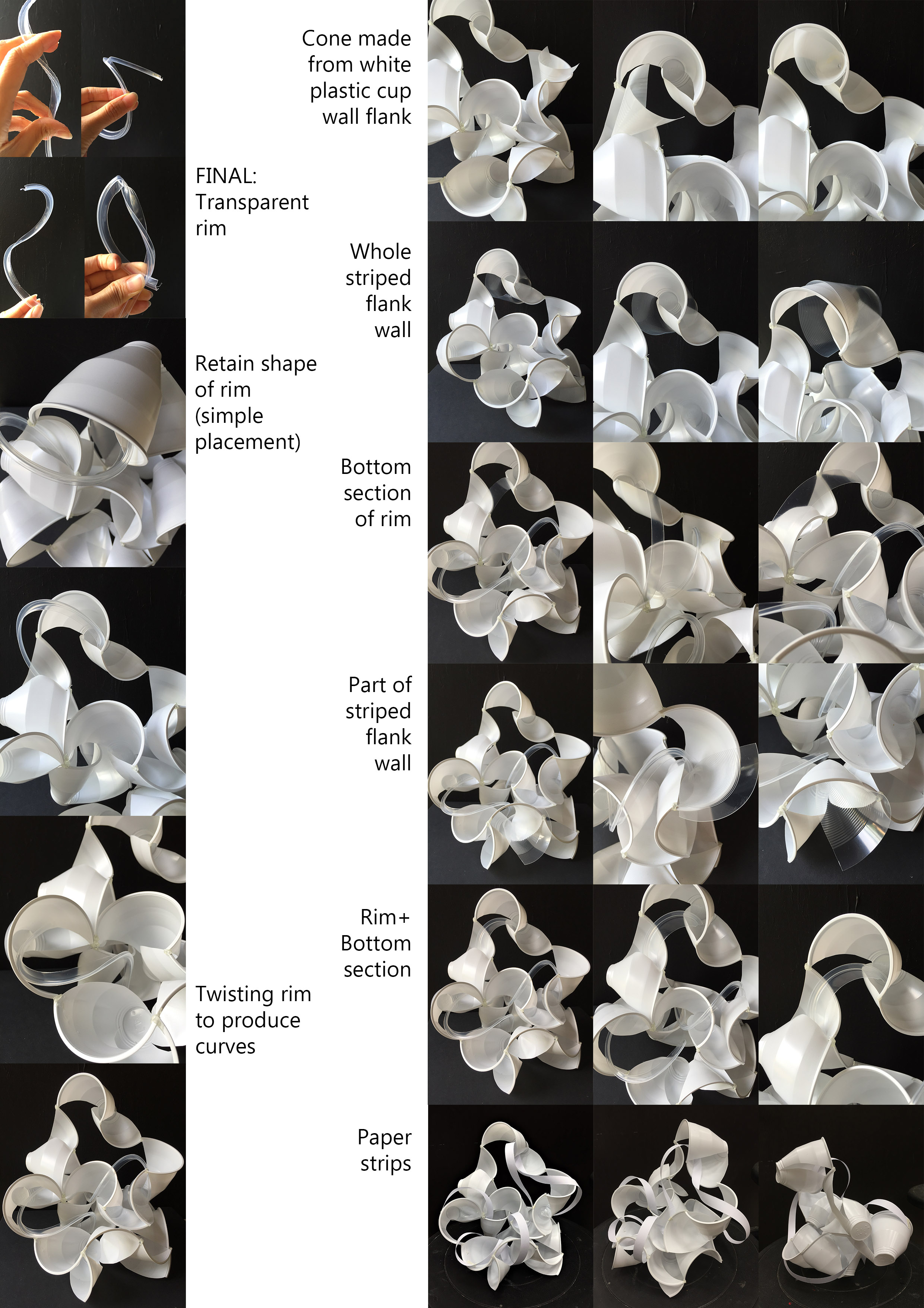
I bought different types of cups of varied material, size, pattern and shape to experiment with, bowls even. I explored different ways of cutting and joining them, orienting them for different angles. I also tried pairing different cups together like the white and transparent one to suggest the idea of opposing forces.
Types of cups:
- Transparent plastic cup with horizontal line pattern
-Alone, presence not commanding enough VS opaque materials’ ability to suggest form and force/ gesture of dance more strongly
-Tried to combine with other opaque materials (white cups) → liked the relationship between the two suggested: harmonious in joined curves, while contrasting in size, texture and colour (fitting concept of paradoxically opposing and mutually enhancing forces of dance)
- White plastic cup with horizontal line pattern
-Horizontal lines don’t add value/ contribute to conception of dance
- White plastic cup with smooth surface + curved walls*
- White paper cup with smooth surface
-Somehow doesn’t have same elegance and resonance with dance piece compared to plastic
- Off-white biodegradable plastic cup with horizontal line pattern
-Doesn’t have same elegance and resonance with dance piece
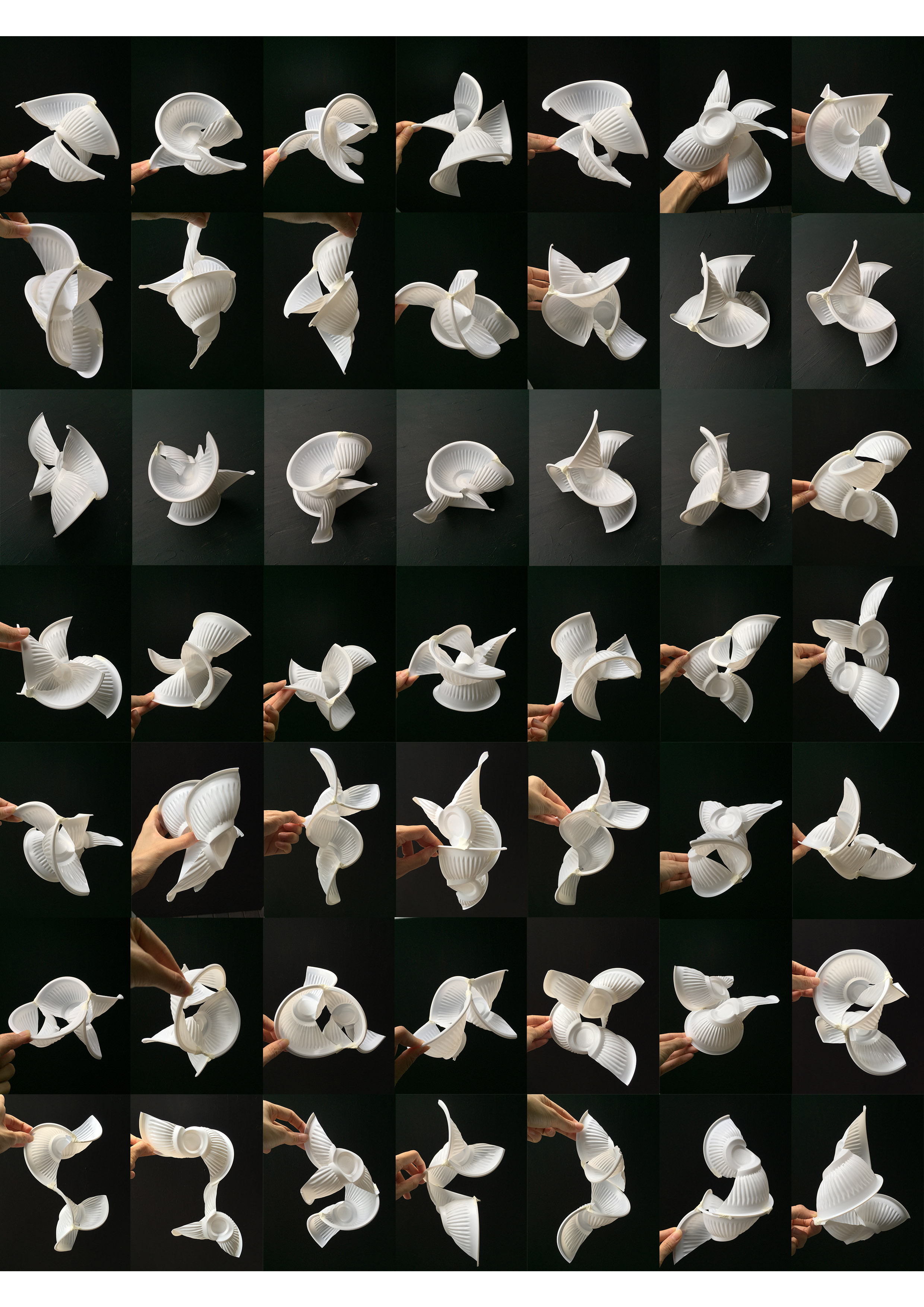
- White plastic bowl with vertical line pattern*
-Cutting straight along vertical lines produced neater cuts but curved cuts produced more organic forms/curves
-Vertical line pattern helps to accentuate the form and direction of the conical walls– which for me suggest the manifestation of drag for each gesture (rim curves) within water
Of the different cups, the starred ones created forms that I felt were more visually appealing and more closely fit my conception of the dance.
Choosing between bowls and cups, at some point I found the line patterns of the bowls distracting because they implied direction towards the base of the bowl, instead of following the direction of the curves formed by the rims entirely. I thought having a smooth surface without patterns would draw better focus to the rim curves and be more effective in conveying the dance gestures.

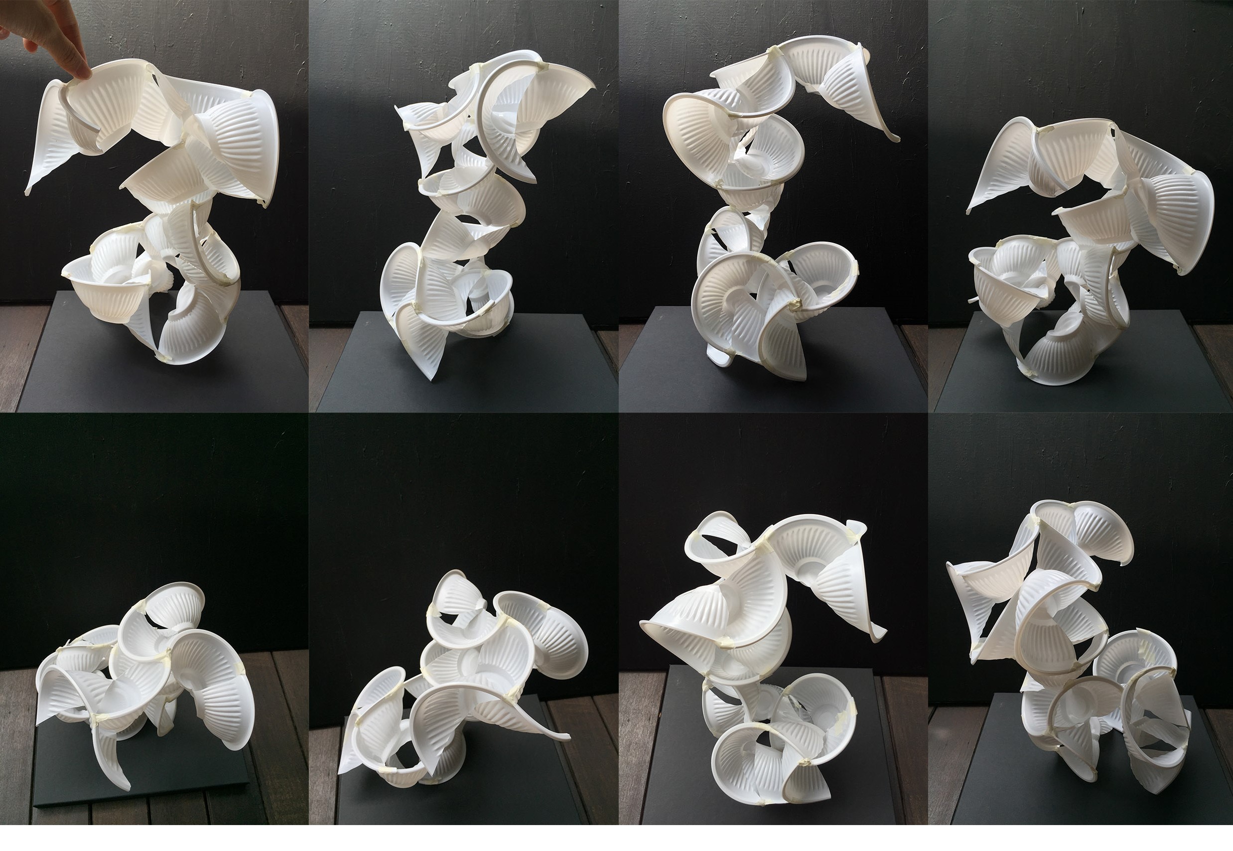
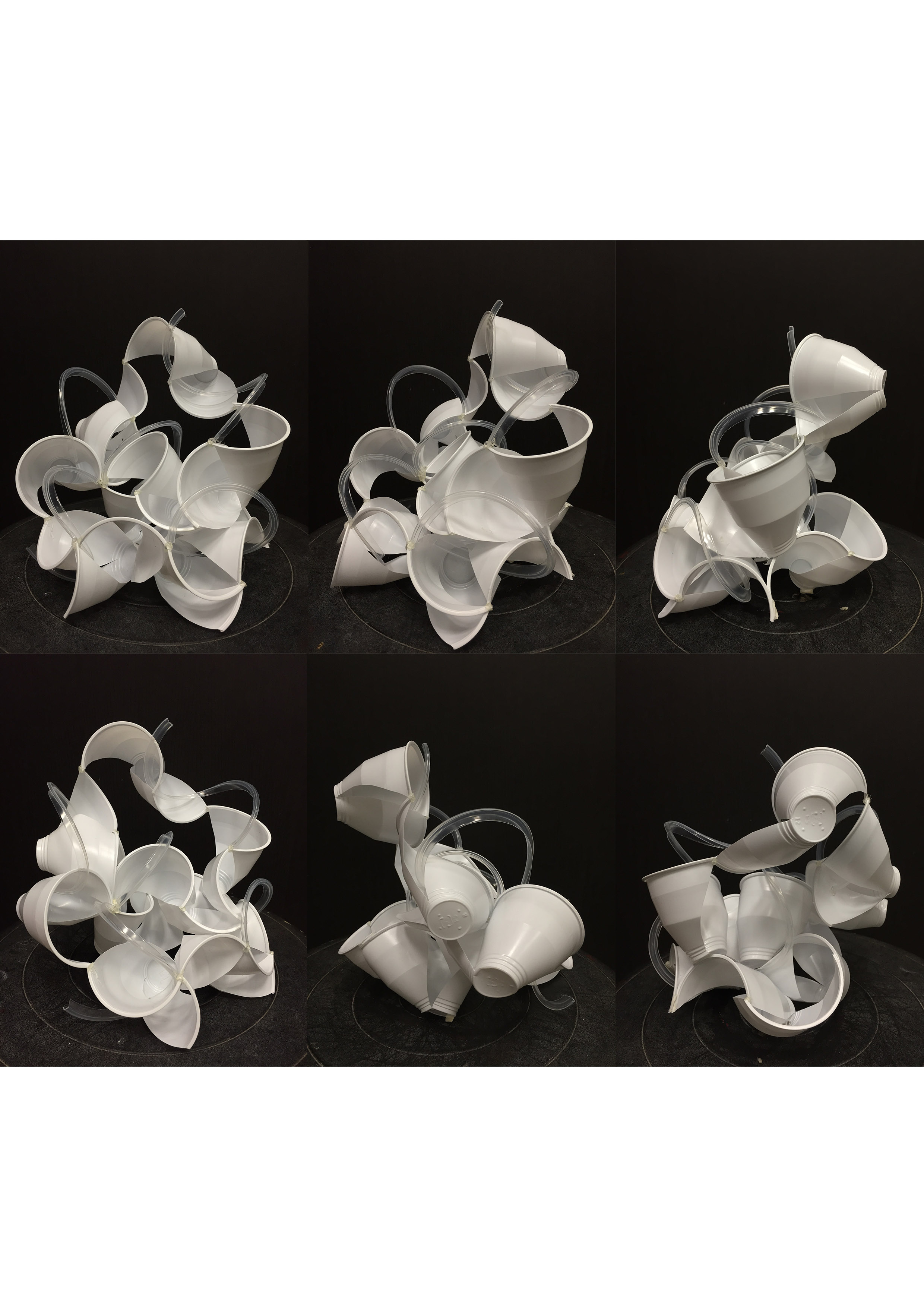
While joining the cups by their rim curves, I found that the structure made could either be standing or hanging depending on how densely I arranged them and the number of joints I made. Between the two, I decided to do a standing sculpture. I felt that the standing arrangement conveyed the idea of paradoxical weight better than a hanging arrangement. The hanging one had a more elegant form and clearer upward flow but the suspension appearance made it feel more entirely lightweight than both weighted and weightless. Whereas in the standing sculpture, there is the contrast between the grounded cups and those that are elevated, such that the elevated ones have the similar quality of appearing both weighted and weightless like the dancer carried afloat by water.
While I had all along visualised and planned for wires to be used to create lines that emphasised the flow of the cups’ motion, when I put the materials together they didn’t look harmonious. There was too much contrast in colour and surface quality. So I explored using paper strips instead since cones didn’t look too bad with the plastic cups when I tried them out before. I discovered that paper gave me the benefit of introducing more interesting lines and a variety of them—by having some width (compared to a wire), the strips allowed twisting, curling and rolling in the elegant lines created between the cups. Although paper was much better than wire in complementing the plastic cups, I wasn’t too sure there was enough contrast because it was white like the cups. I didn’t want to introduce colour either (colour paper) because of the additional associations colour introduced—I also perceived the “colour” of the dance to be white/colourless (elegance/serenity/suspension/water), so using dark colours like black or blue for the literal association with water was out of question.
I considered using transparent materials instead and thought of using plastic tubes or making them myself with rolled transparencies/cling wrap even but they all seemed pretty shabby in appearance. By chance I turned to the materials I already had at hand and cut up the transparent plastic cup I had eliminated for the main form of the sculpture to see what forms I could “recycle” out of it. In my final, I used strips cut from the cup’s bottom section below its rim. These were rigid (could hold itself) but twistable to form some pretty elegant flowy lines, and were conspicuous as well compared to other parts of the cup that were too “transparent”.
Final
Working from my prototypes to the final, I made a conscious effort to try to “declutter” the arrangement of the cups to have more breathing room and spaces within the structure. I also tried to make the snaking motion and direction of flow implied more pronounced. The prototypes were too cluttered and heavy to the extent that the flow and quality of weightlessness was were compromised.
In the final, conical structures are not used to represent forces in the way I had initially conceptualised them to. Instead, the opposing forces manifest in the unique structure of the cups themselves: the lines formed by the rims are the dancers’ gestures and the flanking planes (sort of like water resistance echoes or ripples) are the drag force. Arrangement of the cups are cumulative and slowly build-up to produce a flow that conveys the idea of stretched time and gesture.
I like it!
– You have a very systemic way of experimenting with your choice of media and your documentation and keen observations have worked well for you.
– The ideas that you had drawn from the dance pieces, each in itself would have been a worthy exercise of exploration.
– Perhaps some editing of ideas may have helped with the clarity of the overall expression. The final composition may have benefited from some relief or negative space allowing the rest of the twisting cups to shine in its expression.
– On the whole a good attempt with your chosen media and kudos to your methodology and experimentation.