Link to presentation slides:
https://docs.google.com/presentation/d/1AxTukLpNfs8bZlUe9OZEC4s_JotmmiZxno5EYol2hY8/edit?usp=sharing


trash

Link to presentation slides:
https://docs.google.com/presentation/d/1AxTukLpNfs8bZlUe9OZEC4s_JotmmiZxno5EYol2hY8/edit?usp=sharing
1.  16 Feb 2019, 1:00PM - 4:30PM (Saturday afternoon)
2.  01 Mar 2019, 7:30PM - 9:30PM (Friday night)
3. 02 Mar 2019, 7:00PM - 9:30PM (Saturday night)
4.  04 Mar 2019, 12:00PM - 4:00PM (Monday afternoon)
5.  31 Mar 2019, 8:00AM - 9:30AM (Sunday morning)
<Recorded transcripts log>
1 Rock n Hop Bar staff
(Singaporean Indian)
ICON #01-01
2 Bento-Go takeaway and dine-in shop owner Mayumi Endo
(Japanese)
ICON #01-05
3 Star Shine Wellness Massage/Spa Therapist
(China Chinese)
ICON #01-07
4 Jurong Provision Shop shopkeepers
(South Indian)
ICON #01-09
5 KEEPS/COOKS FRESH market/cafe staff
(Singaporean Chinese)
ICON #01-10, #01-11
6 Blossom Hair Salon hairdresser, Janet Choey
(Singaporean Chinese)
ICON #01-16
7 Music school teacher
(Japanese)
ICON #02-?
8 HOOHA Restaurant & Cafe boss
(Singaporean Chinese)
VIVA VISTA #B1-06, #B1-11, #B1-50
9 Edge Creations Interior Design staff
(Singaporean Indian)
VIVA VISTA #B1-56
10 Global Craft staff
(Singaporean Chinese)
VIVA VISTA #01-04
11 Natural TCM Clinic physician
(Singaporean Chinese)
VIVA VISTA #01-10
12 Lotus Yog yoga instructor, Sudha
(Singaporean Indian)
VIVA VISTA #01-34
13 CV Global Resources Pte Ltd trade managers
(Singaporean Chinese)
VIVA VISTA #01-37
14 Wood World Renovation Timber Consultant, Qiu Feng
(Singaporean Chinese)
VIVA VISTA #01-38
15 American passer-by
16 Norwegian passer-by
Profile


Nationality:
American - 3
British - 1
British (Scottish) - 1
Filipino - 3
Holland - 1
Indian - 3
Japanese - 2
New Zealand - 1
Norwegian - 1
Singaporean - 24
Profile


Nationality:
Burmese - 2
Malaysian - 6
Swiss - 1
Singaporean - 48


Link to repository:
https://docs.google.com/document/d/1M97dtW8DDSdgyi1-NZ2FUt3reGWITwpDr3rHaftYL6w/edit


My findings are hosted on a website:
https://manweileong.wixsite.com/pasirpanjang
Content of the website is framed by the basic questions: “What comes to mind when you think of Pasir Panjang?” and “Has Pasir Panjang changed in the time you’ve known it?” Information is grouped into 3 main themes on different tabs:

I curated my findings by the stark contrasts in a variety of aspects. The layout/organization of research materials (interview transcripts, photos, newspaper articles etc.) is hence organized with a 2-column structure that assigns each column with a polarity that contrasts the other. The website is a mix-mash of materials consisting of transcripts, photos, videos, infographics, GIFs and animated text.

From part 1 of the research, I decided to portray the concept of change in Pasir Panjang. What stood out for me most was how change in my childhood neighbourhood consists of many stark contrasts/paradoxes.
IDEA 1: Design-your-gallery/shop Activity Playbook

IDEA 2: Spot-the-difference Sticker Playbook

IDEA 3: “Accordion” of Pasir Panjang Village/ICON shophouses
![]()
< c o n c e p t x l a y o u t >

In the extent of change that the place has undergone, Pasir Panjang has both changed drastically in some aspects and remained the same in others. And it continues to change, despite development works starting close to 10 years back since I moved away.
Some buildings have been torn down and redeveloped, others have stayed. Some people have moved, others continue to stay. All this movement—of people, construction work and heavy vehicles—embody the idea of Pasir Panjang as a place of transition; a stopover at which all things are suspended and somewhat displaced in change. The place as a point of transition also emulates the idea of a port which is a crucial part of Pasir Panjang’s identity also.
For my zine I zoomed in specifically to the iconic row of shophouses previously known as Pasir Panjang Village because of its position at the “gate” of Pasir Panjang—all traffic has to pass it to “enter” the neighbourhood. Also, I felt that the changes at this site embodied the landscape of change of the whole neighbourhood itself. Right now the place is a mixed use commercial and residential property called ICON with a “same same but different” facade, with an extra row of high rise buildings behind. But about 10 years back it was a quaint row of shophouses with little restaurants, bars and services catered to the neighbourhood like mama shops and laundry.
There’s some subjective bias to my preference and longing for the past Pasir Panjang Village over the present ICON, but through research I discovered I wasn’t alone on this, and neither was I unjustified in feeling this way. Finding out that the site was a gazetted conservation site gave me a starting point for staging a conversation on change in Pasir Panjang.

back + front covers: narratives of conservation
Spot-the-difference
Although “conservation” of the site by URA’s terms did not mean the preservation of its state as Pasir Panjang, I appropriated it for my own purpose anyway to take this meaning. I took the conservation plan map of the site from the online heritage archive (unfortunately the only place you can visit Pasir Panjang Village now) and manipulated it with elements from the ICON property development brochure.
> I wanted to evoke a sense of irony and inconsistency to the “conservation” narrative I took URA to promise: that despite the gazetting of the area for conservation (in my terms), Pasir Panjang Village was redeveloped into ICON.


Within the zine itself, I also made use of this spot-the-difference/comparison idea in my layout. The pages are not limited to being read as spreads with the pages they are directly side-by-side with. I curated the content to allow connections and contrasts to be made across pages not directly next to each other, to form new spreads. For each spread/pair of pages, I use a different device for showing contrast, or convey a different type of contrast in content.
< overview of ways pages can be read as spreads >


< individual spreads >

1 + 4: introduction to narrative of change
“worse.” – Interview response on changes in Pasir Panjang (4)
> Typically you expect development to bring improvement, but what I found about change in Pasir Panjang was that this wasn’t necessarily the case. The present state of ICON is much more deserted than its past state when it was Pasir Panjang Village. Many shops remain unsold without tenants, and shops with businesses set up do not have much customer flow. This led me to question the purpose of redevelopment in the first place and the irony in the narrative of improvement implied/presented.
[]


1 + | 2 , 3 | + 4: narrative of obstructive construction
Separating (1) and (4), (2) and (3) depict elements from construction sites there: construction signs, sound barrier cloths, property development advertisement text etc.
– Quote on (4): “Pasir Panjang is built on its rich history and charm.” – Property Website
Direct reference to literal meaning of ICON being built upon Pasir Panjang Village (the audacity of it to replace the Village and make it history while praising its charm)
> I felt that construction work had a very intrusive character to the locale, separating the past and the present, representing a state of displacement in transition for the people living there/passing through. I thought construction work would have completed by the time I visited after growing up, but the building continues. The ceaseless construction continues to obstruct and separate life there even today. Thus I set aside 2 pages specially to depict construction, breaking the continuity and flow of the row of shophouses spreading across the rest of the pages.


[]

| 4 + 5 | : views on extent of change
“looks pretty much the same to me”, “Still ___” Interview transcripts (5)
> Contrasting views on extent of change that Pasir Panjang has gone through (from people who have known the place for different lengths of time)
[]

Interview transcripts about attitudes towards change. Not curated according to positive/negative attitudes, remixed together. Increasingly densely packed from left (5) to right (6), with greater distance from sound barrier 防音 page (3).
> The attitudes towards the changes that Pasir Panjang has undergone and continues to go through, are just as varied as the state of change in the place. Some people are negative and reminisce the past, others are positive and optimistic about the development. Then there also those who occupy the middle ground and are neutral. Mixing the elements of the old and new shophouses together as well, I wanted to show the confusing coexistence of past and new physical infrastructure/architecture in Pasir Panjang. I also wanted to express how despite all the changes, even in the present landscape, you can still find traces of the past—both tangible and intangible ones—in the physical landscape, people that remain, and memories.
[]

(6) Packed with visual noise of quotes
> I wanted to highlight how all the views about change in Pasir Panjang are sort of like unspoken “white noise”. Hence the not-so-clear readability of the words against the pictures. The sound barrier, representing construction work, blocks out the activities and voices of the people living there (obstruction to daily life). It is however not the physical barrier that does this, but the deafening noise of construction work that drowns all other sounds. (It is unclear what sounds these sound barriers are designed to be barriers for: sounds of building or voices and activities of residents?)


[]

“It’s only getting better in the near future.” (6)
> All the changes are framed within the narrative of development that the government has planned for Pasir Panjang: plans to relocate the ports amongst others in the Great Southern Waterway Masterplan. Combining mixed observations and attitudes on change in (1) and (6), I address the uncertainty that I feel about the “Greater” masterplan and Pasir Panjang’s state in the future.
Stitching
I had to stitch photos of both the past houses and present houses before I could compare and stitch the two times together. However, multiple perspectives present in each photo made the task a bit more difficult and I had to remove elements like the roof separators that threatened the frontal perspective I tried to create across the row. The past houses also had to be skewed and manipulated to fit the perspective of the present houses.

Joining the individual pages to create the continuous spreads, I also had to make sure they aligned.

First draft
For the construction work page (3|4), my original idea was to have a hole in the silhouette of a shophouse unit cut out such that you could see the past/present house concealed behind, but framed by the sound barrier construction cloth. The idea was to allow for comparison between the past and present houses with the construction narrative framing/contextualising it. I wanted to have holes also to allude to the idea of demolition of the past to create an empty space, before the present/future succeeds it. The holes also implied the absence and sense of loss I felt towards Pasir Panjang Village more strongly.


However after trying the idea out with the images stitched together, I couldn’t find an elegant/aesthetic solution. The hole made by one house did not frame the house on the other page similarly. Changing the shape of the hole to just a rectangle created a window instead of a silhouette that registered the past’s absence/disappearance. In the end, I decided to discard this hole idea and use the full-page opaque sound barrier cloth idea instead (final).
Because of the poor resolution of the past photos of the shophouses I had to work with (from the conservation archives online), I had to find ways to make the zine look like it wasn’t using bad quality images. I considered replacing the photographs with illustrations/traced drawings but using photographs was important for me because of its “documentation” idea and how it alluded to a real place. With Pasir Panjang Village already non-existent as a physical site, I needed the power of photographs to prove it existed. Illustrations would not have achieved the same effect.
Joy recommended I play with pixelation so I tried different distortion and blurring effects. However, the effects either made the past photos too ambiguous (unidentifiable specifically as Pasir Panjang Village VS just any row of shophouses) or added a different layer of meaning. The stagger filter effect created a vacuum/erasure sort of motion. In the end, I decided to fade the colours and use inkjet instead of laser printing to resolve the problem. The printed effect achieved a “low-res” sort of consistency across the past and present photos.


I also chose plain paper of a thinner weight to fit the aesthetic of the ink. This gave the zine a sort of fragile quality as well when you held it in your hands. It captures what I feel about the present state of Pasir Panjang, suspended in a fragile, uncertain state of change and transition. It also reflects how I personally feel about the site as a place that both allows and does not allow me to reconnect with all the childhood memories I formed there.


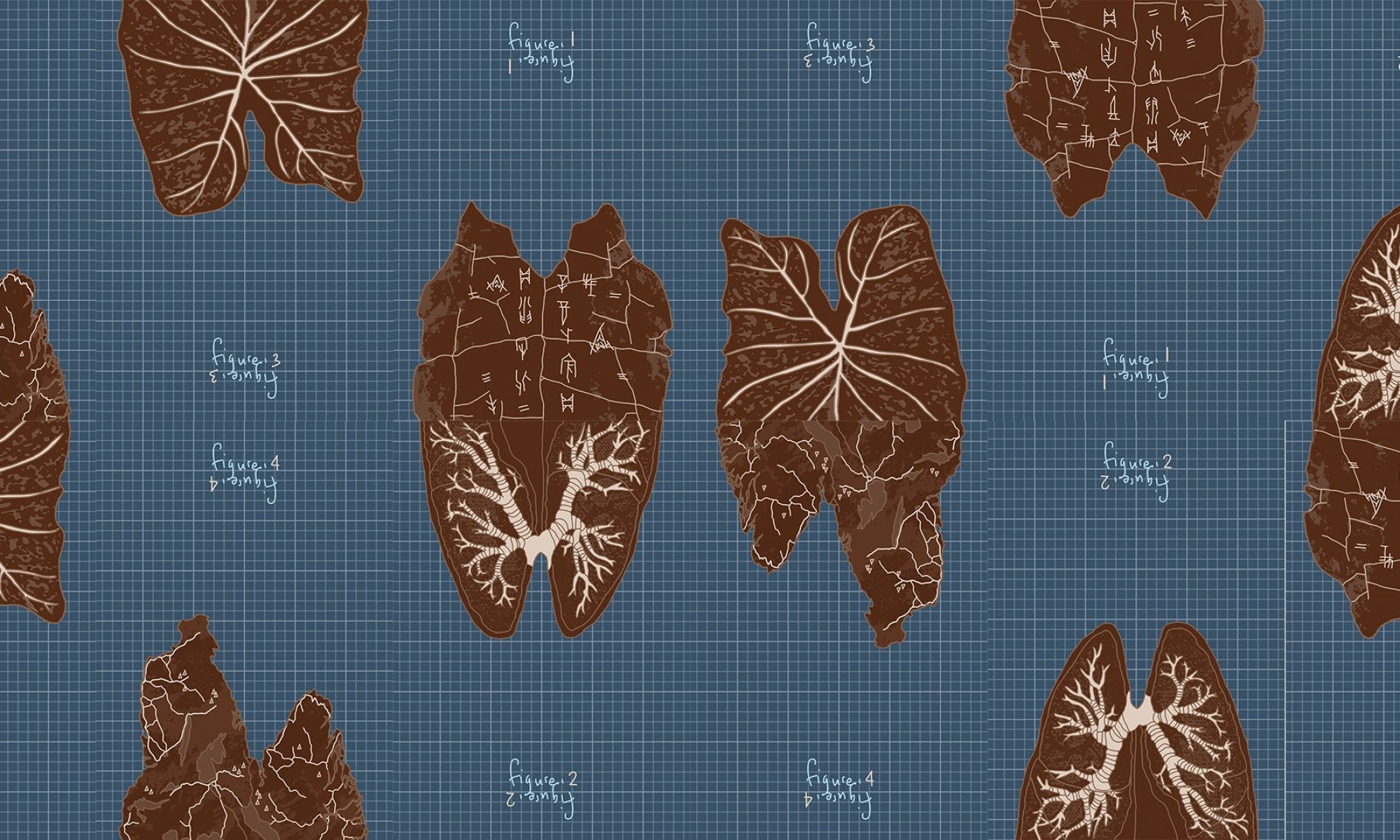
All 4 compositions describe a single job: a researcher who is a universal man— a l’uomo universale Da Vinci in the 21st century. Other synonyms for the title of this job would be anatomist, cartographer, artist, scientist and storyteller. The universal man researcher I dream of being is one who dabbles in everything and makes interdisciplinary connections between subjects. Hence each composition represents a field I’m interested in:
The images were chosen by their ability to evoke the forms of the letters M and W. I chose to represent only these 2 letters of my name and make use of the fact that the same form of M or W can be the other alphabet as well, just by turning it around—suggesting the idea of how as a researcher I can connect these different disciplines in multiple ways. By connecting them in the different ways you are also able to see how my initials, M and W, can be formed and read in different ways also: looking at the positive and negative spaces, both suggest the letter forms of M and W.

With this vertical arrangement where I stack the M and W, I wanted to show how two disciplines can be connected in this way to form a coherent unified whole. This idea of connection and unity is the essence of my job that I want to convey, and my name represented as a single entity (joined M and W).
In terms of design, there were many ways I could go about it: having the images be photo-based or doing it with a hand-drawn style like the Vitruvian man with an antique sort of paper texture. However I wanted to convey the idea that in this job as researcher, my method of presentation and sharing of findings is deeply personal and subjective; the figures I present are my own interpretations and understanding of the world. This helped me decide to use a style that had the “hand-drawn” touch to it, but not in the Vitruvian man sketch sense. Joy asked me how the DaVinci I wanted to be was different from the man himself; how I was different from him as a researcher, and what was different about being based in the 21st century. This led me to decide to present my drawings in a digital instead of traditional/analogue sketchy style, that captured my own art style which is more graphic: cleaner lines and bold, flat forms. With the graph paper sort of blueprint background, I wanted to convey the empirical nature to my research, rooted in observation and reason, that exists alongside the contrasting subjectivity of it—conveyed in my drawing style.


Given this, for each composition I also had to navigate the decision of how much of a “drawing” style I wanted, versus a more stylised, graphic style. While I explored pencil/paint filters for the textures of the image at the start, I decided to stylise them completely in the end.

It was important that the images chosen not only captured the subject they represented, but also evoked the forms of the letters M and W clearly. While I used a brain for the scientist composition initially, this was not very effective/clear in bringing out the indent between the arches of M/W. I had to look for alternatives like villi and lungs instead.
Other considerations in rendering the forms were guided by the clarity of the M/W forms they evoked. While I wanted them to be clear, I also didn’t want them to be too clear and unnecessarily explicit. I had to find a balance between subtlety VS clarity, and variation VS uniformity. For outlines, I had to decide if they were:
 To ensure the letter forms could be easily perceived, I had to play around with how the details of images were portrayed as well such that they didn’t distract from the overall letter form.
Likewise with text specific to the imagery (scientific labels, names and symbols on map etc.), I had to balance their inclusion/omission such that they didn’t distract from the letter forms. I also wanted the networks formed by the details of the cracks/veins/rivers in each composition to be highlighted since they are used to connect the compositions further. So these details were prioritised over text.

Considerations to the font of the text were guided by the same ideas involved with the medium/style of the images.
At one point, I experimented with overlaying the text specific to an imagery over another as a different way of invoking interdisciplinary connections. However it got a bit excessive and affected the clarity of what image represented as well. Given the multiple other ways I was able to evoke connections across the compositions (through arrangement, colour, form, networks etc.), I discarded this idea.

For the colour scheme it was important that I used a monochromatic palette for each composition so that its positive and negative spaces highlighting the M and W letter forms could be seen easily. Applying the same palette across all 4 compositions was also decided to create greater unity for the interdisciplinary connections idea, even as the compositions are sufficient on their own, viewed separately.


My experiment with inverting the brown colour scheme (inspired by palette of Vitruvian man but a digital graphic take of it) led me to discover the blue argyrotype-looking palette. I liked the colour scheme and thought the contrast worked well with further distinguishing the letter forms. This led me to adapt it to use both brown and blue schemes in a single composition with the graph paper grids overlayed.

These were the preliminary drafts I made exploring how the different compositions could be connected in different arrangements and permutations. To maximise the permutations possible, I:

For critique, I displayed the compositions on a push trolley with stains that evoked a lab setting of a researcher/scientist. I really just needed a flat surface that would allow the compositions to be played around with easily (versus stuck on the wall) but the trolley made a fitting aesthetic.

