VC1-04: Final Reflection on History of Design Lessons
I had imagined History of Graphic Design to be rather boring, focused around technical terms like serif and kerning for typography, and rules for grids and layouts. Instead I was pleasantly surprised by not only how much more there is to graphic design, but the wider scheme of cultures and disciplines it is connected to. I enjoyed how you explained the cultural background and changes in society that each artist/design was set against (although not chronologically; recognising the difficulty in doing so for design and art movements that really bounce back and forth in the time tunnel). It was meaningful this way and helped me understand how my own design practice is and should also be closely aligned with the developments in society.
Perhaps because I don’t take Typography I, I enjoyed the little insights to linguistics and semiotics gained from learning about graphic design – which I realise now is so intertwined with language, and not divorced from it just because its “visual communication” (not sure where I got that impression from). On the “visuals side”, I also hadn’t realised how closely intertwined graphic design was with fine art movements. It was interesting to see how designers responded to the manifestos of Futurism and Dada within a design framework, as opposed to painting in brisk dynamic brushstrokes or mounting urinals on pedestals.
Additionally, I appreciated how you introduced examples where links were drawn between graphic design/visual communication and other mediums, such as in the film title sequence of The Man With The Golden Arm, and the use of photomontage in poster design. Not because of the whole “T-shaped designer manifesto” the professors are trying with our History of Design education, but simply because I thought it showed how versatile and adaptable graphic design is (and perhaps the most widely applied across media and disciplines, compared to product and interactive design). I thought maybe since you showed us designers and works produced against the backdrop of the rise of corporate and identity branding, it would have been nice to have examples of graphic design incorporated into product design as well; in packaging and other paraphernalia. That might have aided my understanding of how graphic design was applied across different media.
The lessons, to my surprise, also complemented my practice in Visual Communication I. The designers and examples, ways of design thinking and design trends were valuable inspiration that I referred to in my assignments. If I had to summarise what I gained from the lessons, I think visual communication/graphic design is about the art of communicating ideas not only specific to periods, but across; each design movement or innovation being a response to another, no culture pr period excluded. Most heartwarming to know was that graphic designers are found in every aspect of society – politics, sciences, music, entertainment, sports, currency, education, you-name-it – and that they are so so important in every one of them. I am happy to be in the position of facilitating one of the most important activities of humans: communication.
PS: I think the use of OSS posts to consolidate reflections after each lesson was very effective in facilitating learning, not just for myself but from reading the posts put up by other classmates, and the comments/external links you put up. Also appreciate the very lovely printouts with keywords every lesson. For quizzes however, perhaps focusing on the significance of designers/the different movements and developments is more meaningful than simply recalling names and definitions.
VC1-03: Aupollinaire’s “Calligrammes”

What strikes me as interesting about calligrams is how it emphasises the importance of visual representation as a language; a means of human communication. From lecture 1 we learnt about how the written word and alphabet characters evolved from the archaic Lascaux cave pictographs and the Egyptian’s early hieroglyphs. Humans developed a system for communicating information that was not a literal image of what it represents. For the English alphabets at least (less so for Chinese characters), they look nothing like anything found in our physical reality.
Yet with calligrams, the written word and characters are arranged to evoke visual representations. Paragraphs are formatted to function like ideographs; typeface and arrangement of words on the page purposefully add meaning to the compositions of the poems they form.
I think it hits me even harder that Guillaume Apollinaire’s work, “Calligrammes”, in which this format is employed, is a collection of poems about war.
“Calligrammes: Poems of Peace and War.”
The poems in the collection revolve around his experiences as a soldier during World War I. It is as if words alone – characters divorced from all visual associations and semblance with natural reality – are insufficient to convey the magnitude of emotion and atrocities of war; that Apollinaire saw the need to further resort to arranging the words to evoke visual images of war for effective communication. It is not enough to describe the battlefields with words, he saw it necessary to create a man running away, out of words.
Apollinaire’s collection of poems contributes to the tradition of pattern or figure poetry (carmen figuratum) in which type is arranged in a configuration to convey or extend the emotional content of the words.
The written language was invented to extend the limited vocabulary of expression that pure figurative, ideographic symbols allowed. A few centuries later, we see a renewed reverence of the expressive power of visual representation; in figure poetry, written language is arranged to form visual figures “to convey or extend the emotional content of the words.”
With further research, I was interested to find further distinctions between 2 types of unconventionally-shaped poetry:
1 Concrete poetry: in which the poem’s message relies solely on the arrangement of type and graphic spaces to be conveyed, rather than on words for the meanings they carry, versus
2 Pattern poetry: in which a poem’s message is still conveyed and retained through the words alone; the arrangement of type is but an extension and support to the expressive power of words.
VC1-02: The Elements of Euclid

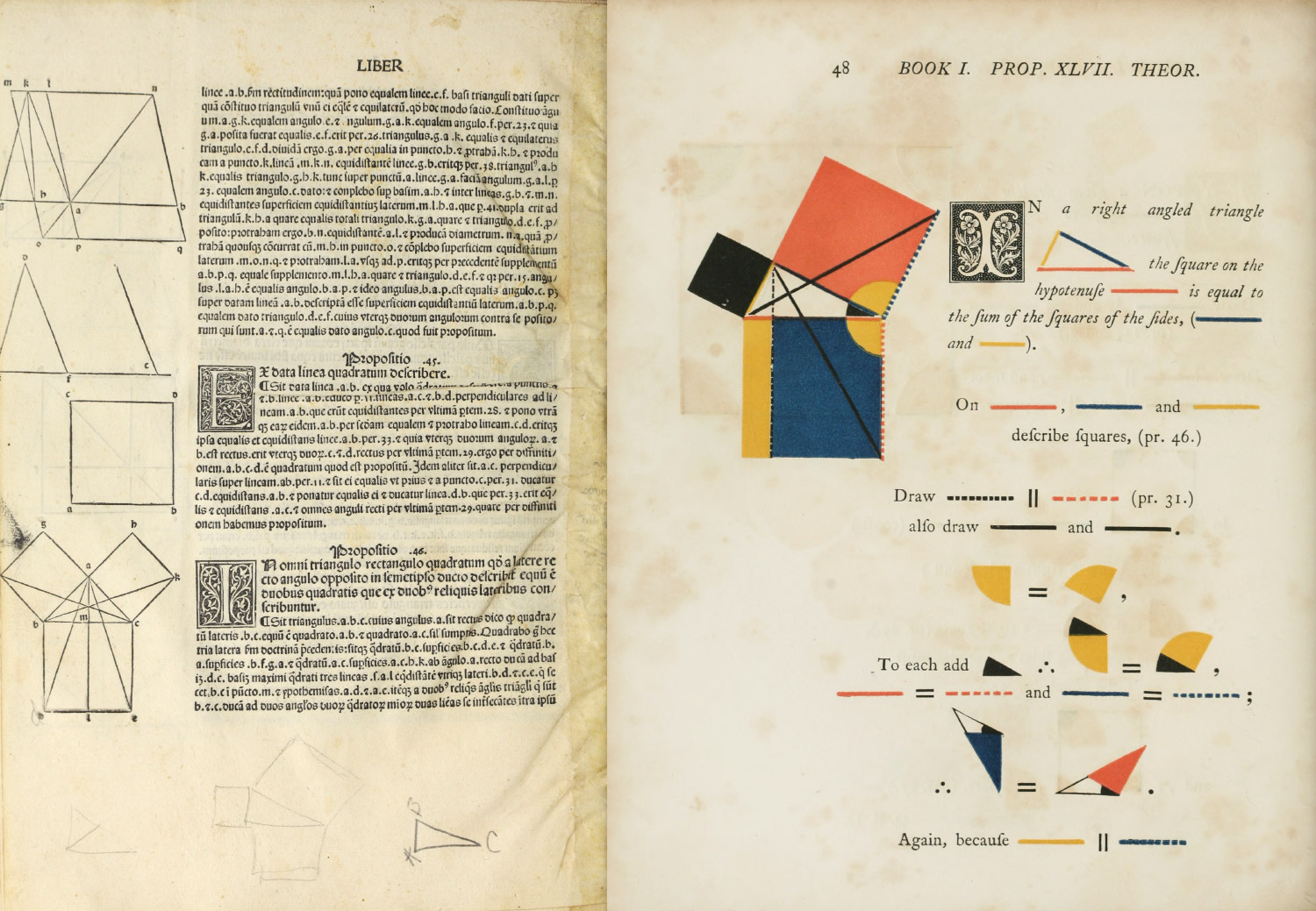
This lesson covered a lot of elaborate and ornamental design styles (Alphonse Mucha and Art Nouveau, display type etc.), but the slide that caught my eye was the otherwise minimalist coloured rendition of The Elements of Euclid (1847) by William Pickering. I was curious about how this design innovation was positioned against the backdrop of art movements like Geometric Abstraction and Neoplasticism, giving the striking similarities in design language. With further research, I found out that the book was printed nearly a century before Kandinsky and Mondrian made geometrical shapes and the RBY colour scheme famous in the 20th century – not after.
It struck me that primary colours were used as the colour palette to design information on the basic geometric elements and mathematical formulas; already Pickering (together with Byrne) had made this connection that would form a key principle of the Abstract Art movement. Mondrian used only primary colours in his paintings because he felt they were the purest colours that captured the fundamentals and essence of truth and reality.
Also on certain pages, the primary colours were assigned to the basic geometric shapes by the conventions proposed by Kandinsky in his Bauhaus textbook Point and Line to Plane (1926). Kandinsky theorised a universal correspondence between the three elementary shapes and three primary colour: yellow, a “sharp” color corresponds with the triangle; red, and ‘earthbound” color with the square; and blue, a “spiritual” color with the circle. The Elements of Euclid might have very well sparked the endeavour of drawing correlations between colour and geometry that would become key in the Abstract Art movement.

What I appreciated most about the book was how it recognised design as an important means of communicating information. The complete title of the book is actually The First Six Books of the Elements of Euclid in which Coloured Diagrams and Symbols are Used Instead of Letters for the Greater Ease of Learners.
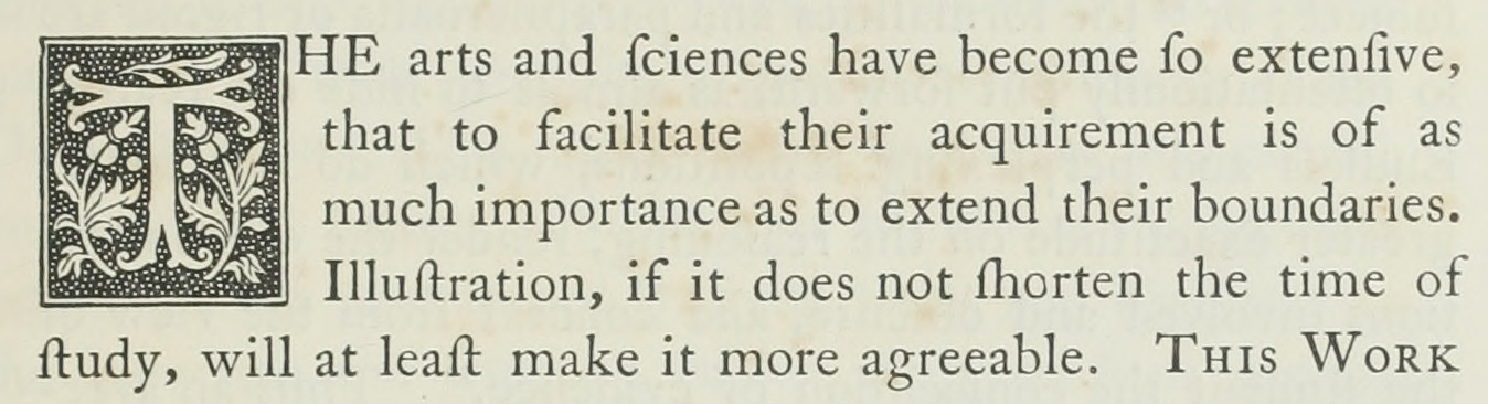
In the introduction section of the book, Pickering also highlighted the importance of design and visual representation in information communication:
“THE arts and sciences have become so extensive, that to facilitate their acquirement is of as much importance as to extend their boundaries. Illustration, if it does not shorten the time of study, will at least make it more agreeable. THIS WORK has a greater aim than mere illustration; we do not introduce colours for the purpose of entertainment, or to amuse by certain combinations of tint and form, but to afflict the mind in its researches after truth, to increase the facilities of instruction and to diffuse permanent knowledge.”
“The object of this Work is to introduce a method of teaching geometry, as well as in France and America. The plan here adopted forcibly appeals to the eye, the most sensitive and the most comprehensive of our external organs…“
“…but as the use of coloured symbols, signs, and diagrams in the linear arts and sciences, renders the process of reasoning more precise, and the attainment more expeditious, they have been in this instance accordingly adopted.”
“Such is the expedition of this enticing mode of communicating knowledge, that the Elements of Euclid can be acquired in less than one third the time usually employed, and the retention by the memory is much more permanent…“
The publishers purposefully broke with information design and book publishing traditions, to employ colourful illustrations rather than letters in referring to diagrams, so as to facilitate “Greater Ease” of learning for readers. Besides enhancing text with shapes and colours, attention was also paid to typography. The book used Caslon as its typeface and started each section with decorative initial capitals.
As one of the first multicolour printed books in the 19th century, and on mathematical works at that, I think it is an important innovation within the development and history of information design.
While researching, I found a website that digitised the book for the viewing by today’s modern readers in the digital age. It retained most of the design elements of Pickering/Byrne’s edition (typeface, symbols and colours etc.) but added an extra “touch” for the “Greater Ease” of learning for 21st century readers: interactivity. The creator Rougeux made the diagrams interactive with clickable shapes in the descriptions, so as to aid in understanding the shapes being referenced. Clicking certain parts would highlight or conceal others for easier correlation of information.
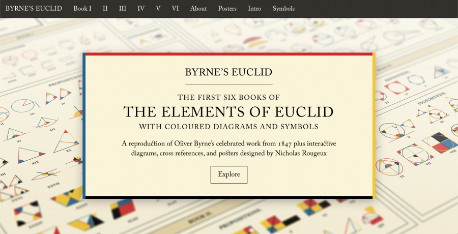

I thought it was interesting to see how the same book was adapted and redesigned to facilitate communication of information to readers of different eras. By comparing the three different versions of The Elements of Euclid, it is possible to chart the development of design trends alongside changes in society and (media) culture.
VC1-01: Rebus Principle

<h>
</h>
The Rebus Principle evolved out of a need to represent intangible concepts easily which the early pictographic signs fell short in. The Ancient Egyptian hieroglyphs were useful in representing concrete objects, but could not do the same for names, ideas and function words.
If you can’t make a picture of something, use a picture of something with the same sound.
I love that the Rebus Principle demonstrates human’s desire/impulse to put a name/finger (hence, tangible) to everything. The act of doing so almost serves as an affirmation of our understanding and knowledge of something; by giving something a name, we officially “own” it and have custody of it in our “knowledge bank”; by spelling out and putting our emotions into words, we legitimise our feelings.
Nothing gets more intangible than an ![]()
 . I can only imagine and share in the satisfaction of the Sumerians in being able to put an image/form to something so formless and abstract.