Final Project: Warm-up the New Normal

WARM-UP THE NEW NORMAL

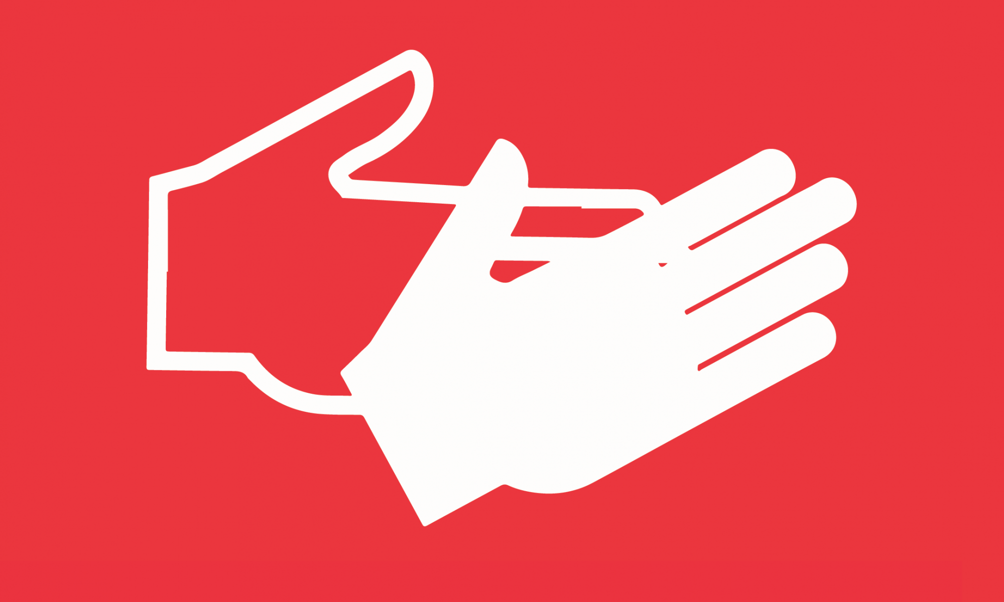
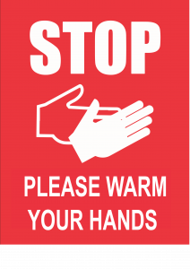
PLEASE WARM YOUR HANDS

Many of us had difficulties adjusting to the new normal as we found ourselves suddenly held to a whole slew of restrictions. Safe-distancing measures place crosses between us, discourage us from talking to each other and gathering in large groups. They challenge our ideas of proximity and relationships altogether and seem to make society a lot more colder.

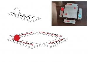
This installation hopes to help users warm up to the new normal and its visual lexicon of tapes and crosses, by offering a new means of connecting and feeling each other in spaces simultaneously shared and divided. The super conductive ADM uncommon table aims to help users remember the feeling of warmth transmitted by the touch of another human’s hand, even while practising safe-distancing. Users are encouraged to make a no-contact heat pass to share their warmth with others across the table – all while keeping their hands to themselves.

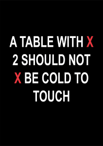
If cold to touch, invite someone else to share the space and warm up with. Just don’t feel too lonely when touch becomes cold again.
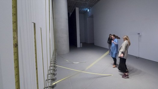
   

FINAL DOCUMENTATION

(Photos and videos here)

PROJECT DEVELOPMENT

Early Idea –

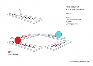
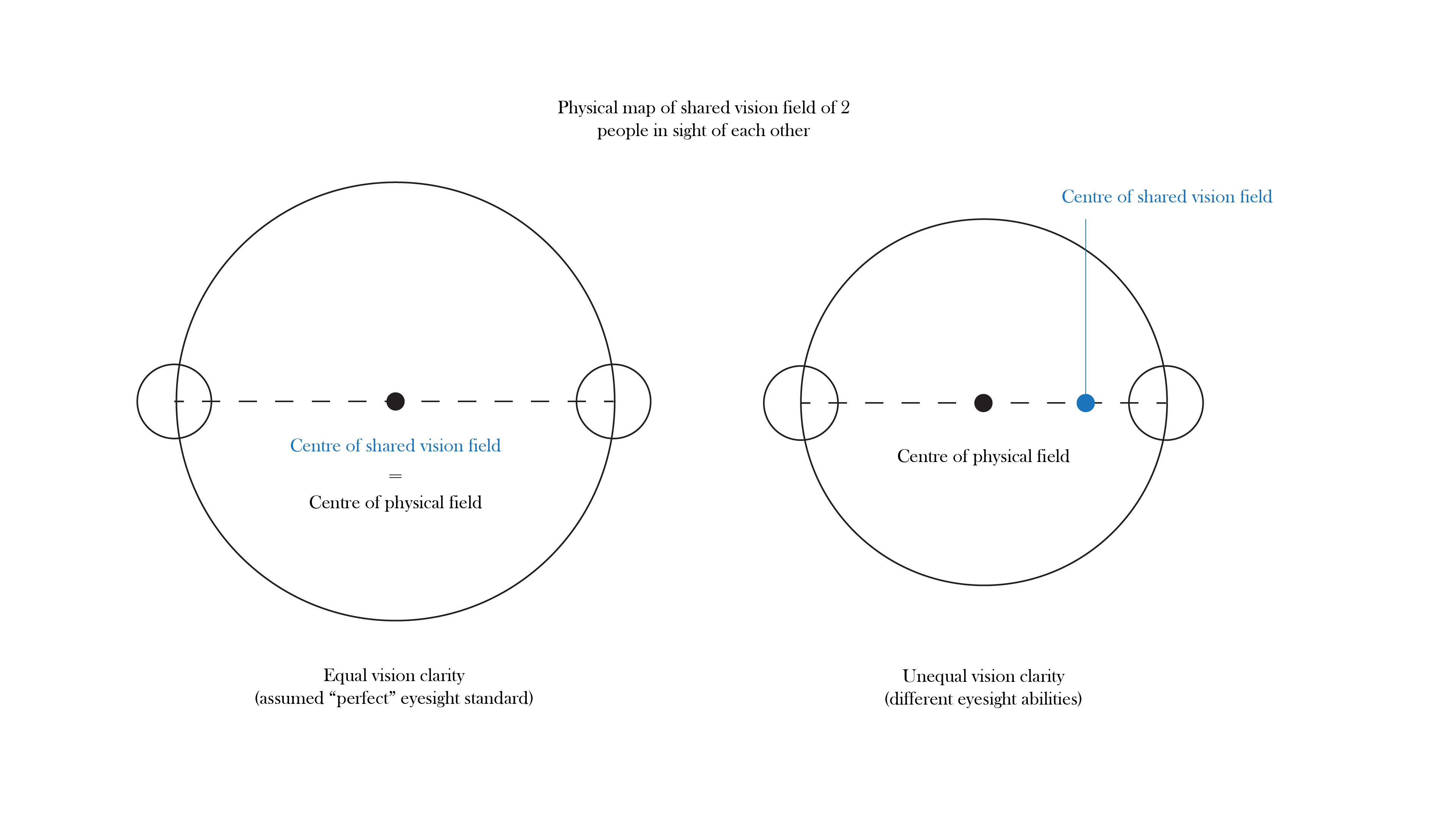
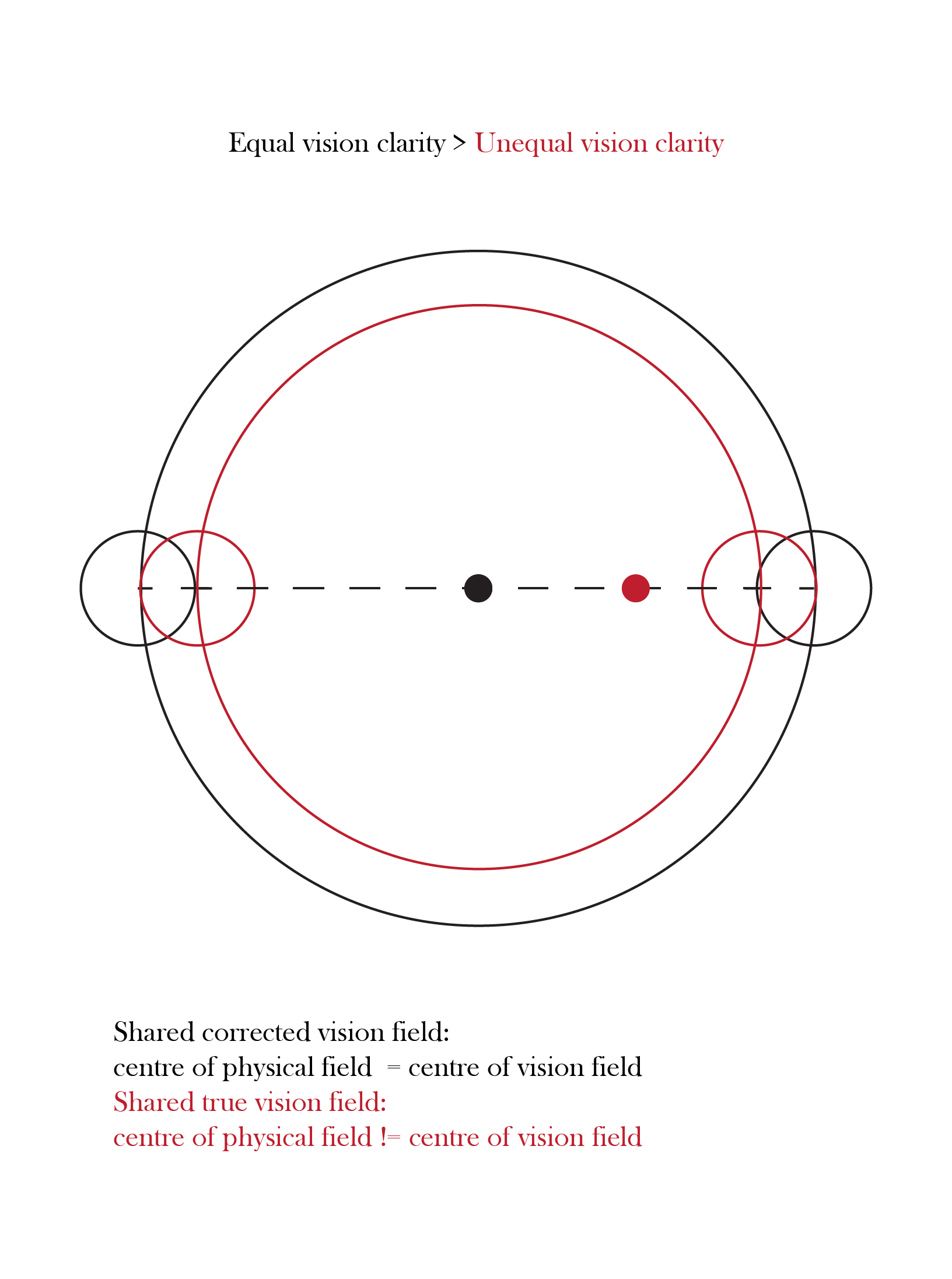
I started with the idea of visualising body heat and mapping out its shared field and paths between 2 people in space, reflecting on these questions:

  1. How can we feel each other in a shared space while apart?
  2. How can feeling each other encourage us to not only acknowledge but interact with each other?
  3. How do we mark personal territories & occupy spaces as our own?
  4. How do we navigate sharing these spaces with others?

/POST-MIDSEM/
Iteration I –
HARDWARE:
LDR (sensor measuring light)
Heating pads + MOFSET semiconductor for temp control
LED strips 
Arduino 
5V power supply

SOFTWARE:
LDR code with threshold value
Heating pad + MOFSET code
LED code for fade + intensity changes

Interaction:

  • If user 1 activates button, user 2 heating pad heats up, LED lights up
  • If both users activate button, both users have heating pads and LED lights activated
  • If no users activate buttons, both heating pads cool, no LED lights
  • The longer the duration of contact/stay, the hotter the heating pads (sufficient to achieve via normal heat conducting mechanisms without need to manipulate software code)

I had to experiment a bit and do some calculations to decide what power supply to use for my circuit as I needed to connect 2 heating pads, 2 LED strips and an arduino to the same supply, while meeting their different power ratings and voltage needs. I tried: Li-Po batteries, cell batteries, open bank, DC adaptors of different capacities. As I am relatively inexperienced with electronics, learning all the hardware and circuitry was slightly challenging but a good learning experience from this project.

Iteration II –
HARDWARE CHANGES:
LDR (sensor measuring light)-> DIY soft button (measure electric contact)
LDR readings unreliable for input due to close position with LED lights in set-up

SOFTWARE CHANGES:
LED code runs to pulse continuously at different light intensities for 1/2-person interaction

After consultation, I decided that I would adjust my interaction to focus on lights only to convey the idea of heat visually and play with the intensity and the way they pulsed when 0/1/2 people activated the buttons.  I wanted to remove heat entirely because I felt that the adafruit heating pad I tested generated an underwhelming max temp of heat that might let down users’ expectations.

FINAL Iteration –
HARDWARE CHANGES:
Adafruit heating pad -> Stripped commercial heating pads
Technical experiments for INPUT: ways of combining resistors to improve contact and sensitivity of sensors

SOFTWARE CHANGES:
Normal ButtonPIN code for DIY soft button ->
Using Capacitive Touch Arduino library to improve sensitivity
Subtle differences to LED code to make 2-people interaction activate brighter lights than 1-person only

PHYSICAL SET-UP MATERIALS:
Cover for heating pad button: black/red/metallic
> Black was most suited to contrast the states of the table activated with and without light
> Black blended well with the table so users focused on feeling the heat VS visuals
> Metallic sheen had conductive associations but was distracting to view, took away from heat feeling focus
> Red suggested heat all the time VS cool surface

Black cloth/felt VS foam VS cellophane paper 
> Cellophane paper worked best to gain/lose heat from the heating pad under and blended with the table set-up
> Cloth and felt were too tactile and captured heat too (lost heat more poorly)

I switched out the adafruit heating pad with heating pads stripped from a commercial product. The maximum temperature reached by these heating pads were still not impressive but their rate of heating and cooling was much higher so the presence/absence of a second person activating the heating pad could be felt more instantaneously. I decided that I would stick to the objective of making heat the main output of my interaction.

My original concern was that the low temperature of the heating pads were defeating to include if they fell short of people’s expectations in their temperature. However while testing the set-up, I realised that the expectation of the pads heating up, combined with the subtlety of the heat generated, actually produced a yearning to feel the “heat from the other person” instead, where I pressed down harder on the pad and focused more on feeling for the heat. The warmth generated is also comforting to the touch and of an appropriate temperature to suggest the warmth of hands. I felt this was more aligned with the concept of my work, versus my first idea to amplify the sensation of heat generated beyond body temperature (boiling) as the heating pads were activated for a longer time. In that iteration, I am creating a new sensation and unfamiliar mode of communication between people via heat, whereas here I am trying to recreate and remind users of the sensation of sharing bodily warmth – that might be forgotten with safe-distancing measures being enforced, limiting physical contact and extending distance between people. I think the subtlety of the heat works well in heightening the user’s sensitivity to feeling – to warmth and also the presence of others in the same space. The yearning to feel the heat output suggestively closes the distance between the interacting users, as they establish “contact” through the heat “conducted” by the table.

Further Improvements –

Given more time, I would have liked to experiment more with the code to make the heating pads pulse a cool white light while no users activated the buttons, and incorporate better fading transitions for the LED lights when activated and switching between intensities. This time however, I have focused on making the simplest code work together with the hardware circuit, and on presentation of the installation to guide the interaction.


Assignment 1: Body-Powered Seat Warmer WIP

 BODY-POWERED SEAT WARMER

CONCEPT

The installation explores other ways we might feel each other in a shared space (presence), that might have greater effect in compelling us to engage with each other – where merely seeing and/or hearing each other can still fall short. While physically apart, can we also feel each other?

The table invites two people to sit across each other diagonally, following  safe-distancing directions. It suggests to users that they may share their body heat with each other by warming the seats directly beside the other user, simulating a scenario where they are seated next to each other instead of across. The body-powered seat warmer mechanism that enables this is undisguised and visible for understanding; all decisions by users to share their own body heat or experience the other person’s induced body heat are therefore conscious and expressions of a desire to actively engage with the other person sharing the space. The unsophisticated lever mechanism requires users to perform work with their bodies in order to “conduct/convert heat energy” for the other user seated on the opposite side.

In reality, there is no situation where people can feel the heat from each other’s bodies without:

  • being in close proximity to each other at the same time (a distance too close for the comfort of strangers), or
  • occupying the same space successively (such as when you sit on a seat warmed by another person who left only shortly before you came).

The installation tries to set-up a scenario that allows two people to induce and feel each other’s body heat while occupying different positions in the same  space, at the same time.

OPEN QUESTION – Does the invitation to share/feel the body heat of another person invite or put off people from sharing a space?

DEVELOPMENT
SET-UP

Project Dimensions: 1.5 x 1.5m

Each bench has a seating spot (user A) and heating spot (user B effect, activated contact between heating pad and metal bench underside).

Knowing how the mechanism works might prompt some people to place objects on the opposite side of the bench to test the experience while occupying the space alone. Nonetheless, that action is an act of inducing/ simulating the presence of another person in the space, drawing attention to the user’s solitary state at the table and inviting the body of another to replace the substitute dummy object. 

In a scenario where the mechanism is concealed and users have no knowledge that “their body heat” will be “conducted” across the benches to be felt by the opposite user, they might be less conscious and keen in sensing any subtle changes in temperature on the bench. 

Consultation review:

In my original mechanism where the heated spot (effect by user A) is positioned directly under user B, it is difficult to determine if the heat felt under each user is caused by their own body heat or the other user’s; the heat output cannot be meaningfully traced to the physical presence of another (objective). 

Whereas in this mechanism where the heated spot is instead beside user B’s seat, more of the user’s attention is drawn to the induced presence (or absence) in the seat beside him/her – where in normal scenarios without social distancing, it would be possible for another person (stranger or acquaintance) to physically occupy this space.

The absence of a physical person in the seat beside, together with the expectation of this seat being warmed when the table is shared by two persons, further creates a pulling force for each user to reach out to the hot spot induced by the other with their hand, or physically inch closer or sit atop of it even (this would be an active choice to engage with the other person and “share” his/her body heat). 

MATERIALS
  • Wooden planks x3
  • Chopsticks
  • Foam/hard board
  • Raffia string
  • Heating pad/ hot water bag x2
  • Black paint
TESTS
  • Exploration of different heat pack materials for longer lifespan/ quicker transmission/ larger area of heat transfer

Results

01
MATERIAL: Aluminum ziplock bag + hot water
TIMING/RADIUS: 2min/5cm,  no further area increase
LIFESPAN: SHORT
02
MATERIAL: Rubber hot water bag 
TIMING/RADIUS: 2min/5cm, no further area increase
LIFESPAN: LONG
NOTES: To test amount of water's effect on retaining heat*
03
MATERIAL: Heating pad
TIMING/RADIUS: WIP
LIFESPAN: WIP
04
MATERIAL: DIY microwave rice sock bag 
TIMING/RADIUS: 
LIFESPAN: 20-30min
https://www.decathlon.sg/p/8373953-81844-hand-warmers-10-pack.html?gclid=CjwKCAjwwab7BRBAEiwAapqpTBHYEP0lEH_ekfuqEFzx8llPPv69pldh_qk0BOJVEyOdBQRSDvbUARoCEd4QAvD_BwE
(one-time use)
https://www.guardian.com.sg/beyond-bodiheat-heat-pad/p/108479?gclid=CjwKCAjwwab7BRBAEiwAapqpTJdwGQEt0DyyXsIz1rrmbcCP2nlNvqyKILVLGlHJzwnR-QEVvBQM8xoCWSMQAvD_BwE
(12 hours, one-time use)
https://shopee.sg/product/12479233/826076469
(reusable, max 54 degrees)

https://www.rainbowcare.com.sg/hot-water-bag
(hot water bag $6, pickup)
  • Exploration of conductive materials to increase radius of heat transmission from heat pack, closer “felt reach” to sitter (can we increase the conductivity of the steel bench along its length?
WIP Findings
Aluminum foil: no significant improvement
  • Different ropes for durability, ability to support weight
WIP Findings
Normal twine: works well enough with wood
Fishing line
MECHANISM
Final version sketch
prototype tests

Miniature model

Original idea: lever beam atop fulcrum

Test 1: seat end only of beam atop bench

Final idea: hang both ends of beam below fulcrum and bench (comfort for sitting and presentation)

PRESENTATION
  • To paint planks and ropes black
  • Heat objects and buttons in bright red/ metallic sheen (conductive associations)
  • Stickers with bad puns/instructions
  • WIP
Visual inspiration

Bidet Toilet Seat Attachment W/ Heated Seat and Hygienic Nozzles Daiwa Felicity Wash Mate Deluxe Elongated - Walmart.com - Walmart.com

Warm regards,

HOME sketch: living room shapes

HOME : LIVING ROOM : SHARED | DIVIDED SPACE
  • mapping self-proclaimed personal space territories of each person
  • little difficulty building walls around ourselves while occupying the same space (defining personal space in shared space)
  • limited interactions and incentives

  • forcing view of shared space: tangible lines / planes to define our vision
  • difficulty: acknowledging and reacting or accommodating to the presence of others sharing the same space
  • drawing tangible lines or planes extrapolated from the positions of our personal space to shift our vision to a shared space (heighten consciousness)

  • stress of “tunnel vision” and felt sense of “connection”, of constantly having to acknowledge presence of others – can we share the burden and negotiate our interactions in space together?
  • if using flexible ropes tied to our heads: tightest when we are at the maximum distance apart, easing when we are closer together (does it necessarily encourage interaction/ relational intimacy?)

//

In the same physical space, we see and hear each other but neither encourages us to engage with each other in a shared space. We don’t touch each other though, obviously since we are spaced apart. So perhaps allowing each other to physically feel and register each other’s presence while at a distance might prompt a new awareness or way of perceiving each other in space? 

What happens also when this form of connection is established between people who are not in each other’s vision and hearing field (in different rooms)? 

Would a rope tied to the heads of different people be space connectors or dividers; do they join or separate? 

Tension of rope X stretched elastic, morphing space

Shifting mats under our feet

Careful not to step on each other

re: Singapore Heritage Light Up

What is it that is being communicated?

I think the installations/event had a heavier emphasis on the message of solidarity than celebration.  I initially expected to be unimpressed, but the experience was surprisingly rather memorable as an edition of light display in Singapore that was particularly context-specific and responding to our present reality of living under a pandemic.  It was unlike any of the other typical displays saturated with fancy sound and moving animations.  It was still and powerful. To visit the installations with the expectation of it being sensational and exciting would be misguided. The atmosphere was instead a mixture of solemn, prideful and introspective reflection – and appropriately so.

This time, the grandeur and structural integrity of the monumental buildings were accentuated by the light displays rather than made secondary. In other instances, I have only ever paid so much attention to them as mere blank canvases for their animated skins, that can be rather random and remotely related to the show’s theme. Highlighting the structures of these monuments that define Singapore’s cityscape, by painting them in our bold national colours, is a simplistic but perhaps effective way of communicating our national identity and evoking solidarity. From my observation of the people around me who stopped to watch the still monuments, a simple display of light and colour can be a uniting force among family and friends and even between strangers. I personally felt an unspoken sense of connection with some of the families viewing the installations beside me.

A family stopped to watch the show (grandma pulled a chair too)

One of the many families visiting the light-up together

Comparing the feelings evoked from Switzerland’s projection of Singapore’s flag on its mountain made me realise that these feelings of solidarity and reflection with the nation that I felt could not have been evoked from the mere display of national colours, or their plastering on any other structure. (This would however be interesting to explore) The mood and messages of the installation were brought out by the site specificity of the selected buildings, all of which shared a certain quality of firmness. Notably, the experience of these cultural institutions were not transformed by lights alone but by the pandemic’s effects too – the stillness of the night and less than normal crowd flow and traffic contributed to my experience.

Singapore flag beamed on to the Matterhorn mountain in Switzerland
National Gallery Singapore
What might the “curators” have to consider to plan such a transformation?

Curators would have to consider:

1. Designing each skin to complement the structural integrity and specificity of each building. Since every building is given the same treatment of red and white lights, curators would have to create designs that were unique to each building to allow some visual interest and differences amongst the different sites.

Victoria Concert Hall
Asian Civilisations Museum

2. Selecting appropriate sites and using design interventions to connect them. It is noteworthy that the sites chosen for the light displays are in close proximity to each other and share similar architectural elements, on top of having cultural or monumental value. Projections were designed to facilitate way-finding between the sites, such as through visual rhythms of alternating red and white pillars on buildings themselves, or smaller lights illuminating smaller paths. Having a consistent style of the red and white skin also helped me spot the next site from afar and encourage searching of the landscape to continue my journey. Considering not only the site but the area around it is important, especially if the curator wishes to design a certain flow and continuity to the  experience.

Strong visual rhythms in projections
Way-finding lights at Old Parliament / Art House

3. Designing interventions that would complement but also stand out from the surroundings. The buildings are situated in the heart of the city flooded with lights. If it were not for the distinct red and white lights, the buildings would have blended in and competed with the flood of lights surrounding it (blue, white, yellow, pink etc.) Way-finding would have been compromised too.

What alternate ways could YOU imagine transforming these sites to communicate something unique or unknown about Singapore culture?

(Putting aside the context of the pandemic) It would be interesting if the public could be invited to decide this themselves and project what they think to be unique or unique to Singapore culture onto these sites. Many projection mapping works already explore enabling greater participation of the average Joe on the street.

For an analogue intervention, one of the things unique to Singapore culture and arts and cultural institutions in particular that came to mind was our (relatively unpoliced) vandalism with visitor stickers (e.g. I AM MADE FOR SAM / NGS / NMS stickers). These stickers can be found plastered over structures like street lamps in the proximity of their galleries/museums. Combining this imagery with that of (illegal) bubble gum on our roads, I think it would be interesting to invite the public to “Kusama-fy” the floors/steps of these cultural institutions with their visitor stickers. (unlikely but just for fun)

GREETINGS FROM SINGAPORE:: OEA SINGAPORE, 2017 – SAM LO

Intervention for 2 persons with true vision

What senses you are manipulating and how does this change your sense of emotion or feeling in space?

When we think of manipulating sight we usually think of the extreme and taking sight away completely. Yet for many of us, the intermediate steps of blurr y vision are lived realities that our youth and corrective lenses help us forget. While blurry vision may not evoke the same sense of panic and disorientation while blind, they still bring intense discomfort and frustration especially for long periods of time. We take (clear) vision for granted. 

The mapped circle around two myopic people is smaller than that of two with “perfect vision”. While physical proximity does not translate to relational intimacy, I’d like to think that people are closer together when they occupy a shared field of their true vision; they are further sensitised to the differences in their eyesight and the need to communicate and accommodate each other to remain in each other’s field of vision.

The person with better eyesight has the benefit of greater comfort and security in the space drawn about the pair. As this person, I felt a sense of responsibility towards Yi Xue, and some discomfort in knowing we were unequal in this circle meant to enclose our shared field of vision. 

To share/make a space with another, awareness of the differences between two people is required – and by extension, accommodation from at least one of them. Dejan also raised a point about honesty being needed for the circle to be drawn true to its intention; mutual trust is also necessary. It was suggested that eyesight test cards could be used to verify positions of the two people at a certain distance to map more accurate distances, but even this in hindsight requires trust from both parties to respond honestly to the test cards.

Reading Assignment: A Companion to Digital Art

A Companion to Digital Art is a collection of essays, edited by Christiane Paul that gives a good introduction to the definition and characteristics of digital art. The essays explore the histories, aesthetics, politics, and social context of digital art, as well as its relationship to institutions and its historicization, in terms of its presentation, collection and preservation.

In the section on the politics of digital art, it is covered how the “technological history of digital art is inextricably linked to the military‐industrial complex and research centers”. For some reason, this darker history of digital technologies makes me appreciate digital arts even more. Digital technologies were developed and advanced within a military context, as weapons to serve destruction and create discord between people. Digital artists take the same technologies and envision them to be used creatively for utopian ideals, to create positive social and political change to benefit mankind. Digital art is an attempt almost, to salvage the mistakes of mankind and restore faith in humanity. It comforts me to know this, as much as I am conscious of the risk of these technologies being misused and creating a dystopian climate of distrust nonetheless – unsurprisingly, this is an issue contemporary digital arts frequently address. 

___

Paul defines digital art as “digital‐born, computable art that is created, stored, and distributed via digital technologies and uses the features of these technologies as a medium.” Before, I hadn’t given much thought to the definition of digital art or new media, much less the necessity of assigning one at all. I held the reductionist view that whatever contemporary art (I had mistakenly equated ‘contemporary’ with ‘new’) that employed technology, and perhaps with mixed media, qualified as “new media” or “digital art”. However, given the ubiquitous use of digital technologies in even traditional art forms today – in photograph, print, sculpture and painting even – I have re-examined my position after learning about the inherent characteristics unique to the digital medium that, employed as a tool for creation, rather than production, make a work digital art

Of these intrinsic characteristics, Paul highlights that digital art is computational; process‐oriented, time‐based, dynamic, and real time; participatory, collaborative, and performative; modular, variable, generative, and customizable, among other things. The characteristics of digital art that pertain to time and change intrigue me the most. 

D  N A      Y I   M       C                                  DIGITAL ART

DYNAMIC: DEFINITION

With the continuously changing state of the digital medium and its methods of application, it is perhaps unsurprising that the terminology and definition for technological art forms has always been extremely fluid too. What is now known as digital art has undergone several name changes since it first emerged: originally referred to as computer art, then multimedia art and cyberarts (1960s–1990s), art forms using digital technologies became digital art or so‐called new media art at the end of the 20th century.

DYNAMIC: MEDIUM

With the medium of technology I think it is interesting that new media’s characteristic of being “dynamic” and “time-based”, evolving and advancing with time, is not limited to the understanding of the nature of a single artwork, but extended to the entire medium as well. The medium of technology itself is always changing, we hear the words “technology” and “advancement” go together all the time. This is in contrast with other traditional mediums like painting and sculpture which are not “dynamic” in relation to time. The medium itself does not continuously change and take on a different form as drastically as technology does, because the traditional materials themselves are derived from nature, while technology on the other hand is literally immaterial software “generated out of thin air”. Changes within traditional mediums involve technologies changing the way materials are manipulated and used, less so involving changes in the nature and form of the materials themselves. Time-based dynamism in media form is a characteristic unique to new media art.

DYNAMIC: PRESERVATION

“digital artworks seldom are static objects but evolve over time, are presented in very different ways over the years, and adapt to changing technological environments.” 

I find it interesting that the “posterity” and preservation of digital art differs so much from those of traditional art. While preservation of traditional paintings is concerned with protecting the original state of the work and exhibiting them in their unchanging static state – or with time-based mediums, exhibiting the work as it registers changes from the flow of time – this is not necessarily so for digital art.

“The variability and modularity of new media works implies that there usually are various possible presentation scenarios: artworks are often reconfigured for the specific space and presented in very different ways from venue to venue.”

It is easy to assume that the immateriality of technologies allows the original state of a digital artwork to be preserved for generations after easily. However, digital art is engaged in a continuous struggle with an accelerating technological obsolescence that serves the profit‐generating strategies of the tech industry. This obsolescence contrasts with the illusion of advancement with time, when one thinks of “technological advancement“. Unlike traditional media like paint, technology is less subjected to material changes like crackling with the flow of time. The changes that transform digital art from their original state (those that do not continuously reconfigure themselves over time) are instead advancements in technology driven by humans, changing not the form but the context within which digital art is displayed. This presents institutions with difficulties in the preservation of digital art.

“Probably more than any other medium of art, the digital is embedded in various layers of commercial systems and technological industry that continuously define standards for the materialities of any kind of hardware components.”

DYNAMIC??? CONTENT

One of my favourite insights I gained about digital art is how how the rapid change and advancement of the medium itself does not imply or necessitate likewise for the content and ideas behind new media works. It is true that many new media artworks explore issues that are current and pertinent to our time – especially those central to the conditions of the age of technology we live in, since the very medium makes it effective to do so. However, it is also possible for the concepts explored to date centuries back, addressed previously in various other traditional arts. Digital artists continue to address universal and timeless human concerns, with new technologies.


Not everything about digital art is necessarily new and dynamic afterall.

VC1-02: The Elements of Euclid

This lesson covered a lot of elaborate and ornamental design styles (Alphonse Mucha and Art Nouveau, display type etc.), but the slide that caught my eye was the otherwise minimalist coloured rendition of The Elements of Euclid (1847) by William Pickering. I was curious about how this design innovation was positioned against the backdrop of art movements like Geometric Abstraction and Neoplasticism, giving the striking similarities in design language. With further research, I found out that the book was printed nearly a century before Kandinsky and Mondrian made geometrical shapes and the RBY colour scheme famous in the 20th century – not after.

It struck me that primary colours were used as the colour palette to design information on the basic geometric elements and mathematical formulas; already Pickering (together with Byrne) had made this connection that would form a key principle of the Abstract Art movement. Mondrian used only primary colours in his paintings because he felt they were the purest colours that captured the fundamentals and essence of truth and reality.

Also on certain pages, the primary colours were assigned to the basic geometric shapes by the conventions proposed by Kandinsky in his Bauhaus textbook Point and Line to Plane (1926). Kandinsky theorised a universal correspondence between the three elementary shapes and three primary colour: yellow, a “sharp” color corresponds with the triangle; red, and ‘earthbound” color with the square; and blue, a “spiritual” color with the circle. The Elements of Euclid might have very well sparked the endeavour of drawing correlations between colour and geometry that would become key in the Abstract Art movement.

Related image
Universal correspondence between primary colours and geometry proposed by Kandinsky in Bauhaus textbook.

What I appreciated most about the book was how it recognised design as an important means of communicating information. The complete title of the book is actually The First Six Books of the Elements of Euclid in which Coloured Diagrams and Symbols are Used Instead of Letters for the Greater Ease of Learners

Title page of the book with full title.

In the introduction section of the book, Pickering also highlighted the importance of design and visual representation in information communication:

“THE arts and sciences have become so extensive, that to facilitate their acquirement is of as much importance as to extend their boundaries. Illustration, if it does not shorten the time of study, will at least make it more agreeable. THIS WORK has a greater aim than mere illustration; we do not introduce colours for the purpose of entertainment, or to amuse by certain combinations of tint and form, but to afflict the mind in its researches after truth, to increase the facilities of instruction and to diffuse permanent knowledge.”

“The object of this Work is to introduce a method of teaching geometry, as well as in France and America. The plan here adopted forcibly appeals to the eye, the most sensitive and the most comprehensive of our external organs…

“…but as the use of coloured symbols, signs, and diagrams in the linear arts and sciences, renders the process of reasoning more precise, and the attainment more expeditious, they have been in this instance accordingly adopted.”

“Such is the expedition of this enticing mode of communicating knowledge, that the Elements of Euclid can be acquired in less than one third the time usually employed, and the retention by the memory is much more permanent…

The publishers purposefully broke with information design and book publishing traditions, to employ colourful illustrations rather than letters in referring to diagrams, so as to facilitate “Greater Ease” of learning for readers. Besides enhancing text with shapes and colours, attention was also paid to typography.  The book used Caslon as its typeface and started each section with decorative initial capitals.

Scanned pages of 1482 and 1847 editions
Geometric proof of the pythagorean theorem from the first printed edition in 1482 (bottom left) versus Byrne’s colorful rendition in 1847 (right).
Intro
The decorative initials were created as wood engravings by Mary Byfield in 1843. They’re a beautiful complement to the modernness of the geometric diagrams.

As one of the first multicolour printed books in the 19th century, and on mathematical works at that, I think it is an important innovation within the development and history of information design.

While researching, I found a website that digitised the book for the viewing by  today’s modern readers in the digital age. It retained most of the design elements of Pickering/Byrne’s edition (typeface, symbols and colours etc.) but added an extra “touch” for the “Greater Ease” of learning for 21st century readers: interactivity. The creator Rougeux made the diagrams interactive with clickable shapes in the descriptions, so as to aid in understanding the shapes being referenced. Clicking certain parts would highlight or conceal others for easier correlation of information.

I thought it was interesting to see how the same book was adapted and redesigned to facilitate communication of information to readers of different eras. By comparing the three different versions of The Elements of Euclid, it is possible to chart the development of design trends alongside changes in society and (media) culture.

Interactive Art: “Tape Recorders”

Tape Recorders (2011)

RAFAEL LOZANO-HEMMER

Rows of motorised measuring tapes record the amount of time that visitors stay in the installation. As a computerised tracking system detects the presence of a person, the closest measuring tape starts to project upwards. When the tape reaches around 3 meters high it crashes and recoils back. Each hour, the system prints the total number of minutes spent by the sum of all visitors.


Tape Recorders is an installation that tracks and visually represents the duration a viewer stays at the exhibit. I like how the work addressed the nature of art-viewing today–and in fact, perhaps, not just with regards to art but all stimuli in general. All too often viewers spare artworks only a glance while passing them. Stopping to look at an artwork proper for more than a few seconds is rare, much less for the duration it takes for a measuring tape in the installation to reach 3 metres and crash to the floor.  This is so especially with removed minimalist pieces or when a museum has an overwhelming amount of exhibits to visit. The viewer for whom time is of essence (in capitalistic societies commodifying time) sometimes brisk walks through even time-based video and durational performances. By creating a work that actively encourages viewers to stay (I might even use the word “beg”), incentivising them with the excitement of watching measuring tapes slowly grow and finally crash and recoil (almost like a grand prize for staying “long enough”), Lozano-Hemmer presents a unique and effective commentary on our short-attention span. I like this work even more because it was an artwork commenting about the very viewing of artworks, through a transformed viewing experience designed to engage the very-difficult-to-grab-hold-of public. In terms of effectiveness in communicating its intent, or simply engaging viewers otherwise (degree of engagement measured, literally, by the duration they spent viewing the work), I thought it was also successful for all ages. Not just adults but children also, who are arguably even harder to engage for prolonged periods, were effectively engaged in interacting with the artwork. There is something appealing about interactive art–seeing how one’s actions visually manifest and shape an artwork in real-time–that makes it worth investing time to view, or more accurately, experience. Tape Recorders is an exemplar of art that people would spare more than a glance or a  few seconds to view. 


VC1-01: Rebus Principle

<h>

</h>

The Rebus Principle evolved out of a need to represent intangible concepts easily which the early pictographic signs fell short in. The Ancient Egyptian hieroglyphs were useful in representing concrete objects, but could not do the same for names, ideas and function words.

If you can’t make a picture of something, use a picture of something with the same sound.

I love that the Rebus Principle demonstrates human’s desire/impulse to put a name/finger (hence, tangible) to everything. The act of doing so almost serves as an affirmation of our understanding and knowledge of something; by giving something a name, we officially “own” it and have custody of it in our “knowledge bank”; by spelling out and putting our emotions into words, we legitimise our feelings.

Nothing gets more intangible than an   .  I can only imagine and share in the satisfaction of the Sumerians in being able to put an image/form to something so formless and abstract.