Living with water (Final) #Zine1


This Zine collection #1 is a collection of my point of view and also a compilation of my overall reflection of 2D. Through this overall process of 2D, it taught me many aspects of illustration and also experimenting through mix media. It got me out of my comfort zone, making me explore further and deeper.

Final Layout and CompositionFullSizeRender 7

FullSizeRender 9

IMG_7191IMG_7192 IMG_7193 IMG_7194 FullSizeRender 8

This marks the end of 2D.


Living with water #Zine1 process

One of my ideation plan was to create a hands on idea to interact with the audience. Playing with the senses of feel. With the brainstorming process, i decided to build on my point of view for my zine publication #1

Below are my process:

IMG_7238

exploring with ink diffusionIMG_7241 IMG_7242 IMG_7243

Final ideation: Living with waterIMG_7244 IMG_7245 IMG_7246 IMG_7247 IMG_7248 IMG_7249 IMG_7250 IMG_7251

Construction process IMG_7252 IMG_7253 IMG_7254 IMG_7255 IMG_7256

(5) WATER FROM THE POINT OF VIEW OF A MERMAID IS THE BEAUTY OF THE OCEAN

I decided to go for the mermaid fantasy feel for the 5th point of view as i was a disney fantasy lover. Inspired by their colours and the corals under water, it captured my attention to go explore further on the details and the intricate look of the fantasy world.

Final design:

Screen Shot 2016-03-12 at 10.01.44 PM

(5) WATER FROM THE POINT OF VIEW OF BLOOD IS BLOOD IS THICKER THAN WATER

The process of diffusion defines the strong ties of the family. Water represents diluted, blood represents the strong and longer ties. This led me into the process of exploring with resin.

FullSizeRender 5

FullSizeRender 5


FullSizeRender 6

Final design:Screen Shot 2016-04-17 at 3.16.07 PM

Heavy downpour causes flash floods around Singapore. High water levels were reported in the Thomson and Novena areas, while part of Orchard Road was reportedly blocked with several rain fall. #flood #orchardroadflood

Inspired by the flood that cause a stir in the social media platform, I illustrated Singapore with areas being over-flooded especially Orchard Road as it is one of the tourist spot. What if the flood when super intense? The cars needs a transformation?

WATER FROM THE POINT OF VIEW OF A PUB IS flooding IN ORCHARD ROAD.

first draft:

Screen Shot 2016-04-17 at 12.31.07 AM

Second draft in colour:Screen Shot 2016-04-17 at 12.31.15 AM

WATER FROM THE POINT OF VIEW OF TSUNAMI IS DISASTER.

During my poly days, the school selected few students for an expedition trip to japan. This trip was mainly to show us the aftermath of the environment. This is where i drew inspiration for my first point of view.

In the process:

Screen Shot 2016-03-18 at 3.33.20 AM Screen Shot 2016-03-18 at 3.33.05 AM Screen Shot 2016-03-15 at 12.47.55 AM

Screen Shot 2016-03-18 at 3.29.38 AM

Final selected design for point of view.

WATER FROM THE POINT OF VIEW OF TSUNAMI IS DISASTER.

Screen Shot 2016-04-16 at 3.26.16 PM

Final Layout: Layout on Canvas

My name is……

FullSizeRender 13

FullSizeRender 14

Through this overall learning process for Assignment 1, I got to get out of my comfort zone and try out new stuff that i did not dare to try before. Usually a abstract person, exploring myself in different ways, i did not expect the outcome to be so different.

From the start, when Assignment 1 was handed out to us, my mind was so blank! I did not know which direction to head to. But after constant consultation and feedback, i got back to track.

Overall, I am satisfied with the outcome which actually shows different variations of styles and also i got to express myself by going deep into it.

This marks the end of Assignment . YAY

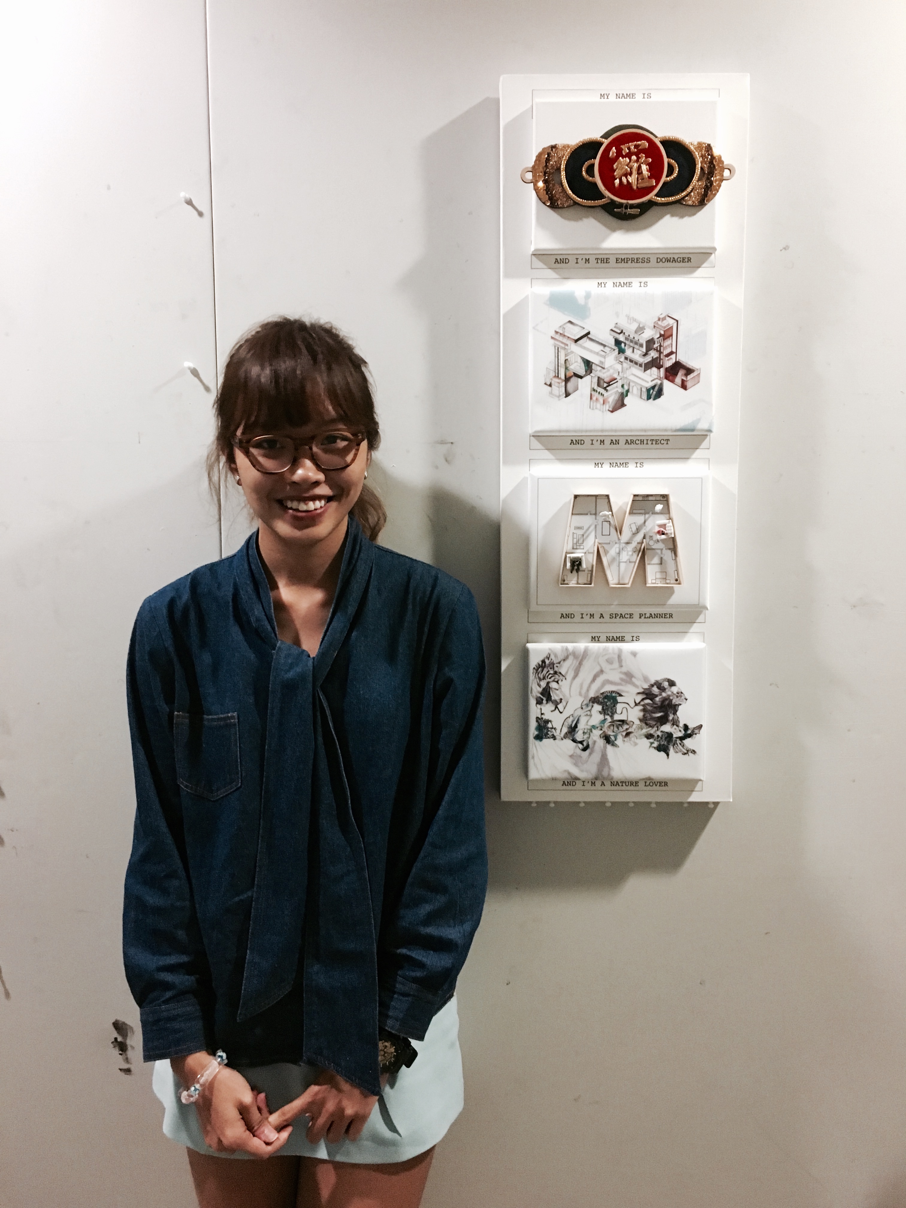
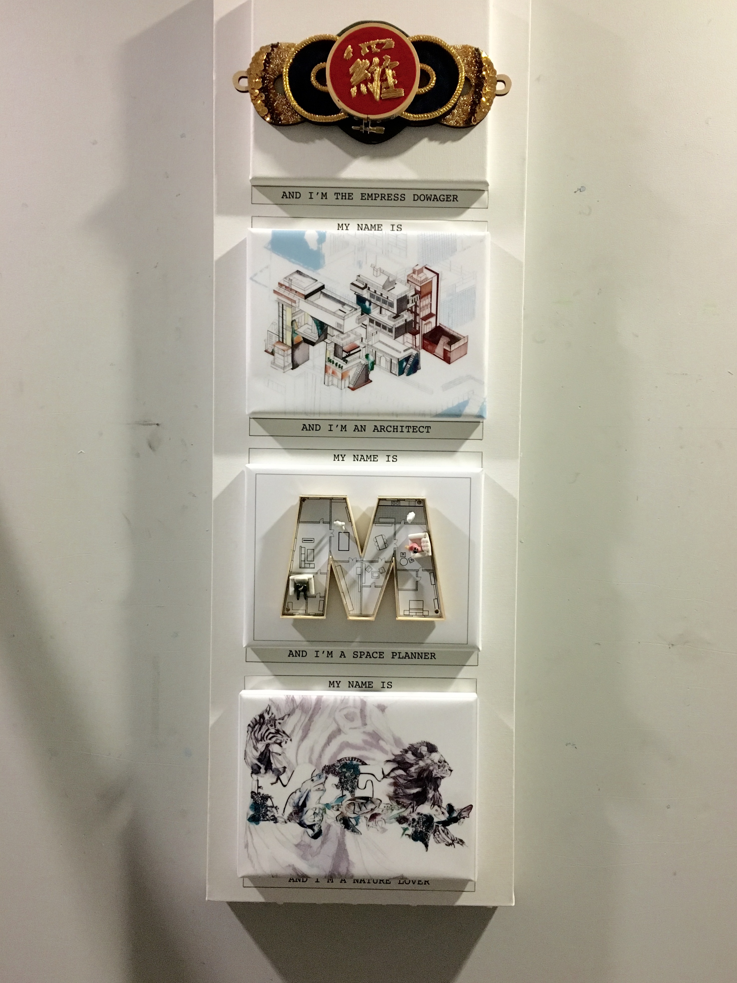
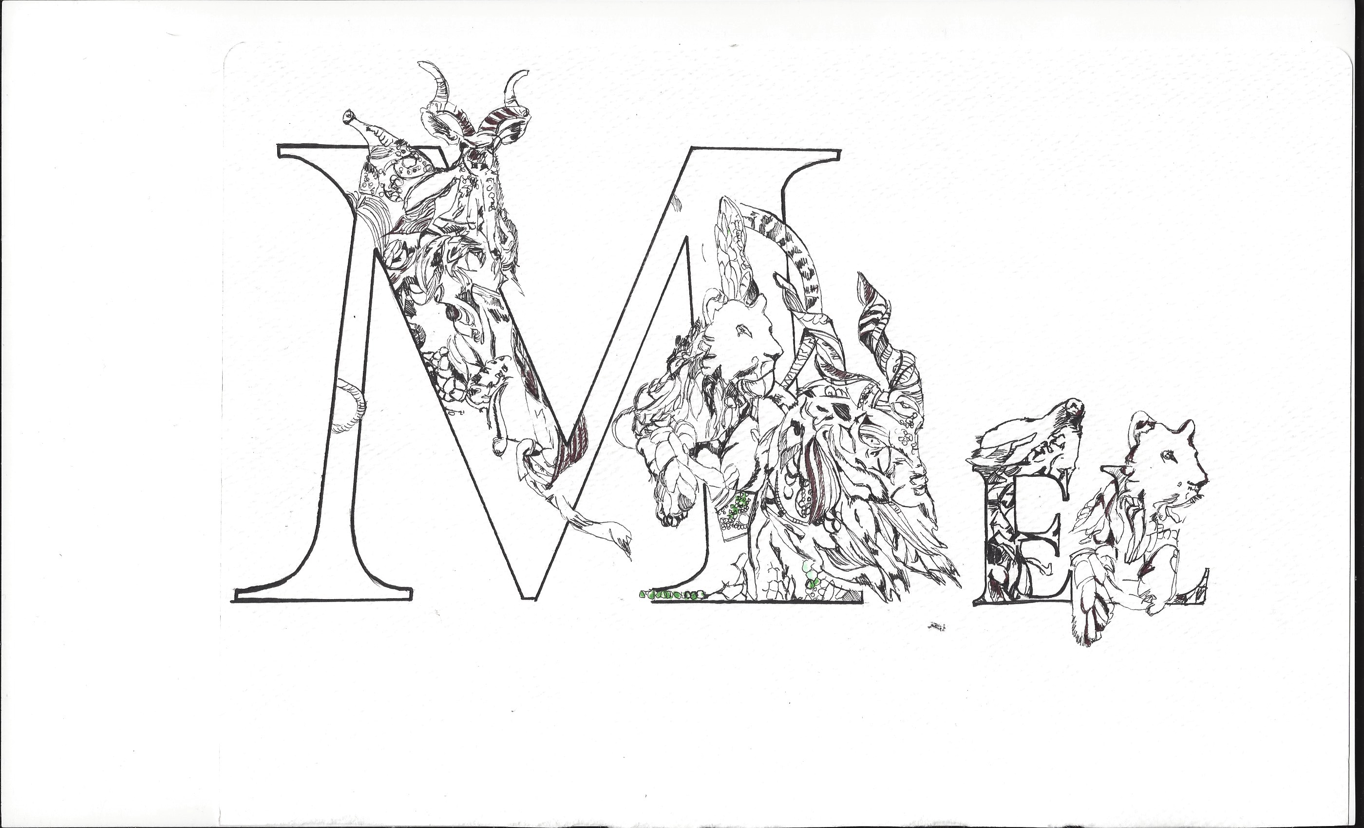
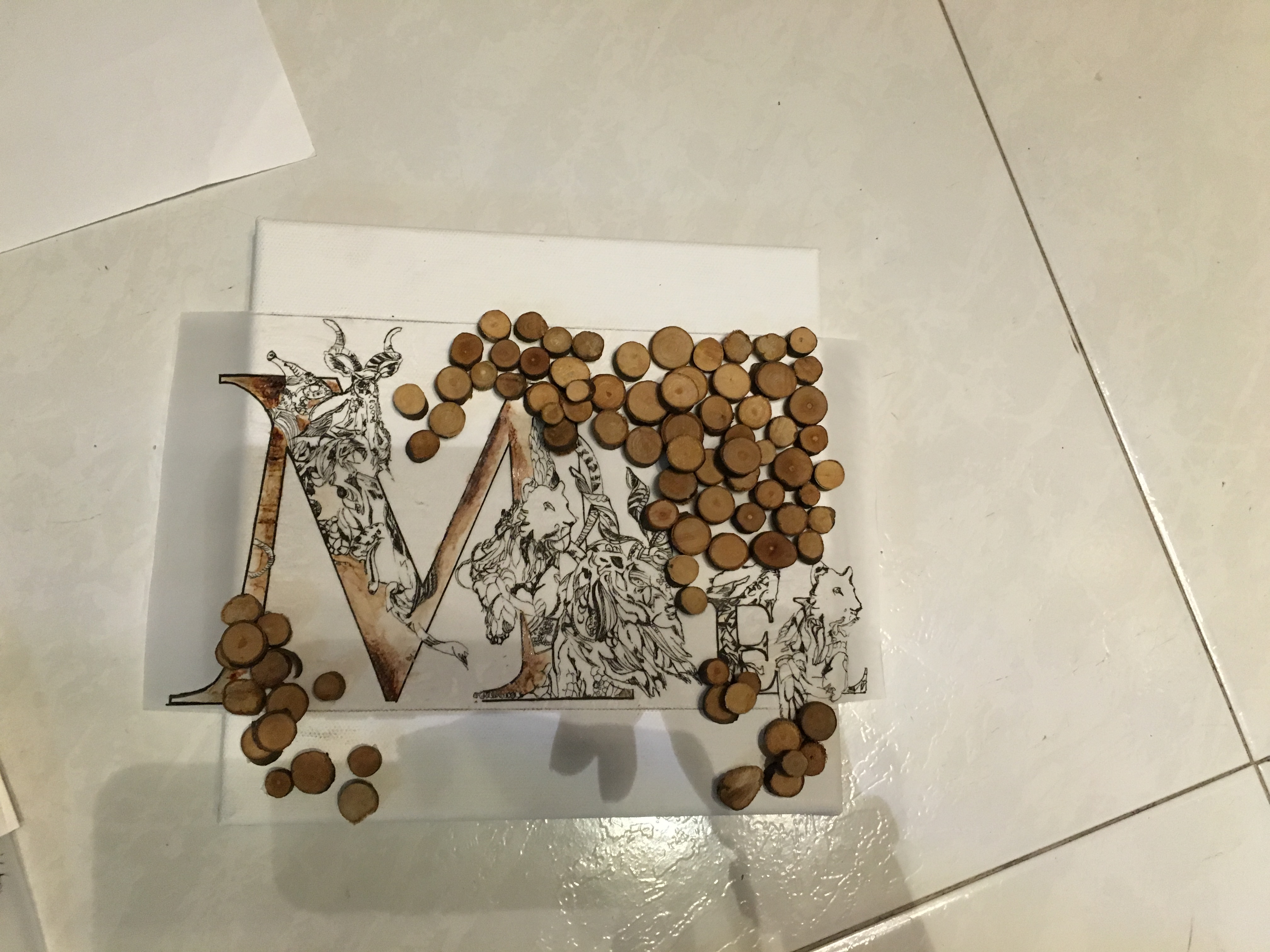
MY NAME IS MEL… AND I’M THE EMPRESS DOWAGER

Interesting Fact: LUO was a surname of an Empress Dowager. The fact that am obsessed with gold and also intricate designs might be the reason.

FullSizeRender 6

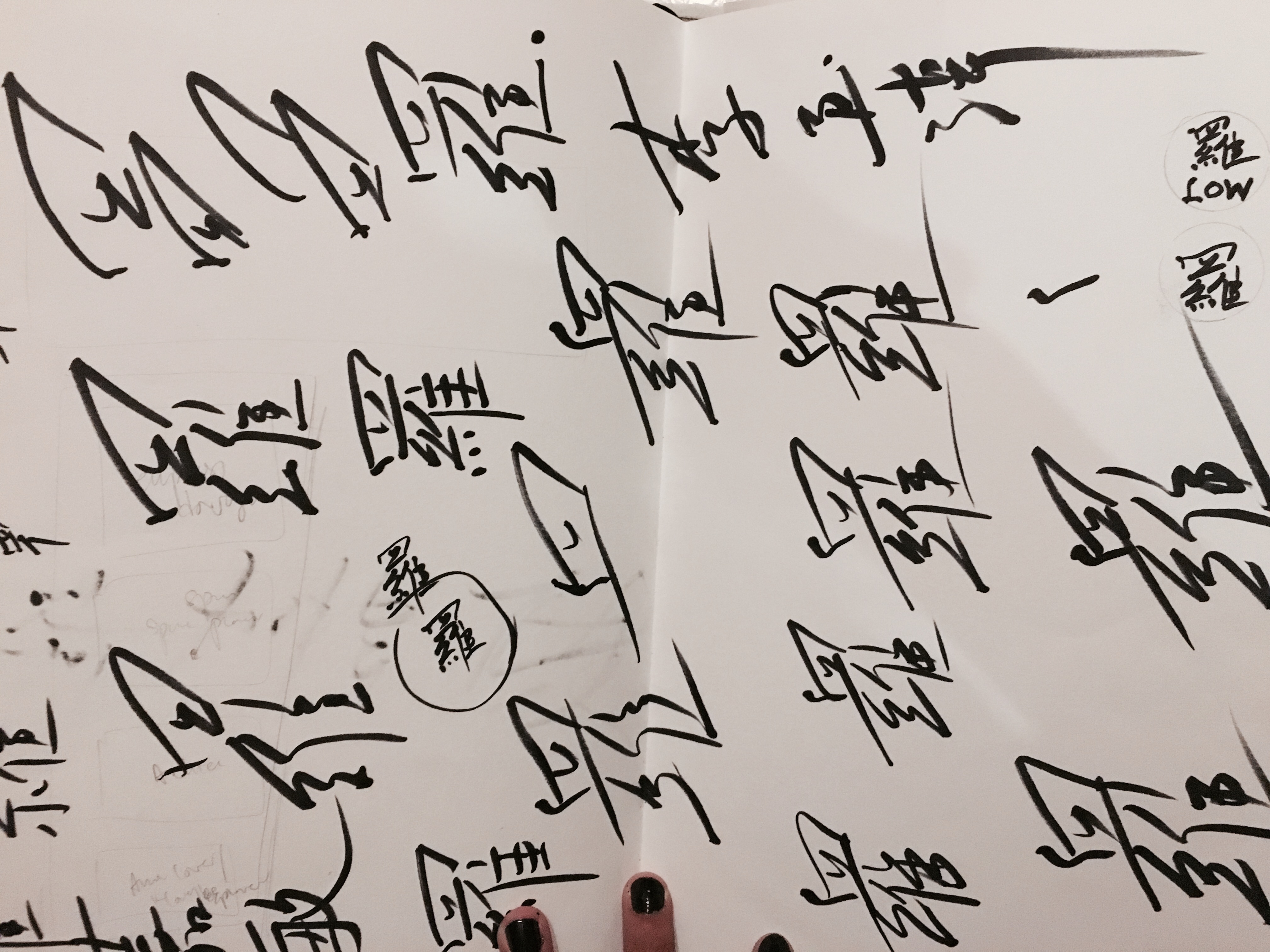
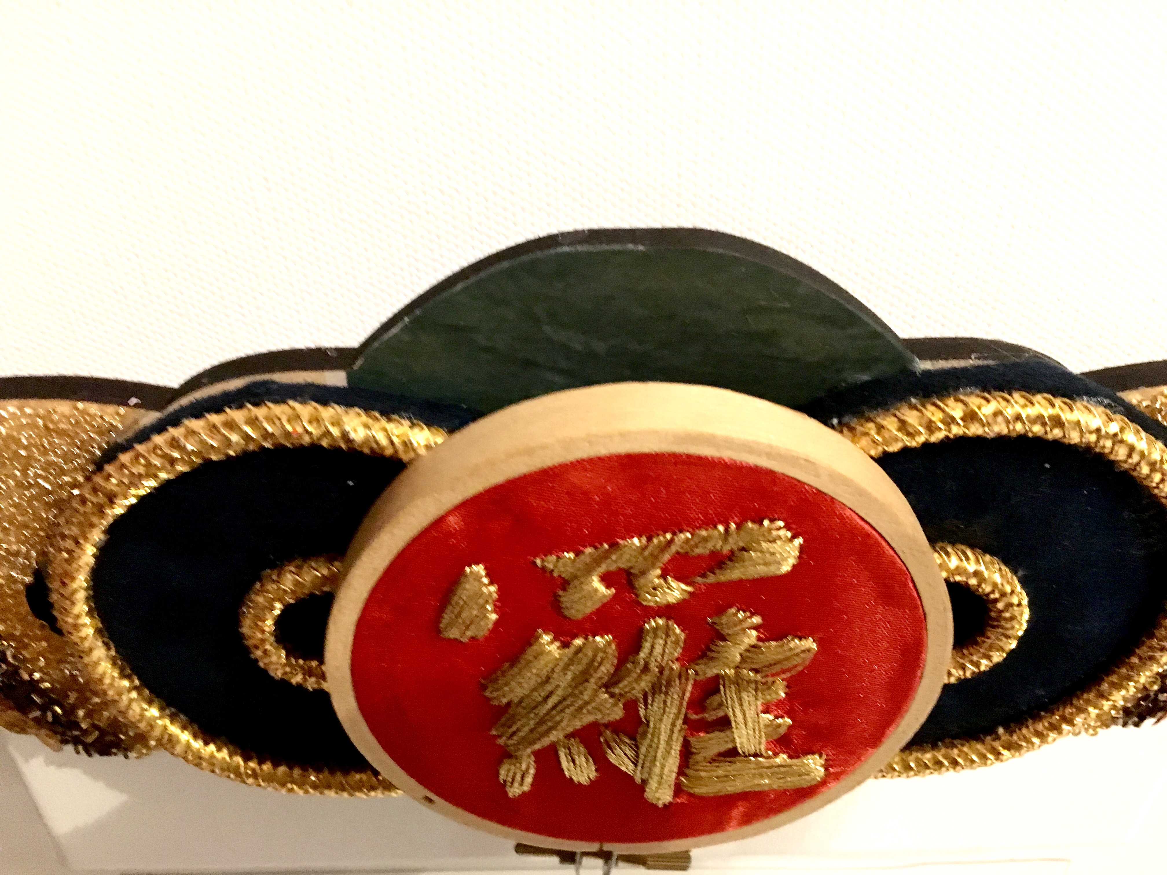
Studying the the traditional, oriental look from the past while coming out with this concept. What stands out the most will be the circular elements that the Chinese believe in. To them, circular means longevity and also it represents full moon which actually defines the prosperity of the family (living forever as a whole). Inspired by the terms, i decided to come out with an ideation which actually flows as a whole while taking into consideration the circular elements.

Planning in progress:

FullSizeRender 8

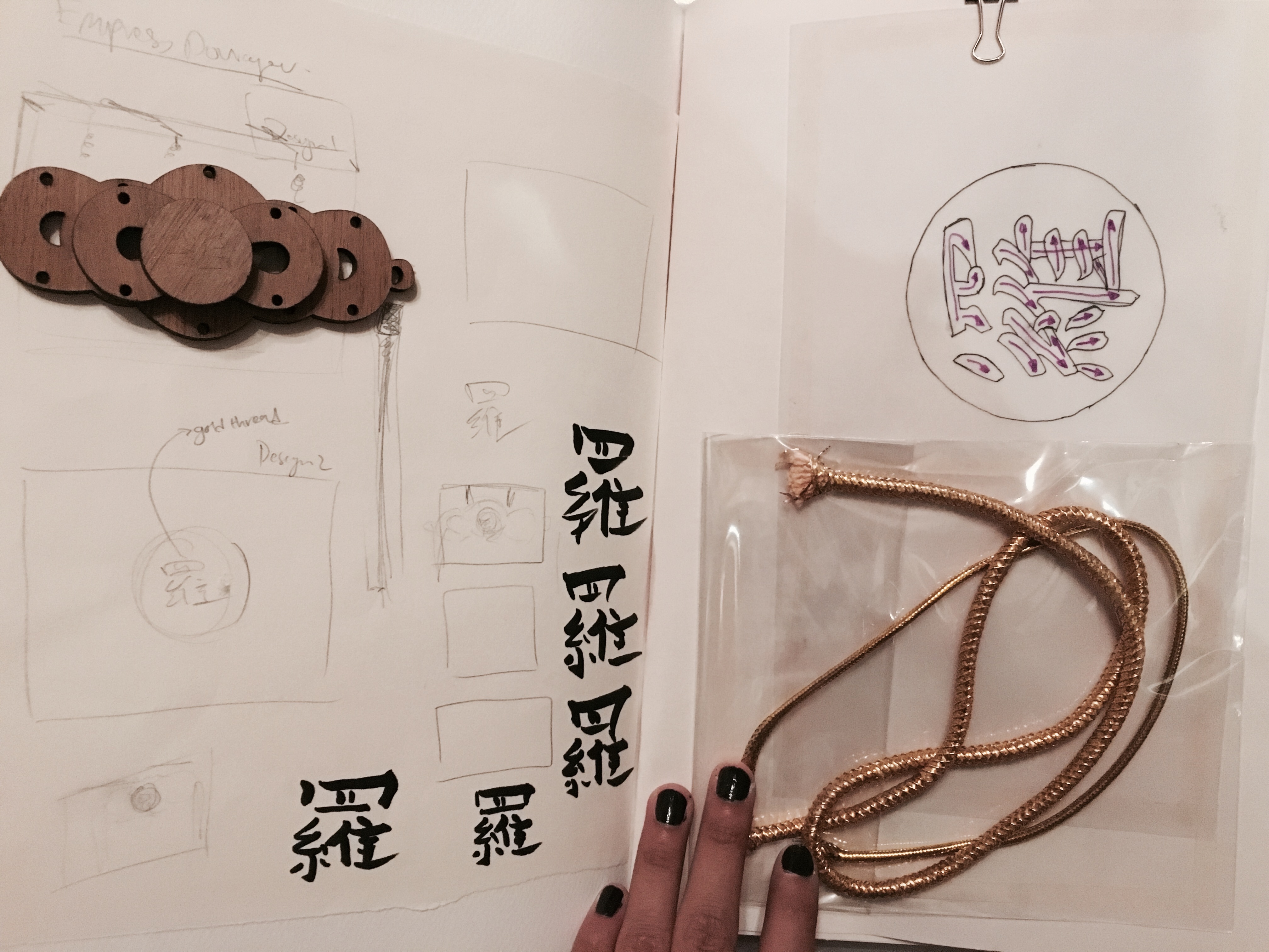
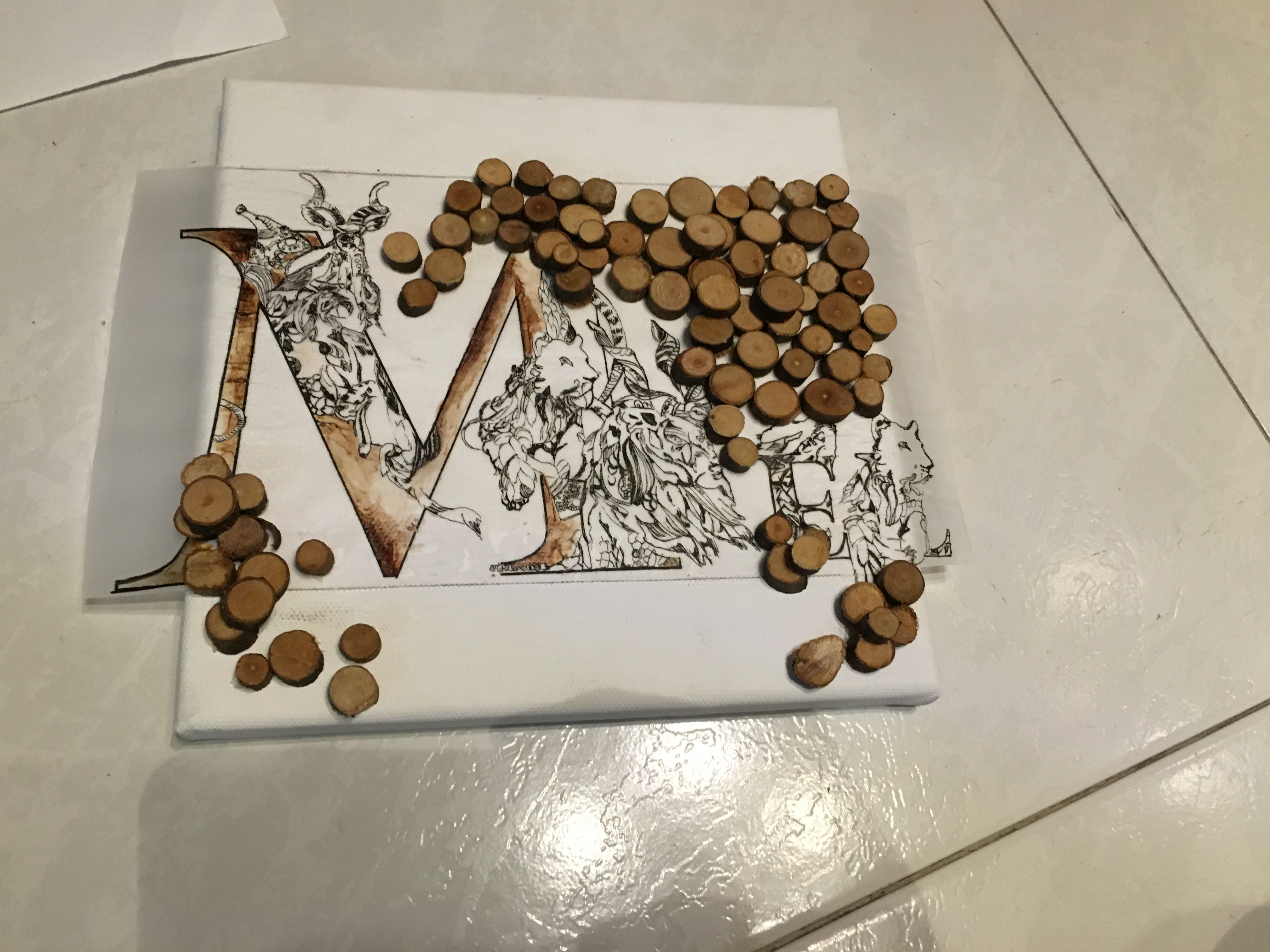
Draft ideation: Playing with the circular elements and not forgetting the intricate elements and the jade feel which was usually used during the olden days.
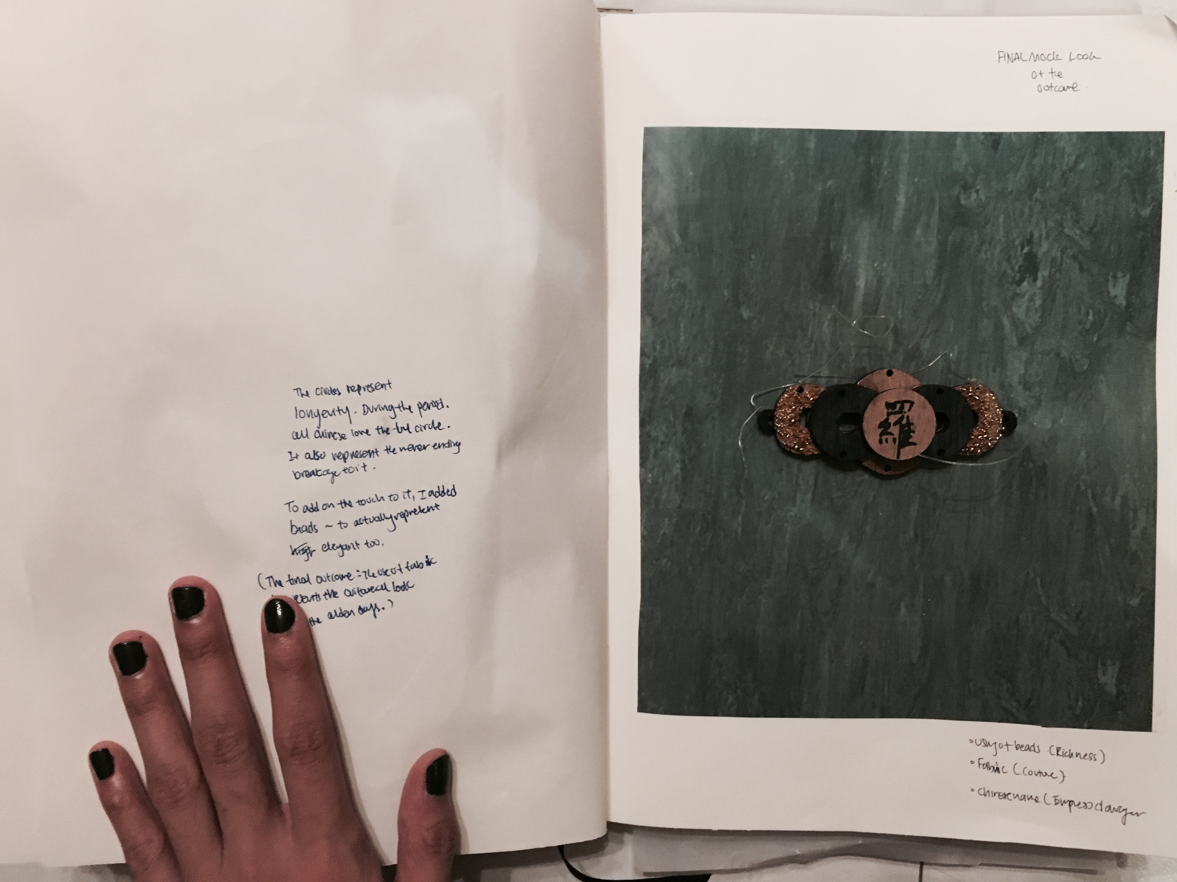
FullSizeRender 7

——————————————————

Final Outcome

The final outcome consists of embroidery, fabric, beads, jade. It defines the traditional and oriental of the past with a touch of a modern look to it too. The circular elements was not forgotten during the ideation process for the final design.

FullSizeRender 11

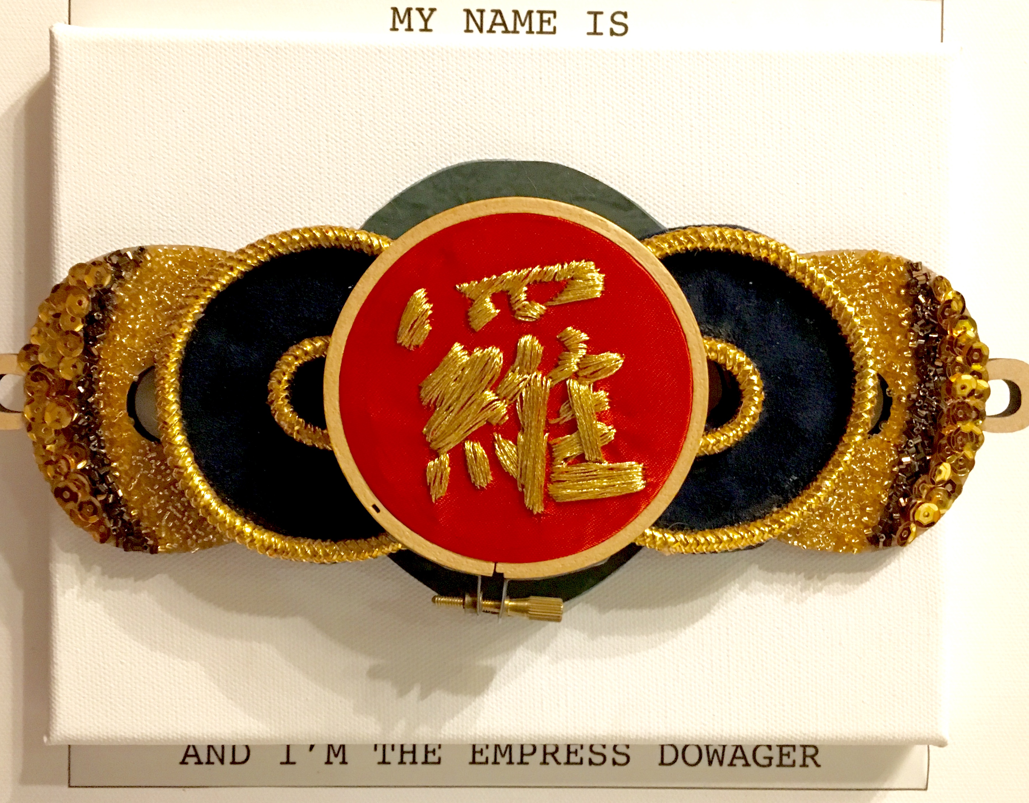
embroidery- the oriental feel of the past Screen Shot 2016-02-21 at 12.24.49 AM

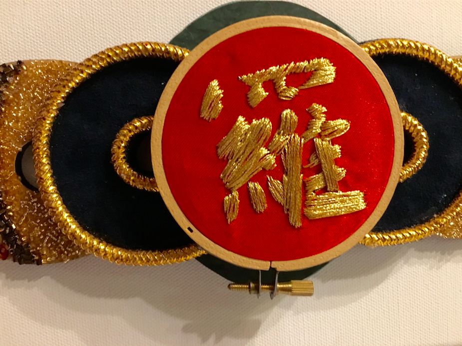
Intricate beading and unbreakable thickness of threads
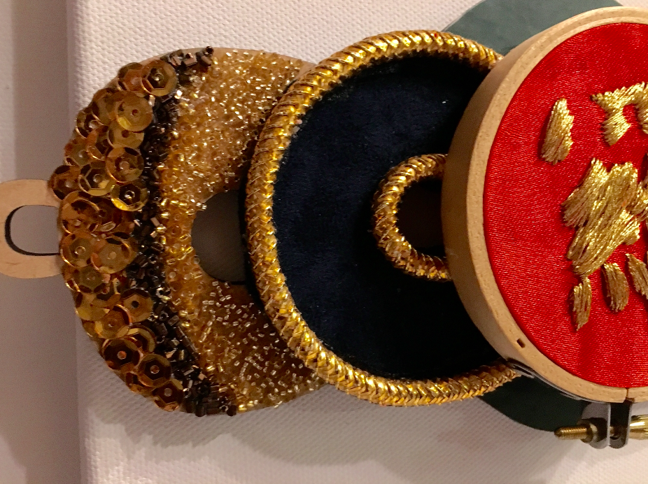
Screen Shot 2016-02-21 at 12.24.38 AM FullSizeRender 10

Final Outcome

——————————————————

The final post will be up next! Critique day and

my overall Assignment 1 reflection

MY NAME IS MEL… AND I’M NATURE LOVER

I love the nature and its habitat that surrounds me.

Compositing nature into my name, i decided to overlay onto the font itself

FullSizeRender 5

First initial plan: playing around with the negative and positive spaces within the name.

melissa nature set 1

Adding wood to play around with the nature feel.

IMG_4536

2nd ideation process

I decided to add colour to the composition to bring life to it. Showing my pen and ink techniques at the same time.


Screen Shot 2016-02-20 at 11.58.43 PM
Screen Shot 2016-02-20 at 11.58.25 PM

Screen Shot 2016-02-20 at 11.58.34 PM
Screen Shot 2016-02-20 at 11.58.50 PM

—————————————————-

Final Composition

I decided to go with the layout as it shows the nature habitat as a whole and also playing with the opacity of the background to bring the visibility of the typography .

Screen Shot 2016-02-20 at 11.58.57 PM * Taking note from the critique: The typography seems to be lacking from this layout. A learning point that i will be taking note*

—————————————————-

Chosen (4 PROCESS [4/4]) continues on the next post …

Chosen (4 PROCESS [2/4])

MY NAME IS MEL… AND I’M A SPACE PLANNER

————————————————————-

Define Space Planning

Space planning is an integral part of the interior design process. In space planning, the design professional blocks out interior spatial areas, defines circulation patterns, and develops plans and layouts for furniture and equipment placement. Space planning services consider numerous design parameters.

——————————————————————

Space defines me perfectly well. [Minimalistic] -Sometimes I can be quite sensitive to space. I might be crazy when it comes to art, but i feel congested and uncomfortable if the place is too messy (I find it hard to come out with inspiration and it makes me LAZY to start on my work).

[Designing a space for a consumer can be my future job occupation]

FullSizeRender 4

Space Planning Design ProcessesFullSizeRender

 FullSizeRender 3 Heres a close up view of my vectored Interior space my letter [M]

(Giving it a clean and professional look, I decided to keep the overall layout white with just the [M] as the main focus )

Screen Shot 2016-02-20 at 11.35.30 PM

———————————

making my layout more interactive, I gave it an elevation. Learning space planning interior during my poly years, i applied the content into this layout.

FullSizeRender 2

Outcome:

FullSizeRender

First try:

The elevated wall seems too high. Taking Professor Mimi’s advice, I lowered my wall to 1.5cm instead so that it will not overpower the final overall.

—————————————————————

Final Layout

IMG_4681

FullSizeRender 2

FullSizeRender 3

FullSizeRender 4

Final Layout

—————————————————————

Chosen (4 PROCESS [3/4]) continues on the next post…

MY NAME IS MEL… AND I’M AN ARCHITECT

I dreamt of becoming an architect when i was young. The strong defined lines and the overall construction of an architect inspired me.

Deciding to go for this theme, attached below are my inspirationFullSizeRender 2

FullSizeRenderGoing for the isometric perspective view with defined lines, below is my outcome for my letterings.

l m or eInitially, I did only E and L with the intention of flipping the E to an M but the outcome is not very pleasing as the M seems falling down. Attached below shows the processes of my outcome for my initial plan:

Screen Shot 2016-02-11 at 3.43.48 PM

(Exploded view 1- monochrome)

Screen Shot 2016-02-11 at 3.43.56 PM

(Exploded view 2)

Screen Shot 2016-02-11 at 3.44.19 PM

(Exploded view 3)

Screen Shot 2016-02-11 at 3.45.06 PM

(Overall view 1)

Screen Shot 2016-02-11 at 4.02.50 PM

(Overall view 2 -monochrome)

Developing~ I did the M in the end, with the similar concept for the E and L

Screen Shot 2016-02-20 at 10.17.45 PM

With the [M], below are the composition that was re-arranged with the design principles applied to it.

Final Layout

Screen Shot 2016-02-20 at 11.11.34 PM

Final Layout

Chosen 4 PROCESS [2/4] continues on the next post~~