Hello World! : Origami Portfolio Kit

Concept: since childhood, a love for the medium of paper, reflecting on my work and personality— versatile and meticulous.

Presenting my portfolio as an origami kit— origami box + square presentation cards— to be presented alongside my digital portfolio. Including a small leave behind, a mini version of my portfolio kit origami box, with the QR code inside to my digital portfolio and personal details.

Patterns for the origami paper used were from existing portfolio works, showcasing textures and patterns I have created for the exterior.

Portfolio link


Research: Powerful Knowledge

Key subject matter:

Power, knowledge, education, schools, information

What motivates me?

In my own experience, education is the largest contributing factor in social mobility. Upon hearing the education experiences of my peers, I became interested in exploring how curricula have changed to suit adapting times, especially in Singapore where one main purpose of education is to make an individual employable.

What can this project contribute?

Raise awareness about the powers behind education and curriculum of schools.


The data

Here is the part where I’m getting stuck so, I’m just going to document what I have been doing for the past few weeks… which hasn’t really been productive in translating into visual results, but I have learned quite some.

From here I think I have grasped the file format with which to write and read my data—JSON (Java Script Notation Object). Through Node js (which is a separate platform from Processing), I can use NPM packages such as this convenient Twit package to get data from twitter.

Shiffman’s Twitter bot tutorial roughly covers that knowledge in a brief way, so it was a good introduction. But he was more focused in post functions in twitter, while I am more interested in the get so I can attain the metadata from twitter. From this at least I learned that I will have to write my own JSON package file that picks up only the metadata that I want.

So with that, I have to figure what JSON actually is. Currently I’m still digesting the knowledge in these lessons:

The main goal here is to figure out from these other projects that Shiffman has done, how to get specific categories of metadata from Twitter, and record it in a JSON file with Node.js . So yes, that’s currently the challenge.

Visuals of the Data Viz

This is a sketch of what I am trying to do… either working on a plane that is rotated (like such) for view, with the protruding data (like Herwig Scherabon); or rotating globes with the data mapped on the 3dimensional sphere. I’m more inclined towards working on a plane, just because it makes more sense, more readable.

A reference that I have been using to learn up: Daniel Shiffman’s 3D Terrain Generation. A lot of what I will be referencing comes from Shiffman’s Youtube channel The Coding Train, I’m trying to understand and use parts of each of his projects to build my own.

I played around with the code which he made available here on Github, but really all I did was to see how I can change colours and sizes and constraints.

My main takeaway from this is learning how to draw a grid with flexible x,y coordinates in relation to the screen size within Processing. This is so hopefully I can attach the long and lat coordinates of countries to a grid and manipulate shapes on each coord point with the extra dimension of height.

Another useful reference: 3D Earthquake Data Visualisation also by Shiffman (because Shiffman is king of teaching coding). Actually, this may be the most useful with what I’m trying to do in terms of planting the data by location, but I will have to map on a flat plane instead of a 3D sphere.

Shiffman’s code for this project available here on Github.

The Idea: News Accessibility Around The World

The idea is compare international news accessibility all over the world, by visualising the consumption of a global trending topic in all the nations of the world.

First I will need: data (live, constantly updated)

  1. Trending news topic—this topic has to be global, predetermined already by a news source. Potential sources could be trends.google.com or @trendingtopics on Twitter.
  2. Metadata—collection of “mentions” about the trending topic in various forums/platforms. I will need the information, the metadata, of the “mention”, namely the quantity, location and time. Potential sources I intend to look from include Twitter and online news networks (preferably, the national paper of the country).

Second I will need: visual

  • Processing sketch, likely utilising P3D (for 3-dimensional visuals)
  • The data (quantity) will have to be geographically by nation.

My main visual reference will be Income Inequality by Herwig Scherabon

Challenges I expect to face:

Really, I’m most worried about collecting the data, especially working with live feeds. Previously I had worked with static data that was already recorded and formatted. I intend to first figure out how to import data from Twitter (which is live and constantly updating, so it could be more dynamic), which will be my main challenge.

Why Design?

Which aspects of Visual Communication are you interested in?

  • Data Visualisation
  • Information Visualisation
  • Campaign designs
  • Production
  • Publishing
  • Editorial design
  • Illustration

What are your strengths in design?

  • Comprehending information into visuals
  • Picking up on client needs and wants
  • Flexible illustration (I’m style-less)
  • Competent in Adobe CS
  • Good craftsmanship
  • I can code (high-level programming language, Processing)

What are the areas you hope to improve on in design?

  • Creating concepts
  • Data Visualisation

Is there any aspect in design that you are less familiar with but you are interested to explore?

  • More data/ info visualisation


Where do you imagine yourself to be in 3 years time?

Working at Google. Or working with sociologists, data vis in research, or info vis in publishing. Or doing my Masters in Sociology.

What is Visual Communication?

Visual Communication is providing visual solutions to a problem presented by a client/ society. It’s presenting the solution such that the message successfully reaches the target audience and makes an impression.

Why do you design?

I like the puzzle (or challenge) each design problem presents, and the many ways to solve it.

Which aspects of Visual Communication fascinates you?

The message. Elegant solutions, no frills. When a design solution is presented in a way that it resonates with it’s intended audience, and makes a deep impression. When campaign messages’ visuals are specific to the target audience, or book covers. I’m also very interested in presentations of big data on macro levels that allow fresh interpretations and thus new solutions. Another thing that fascinates me is “invisible” design, such as good wayfinding that makes navigating new environments effortless.

What might be some of the contemporary issues, concerns and debates surrounding the practice/ society that you are concerned with?

I am concerned about the mass commodification of “design”, where visuals are so easily generated that design is valued less. That’s why I think it’s important to produce and publish more good design, so the public are better attuned to good designs instead of making do with bad ones.

In regards to society, I’m concerned about the lack of in-depth knowledge we have about general issues we so often discuss about, politics, economics, why things are the way they are. I think it’s good that discourses be generated that include new perspectives and some deeper awareness of the many variables and factors at play.

How do you intend to use design to address the above mentioned concerns?

I’d like to work with info graphics such as those in educational or exploratory publications. Or work with research in interpreting data. Then make this information/ knowledge accessible to the public for higher awareness.

Migration: The Process (or How I Learned Processing)

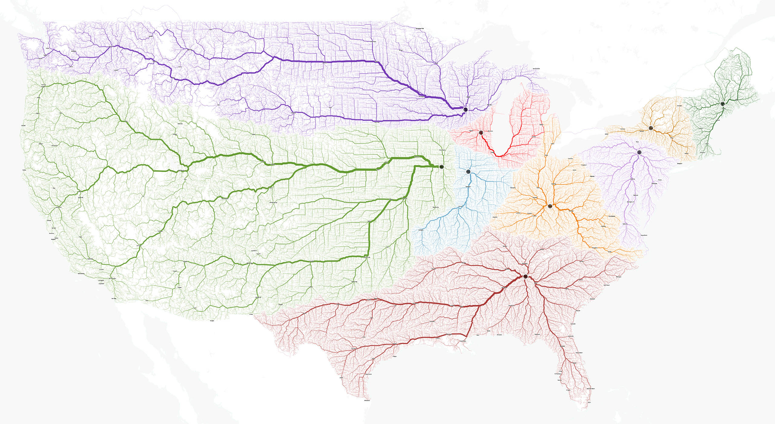
I had a very vague idea of what I wanted to do— visualise the data of migration flows. I had a reference for visuals (Tatiana Plakhova), and I had found a large collection of data by the UN (Migrants by Destination and Origin, 233 nations), and an odd sketch that consisted of just curves.

00

screen-shot-2017-01-23-at-11-37-47-am

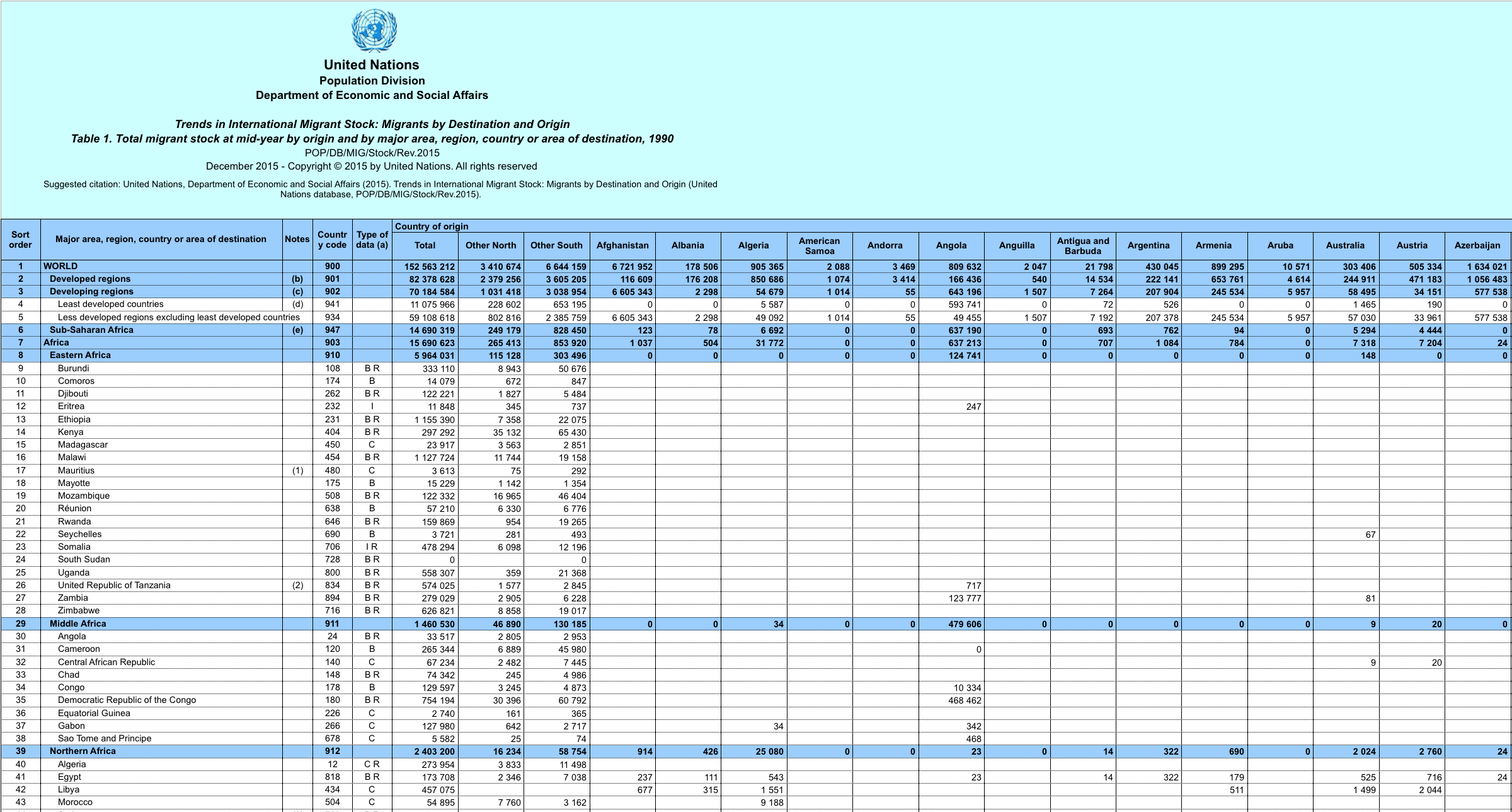
The difficulty was how to develop the visualisation, what medium to use, how can I draw hundreds (maybe thousands?) of curves from one point to another accurate to the large chunks of found data I had.

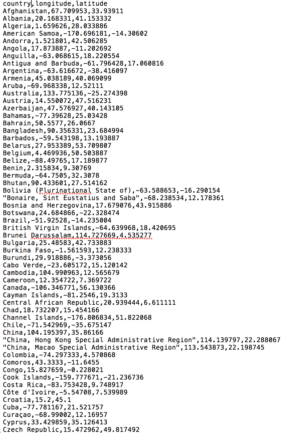
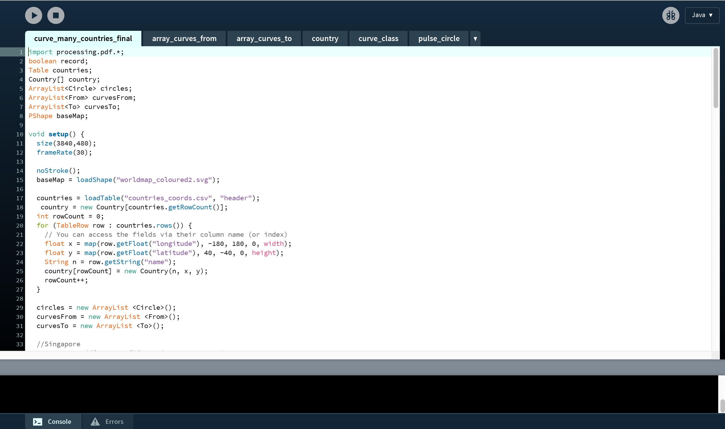
I ventured to an online class on Skillshare.com , taught by data visualisation designer Nicholas Felton on using Processing. This was a great starting point that introduced to me about importing data into code— in the format of CSV (comma separated values), as opposed to excel sheets that come in the form of tables.

screen-shot-2017-01-23-at-11-40-06-am

The way I saw my data was that it had multiple factors (categories, variables, headers… just many “groups”) to take into account:

  • names of countries
  • long and lat coordinates per country
  • number of migrants by origin
  • number of migrants by destination

So my strategy was to parse in code the data such that in one CSV:

  • name of countries + longitude coordinates + latitude coordinates

and that would be fixed and referable when I import another CSV:

  • country of origin + country of destination + migrant flow number

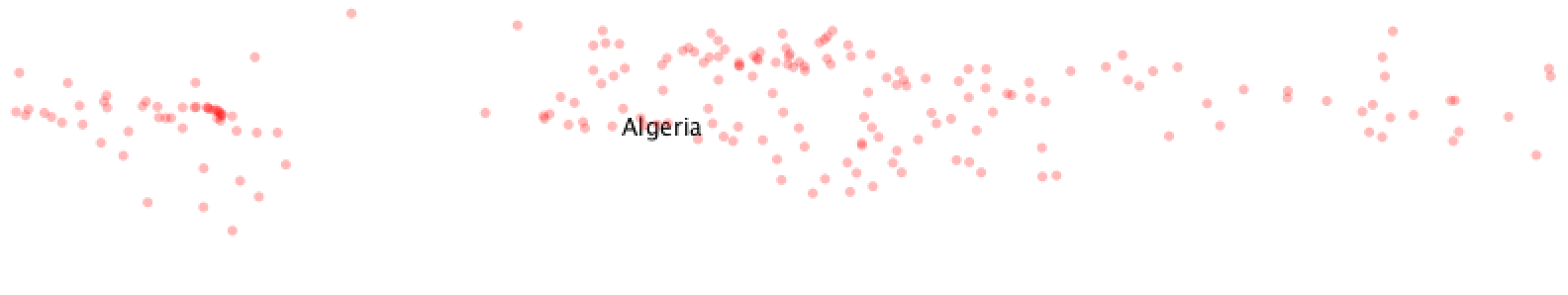
Basically, I was trying to get the code to understand that these two data sets are supposed to work together. I referenced Processing’s resources on various methods trying to create the multiple relationships… but all I achieved was making sense the first set of data. The computer and I were thinking in very different languages.

All I achieved was this useless program that had red dots to plot by coordinates the 233 countries, and the name of the country appeared if your mouse hovered over it. And a lot of Syntax Errors.

05

screen-shot-2017-01-23-at-11-46-49-am

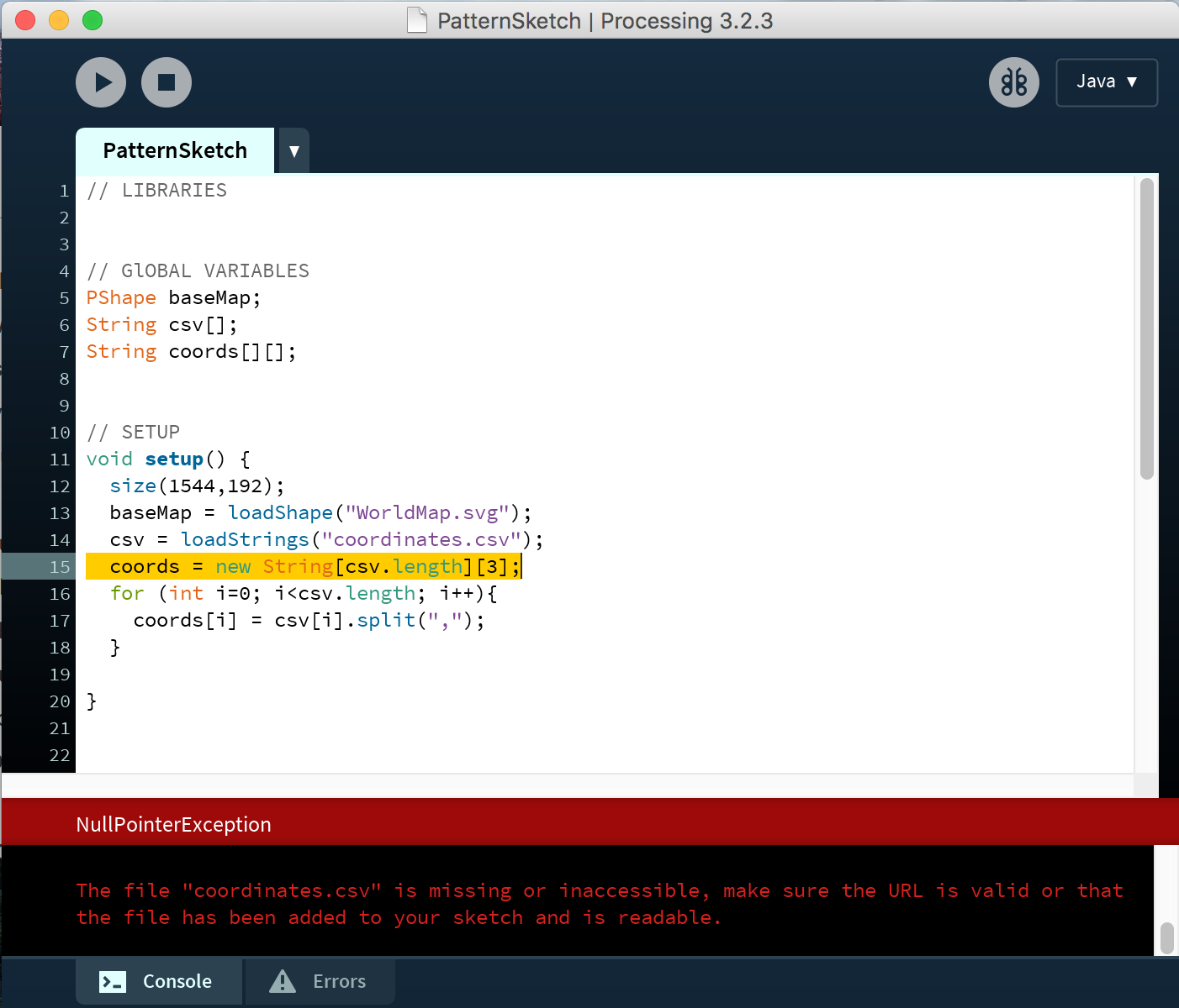
I was stuck on this problem trying to solve it for 10 weeks.

Then (breakthrough!!!) I decided to take a different direction. Instead of plotting all the location points then drawing the curves between them, I would try drawing the curves then plot them according to the location. So I went scouring the internet for how to code curves in motion.

I came upon to awesome example— using an exponential equation to draw a curve with ellipses taking into account starting and ending point.

screen-shot-2017-01-23-at-11-43-47-am

Jackpot.

So I copied and studied the code on how was it done, manipulating bits and parts if I can loop the curved motion of the ball from specific points of origin and destination. Tested it,

screen-shot-2017-01-23-at-11-49-16-am

then two curves,

screen-shot-2017-01-23-at-11-49-38-am

then taking what I had learned about CSVs from Nicholas Felton and drew multiple curves to and from one point by referencing a data set.

03

01

Having figured this out, it became pretty straightforward experimenting how to include multiple data sets of origin/destination points. Then how to write the code such that they were of different colours, moving at speeds correlating to the number of migrants.

07

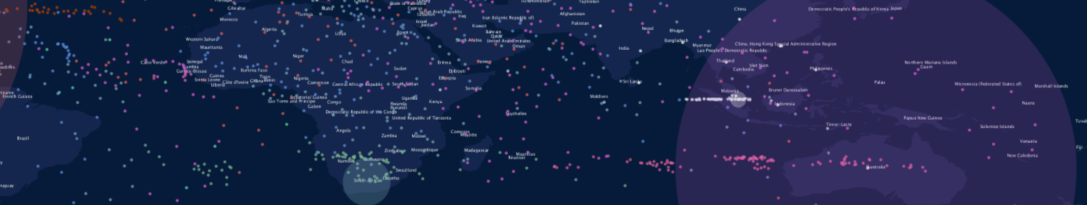
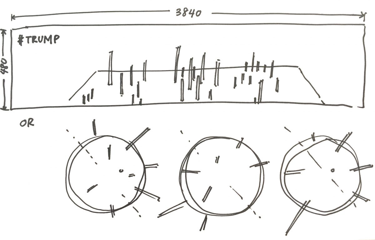
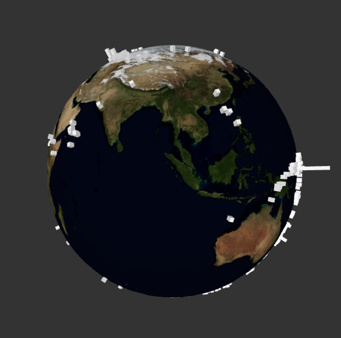
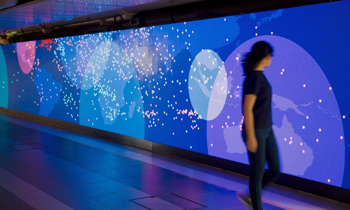
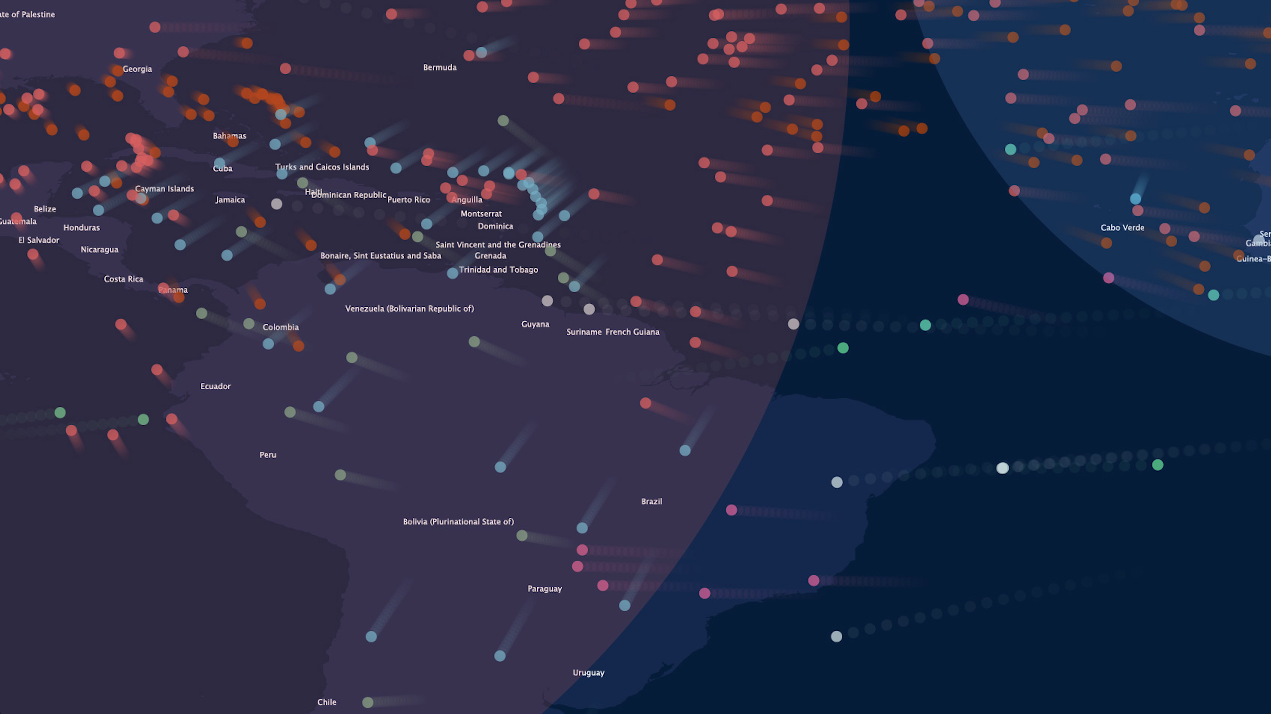
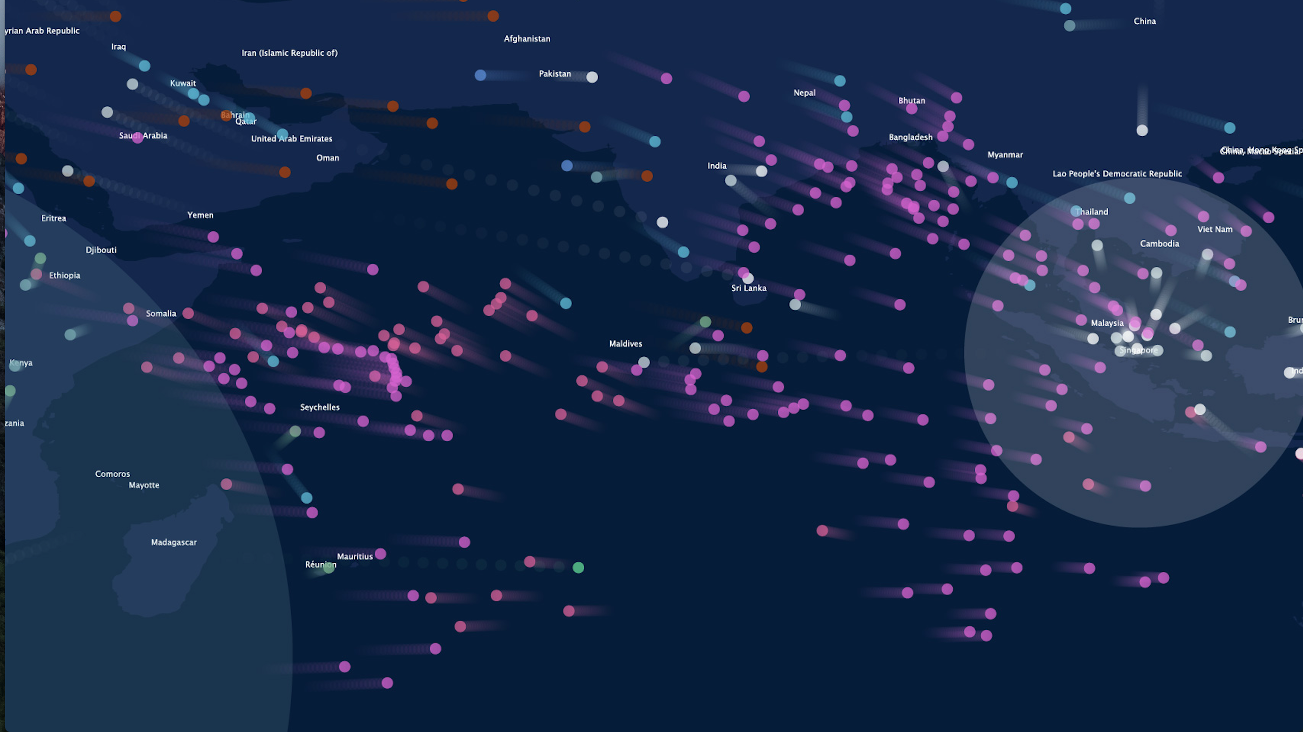
At this point I had realised that including all 233 countries worth of data was going to create an impossible amount of noise (and likely crash my computer), so I chose six nations to compare and contrast: Singapore (a must), USA, UK, Australia, South Africa (destinations recognised for heavy traffic on the global hierarchy) and tiny American Samoa (this one, actually because it’s small like Singapore and on the far left of my atlas, which was empty).

My code was quite long at this point, and many things were repetitive. So I learned to write classes for groups of code that behaved the same way, so I could have multiple sets of similar code but varied with just the change of a few defined variables. This made things like changing colour easier.

screen-shot-2017-01-23-at-12-01-46-pm

Here I was pretty much done, with just some problems/ refinements to be solved.

  • laggy animation— troubleshooting by testing elements in the code found that the trails drawn were inefficiently slowing down the program, so I eliminated the trails (which were unnecessary anyway).
  • it looked to abstract— with just dots flying across the screen, we couldn’t really tell what it was about. So in went the map (imported as vector artwork) and later the names of the countries by their coordinates(that I then had to go into the CSV and shift the coordinates around so they don’t overlap).
  • needed more dynamism— somebody mentioned it needed more moving in it (my dad I think, when I showed him) so I thought to include pulsing circles centred at the points of interest to represent the pull of migration flow. I read up various methods of drawing circles and wrote the code for a circle class that changed in size and opacity.

screen-shot-2017-01-23-at-11-48-49-am

  • getting Processing program to work on MAN— which was run with TD… there were some problems with allocating the screen output, so I just bypassed this problem by exporting frames from my program and converting them to MP4 on After Effects.
  • sound— without which, this would just be flat. So I went looking for recorded digital sounds, clicks clacks and beep boop beeps. This new thing I learned, compositing and editing audio to create my very own sound clip just for this piece.

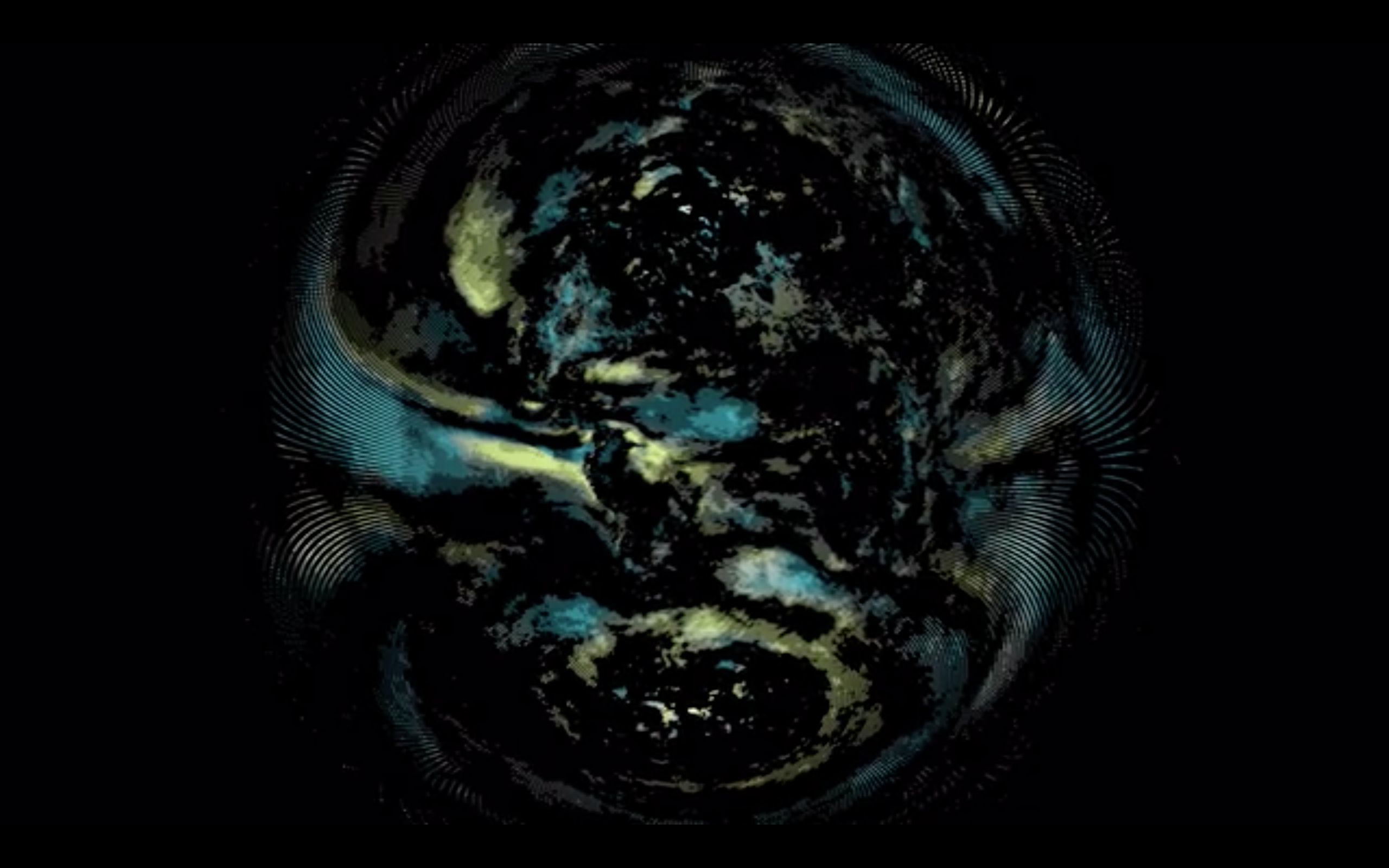
An that… was how I got to the finalised artwork, a composition of flying dots on a screen that people stare at trying to locate their country.

08

Starting off!

This post, is just kickstarting the project… finding the flavour of what I’ll be doing. What I have solidified at this point is the medium of Processing, since I want to further explore (with more depth, this time) data visualisations and I found the last time that it’s great for number crunching.

Last semester I began by referencing Tatiana Plakhova… I was searching for organic patterns, for generated art. Her stuff is really cool, based on “based on mathematical simplicity and harmony”. I’m still looking at her work as a visual reference.

00

RED JELLYFISHES from Tatiana Plakhova on Vimeo.

Coming from a sociology background I’d like to investigate patterns found in quantifiable data and present my findings as a visual+audio (and hopefully, interactive(???)) experience. But this time I hope to take into consideration more variables and the messages reflected in the patterns.

So having a better idea of what exists out there in the field, I’ve gathered some resources/inspiration of data vis:

Moritz Stefaner‘s Project Ukko – seasonal wind predictions for the energy sector.  It’s an interactive browser application that allows the user to explore the data based on climate models. I find this is a great reference of translating what is first a web application to another format that is an alternative experience in the form of an ambient installation in video form.

4b960b645069a9864372f50b08b47fd8

screen-shot-2017-01-16-at-7-23-56-pm

Project Ukko: Ambient Loop from Moritz Stefaner on Vimeo.

moovel Lab‘s Roads to Rome is a project about the roads connecting major cities. This one I find inspiration in that it’s a beautifully abstracted visual that still reflects a very human characteristic: mobility.

us_romes_web2x

Similar inspiring pieces:

What’s your pay gap? for Wall Street Journal by Lam Thuy Vo, Jessia Ma and Paul Overberg, accounts for differences in pay of the different genders by occupation. This is one of the pieces I found that talks about a more relevant issue.

screen-shot-2017-01-16-at-4-56-15-pm

And (also another hot social issue discussed)

Income Inequality by Herwig Scherabon where the height of these blocks corresponds to the income in the respective output area (cities including LA, Chicago and New York). I find this visual (presented as 2D prints) by far the most interesting, and I imagine something similar but with an animated (where appropriate) or interactive element would be great to look at.

los-angeles-detail_1340_c

Schrabon also does loads of other cool relevant data vis(es):

The Atlas of Gentrification

f24216785b7de9e9b3b0c0c99f590990

and Nine Maps of Glasgow.

bb461cf449401ef9ae8daf78639ce218

Reflecting on these now, I find a common thread all these references have (that my past work had as well) in that their images are based on cartography, very geographic visuals. I’d like to explore in this oncoming project, a different canvas maybe… imagined spaces, borderless areas, data plotted but not on a map.

In terms of concept for the piece I’m about the begin, I’m looking into the big data sources available out there to find a subject worth talking about. Some resources:

Data in Gapminder World (recorded data in excel sheets)

Numbeo (user contributed data)

Google Trends (this is google. Google knows everything)

So…

That’s the first step into this. Right now feels very much like the beginning of last semester, just less clueless about where to start.

Migration: Finalised

screen-shot-2016-12-31-at-6-32-22-pm

screen-shot-2016-12-31-at-6-32-05-pm

Migration, a process of absorption or dispersion of people when push and pull forces are encountered. Large cities tend to be the destinations of long distance relocations.

ABOUT THE WORK

This animated data visualisation depicts the varying rhythms of migration. Six nations of interest— Singapore, United States of America, United Kingdom of Great Britain and Northern Ireland, South Africa, and American Samoa— were selected from the UN’s latest collection of data on migration flow all over the globe for visual comparisons and contrasts of the trends in movement to and from each country. Using the java language based software Processing, the data was visualised as a pattern with the motif of movement (each individual movement a connection between two countries) at a speed relative to the size of the migration flow. The pull forces attracting migrants to large cities are represented in the pulsing circles centred at each focused nation.