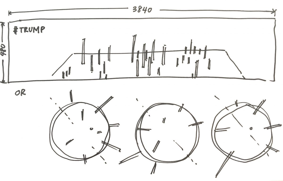
This post, is just kickstarting the project… finding the flavour of what I’ll be doing. What I have solidified at this point is the medium of Processing, since I want to further explore (with more depth, this time) data visualisations and I found the last time that it’s great for number crunching.
Last semester I began by referencing Tatiana Plakhova… I was searching for organic patterns, for generated art. Her stuff is really cool, based on “based on mathematical simplicity and harmony”. I’m still looking at her work as a visual reference.
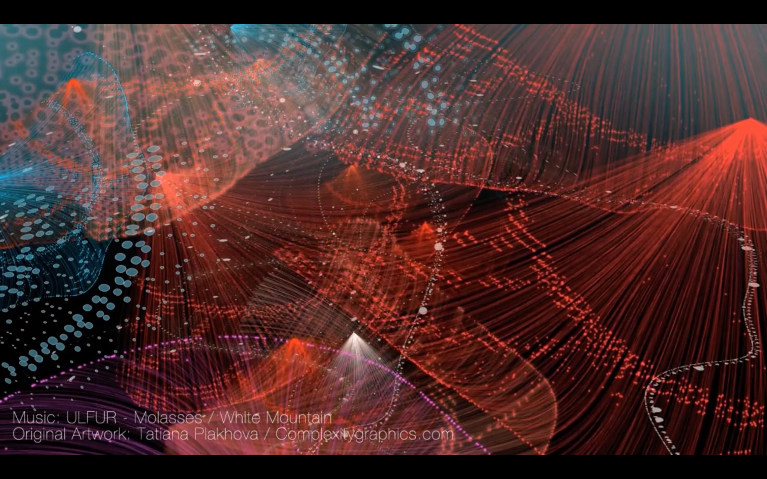
RED JELLYFISHES from Tatiana Plakhova on Vimeo.
Coming from a sociology background I’d like to investigate patterns found in quantifiable data and present my findings as a visual+audio (and hopefully, interactive(???)) experience. But this time I hope to take into consideration more variables and the messages reflected in the patterns.
So having a better idea of what exists out there in the field, I’ve gathered some resources/inspiration of data vis:
Moritz Stefaner‘s Project Ukko – seasonal wind predictions for the energy sector. It’s an interactive browser application that allows the user to explore the data based on climate models. I find this is a great reference of translating what is first a web application to another format that is an alternative experience in the form of an ambient installation in video form.

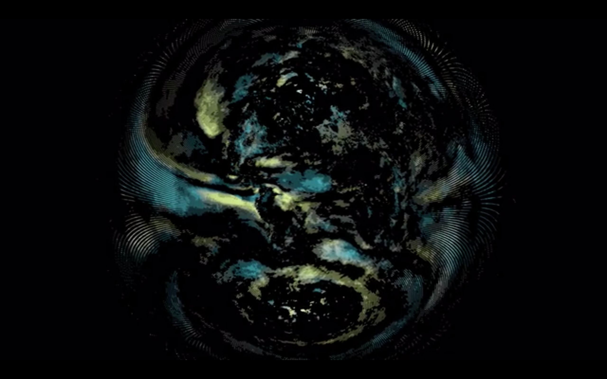
Project Ukko: Ambient Loop from Moritz Stefaner on Vimeo.
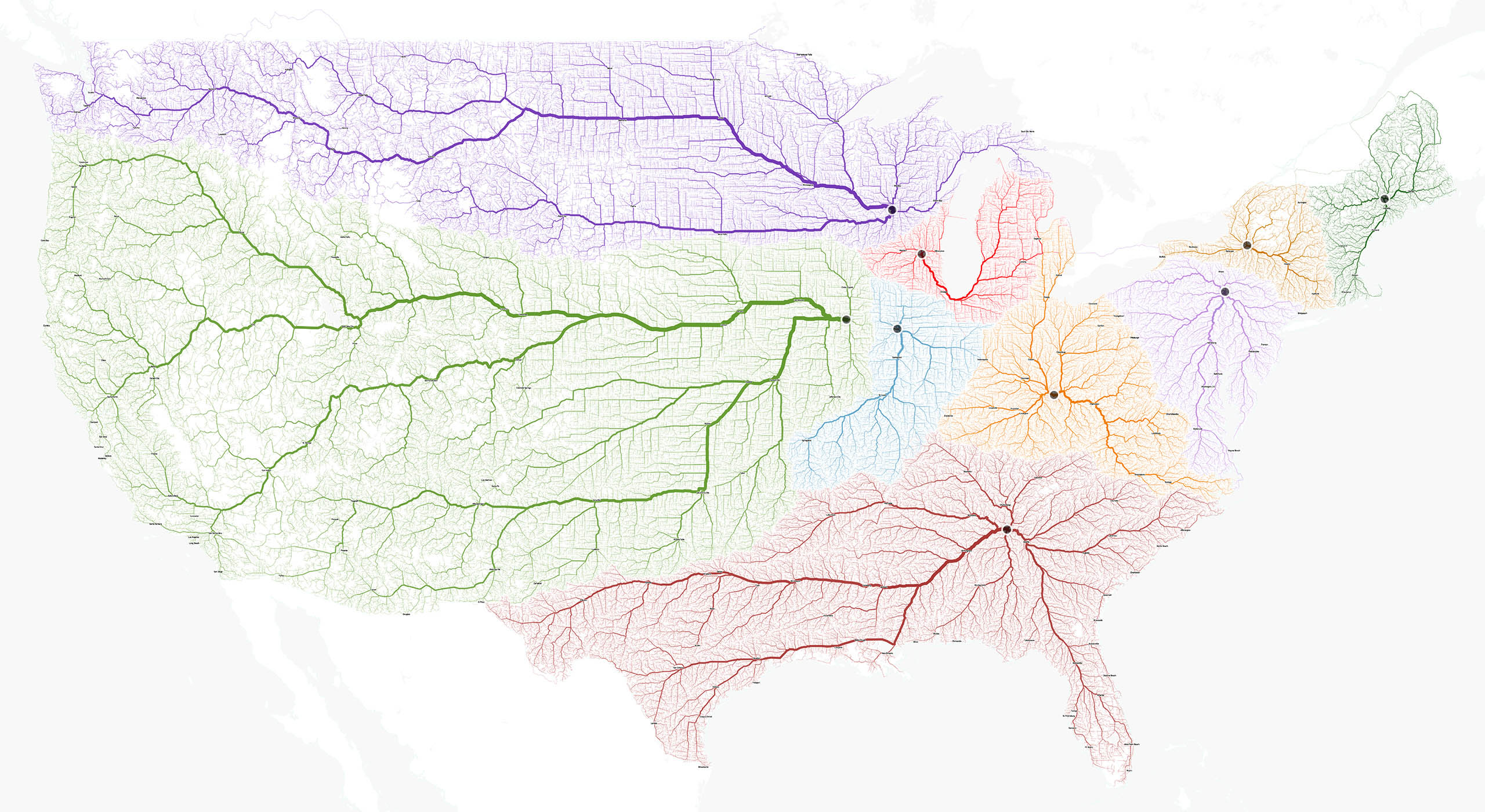
moovel Lab‘s Roads to Rome is a project about the roads connecting major cities. This one I find inspiration in that it’s a beautifully abstracted visual that still reflects a very human characteristic: mobility.
Similar inspiring pieces:
What’s your pay gap? for Wall Street Journal by Lam Thuy Vo, Jessia Ma and Paul Overberg, accounts for differences in pay of the different genders by occupation. This is one of the pieces I found that talks about a more relevant issue.

And (also another hot social issue discussed)
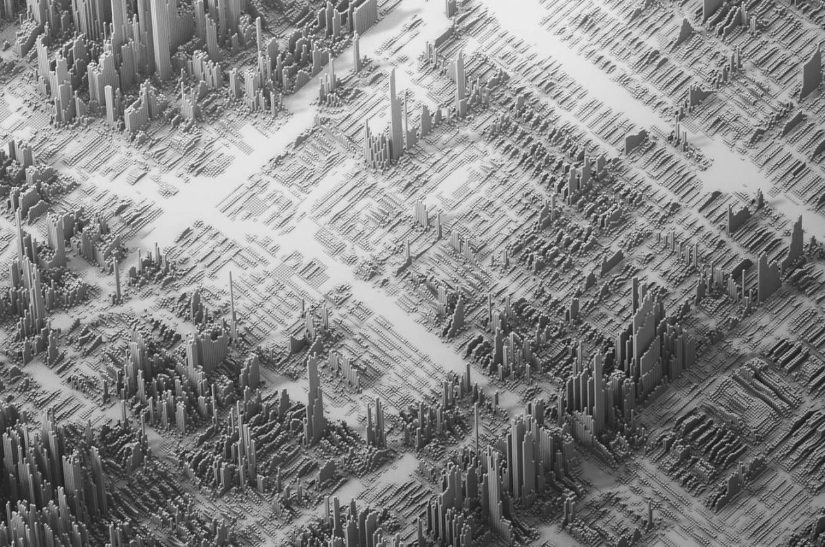
Income Inequality by Herwig Scherabon where the height of these blocks corresponds to the income in the respective output area (cities including LA, Chicago and New York). I find this visual (presented as 2D prints) by far the most interesting, and I imagine something similar but with an animated (where appropriate) or interactive element would be great to look at.

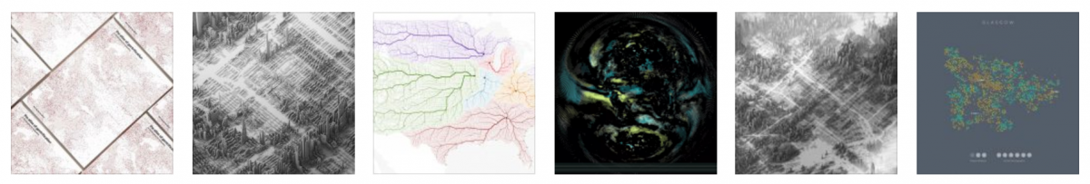
Schrabon also does loads of other cool relevant data vis(es):
The Atlas of Gentrification

and Nine Maps of Glasgow.

Reflecting on these now, I find a common thread all these references have (that my past work had as well) in that their images are based on cartography, very geographic visuals. I’d like to explore in this oncoming project, a different canvas maybe… imagined spaces, borderless areas, data plotted but not on a map.
In terms of concept for the piece I’m about the begin, I’m looking into the big data sources available out there to find a subject worth talking about. Some resources:
Data in Gapminder World (recorded data in excel sheets)
Numbeo (user contributed data)
Google Trends (this is google. Google knows everything)
So…
That’s the first step into this. Right now feels very much like the beginning of last semester, just less clueless about where to start.