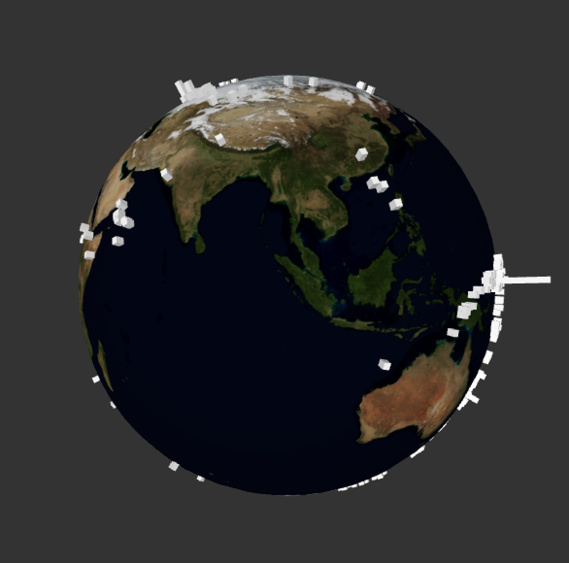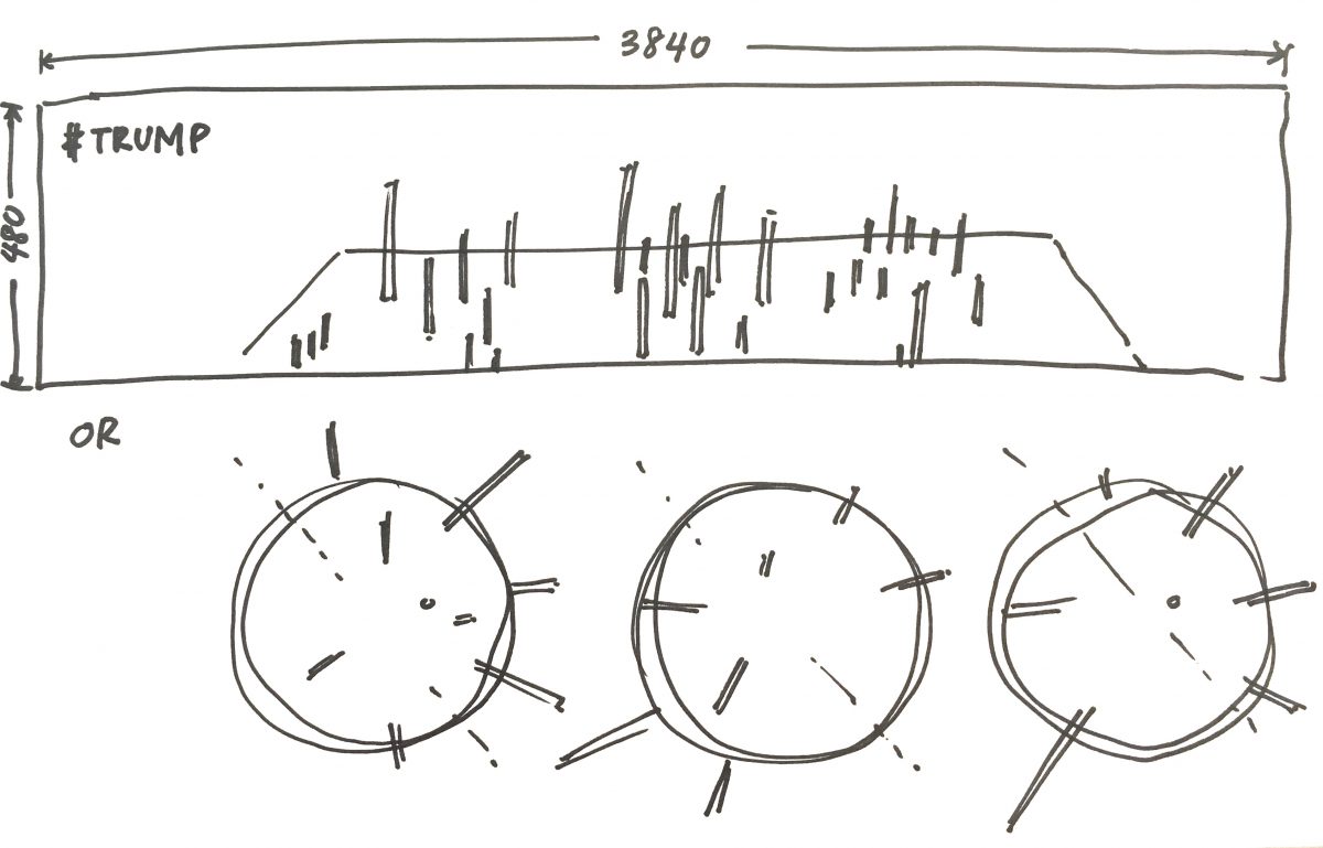
This is a sketch of what I am trying to do… either working on a plane that is rotated (like such) for view, with the protruding data (like Herwig Scherabon); or rotating globes with the data mapped on the 3dimensional sphere. I’m more inclined towards working on a plane, just because it makes more sense, more readable.
A reference that I have been using to learn up: Daniel Shiffman’s 3D Terrain Generation. A lot of what I will be referencing comes from Shiffman’s Youtube channel The Coding Train, I’m trying to understand and use parts of each of his projects to build my own.
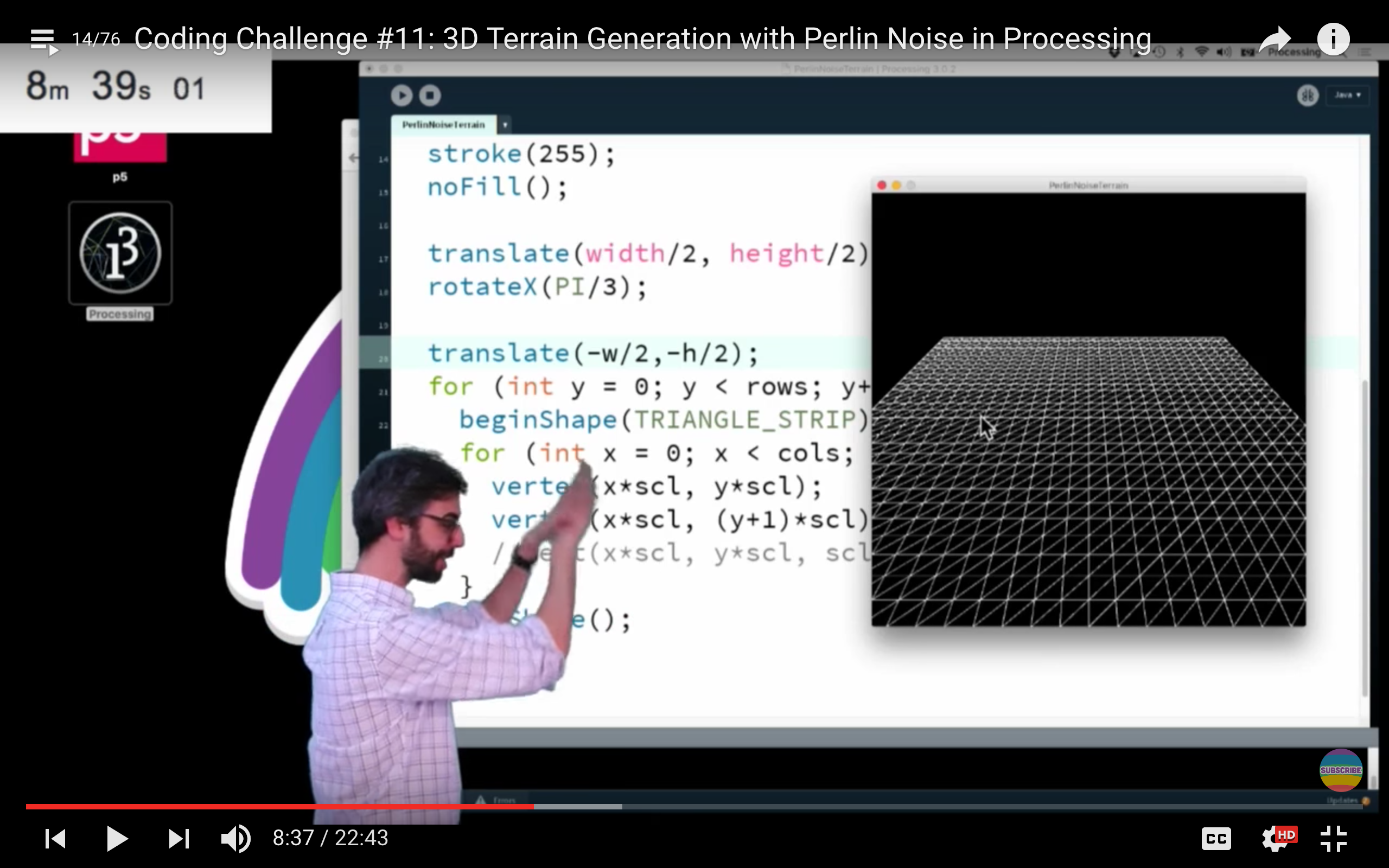
I played around with the code which he made available here on Github, but really all I did was to see how I can change colours and sizes and constraints.

My main takeaway from this is learning how to draw a grid with flexible x,y coordinates in relation to the screen size within Processing. This is so hopefully I can attach the long and lat coordinates of countries to a grid and manipulate shapes on each coord point with the extra dimension of height.
Another useful reference: 3D Earthquake Data Visualisation also by Shiffman (because Shiffman is king of teaching coding). Actually, this may be the most useful with what I’m trying to do in terms of planting the data by location, but I will have to map on a flat plane instead of a 3D sphere.
Shiffman’s code for this project available here on Github.