After gathering all the research, I have embarked on creating the first designs for the project.
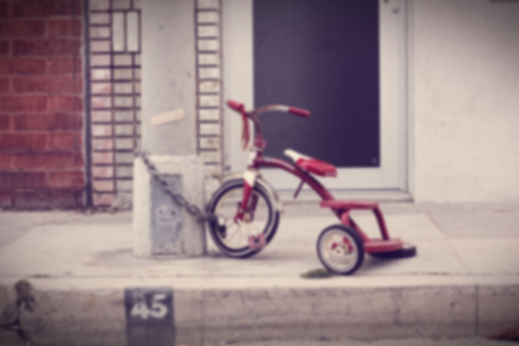
The first design I created was this, I wanted it to have a flowing sensation like a waterfall. Extending out of the A5 paper. I took inspiration from a lamp, which is on the right.
After consultation I realise that this idea could not really work as it is not very attractive.
I move on to my next design which is about travelling.
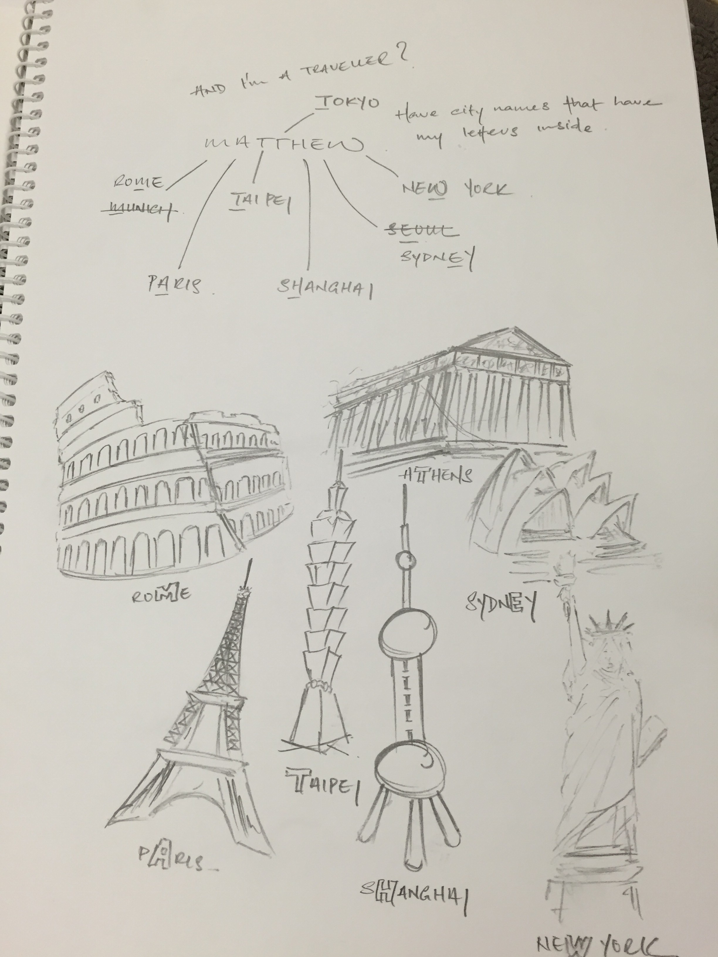
In this design, I have my name MATTHEW and each letter is represented by a city.
roMe
pAris
Taipei
aThens
sHanghai
sydnEy
neW york
What I did was to draw a famous landmark of the city beside the city’s name.
This however, was a good idea but a little bit too literal and simple.
Finally, I thought of an interesting idea; to use paper cranes.
The theme of my project would be Cranes and all four A5 pieces would have something to do with paper cranes.
Cranes in asian culture is use to symbolise happiness and eternal youth. I think that this is applicable to me.
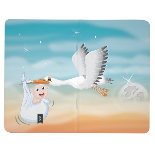
For the first piece, I use 7 paper cranes each carrying a letter of my name. It is also used to show that I am valuable and vulnerable like in fairy tales where the cranes were used to carry babies. 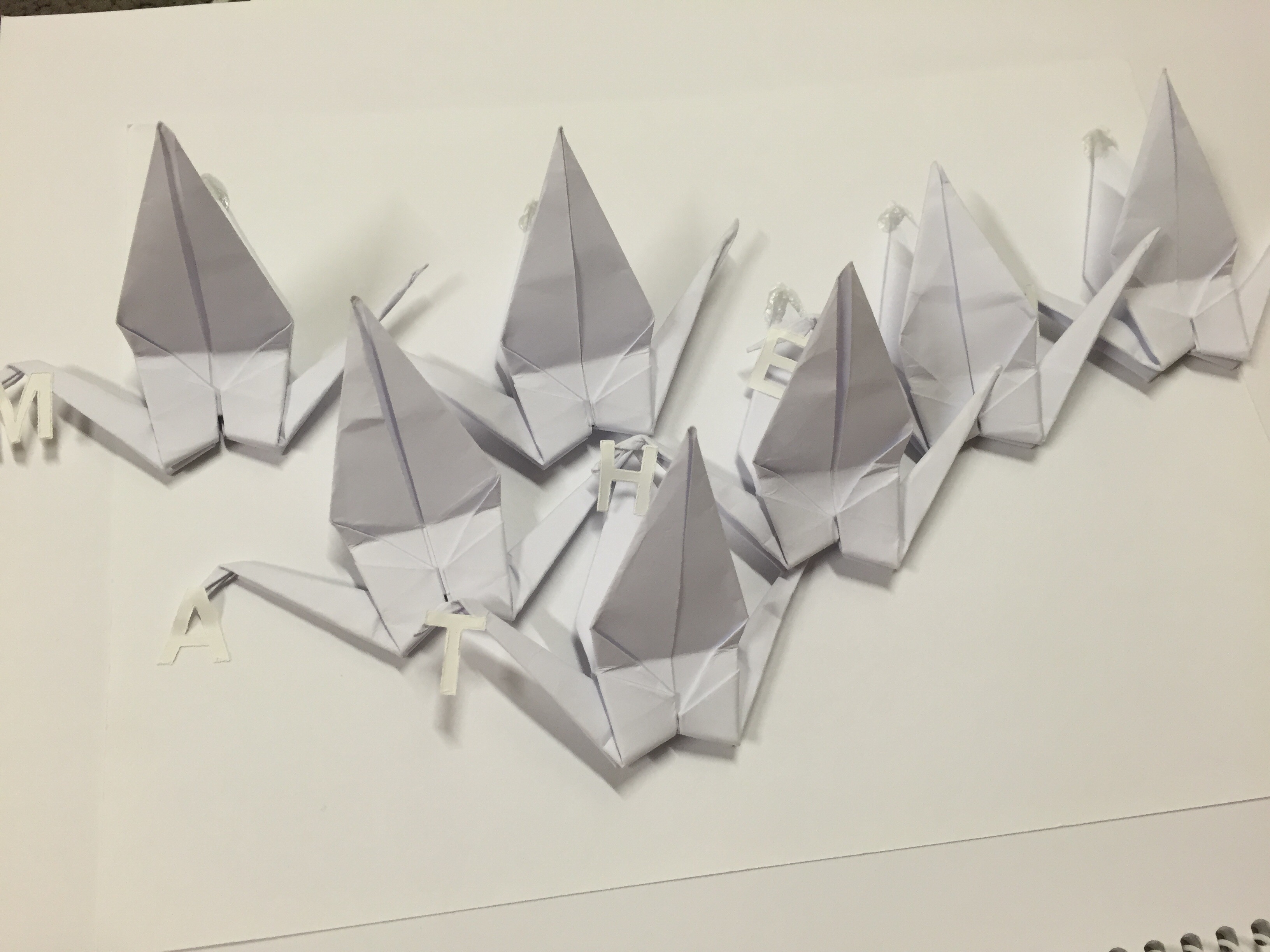
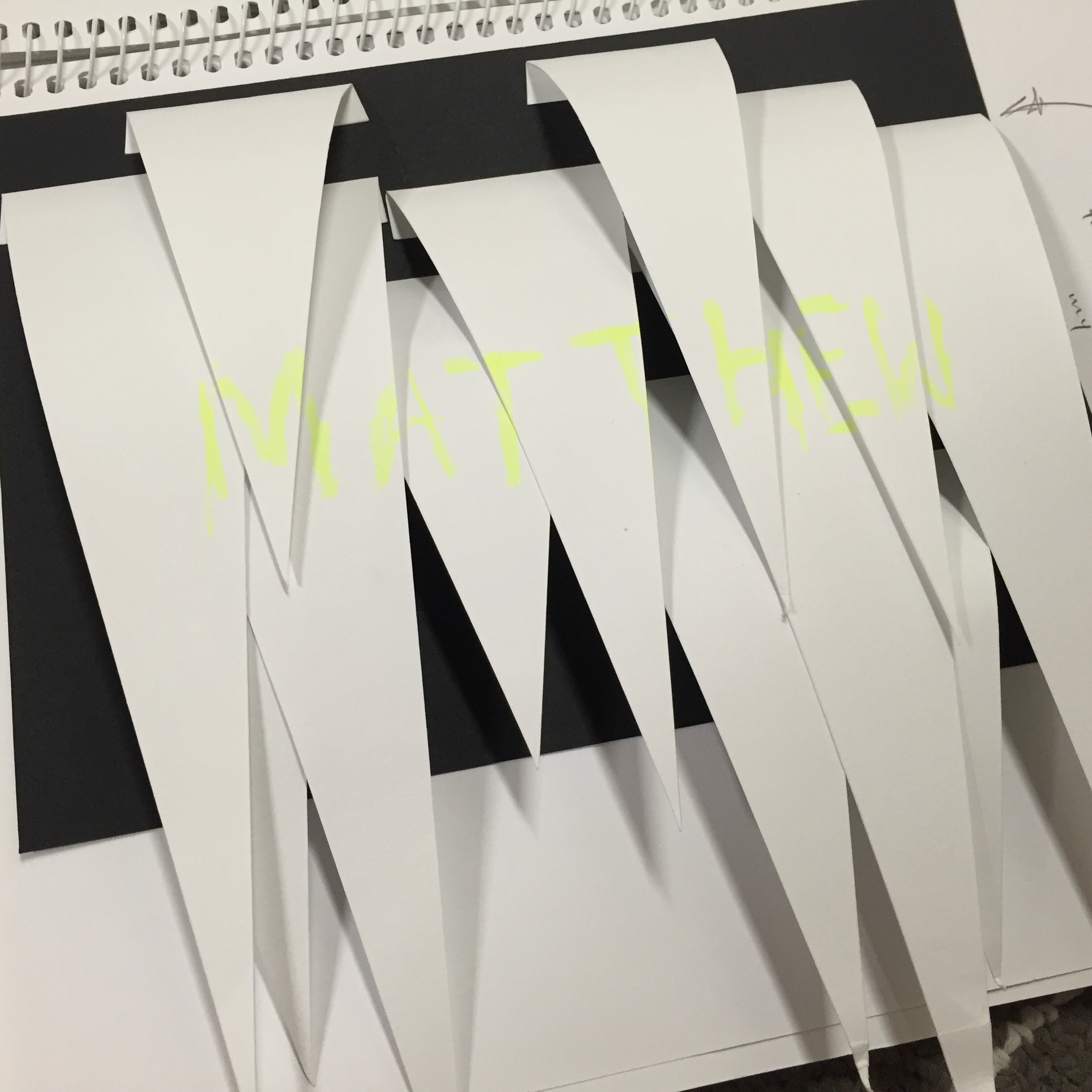
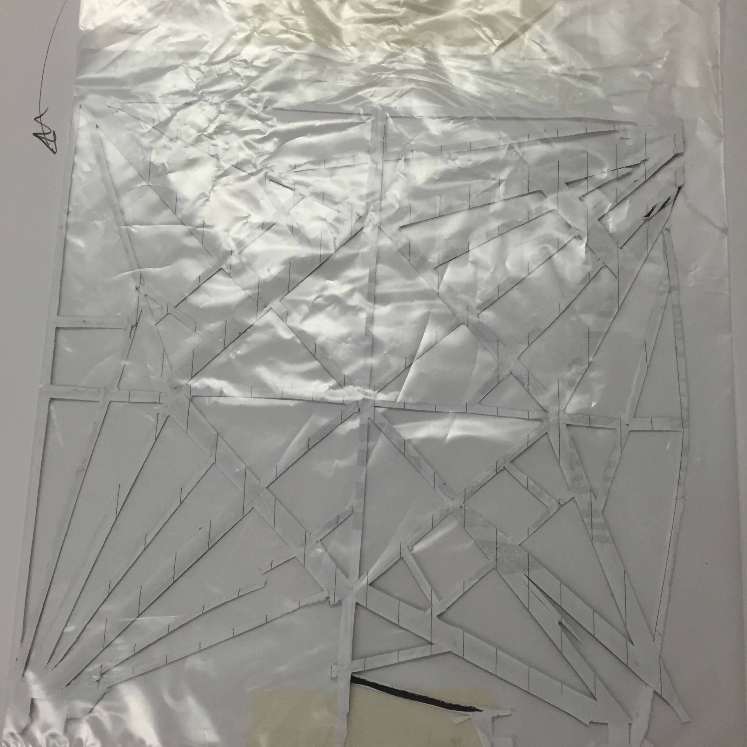
For the second piece, I have thought of using paper cut outs. What I have done is using the folds of the paper cranes, I cut out all the negative spaces and leave only the folded lines. I inserted my name “MATT” into the cut out as well.
For the next design I thought of doing something that involves my handwriting. I decided to created a paper crane that has only my name written to create the outline of the shape. 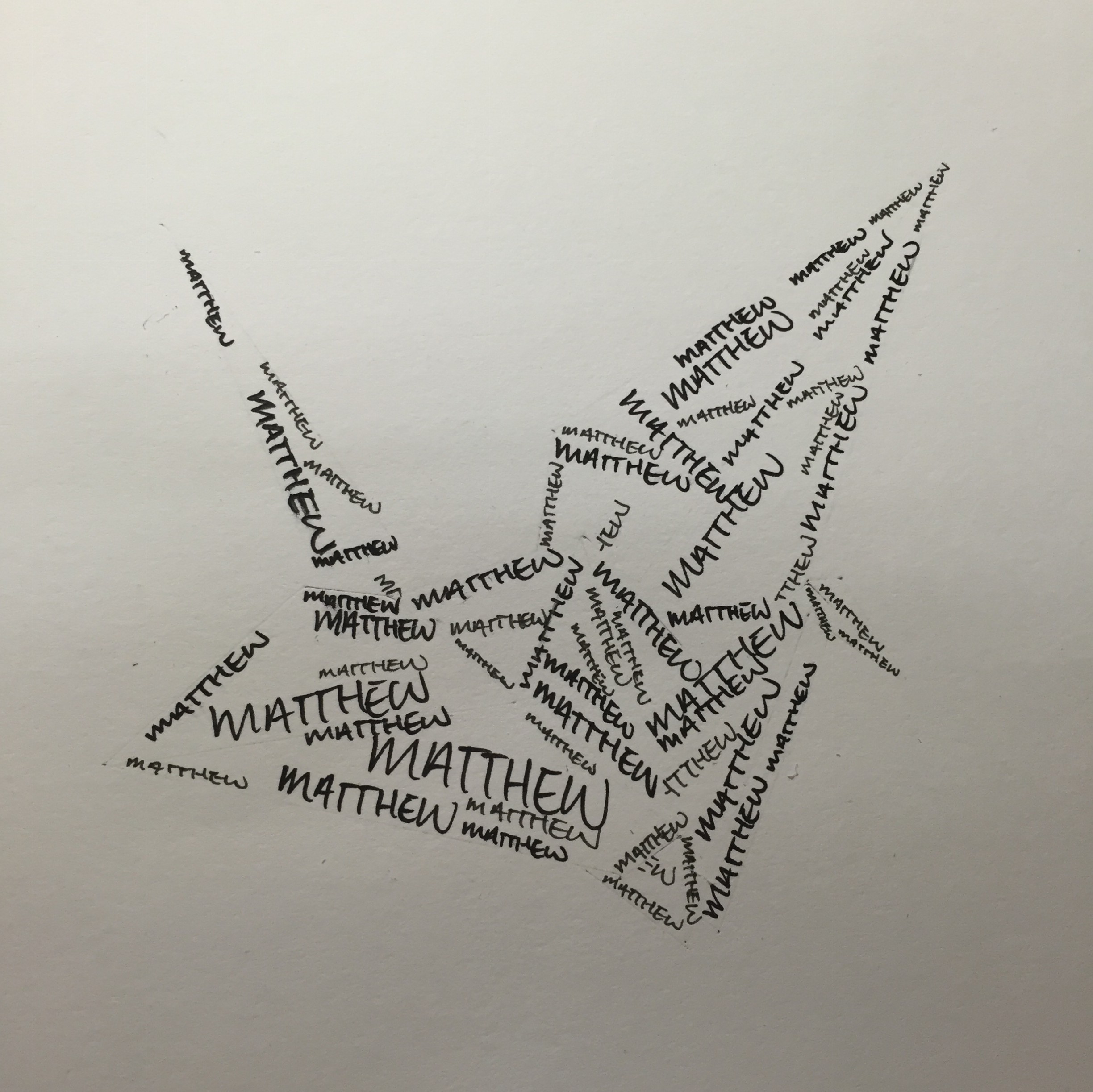
This design could be further improved. I thought of using solid black paper cut-outs to symbolise the imperfections. It is like covering up your flaws and prevent people from seeing them.
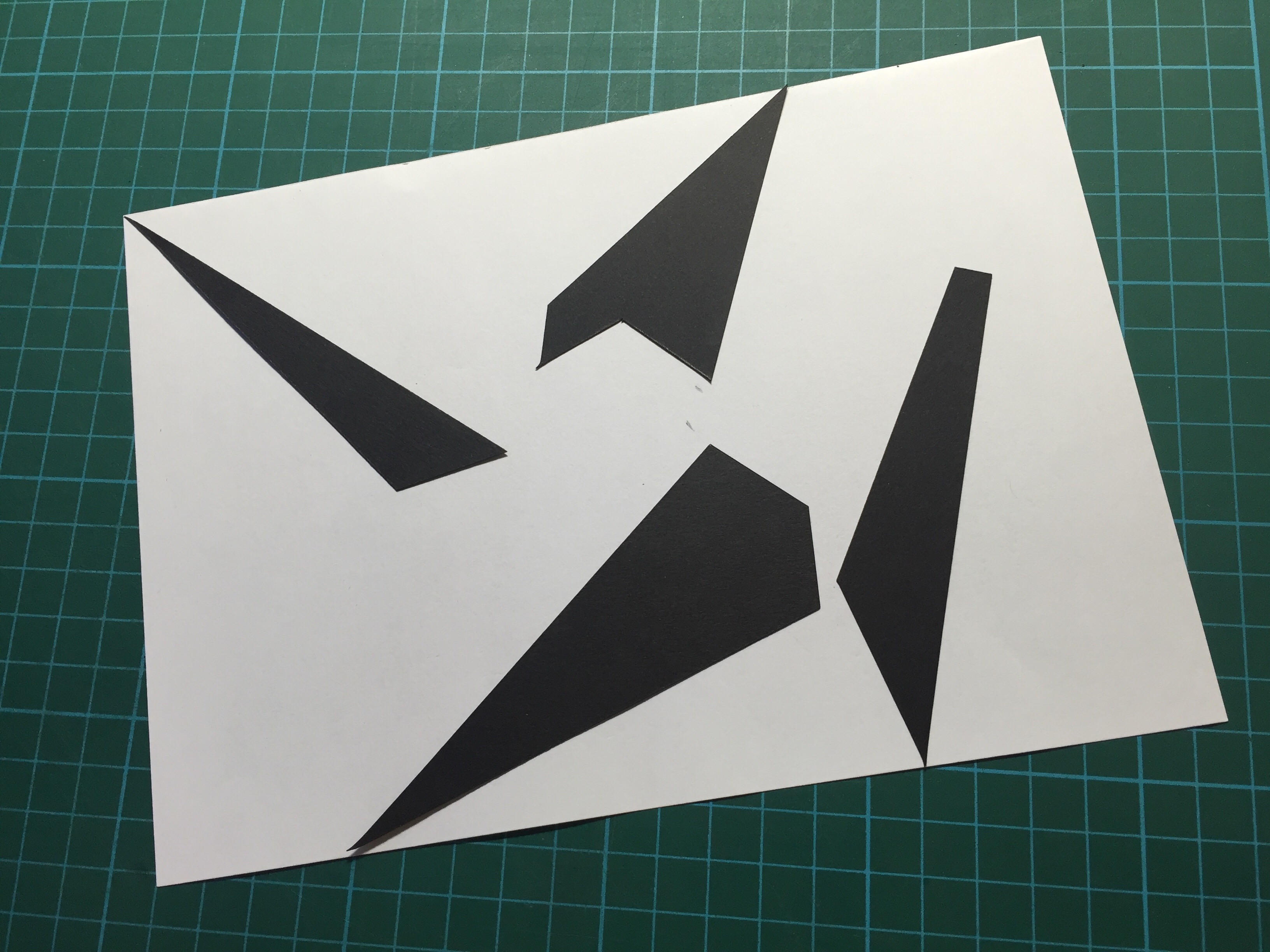
The solid black paper cut-outs are parts of the paper crane.
The following are further designs and paper cut-outs that I have experimented with. 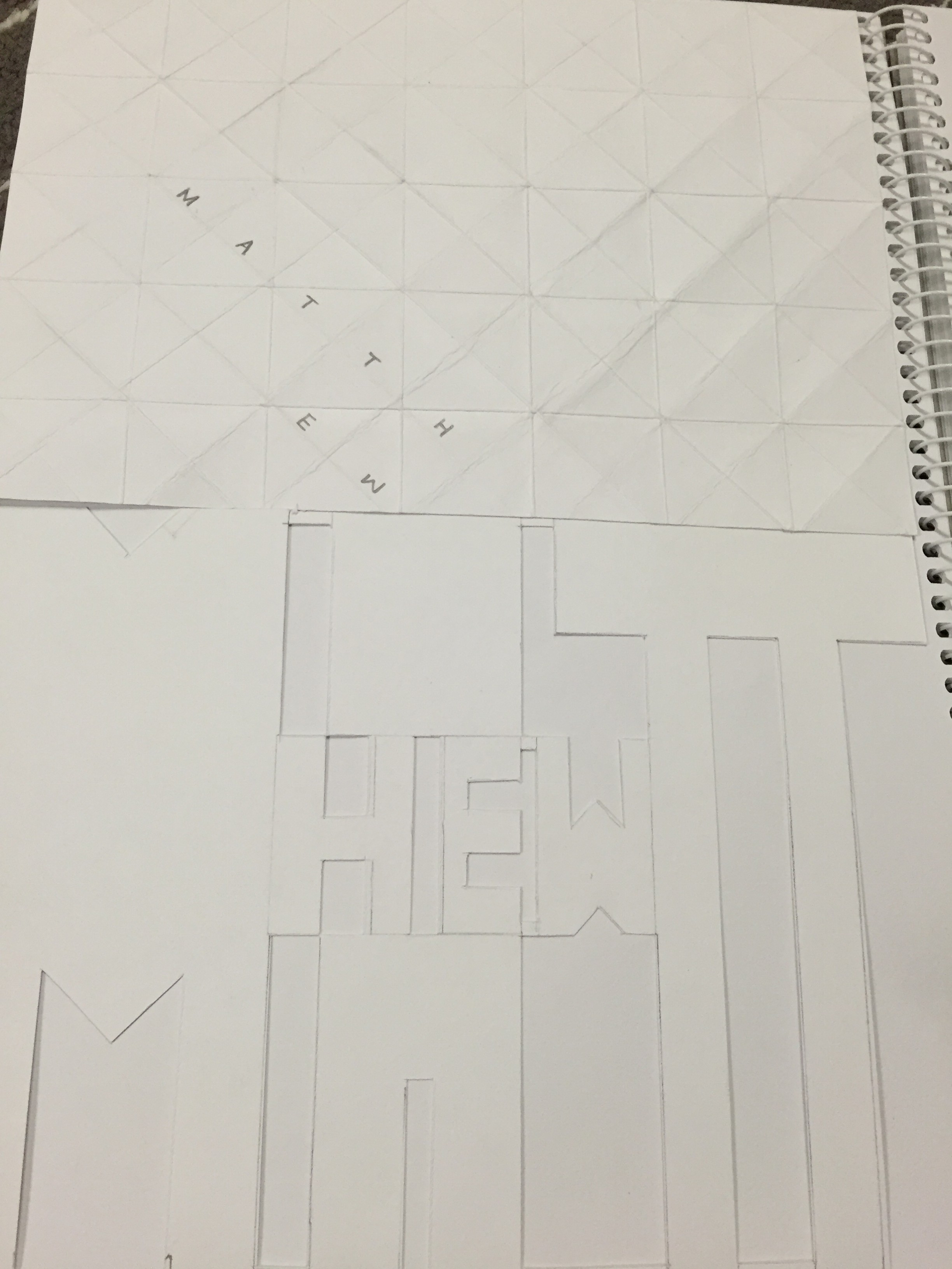

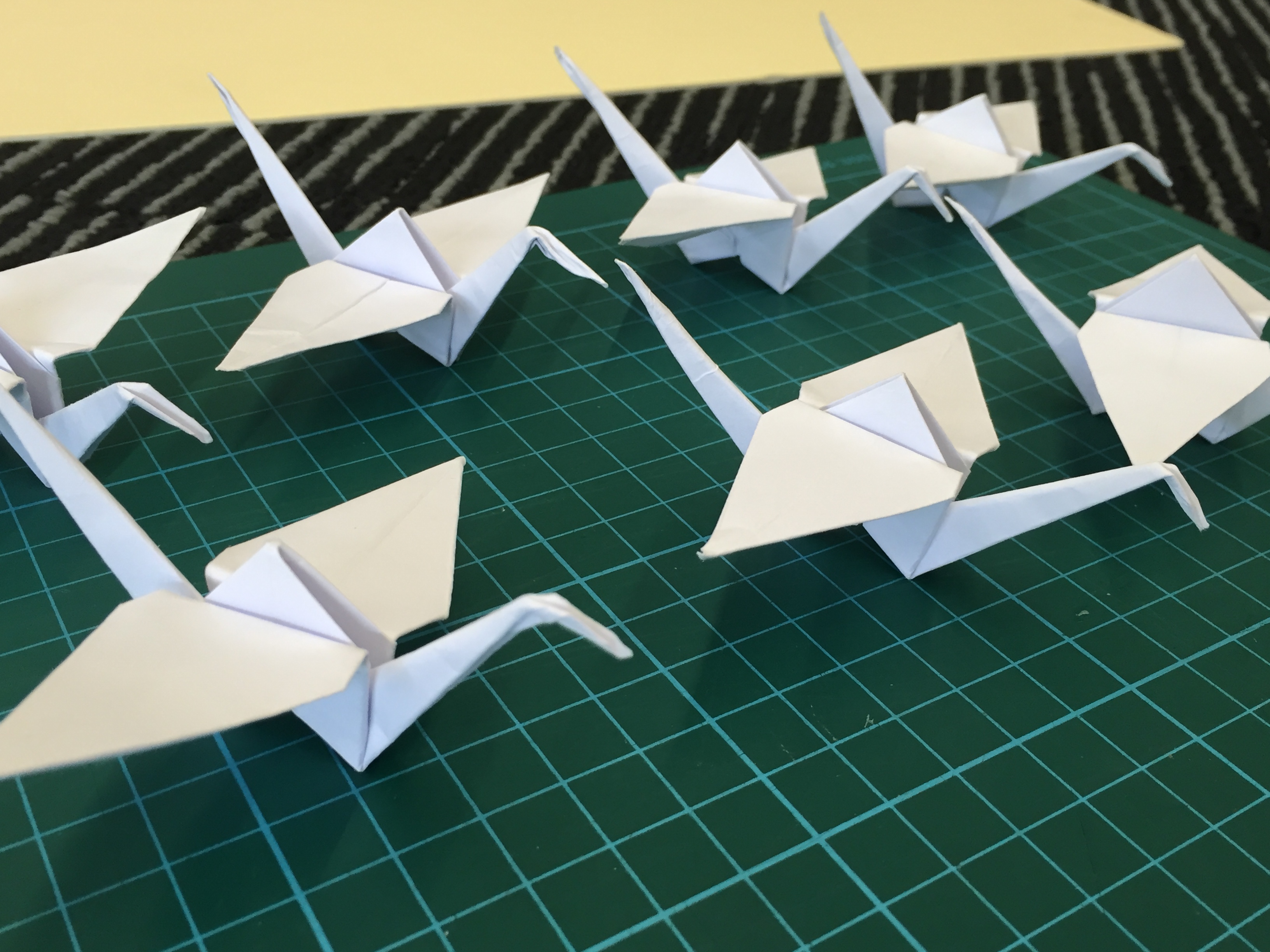
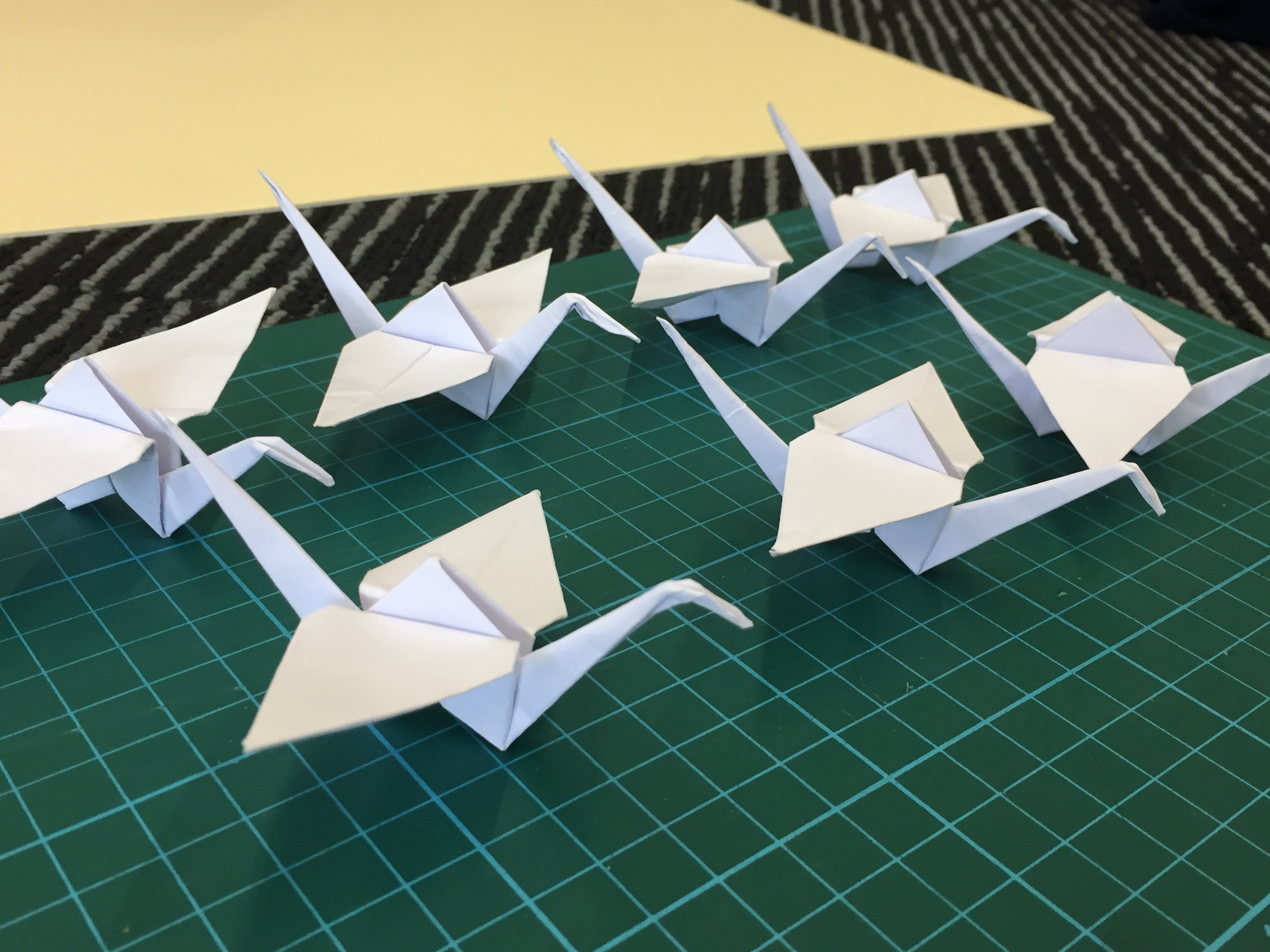
I have also created paper cranes and arrange them nicely to see how should I arrange them to have the best visual effect.
With this I am starting to create my final pieces for submission.
1 comment for “Typographic Portrait Problem: Process”