Hello, my name is Madeline…
…and I am Rational.
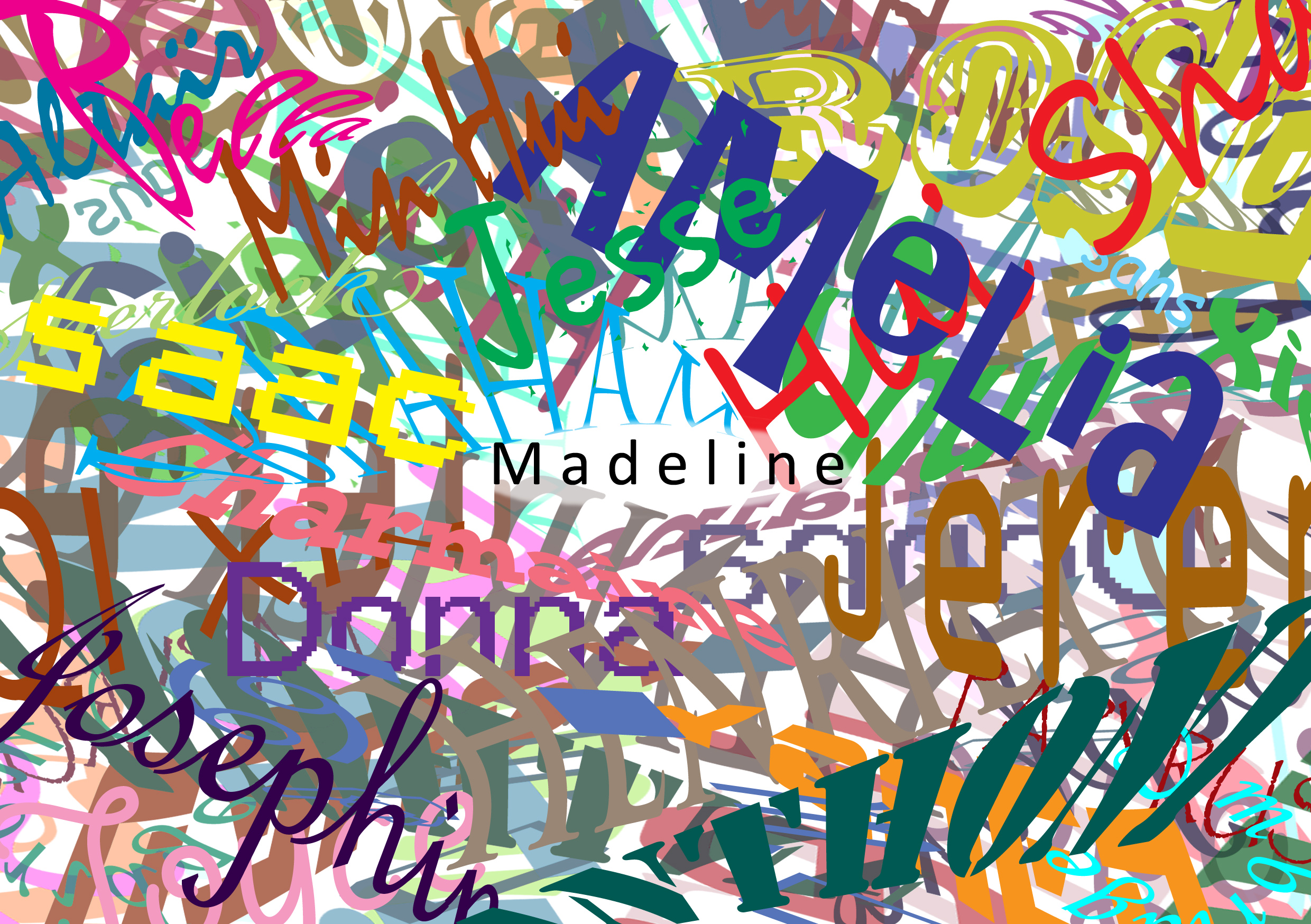
I chose to use ‘rational’ as a way to describe my somewhat inability to participate socially. I am what some would call a ‘low maintenance friend’: whether it’s because I don’t see the point of keeping so frequently in touch with people or remembering anniversaries and birthdays, very frequently I find myself losing contact with old friends… and not feeling the least bit sad about it. I often don’t see the point in telling lies for the sake of sparing feelings and I sometimes unintentionally upset people by, almost compulsively, correcting their grammar, word choice, or logic during casual conversation. Whenever I get upset because of a social reason, I am usually able to talk myself out of those negative emotions (and into apathy). This so called ‘extreme rationality’ (or maybe just ‘heartless callousness’, depending on who you asked) can be said to be the reason why I tend to feel quite isolated or disconnected from others, and I chose to represent that disconnect by using a boring, plain, inexpressive font like Calibri for my name, surrounded by colourful, fancy fonts with warping effects on some to represent other, more expressive, emotive, and social people. To emphasize the disconnect, I added a small white barrier between my name and the others’.
I used Photoshop to type and layer the fonts, flipping the layers and playing with transparency and layer blending to create the noisiness and messiness I needed. I especially wanted the mess to show how social situations can become so bizarre and overwhelming to me, especially in large crowds for extended periods of time.

First pass of all the names I used. It looks quite plain.
As you can see, I duplicated the names layer twice, whereupon I flipped one horizontally. I also added layer effects.
…and I am an Introvert.
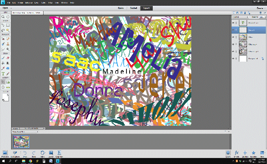
Following my ‘rational’ trait, and somewhat stunted ability to relate instinctively to others on an emotional level, I can become very exhausted very quickly by social situations, deeply treasuring my ‘alone time’. This love for solitude is also one of the reasons why I can’t stand staying in hall (roommates and public restrooms no thank you). I hence chose the imposing image of a wrought iron fence to invoke the idea of PRIVATE PROPERTY DO NOT TRESPASS. I intentionally left out a gate for the same reason as why I topped the fence with spear tips: I don’t want people to get any ideas that getting in is in any way an option at all. I also chose to use insular script for a few reasons. Visually, the letters are very round and appear self-contained, invoking the imagery of someone curled into themselves rather than expanding out into others’ space. The roundness also fits neatly into the circle design common in most wrought iron fences. Also, the name ‘insular’ is something of a pun which implies ‘insulation’ and isolation.
I used pen to draw this piece by hand, as opposed to the digital piece above, as it nears my personal space rather than the version of myself that exists in social spaces.
…and I love to World-Build.
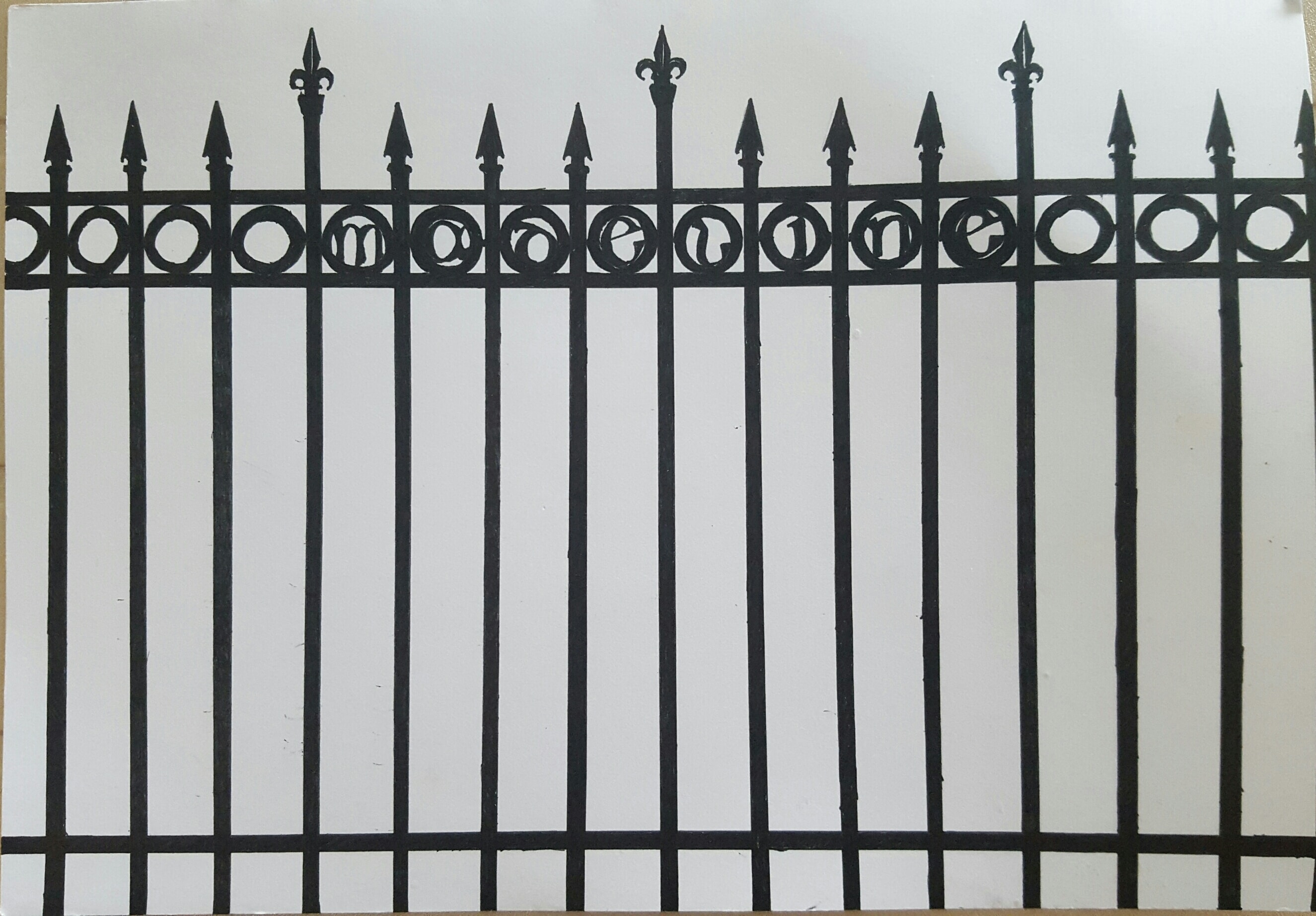
As an introvert, the ‘safest’ way for me to interact with the world, in a sense, is through fiction. World-building is an exercise that allows me to take all the external stimulation and knowledge I have gathered and consolidate them into fictional places and objects and people that I have control and understanding over. As someone who loves logic and reason, another part of world-building I enjoy is understanding how a myriad of different events across time and space come together to frame a setting wherein a narrative takes place, and at the same time will continue to exist independent of the narrative (the story only ends with your death if you think the story is about you, after all). Of course, the third reason why I like it is simply because dreaming up imaginary things like dragons will always be hella fun.
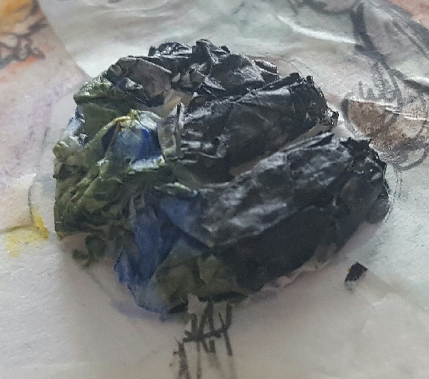
This piece is in the form of a tracing paper collage, with several key figures (a slug, a diver, a small soldier, two ladies, a centaur, and a pair of dragons) over everything else, coloured with colour pencils, and the paper cut away to form my name in the negative space. My name represents here the narrative, or the character’s path through the narrative, and the key figures are what the narrative directly interacts with. The vagueness of the outline implies an ability to go beyond, and discover the other hidden pieces of lore that form the world, which is represented by watercolour drawings on more scraps of tracing paper layered over each other. These pieces show architecture, geography, biology, botany, fashion, symbols, genealogy, and weapon design. These pieces also sticks out of the bounds of the A5 sheet, furthering implying a much, much larger world. The last ‘e’ of my name is stylised as a globe with crumpled pieces of tracing paper, half painted blue and green to represent the world that is encountered and seen within the narrative and supplied lore, and half painted black to represent the rest of the world that must exist as well, but has not yet been elaborated on by the creator or yet discovered by the reader/player.
Moving into the tactile, 3D collage, it shows a closer relationship to my personal world compared to the initial 2D pieces. World-building is at once a hobby that I’ve turned to because of my introversion, yet it is a hobby that allows me to comfortably look outwards from, and is a process that I am happy to share with others (and am interested to see from others as well).
…and I am a Gamer.
What better way to experience built worlds than through games? Specifically, role-playing games (RPGs). RPGs are games wherein the player creates and/or takes control of a character or number of characters and then proceed to interact with the game world to achieve some sort of objective. It is in this interaction with the game’s world where the player can experience the world-building of the creators. Whether it’s cowering from intimidating Qunari warriors, fighting a Rachni swarm on a distant moon, finally getting into that weird pink house beside Napstablook’s, reading an interesting bit of dialogue in Lavender Town, or chowing down on some Lembas while gazing into the Mirrormere, every step you take in a game world is an exciting new piece of lore waiting to be unearthed. (I also recommend doing a Google search on all the referenced games, and then playing them. They are excellent.)
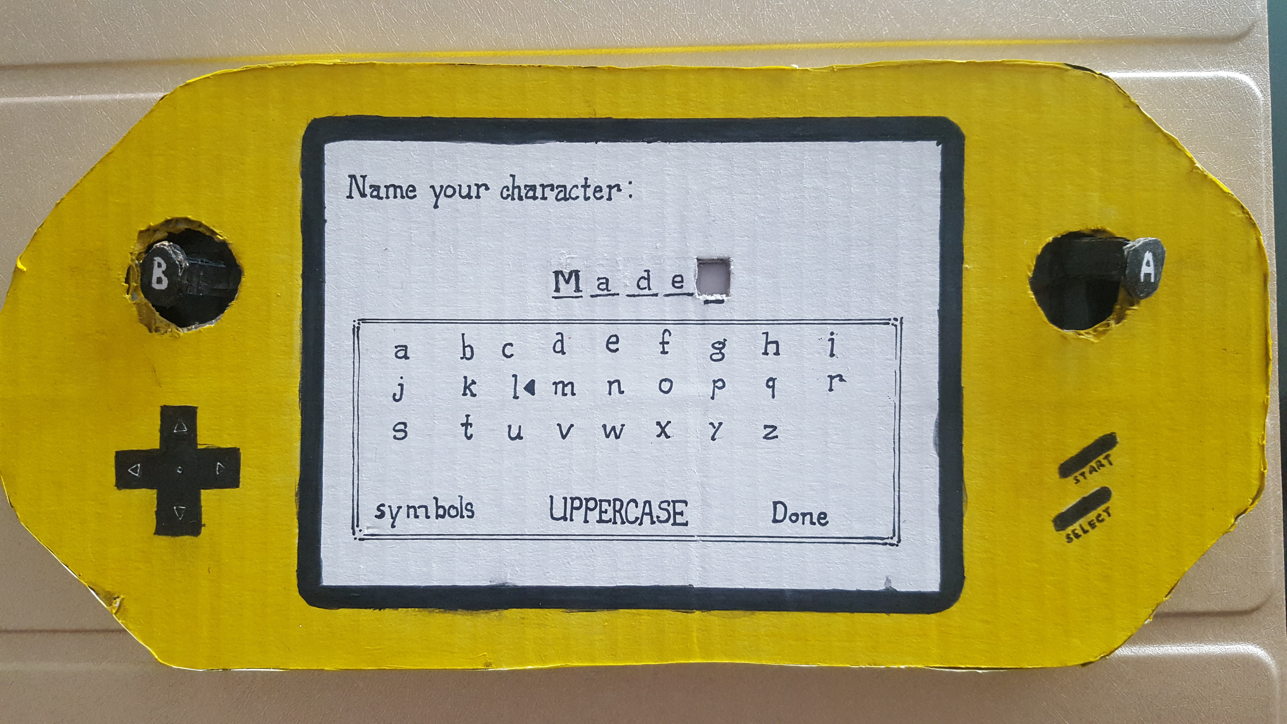
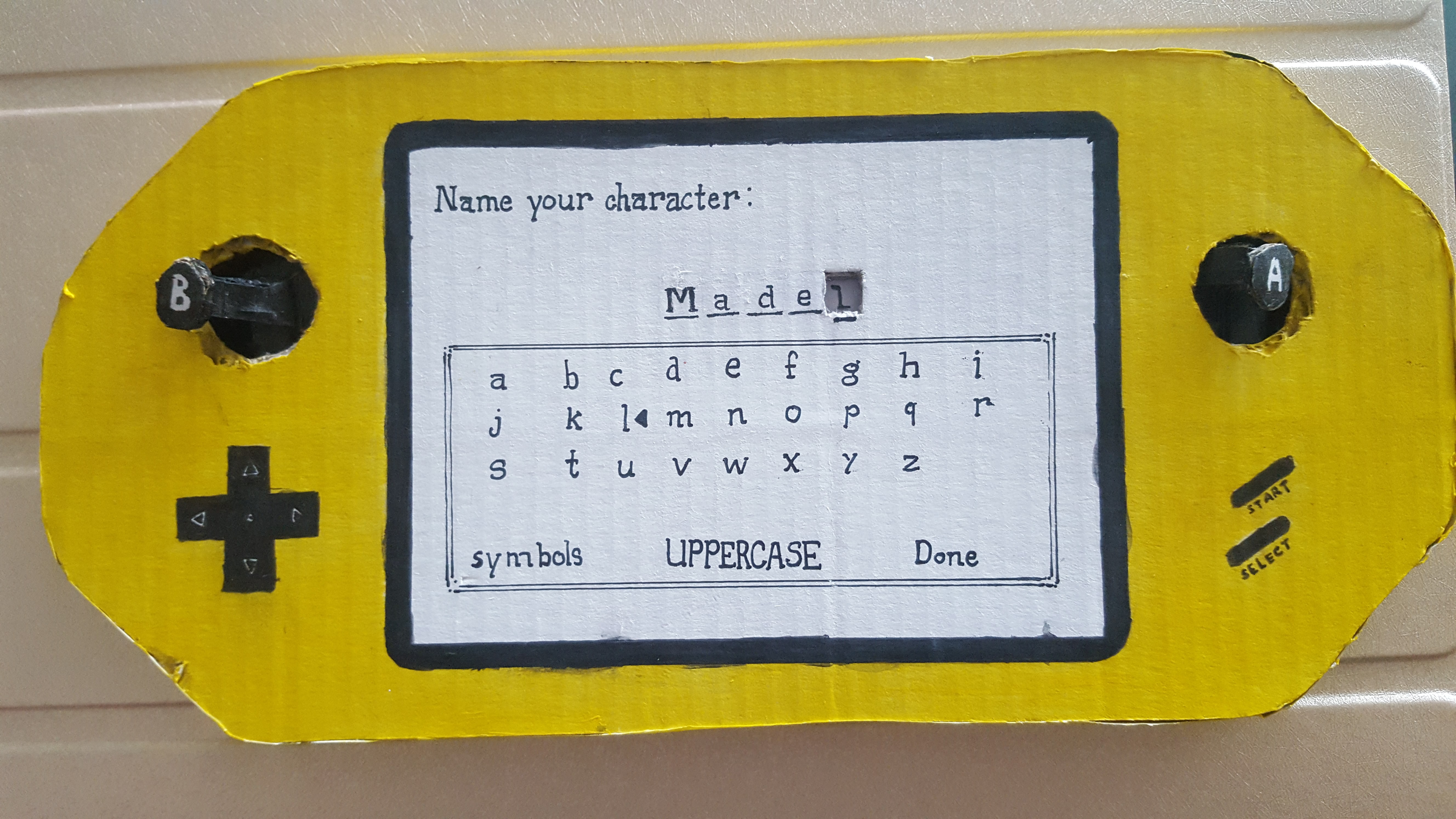
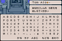
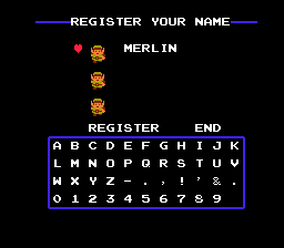
I chose to show the naming screen, both to fit into the project requirements, and also because this is the screen that usually marks the end of character creation (if any), before launching into the game proper. This particular style of character naming will also be especially familiar to old Gameboy players, along with the frustration experienced in some games where there were character limits (usually 3 to 10 characters, depending on the game) and you could not fit the entire name you wanted.

Pokémon naming screen

Undertale naming screen
Mother naming screen
Zelda naming screen
I love playing games, and watching others play games (Let’s Play!), and playing games with others (unfortunately our schedules have gone a little out of whack), and others watching me play games (sometimes, and only if they’re not annoying). Games are one of those things that I am most passionate about, whether I’m alone or with fellow fans. This piece is a 4D interactive piece, with two functioning buttons that slide the ‘l’ in and out, becoming even more personal and inviting than even the previous 3D collage. In a way, art and games are really the ways in which I best relate to and interact with others (you’ll notice that I hardly upload any pictures of myself onto social media, my Instagram and Facebook accounts are filled almost exclusively with my drawings).
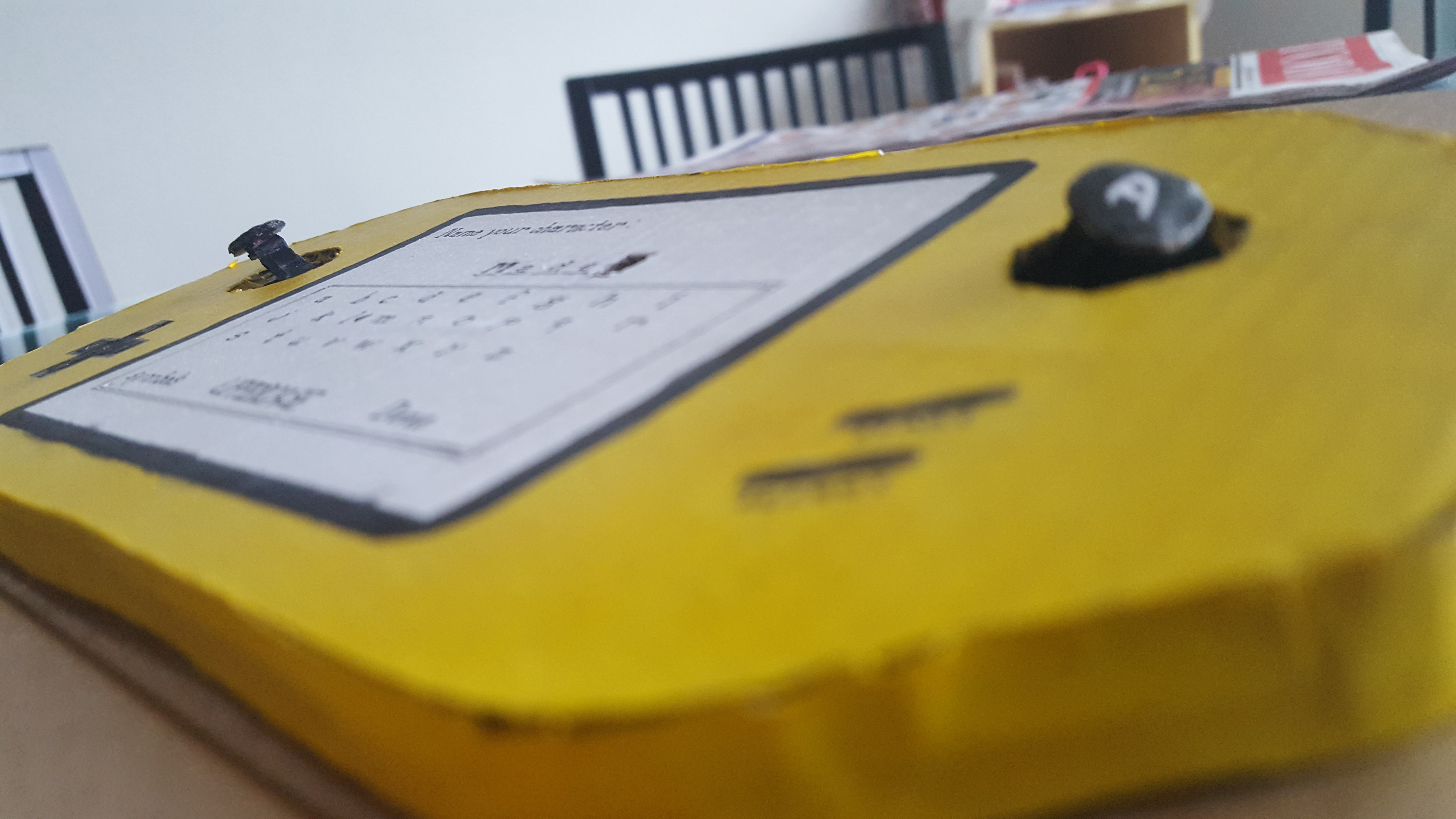
The buttons can be pressed! Please feel free to do so.

The buttons are connected by a single strip of cardboard that slides when one end is pressed, pushing the ‘l’ written on it in and out of the viewing window.
Hi Madeline!
I like the way that you’ve presented your narrative, the points flowed very logically and made your compositions easy to comprehend.
I understand the chaos that you were trying to portray in your first composition. Being an introvert, I totally feel the ridiculousness of mandatory social conventions too! However, I felt that your composition might be a tad too messy. Maybe you could have considered applying colour theory like split complementaries to give the composition a little more harmony. Also, I feel that a solid white box around your name instead of a feather gradient would further emphasize your point of wanting to be isolated.
That’s just my two cents! Anyway, I had wanted to make some parts of my console interactive too, but had no idea how to go about doing it. So I was super duper impressed with the interactive PSP that you’ve made! 🙂