Initial Ideation
Research on Dadaism, Russian Constructivism and Hannah Hoch

Upon reading the brief my first thought was to try to do Arabic calligraphy as this was a part of my roots and it would be amazing to be able to show this to the rest of the class.


As outright figuration is dissuaded in Islam as it is seen as the artist trying to imitate the workings of god, Arabic Calligraphy has evolved in way that is different from western type. Arabic Calligraphy, has always been used as an image to replace figuration and thus I thought this was a perfect starting point for this project. Alas, I realised that writing in Arabic was already hard enough, to do it in calligraphy style was even more difficult.


These were all attempts at writing my name “Shaherfi” in Arabic. Immediately I realised that the way I wrote them did not have the same precision and beauty like those in the previous images I have shown and this was no surprise as Calligraphy is an artform that takes years to master and here I am trying to do it without any formal training. Trying to do it in digital also proved to be unsuccessful.

It just seemed really off. Regardless, I realised that maybe making the calligraphy a bit rougher would help. (Also, Illustrator proved to be very difficult to use for me.)
For this I was kinda inspired by the calligraphy showcased in Barakamon ( A japanese anime on Japanese calligraphy by Satsuki Yoshino)

![]()


For these, I mainly used different brushes and chinese ink to create the rough texture. I also played around with different gradients of black, heavy splotches vs dry rough parts to create contrast.
I also tried to write my name in English alphabets but in the rough calligraphic style.
![]()
I tried breaking down the forms of the letters “SHA” to try and make them look more like Arabic strokes yet still readable as western letters.

But after working on these, for a long time, I decided I should try do other things to the letter forms.
My next step was to try to add other elements, like figuration to the letterforms.

I decided also that I needed to be more sensitive to the unique features that forms a letter. I could use these unique features to my advantage to tell a narrative

For this composition, I wanted to show how difficult it is being a parent and how us children do not make it easy for them. I used the curves of the S to emphasize the difficulty the character is facing in trying to stay afloat.
Following this style, I created something Similar for the H

The H was a continuation of the narrative from the S, where the mother has sacrificed everything for her child and is now gone.

After Consulting with Joy I realised that I should continue working in the way I did for the S and the H to create a narrative. Using a big letter that was cropped but still distinguishable, I could put to light the features that makes a letter unique. The narrative I wanted to depict was also about a parent. To show the other side of being a parent and to show how shitty it can be sometimes. Parents like us are humans, they are subjected to the same insecurities. Parents are not born to be parents and they are learning on the Job.
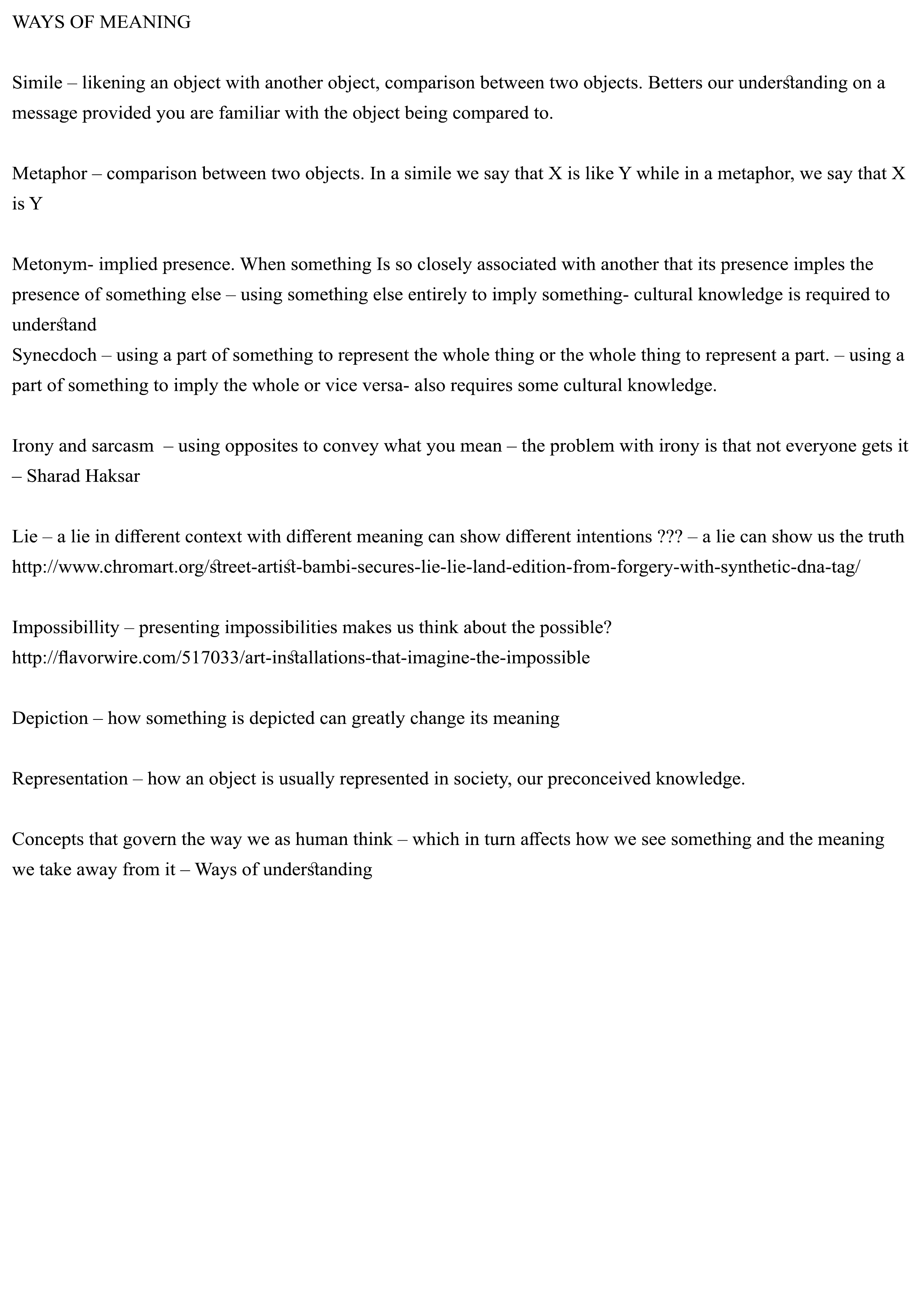
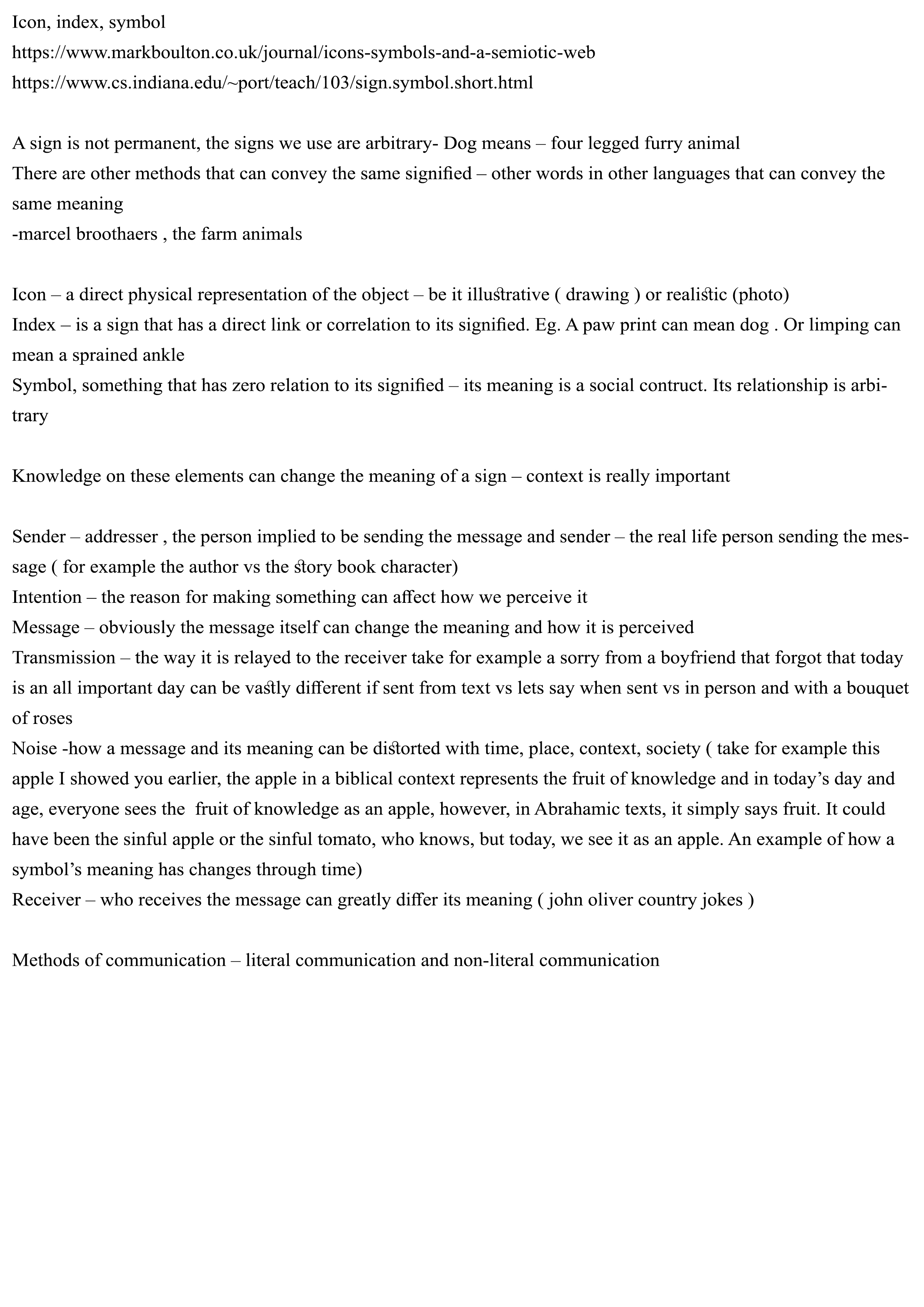
This strong desire to create something that conveys a strong message was also partly inspired from the research I did for my presentation on semiotics.
I also took inspiration for the illustrations from children books that I love such as the Graveyard Book, by Neil Gaiman and also Roald Dahl’s books. I think the dichotomy between the somber theme and the child like aesthetic would drive the message further.


Thus, following this narrative I created the other two letters.
Part 2

For the next letter I decided to use a small H instead of a big H as it is better to portray different forms of the letter to create some variation. Initially I had used another big H but it looked too similar to the last composition.


For this composition I portrayed a parent as an advisor or a supporter. How they would do anything to help their children without regard of their own well being. And us as kids usually choose to ignore this. For the typeform, I focused on the gap in between the stem of the “h” and the curve.

For the next composition, I decided to work with a small a instead of a big A as i thought it would make it look neater when put together with the other compositions as then there would be two upper case letters and 2 lower case letters. For this composition I portrayed the parent as a storyteller. It depicts how as we grow older, we tend to ignore the stories that our parents tell and put hem aside. I used the hole in the a to push this narrative and convey that sense of isolation.


After consulting with Joy there were a few things that I could improve on. First was to try make the letter forms look more linked together , that is make them look more bulbous like the S in the first composition.
Second was think about how I could use other elements of typography such as kerning and Spacing.
The next step was to translate these images into Illustrator to make them neater and add other elements.
Since it was my first time using illustrator this also proved to be a challenge.
Working online and Final compositions


As mentioned earlier, I made the letter forms more bulbous to match the S in the first composition. This I feel also fits with the child like illustrations theme as bulbous letters make the composition seem less formal.
Besides this, I also added text to explain the story. I used kerning and spacing to convey the emotions that the characters are feeling.

It is perhaps more apparent in the last composition. Here the character, the parent is dying and fading away. Thus I made the kerning spacing increase further towards the end of the paragraph. I also made the spacing in between the lines increase and size of the text smaller to imitate this fading “sense”.
For the last composition, I also decided to remove the character completely and instead represent her with a blooming flower.
To make it clearer that this blooming flower is the character that had appeared in the previous compositions, I decided to add a red streak in the hair of the character in the previous compositions. This links the 4 compositions together with a common element and also makes them slightly more exciting as now they aren’t just black and white.


Reflections


I think what was most challenging for me when working on this project was actually using illustrator. It is always daunting trying to learn a new program and it was no different with illustrator. For example, instead of working with the pen tool to vectorise my illustrations, I worked with the scanned images and the brush tool which created thousands of anchor points and this resulted in a composition that was not as tidy and neat as it should be. This is perhaps most apparent in the last composition.

There are actually weird gaps and things sticking out between the H and the edges of the paper, and this was due to my untidy method of editing the image within illustrator itself.
That being said, I think I managed to do a good job with playing with different elements of typography and I managed to convey type as image effectively. I am also really happy with being able to do something that has a deep message. In general I am really glad with the work I was able to produce for this project

Thank you for giving me the opportunity to do this and thank you for reading this post and I hope you have a wonderful and amazing day.

