INITIAL THOUGHTS AND DESIGN
At first, I wasn’t really sure on how to go about doing project 2 as I wasn’t really a fan of collaging and dada. So after taking a quick glimpse a the senior’s work, I decided to dive head head first.

Problems :
As you can see the first design I came up with for the quote ” I give up. I see no point in living if I can’t be Beautiful” – Howl, Howl’s moving castle, is pretty problematic. Firstly, I did not give my own twist to the interpretation of the quote, but simply represented death as skulls and beauty as flowers.
Secondly, I had problems with the arrangement of the elements within the composition. There is slight balance in the arrangement of the flowers, however with everything centralised and there being no play with the viewer’s gaze leads to a composition that isn’t dynamic.
However, time was not wasted in creating this initial composition. I was able to experiment with the different filters and get a good grasp on using halftone, posturize and treshhold. I was even able to create a nice library “black and white” flowers that were used repeatedly in my final 4 compositions. The use of half tone to create polka-dotted images was also something I discovered when creating this first composition.


These are a small percentage of the library I have amassed throughout this project.
After the group presentations on design principles, I was also able to get a good direction on how to arrange my subsequent compositions. YAY 😀

COMPOSITION 1

Interpretation:
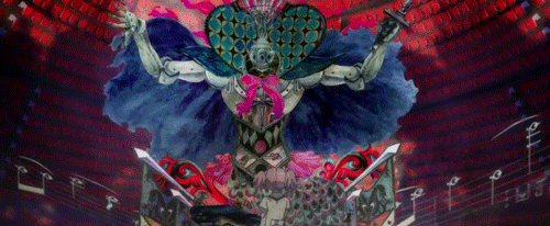
After creating the first composition, I started thinking about what being would be so fixated on beauty that they would give up on life. That is when I thought about he fae folk. Not the Disney renditions of faeries that we are used to. True faeries are actually very dark and mischievous. Above all else, fae folk usually prize beauty. They would dance for decades and life times till their feet bled dry and their skin turn to dust. Why? Simply because dancing is a beautiful thing. And thus that is what I tried to depict here. With the girl and insect wings. At first glance you would think that this was a pretty composition. That is until you come in closer and notice the blood and the skeleton for hands and feet. The girl is killing herself, there is still a sense of beauty to it. Is it wrong for me to think so? The composition is suppose to chide the viewer for thinking that this is beautiful.
Art direction and design principles
Since I was dealing with fae folk as subject matter for this composition, I thought it apt to make the whole composition look surrealistic. Hence I chose images and put them together in way that made it seamless. The composition looks more like a whole rather than individual parts collaged together.
The innitial image of the girl too had the story book panel aesthetic. I tried to retain this for the final composition as I felt that it had surrealistic feel.

For arranging the image, firstly, I used the golden ratio (learnt from the group presentations) to dictate the sizes of the elements in relation to the girl.

Using the golden ratio rectangle as a guide, I resized the images as I worked on the composition.
For this composition, I also learnt about haw gaze within the image itself is a powerful tool that can dictate the gaze of the viewer. Since the girl’s head was looking downwards towards her feet. I decided to make that leg the one that is to be skeletal as that is where the viewer’s gaze would be directed to. Taking note of where the viewer’s gaze would fall, I also decided to render some flowers polka-dotted to give the viewer visual rest and not make the composition too cluttered.
From there I decided to push the idea of directing the viewer’s gaze further using implied lines.I added trails of blood firstly, because of my interpretation of the quote. Secondly also because they created lines that direct the viewer’s gaze. The blood trails her direct the viewer’s gaze to the next feet. The skirt and arms then direct the viewer’s gaze upwards. This cyclic motion of the viewer’s gaze create an illusion of movement within the composition. The viewer is in mid dance, and the composition captures this still, but the viewer imagines and completes the dance for her through his gaze.
COMPOSITION 2
One challenge I set for myself for this project is that I wanted my compositions to take on different art directions. For composition 2, I wanted to challenge myself further and create something dadaistic. The problem with this was that I have always disliked dada as personally I didn’t find it aesthetically appealing. Which is understandable as they had other matter to pay attention to, namely protesting and staying alive.


After thinking long and hard, I realised that there was a work of art that used collaging to create something that I did find appealing and this was the art of Puelle Magi Madoka Magica.


Now, strictly peaking, most fans do not categorise the art of Madoka under surrealism or dadism persay, but instead tout that it is a unique art style of its own. Personally I feel that it definitely has elements of both art movements and is unique through the artists’ own personal take.
For Madoka, I find it appealing firstly because the colours are very well balanced and secondly, because each element within every character and composition has meaning behind it. And thus using this as inspiration, I began making my second composition.

Intepretation
For this composition ( using the same quote) I wanted to depict something where death because of unattainable beauty was more warranted. That is where I decided to depict this unattainable beauty as enlightenment. Reaching enlightenment and self-actualisation ( being contented) is something that every human in one way or another aims for. And it is a respectable goal. So not being able to achieve this, would death then be warranted? Here, I decided to make the composition still feel slightly off, by making the elements of collaging more apparent. The heart has also a halo made out of a polka-dotted. This was done to make the heart look like a monthy python esque false god of sorts. It is to make the viewer question themselves. Is enlightenment the pinnacle in life. Personally, I feel that sometimes, we are too fixated on the end goal, to the point where we forget to live. In this case, when aiming for enlightenment, it is kinda ironic isn’t it.
Here the figures at the bottom each also represent some for of beauty. The wings represent attaining high positions in career/life. The flowers represent physical beauty. And the skull her this time represents worldly desires and material wealth.
Design Principles
Her once again I used the golden ratio to dictate the sizes of the different elements in relation to one another.

Here, I also played with the viewers gaze to place focus and emphasis onto the heart. Although the bottom half of the image is more visually heavy, the focus of the composition if still the heart due to a number of reasons. Firstly, the heart is a recognisable form and our eyes are more inclined to be drawn to images we recognise. Secondly, the implied gaze ( the figures don’t really have eyes but their “heads” imply a gaze) are all directed towards the heart.
This composition is also meant to make the viewer question himself. Due to the heart being on the upper half. The viewer would have to tilt his head when viewing the image and thus at that moment the viewer becomes one of the figures venerating the heart. Are we really like those beings? Are we too fixated on the end goal? These were questions I hope surfaced.
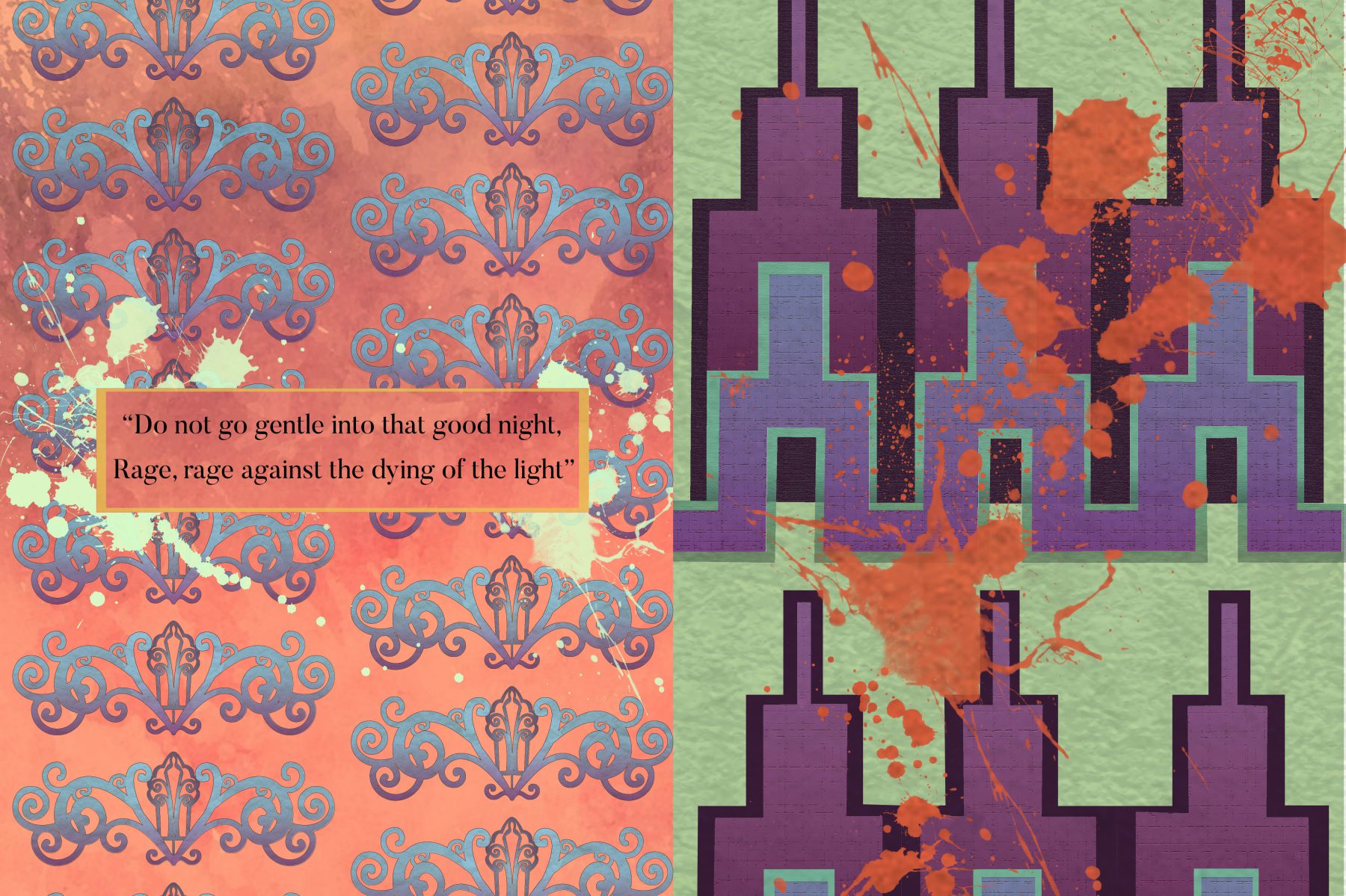
Composition 3

For the next two images, I will be using the quote ” Once you’ve met someone, you never truly forget them” – Zaniba, Spirited away.
Intepretation
Here, I used a page from the Book of Kells, an illuminated bible manuscript. For this composition, I am viewing religious books and texts as a form of record keeping. These records throughout history has been relatively unchanged and in that sense, these characters depicted in these records have been imortalised and are not forgotten.
I have also used just one image to create this entire composition. The polka-dotted background too is also the same image of the Book of Kells, just half-toned and bloated to become the background. The images in the foreground too is the same image, just with different filters. One image however has been left relatively untouched, simply made black and white. Can you see which is it?
This layering of the same image is to represent how our memories work in layers. For the same memory, as we grow and our perception changes, we add different interpretations of the same memory, creating and adding feature we think might have been there. Some parts become muddled and different, represented by the different filters, while others become completely forgotten, represented by the half toned images. However, I believe at the core of it all, there is still a piece of that memory which will still remain unchanged.
Art direction and design principles
For this composition, I wanted to play with the design principles that revolve around the art of patterning. To do this, I drew inspiration from Rene Magritte’s wallpaper work.

Initially, I created simply a background with the Book of Kells and an image of an Angel.

This however, I felt, made the composition too cluttered. Besides, using a literal angel to imply religion I felt was a little too obvious. I favoured more subtle forms of hinting. And thus I decided to use just the background.

I also experimented with the number of rows of books that should present.

I decided to go with the composition with lesser rows as I felt that was neater. After the group consultations, and receiving feedback from my dear classmates, I realised that I could push the composition further. Firstly, I could zoom in on a certain section to a point where the viewer could see more clearly the details of the Book of Kells but yet have the composition feel like it still runs endlessly. Zoomed in, I could now play with principles of design that can put focus on a single element within the pattern. To do this I decided to distort some of the unhalf-toned books while leaving one untouched to put focus on it.

I experimented with every filter, to see which ones would be able to give me a subtle difference from the original. This subtle difference is important as I want to trick the viewer into believing that they are all the same but at the same time compel the viewer to look closer to notice these differences.


After consultation, I also realised the the background was a little too gray. This resulted in a composition where it is difficult for the eyes to focus on a singular object. Although this added to the wallpaper feel of the composition, it would not do good if the viewer simply glances pass the Book of Kells and not notice the subtle differences completely. And thus I used stroke to outline the rows, which resulted in my final composition.

After critique however, I realised that the “original” image could have been made more obvious. The viewer would not know which of these images is the untouched one unless they are familiar with the imagery of the Book of Kells. I tried to do this by making the “original” image the only one that is untiled but I think this could have been brought further by increasing the size of the stroke.
COMPOSITION 4

Interpretation
For the final composition, I drew inspiration from the legend of Alf Layla Wa Layla and its main character Scheherahazade.
I imagined that Scheherahazade when coming up with stories, she would have drawn inspiration from the people she has met throughout her life time. Even they were people she doesn’t know, using their images, she gave them a personality and made them into characters to prolong her life. In this way the people she has met, even the people in passing where you would forget them, they aren’t truly forgotten.
Next would be the use of constellations. To me stories and myths of gods and monsters are based of true people, just warped and exaggerated. In this way, these people are immortalised as they are never truly forgotten. For each of the Zodiac constellations, there is a Greek Myth tied to them of how a significant person or creature was immortalised in the stars by the gods. The Nemean Lion for example, became Leo, Ganymede the water bearer became Aquarius and Chiron became Sagittarius.
Thus in this composition, we have Scheherahazade as a grand story teller of sorts, weaving stories and myths of all the significant people humanity has met throughout history so that they are never truly forgotten.
Design Principles
Composition wise, i used the golden ratio to dictate the sizes of the elements.

This time however, I also used the rectangle view points for the placement of the elements and give the composition balance.

In this composition, I was more aware of negative space and visual clutter. Initially, I wanted to put images depicting popular fairy tales within the circles where the constellation are .

Even with simpler images,, I realised the composition would still have been far too cluttered.

And thus, I settled for the constellations which were simple enough yet, it brings the intended message across.
Next I tried to white out the last ring of stained glass to see if it gave more visual rest.


However, I felt that this added to the visual clutter instead. Thus I settled for the black spaces in between the circles to be enough negative space to give the viewer visual rest.

After critique however, I realised that the top corner still had a lot of visual emphasis due to the gaze of the central figure. This I had actually realised from the start, but put off adding anything as it would have mde the composition too cluttered. However, I do agree that adding a beam of light to the composition would have made it more complete.
Silkscreen Printing
Exposing a screen for silksreen printing turned out to be much more tedious than I had remembered it to be. I spent about 4 hours washing off my screen to get it perfect.
Printing itself was much more easier. However, even after practicing on paper multiple times, it did not turn out as perfectly on the tote bag as I would have liked. The halftone one on the top flowers were lost, due to too much pressure being applied. However, I am still satisfied with how the halftone of the skirt turned out. It really did give the illusion of gray.
Overall, although the process was tedious, I still think that silk screen printing is still well worth it. I mean it is just makes the final tote bag much more sweeter as it is your own design.
