The Art of the Title
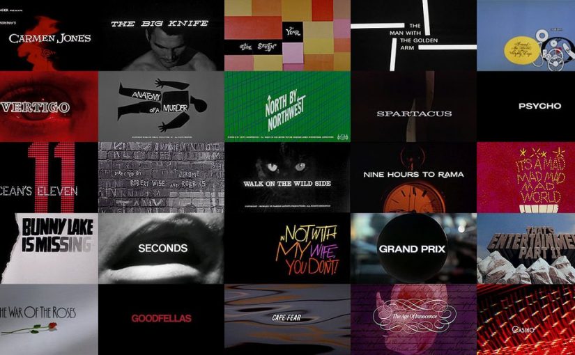
Saul Bass was one of the earlier designers in title sequences in films.

Source: the 20th Century Fox Blu-ray (2017)
I find his designs were very intriguing in capturing the essence of the film and making the viewers expectant and ready to watch the film.
As Saul Bass once said:
“For the average audience, the credits tell them there’s only three minutes left to eat popcorn. I take this ‘dead’ period and try to do more than simply get rid of names that filmgoers aren’t interested in. I aim to set up the audience for what’s coming; make them expectant.”
His creation has pushed the potential can be for main titles in films or even interactive works we see currently. He urges designers, directors, to take advantage of this opportunity in the beginning of a movie and use it to help tell the story or just use it to make something really interesting or beautiful. Perhaps, it has also started advertisements before the premiere of a movie?
Overall, this has opened up another source of inspiration for type and graphics in the area of film title sequences. 🙂