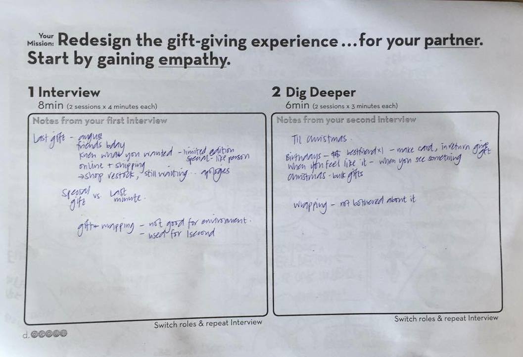
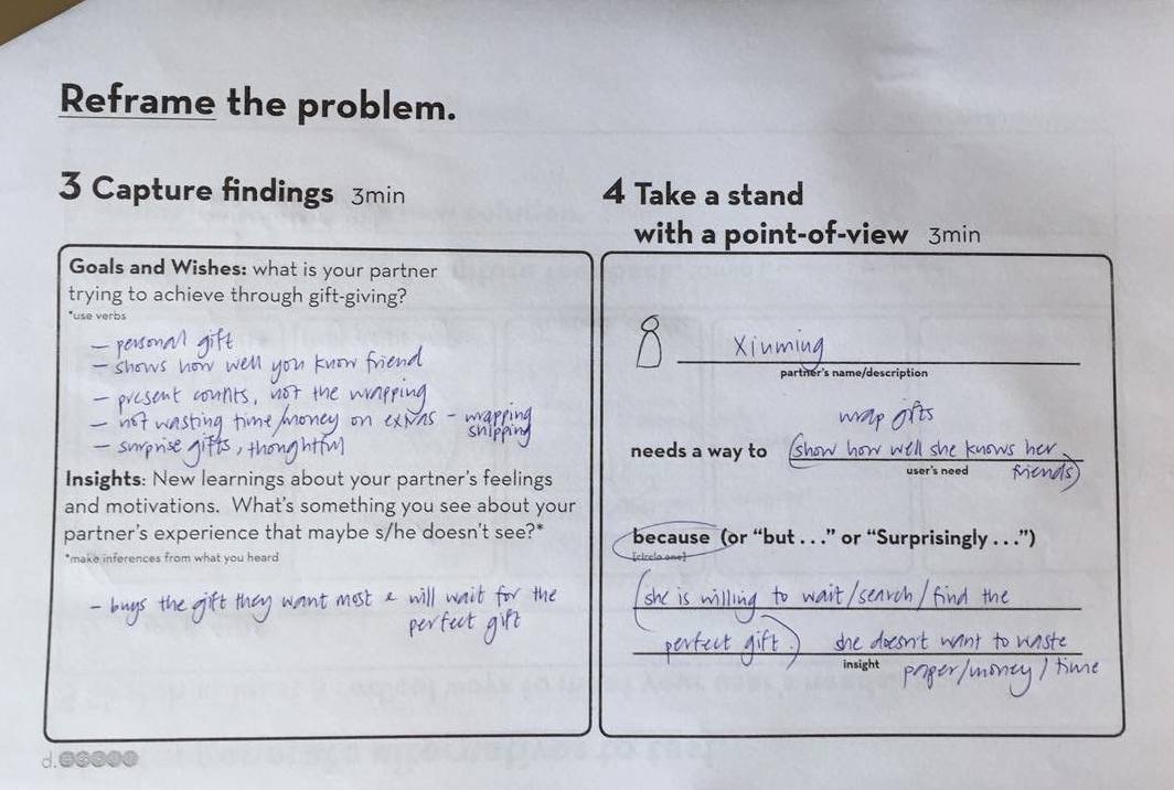
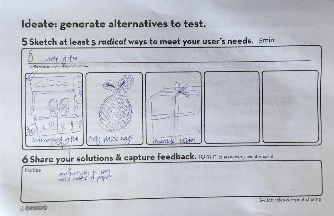
Paragraph brief – An interactive art installation to enhance peoples experience through the dead spaces in MRT stations, and to inform commuters of the currents events happening in the city.
Survey questions – which space in the station would be most effective? Would you interact with it? What time of day do you use the MRT -morning, midday, afternoon, evening?
Research on similar projects – airports/art/installations
Narrative senario – people walking through MRT station and the wall projection responds to their movement
When its busy – perhaps the motion sensor is turned off during peak times or else the projection wall would get super busy. This may also need to be dependent on which station/busier ones might need to be treated differently to quiet ones. The projection could revert to a default during peak hours e.g. 7-10am and 5-8pm.
Location – give client the option of installing the project into one station (near the festival/events location) and if they grant it successful they can then spread it to stations in the surrounding area/further abroad. This allows for cost challenges and provides a sort of ‘trial’ for our concept.
Dobby Ghaut – interchange, large spaces to occupy, different levels in station, different population during the day,
Enough events on? While there seem to always be things happening in the city we could have a ‘default’ projection of the area of the MRT, bringing the outside in. Visuals could include nature, architecture and aspects that are specific to that area.
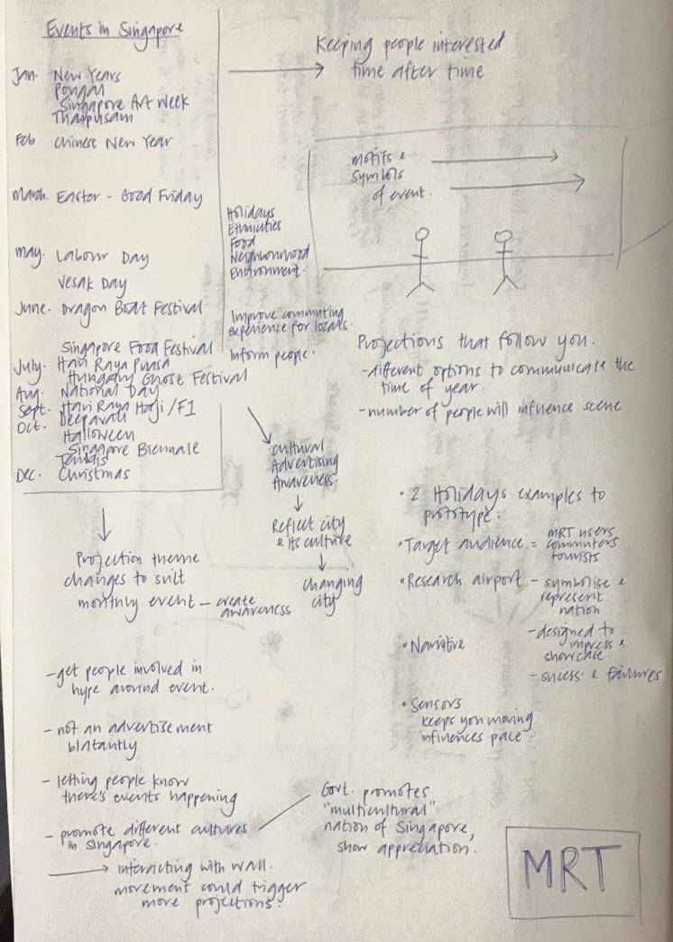
Janurary new -years, pongal, singapore art week, thaipusam
Febuary – chinese new year
March – easter/good friday
May – labour day, vesak day
June – dragon boat festival
July – singapore food festival, hari raya puasa, hungry ghost festival
August – national day
September – hari raya haji, formula 1
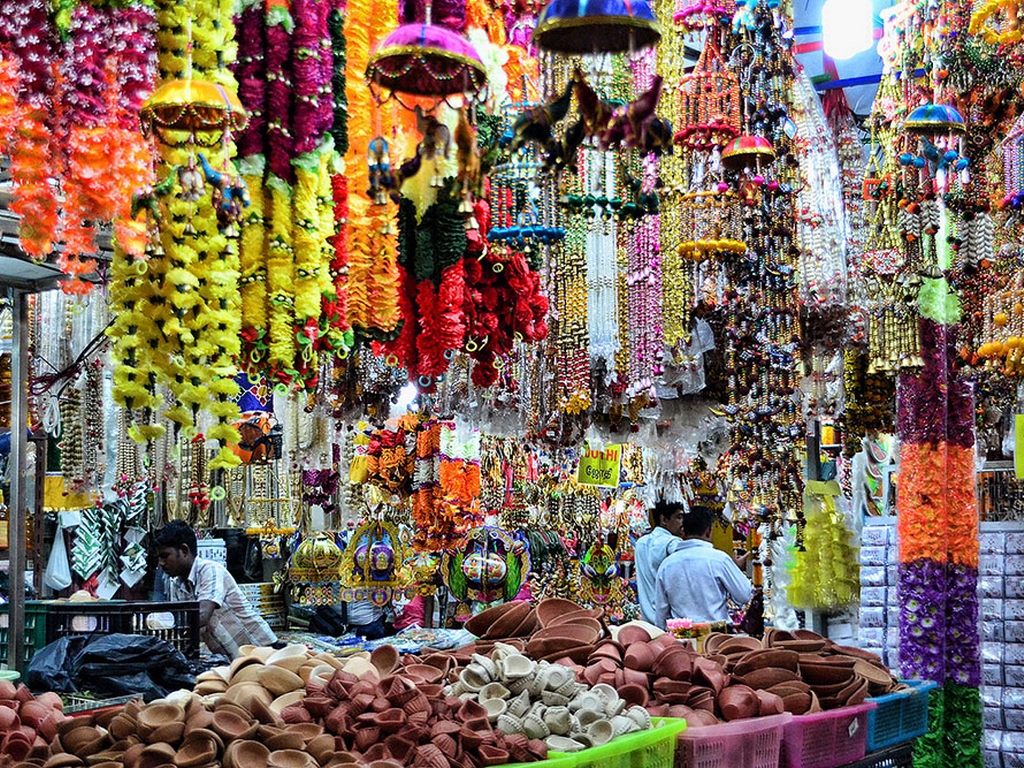
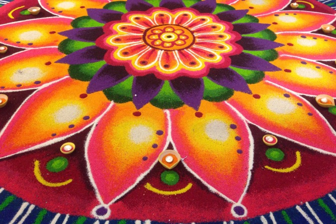
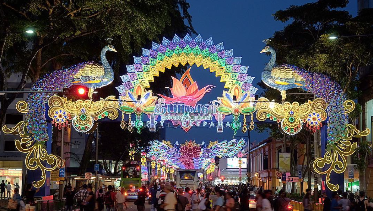
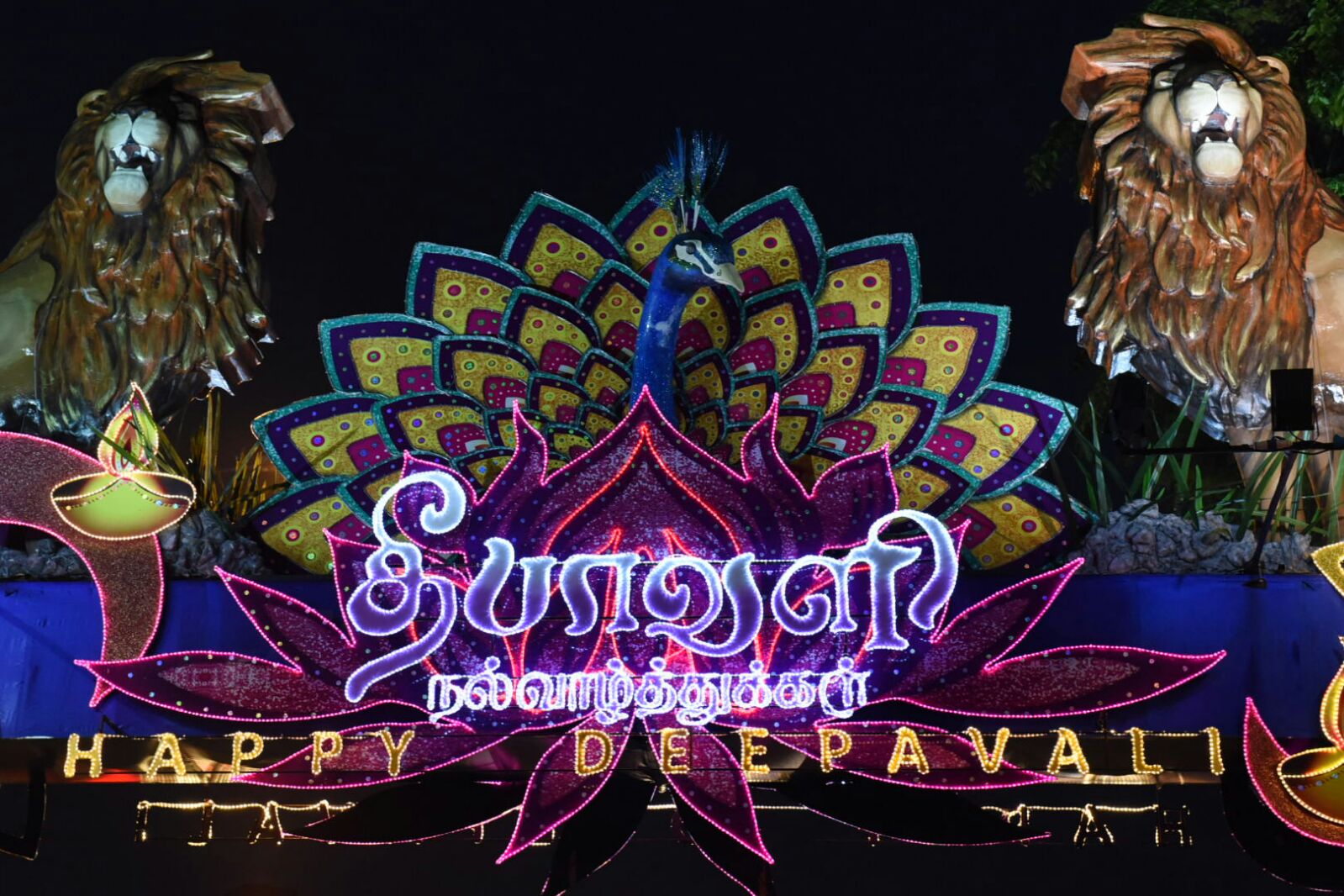
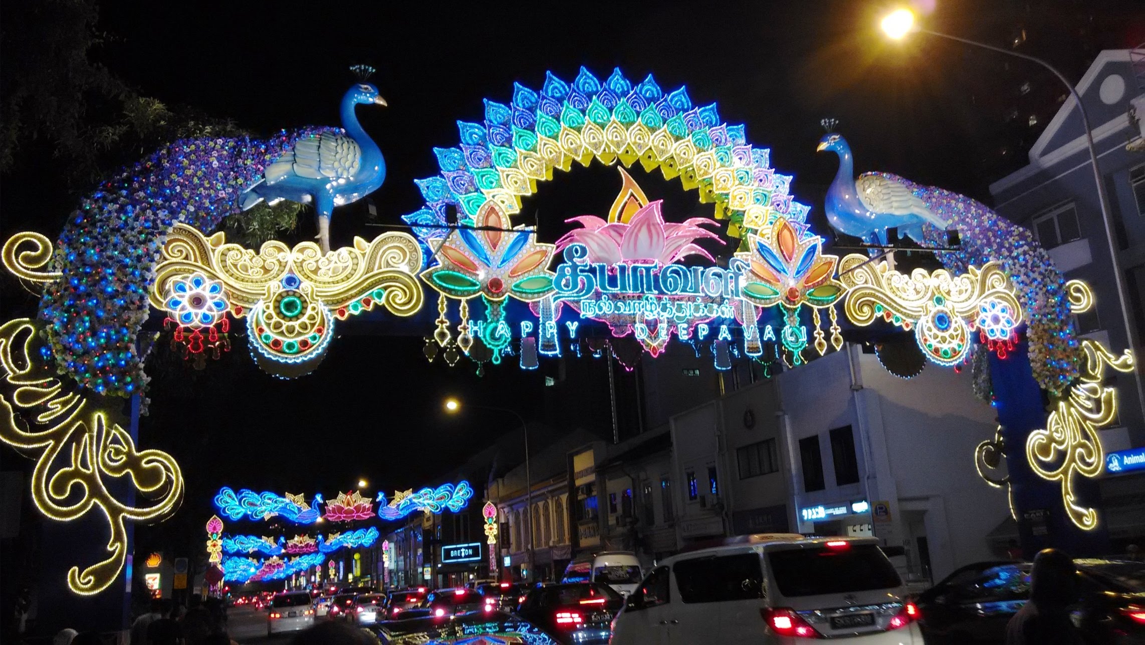
October – deepavali, halloween, singapore biennale, tennis tournament
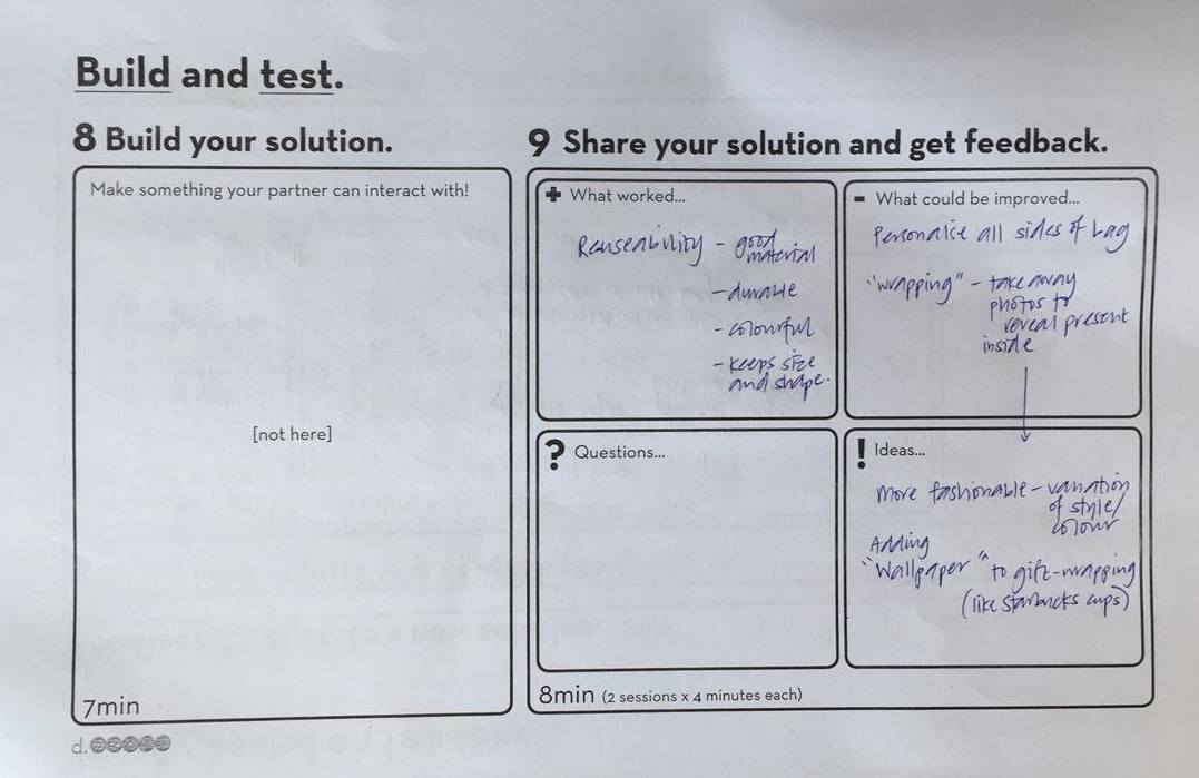
We think the Deepavali Festival will be a good example for us to use to present our concept as it is current and so bright and colourful! The main motifs and symbols are the oil light/lanterns and peacocks.
Gamification to improve our world: Yu-kai Chou at TEDx Lausanne
Harnessing the world of play
Generic demographic – average gamer 35y/o and 50% men/women
Gamification – take elements of games into non-game contexts, takes you don’t want to do but have to
Games allow you to be more
Engaging/boring/exciting
Game elements need to motivate and drive
8 Core Drives – We do things based on these influences for extrinsic and intrinsic value
epic meaning and calling (part of something bigger than yourself)
development and accomplishment (makes you feel like you’re improving)
empowerment of creativity and feedback
ownership and possession (you want more)
social influence and relatedness (what you do based on what others do)
scarcity and impatience (wanting something you can’t have)
unpredictability and curiosity (you don’t know whats happening next)
loss and avoidance (don’t want bad things to happen)
I think the unpredictability and curiosity one is most relevant to our project. It relates to our aim of having people continue to be interested in our project and look at it.
Airport Research– The art/installations in airports and symbolic and used to represent a nation. The examples I have found have been used to fill empty spaces in airports and make an impression on people who wall through the space. Like airports, MRT stations are places that provide people with lots or instructions and directions, therefore these art installations are significant for counteracting the seriousness of the processing through these areas.
Detroit Airport
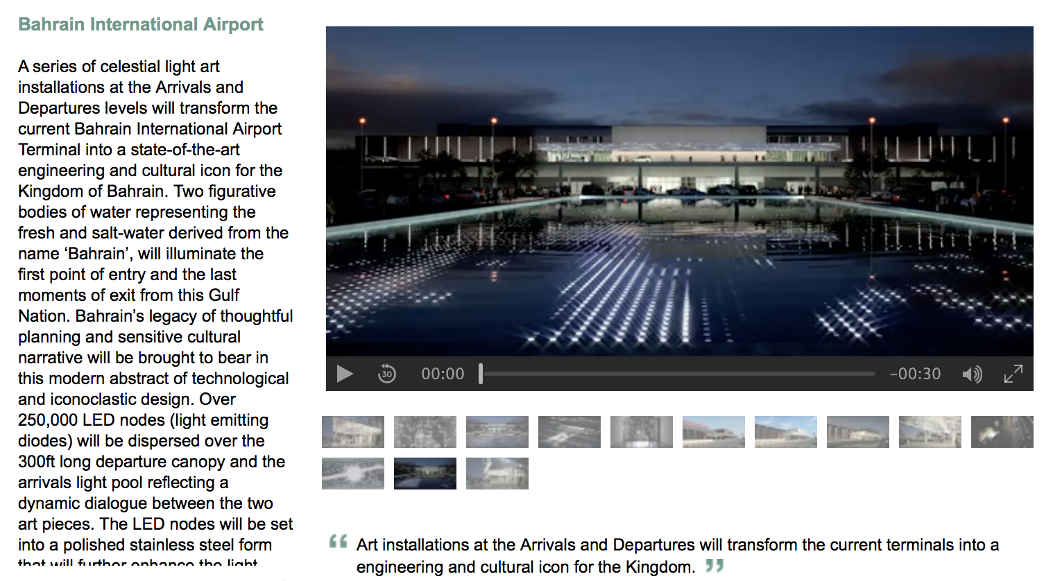
Bahrain Airport – turning the airport into a state-of-the-art engineering and cultural icon.
“Bahrain Airports Company will have the opportunity to allow the creative team to modify the abstract streaming video to reflect changes in the moment.”
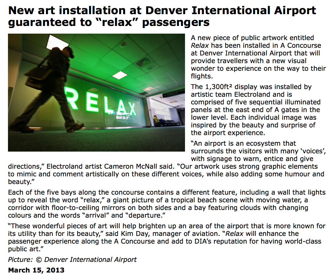
Denver Airport
Narita Airport – 385-inch “concave organic EL Panorama Vision” display in the Terminal 1 departures lobby. The display is turned on for the first 30 minutes of every hour from 6:00 a.m. to 10:00 p.m. daily.
A sensor detects people who approach the text on the signage. The text then takes the shape of an animal or other animate object to create an original, virtual fantasy world. As its creators explained, “The embodied creations interrelate with each other. A bird approaches a tree, or plants sprout when the rain falls. It constantly recreates the landscape.”
The artwork was announced in 2011 and has toured six countries in Asia, South America and Europe. It has received high international acclaim, having received an award at an international contest and selected to be among the best four works by an online art magazine. It is also the first work of “interactive” digital art created for digital signage at a Japanese airport.
–> I think this example is most like what we are trying to create. Something that responds to peoples movement and takes up the dead space in a public transportation area.
Indianapolis Airport
The ceiling of the pedestrian bridge is covered with a field of interactive, computer-controlled dots that display different colors and exhibit a range of intelligent and playful behaviors. The dots can light up exactly over where the passengers stand, and are able to fix on and follow a passenger down the length of the walk. At other times, lines of dots may visually connect two passengers approaching each other over long distances. Designed by Electroland, completed 2008.
Other interactive installations
This light installation responds to your voice and movements.
This rain exhibit uses tracking by 3D-depth cameras, so the rain won’t fall on you as you walk inside.
The airport location allows people to stop and appreciate the experience of installation as they are likely not rushing through the space.
Most MRT users appear to be in a rush and don’t have the luxury of utilising waiting time. Therefore our project will need to motivate people to continue to move through the space- at their own pace perhaps or we could dictate it. By having projections that move with the pedestrians this allows them to watch it while they walk, without distracting them too much.
At our group meeting we discussed the three ideas we had form last class and chose to focus more specifically on utilising the corridor spaces in MRT stations.
Designing on the platforms came a close second as we would be able to tackle a ‘practical’ problem of people waiting in the wrong areas for the train/people getting onto busy carriages when other are not busy… but solutions have already been put in place to solve these issues like the lines of the floor and people working on the platforms telling commuters to move down the platform. Therefore could another solution be effective? And surely its common sense for people to get onto a busy carriage and move down or see its busy and choose another?
With the corridor spaces we are aiming to address a practical issue – moving people through the space effectively by separating the slow and fast walkers, as well as a more intangible issue of activating the dead space and making people look up from their phones, also making them more aware of their surroundings and perhaps bringing the outside inside in some way?
After the class feedback we realised our main challenge would be making people want to look at/interact with the installation more than once.
To keep people interested time after time we though about adding a dynamic element to the experience, that motifs/symbols/images would be projected on the wall that follow you as you walk through the space. This also encourages people to continue walking (perhaps also dictates pace?) and not to stop and interrupt others. It means that the projection will always be different also as it will change dependent on the number of people moving through the space.
Then we thought these motifs and symbols could be themed to a particular cultural event or public holiday being celebrated in Singapore in order to add variety and a frequency change of imagery. This would work to make people aware of events without being a blatant advertisement. Singapore prides itself on being multicultural so we thought this would be an excellent platform to showcase this, and celebrate and inform people of the various cultural festivities.
We are looking to improve the experience of MRT users. As we are still deciding on our specific idea we have separated our ideas into the various scenarios we could work around.
Platform – gameplay to fill waiting time – on windows/doors/floors/walls
Stairs – encourage use/gameplay – entice with cheaper fare and swipe halfway up
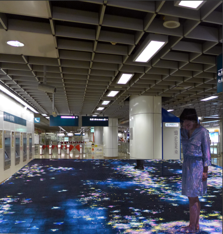
Corridors – immersive environment, activate space – make empty space enjoyable, keep busy people moving/they won’t stop
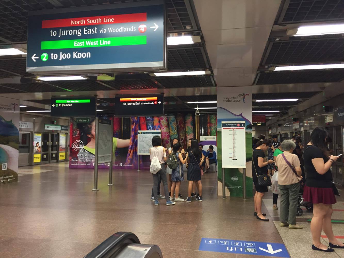
After visiting a few MRT stations during the week…
I’ve realised that the high frequency of trains means that people spend very little time actually waiting at the platform for a train. Therefore its possible that a game projected into this space wouldn’t be used very often. Also there is an almost constant influx of people getting off the train -from both sides, and this could cause an interruption to the game or even anger people if the game doesn’t position players out of the way from alighting passengers.
I saw that the amount of stairs differs greatly at different stations and that when there aren’t so many some people appear willing to use them. However when there are lots (like Buena Vista) it is very unattractive and I’m not sure even I would tackle them for an incentive!
I observed people walking through stations on their phones, looking down, looking unhappy and pretty bored. People use this space as a method of getting from A to B and consider it nothing more than that.
I think we should attempt to improve this space, even if it is simply for the purpose of getting people to look up from their phones or make people smile. I think majority of people here are going to work/coming home from work/in a rush to get somewhere etc although I’m sure there are a few that would stop and interact with the wall if that option presented itself. Children/students/people not in a rush might have the ability to stop and appreciate the environment more which could also encourage others to join in.
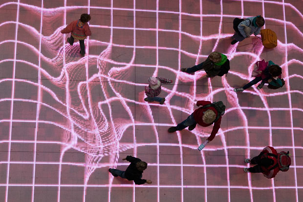
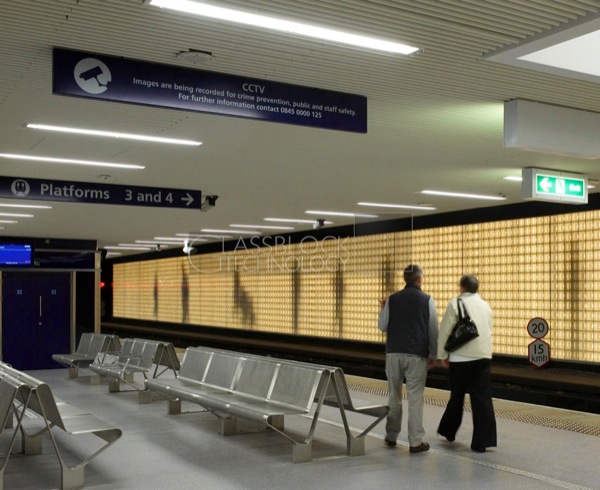
Interactive Environments in Public Spaces
Stockholm Central Station – stepping on coloured circle stickers on the floor activates different musical note sounds.
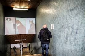
Passengers paths are traced by LED projections at a Berlin station.
Sunderland Train Station in the UK – this wall mimics the actions of passengers walking around the platform.
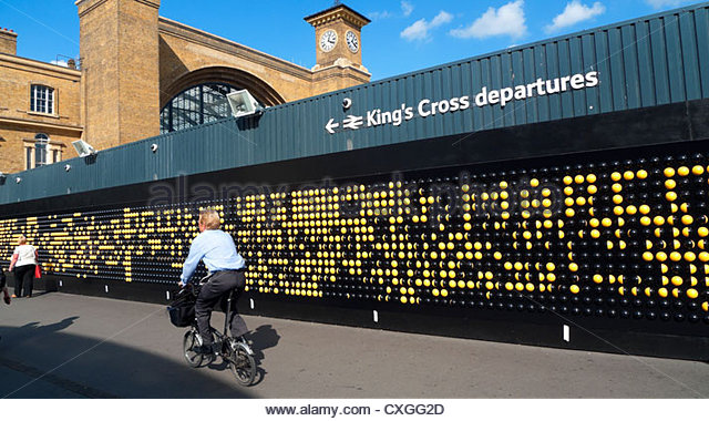
The Song Board outside Kings Cross Station was able to be manipulated by visitors to create patterns and words.
Feline installation art exhibited in a Copenhagen station.
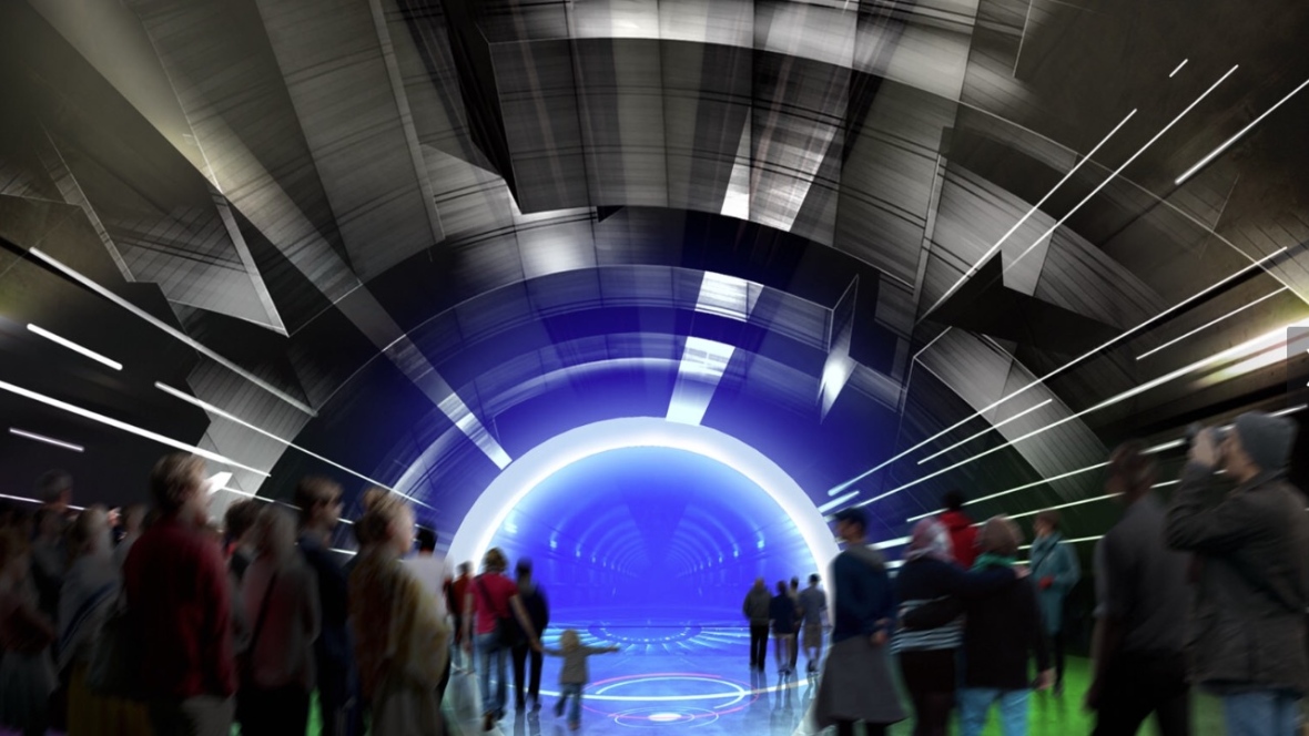
Ottawa LRT station sound & light show coming in summer 2017.
“$3-4million show billed as futuristic, interactive and a cornerstone of 2017 tourism”
“It will be the world’s first underground multimedia production”
“We want to show a more modern, technology image for our city and this is a perfect fit.”
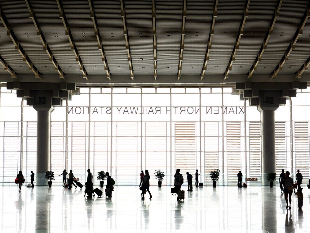
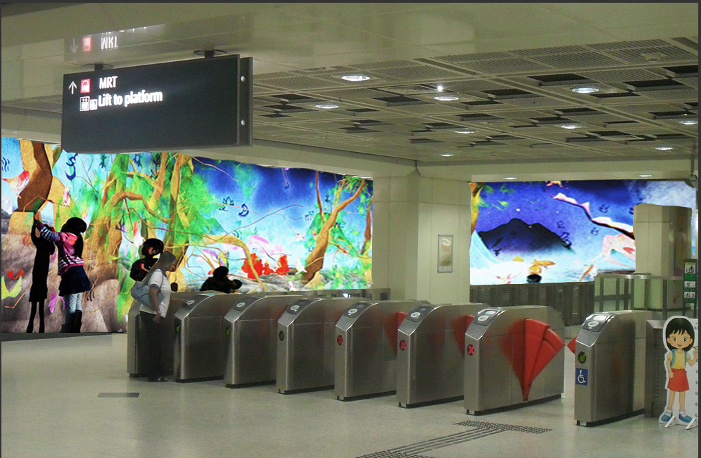
Xiamen North Railway Station
2,000 square meter multidimensional interactive art exhibition
themes will be featured in the exhibition include an Underwater World, a Funny Beach, an Amazing Forest, an Animal World and a Fantasy Sky
Visitors can enjoy a new, interactive photo-taking experience
They will be able to scan QR codes near the paintings to download software, which will make moving animals such as tigers and dolphins appear in users’ photos
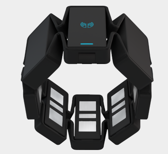
Theres so much we have to carry around with us everyday and our phone seems to be the most important of them all with so much stored on it. It would be so much easier if all the items we needed each day could be compressed into one thing or device. App? Wearable wristband?
Myo gesture control armband is used to control your devices through natural gestures which translate to certain commands… but isn’t an attractive product and is just an extra device for us to use.
Pushing this concept forward, I propose a wrist worn product that responds to the issue we have of carrying so much around. If it could act as our phone, keys and money while also being worn on our wrist it would be harder to forget and easier to manage all these things.
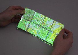
Paddle is a shape-shifting prototype smart phone. It unfolds for a map, scrolls a list in a circular loop, or flips “pages” for viewing album photos.
The phone/screen could wrap around your wrist? Be removed for use or left on for less intensive uses that don’t need a large screen area.
It could address the following items
Keys – be a sensor/swipe access
Money – act as a ‘pay wave’ or non-contact type of payment transfer (also for MRT tag on and tag off actions)
Phone – have a screen to use apps
Other features
Make interaction with the user easier and generally less
Programme gestures to be recognised as a command -moving wrist, tensing arm, clicking etc.
As the screen would be very small, perhaps a projector function to enlarge the screen and enhance viewing
Intuitive device -little learning required as this would put users off
Proposal 2
Issue:
Long transportation time
MRT/stations boring
Dead spaces
Queueing and waiting
Proposal – bring interactive media and play to mundane MRT stations. This concept can combine advertising/marketing with public installation. It enhances the area and makes people want to interact and enjoy the space, it brings it and the people in it to life while also promoting Future World exhibition (or another current exhibition/product/art). The MRT user experience is improved by being distracted with something to do -play and interact with the space.
This idea on the MRT trains could also be useful in encouraging interaction with the space as well as others. The journey is usually very boring and people mostly appear to travel alone so why not talk to others there or simply enjoy this time more by playing.
Proposal 3
Issue:
Language/cultural/knowledge barriers when travelling abroad
Getting lost
Lack of information
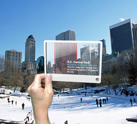
Proposal – an app that uses the camera to recognise your location and provide relevant information
Uses:
provide location information – where you are/whats around/events nearby
show cultural information relevant to place – how to behave/recommendations
translate languages/find definitions
mapping – see route in front of you/guide is more understandable
I considered having a transparent glass phone, but what functions would this allow that a camera does not?
Screen-based experience
Can be speculative… hypothetical, abstract, suppositive
Create an experience, interaction, response using…
Technology
App
Website
Wearable technology
Interface
Wearables
Limit interaction with smartphones
Useful in an everyday context
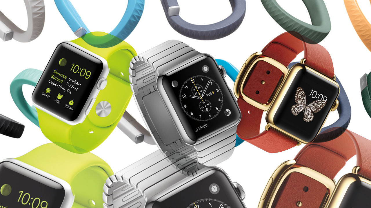
Wearables have become recognised as the future of technology
Smartwatches and activity trackers are so popular but they don’t do anything that a smartphone can’t
They aren’t essential
“There will be plenty of people who will benefit from smartwatches, but there won’t be many people who will be worse off for not having one.”
With that in mind.. my research has come across some products that have influenced my ideas for a project.
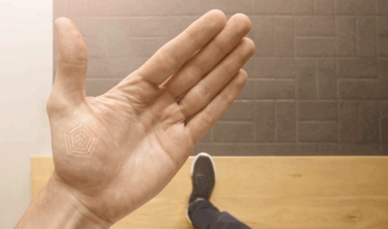
Digital Tattoo – Project Underskin
Technology and fashion reaching beyond the wrist
Smart digital tattoo implanted in your hand and interacts with things you touch
“It can unlock your front door, trade data with a handshake, or even tell you if you have low blood sugar.”
Cultural precincts may oppose this but its not a huge step forward from tattoos, piercings, birth control
It runs off of your body’s electro-chemical energy and can send out NFC signals
Can recognise location and body movements
—-> Digital Tattoo for MRT users
Instead of a smartwatch/smartphone/wristband, having a digital implant to pay for rides
Can track your location so reduces need to queue for the card-sensor stations
Accessible and useful for everyone as the MRT is used by all
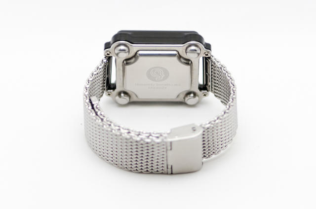
Moment by Somatic Labs
A smartwatch with no screen –questions screen as a means of interface interaction
Communicates by sending vibrations in each corner of the watch, that the user is able to recognise
Connects with smartphones, creates vibration patterns to communicate who is calling/directions/music
—-> SMRT Wristband
Use to pay for rides
Can vibrate on arrival (to wake sleeping passengers)
Vibrate to communicate directions and aid people walking around the stations (signage is confusing)
Alternatively, create an app that can do all this
Minimises the things you have to carry
Makes process quicker
Everyone is using their phone anyway
Issues –availability of smartphone to everyone? Functionality with a dead battery?
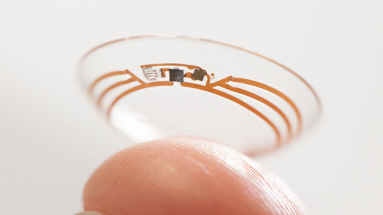
Smart Contact Lens by Google and Novartis
A contact lens to help diabetics monitor their insulin levels from tears. Uses a small glucose sensor and a wireless chip to transmit information from the eye.
health tracker
removes the need to diabetics to pin prick themselves
simple to use
design makes it subtle to wear -also not different to normal contacts
Google is even working on LED lights that will notify a wearer of low blood sugar right in their field of view -immediate feedback to user
can be used for non-diabetics to simply monitor healthy eating/dieting
I’d love to find a way to use this innovation…
More ideas I want to explore
Addressing the ‘issue’ of queueing and waiting times -providing an experience during these times and activating the dead space/public space
EG bringing a taste of the FutureWorld exhibition to the MRT – interactive walls to entertain the people in the space, enhance the boring and tired experience and also to advertise the exhibition to encourage people to go
Interactive advertising to provide a taste-test of the experience
Uber is very well-known and popular due to its great use of UX and UI design.
clear and clean design -minimal colours used
easy to navigate and use app
use of tracking and gps makes it easy to define your location
quick response (often)
complaints are entertained -easy refund for any issues
visibility and recognition of important information -cars around your location/time til pick-up/cost of ride/car options
icons are recognisable
promos to encourage new users
cheaper than taxis (often)
easy and simple review system (of driver) -also recognises safety of the service
UberPool – I really like this feature as it makes the fares cheaper and also is beneficial for the environment because strangers share the ride instead of taking separate ones. It also shows how the company is constantly looking to improve and develop.
Smart Highways, Glowing Lines (glow-in-the-dark roads in the Netherlands)
This is definitely an innovative and forward-thinking use of UX design introduced to enhance road safety particularly in dimly-light streets.
the project was conceived in 2012 by Heijmans and Studio Roosegaarde to create the “interactive and sustainable roads of tomorrow.”
uses luminescent paint that is charged by solar energy during the day and then glows for up to 10 hours when it gets dark
increases visibility
improves safety
sleek and simple design, aesthetically pleasing
easy to use/understand/see
environmentally friendly- solar powered
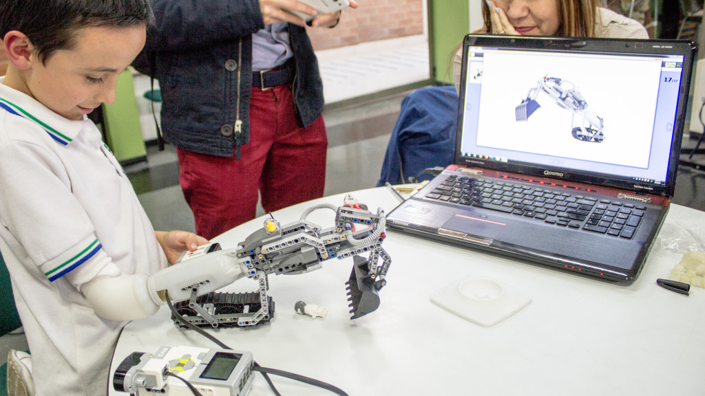
IKO Creative Prosthetic System
This innovation combines robotics, programming, and prototyping into a prosthetic arm that’s half prosthesis, half Lego set. It allows kids who are navigating the world with a disability to be able to create any kind of arm they want for themselves.
The prototype has a three main sections: a base that fits around an arm stump and senses for its movements, a “muscle” that translates those signals into motorized movements, and then the attachments, which can either be a conventional “hand” or many of the toy systems the Danish company has to offer.
an interactive, innovative and creative experience for users/kids
playful and fun approach to UXD -appropriate for the target audience
empowers children with disabilities
encourages the navigation of the relationship between their bodies and the technology that will enhance their abilities
its personalisable -can function according to the needs of the user
double function -an arm and a lego set
One more because this is really cool…
Smart Contact Lens created by Google and Novartis
A contact lens to help diabetics monitor their insulin levels from tears. Uses a small glucose sensor and a wireless chip to transmit information from the eye.
health tracker
removes the need to diabetics to pin prick themselves
simple to use
design makes it subtle to wear -also not different to normal contacts
Google is even working on LED lights that will notify a wearer of low blood sugar right in their field of view -immediate feedback to user
can be used for non-diabetics to simply monitor healthy eating/dieting
I discovered some more awesome UX examples on here https://www.fastcodesign.com/3063953/18-of-the-smartest-ux-designs-of-the-year


