Assignement Week 1 – Part 4

  • Response to the 1st chapter of Donald Norman’s The Design of Everyday things

As well as D. Normal, I feel like feedback is an essential component of our experience as users and should really be taken into account by the designers. In my experience, I have found that sound feedback is one of the most important component of user experience. For example I’m used to filming my skiing adventures with my GoPro camera. This forces me to turn on and off the camera at any time (whether I am in the middle of a slope or not). Therefore the sound feedback emitted by the device when I turn it on is essential for me because it allows me to continue skiing without having to stop to check if the camera is on.

This is an example among many others in which the absence of the feedback would be disastrous for the user experience.

I also enjoyed the author’s insight on the cycles in product design and how with time designers and manifucturers tend to over-complexify their products. . However I feel like it is a point a view which only takes into account technological advance but doesn’t take into account trends. If you think about it, 10 years ago, digital (and complex) watches were a hit (Casio’s G-Shock for example), but now trends like minimalism have had a real influence on how we see watches. We have now mostly become attracted to more minimalistic watches, which only have one function (see Ice Watch 2015 or Daniel Wellington watches for example).

Daniel Wellington Watch
Ice watches 2015
Ice watches 2015

Of course there are still complex watches but their target audience is a niche market (runners …).

Question 1) The author talks about the over-complexity of some products but sometimes it is a trademark of the brand and it is how it can differentiate itself from its competitors, only real “users” will be able to use it. For example if you take swiss knives (Wenger brand) with a lot of functions. Does it make it a poorly-designed product?

Question 2) The question of affordance of a product is very important but it differs from countries and areas in the world, is it better to adapt our design to each part of the world we are aiming or should we actually be able to design a product which will appeal to the entire world ? This question concerns especially high-tech products

Assignement Week 1 – Part 3

  • First object – Computer Mouse

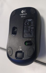
The first object I chose is the computer mouse I use every day.

Basic computer mouse

IMG_20160824_163641863


It is a basic wireless Logitech mouse with one On/Off switch under it and the standard mouse buttons (Left Click – Right Click – Scroll). In my opinion it is very intuitive. If the device is off you notice it because the pointer on the screen doesn’t move, so the first reaction is to look for an On/Off switch and therefore picking it up and looking under it. There is a light on top the mouse to give the feedback that it has been turned on (Light turns green). There is one button to open the trap for the battery, which is labelled with a battery icon.

If I had to describe it to someone who had never seen one before I would say that it is a device which allows you to navigate on the screen of your computer. You use it by moving you hand holding the device in all directions, the immediate consequence is that you make the pointer move on the screen. You have however to maintain a contact between the desk/table and the device, otherwise the computer doesn’t detect the movement.

Here are some ideas of redesigns of this mouse

  1. This is a simple redesign which deletes a movement (picking up the mouse and looking under it) because the On/Off is now located on the side of the mouse, where the thumb rests. 

    re-design-n1
    Re-design n°1
  2. In this re-design, I changed the position of the left click so that the thumb now activates it. And thereby the scroll is moved in the left click’s original position so that the index now activates it. This way each finger is responsible for a specific function and it is even more intuitive.
Re-design N°2
Re-design N°2
  1. Same as the last one, it is a simple redesign which makes the changing of the battery even more intuitive since there is no more need to pick it up and looking under it. Just sliding the trap does the trick. Adding a battery icon and an arrow to symbolize the movement on the trap makes it even more intuitive.
Re-design n°3
Re-design n°3
  • Second object – Shower Gel Bottle Tahiti

This is another object I use every day, it’s a shower gel sold in France. The particularity of this product is its packaging, in particular the retractable beak which gives the product a very cubic and compact aspect.

IMG_20160824_175318813
The retractable beak is in its open position
Shower Gel Packaging

The product is very intuitive, the slot on the front suggest only one type of action possible by the user (pulling on the beak to get it out and pushing on it to put it back to its original position)

If I had to describe it to someone who had never seen it before I would say that it is a Shower Gel container which has a 90° retractable beak. This beak, when put back in its storing position (horizontally) avoids leakage or introduction of water in the container.

If I had to redesign it, I would add a transparent part opening on the  side of the bottle. This would allow the user to see how much product is left. It is in fact a feature that in my opinion lacks in this product and makes the user experience a bit frustrating because you have to guess how much product is left, by the weight of the bottle.

Re-design of the shower gel packaging


Assignement Week 1 – Part 1

The ADM building, because of its characteristic shape and architecture, provides the user with a very different experience from what he is used to. As most of the teaching buildings at NTU resemble each other (if you exclude the hive). This experience presents some very positive aspects but in my opinion there are also some aspects on which the user experience could be improved.

The presence of graphic elements, which contrast with the raw aspect of the building (concrete floors and walls, grass on the roof etc.), remind us that we find ourselves in an art and design building.

Graphic Element in the ADM Building

They attract the eye of the visitor. Furthermore signage is very discreet and quite tastefully chosen. For example the minimalistic metal plaques which fade in with the global design of the building.

Metal Plaque at the entrance of the ADM Building

The outside furniture and the lounge areas suggest a peaceful place to rest between courses and contrast with the purpose of our stay in the building (following a tutorial/ a lecture).

Outside of the ADM Building

The entrances and more importantly the exit signs are visible from a distance. Finding your way out and your way in the building is never an issue.

The fact that you can enter the building from almost every side suggests a very open and collaborative space.

However in my opinion some aspects of the building could be improved. For example what disturbed me the most is the complete absence, at least from what I saw, of signage to indicate the location of the toilets, as you can see on the picture. When you are not familiar with the building, it is quite disorienting. You find yourself walking across the entire building just to find some toilets because you failed to see the ones closest to you.

In my opinion there are not enough maps of the building and they are not visible enough, on the contrary to North Spine where large and visible maps are displayed. And the places where you would expect a map are sometimes overloaded with posters/flyers.

Overloaded wall at the entrance of the ADM Building
One of the few maps I came across

Furthermore since there are so large corridors, I find that the labels of the classrooms are too small, you need to get really close to know which classroom it is.

One last problem which I noted concerns the outside doors. It is exactly like the example given in the reading for week 1, you have no clue as whether to pull or push the doors.

The doors outside the ADM Building