- First object – Computer Mouse
The first object I chose is the computer mouse I use every day.

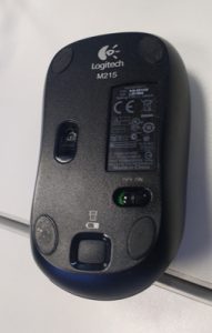
It is a basic wireless Logitech mouse with one On/Off switch under it and the standard mouse buttons (Left Click – Right Click – Scroll). In my opinion it is very intuitive. If the device is off you notice it because the pointer on the screen doesn’t move, so the first reaction is to look for an On/Off switch and therefore picking it up and looking under it. There is a light on top the mouse to give the feedback that it has been turned on (Light turns green). There is one button to open the trap for the battery, which is labelled with a battery icon.
If I had to describe it to someone who had never seen one before I would say that it is a device which allows you to navigate on the screen of your computer. You use it by moving you hand holding the device in all directions, the immediate consequence is that you make the pointer move on the screen. You have however to maintain a contact between the desk/table and the device, otherwise the computer doesn’t detect the movement.
Here are some ideas of redesigns of this mouse
- This is a simple redesign which deletes a movement (picking up the mouse and looking under it) because the On/Off is now located on the side of the mouse, where the thumb rests.

Re-design n°1 - In this re-design, I changed the position of the left click so that the thumb now activates it. And thereby the scroll is moved in the left click’s original position so that the index now activates it. This way each finger is responsible for a specific function and it is even more intuitive.

- Same as the last one, it is a simple redesign which makes the changing of the battery even more intuitive since there is no more need to pick it up and looking under it. Just sliding the trap does the trick. Adding a battery icon and an arrow to symbolize the movement on the trap makes it even more intuitive.

- Second object – Shower Gel Bottle Tahiti
This is another object I use every day, it’s a shower gel sold in France. The particularity of this product is its packaging, in particular the retractable beak which gives the product a very cubic and compact aspect.


The product is very intuitive, the slot on the front suggest only one type of action possible by the user (pulling on the beak to get it out and pushing on it to put it back to its original position)
If I had to describe it to someone who had never seen it before I would say that it is a Shower Gel container which has a 90° retractable beak. This beak, when put back in its storing position (horizontally) avoids leakage or introduction of water in the container.
If I had to redesign it, I would add a transparent part opening on the side of the bottle. This would allow the user to see how much product is left. It is in fact a feature that in my opinion lacks in this product and makes the user experience a bit frustrating because you have to guess how much product is left, by the weight of the bottle.
