Colour me Happy!
Designer statement
Visual Communication is a way of expressing an idea or a belief through various mediums, such as illustration, typography, print, editorial etc. I love designing so I can convey messages in a stimulating and appealing way, so that they are remembered by the target audience.
I am a designer who loves all things colourful, which reflects in my bubbly and energetic personality. I am particularly superstitious, though this is sometimes contradicted with my interest in science. Wandering around the world, absorbing different cultures is what I thrive off and I believe this is a daring trait, hence the style of work I like is daring; something that has taken a risk. This doesn’t always result in a positive outcome, though when it does the design is more powerful.
I am fascinated by eye-catching, niche designs, that portray intriguing concepts, rather than just being aesthetically pleasing. I love exploring all mediums of design, as concentrating in one area can narrow your imagination. Therefore, having the ability to approach a situation in any way gives us designers freedom. I believe good design has undertaken countless amounts of trial and error and it is that process which encourages you to learn.
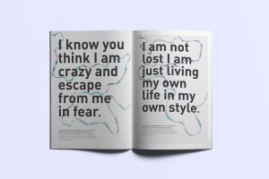
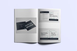
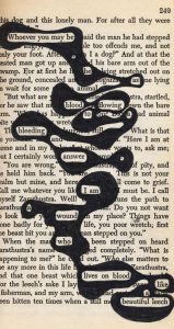
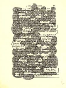
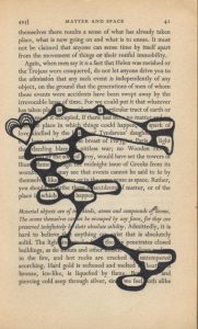
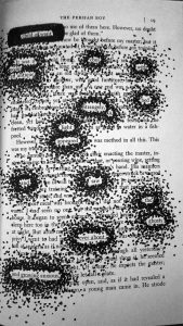
There are still many taboo subjects in the world, and I think designing to make the unknown known is very important. Such topics could include mental health, the environment and our future. I also have a passion for colour and how deceivingly important its role is in society. Colours, as well as being visually attractive can evoke many emotions without directly using words, hence an image speaks a 1000 words.
Concept
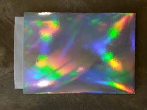
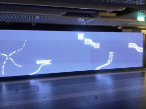
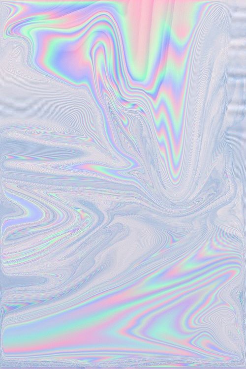
As I am thoroughly interested in colours, I thought the best way to express all the different colours would be through holographic card. Depending on the angle and which way the light shines on it, you can make out all the different colours in the rainbow.
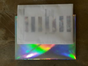
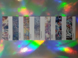
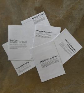
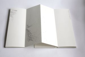
Inside the holographic holder is a holographic colour chart, with each texture representing a different aspect of my personality. I have also included my work in the form of several booklets in order for it to be passed around easily.


