Task 1: Designing Exploration

Existing brochure designs:
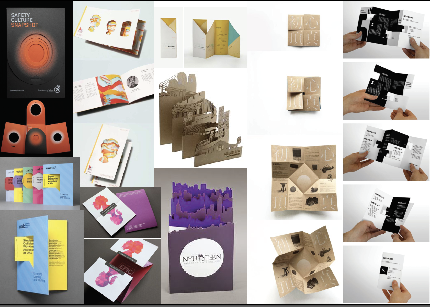
3 Favourites:

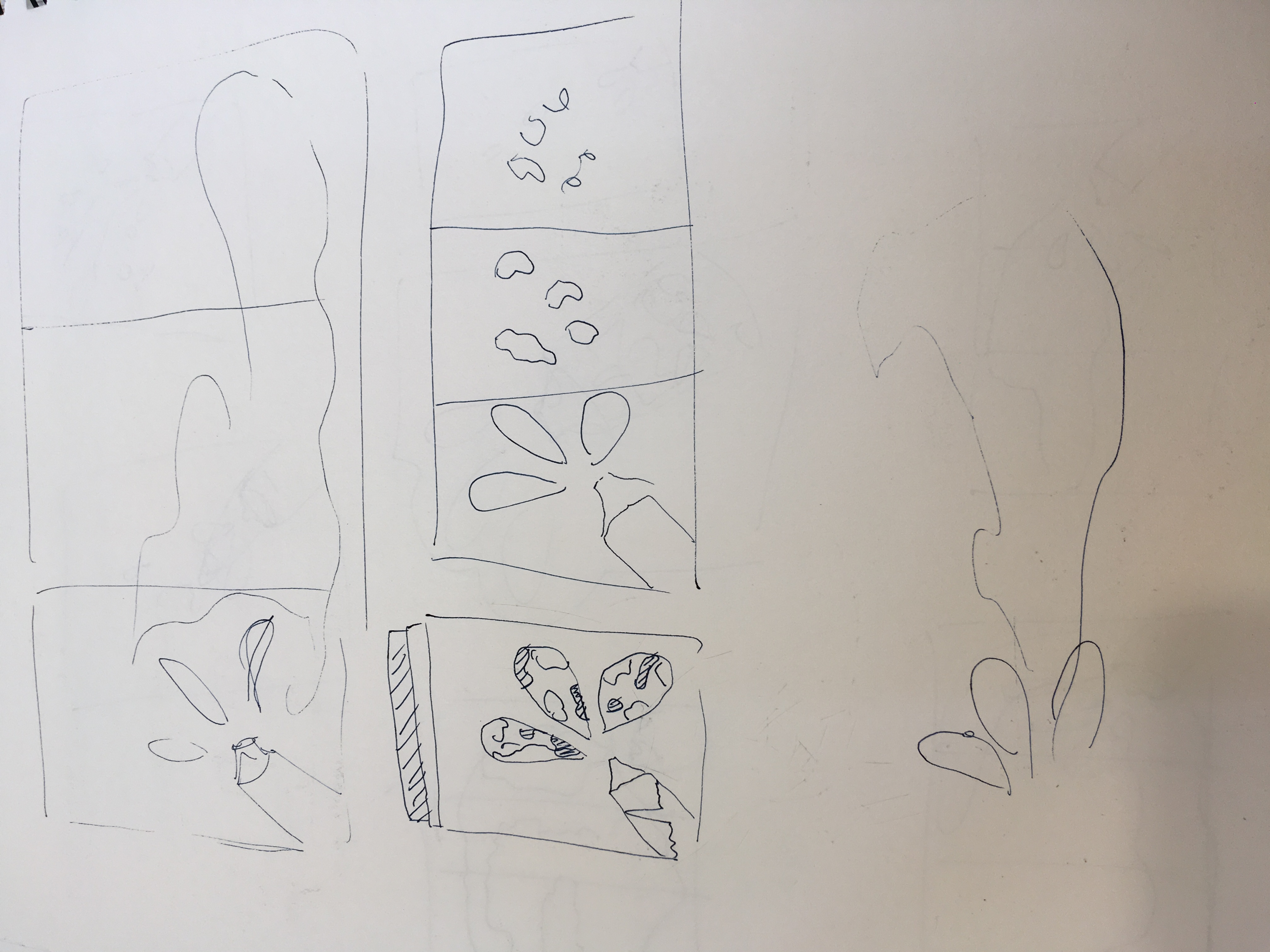
Using an accordion fold this brochure has been cut to create popups, surprising the reader when it is opened. This design is interesting and easily creates a rhythm with the eye.

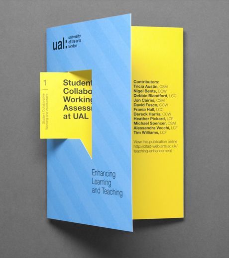
This brochure uses a die cut to highlight an element, the speech bubble.

This brochure is folded inwards using 4 panels. It is a fun way to use a brochure, however, it looks difficult to lay the content out effectively.


Playing with folds:

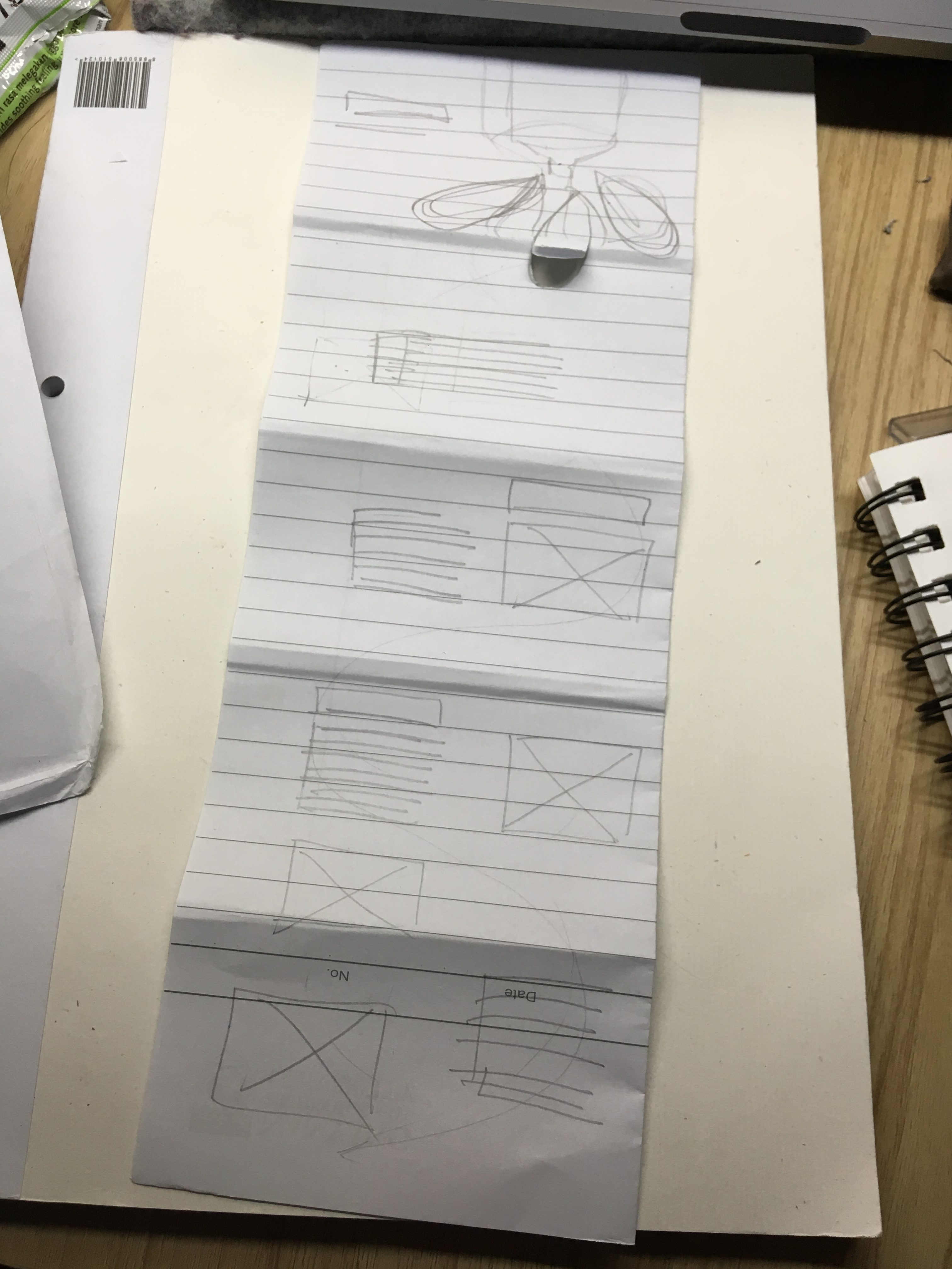
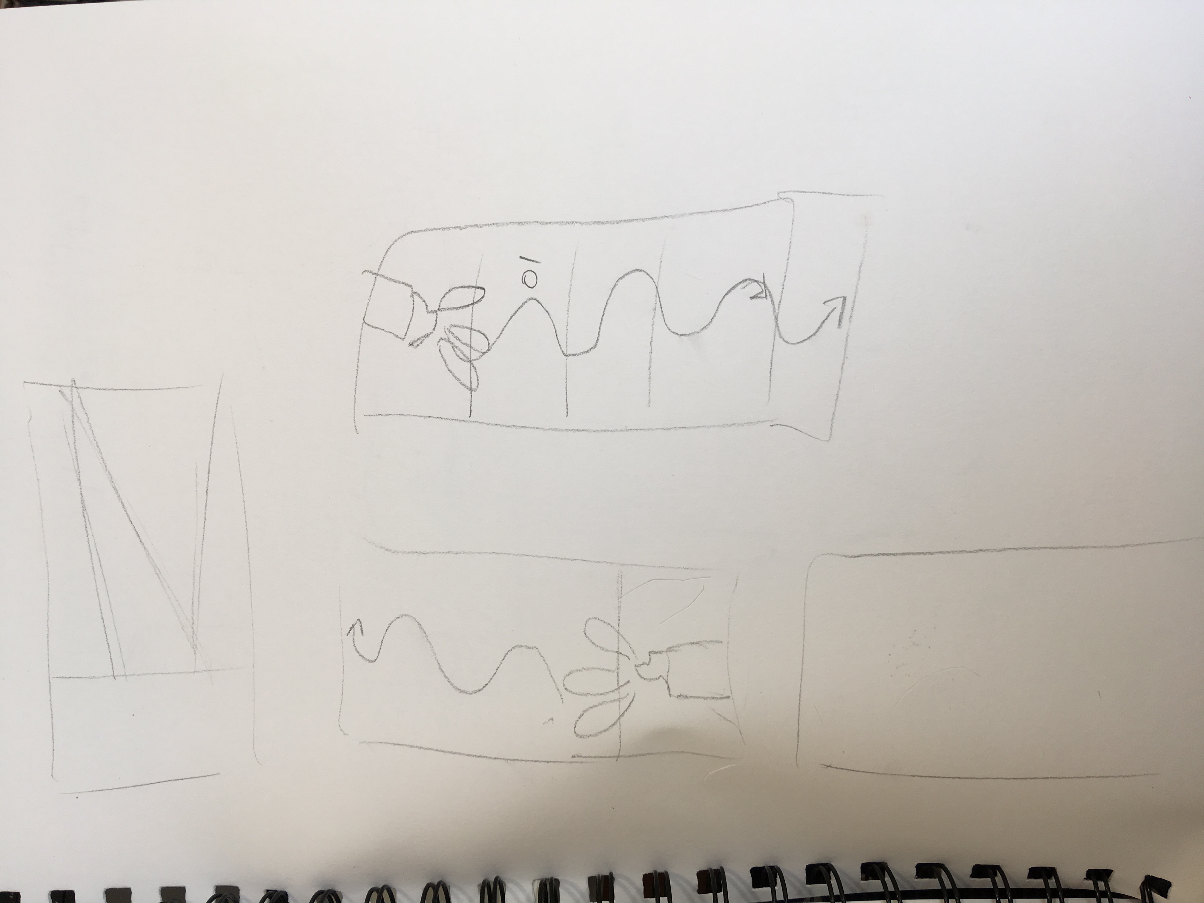
Tried to create a drop down vertical brochure but the layout was pretty difficult to achieve and the user experience would have been awkward to handle.

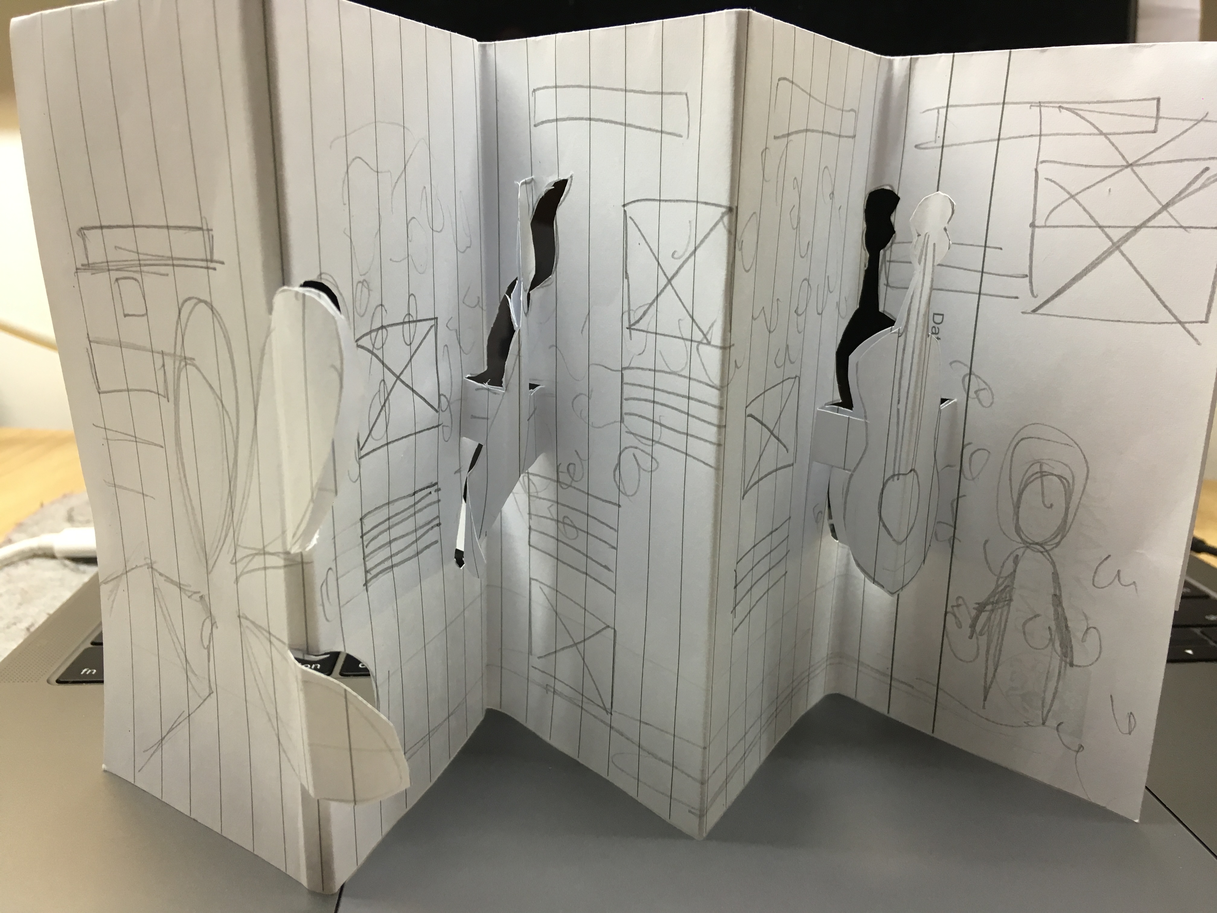
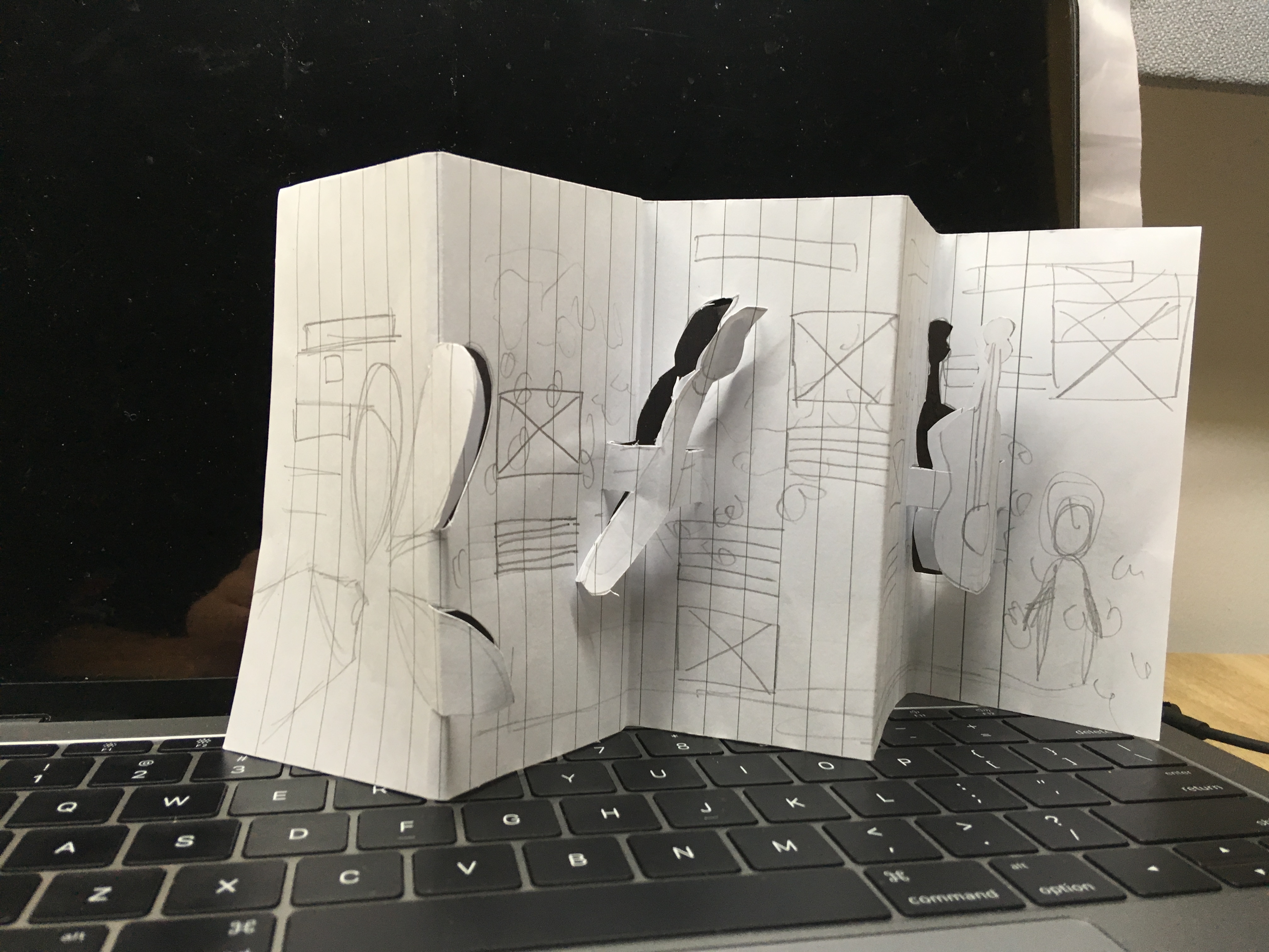
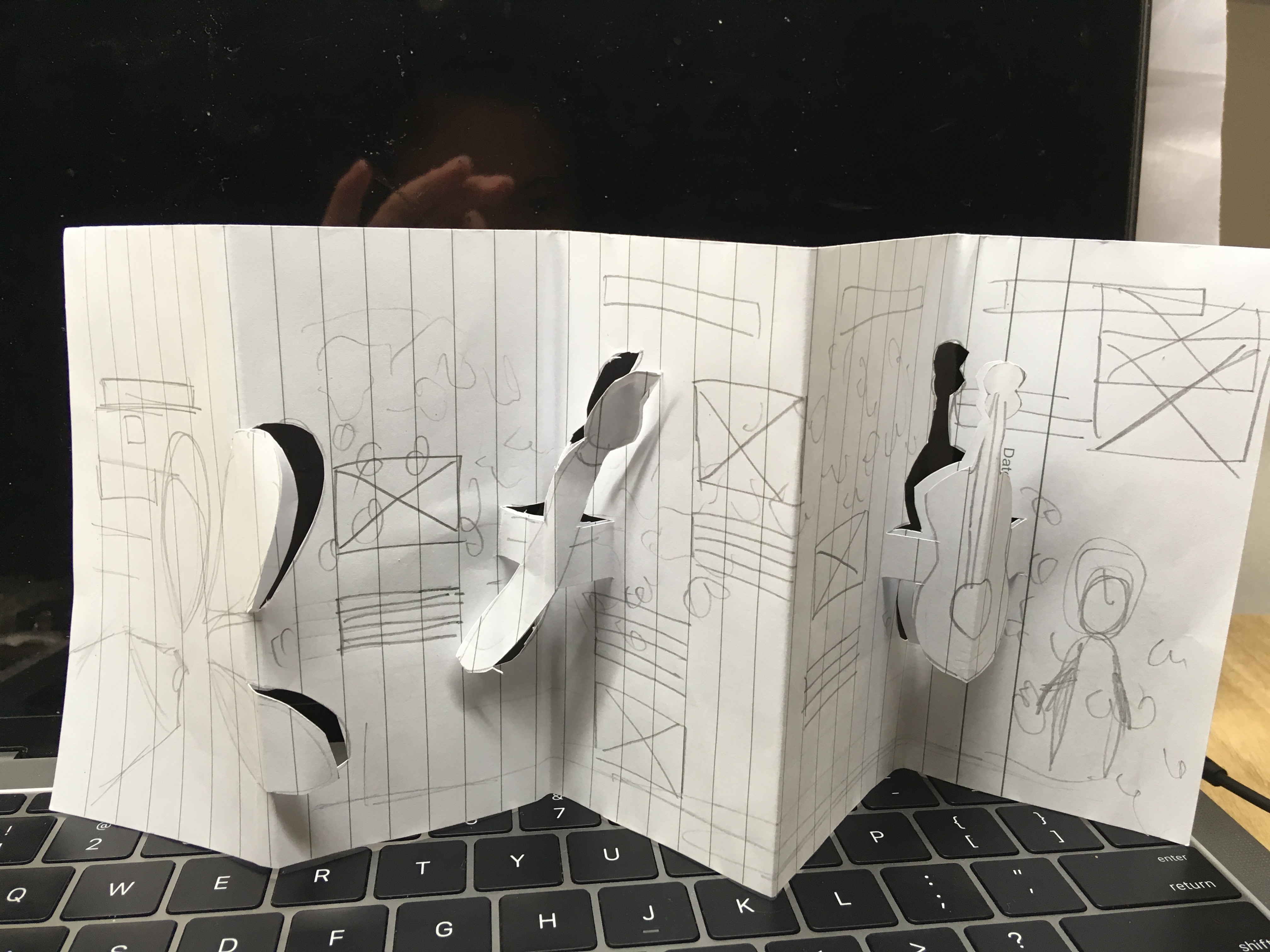
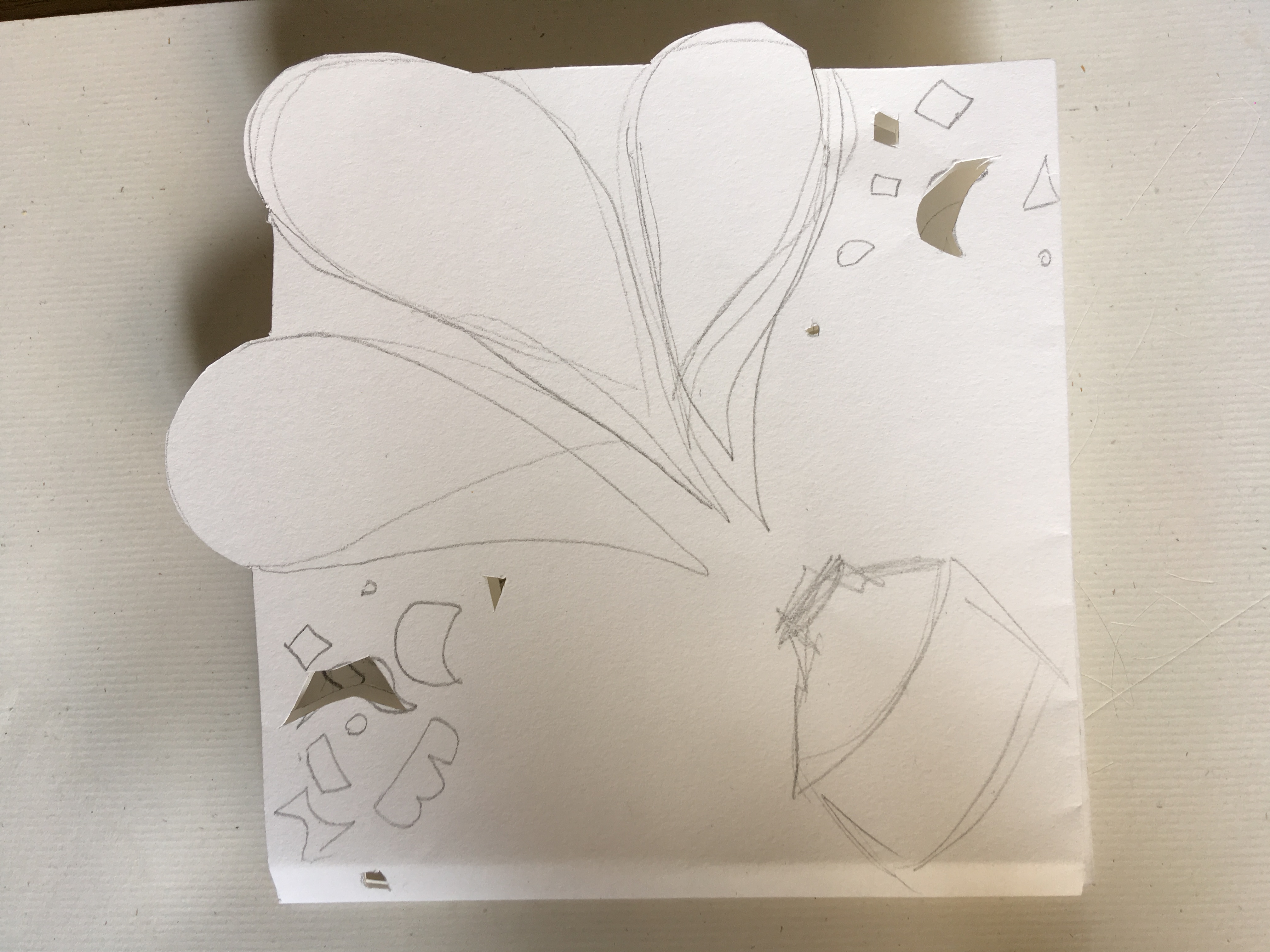
Using the inspiration from above I tried to create an accordion fold brochure with pop up to create a surprise element. But folding the brochure back was difficult.

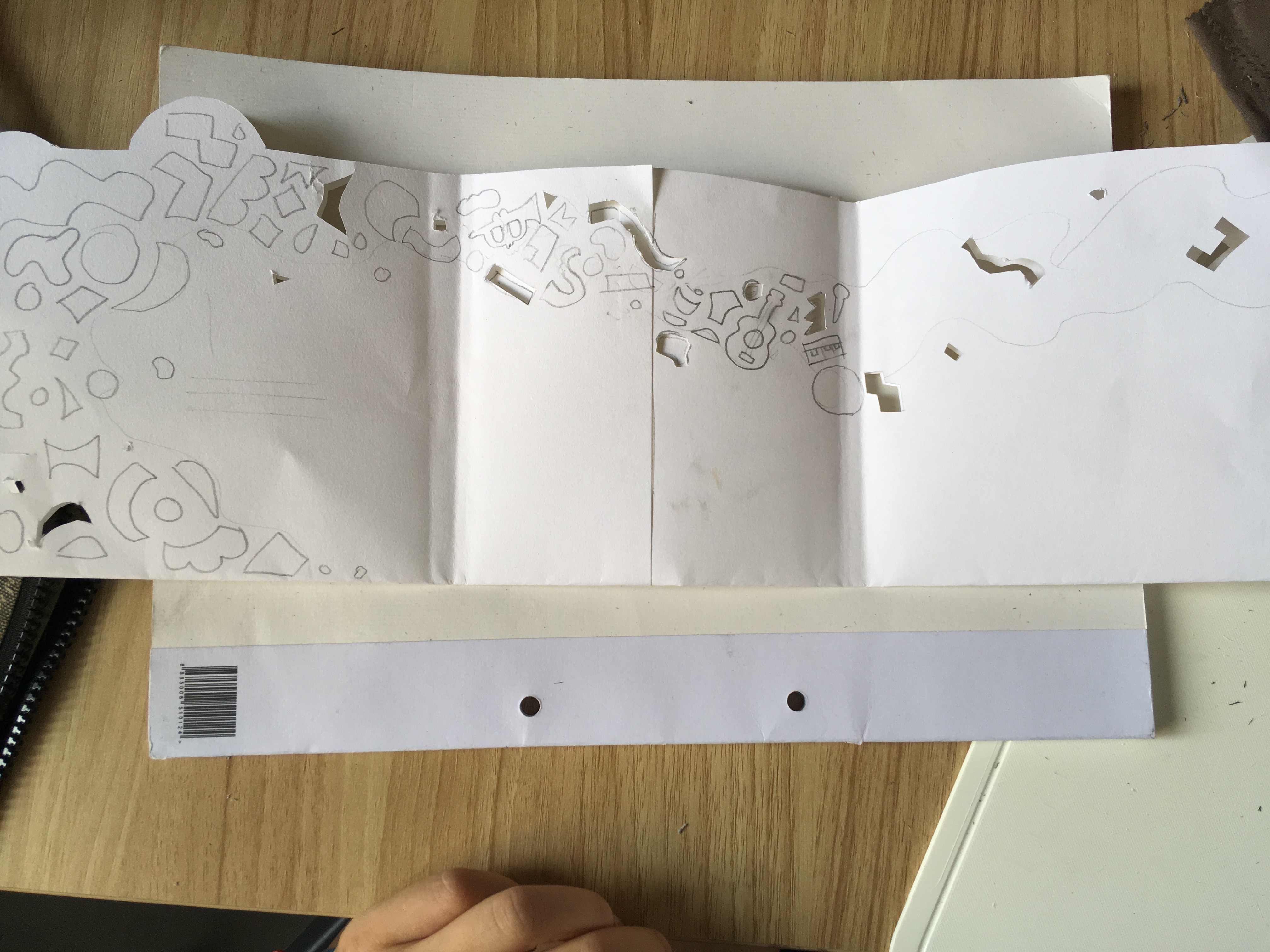
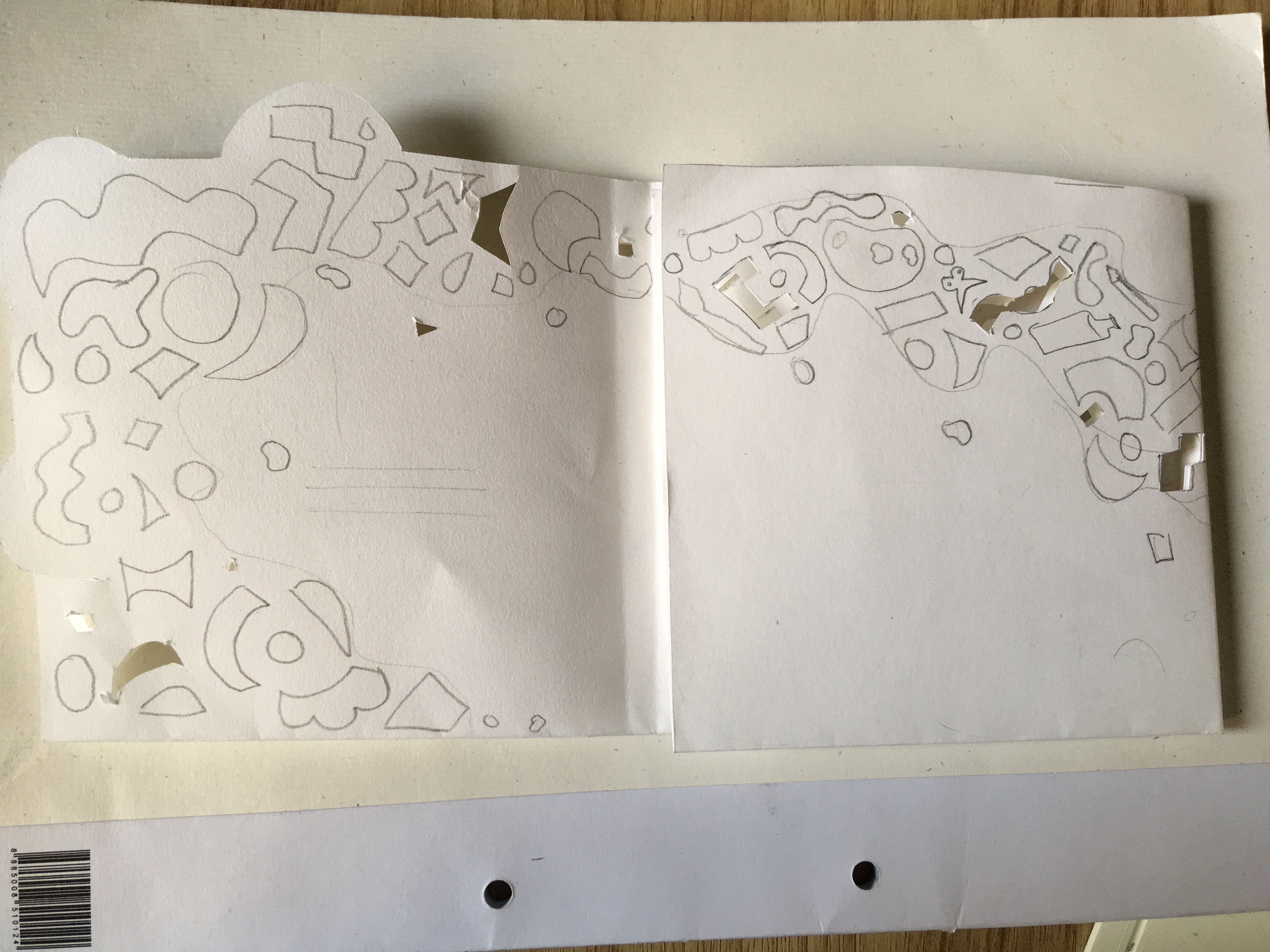
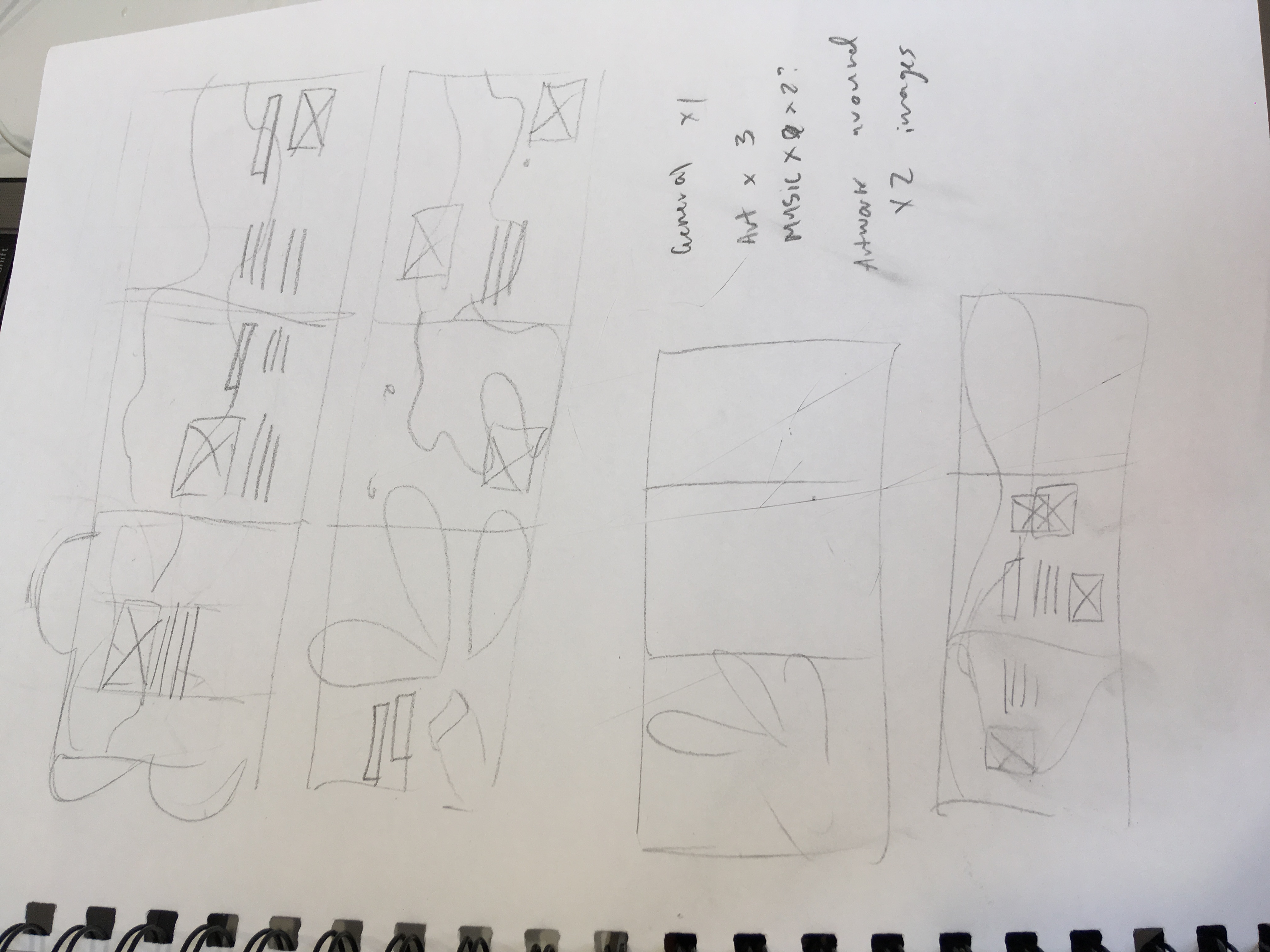
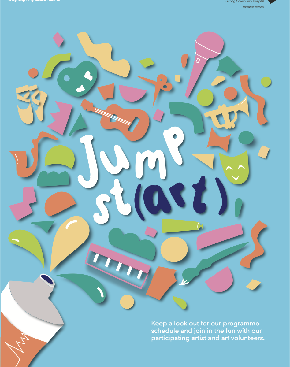
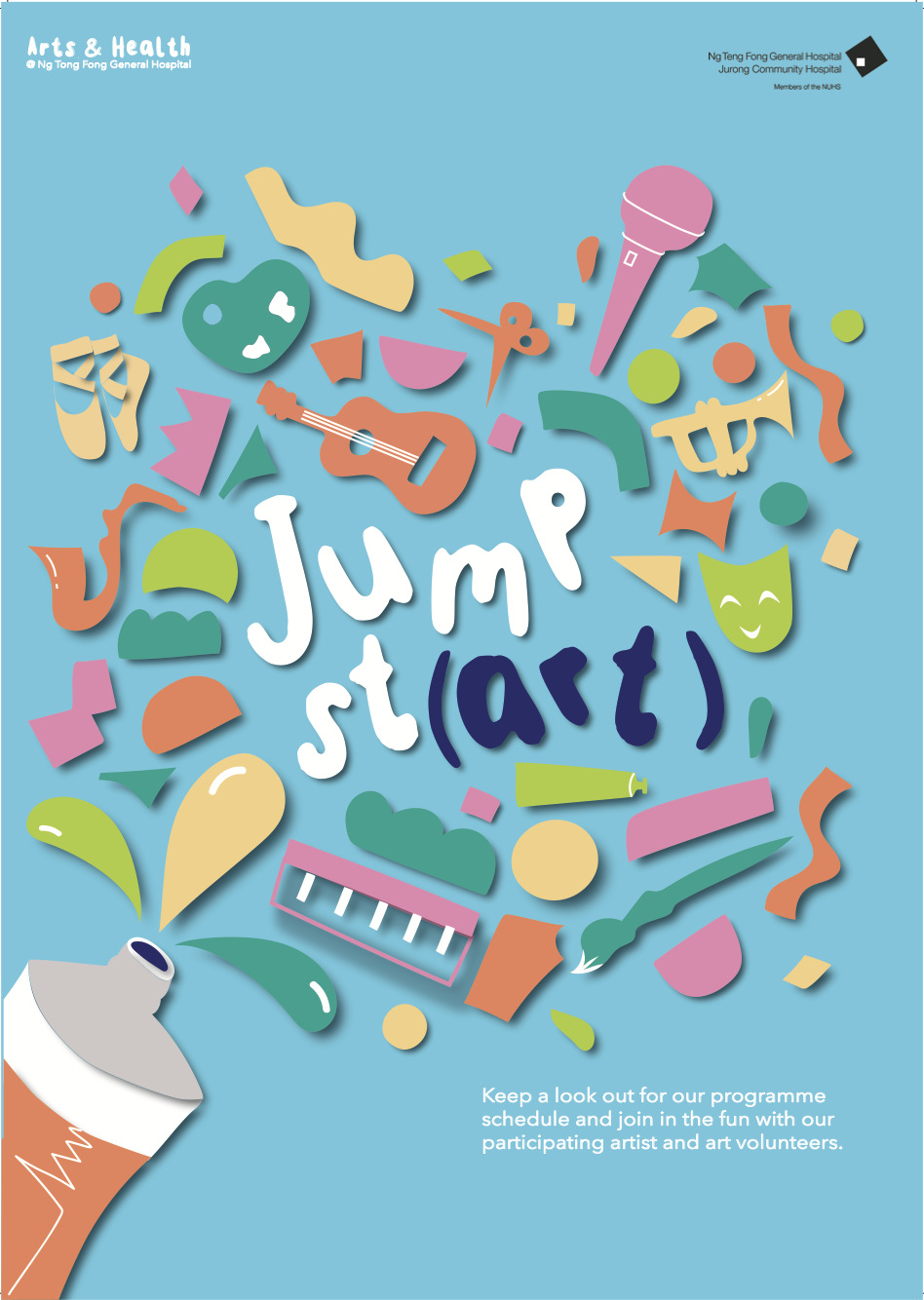
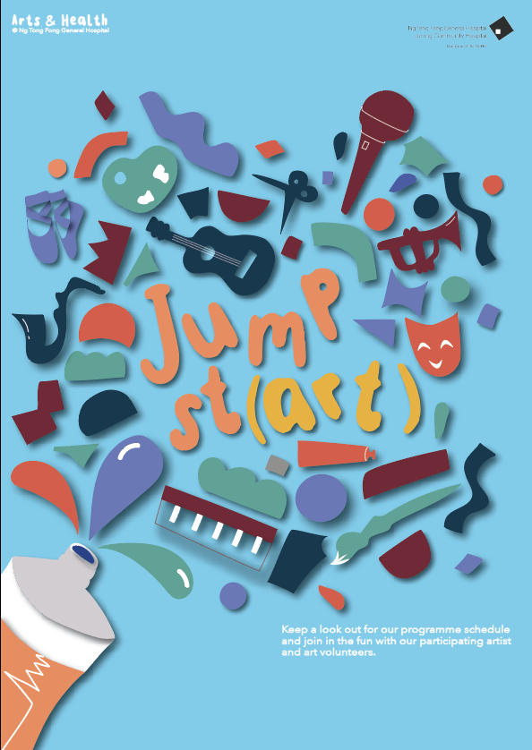
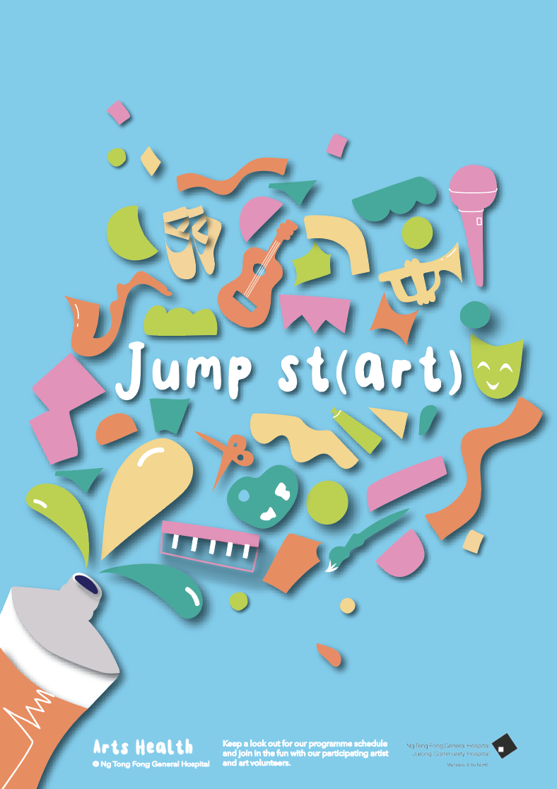
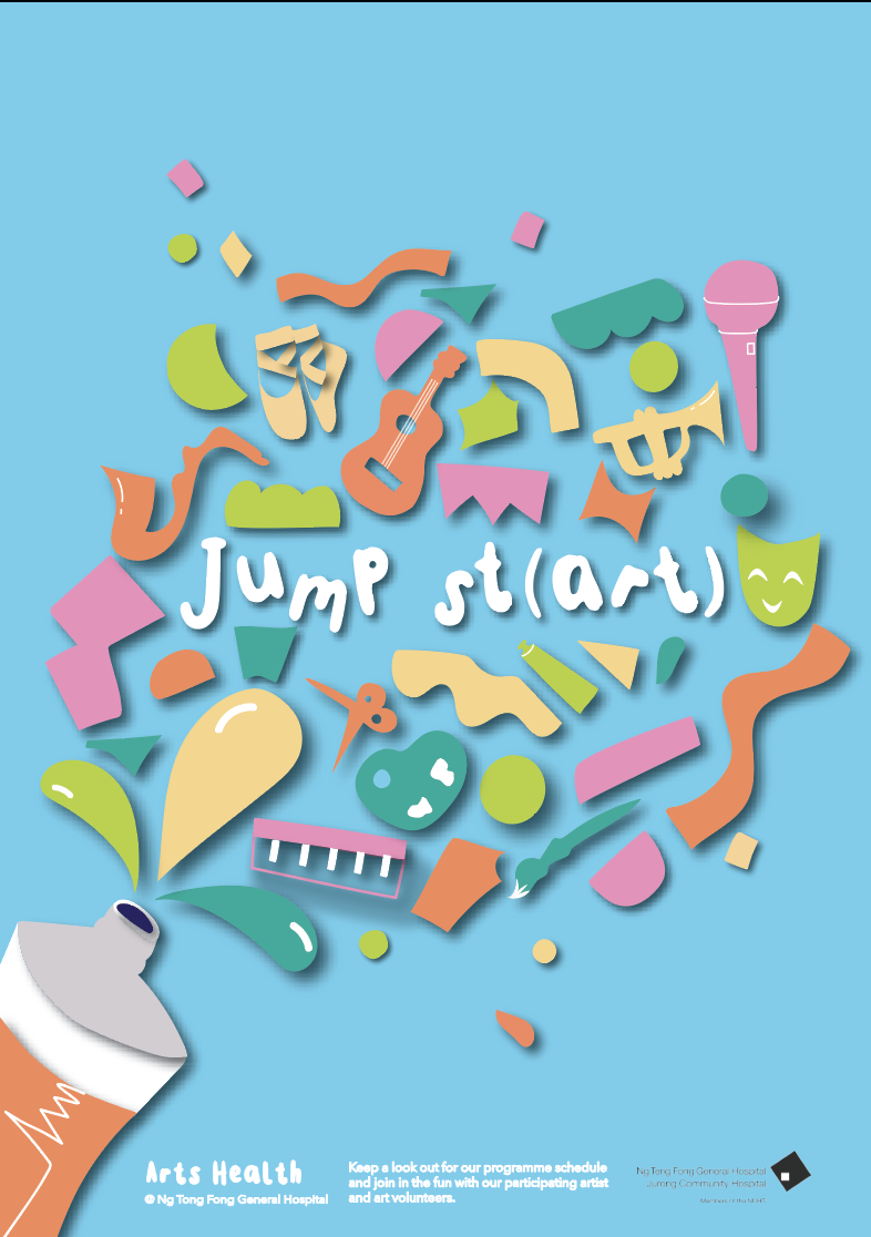
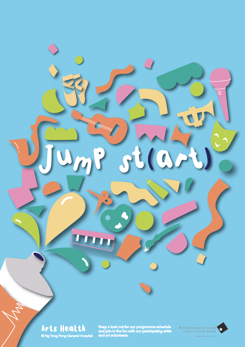
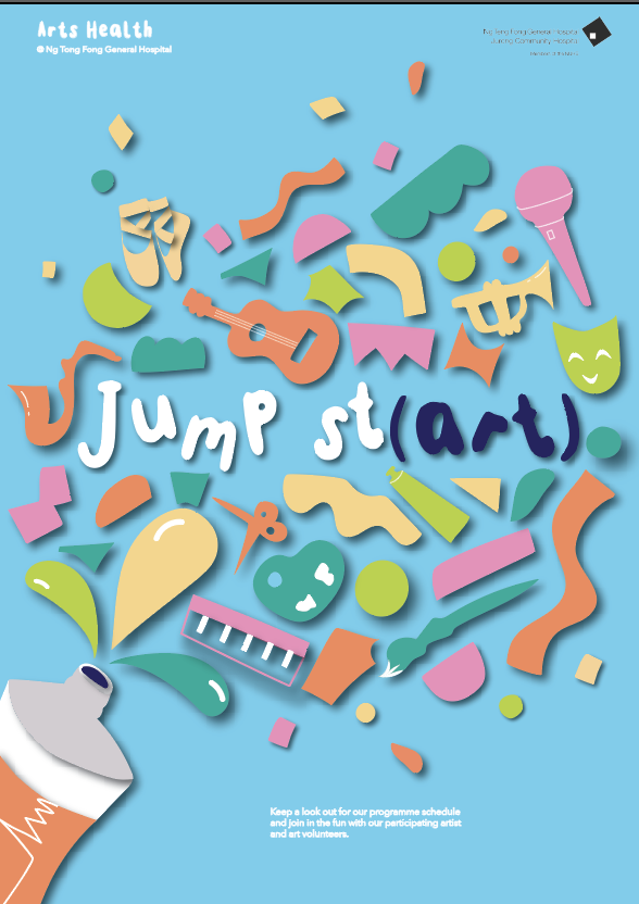
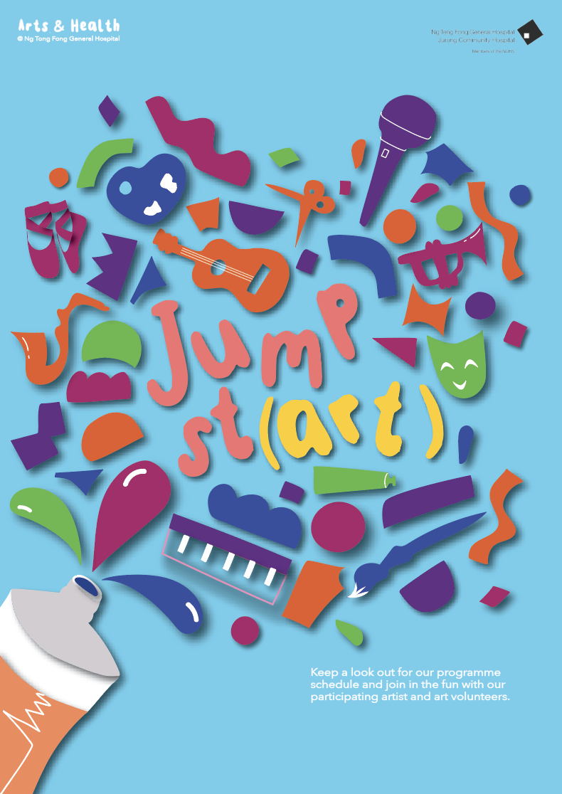
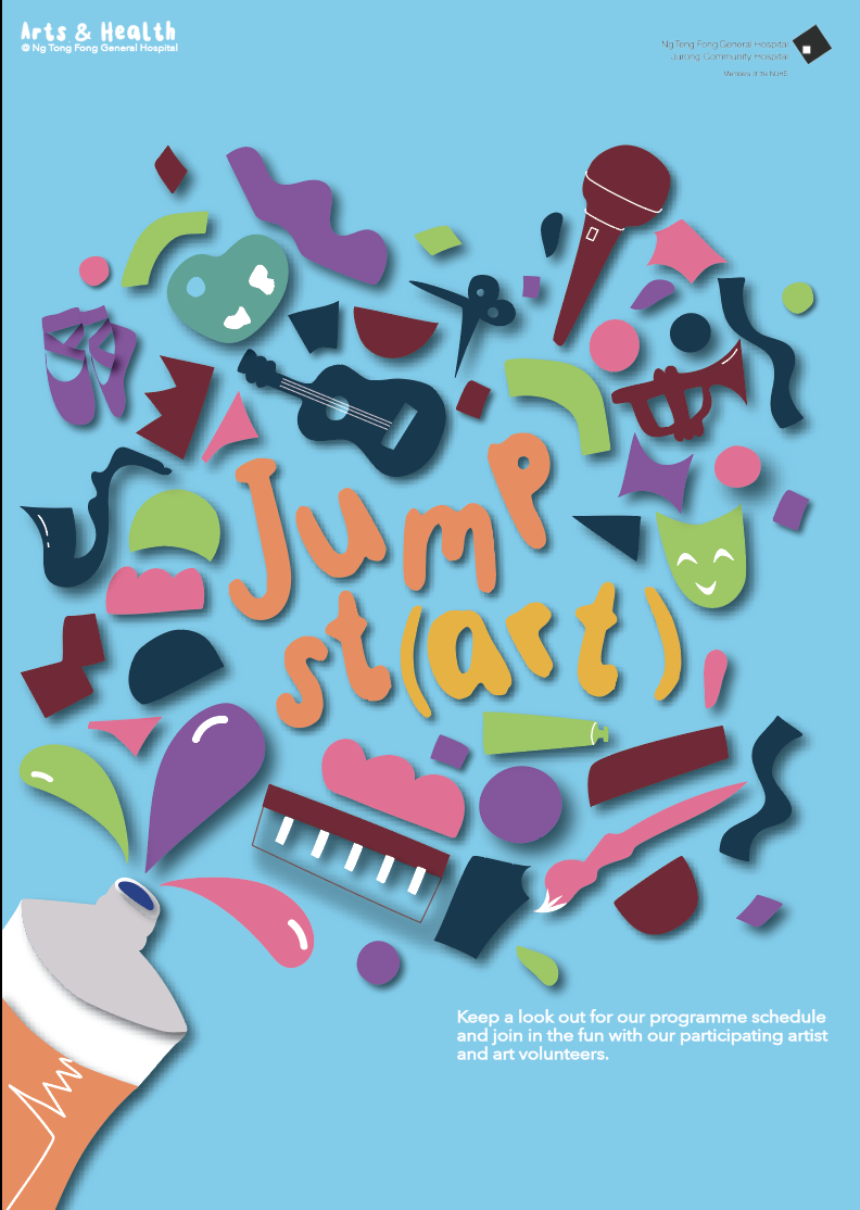
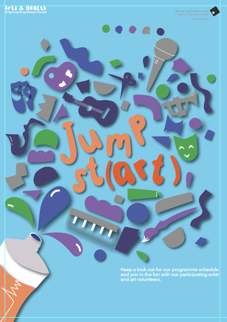
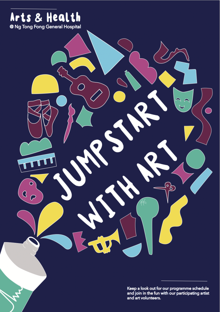
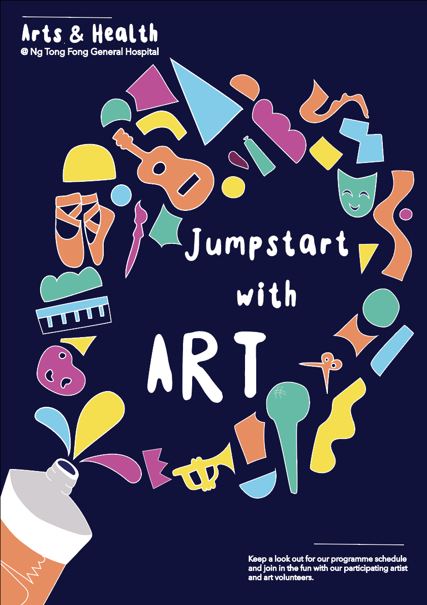
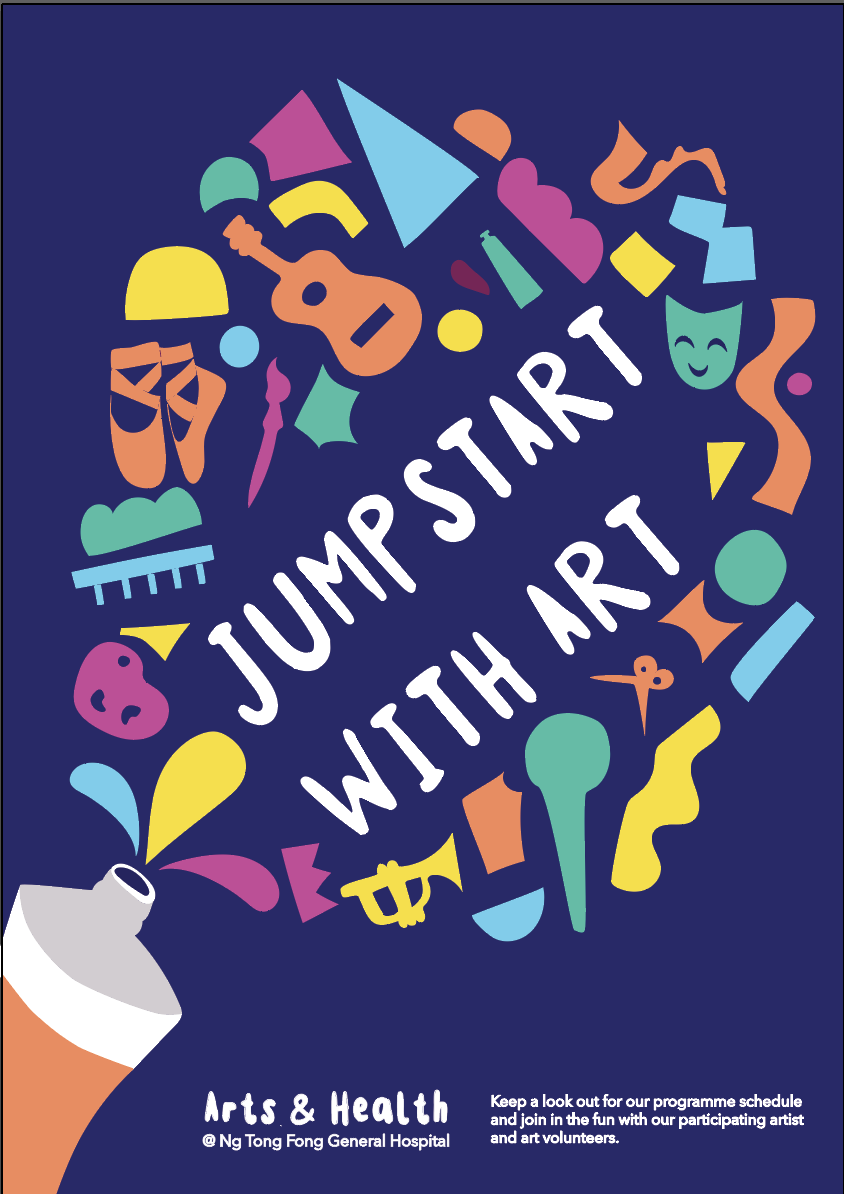
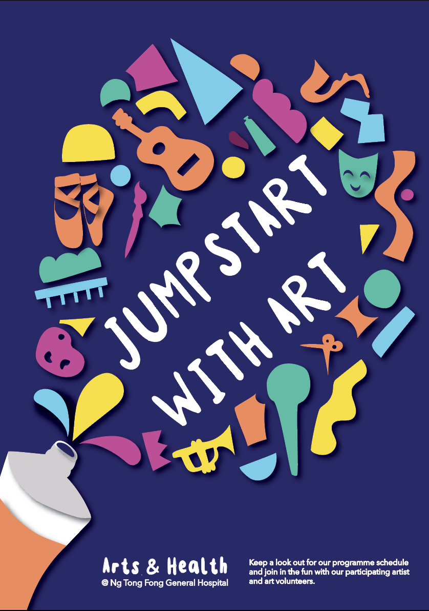
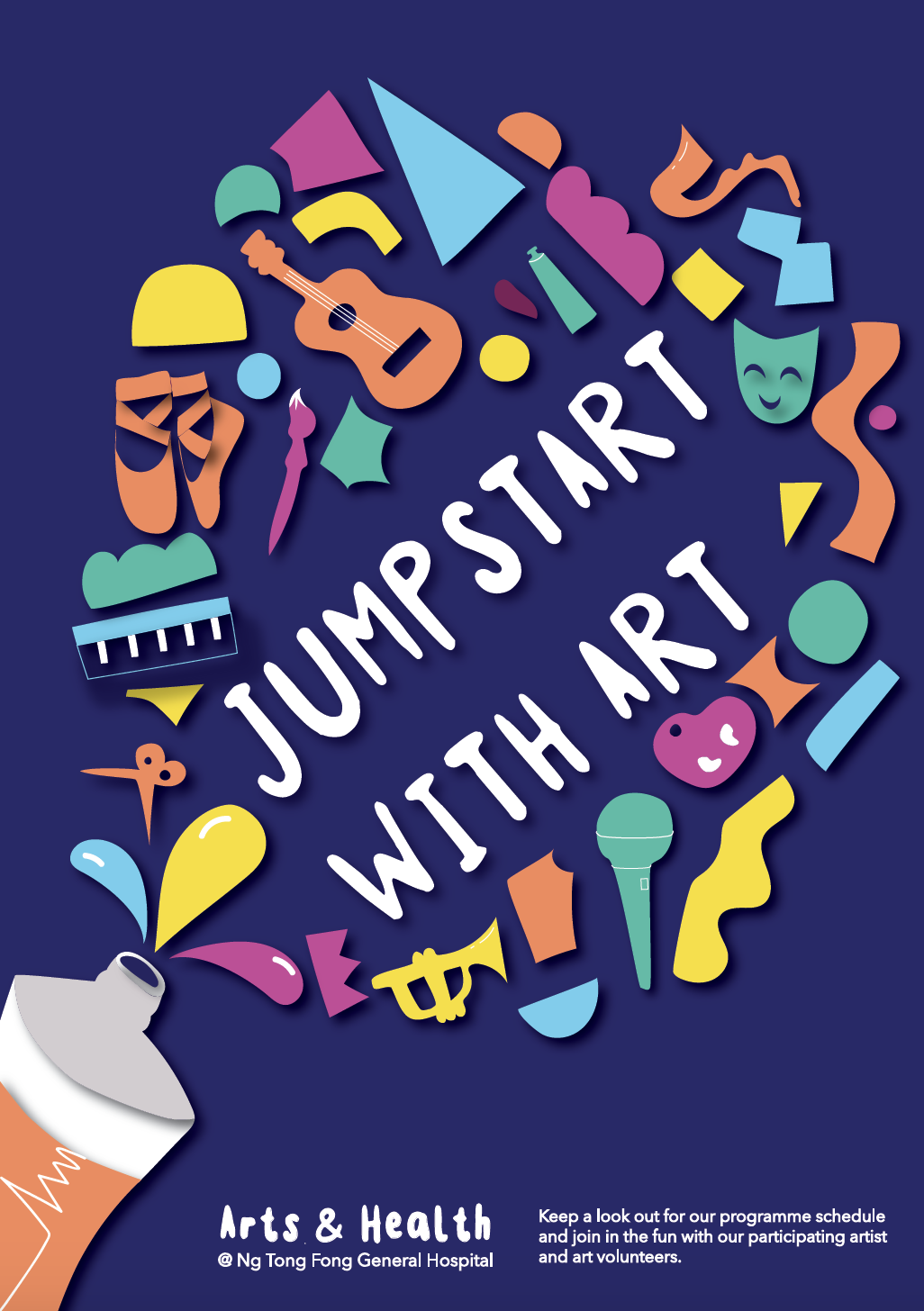
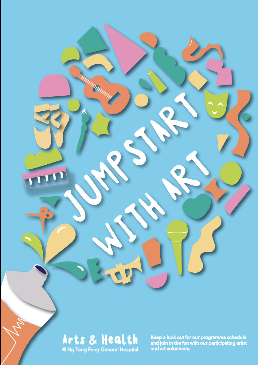
Using the trifold I tried to incorporated die cuts into my brochure to make things more interesting for the reader. I also cut out the shape of the paint splatter to create a less uniform brochure.
I also used the shapes across the pages to create visual flow and to establish visual hierarchy.

Sketches:

Final Poster

To represent Arts on the Move as a program that brings creativity into patient lives for therapeutic, educational and expressive purposes I have created this energetic poster with the slogan ‘Jumpst(art)’. Jumpst(art) can be interpreted as imparting fresh energy into patients every time they create art through this program. The images in this poster are textured to look like paper cuts and confetti to strengthen the creativity of all the instruments and shapes seen in the confetti. The paint tube is also an analogy for jumpstarting patients – one squeeze and the creativity will flow. The light colour palette and bubbly font are used to create a positive, welcoming and cheerful vibe.

Final refinement

Feedback from Peers:

  • no distinct lines
  • play with the title – very static – break it up
  • move to the right – Jump St(art) – brackets colour or capitalise
  • the main drive of shape
  • create tension point – focus point – created by lines and etc
  • move up- twist shapes
  • a little bottom heavy – lift closer
  • the orientation of shapes
  • introduce colour
  • Jumpstart could have shadow

As I only had Monday and Tuesday of the final week to tweak my work as I was travelling up until Sunday, I should have let myself have more time to explore the colour range.

Task 2: Design Exploration


Task 3: Design Refinement & Mock Up

Task 3A: Readability and Legibility


Design Refinements:

Feedback from Peers:

  • no outline
  • more details – strings and palette
  • confetti – vibrant, joy
  • continue splash
  • look into text details – a different voice emphasis – play with size and orientation
  • the orientation of shapes – how to play with the elements
  • try a different palette
  • add Jurong Health Logo – monochrome can do
  • accent – 3D the objects like the tube


The two different colours look like day an night unintentionally. I prefer the light blue one as it is brighter and more cheerful.

Added the logo. found it difficult to place