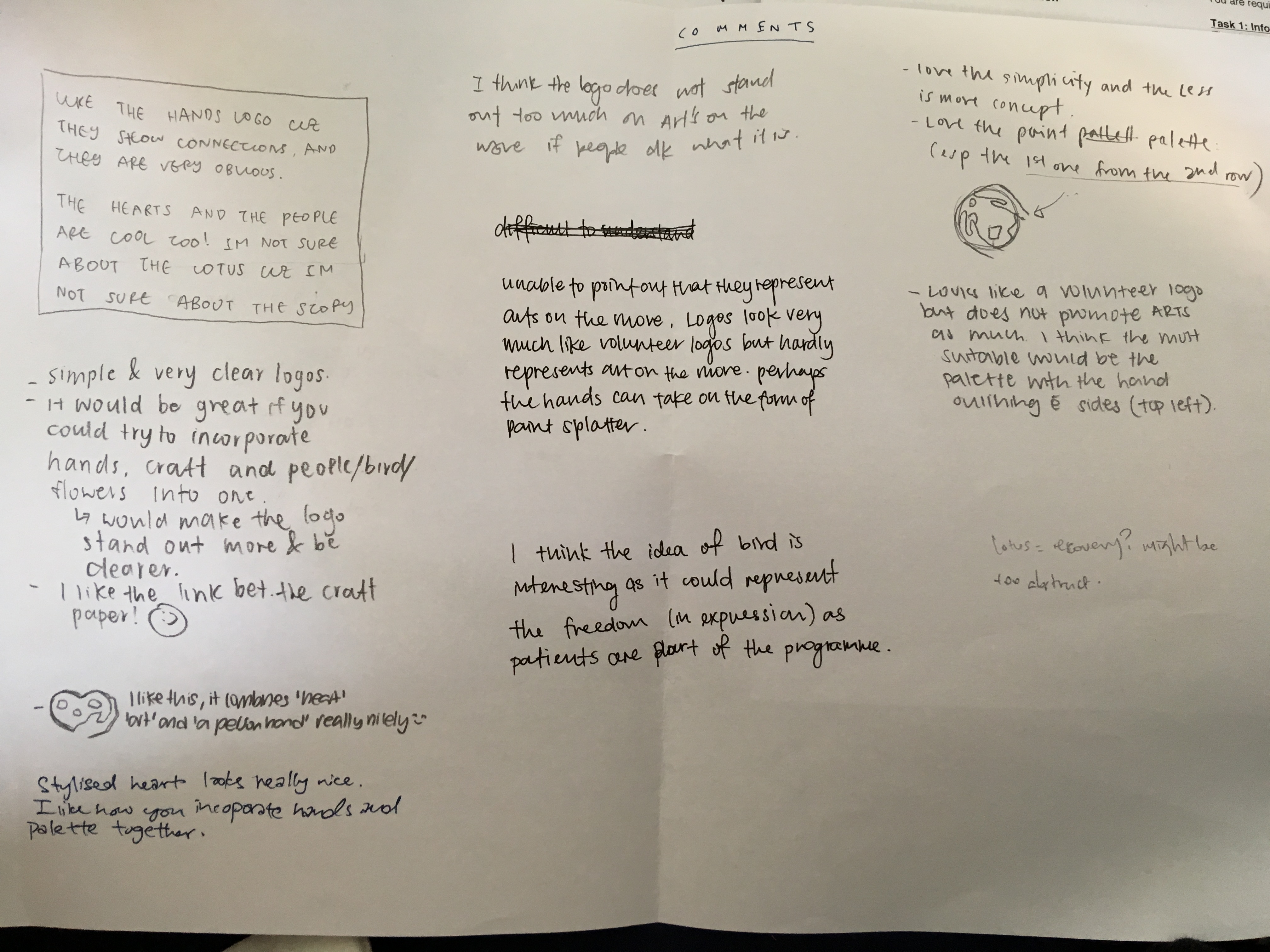
Pink and yellow work best compared to the other that were too dark or competed for attention against the turquoise vest. I changed the red to pink as the red was not an exciting colour and may have been misinterpreted as the colour of blood.
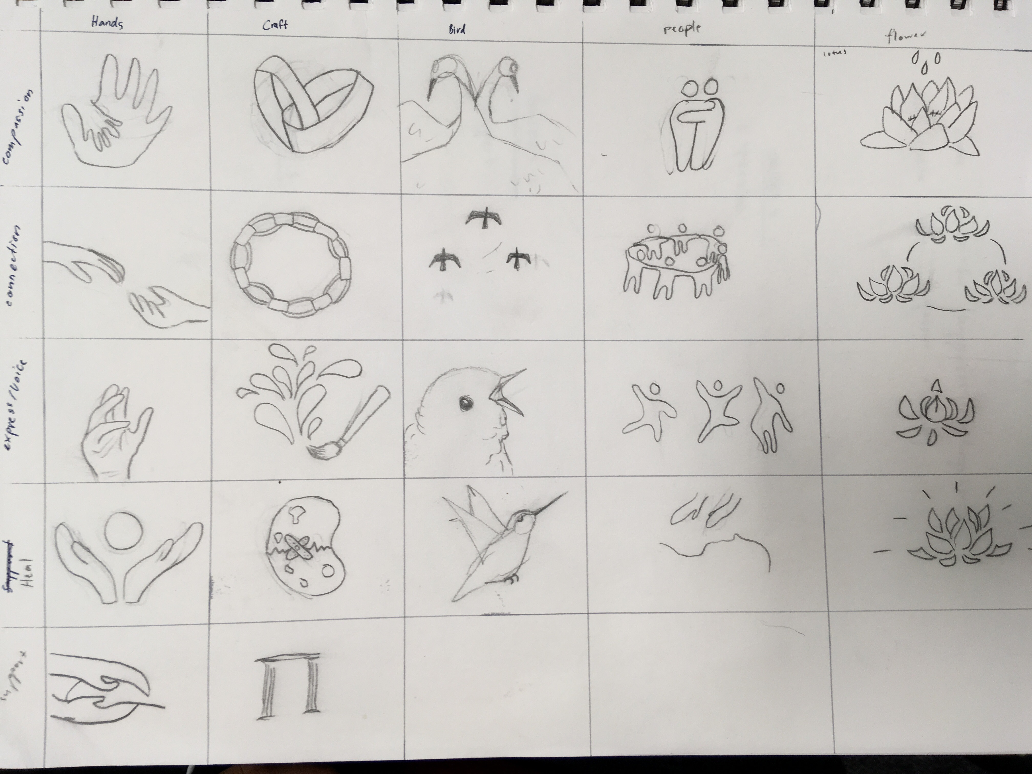
Exercises started in class to help generate ideas and more iterations:
* Birds – cranes represent compassion and longevity, Hummingbirds represent healing and health
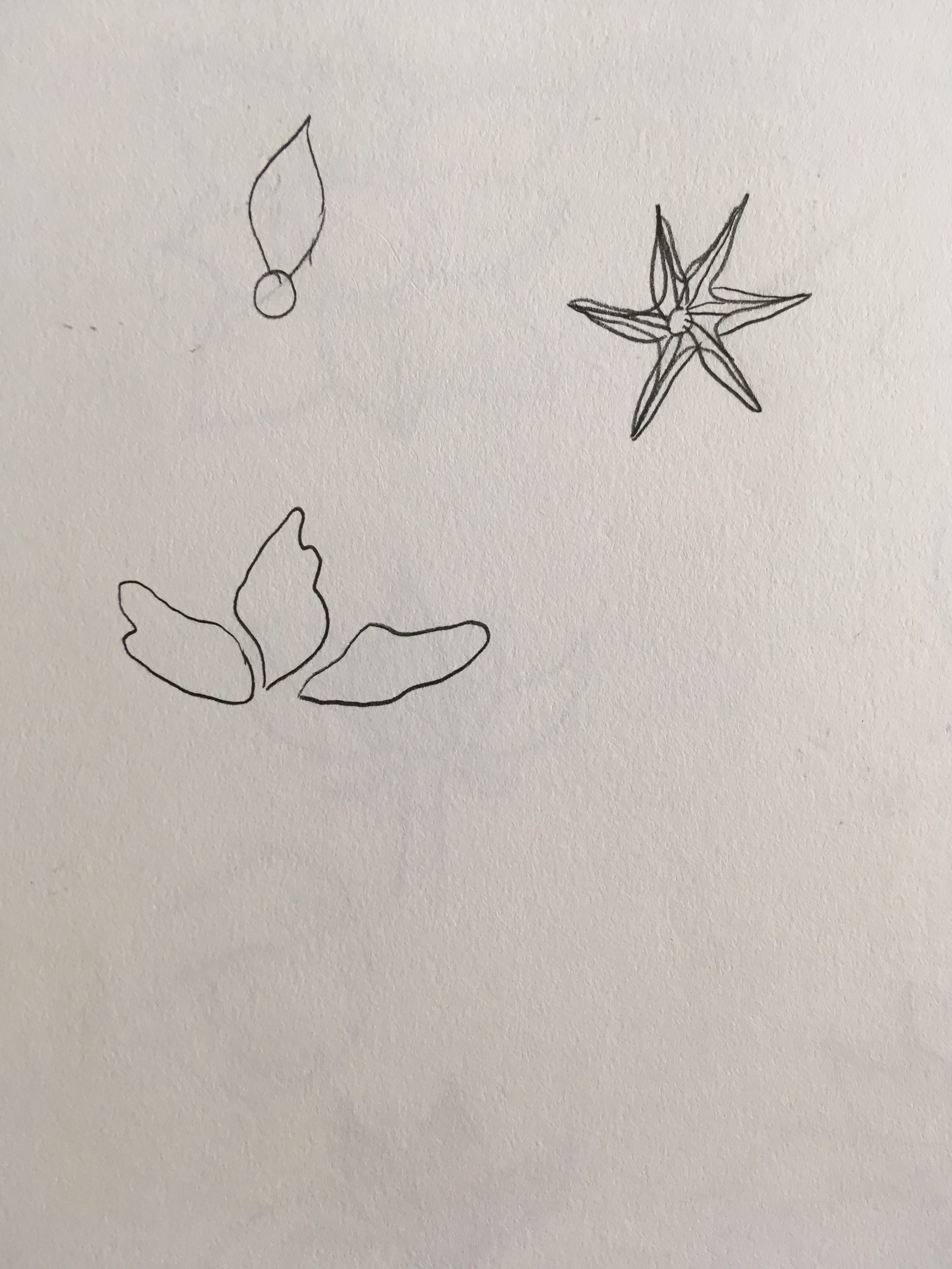
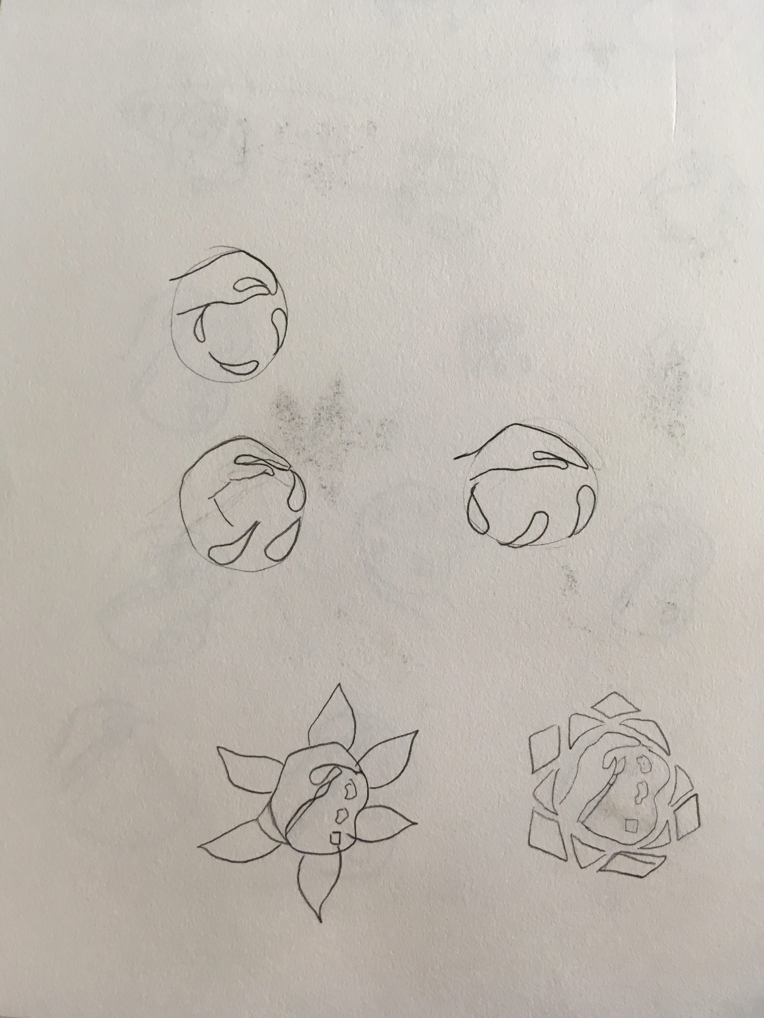
**Lotus is most commonly associated with health, healing and spirituality
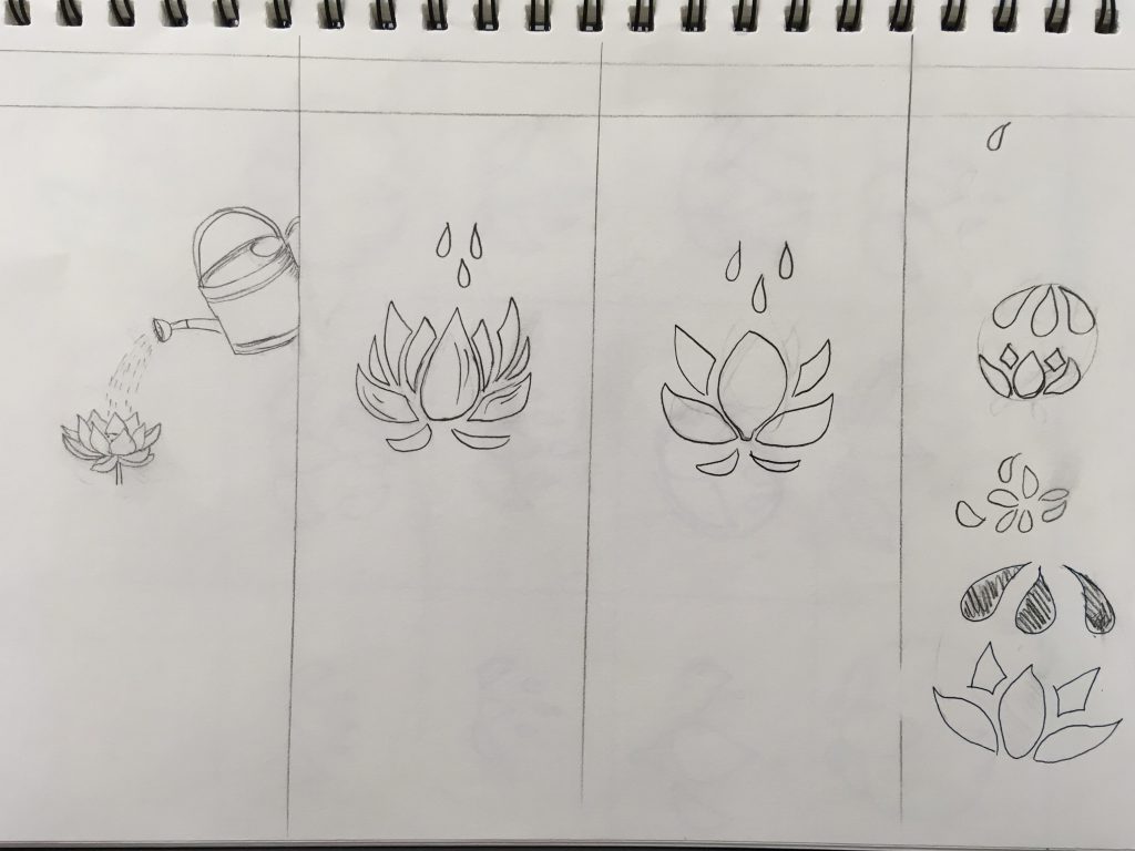
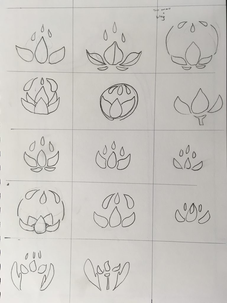
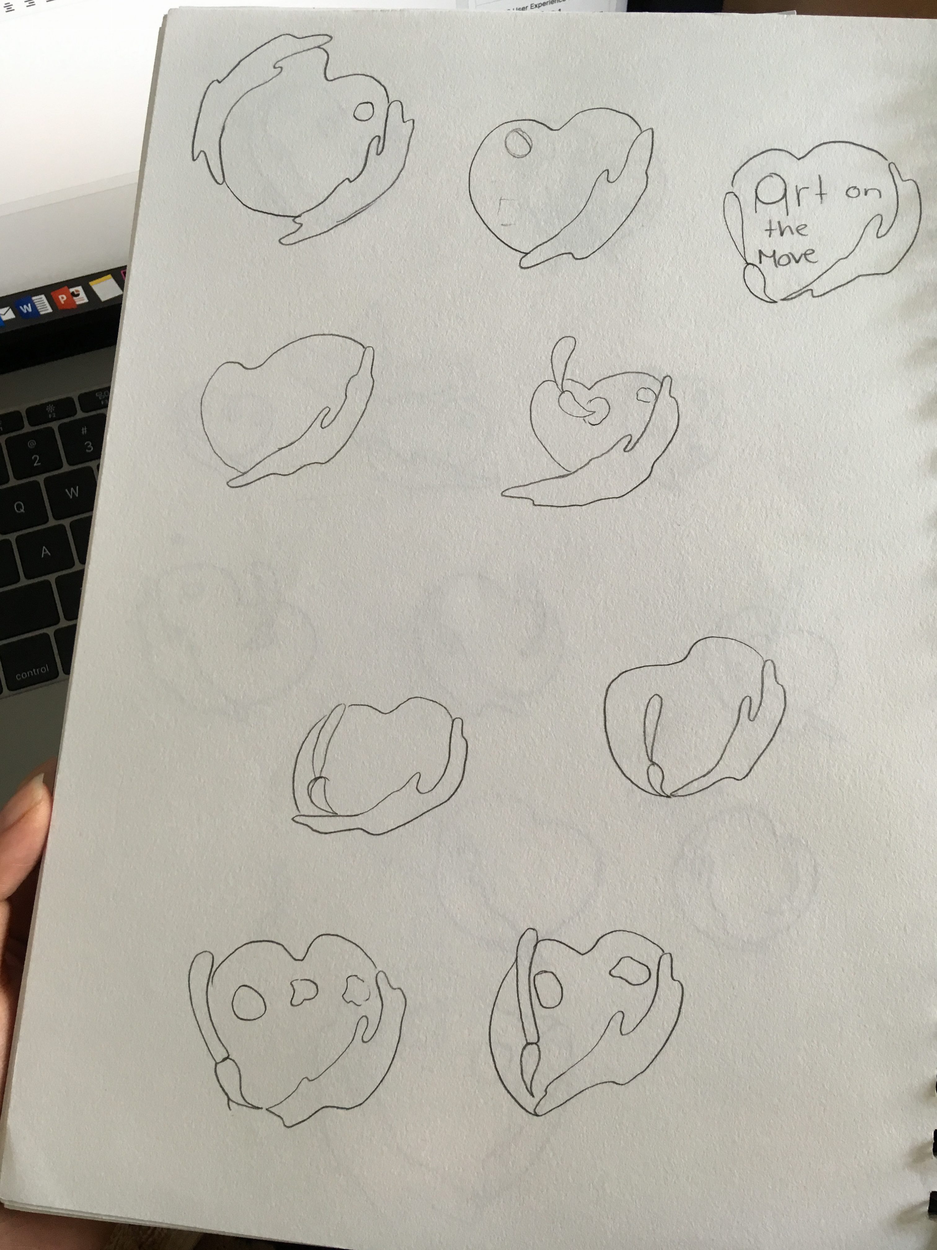
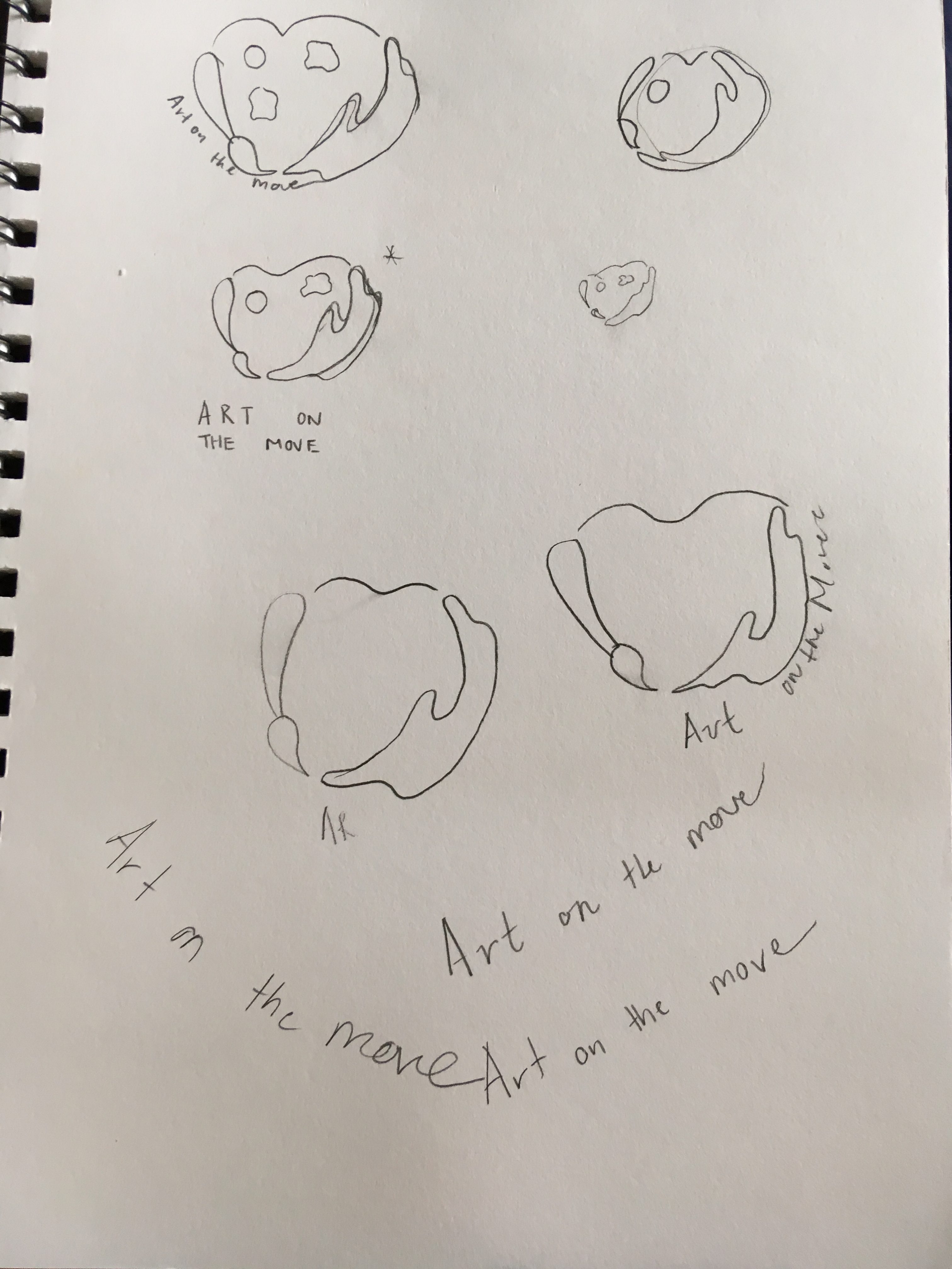
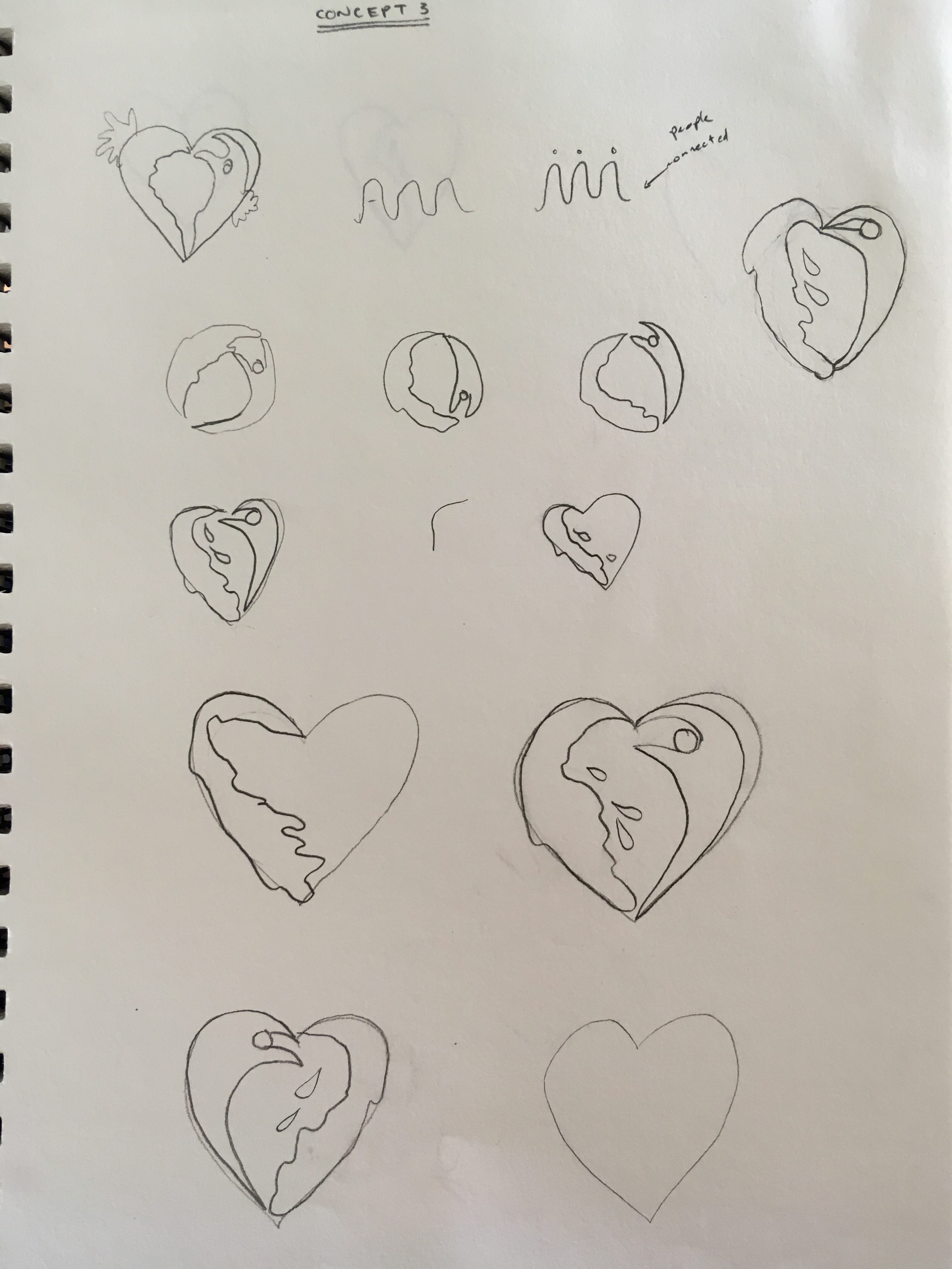
Below are iterations of the Lotus concept.
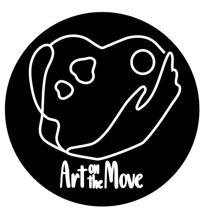
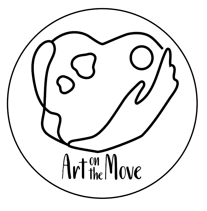
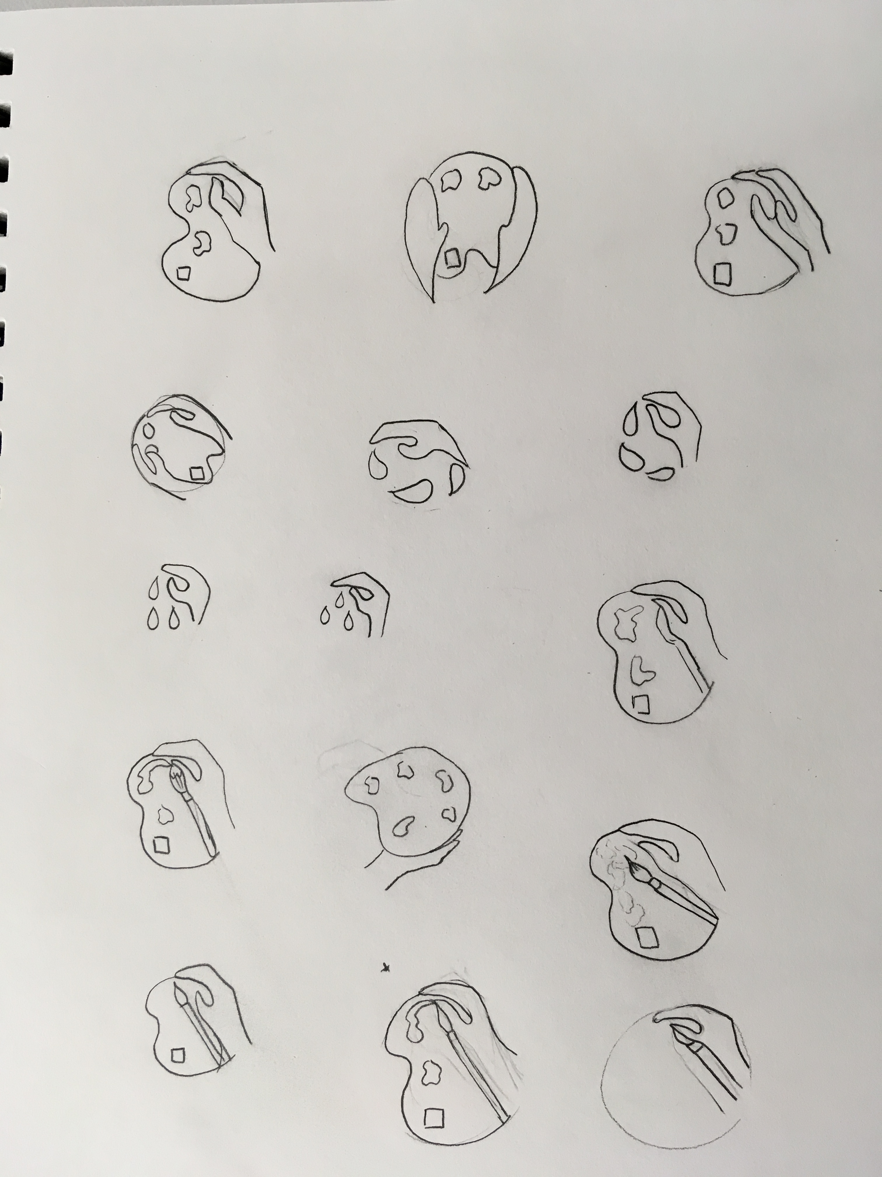
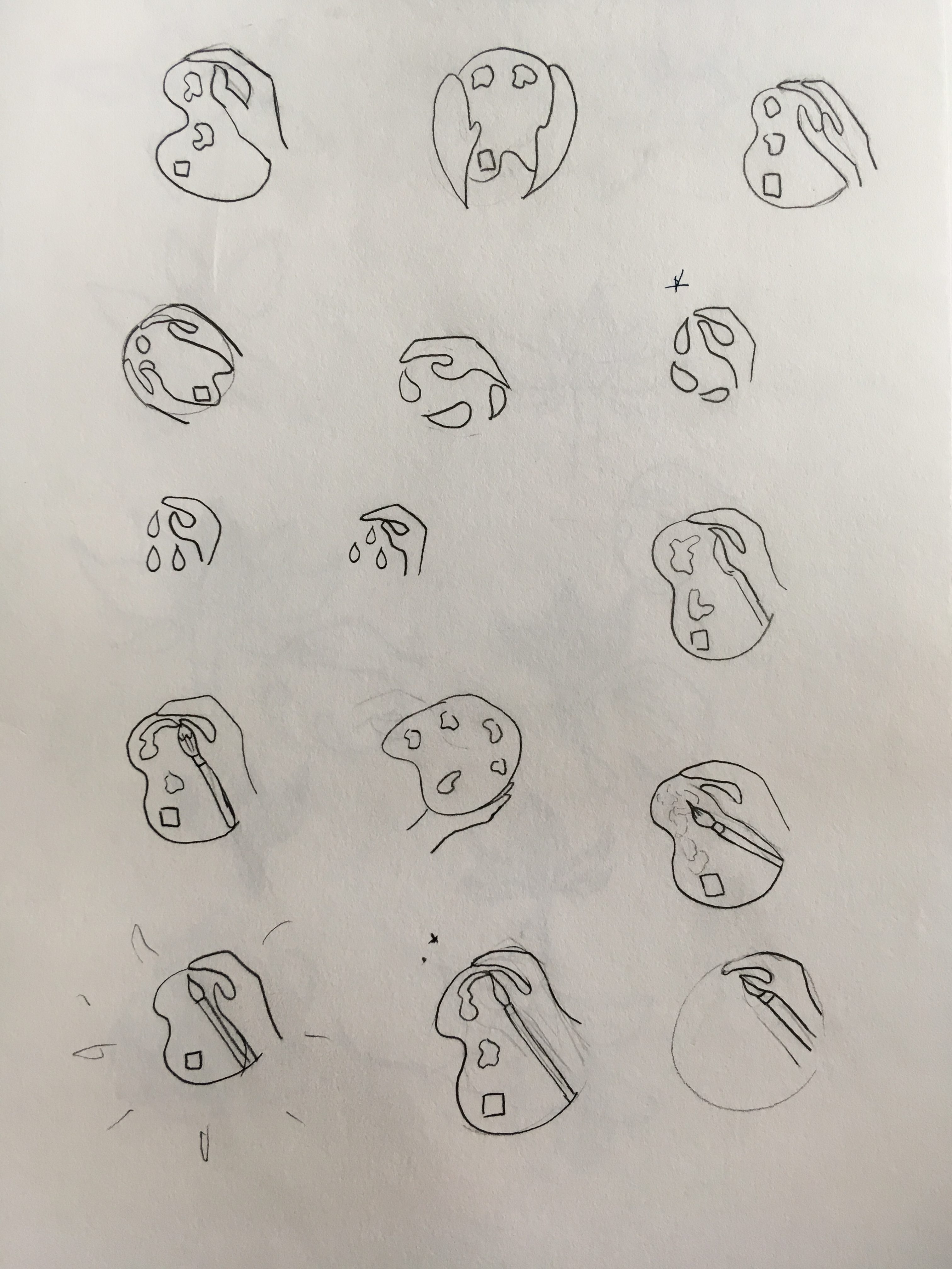
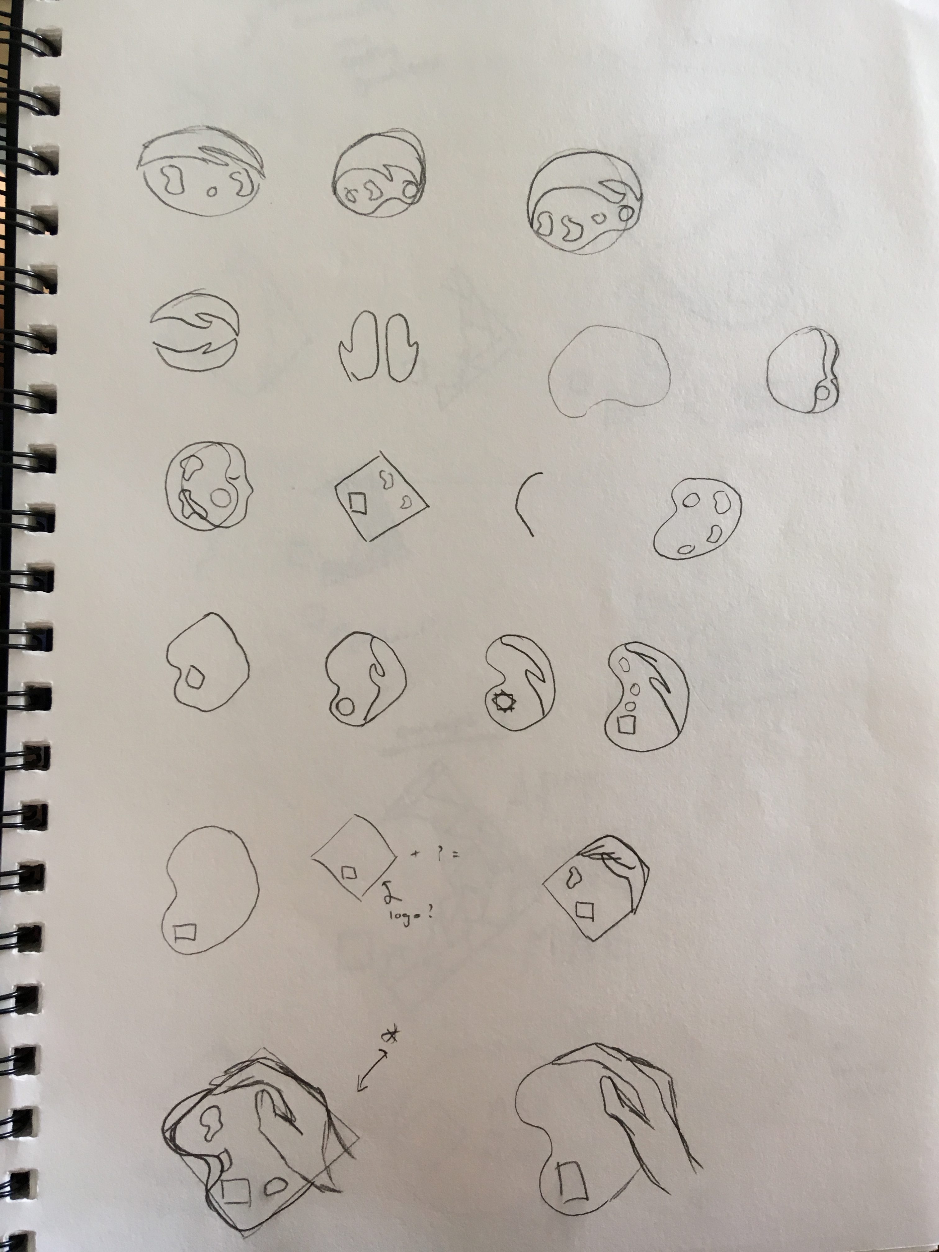
I have expanded on more of my first idea with the hand and the palette below
Peer assessment:
In summary, many of my peers said that the lotus is hard to connect back with arts on the move and that they preferred the palette and the hand idea.
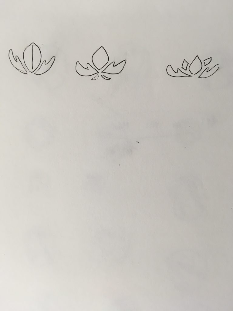
Further iterations:
I tried to continue and work on the Lotus idea, however, I found it too difficult to relate it back to arts on the move. So I tried to combine the palette and the lotus but It was too busy so I scrapped the Lotus idea and went with the palette idea.
Design aim:
The client, Ng Teng Fong General Hospital requires a new logo design to be used on the button badge for their Arts on the move volunteer program.
A design that reflects the programs values, passion and purpose.
Keywords: Expressive
Evoke
Love
Create
Harness creativity
Create
Hands on
Support
Community
Voice
Connect
Heal
Positive Distraction
Companion
Rationale:
Concept 1
Concept 1:
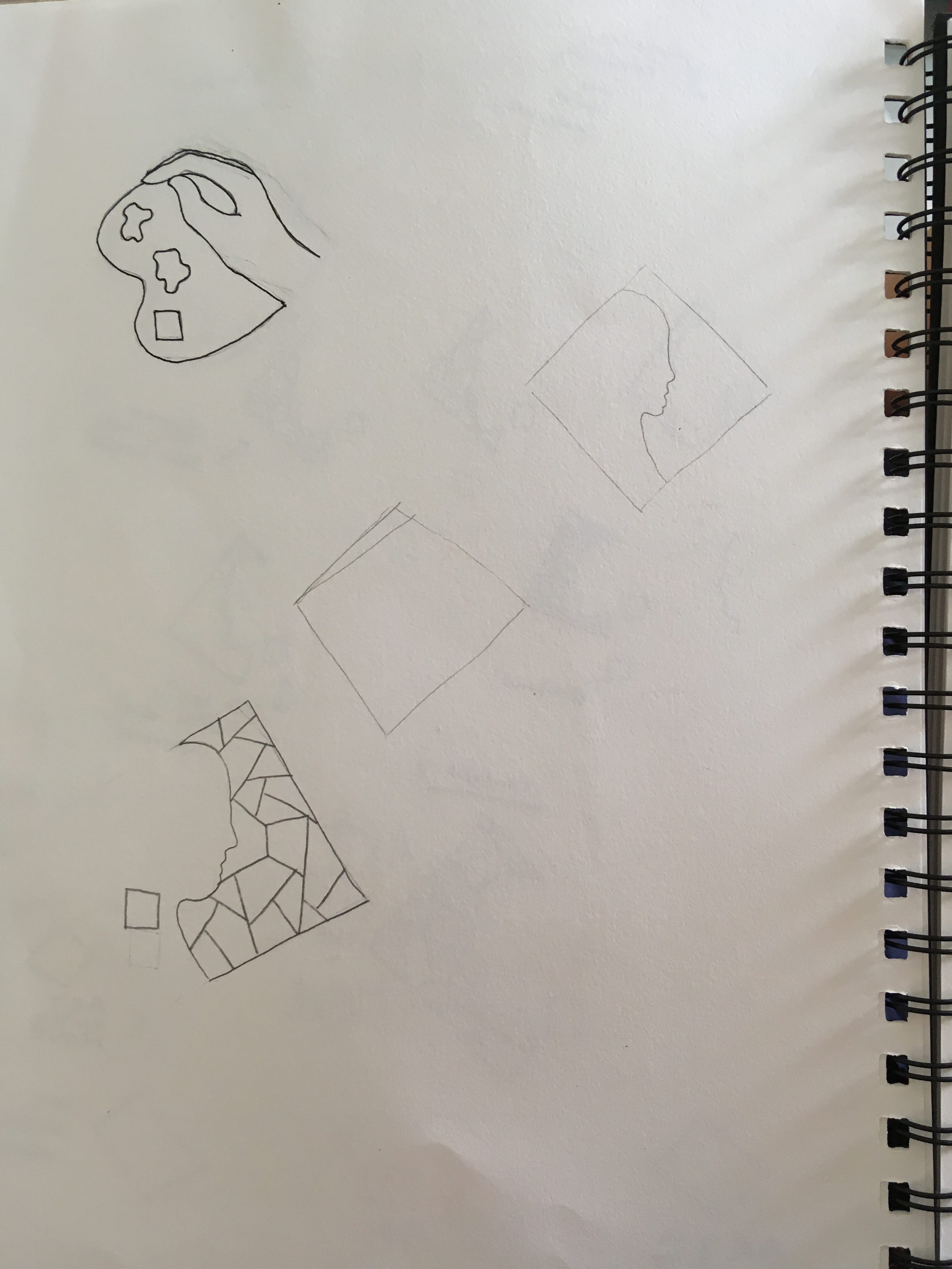
The hand can be seen as both patient and volunteer, the patient’s hand is connecting with the paint palette representing art and how they express through art. If it is seen as the volunteer’s hand, it is a hand of support and reassurance like a hand on the shoulder. The square handle of the pallet is part of the hospital’s official logo and so it can be seen that Arts on the Move is affiliated with the hospital.
Concept 2
Concept 2:
This logo represents how this program harnesses creativity and allows the patients to express and be free through craft. Depicted is a patient freely throwing paint to their heart’s desire without being restricted by their state of health. The human and the paint is shaped into a heart symbolizing how both are connected and also reflect the caring value of the program.
Concept 3
Concept 3:
The logo is a play on the official hospital logo to follow on style and to show they are affiliated. The silhouette of a patient is seen next to the cracked pattern. This pattern represents how the patients may be broken when being admitted but shows that they can be put back together through art. The web like pattern also represents the community and the connections made with others. The square is located near the vocal cord representing that this program can help patient speak their mind through art.
Mood Board:
Revisiting Task 1:
Misinterpreted the task and had already started drawing logos so I am revisiting concept ideas from Week 1 for a clearer understanding of what my aim is. My three-word concepts will be:
Expression
Support
Heal
Process for three logos that I have already designed:


Misinterpreted the task and had already started drawing logos so I am revisiting concept ideas from Week 1 for a clearer understanding of what my aim is. My three-word concepts will be: