Feedback and critic from peers and tutor:
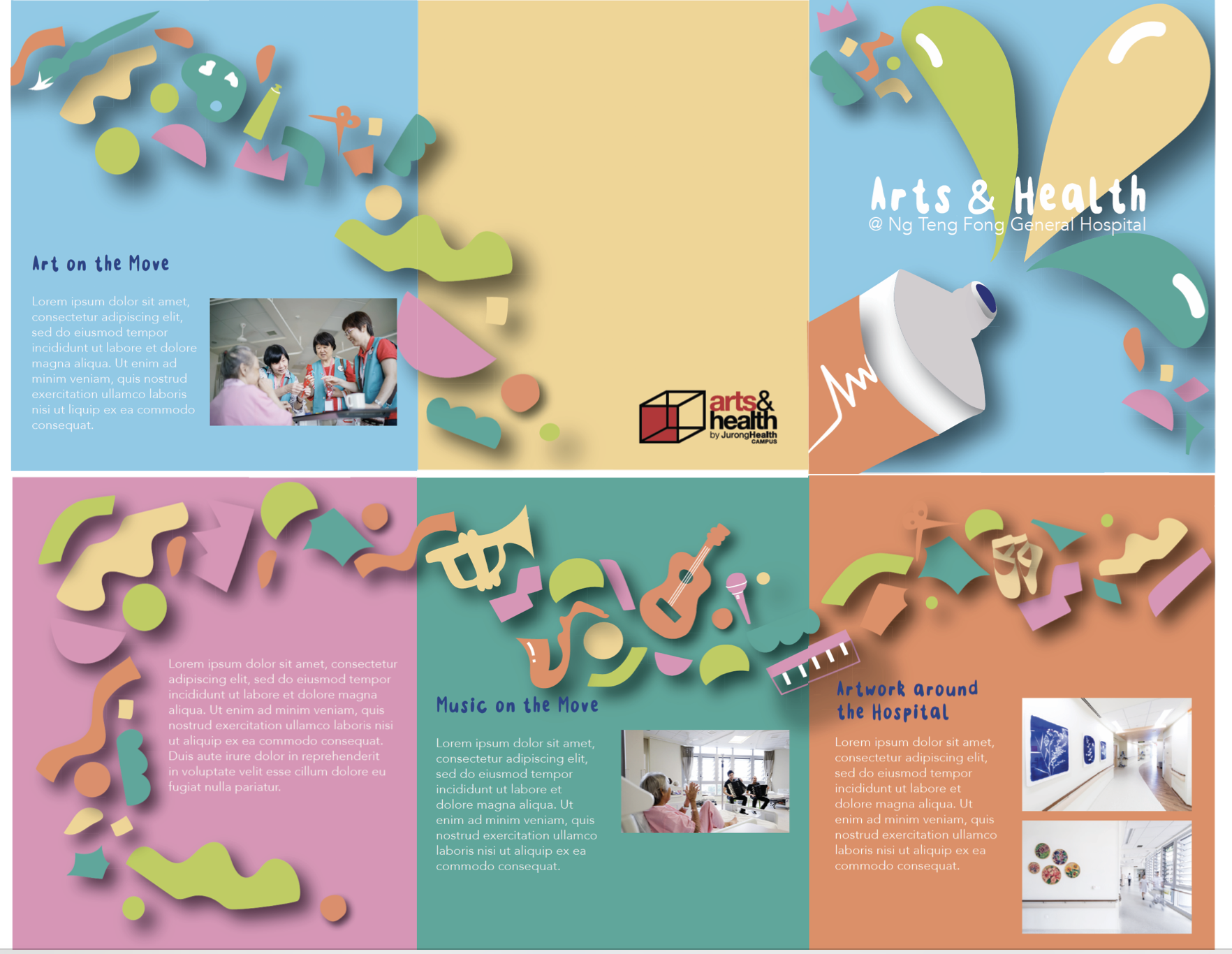
- colour as hierarchy – hot > cold, dark > bright – sequence
- orange first?
- mindful of the visual
- is the die cut for? – must have a purpose as it adds to the budget cost
- currently too bottom heavy
- cut out pictures to structure?
- has a sense of unity
- could move some shapes down
- be aware of contrast – visual vibrations – scaling – visual depth – pulls things in
- doesn’t have to be continues
- words stagger
- special treatment for header box
- shape image
- tagline front – arts and health on the back
- bump text box 50%
- insert more images?