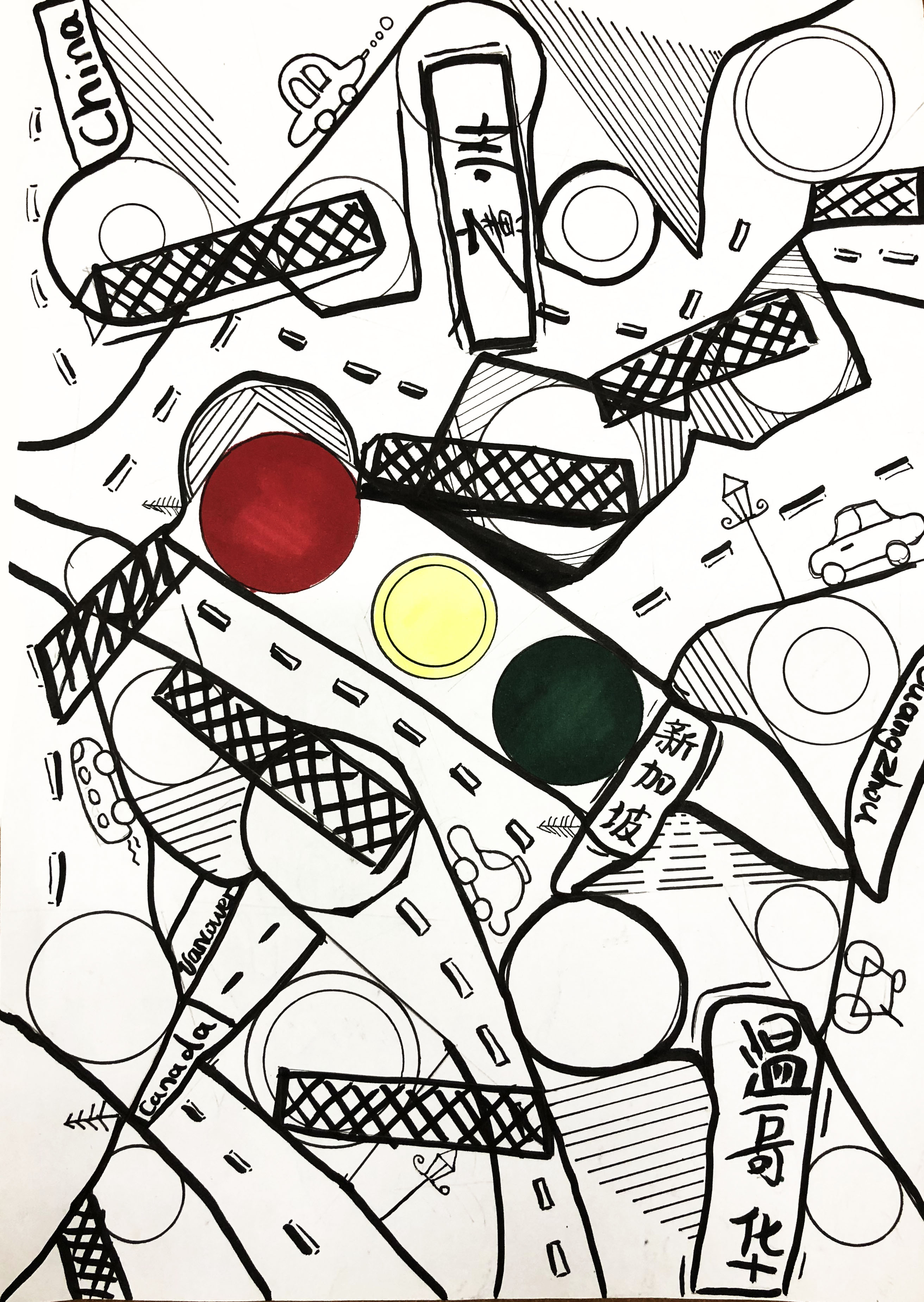
Hi, Class~ Here are my three sketch ideas. My topic will be the obsession – roads.
- using Chinese calligraphy type of writing and also using the traffic light color as the main color in it. The mapping road of my life experience, the city/ country I been, and I like. But then so many places I had been, the obsession with it will be where should I go or stay? Where do I belong to?
2. This will be the road in Canada, which those names are cities name. And also will have the element of Chinese calligraphy.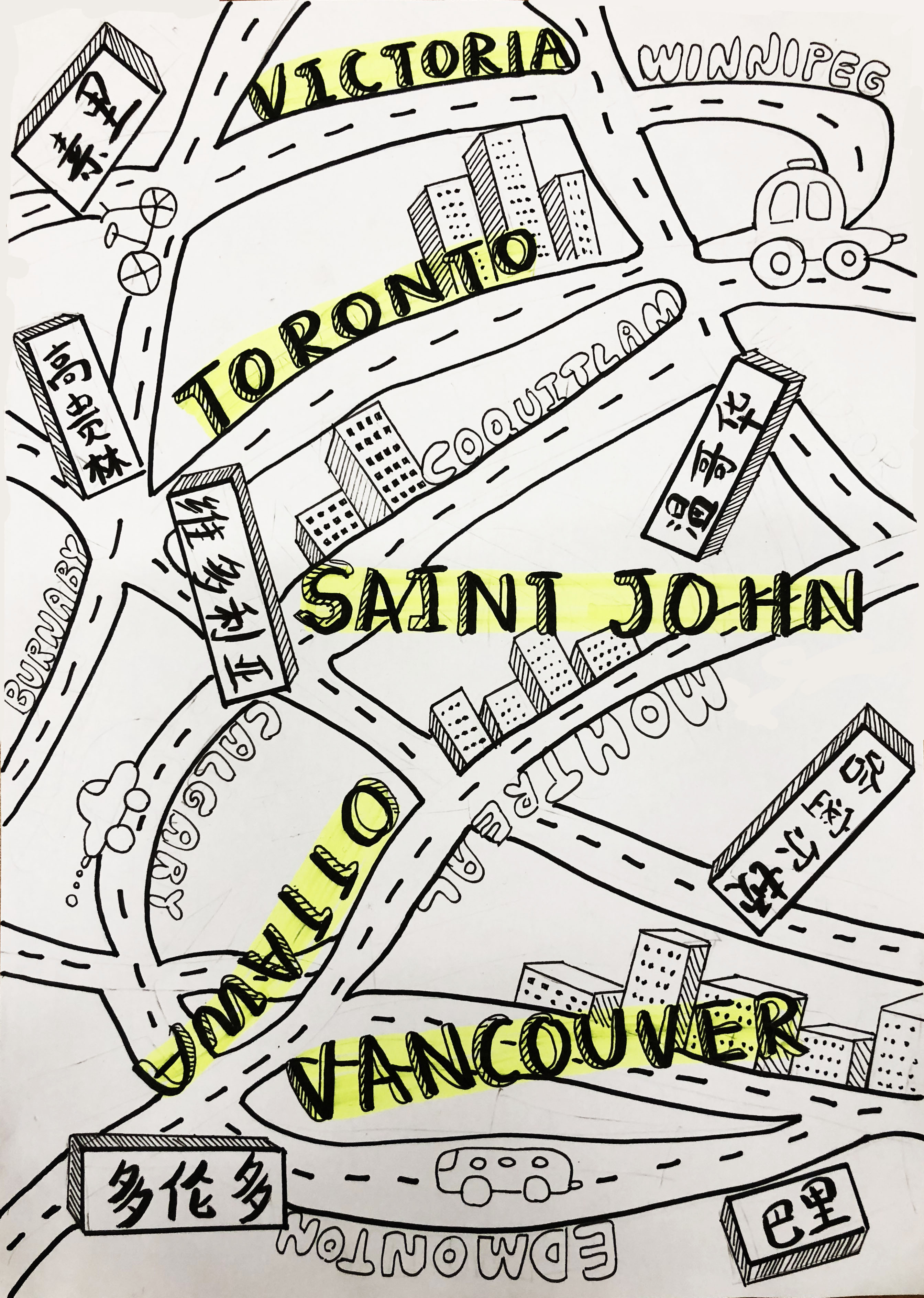
3. This will be mapping road of China, I want to just use words to fill up the whole space. 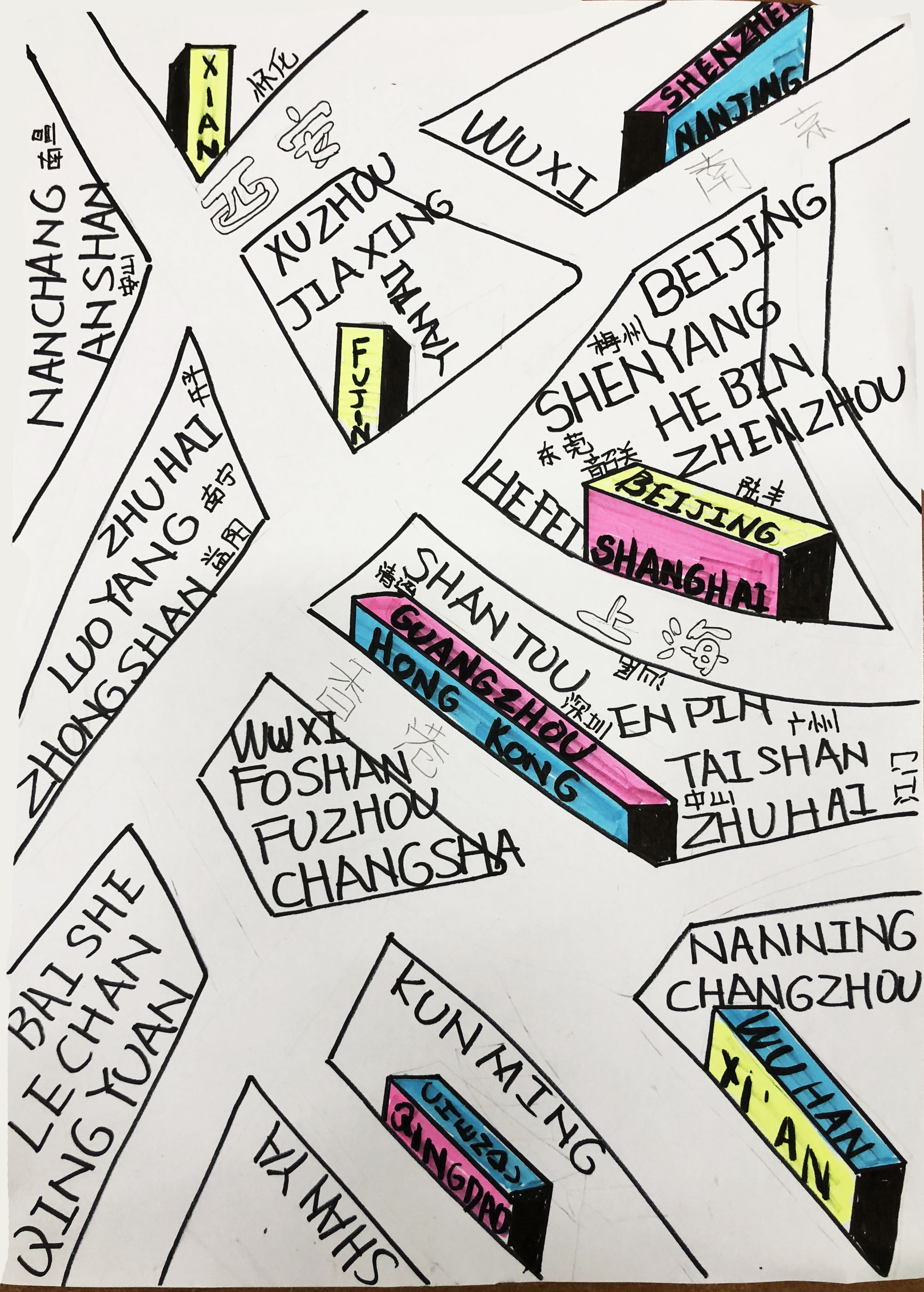
March 2, 2018 at 6:17 pm
I really like the mess and chaos in Comp 1 it underlines the restless quest to find the right place to live/ rest. You can maybe take a look at the picture “Relativity” from Escher and try to apply some ordered/ structured chaos/ mess to your composition.
March 9, 2018 at 4:29 pm
Hello! I agree that the first one has a more interesting composition; the chaos conveys the absence of sense of belonging better than the other two. It kind of reminds me of the movie Inception where the architect Ariadne controls her own dream for the first time. (linked a short clip below!)
I think it’s also more interesting to use buildings and landmarks instead of too many signs/letters to show instead of tell 🙂
https://www.youtube.com/watch?v=7yshUmxuEjE
March 12, 2018 at 10:35 am
Heya! :>
I do like the composition 1 as the typography feels well-placed and interacts well with the map concept. I also find that the main three lights in the middle is a really nice focal point. If you are using the same colours for the circles around it, maybe you could consider making them smaller or desaturating them or other ways to make them more subtle, as compared to the main center traffic lights.
Additionally, you could play up/down the sizes of things because as of now, although the sizes of the circles and the fences are already sliightly different, you could exaggerate the difference even more to add contrast which will lead the viewers’ eyes around the composition better! 🙂 Because as of now my eyes dart around the composition restlessly (which may be what you’re aiming for to evoke confusion, I’m not sure?) But what Jan pointed out with MC Escher’s work is a great point; it evokes the sense of endlessness and confusion and yet there is a strong triangular composition (for ‘Relativity’) that leads the eyes around the composition.
Perhaps you could even render the street signs or the typography in different manners to highlight the different places, but this is at your discretion because it might disrupt the rhythm too much. So it’s up to you!