Empathy
Interview Questions
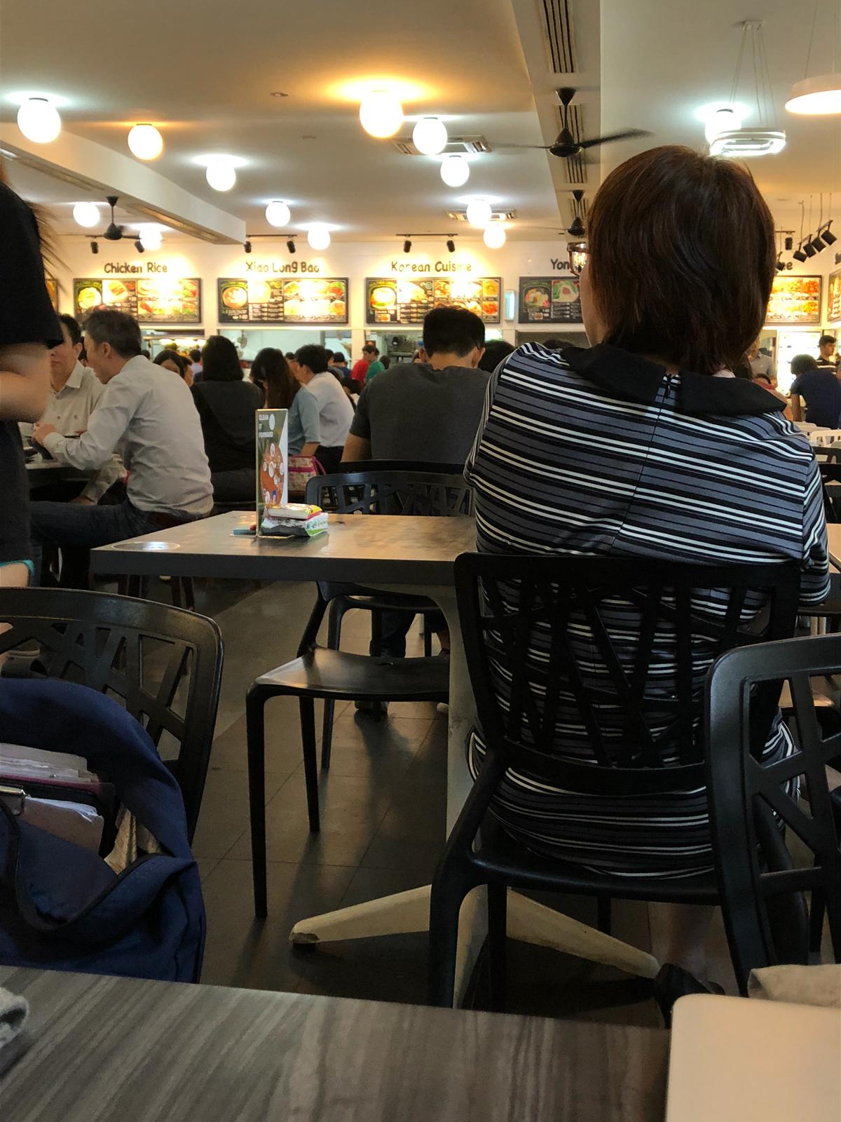
1. Where do you usually eat in campus?
2. Why do you eat there?
3. Who do you eat with?
4. What do you usually eat and why?
5. What time of the day do you eat?
6. Walk me through your eating experience from the minute you decide you have to eat something to actually eating.
7. What is your favorite food around campus?
8. Tell me about your best eating experience in school.
9. Tell me about your most frustrating eating experience in school.
10. Tell me about your most embarrassing eating experience in school.
11. Do you have any dietary preferences?
Interview Insights
- NIE canteen is closed early, even though the food is liked by many.
- Limited halal options, usually McDonalds or KFC.
- Many vegetarian options available.
- Most students that we interviewed mentioned that they usually eat with friends and don’t like eating alone because it’s “awkward”.
- Most students really cared about the food quality and three respondents mentioned that they won’t mind paying more to get better quality food in NTU.
- In relation to what students feel is a good eating experience: 1.Friends, 2.Convenience, 3.Environment, 4.Price
- Many are frustrated by the lunch crowds, queues, and difficulty in finding seats.
– We narrowed our focus down to two themes, the social aspect and the environment. Eventually, we chose to focus on the environment as eating alone is not really a problem, as it is a personal choice.
Online Survey
We first conducted an online survey with 34 respondents.
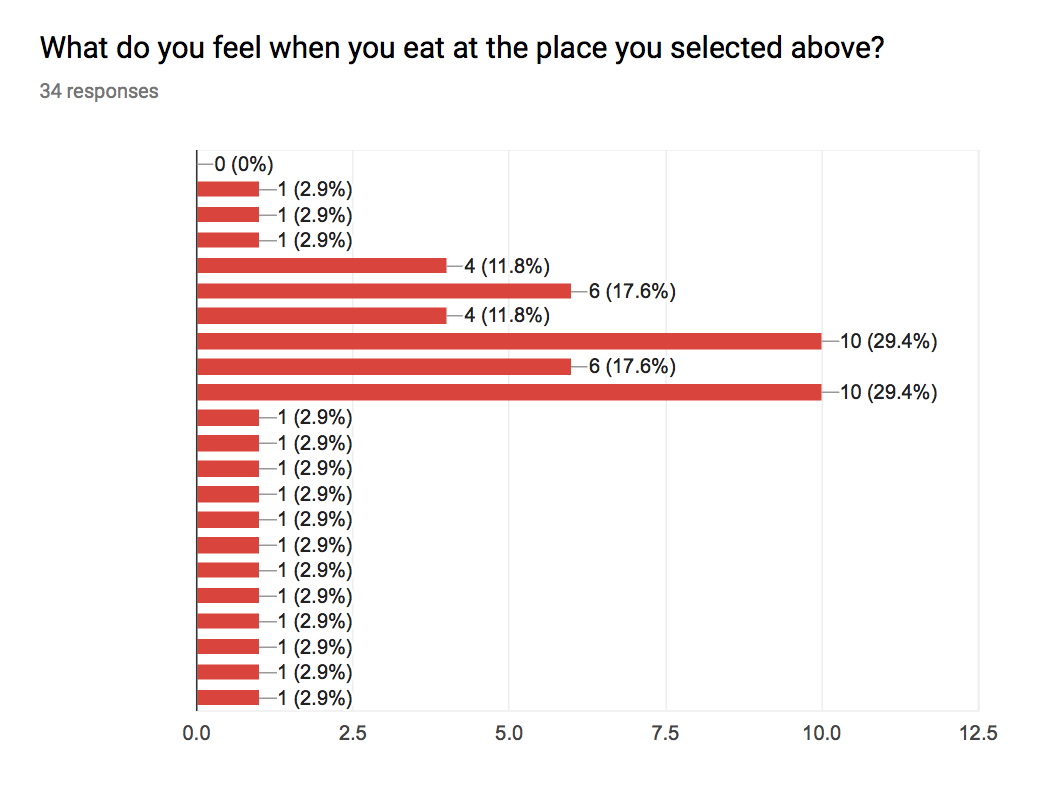
When asked about how they feel when they eat at their worst eating environment, 30% said they felt worried and anxious, 18% felt anger and sadness.
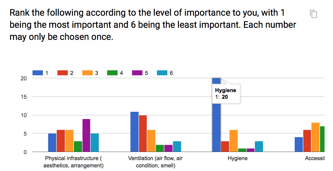
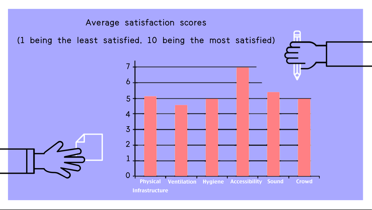
20 respondents ranked hygiene as the most important factor for eating environments, among 5 other factors including the physical infrastructure (aesthetics and arrangement), ventilation (air flow, air condition, smell), sound (noise level, music), accessibility and crowd.
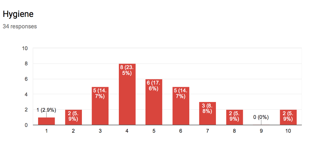
The respondents are not very satisfied with hygiene levels in their chosen environment, with most respondents choosing 4 out of 10 in terms of satisfaction. (The second least satisfied factor).
Secondary research
To further validate the importance of our project focus, we did some secondary research as well.
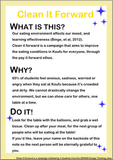
According to a study conducted in a University in China, the quality of food service (food, service, environment) not only directly relates to students’ health, but also have an impact on students’ mental attitude, happiness, learning effectiveness and influences students’ overall satisfaction with the school (Binge, Xufen, Guoying, Chunyue, & Tingting, 2012).
Define
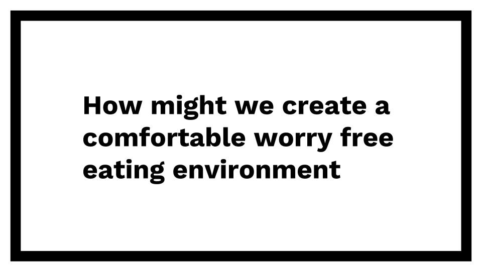
How might we create a comfortable and worry-free eating environment?
Ideate
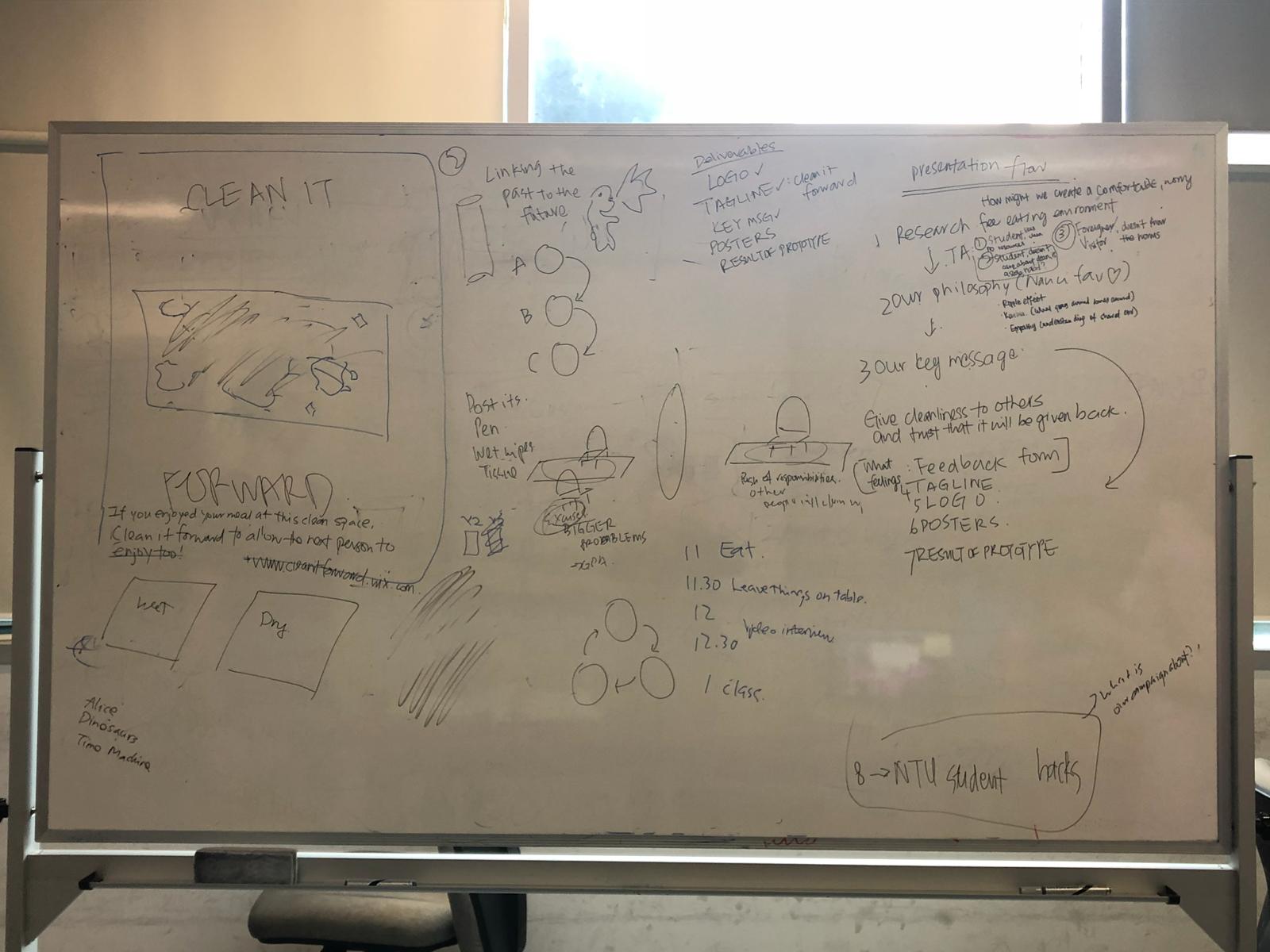
After rounds of discussion, brainstorming and help from our classmates, we came up with 3 ideas to tackle the how might we statement.
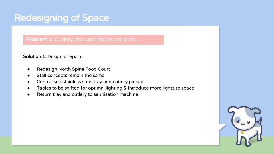
Idea 1: Design of Space
Problem: Cutlery, tray, and tables are dirty
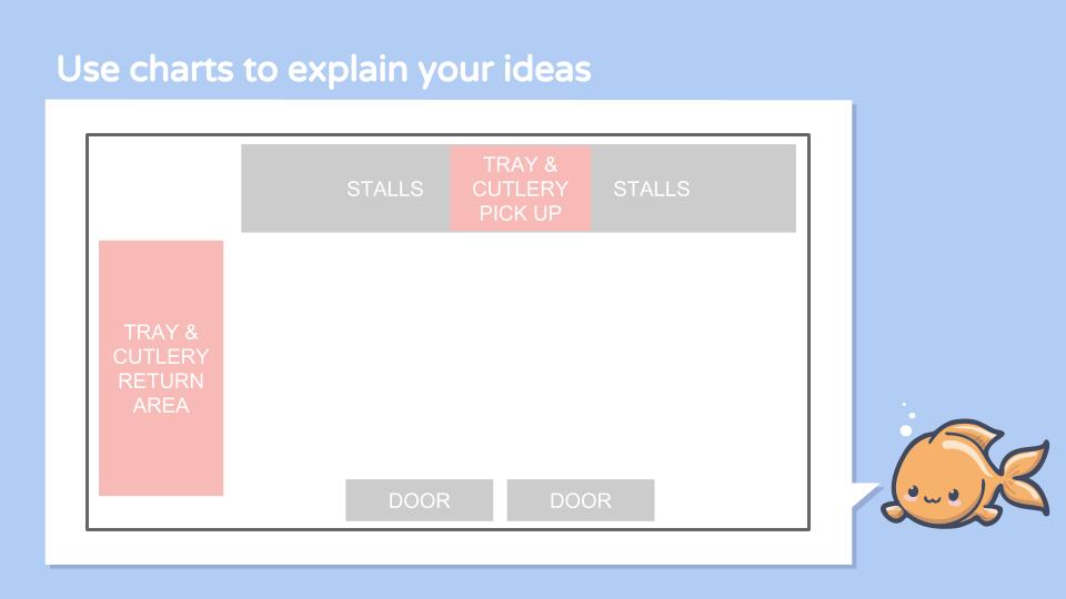
An implementation could be a redesign of the North Spine food court, for example.
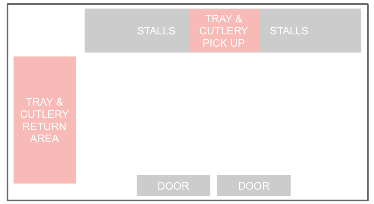
The 4 main change would be:
- The addition of a centralized stainless-steel tray and cutlery pick-up station
- The trays and cutlery will be sanitized at high temperatures and UV exposure
- The process and material gives the perception of a high degree of cleanliness
- To optimize lighting in the area.
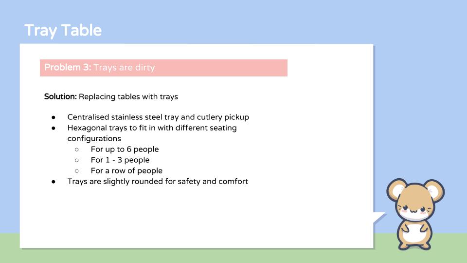
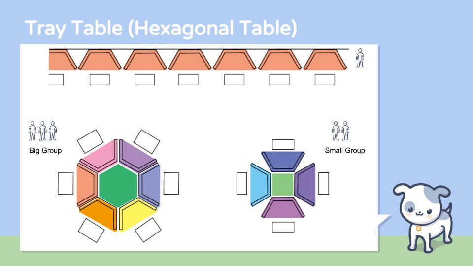
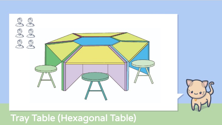
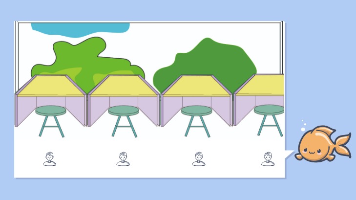
Idea 2: Trapezium tray-tables
Problem: Dirty trays
This is a development of the previous table/tray concept from the first ideation stage.
The concept was to have a tray-table system where the table top was replaced by a removable tray. This meant the tables could never be dirty since there no longer would be tables – essentially removing the problem.
Trays will be shaped into a trapezium to form different seating arrangements. Additionally, a centralized tray and cutlery pickup stations could be implemented where trays and cutlery are stainless-steel and can be sanitized.
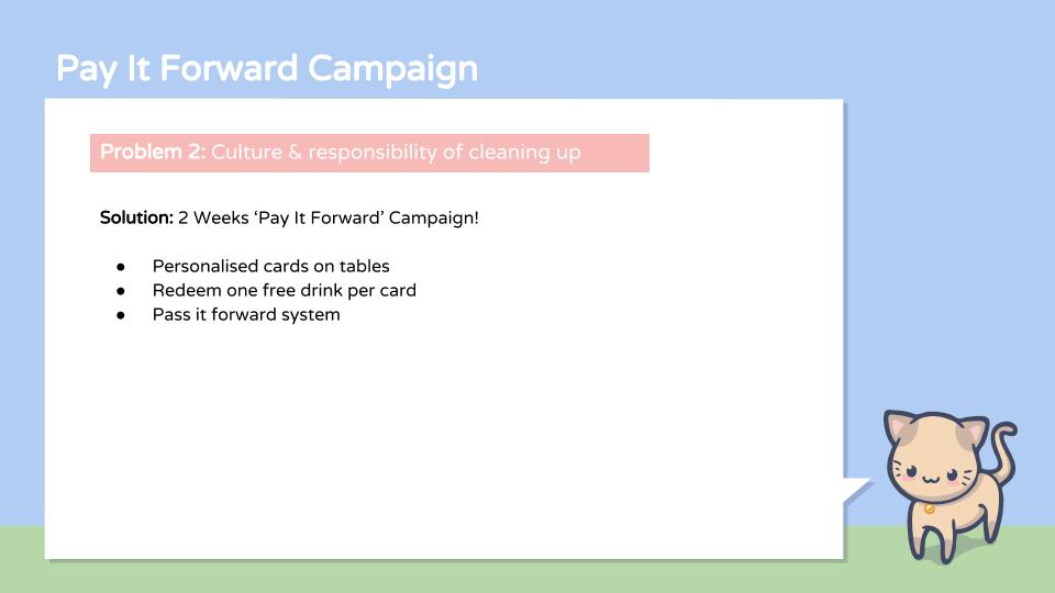
Idea 3: ‘Pay It Forward’ Campaign
Problem: Culture and responsibility of cleaning up does not currently exist
Our solution to this problem is to create a culture where patrons are responsible for cleaning the table after themselves.
We thought we could do this campaign through the concept of “paying it forward”.
In order to incentivize patrons to clean up for the next user, we could
(1) recognize these responsible users
(2) reward responsible users with coupons that could be redeemed for drinks at the canteen.
The Chosen Idea
We decided to go with idea 3, because the physical space could be changed, but without the changing of mindsets, these physical spaces have a chance of remaining dirty nonetheless. What we needed was to change the mindsets of the users, which could be tackled by idea 3.
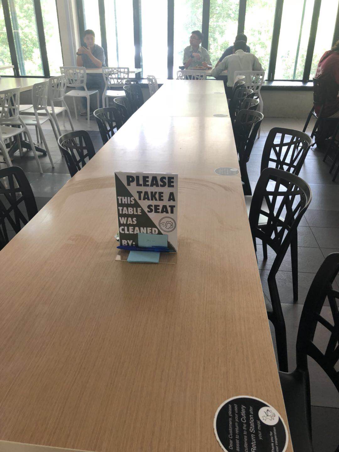
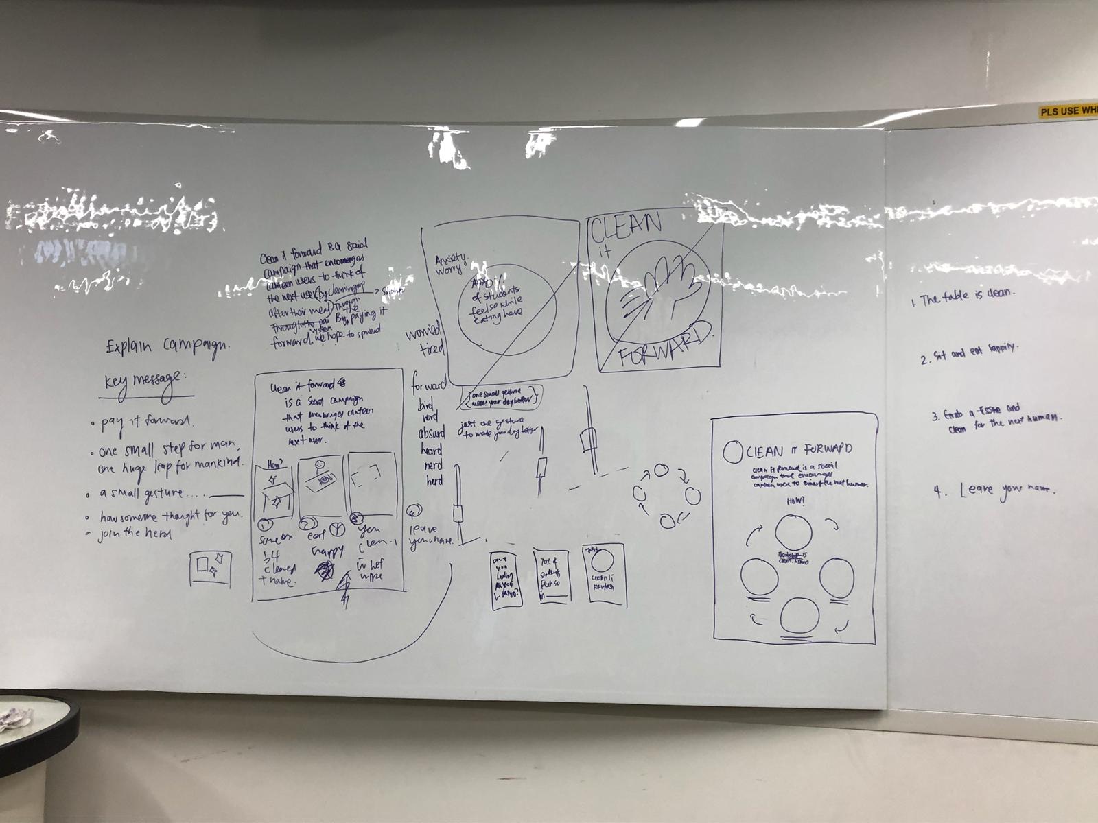
Prototype 1
During this stage, we designed signs, a campaign poster, and a plan for testing
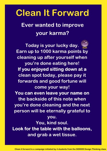
How it works
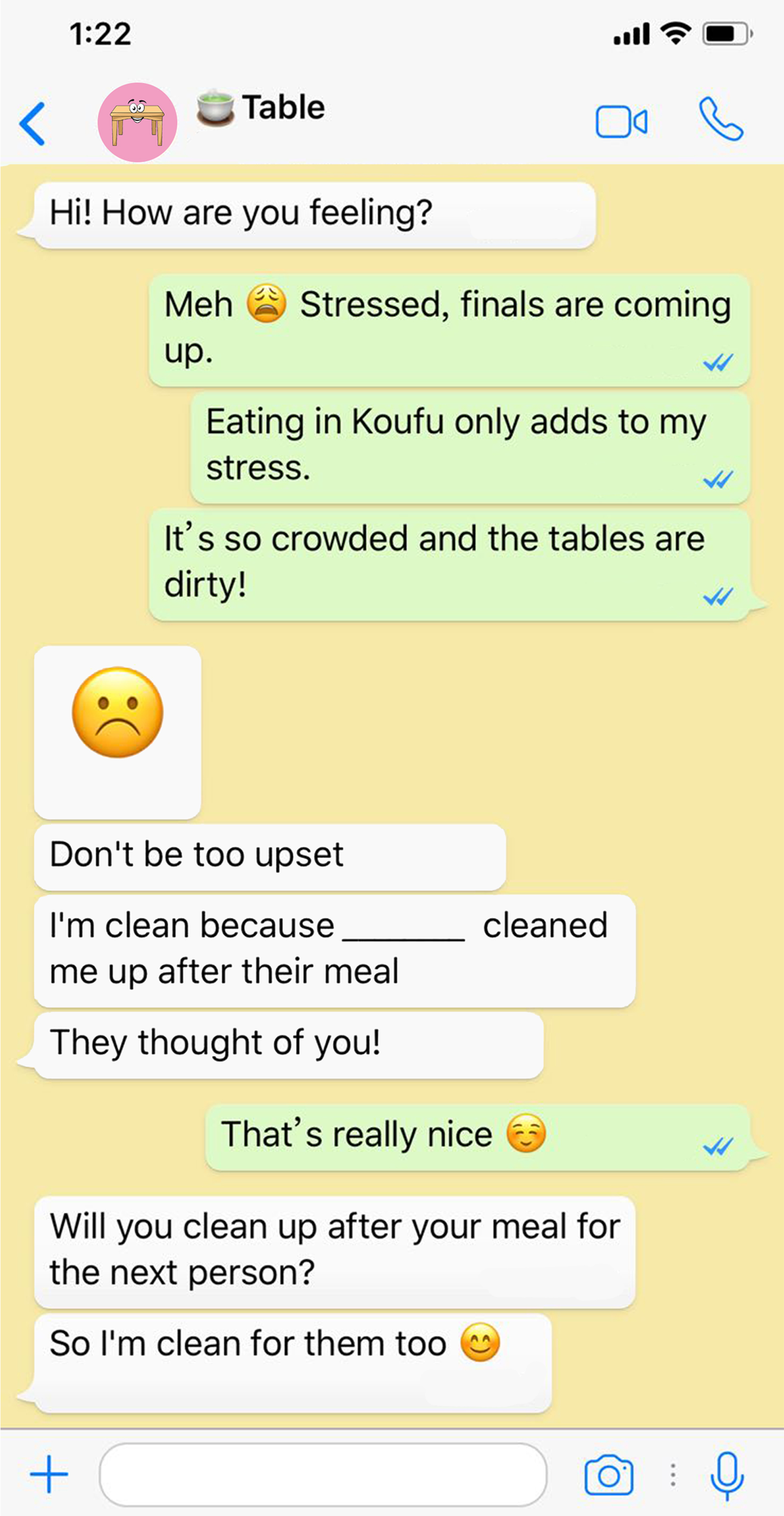
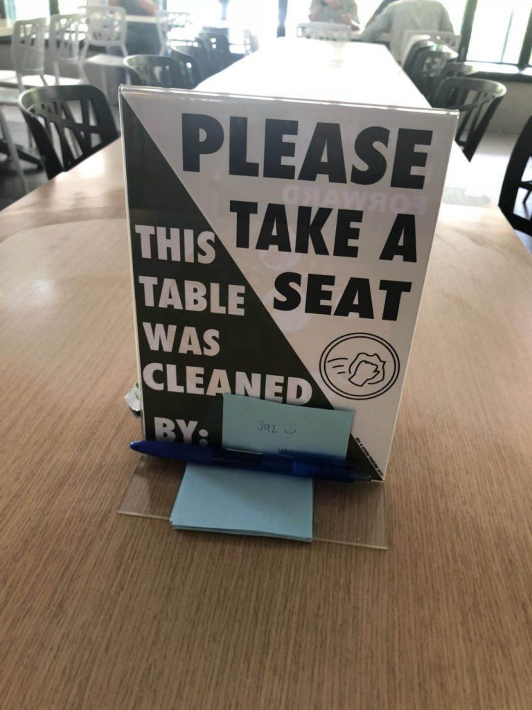
As a user approaches the table, she sees A5 table signs.
The sign encourages and prompts her to clean up after she is done.
There are directions on where she can get cleaning materials.
She gets her food, eats, and then looks for a table with a balloon.
She walks over and grabs a cloth to clean up her table, keeping the table clean for the next person.
She writes her name.
Then, she returns her tray.
Design & Copy of Signs
The front side of the A5 table sign aims to encourage patrons to clean up after their meal. We came up with two different approaches: First, playing on the concept of karma. Second, making the user interact with the ‘table’ through the WhatsApp chat.
The back side of the A5 table sign aims to communicate the purpose of the campaign and the instructions on how to get the cleaning supplies.
Prototype 2
We moved into prototype 2. We felt we had to understand our users better.
Basically, there are two types of people: Those who clean up after themselves and those who do not clean up after themselves. For people who don’t, they leave a place as how it was when they came or dirtier than before.
We came up with the following possible reasons as to why they choose not to:
- They don’t feel responsible and have the impression that the aunties will clean up for them.
- No one appreciates their effort even if they cleaned up, and no one would catch them if they left the space dirty. There is a sense of indifference about cleaning up.
Thus our mission is to change the second type of person to the first.
We also created personas to categorize the main audiences for our campaign.
Personas
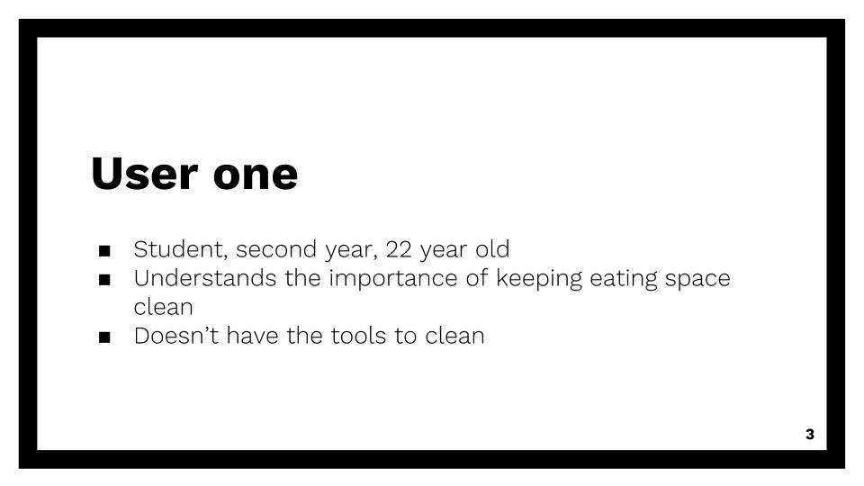
User One
-
- 22 year old, second year student in NTU
- Understands the importance of cleaning up
- But doesn’t have the supplies to clean
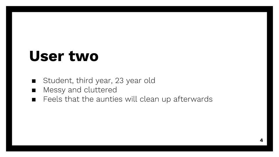
User Two
-
- 23 year old, third year student in NTU
- Messy and cluttered
- Feels that aunty will clean up after him
- Out of sight out of mind?
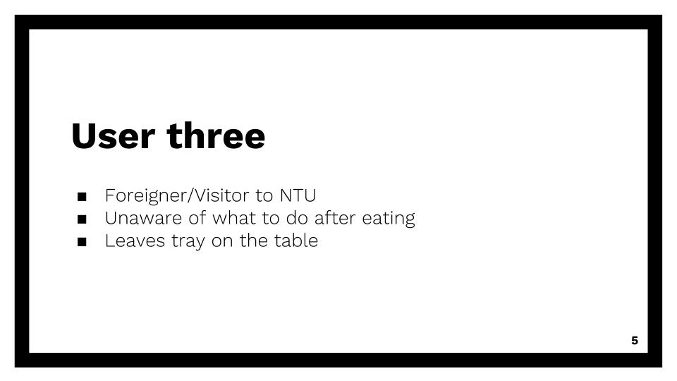
User Three
-
- Foreigner or visitor in NTU
- Unaware of what to do after eating
- Leaves tray on the table
We then asked ourselves two questions:
Q1. Assuming that our target audience is greedy and only does things ultimately for their own benefit. How can we make the connection between doing this action of cleaning and self-benefit? How can we make our campaign appeal to our audiences such that they will participate?
We brainstormed three underlying driving human truths:
- People want to be perceived as good people
- People will do well if they hold the belief that they will receive well in return
- People desire recognition for doing good
- We translated these truths into action points for our prototype 2.
- For point 1, since people wanted to be perceived as good people, we decided to choose positive framing over shame or guilt to drive the message.
- For point 2, we used the pay it forward system, such that they are already receiving the benefit before they do the good deed, and might pay it forward to the next person.
- For point 3, since people needed recognition for doing good, we incorporated their names to be written down on our signs.
Q2. What is the key message of our campaign and what is it grounded in?
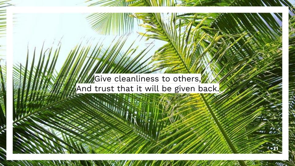
Key message of our campaign: Just one small gesture, can make your mood better
Three concepts we wanted our campaign to be grounded in:
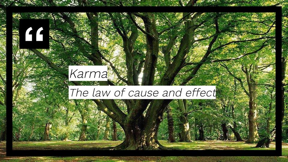
- Karma – the law of cause and effect
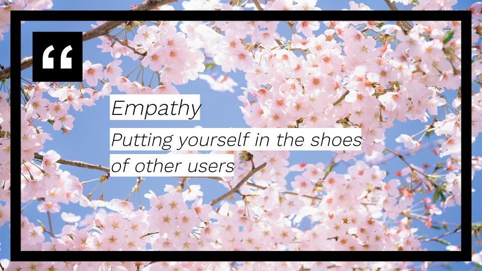
- Empathy – putting yourself in the shoes of others
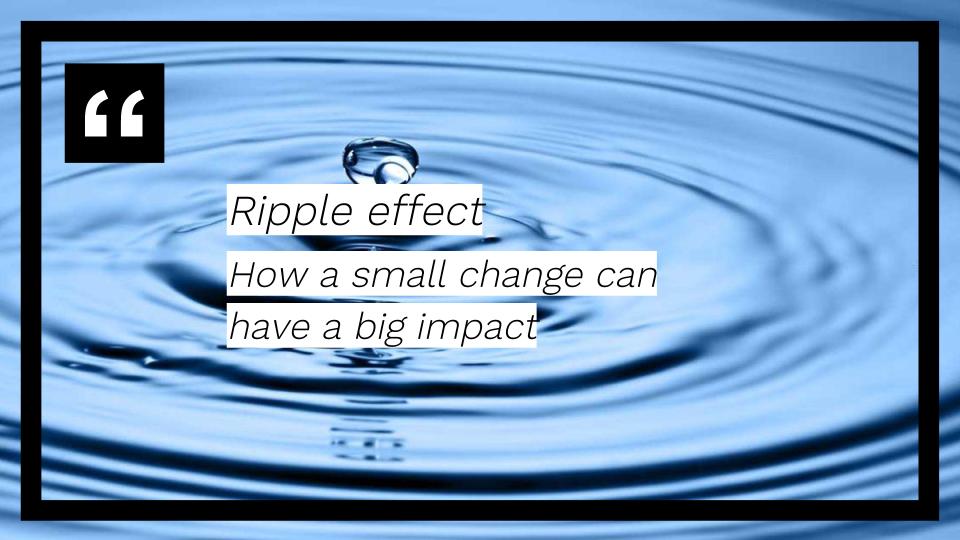
- Ripple effect – how a small change can have a big impact
-
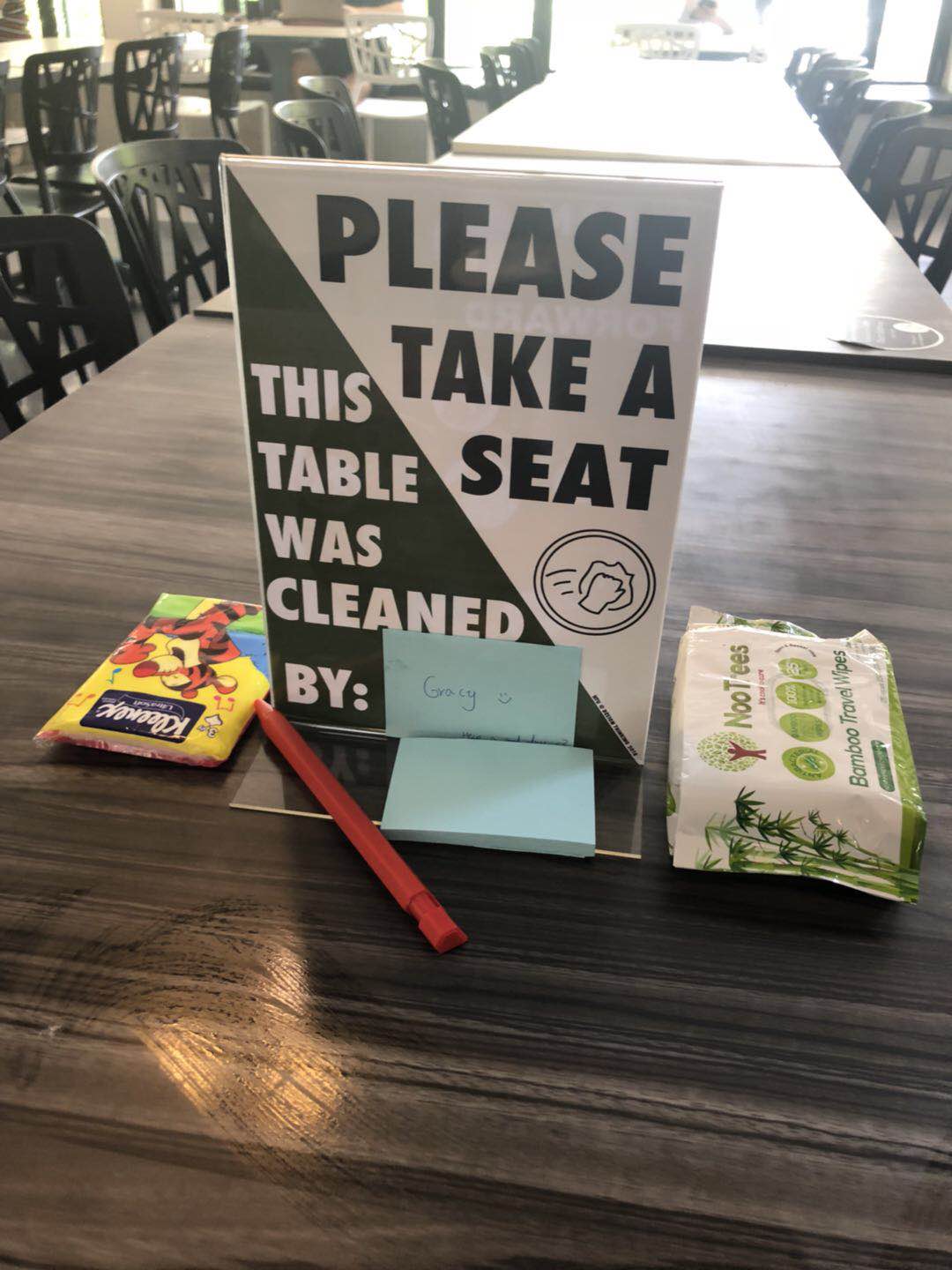
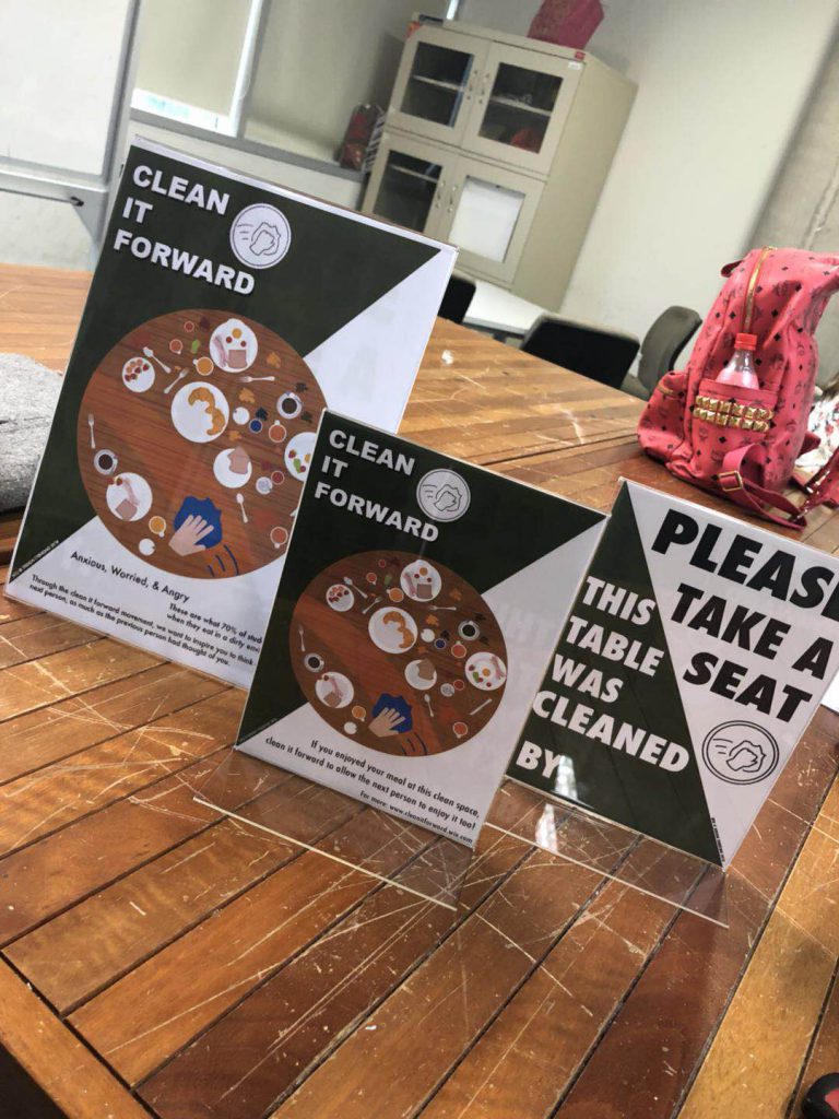
Design & Copy of Sign
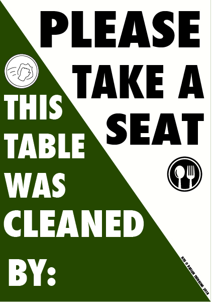
- As compared to prototype 1, we cut down most of the words to make it as easy and appealing for patrons to read and understand. On the front side, the top half of the sign is used to inform patrons to “please take a seat”. This is to prevent people from the misunderstanding that the tables are reserved or “chope-d”.
The second half states “this table was cleaned by:” followed by a little space, meant for patrons to stack their post its with their name on it. This idea of of stacking on a pile of post its with the patrons names is to enhance the visibility of this campaign. It touches on two of the underlying human truths mentioned earlier: that people want to be perceived as good people and that people desire recognition for doing good. This achieves both goals. Furthermore, establishes the connection between the current user seated at the table and the previous user. The current user that reads and understands that someone before him/her had cleaned the table will feel appreciative and will be more inclined to do the same for the next user.
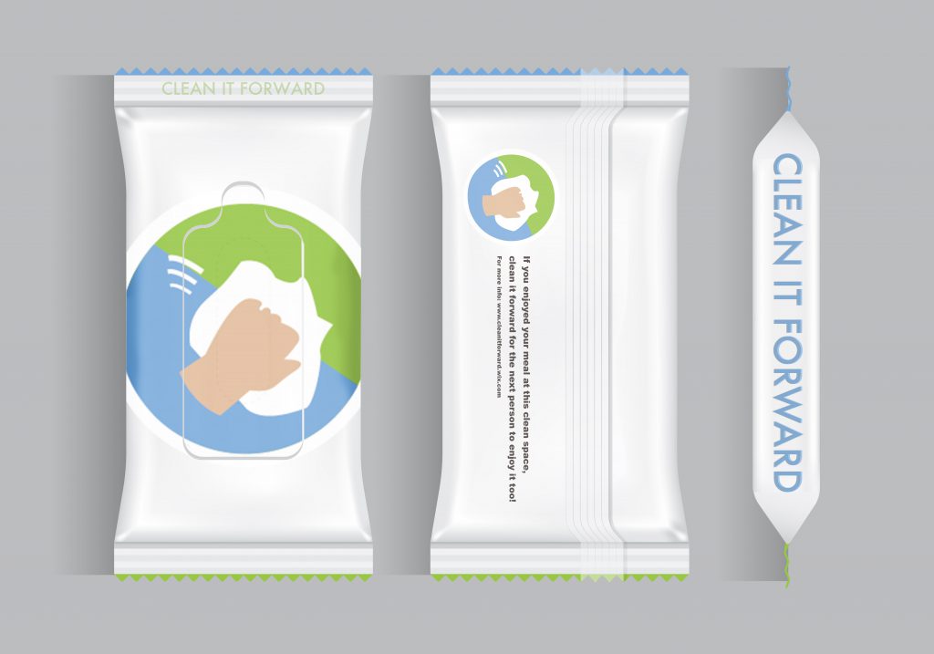
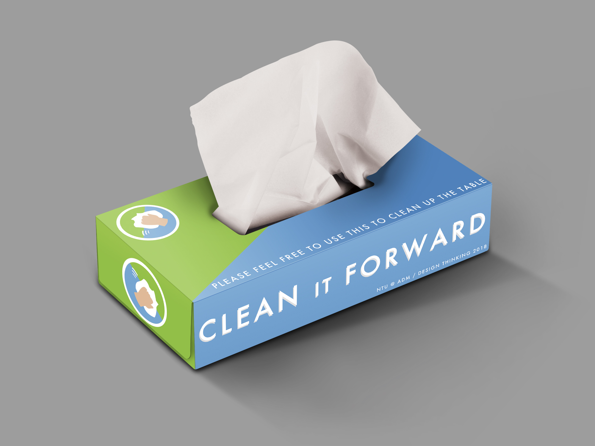
On the back side, instead of having a huge text explaining our campaign, like what we did previously, we summarised it into one graphic and a single sentence. The graphic captures the essence of what we would like canteen users to do – to clean the tables after their meal.
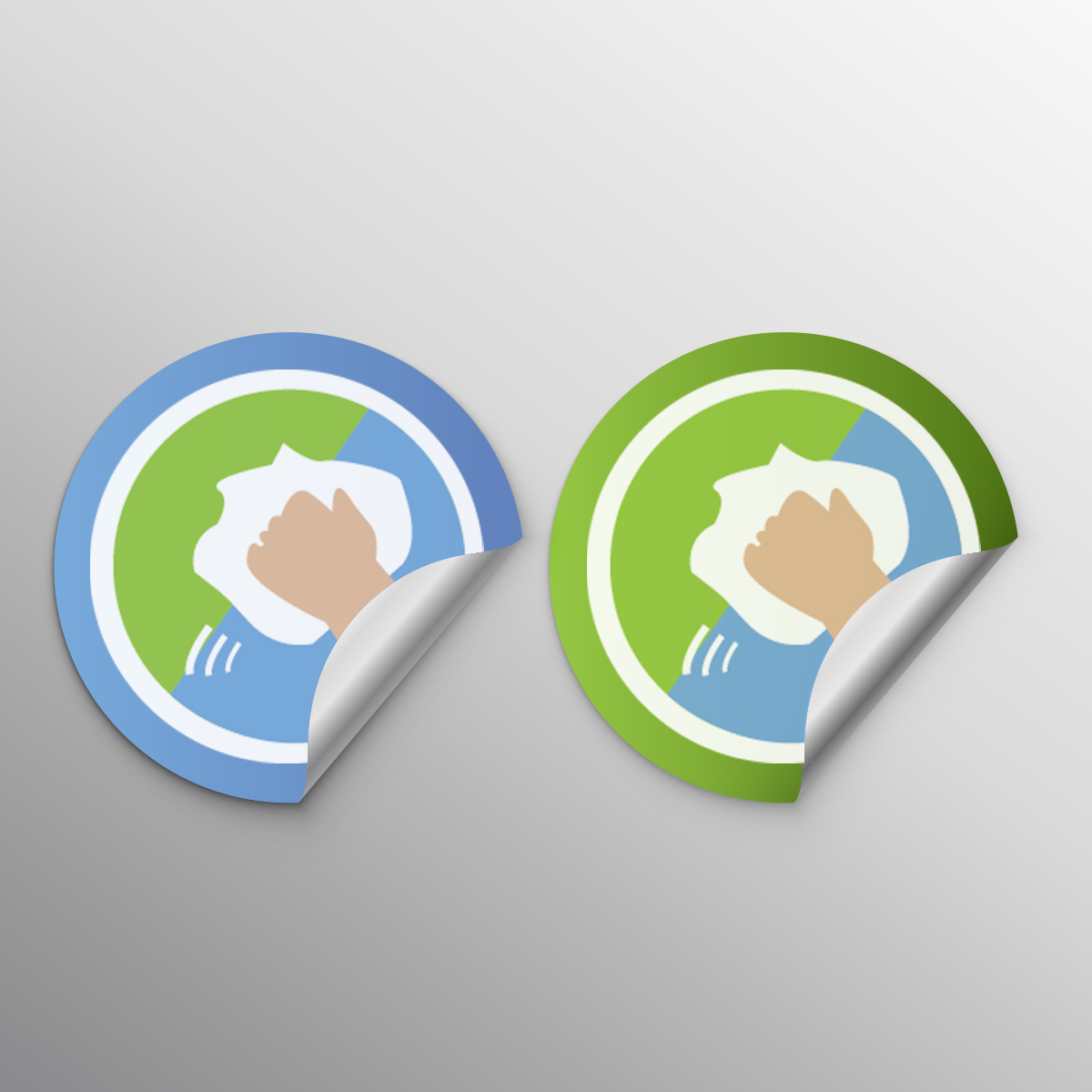
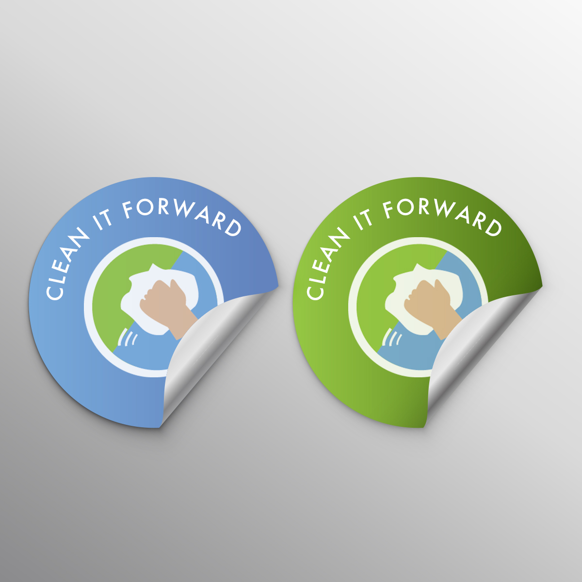
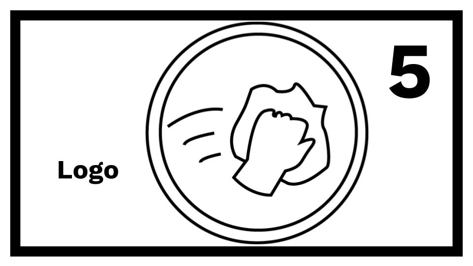
The signs make use of a diagonal colour split design to make it more eye-catching. Green and white are chosen as those colours have a greater association to the concept of ‘clean’. We also created the logo, a simple black and white image of a hand wiping with a cloth.
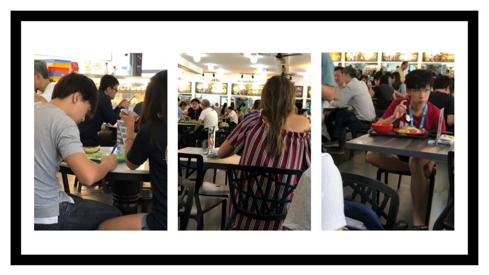
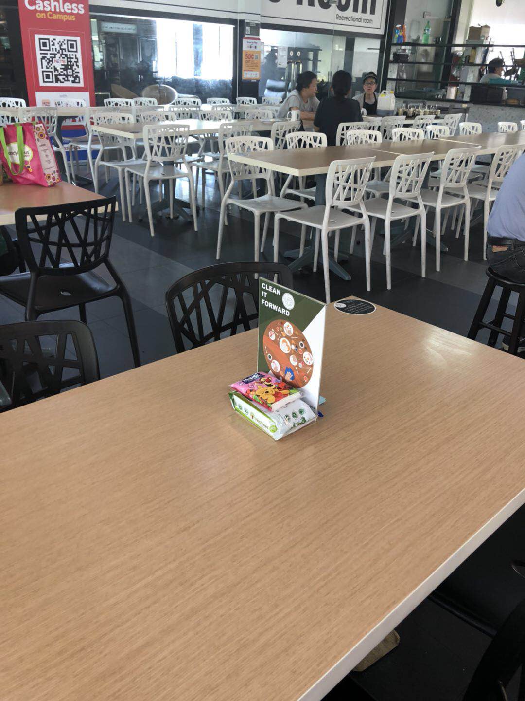
Test
Finally it was time to put our prototype to the test! Our location for testing was Canteen 2, during the busy lunch hour. We put out three sets of signs and wipes and observed patrons reacting and interacting with our prototypes.
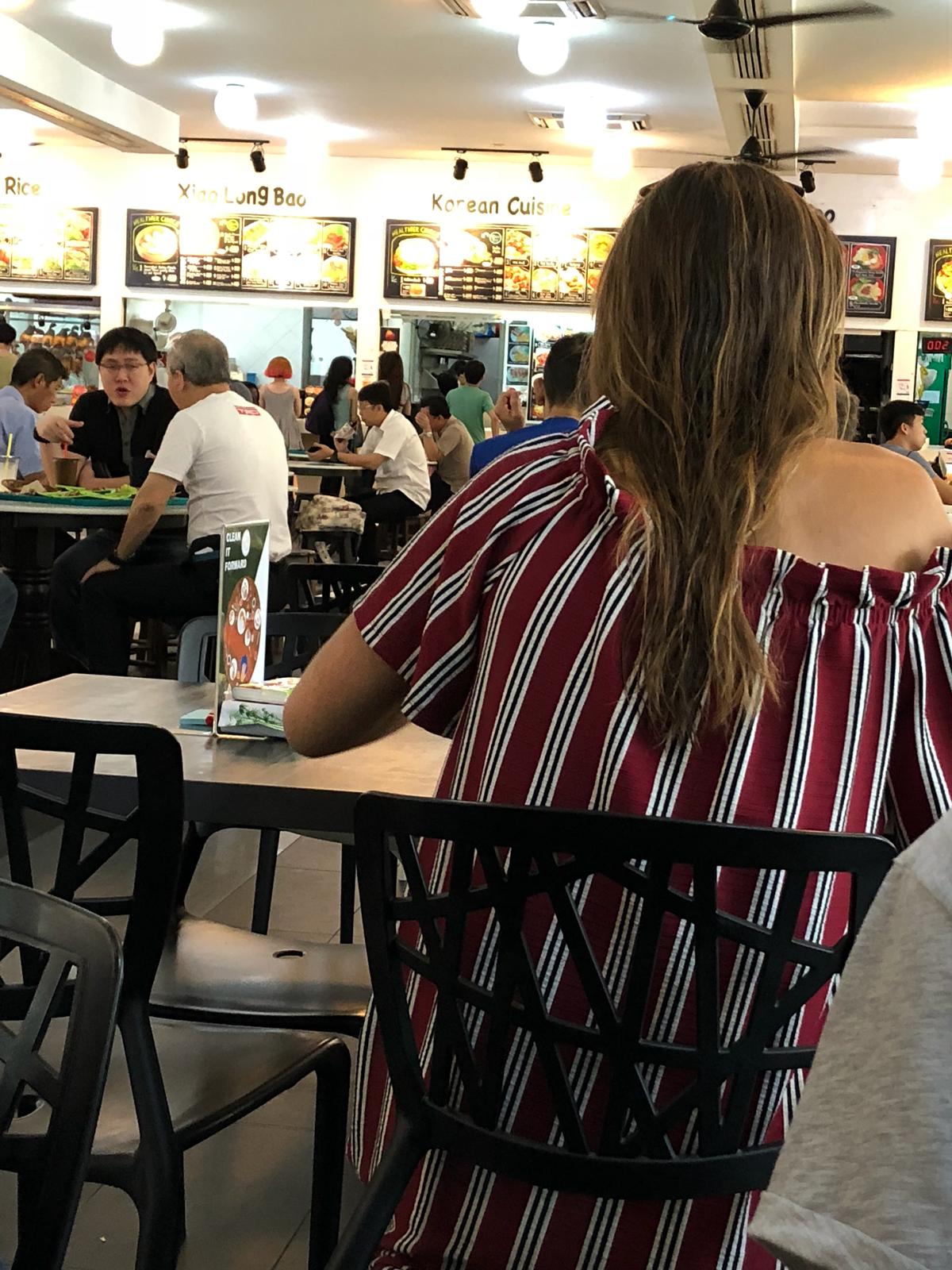
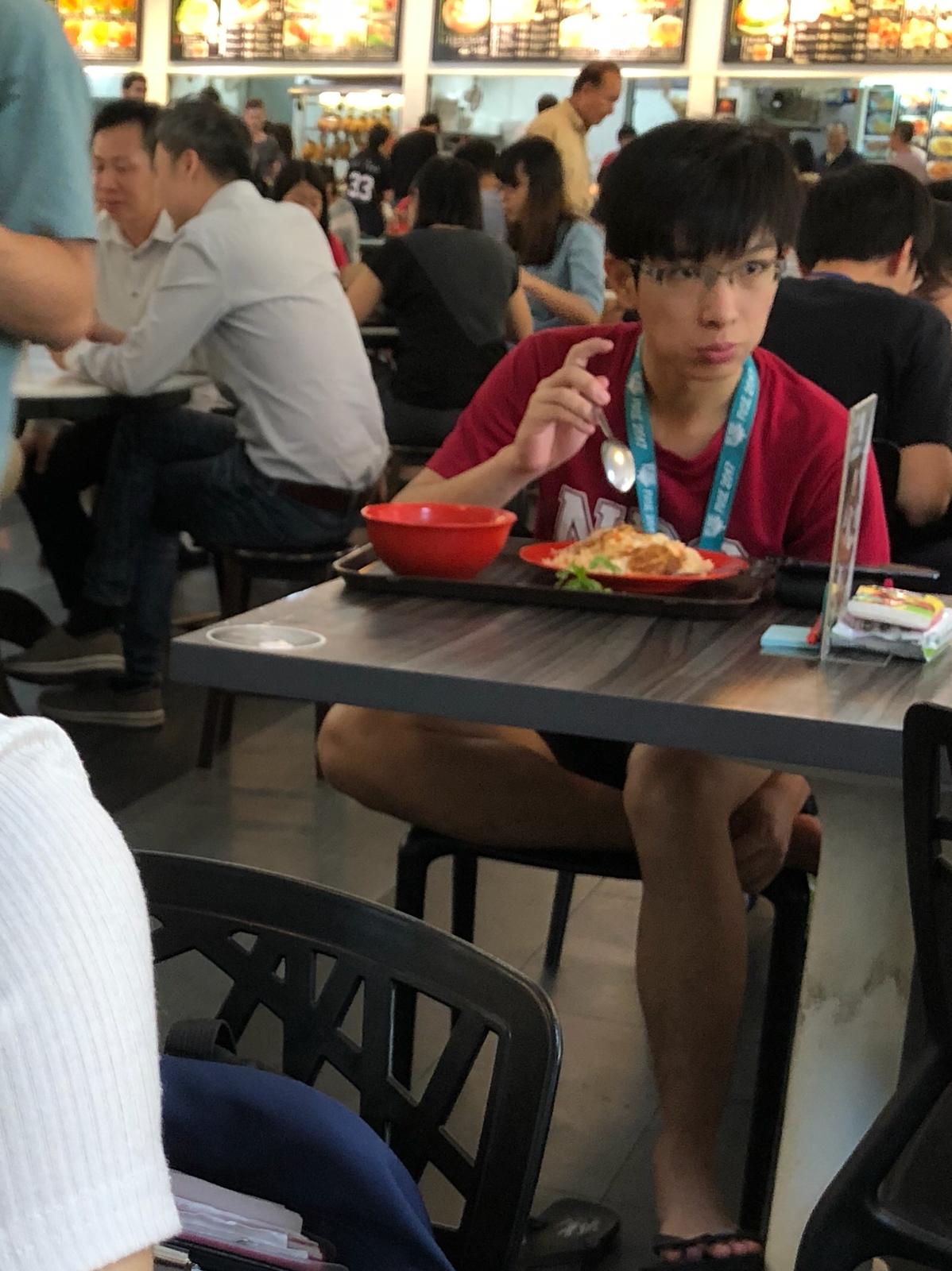
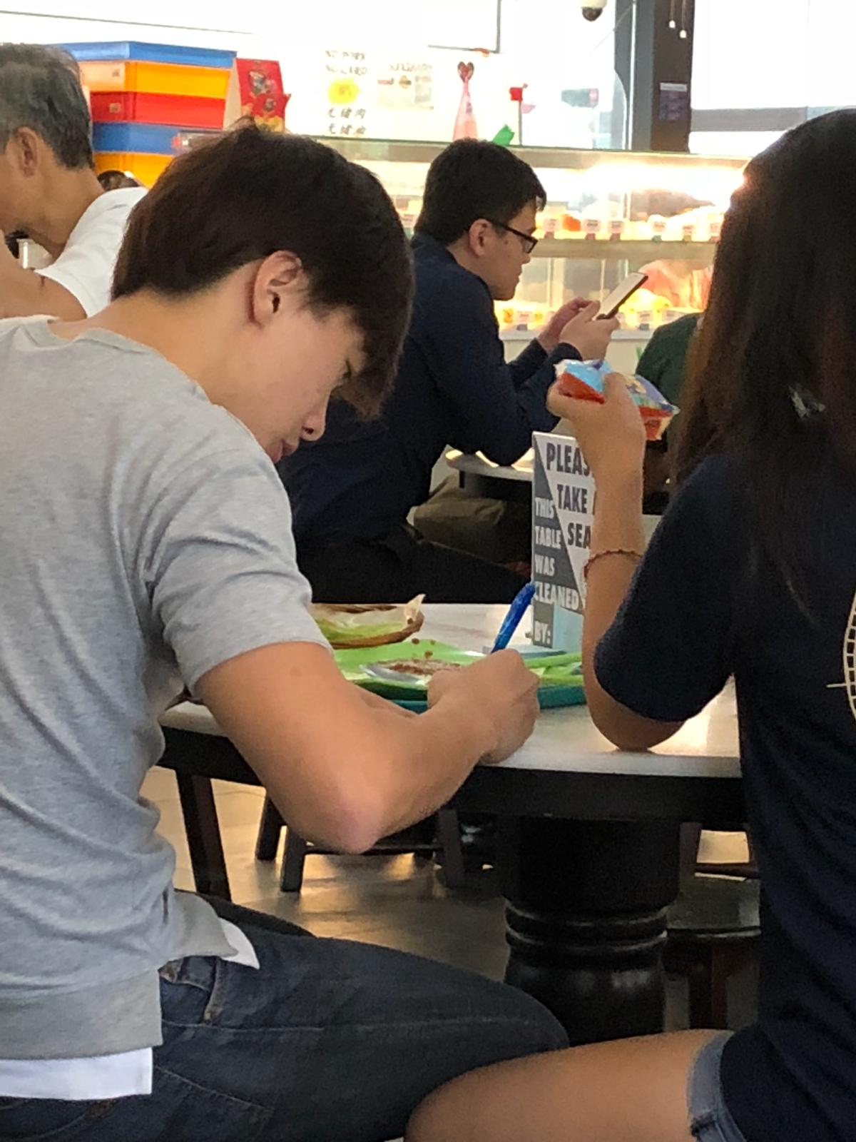
Results
All participants, except one local male student, took interest in reading the signage and also made use of the supplies to clean up their tables after the meal.
Feedback from participants
Additionally, we surveyed those who had interacted with our signs after their meal to gather insights on the effectiveness of the campaign and areas to improve in.
- Did you clean up after your meal? Why?
- What do you understand from the message we are trying to convey through this campaign?
- Are you more inclined to keep the eating environment clean now?
- How do you feel about eating here knowing a fellow patron cleaned up for you?
- How did you feel when you cleaned for the person after you?
- What would make you more inclined to clean after your meal?
In general, all the participants understood the messaging and the purpose of this campaign. A common initial misconception among the locals is that the signs and tissues seemed to signal that the table is reserved. But they quickly realize that it is not the case as they see that a few other tables have the same sign.
Participants mentioned that they thought this was a great initiative and that it “feels good” knowing that someone before had cleaned up for them, and that they cleaned up after themselves for the next person – “it’s like taking care of people”.
The only participant who did not clean up seemed nonchalant and indifferent about the campaign. He did not seem to understand the messaging thinking that “it was some CIP instead of encouraging us to keep it clean”.
Things that could be improved include making the wording and design of the signage more “fun”. The wording could also be more clear-cut – the group of middle-aged NTU staff did not fully understand the purpose of the post its.
Prototype 3
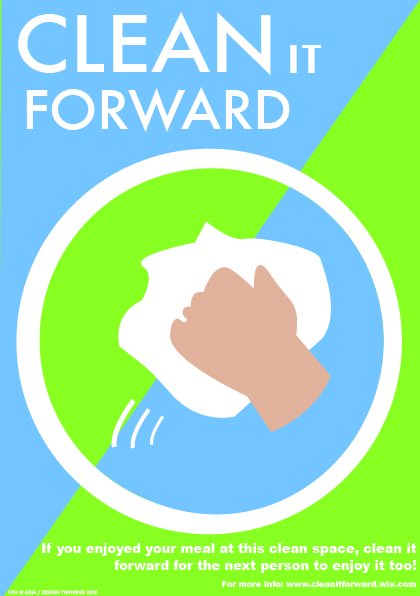
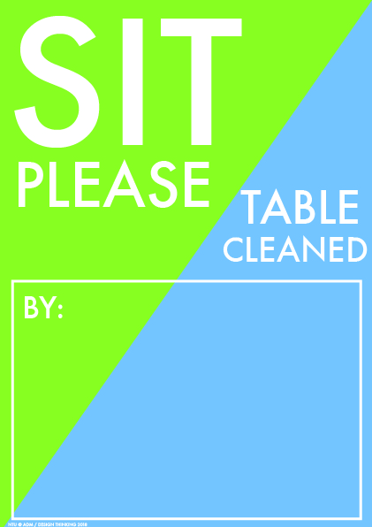
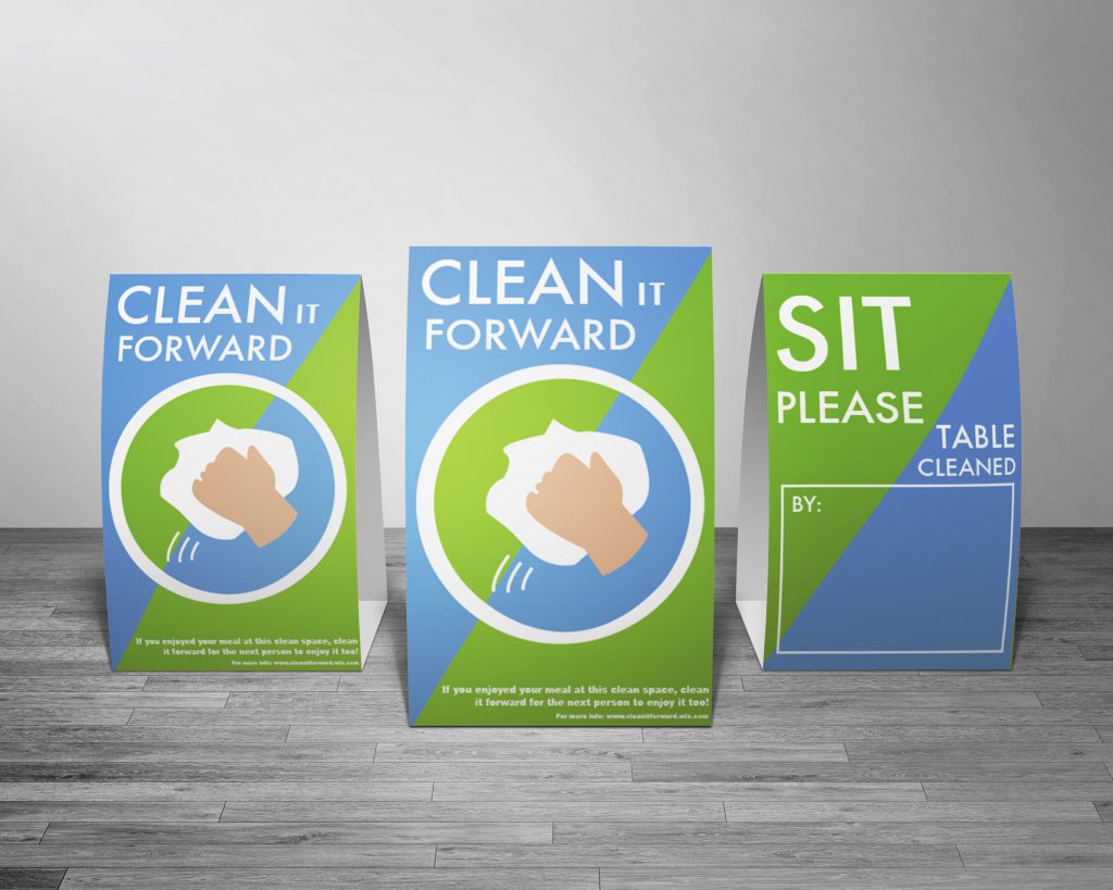
A5 Table Signs
Based on the reactions of our participants and feedback from the class, we made the following key changes:
- Text:
- More obvious it’s not a ‘reserved’ sign
- More concise wording
- Graphical design:
- More fun
- More comprehensive
- Add diagonal in the logo
- Consistent colour scheme
- Put hand and cloth at diagonal and make “clean it forward” bigger
- Clean up the table
One of the largest problems our prototype sign faced was being confused for a “Reserved” or “Chope” sign. To address this, we chose to change the wording. Previously the signs said “Please take a seat”, spanning 3 lines. We hypothesised that because reading the complete phrase (3 lines) was required to understand the message, patrons were unable to tell what the signs meant at a glance. To correct this, we tried to use fewer words and place the most important words at the start of the phrase. Our new phrase is “Sit please” and spans only two lines. This way, hopefully patrons will know it is okay to sit, with only a glance at the sign.
Secondly, to make the signs, and campaign as a whole, more fun, we decided on a more bright and vibrant color scheme. The idea behind this is to instill positive emotion and to make the signs more inviting. Additionally, the color scheme needed to appear ‘clean’, so as to compliment the theme of the campaign. We experimented with different tones of blue, orange, and green, eventually deciding on a blue/green/white combination.
It was suggested that we make the campaign more comprehensive. We addressed this by coordinating the color scheme across campaign items and attempting to create the similarity between signage and the campaign logo. The diagonal color split design of the signs from our second prototype was well received, so we chose to keep this design element and tried to incorporate it into the logo as well. We did this by using the same diagonal color split as the background of our existing logo. Additionally, we replaced the table imagery in our signs with an enlarged logo. This has the appearance that the logo itself is a table being wiped clean. The diagonal in the logo and the sign backgrounds meshed well together to create a very coherent look.
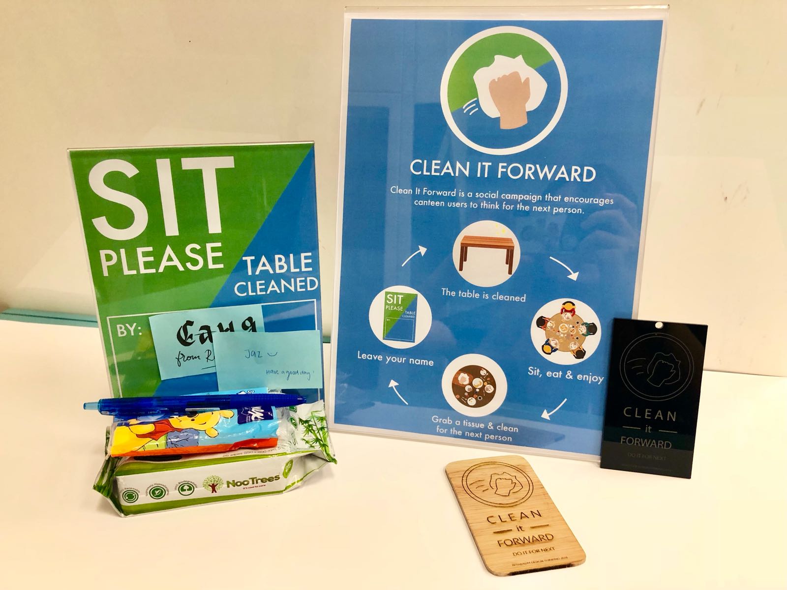
The system where sticky notes were left behind as a message for future patrons was kept because we believed it shows that many people have cleaned the table, which should inspire patrons to clean it again after themselves. We made the instructional wording more concise, changing it to “Table cleaned by”, followed by a box indicating where to paste sticky notes.
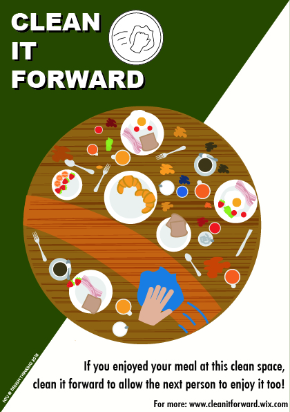
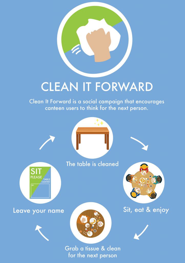
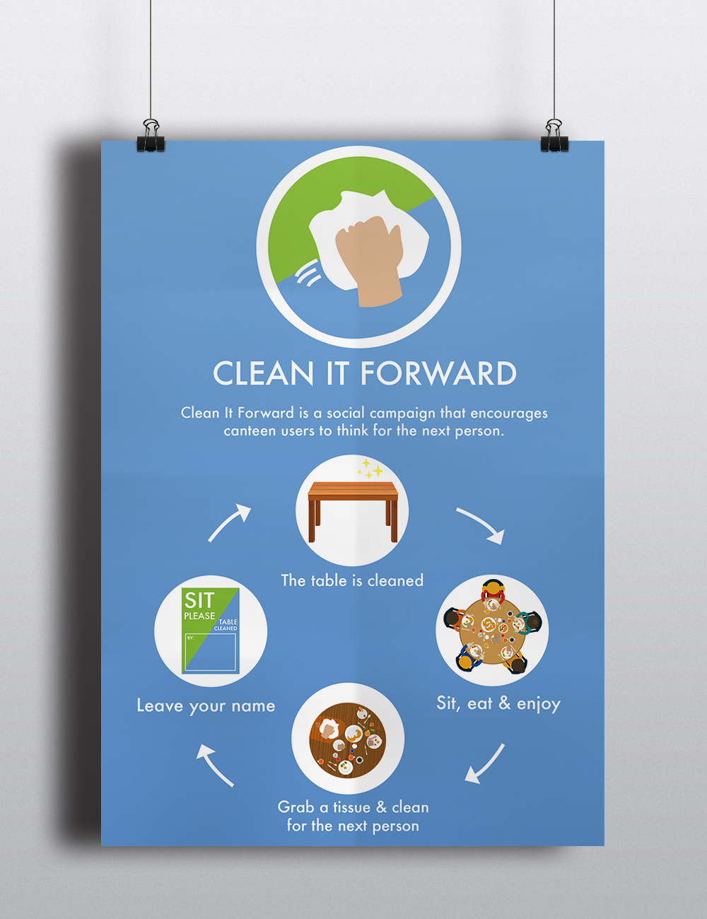
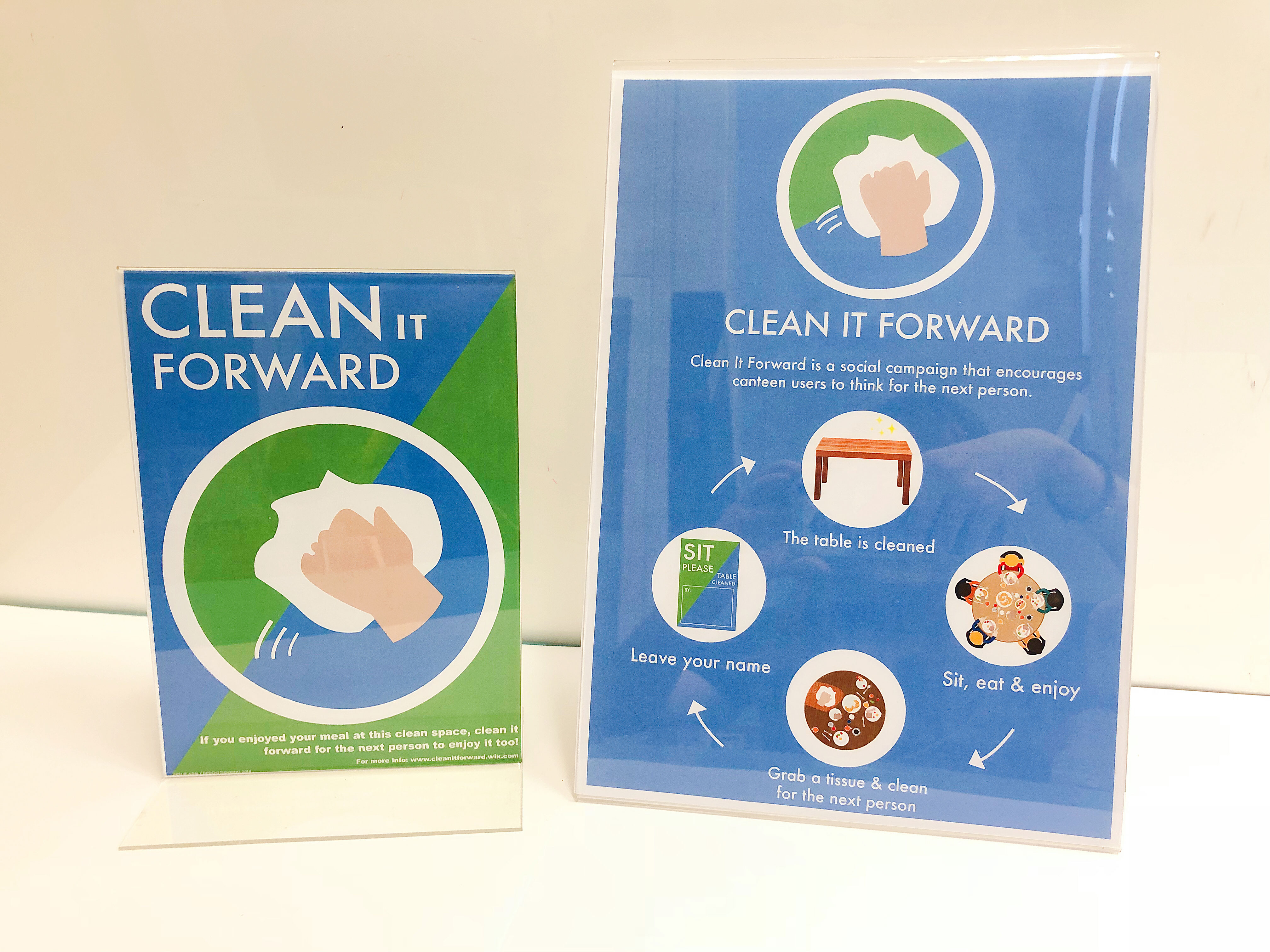
Main campaign poster
Other than improving on the A5 signs to be placed on canteen tables, we also created an A4 campaign poster to be put up on pillars and walls in the canteen and the areas leading up to it. This A4 poster aims to communicate the purpose of the Clean It Forward campaign, and how users can be a part of it.
- As we brainstormed about what key message we would like to highlight in this campaign poster, we came to the conclusion that the idea of the pay it forward system was the most appropriate as it encompassed the entirety of our campaign – users receiving the benefit of someone before them, and then them passing on the same benefit to the next user.
In order to explain this pay it forward system, we displayed it in a cycle diagram. At the top of the cycle, it is stated that “the table is cleaned”. Next, users are able to “sit, eat & enjoy”. After finishing their meal, users can “grab a tissue & clean for the next person”. The user can then choose the leave their name on the A5 table sign. Finally, the cycle is complete as the table is
once again cleaned.From all the feedback received from previous prototypes, we tried as much as possible to streamline the design and copy to ensure that it will be easy for users to understand immediately. As such, the copy for the purpose of the campaign is condensed into a single sentence, and the description of the instructions is reduced to short phrases.
Design-wise, we used the three brand colors – blue, green and white on the poster. Also, as the campaign logo is placed at the top one-third of the poster, we decided to do away with the diagonal color split. This is because there would have been a clash in the design if there were too many diagonals. Instead, we went with blue for the entire background. The icons are placed within white circles to be consistent with the use of circles in the logo.
Learning points
Empathy!
Testing


Recent Comments