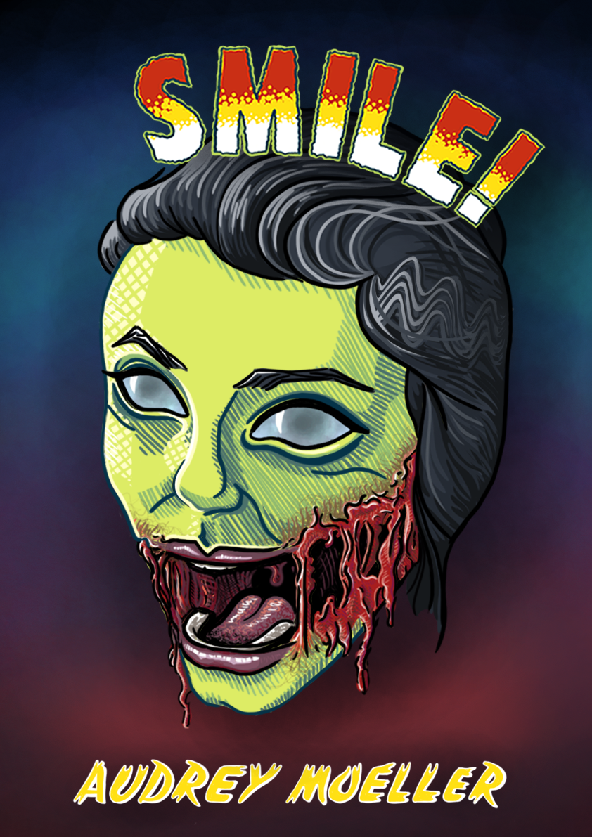

Before the piece was finalized, I received feedback that the typography across the top was not well-integrated in the piece, which I agreed with. Below are a few of the previous renditions of the title:
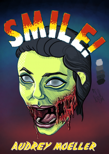
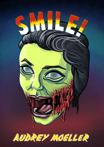
I had to make sure the face remained the focal point, and that the text didn’t look like it was just laid on top . By adding the shadow behind both the text and the head, some depth was created and as a result I think it looks less flat. Additionally, the green border behind the title gives it more contrast to the darkness behind it and therefore looks more purposeful. I am quite happy with the final version.