What for is a happening?

With the idea of hosting a happening i intended to combine a houseparty (with only a few people, maybe 15-20) with creation.
I’d like to give space for enjoying the day or the weekend with other people that have simmilar interests and to use the time to work, experiment or/ and talk together and with one another.

In my mind this event consists of different activities. Music production, photography/ experimental filmmaking, painting/ drawing, cooking, eating and drinking.
Best would be to have one huge room for all of this but to keep it feasible i would need to use the apartement i’m living in because there are no empty places in Stuttgart that would be easy to use or affordable. For this reason it makes only sense to partition the activities and let them take place in different rooms of the flat.

Thinking about which room would be the most suitable for which activity photography and experimental filmmaking should take place in the hallway because its the biggest rooms of all. There you can set up lights and scenes. People would walk through on their way to the toilet and balcony but also always get in contact with each other and the medium there. In contrast to the ones working on music production. The most suitable room for this would be my room. In there is a table with a huge screen and a computer with production software, studio monitoring speakers, an audio interface, an electric guitar, synthesizers and a lot of audio and midi cables for all needs. And you can really concentrate on the production there without interruptions because its a seperate room.

Painting/ drawing should take place in the kitchen and also hallway because there is a sink and water in the kitchen and its the most social room. The atmosphere in there will be much much relaxed and bright.

The balcony should act like a room to get a creative break and enjoy some sunlight and fresh air, speak in peace to others. Im feared it will be crowded with people smoking but at least all will talk alot there.

Design

I first thought about liquids flowing in a glitchy way with some text interfering as a poster for the event and also an illustrated, animated szene of two people sitting on the balcony talking. For the musical aspect of the events i wanted to make a video of close-ups of played instruments, turning knobs and pushing sliders with some little animations of colorful blobs flowing on top and music played underneath.

A problem for me here was that the styles of the design ideas are so different and complex on them own that it would be very difficult to let them belong together in a understanding way.

Words words words

After some research on happening i realised that this is the clearly the wrong word to describe the event im planning. I stumbled over the word “Fluxus” and instantly realised the consistency with my event. It describes a modern process of finding new ideas a while working on it and to create a new, more creative way of living. Happening are more like performance art and most of the time include an audience.

Also Fluxus, which consists of flow and fuse, perfectly fits my first ideations for the design.


(Forward Festival Identity, 24. Februar 2017, https://www.pinterest.de/pin/836332593275660163)


Inspired by this poster for the Forward Festival which i found on Pinterest while researching I decided to make a similar approach instead of the glitchy shapes and masked texts I thought of at the beginning of this project.

The abstract, organic shapes in contrast to the structured informative background in black and white formed the perfect juxtaposition for my topic Fluxus.


In addition to this I tried to invert the concept by combining structured, geometrical shapes with an organic looking font but it didn’t turn out as expected. I tried different architectures and also some of my own photographies to show the photographical part of the event but most of the time drifted away from the concept I developed after changing the event from Happening to Fluxus.


(Korea Now,

https://www.pinterest.de/pin/836332593275661259)


With this experience I also decided to drop the music video and the balcony scene to solve the problem I had from the very beginning: not finding any consistency.

The Manifesto written by Georges Maciunas gave the final hint for the title of my event: Flow and Fuse.

To really show the process of flowing and fusing I came up with some animated forms in pastel colours moving on top of a white surface with black font.


I liked the shapes but the interference wasn’t big enought so I added some shine to it making it more 3D and also show some overlapping.

For the text I tried many different compositions, fonts, sizes, orientations and distortions to get the result I wanted. An incisive design that really expresses the two different ideas of creation: Flow and Fuse.

I “fused” the Letters of the title together and stretched out a part of the word “Flow” to show the impact of work and in particular this event.


To “cover up” the 3 dimensional aspect of this assignment and finally show the musical facet I wanted to design a cassette cover. The cassette functions as an invitational card (props to Lisa Winstanley), shows all the important information like the adress on the inside (found no asset for this) and also has some music on it to be a kind of memento.


(Cassette, Secret Birds, In Hex)

This cassette design also inpired me to limit my colourpalett to two colours only.


Finally I gatherd all the important information necessary for the event.


Design:

Casette Design – Invitation

Poster
Flyer

Animated Facebook Banner
Motion Graphics Poster

Information:

What? – Flow and Fuse

When? – Summer 2019 August 17.

Where? – Stuttgart, my commune

Who? – friends and art interested, friendly people

Flow:
organic, lightweight, fluid, moves in a appealing way, constant,

Fuse:
merge, weld, at least two different „things“(Semiotik) fuse together

Function, Meaning and also Design gets fused together by creating coloured, flowing forms that devide and combine again and a writing which letters are fused together but get also stretched and leave the image area.


Moodboard


User

The people i’d like to meet on this event are art interested, open-minded people around my age. Experienced and with a sense of style so participants can share ideas and push each other to different results. I hope to create a temporal space to find others for a sensible collaboration even beyond that event.

To create a design that fits different mediums we had the chance to choose an event ourself.

A fair, a fashionshow, the opening of a restaurant and a party as part of an exhibition opening came to my mind in the very beginning.
Later on while being busy working on my last illustration and talking about this assignment with a good friend here at Adm i came to the conclusion that i’d rather want to design something for a real event.
While thinking about possible events in my surrounding and only thinking of parties of befriended Djs i decided to prepare an event on my own.


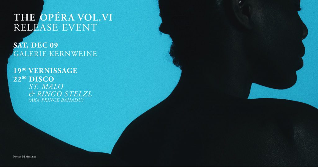
Event in Stuttgart I enjoyed last year. (THE OPÉRA , Galerie Kernweine , Facebook Event)
 

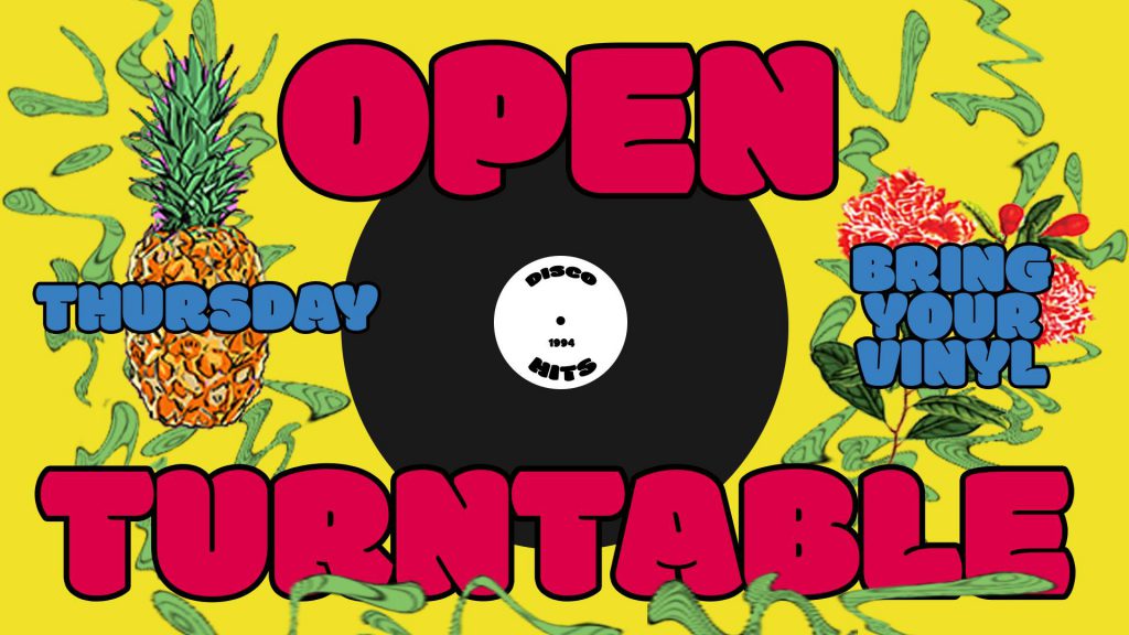
Last year i did a party for my birthday where everyone should have brought some vinyls. A lot of people didn’t bring their music but others brought even better vinyls and we all listened to different genres and weird and interesting songs and i even got some vinyls as presents.

Also i decided to let the party/ relaxed gettogether evening kind of thing take place in our cozy hallway instead of the huge kitchentable where we (me and my flatmates) usually receive visitors. The atmosphere was totally different. People were sitting on the couch, on chairs and pillows on the persian looking carpet in a grape formation have been much more active and seats were swapped more often.


Nothing Fancy Vol.23 – The eventbanner of my birthday invitation on facebook with a lot of stolen graphics…

Since i’ve learned about Andy Warhol i always wanted to go on a happening or host one by myself.
I dreamed of an appartement together with two or three of my best friend and fellow students and days full of creation in a surrounding with a sense of well-being.

I live together with 2 female architecture students, a guy who studies industrial engineering and another girl who’s studying audio and visual media together with me.

Im affraid that the architecture students won’t like the idea of hosting a happening in our appartement that much and the industrial engineering student may not be able to fully relate to it and may declare me insane if he hasn’t already.

But all in all i really want to organize such an event so im going to start my research on this.

For this project it was recommended to look out for inspiration whether in form of new styles or to get some references from illustrations we like.

1. astoryaboutnothing

The instagram channel “astoryaboutnothing” tells an ongoing story about a diver in a fictional underwaterworld through slimy illustrations.
The audience can decide at several points how the story should go on and get a feedback under the next post.
What inspired me the most are the sloppy handdrawn digital lines and the variety of unsaturated colours in different tones and contrasts to generate depth.


(astoryaboutnothing, Instagram, 23.11.2017,
www.instagram.com/p/Bb0VHcFnODD/?taken-by=astoryaboutnothing.)


Colourboard

Here you can see most of the colours used for these illustrations in comparison to the fully saturated colours

Furthermore I was inspired by the artists use of textures. He(/ She) uses inaccurat little lines and dots in combinations with organic outlines to create a material for each shape.


2. johnlestudio

The artist “John Le” presents detailed digital illustrations about an organic futuristic world with machines, creatures, nature and humans under his name “johnlestudio”.
His simplified organic shapes in a graphicnovel style inspired me to use a graphictablet for my illustrative self-portrait.


(Manta, John Le, www.johnlestudio.com.)

His spacious sceneries with simplified plain background layers and a coloured sky indroduce the viewer into a mysterious surrealistic world.

His inspiration was one of the reasons I chose to illustrate a landscape as a background of my portrait.
I wanted to embed my face illustration into an wide and spacious landscape to emphasize the weight and size of the two shown expressions.
The landspace points the way to a place far away and makes the viewer feel like beeing there inspead of looking at an image of me looking back.

His use of unsaturated colours, detailed rocked down textures and handdrawn organic shapes inspired me already in the past and induced me to try out a similar style for this assignment.
Especially the forms and colours of the clouds convinced me to favour his work.

To study the “concepts of visual narrative or visual storytelling” (Winstanley, L. (2018). Assignment 1. Singapore.) for my course “Illustration for Designer” I had the assignment to portray myself in any form of an illustration whether digital or analog.

To get started every student had to make a word list of 5-8 words discribing their current situatiuon in life. The given examples were rather simple discribing music, film or animals that you like.

Wordlist

For this technique to gather creativity I made a long and confusing list of all things that inspire me, that i like or describe me in some way and also thinking about their suitability as a depiction for my portrait.

Most suitable as images for my illustrations may be my skateboard as a respresentation of my sports and social activities, my synthesizer substitutional for my uncommon taste of music and hobbies and an avocado firstly because i love avocados and also because im a vegetarian.

Sport was always a big part of my life.
Starting with Trial (all terrain parcour with a bike), inline skating, football, slacklining up to skateboarding i definitely prefer sport that i can do on my own in no need of a team. Not saying im not a teamplayer. I like working in teams but when it comes to sport I prefer an activity where I can focus to achieve something regardless of the amounts rendered by others.
Skateboarding is for me the purest form of concentration, hard work and balance of life. I can be in the worst mood but as soon as you jump on your board its gone.
Also skateboarding defines a certain lifestyle and connects people with similar interests. Most of my friends skate, have been skating or are interested in it. Thats why I’d like to include a skateboard in my portrait.

The taste of music or interests in creative activies also connect me to my friends and beloved.
Thats what the synthesizer should sybolize. It represents an alternative taste of music apart from popmusic and charts and also one of my main hobbies: making electronic music.
To include my other interests like animation, motion design, photography and filmmaking I’d also like to stay with the synthesizer as a symbol of creativity throughout technical instruments and reduce the amount of metaphoric item in my picture.

Focal Point

All visualisations based on the wordlist should rather be secondary elements instead of the main part of the portrait the focal point.
For this i wanted to show the front view of my face as a close-up centered in the picture. To express the different moods that mainly occur in my everyday life i came up with an idea pretty fast. I wanted to split mit face in two halfes with different expressions and turn one of them around.
The two expressions had be simplified and reduced to happyness and sadness or working oneself up. Or even simpler and more classified: The good and the bad.

At this point I didnt know how to include the visual elements from the wordlist but I really wanted to use organic shapes like smoke or clouds (also mentioned in my wordlist) to merge all elements.


Herefore I came up with some sketches of a swirl,flog, clouds and waves.


To include all elements and add some structure my lecturer suggested to build up the background or frame like an economical system. I really liked the idea and came up with a sketch immediately.